Today (June 3, 2026), the Australian Bureau of Statistics (ABS) released the latest - Australian…
The Ireland growth miracle is largely illusory and biasing Eurozone growth data upwards
I have been avoiding keeping up-to-date with the Irish national accounts over the last several years for reasons that I documented in this blog post – Ireland – not as rosy as the official story might suggest (January 2, 2018). Ireland has been held out as the poster nation for the Eurozone boosters because of its seemingly ‘impressive’ growth performance after entry into the common currency and its resilience after the Global Financial Crisis. During the GFC, I wrote a series of blog posts (see below) that delved into reality of the Irish situation and we learned that the so-called ‘Celtic Tiger’ growth miracle was an illusion and was driven by major US corporations evading US tax liabilities by exploiting massive tax breaks supplied to them by the Irish government. Since then the ‘smoke and mirrors’ have become even more obvious as the Irish national accounts recorded massive increases in business investment all due to fudges in the way several large corporations recorded their tax affairs. I decided recently to see where this was at given the European Commission is still claiming that growth. What I found was that the distortions in the Irish data are influencing the outcomes reported for the European Union as a whole and things are definitely not as robust as the official figures demonstrate.
A brief Irish crisis and post-crisis history via my blog
The following blogs tracked the Irish experience since the onset of the crisis:
1. The sick Celtic Tiger getting sicker (May 24, 2010) – Ireland imposed fiscal austerity early under pressure from the IMF and the Eurogroup. Its banking system basically collapsed and its economy continued to nose-dive with net emigration rates (particularly among the education and 25-34 years old rose significantly). Further, we learned that the so-called “Celtic Tiger” growth miracle was an illusion and was driven by major US corporations evading US tax liabilities by exploiting massive tax breaks supplied to them by the Irish government.
2. The Celtic Tiger is not a good example (July 10, 2010) – while Ireland was the first nation to really embrace fiscal austerity any early growth that followed was driven largely by the growth in the US economy through trade linkages. Exports were growing but the growth dividend was largely expatriated to foreigners as rising income. Domestic demand continued to contract.
3. How’s poor old Ireland, and how does she stand? (December 19, 2011) – by 2011 there was some growth mostly driven by a fall in Net Financial Income flows while the domestic economy was still declining and unemployment rising further.
4. Oh Ireland, if only you were growing (May 4, 2012) – Ireland was still going backwards and its people were becoming poorer. While GDP was showing the slightest signs of growth, the local residents in Ireland went backwards over 2011 because what growth there was was expropriated by foreigners.
5. Ireland still located in the Irish Sea despite multibillion-euro austerity drive (July 1, 2013) – Real GDP continued to decrease. It was also clear that while exports showed some growth signs courtesy of the renewed growth in the UK and the on-going US growth, any growth dividend was being expatriated to foreigners as rising income. Further, we documented that the Irish labour force shrank dramatically following the onset of the crisis in 2007, which had the effect of attenuating the already massive rise in unemployment.
6. Ireland national accounts and inversion (July 7, 2014) – the tax inversion made it hard to disentangle what is actually happening with the Irish National Accounts.
7. Ireland – the quantity-adjusting recovery (August 10, 2015) – the growth data showed that Ireland was not an example of a “supply-side” internal devaluation inspired recovery. Rather, its growth was an example of a straightforward “Keynesian” quantity adjustment aided by Ireland’s very open economy and the fact that is has been favourably disposed to growth elsewhere supported by on-going fiscal deficits. Further, favourable shifts in the US dollar dominated external competitiveness improvements rather than anything Ireland had done by way of internal devaluation.
8. Ireland demonstrates that fiscal deficits promote growth (December 24, 2015) – analysed the implications of Ireland as a rather strange Eurozone Member State, given that it is more firmly plugged in to the Anglo world than other Eurozone nations. While the Irish government was suppressing domestic demand through austerity from as early as 2009, significant trading partners (such as, Britain, the US and China) were maintaining expansionary fiscal positions, which allowed Ireland to resume growth. Further, a narrow focus on the growth cycle misses significant aspects of national prosperity. Even with two years of economic growth, real earnings growth was flat to negative, the rate of enforced deprivation remains around 30 per cent, and there was a rising proportion of people at risk of poverty. On top of that, net emigration of skilled workers continued, which means that the official unemployment rate was much lower than it would have been if these workers had not left the country.
9. Irish national accounts – smoke and mirrors really (July 20, 2016) – documented the ridiculous data release which showed that between 2014 and 2015, Ireland grew by a staggering 26.3 per cent. Apparently, exports grew by 34.4 per cent and Gross physical capital formation grew by 26.7 per cent, which had to be a data fudge. There had been a rise in the number of aircrafts that have been sent to Ireland to be leased back to international carriers. Further, the tax inversion distortions continued – several large corporation relocated their ‘legal domicile’ to Ireland as a tax haven while leaving their main operations somewhere else where they actually produce things and employ people. The shifting balance sheet is recorded as production (capital formation) in the Irish National Accounts.
10. Ireland – not as rosy as the official story might suggest (January 2, 2018) – my last report on the data scams and how it distorts the public debate. This post reports on an official enquiry conducted by the Irish Central Statistics Office (CSO) to review the data anomalies and come up with a better framework for measuring economic activity. A new measure GNI* (Modified Gross National Income) was proposed which would exclude the depreciation attributable to relocated capital assets and the impact of re-domiciled firms.
Fast track to 2023
To understand the next graph we need to be clear on what the lines are measuring:
- Gross Domestic Product – is equal to Gross Value Added at factor cost plus taxes on production less subsidies on production. It represents total expenditure on the output of goods and services produced in the country and valued at the prices at which the expenditure is incurred.
- Gross National Product – is equal to Gross Domestic Product at market prices plus net factor income from the rest of the world and represents the total of all payments for productive services accruing to the permanent residents of the country. Some income accrues to Irish residents as a result of economic activity abroad or property held abroad while some income arising in the state is paid to non-residents
- Gross National Income – is equal to Gross National Product at market prices plus EU subsidies less EU taxes. This is more commonly described as being equal to Gross Domestic Product plus net primary incomes from abroad.
- Modified Gross National Income – is equal to Gross National Income at market prices less the factor income of redomiciled companies, less depreciation on R&D service imports and trade in IP and less depreciation on aircraft related to aircraft leasing.
The point is that while GDP measures the total value of goods and services produced by the economy in a given period, not all of the income generated by that production accrues to domestic residents.
GNP adjusts the GDP figure to show the income that accrues to Irish residents.
It gives a better measure of the material benefits of economic activity that accrue to residents.
The modified GNI figure more clearly nets out the tax rorts and other aspects that provide vast benefits to foreigners but do not accrue to residents.
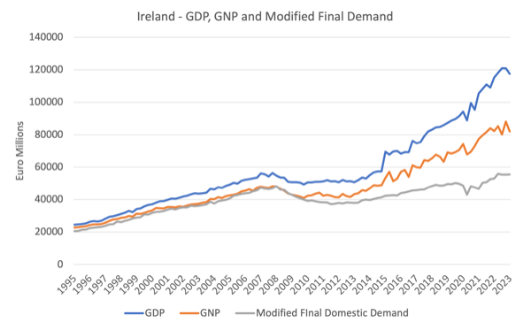
The following graph is based on the quarterly national accounts data from the March-quarter 1995 to the March-quarter 2023.
Since the March-quarter 2008 (at the onset of the GFC), GDP has grown by 114.8 per cent.
However, GNP has only growth by 71.1 per cent and Modified final domestic demand has only grown by 14.9 per cent.
So the claims that Ireland has boomed as a result of joining the EMU fail to recognise that these corporate arrangements provide very little employment or income gains to Irish workers.
They provide massive benefits to multi-national corporations who can spread production out into low-wage nations where workers have very little protections or rights, while recording the income gains and value of IP etc in Ireland as a result of generous conditions provided by the Irish government.
The GDP narrative is thus an illusion.
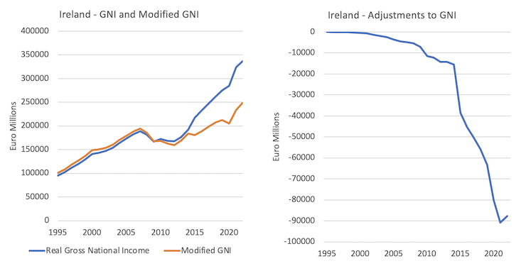
The next graph shows real Gross National Income and the Modified GNI series (left panel) and the difference between the two after the adjustments are made (right panel) from 1995 to 2022.
The mainstream media is now picking up on this problem.
A recent Financial Times article (August 23, 2023) – Ireland’s wild data is leaving economists stumped – seems to think that we are fooled by the vagaries of the Irish national accounts.
Those who study the data have understood this problem for some years and concluded that Ireland’s economic performance is largely illusory.
Even before the GFC, we knew that around 20 per cent of the Irish GDP income was just ‘profit transfers’ to foreign owned companies that provided virtually zero benefits to the Irish people.
The miracle of the Celtic Tiger was a confection – the result of manipulation of the rules regarding Ireland as a tax-haven for large multi-national companies that can shift activity and accounts across nations to suit their own aspirations.
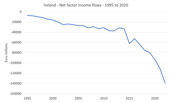
Net factor income is the difference between the income flows accruing to Irish residents as a result of investments abroad and the incomes flows from Ireland to foreigners.
The following graph shows the annual net factor income flows from 1995 to 2022.
In 2022, they represented 29.3 per cent of total GDP income produced – which was flowing out of Ireland to enrich foreigners, who had exploited the tax-haven rules.
The Financial Times article notes that these distortions are now impacting at the Eurozone level:
The latest example came when eurozone industrial production figures, published this month by the EU’s statistics arm Eurostat, showed month-on-month growth of 0.5 per cent in June, confounding analysts’ expectations for a slight decline.
The growth was entirely down to Ireland’s 13.1 per cent surge. Excluding “statistical quirks and distortions” in the Irish data
The production data for Ireland is highly volatile and the CSO has recorded industrial production growing in excess of 10 per cent for 14 out of the past 24 months.
Which is unbelievable.
There are many possible explanations – poor constant price adjustments, strange seasonal adjustment, and more.
But what we now know is that:
Big swings in Irish industrial production even affect gross domestic product figures, including for the eurozone. In the three months to June, more than half the region’s 0.3 per cent growth from the previous quarter was due to Ireland’s 3.3 per cent expansion in the period.
Again, unbelievable.
The CSO media release accompanying the most recent (preliminary) GDP estimates for the June-quarter 2023 – Early estimates indicate that Gross Domestic Product (GDP) increased by 3.3% in Quarter 2 2023 – note:
In today’s release, Gross Domestic Product (GDP) is estimated to have risen by 3.3% in Q2 2023 in volume terms when compared with Q1 2023, driven by increases in the multinational dominated sectors (the Industry and Information & Communication sectors) in Q2 2023. GDP is estimated to have increased by 2.7% when compared with the same quarter of 2022.
We still don’t have the full national accounts release for the June-quarter 2023, but you can be sure that only a small fraction of this growth will benefit Irish citizens.
Conclusion
The other obvious conclusion is that the Eurozone national accounts will also be overstated and hide the degree of contraction that is going on.
Strange places really.
That is enough for today!
(c) Copyright 2023 William Mitchell. All Rights Reserved.
The eurozone freak show is still open, but as time goes by, and the tumor growing, the looming burst will become more and more painfull.
Nothing can be done to stop it.
I first go interested in economics when Ireland posted a 24.5% annual increase in GDP and I certainly did not get a 25% pay increase. I went searching for how to calculate the GDP and the formula to calculate it opened my eyes and lead me to MMT.
The increase in GDP was due to an airline booking it’s purchase of aeroplanes in Ireland for tax purposes.
I’d be curious whether or not a parallel analysis of the movement of atoms and transfer/consumption of joules in and out of Ireland would further confirm the extent to which the spreadsheet data is terribly misleading.
My suspicion is that it would.
@eg
It’s an interesting question whether the much discussed energy/GDP decoupling is related to the vagaries of national income accounting. If you go to the page here and compare Ireland to the UK, for example, the answer seems to be that the tax policies of Ireland are NOT a big factor compared to whatever else is going on.
In case the link does not work, search for “our world in data energy gdp decoupling”.
*Cause* of the conflict between “reality” and “official figures” is what’s important. (Demonstration of the conflict changes nothing.)
Sorry, this is an attack of frivolity, but you touched on something I’ve been working on.
Energy flow from the Sun is 3.83E+26 Watts, of which 6.958E+17 Watts reach the planet Earth.
Human energy use is estimated at 2.05E+13 Watts, 1.64E+13 Watts from “non-solar” sources (coal, oil, natural gas, nuclear). The human component of earth’s energy budget is one ten-thousandth of the whole. We have to look very closely to detect anybody’s GDP in those numbers.
Anthropogenic Global Warming isn’t effected by our direct energy use. We bring AGW about by changing the composition of the atmosphere, adding so-called Greenhouse Gases, and making the atmosphere a more effective insulator to slow down the loss of those 696,000 teraWatts back to space.
The Republic of Ireland, with an area of 70,273 km2 at a latitude of 51 degrees represents 1/3047 of the earth’s cross-sectional area, so its share of the solar budget would be 2.28E+14 Watts. I suppose we could compare that with its share of World Production and see something, whatever it might be.
If I did this spreadsheet right.
Mel, my wording was a little clumsy. I was referring to the sort of analysis underlying this paper: “Imperialist appropriation in the world economy: Drain from the global South through unequal exchange, 1990–2015”
https://www.sciencedirect.com/science/article/pii/S095937802200005X
From the abstract:
“Here we use environmental input-output data and footprint analysis to quantify the physical scale of net appropriation from the South in terms of embodied resources and labour over the period 1990 to 2015. We then represent the value of appropriated resources in terms of prevailing market prices. Our results show that in 2015 the North net appropriated from the South 12 billion tons of embodied raw material equivalents, 822 million hectares of embodied land, 21 exajoules of embodied energy, and 188 million person-years of embodied labour, worth $10.8 trillion in Northern prices – enough to end extreme poverty 70 times over. Over the whole period, drain from the South totalled $242 trillion (constant 2010 USD). This drain represents a significant windfall for the global North, equivalent to a quarter of Northern GDP. For comparison, we also report drain in global average prices. Using this method, we find that the South’s losses due to unequal exchange outstrip their total aid receipts over the period by a factor of 30. Our analysis confirms that unequal exchange is a significant driver of global inequality, uneven development, and ecological breakdown.”
Solar insolation is greater at latitude zero than latitude 51. That’s before you take into account the clouds.
The distribution of solar radiation isn’t fair.
Those of us in the British Isles should demand reparations. Probably in the form of Vitamin D tablets.
No, no, no Neil. We should be grateful that we live in the British Isles with our cloudy, wet n windy weather as it keeps us indoors more often and less exposed to the ‘virus’…