The Australian Bureau of Statistics (ABS) released the latest labour force data today (March 19,…
US labour market continues to improve but questions remain
Today is the mid-term elections in the US and it seems that the media is focused on how many seats the Democrats will win. As a progressive this doesn’t particularly interest me much given that the claims the Democrats have been making in the last few months about fiscal policy. Trump is out there demonstrating what expansionary fiscal policy can do when there is idle capacity. And last week’s (November 2, 2018) release by the US Bureau of Labor Statistics (BLS) of their latest labour market data – Employment Situation Summary – October 2018 – showed the employment impacts of that fiscal approach. Total non-farm employment from the payroll survey rose by a very strong 250,000 and the unemployment rate was steady at 3.5 per cent. Inflation remains subdued. The strong employment growth has also stimulated participation, which meant that the growth in the labour force has outstripped the strong employment growth and unemployment rose slightly in October. But that is the sort of dynamic that a high pressure economy exhibits and eventually the cyclical participation effects exhaust and the strong employment growth starts mopping up the last of the cyclical unemployment and underemployment. There is still some way to go for that to be the case. While the US labour market is reaching unemployment rates not seen since the late 1960s, the participation rate is still well below the pre-GFC levels and a substantial jobs deficit remains. There has also been a hollowing out of the occupational employment structure around the median pay occupations which confirms the bias towards low-pay jobs in the recovery. The employment-population ratio rose by 0.2 points in October. Taken together, the US labour market continued to improve in October but remains some distance from full employment.
Overview for October 2018
- Payroll employment rose by 250,000.
- Total labour force survey employment rose by 600 thousand in net terms.
- The seasonally adjusted labour force rose by 711 thousand.
- Official unemployment rose by 111 thousand to 6,075 thousand.
- The official unemployment rate rose from 3.68 per cent to 3.74 per cent.
- The participation rate rose by 2 points to 62.9 per cent but remains well below the peak in December 2006 (66.4 per cent). Adjusting for age effects, the rise in those who have given up looking for work for one reason or another since December 2006 is around 3,800 thousand workers. The corresponding unemployment rate would be 5.8 per cent, far higher than the current official rate.
- The broad labour underutilisation measure (U6) fell to 7.5 per cent from 7.4 per cent.
For those who are confused about the difference between the payroll (establishment) data and the household survey data you should read this blog – US labour market is in a deplorable state – where I explain the differences in detail.
See also the – Employment Situation FAQ – provided by the BLS, itself.
The BLS say that:
The establishment survey employment series has a smaller margin of error on the measurement of month-to-month change than the household survey because of its much larger sample size. … However, the household survey has a more expansive scope than the establishment survey because it includes self-employed workers whose businesses are unincorporated, unpaid family workers, agricultural workers, and private household workers …
The BLS noted this month that:
Hurricane Michael made landfall in the Florida Panhandle on October 10, 2018, during the reference periods for both the establishment and household surveys. Hurricane Michael had no discernible effect on the national employment and unemployment estimates for October, and response rates for the two surveys were within normal ranges.
Payroll employment trends
The BLS noted that:
Total nonfarm payroll employment rose by 250,000 in October … Job gains occurred in health care, in manufacturing, in construction, and in transportation and warehousing.
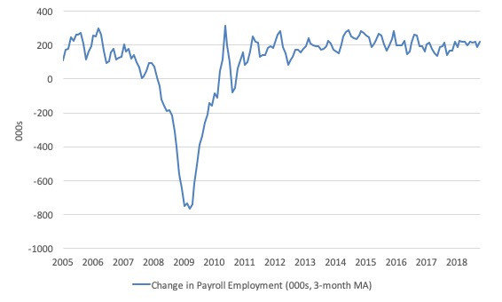
The first graph shows the monthly change in payroll employment (in thousands, expressed as a 3-month moving average to take out the monthly noise).
The monthly changes were stronger in 2014 and 2015, and then dipped in the first-half of 2016. By the end of 2016, job creation was stronger but then it tailed off again, somewhat.
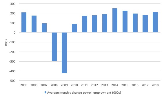
The next graph shows the same data in a different way – in this case the graph shows the average net monthly change in payroll employment (actual) for the calendar years from 2005 to 2018 (the current year is up to September).
The slowdown that began in 2015 is continued through 2017 and 2018 so far appears to have reversed that trend, with the current average for 2018 (213 thousand) higher than the 2017 average.
The average change in 2017 was 182 thousand, down from the 195 thousand average throughout 2016.
The average net change in 2014 was 250 thousand, in 2015 it was 226 thousand.
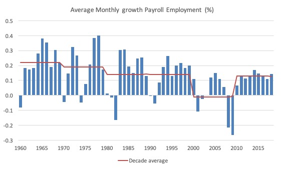
To put the current recovery into historical perspective the following graph shows the average annual growth in payroll employment since 1960 (blue columns) with the decade averages shown by the red line.
It reinforces the view that while payroll employment growth has been steady since the crisis ended, it is still well down on previous decades of growth.
Labour Force Survey – employment growth strong
In October 2018, employment as measured by the household survey rose by 600 thousand net (0.38 per cent) while the labour force rose by 711 thousand (0.44 per cent) as a result of a 0.2 point rise in the participation rate to 62.9 per cent.
The rising participation is a reflection of the last few months of strong employment growth.
But because the rise in the labour force was greater than the rise in employment, total unemployment rose by 111 thousand and the unemployment rate edged up at the second decimal point.
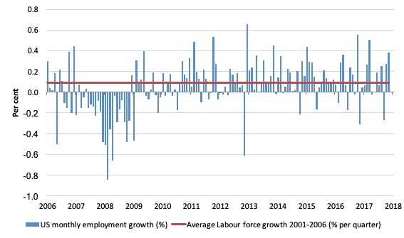
The next graph shows the monthly employment growth since the low-point unemployment rate month (December 2006). The red line is the average labour force growth over the period December 2001 to December 2006 (0.09 per cent per month).
Summary conclusions:
1. The swings around the zero line are obvious.
2. There is still no coherent positive and reinforcing trend in employment growth since the recovery began back in 2009. There are still many months where employment growth, while positive, remains relatively weak when compared to the average labour force growth prior to the crisis or is negative.
3. The last few months have been encouraging.
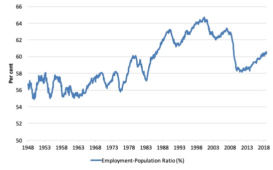
A good measure of the strength of the labour market is the Employment-Population ratio given that the movements are relatively unambiguous because the denominator population is not particularly sensitive to the cycle (unlike the labour force).
The following graph shows the US Employment-Population from January 1970 to October 2018. While the ratio fluctuates a little, the October 2018 ratio was up by 0.2 points to 60.6 per cent.
It has risen by 0.5 points since the beginning of 2018, which is a hopeful sign.
Over the longer period though, we see that the ratio remains well down on pre-GFC levels (peak 63.4 per cent in December 2006), which is a further indication of how weak the recovery has been so far and the distance that the US labour market is from being at full capacity (assuming that the December 2006 level was closer to that state).
Unemployment and underutilisation trends
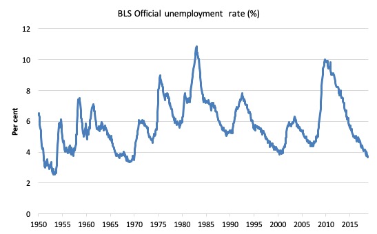
The first graph shows the official unemployment rate since January 1950.
It is clear that the US labour market is reaching unemployment rates not seen since the late 1960s.
The official unemployment rate is a narrow measure of labour wastage.
The next graph shows the BLS measure U6, which is defined as:
Total unemployed, plus all marginally attached workers plus total employed part time for economic reasons, as a percent of all civilian labor force plus all marginally attached workers.
It is thus the broadest measure of labour underutilisation that the BLS publish.
In December 2006, before the affects of the slowdown started to impact upon the labour market, the measure was estimated to be 7.9 per cent.
It is now at 7.4 per cent. It has been steadily declining over 2018, and fell by 0.1 points in October 2018.
The U-6 measure is marginally below the pre-GFC level but remains above the trough of the early 2000s.
That provides a quite different perspective in the way we assess the US recovery and challenges the view that the US economy is close to full employment.
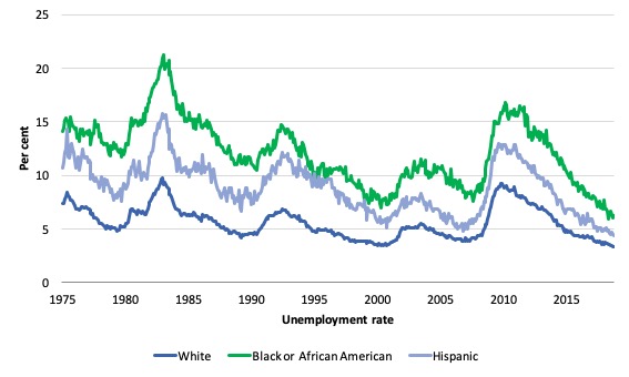
The ethnic trends in trends in unemployment by ethnicity are interesting in the US.
Two questions arise:
1. How have the Black and African American and White unemployment rate fared in the post-GFC period?
2. How has the relationship between the Black and African American unemployment rate and the White unemployment rate changed since the GFC?
The first graph shows the history of BLS unemployment rates for Black and African Americans, Hispanics and Whites.
Summary:
- All the series move together as economic activity cycles. The data also moves around a lot on a monthly basis.
- The Black and African American unemployment rate is currently at 6.2 per cent, which is well below the pre-GFC minimum achieved of 7.6 per cent (August 2007).
- The Black and African American unemployment rate has fallen by 1.1 percentage points over the last 12 months.
- The White unemployment rate is 3.3 per cent in October 2018 and 0.8 points lower than the pre-GFC low-point (October 2007).
- The White unemployment rate has fallen by 0.2 percentage point over the last 12 months.
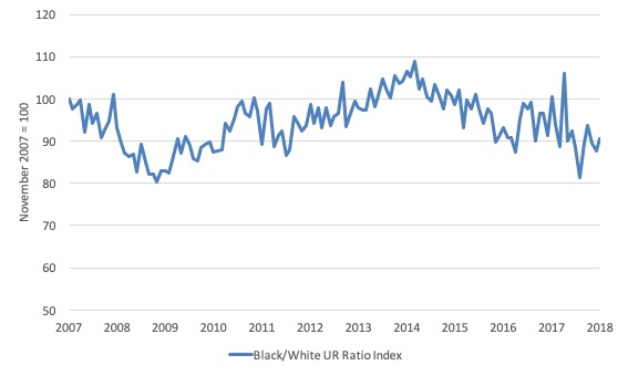
The second graph shows the Black and African American unemployment rate to White unemployment rate (ratio) from October 2007 (index = 100), when the White unemployment rate was at its previous lowest level.
This graph allows us to see whether the relative position of the two cohorts has changed since the crisis.
The data shows that, in fact, Black and African Americans are better off in relative terms (to Whites) now (October 2018) than they were in October 2007.
The ratio index stands at 90.6 points, meaning that that the Black and African American to White unemployment rate ratio has fallen by 9.4 percentage points since October 2007 – a relative improvement for Black and African Americans.
Overall, since the end of the GFC, the US labour force growth is absorbing proportionately more disadvantaged workers.
The low-wage bias continues
My feature on the US labour market this month focuses on tracking what I have called in previous blogs the low-wage employment bias in the US labour market.
To see the full methodology I employed in making these calculations please read the blogs – US jobs recovery biased towards low-pay jobs and Bias toward low-wage job creation in the US continues.
The question: Is there a bias towards low-pays jobs in the recovery in the US?
Answer: bias continues at the sectoral level.
Effectively, since the recovery began in January 2010, there have been 20,055 thousand net jobs added to the US labour market (in the non-farm sector).
Of those net employment additions, 25.1 per cent have been what might be considered low-pay, where that is defined as less than 75 per cent of average weekly earnings.
Previously, I have calculated what happened in the downturn with respect to the jobs lost in net terms and their pay characteristics (at a sectoral level).
Please read my blog – US labour market – improves in August but still no growth trend is apparent – for more discussion on this point.
The main conclusions were:
1. Peak US non-farm employment occurred in January 2008 (138,430 thousand) and the trough occurred in December 2009 (129,778 thousand).
2. The job losses for the top-level North American Industry Classification System (2012 NAICS) were calculated from peak (January 2008) to the trough (December 2009).
3. Overall 8.7 million jobs were lost – with 8.8 million lost in the private sector and they were only partially offset by the 94,000 net jobs added in the government sector.
4. In the downturn, 21.1 per cent of the jobs lost (net) were in sectors that paid on average below 75 per cent of the overall private sector average pay (that is, low-pay jobs).
5. 86.1 per cent of the total jobs lost in the downturn were in sectors paying above average pay.
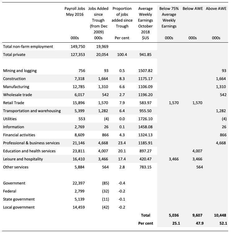
The following table summarises what happened in the period from the trough to the most recent monthly data observation (October 2018).
The second column shows the latest BLS payroll employment data as at October 2018. The next column shows the number of net jobs (in thousands) that have been added by each sector since the trough in December 2009.
The next column shows the percentage of those total jobs added by sector. You can see that with the Government sector in contraction the total jobs added in the Private sector are 100.4 per cent of the total net jobs added.
The fourth column shows the Average Weekly Earnings for each sector as at October 2018.
The final three columns split these job additions into their pay characteristics using the sectoral average weekly earnings and the same criteria as in the previous example.
The summary statistics for each ‘pay category’ (75% of Average Pay, Below Average Pay, Above Average Pay) are at the bottom of each column.
We find that:
1. Government employment has contracted in the expansion by 85 thousand. This has been particularly evident at all levels of government in the US.
2. 25.1 per cent of the total private jobs added could be considered low-pay, that is, in sectors that pay on average weekly wage 75 per cent below the total private sector average weekly earnings.
3. 47.9 per cent of the private jobs created (net) since the recovery began pay below average weekly earnings. That proportion was 50.4 per cent in May 2016.
4. The data shows that the low-paid private jobs that were lost in the downturn (1,843.8 thousand) have been more than added back (in net terms) in the upturn so far (5,036 thousand).
5. The above average pay private jobs that were lost in the downturn (7,528.8 thousand) have now been more than added back in net terms (10,447.5 thousand).
6. The bias in the recovery towards low-paid private jobs in the US has continued. In January 2008, low-pay jobs constituted 25.1 per cent of total private jobs and this proportion remains in October 2018.
7. However, the proportion of below-average jobs since January 2008 has increased – from 46.2 per cent of the total to 47.9 per cent in March 2018.
Clearly, this analysis is at the aggregated NAICS level and a richer story could be told if we used the two-digit and three-digit typed drill downs into the industry classification.
Occupational wage bias
I have been curious about what was going on underneath the sectoral aggregates discussed in the previous section. So I found a little time to research the cyclical shifts at the main occupational level.
And the results are very interesting.
Remember, the last section focused on industry aggregates. So when we concluded, for example, that the proportion of below-average pay jobs has increased since January 2008, we were saying that the proportion of jobs in the total employment in sectors that pay below-average pay has increased.
At that level we are unable to say whether these jobs in question were high-pay or low-pay.
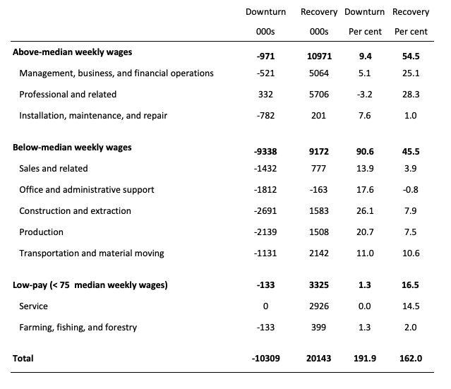
The next table helps to expand on that understanding.
It shows the net job losses (in the downturn) and net job gains (in the recovery to date) for the major occupations in the BLS classification.
I have sorted the occupations relative to median weekly earnings as at the third-quarter 2018.
Low-pay is 75 per cent of the median.
Results:
1. In the downturn 90.6 per cent of the jobs lost were in occupations that paid below median weekly earnings (1.3 per cent of the in low-paid occupations). Very few jobs (relatively) were lost in the higher paying occupations.
2. Given 86.1 per cent of the total jobs lost in the downturn were in sectors paying above average pay. The inference is that the jobs lost were predominantly the lower paying jobs in those sectors (although we cannot strictly compare mean and median in a wage distribution given the skewness).
3. In the upturn, the net jobs added have not quite replaced those lost in the occupations with below median weekly earnings. 54.5 per cent of the net jobs added were in occupations with above median weekly earnings.
4. While only a small number and proportion of jobs were lost in the low-pay occupations, the recovery has seen a much larger number of those jobs being added. Of the 45.5 per cent share of below median earning jobs in the recovery, 16.5 per cent of them were in low-pay occupations.
5. This tells us that there is a polarisation going on in the occupational employment structure with a bias towards low-pay jobs in the below median weekly earnings occupations and towards jobs in the above median weekly earnings.
6. There is probably a hollowing out around the median that warrants further analysis.
Conclusion
The October BLS labour market data release for the US tells me that the US labour market is improving.
Caution should always be exercised given the volatility of the monthly data.
The official unemployment rate is at levels not seen since the late 1960s but the U6 broad underutilisation rate is still at elevated levels (albeit dropping).
While the participation rate is still well below where it was even after we adjust for the ageing effects (retirements), the strong employment growth over the last few months has seen activity rising.
But there is still slack in the system – at least 3,8000 thousand workers who have left the labour force in the period since the GFC.
That is enough for today!
(c) Copyright 2018 William Mitchell. All Rights Reserved.

In the first two graphs, the largest dip is of course the GFC. The first makes the tepid recovery look bettern than that depicted in the second graph. With respect to 2016, the two graphs could lead to differing interpretations of what is going on. This could be attributed to the fact that they are scaled similarly while their representations differ, I suppose.
Jon Snow could have done with a perusal of this post before he made his comments about the state of the US economy last night. Of course, that would have been difficult as the post did not yet exist in print, as it were. To help him out, I have sent it to him today. Whether he reads it, … .
What is a “job” these days? A fairly-secure, long-term position with an established and respected employer, a position which offers decent pay and benefits which in turn allow an employee to make realizable plans for his/her family and future? From the end of WWII to Thatcher/Reagan, that was the customary understanding of the word “job”–a stable income-earning position that enabled a viable working class or middle class existence. How many of THOSE kinds of jobs have been created since the GFC? Indeed, how many of THOSE kinds of jobs were lost in the Thatcher/Reagan and post-Thatcher/Reagan decades that preceded the GFC? We can crunch numbers all day and night about the temporary and precarious gigs, often at starvation wages and without significant benefits, that have come and gone at various times during these dreadful four decades, but what does that really tell us? IMHO it tells us only how well the new system of wage-slavery has done or is doing. Am I the only one who finds that subject of little interest compared to ideas and proposals, often coming from Bill and his MMT colleagues, which seek to recreate an economy that again offers genuine jobs to genuine employees, not occasional gigs to desperate wage-slaves?
I think that what Trump is doing has been driven by the military-industrial complex. He is behaving like an evil clown but what really matters is what they are doing in the US behind the scenes, what should explain the use of fiscal policies, the trade war, blocking the spread of advanced technologies, etc. (A side effect of the active fiscal policy aiming at halting the de-industrialisation is the reduction in unemployment). The change in global economic leadership (the rise of China) is not a one-hundred-year event. (The last one was the rise of the US at the cost of France, Germany and the UK). What we are witnessing is a five-hundred-year event, the undoing of the Western domination over the rest of the world. That system was build on the political domination of the private capital owners, using nation-states and confederations (like the EU) as their agents. As I mentioned here a few years ago, this global capitalist system has been hacked by China (where the power gives money, not money gives power). The “true” American political elite (the neocons and some Democrats) have finally realised what is going on but it is too late. Initially they thought that China could be poisoned by the spread of so-called “Western democracy” and the emancipation of the middle class. It didn’t work, China is not Ukraine. Now they think that the last chance for the US is that China can be economically destabilised, isolated and/or dragged into a war otherwise they won’t be the “top dog” anymore (in capitalism if you are not at the top, you are human thrash and it is your fault). There has been a recent interview with Steve Bannon where he hoped that the Chinese financial system would collapse. I don’t think this is going to happen.
What are the so-called progressives doing? “MeeToo” is their most intellectually sophisticated answer. They can win the elections and impeach Trump or even lock up Weinstein for paying not enough for sex. They can’t impeach Mr. Xi.