The recent extreme weather in the northern hemisphere, the twin monster tropical storms in Japan,…
US labour market – improves in June but still no growth trend is apparent
On July 7, 2017, the US Bureau of Labor Statistics (BLS) released their latest labour market data – Employment Situation Summary – June 2017 – which showed that total non-farm employment from the payroll survey rose by a relatively healthy 222,000 in June, after a much weaker result in May 2017. The Labour Force Survey data showed that employment rose by 245 thousand in June but was still not large enough an increase to offset the rise in the labour force, and as a consequence, official unemployment rose by 116 thousand. The official unemployment rate rose by 0.1 points to 4.4 per cent as a result. There are still 6.98 million unemployed persons in the US. The Federal Reserve Board’s Labour Market Conditions Index showed a slight deterioration in the overall labour market. There is still a large jobs deficit remaining and other indicators suggest the labour market is still below where it was prior to the crisis. Further, the bias towards low-pay and below-average pay jobs continues.
Overview
For those who are confused about the difference between the payroll (establishment) data and the household survey data you should read this blog – US labour market is in a deplorable state – where I explain the differences in detail.
See also the – Employment Situation FAQ – provided by the BLS, itself.
The BLS say that:
The establishment survey employment series has a smaller margin of error on the measurement of month-to-month change than the household survey because of its much larger sample size. … However, the household survey has a more expansive scope than the establishment survey because it includes self-employed workers whose businesses are unincorporated, unpaid family workers, agricultural workers, and private household workers …
Focusing on the Household Labour Force Survey data, the seasonally adjusted labour force rose by 361 thousand in June 2017 as the participation rate rose by 0.1 points to 62.8 per cent.
Total employment fell by 245 thousand in net terms, and as a consequence, official unemployment rose by 116 thousand.
As a result the official unemployment rate rose 4.3 per cent to 4.4 per cent.
Further, the June 2017 participation rate of 62.7 per cent is still far below the peak in December 2006 (66.4).
Adjusting for the ageing effect (see US labour market – some improvement but still soft for an explanation of this effect), the rise in those who have given up looking for work for one reason or another since December 2006 is around 4.1 million.
If we added them back into the labour force and considered them to be unemployed (which is not an unreasonable assumption given that the difference between being classified as officially unemployed against not in the labour force is solely due to whether the person had actively searched for work in the previous month) – we would find that the current US unemployment rate would be around 6.4 per cent rather than the official estimate of 4.4 per cent.
That provides a quite different perspective in the way we assess the US recovery.
Note also previous discussions – All net jobs in US since 2005 have been non-standard and the fact that there has been a bias towards low-wage job creation in the recovery.
Conclusion: the US labour market is still a long way from where it was at the end of 2007.
Payroll employment trends
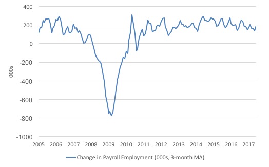
The first graph shows the monthly change in payroll employment (in thousands, expressed as a 3-month moving average to take out the monthly noise).
The monthly changes were stronger in 2014 and 2015, and then dipped in the first-half of 2016. By the end of 2016, job creation was stronger but then it tailed off again, somewhat.
In the first two months of 2017 (January and February), there was a strengthening of the net payroll employment change, but since then it has all been downhill.
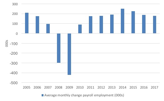
The next graph shows the same data in a different way – in this case the graph shows the average net monthly change in payroll employment (actual) for the calendar years from 2005 to 2017. Clearly, the average for 2017 is for January to June only.
The slowdown that began in 2014 is continuing.
The average change so far in 2017 (180 thousand) is down from the 187 thousand average throughout 2016.
The average net change in 2014 was 250 thousand, in 2015 it was 226 thousand.
Labour Force Survey – employment growth stronger this month
In June 2017, employment increased by 0.16 per cent (245 thousand) while the labour force r0se by 0.23 per cent (361 thousand) as the participation rate rose by 0.1 percentage points.
As a result, while employment growth was stronger than in the previous few months, unemployment still rose by by 116 thousand.
We should note that the monthly data has been all over the place lately although it appears a deteriorating trend is apparent once we cut through the noise.
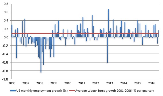
The next graph shows the monthly employment growth since the low-point unemployment rate month (December 2006). The red line is the average labour force growth over the period December 2001 to December 2006 (0.09 per cent per month).
What is apparent is that no coherent positive and reinforcing trend in employment growth has been established in the US labour market since the recovery began back in 2009. There are still many months where employment growth, while positive, remains relatively weak when compared to the average labour force growth prior to the crisis or is negative.
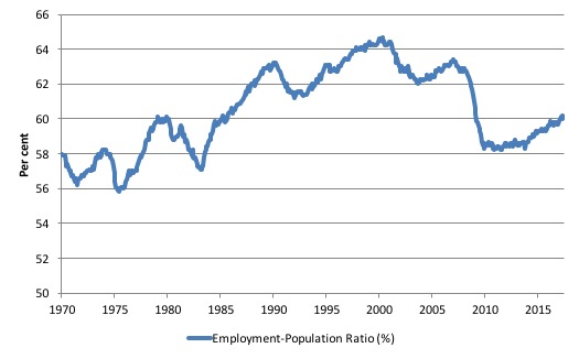
A good measure of the strength of the labour market is the Employment-Population ratio given that the movements are relatively unambiguous because the denominator population is not particularly sensitive to the cycle (unlike the labour force).
The following graph shows the US Employment-Population from January 1970 to June 2017. While the ratio fluctuates a little, the June 2017 outcome (60.1 per cent) was 0.1 points up from the previous month.
But it remains well down on pre-GFC levels (peak 63.4 per cent in December 2006), which is a further indication of how weak the recovery has been so far.
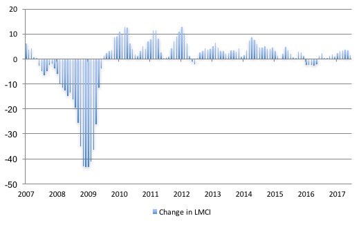
Federal Reserve Bank Labor Market Conditions Index (LMCI)
The Federal Reserve Bank of America has been publishing a new indicator – Labor Market Conditions Index (LMCI) – which is derived from a statistical analysis of 19 individual labour market measures since October 2014.
It is now being watched by those who want to be the first to predict a rise in US official interest rates. Suffice to say that the short-run (monthly) changes in the LMCI are “assumed to summarize overall labor market conditions”.
A rising value (positive change) is a sign of an improving labour market, whereas a declining value (negative change) indicates the opposite.
You can get the full dataset HERE.
I discussed the derivation and interpretation of the LMCI in this blog – US labour market weakening.
In June 2017, the LMCI rose by 1.5 index points down from 3.3 points in May and 3.8 points in April.
This suggests a weakening in the US labour market although the index remains well below the levels experienced earlier in the recovery.
The following graph shows the FRB LMCI for the period January 2007 to June 2017.
We note that while unemployment is now lower than last year and the rate of hiring has stabilised after declining earlier in the year. The way these factors combine in the index leads to an overall assessment that the labour market has been in decline.
The US jobs deficit
As noted in the Overview, the current participation rate of 62.8 per cent is a long way below the most recent peak in December 2006 of 66.4 per cent.
When times are bad, many workers opt to stop searching for work while there are not enough jobs to go around. As a result, national statistics offices classify these workers as not being in the labour force (they fail the activity test), which has the effect of attenuating the rise in official estimates of unemployment and unemployment rates.
These discouraged workers are considered to be in hidden unemployment and like the officially unemployed workers are available to work immediately and would take a job if one was offered.
But the participation rates are also influenced by compositional shifts (changing shares) of the different demographic age groups in the working age population. In most nations, the population is shifting towards older workers who have lower participation rates.
Thus some of the decline in the total participation rate could simply being an averaging issue – more workers are the average who have a lower participation rate.
I analysed this declining trend in this blog – Decomposing the decline in the US participation rate for ageing.
I updated that analysis to December 2015 and computed that the decline in the participation rate due to the shift in the age composition of the working age population towards older workers with lower participation rates accounted for about 58 per cent of the actual decline.
Thus, even if we take out the estimated demographic effect (the trend), we are still left with a massive cyclical response.
What does that mean for the underlying unemployment?
The labour force changes as the underlying working age population grows and with changes in the participation rate.
If we adjust for the ageing component of the declining participation rate and calculate what the labour force would have been given the underlying growth in the working age population if participation rates had not declined since December 2006 then we can estimate the change in hidden unemployment since that time due to the sluggish state of the US labour market.
Adjusting for the demographic effect would give an estimate of the participation rate in June 2017 of 64.4 if there had been no cyclical effects (1.6 percentage points up from the current 62.8 per cent).
So the 1.6 percentage point decline in the participation rate due to the downturn (net of ageing effect) amounts to 3,695 thousand workers who have left the labour force as a result of the cyclical sensitivity of the labour force.
It is hard to claim that these withdrawals reflect structural changes (for example, a change in preference with respect to retirement age, a sudden increase in the desire to engage in full-time education).
We can have a separate debate about whether 4.4 per cent constitutes full employment in the US.
My bet is that if the government offered an unconditional Job Guarantee at an acceptable minimum wage there would be a sudden reduction in the national unemployment rate which would take it to well below 4.4 per cent without any significant inflationary impacts (via aggregate demand effects).
So I doubt 4.4 per cent is the true irreducible minimum unemployment rate that can be sustained in the US. In June 2017, the unemployment rate fell to 4.3 per cent and there is plenty of scope for further reductions.
But we will use 4.4 per cent as a benchmark so as not to get sidetracked into definitions of full employment. In that sense, my estimates should be considered the best-case scenario given that I actually think the cyclical losses are much worse than I provide here.
4.4 per cent just compares the present with where the US was in March 2007 (after adjusting for the demographic shifts since then).
Using the estimated potential labour force (controlling for declining participation), we can compute a ‘necessary’ employment series which is defined as the level of employment that would ensure on 4.4 per cent of the simulated labour force remained unemployed.
This time series tells us by how much employment has to grow each month (in thousands) to match the underlying growth in the working age population with participation rates constant at their January 2007 peak – that is, to maintain the 4.4 per cent unemployment rate benchmark.
I computed the ‘necessary’ employment series based on the age-adjusted potential labour force (dark green line in the following graph).
The light blue line is the actual employment as measured by the BLS and the dotted red line is the level of employment that prevailed in November 2007 (the peak before the crisis).
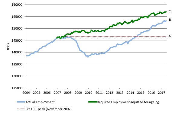
This allows us to calculate how far below the age-adjusted 4.4 per cent unemployment rate (constant participation rate) the US employment level currently is.
There are two effects:
- The actual loss of jobs between the employment peak in November 2007 and the trough (January 2010) was 8,582 thousand jobs. However, total employment is now above the January 2008 peak by 6,573 thousand jobs. This gain in jobs is measured by the AB gap in the graph which shows the gap in employment relative to the November 2007 peak (the dotted red line is an extrapolation of the peak employment level). You can see that it wasn’t until July 2014 that the US labour market reached the November 2007 peak employment level again.
- The shortfall of jobs (the overall jobs gap) is the actual employment relative to the jobs that would have been generated had the demand-side of the labour market kept pace with the underlying population growth (Required Employment Adjusted for Ageing) – that is, with the participation rate at its December 2006 peak and the unemployment rate constant at 4.4 per cent. This shortfall (BC) loss amounts to 3,831 thousand jobs. This is the segment BC measured as at June 2017.
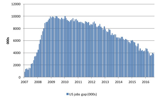
The next graph shows the difference between the blue and green lines in the above graph. The US Jobs Gap is thus the departure of current employment from the level of employment that would have generated a 4.4 per cent unemployment rate, given current population trends.
While the jobs gap has declined, it is still substantial and subject to monthly variation in either direction.
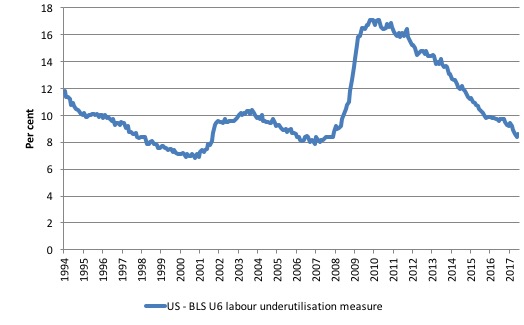
To put that into further perspective, the following graph shows the BLS measure U6, which is defined as:
Total unemployed, plus all marginally attached workers plus total employed part time for economic reasons, as a percent of all civilian labor force plus all marginally attached workers.
It is thus the broadest measure of labour underutilisation that the BLS publish.
In December 2006, before the affects of the slowdown started to impact upon the labour market, the measure was estimated to be 7.9 per cent. It now stands at 8.6 per cent (June 2017) an increase of 0.2 points since May. But it has fallen by 0.6 points since the end of 2016.
The U-6 measure remains well above previous troughs, which suggests (along with the other signals presented above) that the labour market is still some way from being considered ‘recovered’.
The low-wage bias continues
My feature on the US labour market this month focuses on the quality of employment being created in the US – or what I have called in previous blogs the low-wage employment bias.
To see the full methodology I employed in making these calculations please read the blogs – US jobs recovery biased towards low-pay jobs and Bias toward low-wage job creation in the US continues.
My last estimates were in March 2017 – US labour market – hard to read at present but probably improving
The question: Is there a bias towards low-pays jobs in the recovery in the US?
Answer: bias continues.
Effectively, since the recovery began in January 2010, there have been 16,626 thousand net jobs added to the US labour market (in the non-farm sector).
Of those net employment additions, 27 per cent have been what might be considered low-pay, where that is defined as less than 75 per cent of average weekly earnings.
Previously, I have calculated what happened in the downturn with respect to the jobs lost in net terms and their pay characteristics (at a sectoral level).
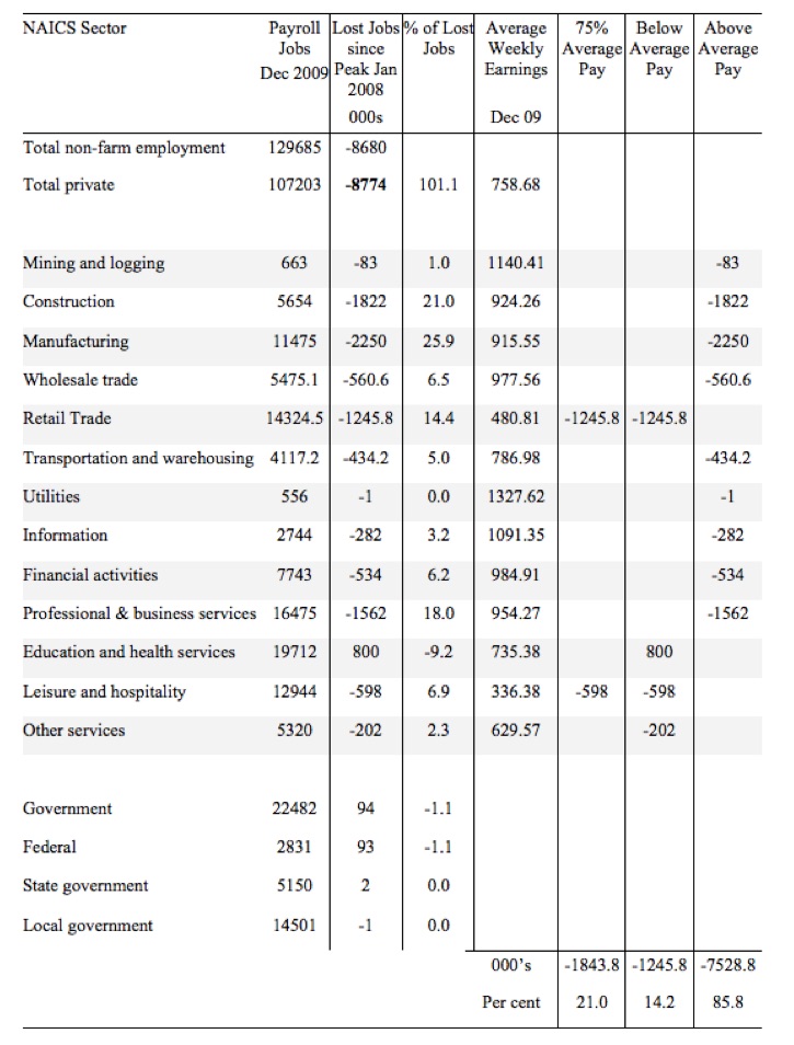
Peak US non-farm employment occurred in January 2008 (138,430 thousand) and the trough occurred in December 2009 (129,778 thousand).
Using the top-level North American Industry Classification System (2012 NAICS), we can calculate the job losses that occurred from peak (January 2008) to the trough (December 2009).
The following table summarises what happened in the Peak-trough period.
The first column shows the NAICS sector with the first two rows summarising relevant totals. Total non-farm employment is the sum of total private employment plus Government employment.
The second column shows the total employment in each sector as at December 2009, which was the trough of the downturn following the peak in January 2008.
The third column shows the lost jobs (in thousands) between the Peak and the Trough (these are net losses). So overall 8.7 million jobs were lost – with 8.8 million lost in the private sector and they were only partially offset by the 94,000 net jobs added in the government sector.
The next column shows the percentage of those lost jobs per sector, which allows you to see where the downturn impacted mostly. The next column shows average weekly earnings as at December 2009 in US dollars.
The final three columns then distribute the jobs lost according to whether the sector pays 75 per cent or less than average pay, below average pay (the first being a subset of the second), or above average pay as at December 2009.
The totals are below the last three columns and the percent indicates the percent of total jobs lost in each of the pay categories.
So in the downturn, from January 2008 to December 2009, 21.1 per cent of the jobs lost (net) were in sectors that paid on average below 75 per cent of the overall private sector average pay.
The last two columns divide the total job losses in net terms between above and below average pay and you can see that 86.1 per cent of the total jobs lost in the downturn were in sectors were paying above average pay.
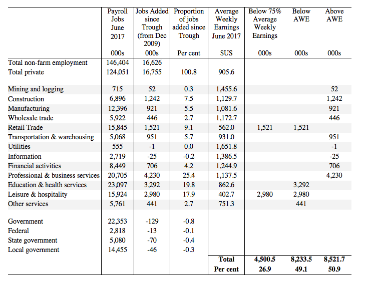
The next table summarises what happened in the period from the trough to the most recent monthly data observation (June 2017).
The columns now have a slightly different interpretation, given that we are discussing a growth period rather than a period of contraction.
The second column shows the latest BLS payroll employment data as at June 2017. The next column shows the number of net jobs (in thousands) that have been added by each sector since the trough in December 2009.
The next column shows the percentage of those total jobs added by sector. You can see that with the Government sector in contraction the total jobs added in the Private sector are 101 per cent of the total net jobs added.
The fourth column shows the Average Weekly Earnings for each sector as at June 2017.
The final three columns split these job additions into their pay characteristics using the sectoral average weekly earnings and the same criteria as in the previous example.
The summary statistics for each ‘pay category’ (75% of Average Pay, Below Average Pay, Above Average Pay) are at the bottom of each column.
We find that:
1. Government employment has contracted in the expansion, particularly at the State and Local Government level as fiscal austerity has been imposed.
2. 27 per cent of the total private jobs added could be considered low-pay, that is, in sectors that pay on average weekly wage 75 per cent below the total private sector average weekly earnings.
3. 49.1 per cent of the private jobs created (net) since the recovery began pay below average weekly earnings. That proportion was 50.4 per cent in May 2016.
4. The data shows that the low-paid private jobs that were lost in the downturn have been more than added back (in net terms) in the upturn so far.
5. The above average pay private jobs that were lost in the downturn (7,528.8 thousand) have now been more than added back in net terms (8,521.7 thousand).
6. This analysis shows a bias in the recovery towards low-paid private jobs in the US has increased slightly since the GFC began. In January 2008, low-pay jobs constituted 25.1 per cent of total private jobs and this proportion has risen to 25.6 per cent by June 2017.
7. A similar increase in the proportion of below-average jobs since January 2008 is observed, from 46.2 per cent of the total to 48.8
per cent in June 2017.
Clearly, this analysis is at the aggregated NAICS level and a richer story could be told if we used the two-digit and three-digit typed drill downs into the industry classification.
Conclusion
The June labour market data release confirms that there is no clear improving trend emerging in the US labour market.
Caution always has to be exercised given the volatility of the monthly data.
Employment growth was stronger in June but failed to keep pace with the underlying population growth and so unemployment rose by 116 thousand.
Further the broader measure of labour underutilisation (U-6) rose by 0.2 points a further worrying sign and certainly brings into question the claims that the US labour market is at full employment.
This assessment is reinforced by the fact that the participation rate is still well below where it was even after we adjust for the ageing effects (retirements).
Finally, bias towards low-pay and below-average pay jobs continues.
That is enough for today!
(c) Copyright 2017 William Mitchell. All Rights Reserved.
Great article.
I was reading the headlines about high job creation in June. When I read the first paragraph after those headlines to my father, he responded by saying “pffft… of course mainstream media is fake news.”
Turns out unemployment is actually higher and mainly low wage jobs are being created.
Hello Billy
Here comes another irrelevant post: I have been thinking about the relationship between empirical economists’ notion of ‘labour productivity’ and Marxist notion of ‘value’ or ‘labour value’. Although I see you in the former camp, albeit a Kenyesian one, could you please shed light on this relationship – or better still – or lack thereof.
I will write to you about the ‘future of work’ project. A lot has been written on this in Germany, particularly in the past 12 months on digitalisation, role of robots etc. when I find time…
cheers Minna
Professor, this post from the Fed New York seems to describe central bank activities and QE just as you have.
http://libertystreeteconomics.newyorkfed.org/2017/07/how-the-fed-changes-the-size-of-its-balance-sheet.html