The income and wealth inequality that continues to grow in most advanced nations has led…
US economy slowdown – not likely to be a trend
Last week (October 27, 2015), the British Office of National Statistics published its – Gross Domestic Product Preliminary Estimate, Quarter 3 2015 – which revealed that the British economy is slowing and heading back into recession under current policy settings. The annual real GDP growth rate declined for the third successive quarter as the impacts of the world slowdown and domestic policy austerity start to take their toll. Later in the week (October 29, 2015), the US Bureau of Economic Analysis released their estimates of – Gross Domestic Product, 3rd quarter 2015 (advance estimate) – which showed that the US economy has also slowed rather appreciably in the third quarter and “increased at an annual rate of 1.5 percent” after having increased by 3.9 per cent in the second-quarter of 2015. We will have a better picture of the state of the US economy on November 24, 2015, when the estimates are revised based on updated data. The most obvious reason for the slowdown was the sharp drop in private inventory investment, a slowdown in exports and investment. Households maintained a relatively stable saving ratio – 4.7 per cent of disposable personal income compared to 4.6 per cent last quarter.
The BEA said in the release that:
Real gross domestic product — the value of the goods and services produced by the nation’s economy less the value of the goods and services used up in production, adjusted for price changes — increased at an annual rate of 1.5 percent in the third quarter of 2015 … In the second quarter, real GDP increased 3.9 percent … The increase in real GDP in the third quarter primarily reflected positive contributions from personal consumption expenditures (PCE), state and local government spending, nonresidential fixed investment, exports, and residential fixed investment that were partly offset by negative contributions from private inventory investment. Imports, which are a subtraction in the calculation of GDP, increased.
The deceleration in real GDP in the third quarter primarily reflected a downturn in private inventory investment and decelerations in exports, in nonresidential fixed investment, in PCE, in state and local government spending, and in residential fixed investment that were partly offset by a deceleration in imports.
The following sequence of graphs captures the story.
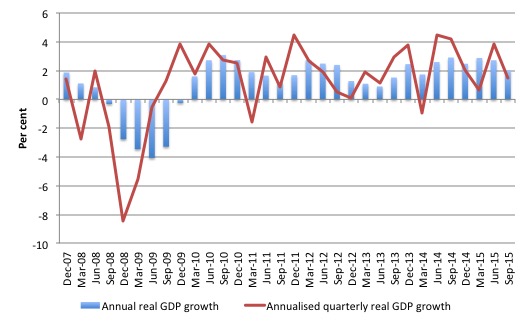
The first graph shows the annual real GDP growth rate (year-to-year) from the peak of the last cycle (December-quarter 2007) to the September-quarter 2015 (blue bars) and the annualised last quarter growth rate (red line). The data is available – HERE.
The year-to-year growth rate (September-quarter 2014 to September-quarter 2015) was 2 per cent, down from 2.7 per cent in the last quarter. There is considerable volatility in the data which is smoothed out by the year-to-year growth calculation.
The annualised quarterly growth rate (that is, multiplying the September-quarter 2015 performance by 4) is only 1.48 per cent down from 3.86 per cent in the last quarter.
So the BEA quotes the latter growth rate in its official release.
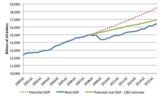
The next graph shows the actual real GDP for the US (in $US billions) and an estimate of the potential GDP. There are many ways of estimating potential (given it is unobservable). There is a whole industry involved in this endeavour and is in the realm of ‘making stuff up’.
While I could have adopted a much more sophisticated technique to produce the red series (potential GDP) in the graph, I decided to do some simple extrapolation instead to provide a base case.
The question is when to start the projection and at what rate. I chose to extrapolate from the most recent real GDP peak (December-quarter 2007). This is a fairly standard sort of exercise.
The projected rate of growth was the average quarterly growth rate between 2001Q4 and 2007Q4, which was a period (as you can see in the graph) where real GDP grew steadily (at 0.68 per cent per quarter) with no major shocks.
If the global financial crisis had not have occurred it would be reasonable to assume that the economy would have grown along the red line (or thereabouts).
The gap between actual and potential GDP in the third-quarter 2015 is around $US2,080 billion or around 11.3 per cent. The gap has been steady at around 11 per cent since the first-quarter 2014, which means that real GDP is once again growing about as fast at it did, on average in the 6 years before the crisis.
The green line is the estimate of potential output provided by the US Congressional Budget Office in their latest – August 2015 Baseline. I distributed their annual estimates across the quarters in a linear fashion.
Their output gap estimate (difference between actual and potential) is around 3.1 per cent.
CBO define Potential GDP as “the level of output that corresponds to a high level of resource-labor and capital-use.” So how do they estimate potential GDP? They explain their methodology in the document – A Summary of Alternative Methods for Estimating Potential GDP.
I discussed the methodology and limitations in these blogs – Structural deficits and automatic stabilisers and US problems are cyclical not structural.
For those who want even more technical detail, please consult my 2008 book with Joan Muysken – Full Employment abandoned – where we provide a mathematical and econometric discussion of the techniques that the CBO uses.
By way of summary, the CBO say that they:
They start with “a Solow growth model, with a neoclassical production function at its core, and estimates trends in the components of GDP using a variant of a tried-and-tested relationship known as Okun’s law. According to that relationship, actual output exceeds its potential level when the rate of unemployment is below the “natural” rate of unemployment) Conversely, when the unemployment rate exceeds its natural rate, output falls short of potential. In models based on Okun’s law, the difference between the natural and actual rates of unemployment is the pivotal indicator of what phase of a business cycle the economy is in.
The resulting estimate of Potential GDP is “an estimate of the level of GDP attainable when the economy is operating at a high rate of resource use” and that if “actual output rises above its potential level, then constraints on capacity begin to bind and inflationary pressures build” (and vice versa).
So despite saying that their estimate of Potential GDP is “the level of output that corresponds to a high level of resource-labor and capital-use” what you really need to understand is that it is the level of GDP where the unemployment rate equals some estimated (unobservable) Nonaccelerating Inflation Rate of Unemployment (NAIRU).
Intrinsic to the computation is an estimate of the so-called “natural rate of unemployment” or the NAIRU which is the mainstream version of ‘full employment’ but is, in fact, a conceptual unemployment rate that is consistent with a stable rate of inflation.
The literature demonstrates that the history of NAIRU estimation is far from precise. Studies have provided estimates of this so-called ‘full employment’ unemployment rate as high as 8 per cent or as low as 3 per cent all at the same time, given how imprecise the methodology is.
The former estimate would hardly be considered “”high rate of resource use”. Similarly, underemployment is not factored into these estimates.
The concept of a potential GDP in the CBO parlance is thus not to be taken as a fully employed economy. Rather they use the devious shift in definition in mainstream economics where the the concept of full employment is not constructed as the number of jobs (and working hours) that which satisfy the preferences of the available labour force but rather in terms of the unobservable NAIRU.
The fact is that these estimates will typically underestimate (by some margin) the true scale of the existing output gaps because the estimated NAIRU is never above the irreducible minimum unemployment rate, the latter reflecting frictions in the labour market as people move between jobs.
You may also like to read this blog – Demand and supply interdependence – stimulus wins, austerity fails – where I discuss the US Federal Reserve Bank’s recent updated estimates of potential GDP.
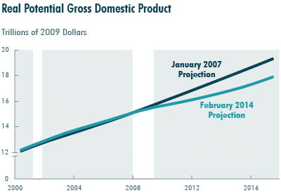
Last year, the CBO updated its potential GDP series from its earlier January 2007 (before the crisis estimates). The CBO published a report in February 2014 – Revisions to CBO’s Projection of Potential Output Since 2007 – where they outlined why their estimates of real potential GDP had fallen rather sharply since their previous projection in January 2007 (that is, before the GFC).
The following graph shows the difference in projections between January 2007 and February 2014. The revisions mean that Potential GDP for 2017 is some 7.3 per cent lower than previously estimated.
What accounts for this sharp reduction in estimated Potential GDP?
The revision is based on impacts on potential labour hours, use of productive capital and total factor productivity.
The CBO say that:
1. “The impact of cyclical weakness in the economy accounts for just 1.8 percentage points, or about one-fourth, of the difference from the 2007 projection”.
2. “Reassessments of economic trends that were in process before the recession began account for 4.8 percentage points, or about two-thirds, of the revision.”
3. “Revisions to historical data for the period before the recent recession lowered the projection of potential
output by 0.1 percentage points”.
4. “The effects of changes in federal tax and spending policies, higher federal deficits, changes in the relative size of various sectors of the economy, and other factors after 2007 apart from cyclical conditions account for the remaining 0.7 percentage-point reduction”.
This is not the time to analyse the veracity of their work except to say that the general point remains. Any of these effects have to be traced through the flawed NAIRU methodology and the result will typically be an underestimate of the true output gap.
Both potential GDP estimates in the graph above (the red dotted linear extrapolation and the CBO green estimates) are extremes and the truth is somewhere in between the two.
The decline in the investment ratio as a result of the crisis will have caused the potential GDP growth to slacken somewhat, which means the red dotted line is an upper limit.
The qualitative assessment is that unemployment is still elevated and underemployment is high, which means that the output gap is likely to be closer to 11 per cent than 3 per cent.
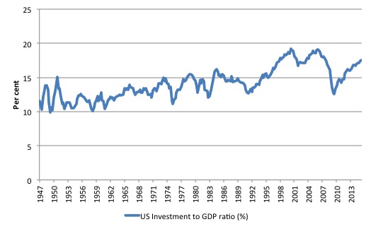
But it is true that potential output will have fallen of the red linear trend as the investment ratio (total investment as a percent of GDP) slowed in 2009. It went from 18 per cent in the September-quarter 2007 to 12.5 per cent in the December-quarter 2009.
So there was a sharp slowdown in capacity building which would have reduced the potential growth path somewhat.
It was back to 17.4 per cent in the September-quarter 2015 but is still well below the pre-GFC levels.
The following graph shows the evolution of the Private Investment to GDP ratio from the March-quarter 1947 to the September-quarter 2015.
The other relevant point about the graph is that it defies those who want to characterise the main US problem as being structural (labour market rigidities etc). The US would not have fallen off the cliff as it did in early 2008 if that was the case. Structural deterioration is gradual and cumulative not sudden and sharp.
Contributions to growth
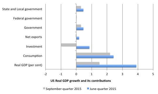
The next graph compares the June-quarter 2014 (blie bars) contributions to real GDP growth at the level of the broad spending aggregates with the September-quarter 2015 (gray bars). The overall real GDP growth was 1.5 per cent.
The main aggregate source of growth came from Private consumption spending (2.2 percentage points). This was weaker than the previous quarter (2.4 percentage points) and the household saving ratio rose slightly.
The contribution of Private investment spending fell sharply in this quarter – negative 0.97 percentage points down from 0.85 points in the previous quarter (see analysis later).
The Government sector overall reduced its growth contribution to 0.3 points down from 0.46 points. The federal contribution remained at zero – neither adding or undermining growth – which means that the state and local government sector was the growth driver.
Net exports drained total spending by 0.03 points (down from 0.18 points in the last quarter). Last quarter, exports added 0.63 points but this quarter they slowed and added only 0.24 points. The negative contribution of imports was less this quarter which helped offset the export decline.
The external outlook for the US is being dampened by the on-going malaise in Europe and the appreciation of the US dollar.
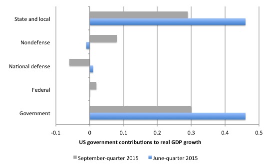
The next graph decomposes the government sector and shows that the positive contribution at the federal sphere was due to non-defense spending more than offsetting a contraction in national defense spending.
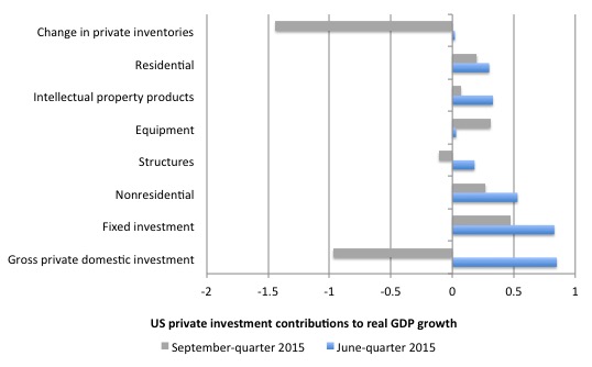
The next graph shows the contributions to real GDP growth of the various components of investment. It is here that we see why total real GDP growth slowed in the third-quarter.
There was a big swing in unsold inventories in the September-quarter 2015, which drained growth by -1.44 points. The run-down in inventories is hard to interpret.
It could be a sign that the inventory cycle is turning down which would signal an on-going weakness in the economy as firms reduce production plans.
But consumer demand is still fairly strong (household consumption rose by 3.2 per cent overall in the September-quarter which was only moderately below the previous quarter of 3.6 per cent).
There was a slowdown in fixed investment, which added 0.47 points to growth in the current quarter (down from 0.83 points).
The data shows that investment in structures fell quite sharply and subtracted 0.11 points from the real GDP outcome (down from 0.18 points).
This includes investments in factory buildings, office buildings, hospitals etc but also would include investments in mining and oil production capacity.
Residential investment was a weaker contributor in the current quarter (0.2 points down from 0.3 points).
Conclusion
It is too early to say whether the US economy is trending down or whether this slowdown is a temporary blip driven by the rising US dollar value and the slowdown in investment expenditure by energy as oil prices remain lower.
Clearly household consumption expenditure is holding up and the run-down in inventories is unlikely to signal any major production cuts.
The continuing consumption growth is likely to push sales along and firms will restock to ensure they do not lose market share.
It is also likely that the federal deficit is now too low to support stronger growth and labour underutilisation rates (U6) remain elevated (and excessive).
That is enough for today!
(c) Copyright 2015 Bill Mitchell. All Rights Reserved.
once again thanks
Interesting to note the differences with Warren Mosler’s analysis of the US economy. He’s been calling for a downturn based on deficits too small plus collapse of energy-related CAPEX (due to Saudi-determined low oil price).
Precedent is on the side of Warren Mosler. The previous 18 U.S. recessions followed
falls of government sector deficit not dissimilar to what has been happening in the
last few years.As Bills US namesake Roger shows on his excellent Monetary Sovereignty
site the U.S. recession clock is ticking.
Typically ‘normal’ recessions are on a shorter cycle than financial ones .With the volatility,
size and derivative nature of the financial markets today that is a precedent which is less
likely to be followed.