Over the last several years, I have been indicating that I think we are in…
Australian labour market – evidence is mounting of policy sabotage driving the unemployment rate up
The Australian Bureau of Statistics (ABS) released the latest labour force data today (July 17, 2025) – Labour Force, Australia – for June 2025, which reveals that finally, the slack that the combination of the fiscal austerity and the high interest rates has created is feeding into the labour market as employment growth slows and the unemployment rate rises (by 0.2 points) to 4.3 per cent. The array of indicators now suggest that there is a systematic slowdown occurring in the labour market. Unemployment has now risen by 59.5 thousand or 0.4 points over the last 6 months as the fiscal position remains tight and the central bank holds interest rates at elevated levels. This is unnecessary policy sabotage – inflation began declining in December 2022 and is now at relatively stable and low levels – there is no reason for the government to be running contractionary policy stance. Underemployment also rose 0.1 point. The broad labour underutilisation rate (sum of unemployment and underemployment) rose to 10.3 per cent (up 0.3 points). It remains a fact that with 10.3 per cent of available labour not being used it is ludicrous to talk about Australia being close to full employment. There is substantial scope for more job creation given the slack that is present.
The summary seasonally-adjusted statistics for June 2025 are:
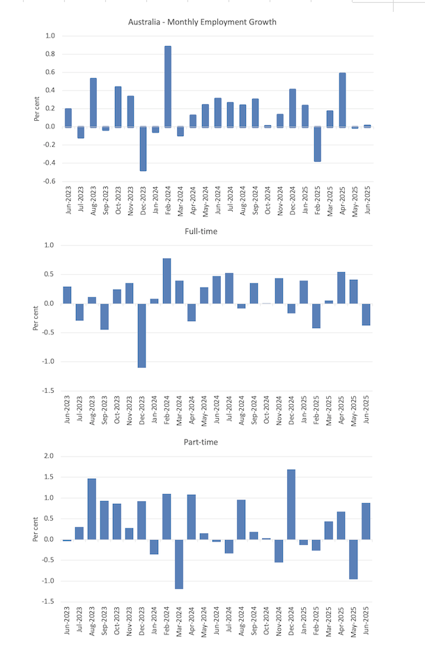
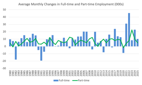
- Employment rose 2,800 (0.0 per cent) – full-time employment fell 38.2 thousand (-0.4 per cent) and part-time employment rose 40.2 thousand (0.9 per cent).
- Unemployment rose 33,600 (5.4 per cent) to 659,600.
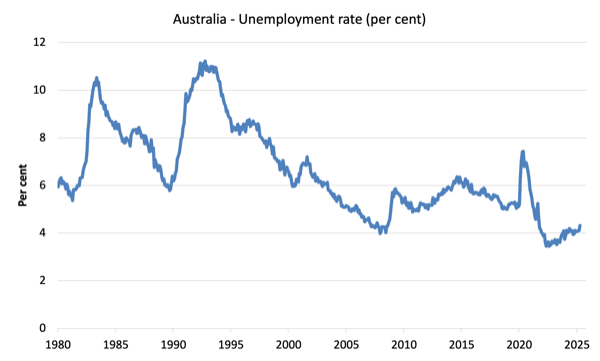
- The unemployment rate rose 0.2 points to 4.3 per cent.
- The participation rate rose by 0.1 point 67.1 per cent.
- The Employment-population ratio was steady on 64.2 per cent.
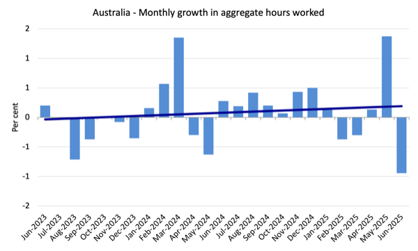
- Monthly hours worked fell 19 million (-0.9 per cent).
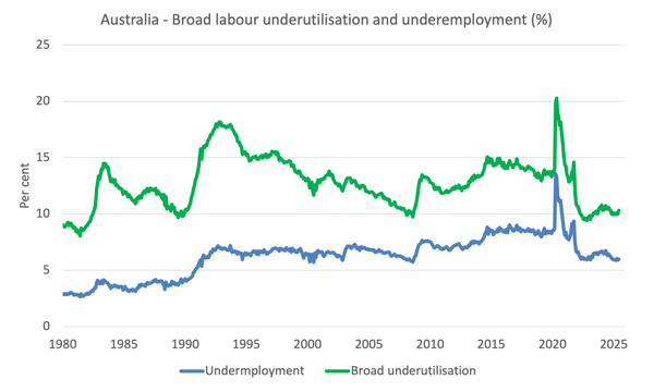
- Underemployment rose 0.1 point to 6 per cent (rising by 16.9 thousand to 915.1 thousand).
- The Broad Labour Underutilisation rate (the sum of unemployment and underemployment) rose 0.3 points to 10.3 per cent.
- Overall, there are 1574.7 thousand people either unemployed or underemployed.
The ABS press release – Unemployment rate rises to 4.3% – noted that:
This month we saw the unemployment rate rise 0.2 percentage points, driven by a 34,000 increase in the number of unemployed people …
This month we saw a decrease in full time hours worked, down 1.3 per cent, associated with a 0.4 per cent fall in full time employees …
The underutilisation rate, which combines the unemployment and underemployment rates, rose by 0.3 percentage points to 10.3 per cent.
Summary
1. It now looks like the stagnating output side of the economy is finally feeding into the labour market.
2. The large drop in full-time employment is a bad sign.
3. There was a 0.3 points rise in labour underutilisation – 0.2 points from unemployment and 0.1 points from underemployment. So there is now 10.3 per cent of the available and willing labour supply being wasted.
4. The only caveat I have is that participation is still rising, which is usually not something one observes when there is a major slowdown underway.
Employment growth slows to close to zero in June 2025
- Employment rose 2,800 (0.0 per cent).
- Full-time employment fell 38.2 thousand (-0.4 per cent).
- rose 40.2 thousand (0.9 per cent).
The following graph shows the growth in total, full-time, and part-time employment for the last 24 months.
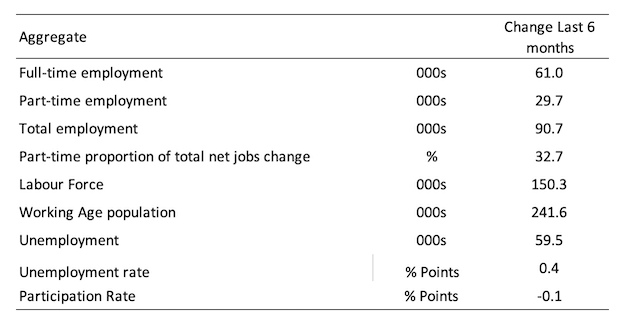
The following table shows the shifts over the last 6 months which helps to see the underlying trend.
Employment has increased by 61 thousand, while the labour force has increased by 150.3 thousand on the back of underlying population growth despite a 0.1 fall in participation.
As a result, official unemployment has risen by 59.5 thousand.
So we are now getting confirmed evidence of a slowdown in the labour market.
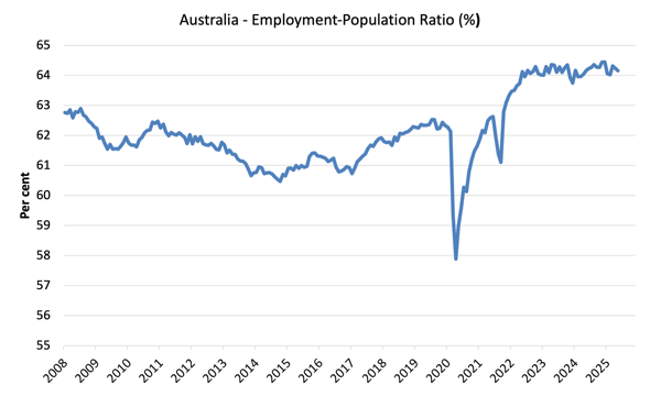
The Employment-to-Population ratio provides a measure of the state of the labour market that is independent of the supply shifts in the labour market (driven by the shifts in the participation rate).
The underlying working age population grows steadily while the labour force shifts with both underlying population growth and the participation swings.
The following graph shows the Employment-Population ratio was steady at 64.2 – which provides some counter to the other variables that are indicating a systematic slowdown is underway.
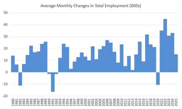
The next graphs show the average monthly change in total employment (first graph) and full- and part-time employment (second graph).
For total employment the monthly average changes were:
- 2022 – 44.8 thousand
- 2023 – 30.8 thousand
- 2024 – 33 thousand
- 2025 so far – 15.1 thousand
Monthly hours worked fell 0.95 per cent in June 2025
Monthly hours worked fell by 18.8 million hours (0.95 per cent) indicating that the labour market has stalled.
The following graph shows the growth in monthly hours worked for the last 24 months, with the straight line being a simple linear regression to indicate trend.
Unemployment rose 33,600 (5.4 per cent) to 659,600
With total employment rising by just 2,000 and the labour force rising by 35.6 thousand, official unemployment rise by 33.6 thousand.
The unemployment rate rose 0.2 points to 4.3 per cent.
The following graph shows the evolution of the official unemployment rate since 1980.
Broad labour underutilisation – up 0.3 points to 10.3 per cent in May
- Underemployment rose 0.1 point to 6 per cent (rising by 16.9 thousand to 915.1 thousand).
- The Broad Labour Underutilisation rate (the sum of unemployment and underemployment) rose 0.3 points to 10.3 per cent.
- Overall, there are 1574.7 thousand people either unemployed or underemployed.
The following graph shows the evolution of underemployment and the Broad labour underutilisation rate since 1980.
Teenage labour market – deteriorates sharply
- Total teenage (15-19) employment fell by 12.6 thousand (-1.5 per cent) in June 2025.
- Full-time employment fell by 14.8 thousand (-6.8 per cent).
- Part-time employment rose 13.6 thousand (0.03 per cent).
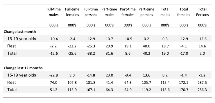
The following table summarises the shifts in the teenage labour market for the month and over the last 12 months.
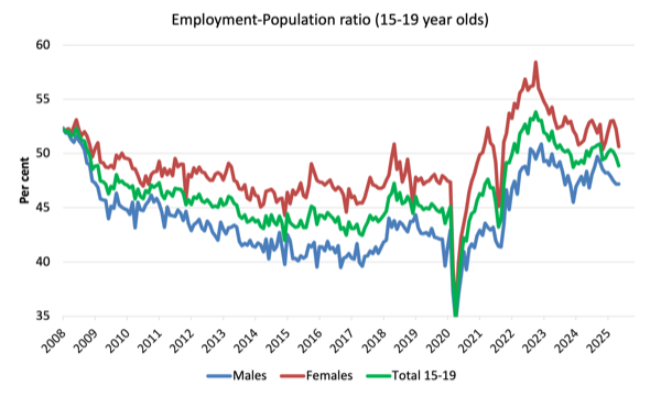
To put these changes into a scale perspective (that is, relative to size of the teenage labour force) the following graph shows the shifts in the Employment-Population ratio for teenagers.
The Teenage Employment-Population ratios and their monthly changes in June 2025 were:
- Males: 47.2 per cent unchanged
- Females: 50.6 per cent -1.6 points
- Total: 48.9 per cent -0.8 points
Conclusion
My standard warning to take care in interpreting monthly labour force changes – they can fluctuate for a number of reasons and it is imprudent to jump to conclusions on the back of a single month’s data.
- The array of indicators now suggest that there is a systematic slowdown occurring in the labour market.
- Unemployment has now risen by 59.5 thousand or 0.4 points over the last 6 months as the fiscal position remains tight and the central bank holds interest rates at elevated levels.
- This is unnecessary policy sabotage – inflation began declining in December 2022 and is now at relatively stable and low levels – there is no reason for the government to be running contractionary policy stance.
- Underemployment also rose 0.1 point. The broad labour underutilisation rate (sum of unemployment and underemployment) rose to 10.3 per cent (up 0.3 points).
- It remains a fact that with 10.3 per cent of available labour not being used it is ludicrous to talk about Australia being close to full employment. There is substantial scope for more job creation given the slack that is present.
That is enough for today!
(c) Copyright 2025 William Mitchell. All Rights Reserved.
This Post Has 0 Comments