The income and wealth inequality that continues to grow in most advanced nations has led…
US labour market – improving but warning signs still present
Last week (January 9, 2015), the US Bureau of Labor Statistics released the – Employment Situation – for December 2014. The data showed that “Nonfarm payroll employment rose by 252,000 in December, and the unemployment rate declined by 0.2 percentage point to 5.6 percent”, which suggests the US recovery is on-going. However, the participation rate continued to decline and the employment-population ratio has not showed much sign of recovery. There are two other ways of looking at the labour market, which are typically neglected by the mainstream press analysis, but which provide very useful information about the direction of the labour market. I updated my gross flows database today and also the job openings and quits database. I will consider the latter next week, but today the question is whether workers have a higher probability of gaining a job in the US now than in the recent past.
For those who are interested, I checked out the ageing conjecture about participation rates in the US in this blog last july – Decomposing the decline in the US participation rate for ageing.
I concluded that:
1. There is some factual basis for the conclusion that the falling participation rate in US is an artefact of the ageing population. There are now more older workers in the working age population and although their participation rate has risen somewhat since the onset of the GFC, the volume effect outweighs the rate effect and the impact on the overal participation rate is negative.
2. The shift in the age composition of the working age population accounted for about 60.1 per cent of the actual decline in the labour force participation rate in the US.
3. The remainder is most likely driven by cyclical effects, which means that 4.3 million workers who could reasonably be considered to be added to hidden unemployed.
4. There were 9.5 million workers officially unemployed in the US (6.1 per cent of the labour force) in June 2014. If we considered the 4.3 millions workers to be hidden unemployed, then the adjusted ‘unemployment rate’ would be 8.7 per cent in June 2014.
5. Thus even when we adjust for the ageing factor, the situation is still very grim in the US and the official headline data is quite misleading.
Gross Flows analysis
The last blog I wrote about the US Gross Flows was – Cutting US unemployment benefits is cruel and stupid – Part 2.
To fully understand the way gross flows are assembled and the transition probabilities calculated you might like to read these blogs – What can the gross flows tell us? and More calls for job creation – but then. For earlier US analysis see this blog – Jobs are needed in the US but that would require leadership
The data is available from the – Data Retrieval App – from the BLS. It is a hateful data tool and replaced the much more efficient text dump.
Gross flows analysis allows us to trace flows of workers between different labour market states (employment; unemployment; and non-participation) between months. So we can see the size of the flows in and out of the labour force more easily and into the respective labour force states (employment and unemployment).
Each period there are a large number of workers that flow between the labour market states – employment (E), unemployment (U) and not in the labour force (N). The stock measure of each state indicates the level at some point in time, while the flows measure the transitions between the states over two periods (for example, between two months).
National statisticians measure these flows in their monthly labour force surveys. The various stocks and flows are denoted as follows (single letters denote stocks, dual letters are flows between the stocks):
- E = employment, with subscript t = now, t+1 the next period
- U = unemployment
- N = not in the labour force
- EE = flow from employment to employment (that is, the number of people who were employed last period who remain employment this period)
- UU = flow of unemployment to unemployment (that is, the number of people who were unemployed last period who remain unemployed this period)
- NN = flow of those not in the labour force last period who remain in that state this period
- EU = flow from employment to unemployment
- EN = flow from employment to not in the labour force
- UE = flow from unemployment to employment
- UN = flow from unemployment to not in the labour force
- NE = flow from not in the labour force to employment
- NU = flow from not in the labour force to unemployment
The following Matrix Table provides a schematic description of the flows that can occur between the three labour force framework states.
More detailed breakdowns into full-time, part-time, gender etc are available depending on the complexity of the published data. For example, gross flows data from the Australian Bureau of Statistics allows for more detailed breakdowns than the US data we are dealing with in this blog.
The latest US gross flows data is for transitions between November and December 2014.
To give you some idea of the magnitude of these flows between any given months, the next table summarises the flows for the US labour market for the period between November and December 2014.
By way of example, you read the Table in the following way. 2,160 thousand unemployed workers in November 2014 entered employment in December 2014 (the UE flow) while 1,756 employed workers in November 2014 became unemployed in December 2014 (the EU flow).
The EE, UU, and NN (main diagonal elements) flows just tell us that, for example, 141,140 thousand workers who were employed in November 2014 remained employed in December 2013 (EE flow). The other main diagonal elements (UU, NN) are 4,712 thousand and 85,986 thousand, respectively. These are the unchanged state flows.
It doesn’t mean though that a worker who was employed in November 2014 and remained that way in December 2014, didn’t change jobs. Those type of flows are not captured in this data and can be substantial.
The data also allows us to understand the total change in each state. For example, why did unemployment fall in the US between November and December 2014? Or where did the change in employment come from between these months?
This involves a calculation of the total inflows and outflows from the three labour force states between any two periods of interest.
The following Table shows the concepts total inflows and outflows and total change in state between periods.
The total inflow into employment is measured by the sum, UE + NE and for the period show equalled 6,207 thousand whereas the total outflow from employment, measured by the sum, EU + EN was 6,167 thousand. The net flow was thus positive (that is, employment rose) and equal to 40 thousand workers.
The total inflow into unemployment is measured by the sum, EU + NU and for the period show equalled 3,971 thousand whereas the total outflow from unemployment, measured by the sum, UE + UN was 4,358 thousand. The net flow was thus negative (meaning unemployment fell over the period) and equal to -387 thousand workers.
Finally, the total exits from the labour force is measured by the sum, EN + UN and for the period show equalled 6,609 thousand whereas the total new entrants into the labour force, measured by the sum, NE + NU was 6,262 thousand. The net flow was thus equal to 347 thousand workers.
You can see from the final column that between November and December 2014, employment rose by 40 thousand and that was because 387 thousand workers who were unemployed in November entered employment in December (in net terms) but 347 thousand persons left the labour force (entered Not in the Labour Force in December).
Total inflows and outflows from states – November-December 2014

To put the flows for November and December 2014 into context, here is what the data looked like at the height of the recession when employment was collapsing – October and November 2008.
You can see that the total change in employment was -802 thousand in the month and 355 thousand of those who lost jobs entered unemployment but 447 thousand left the labour force – early (forced) retirement or discouraged workers.
If the labour force had not contracted then the US unemployment rate would have been much higher than it was (and is). The cyclical shifts in participation mean that the full extent of the labour force underutlisation is disguised and some of it manifests outside of the labour force.
And that doesn’t even consider that of the 5,597 thousand that remained in employment between October and November 2008, many would have been reduced to part-time hours because of lack of sales. That is, this data doesn’t tell us about shifts in underemployment.
Total inflows and outflows from states – October-November 2008

We can thus understand the stock measures of the labour market states in each period by considering the net flows between two periods.
To learn more about this please read my blog – Labour market measurement – Part 2.
Transition Probabilities
The various inflows and outflows between the labour force categories are expressed in terms of numbers of persons which can then be converted into so-called transition probabilities – the probabilities that transitions (changes of state) occur.
We can then answer questions like: What is the probability that a person who is unemployed now will enter employment next period?
So if a transition probability for the shift between employment to unemployment is 0.05, we say that a worker who is currently employed has a 5 per cent chance of becoming unemployed in the next month. If this probability fell to 0.01 then we would say that the labour market is improving (only a 1 per cent chance of making this transition).
From the table above – sometimes called a Gross Flows Matrix – we can deduce the gross flows. For example, the element EE tells you how many people who were in employment in the previous month remain in employment in the current month.
Similarly the element EU tells you how many people who were in employment in the previous month are now unemployed in the current month. And so on. This allows you to trace all inflows and outflows from a given state during the month in question.
The transition probabilities are computed by dividing the flow element in the matrix by the initial state. For example, if you want the probability of a worker remaining unemployed between the two months you would divide the flow (UU) by the initial stock of unemployment. If you wanted to compute the probability that a worker would make the transition from employment to unemployment you would divide the flow (EU) by the initial stock of employment. And so on.
So the 3 Labour Force states in the Matrix Table above allow us to compute 9 transition probabilities reflecting the inflows and outflows from each of the combinations.
Analysing movements in these probabilities over time provides a different insight into how the labour market is performing by way of flows of workers.
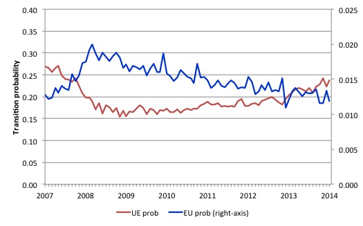
The next graph shows the transitions for EU and UE from December 2007 (when the crisis hit the US labour market) up to December 2014. The probability of an employed worker losing their job (denoted ‘EU prob’ and not to be confused with the Gross Flow from employment to unemployment ‘EU’) is plotted on the right-hand axis and to express the probabilities in percentage terms just multiply by 100.
The probability of an American (in general) losing their job if employed (blue line) rose throughout 2008 (peaking at 2 per cent in February 2009), slowly evened out and has been steadily falling since (1.2 per cent in December 2014). It is now back to the level it was before the crisis.
In December 2007, the chance of an unemployed American worker gaining employment (‘UE prob’) was 27 per cent. This probability fell to a low of 15.4 per cent in October 2009, and scudded along at around 17 per cent through much of 2010-2011. It has been steadily rising since the end of 2013 and is now at 23.8 per cent, still well below the pre-crisis level.
This is not a rapid recovery – rather one would now say the US is in a steady recovery, although the tension has been eased by workers giving up looking for work and exiting the labour market. That is a big difference between this recession and previous recessions where the participation rates were more responsive (postively) to the upturn.
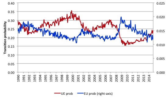
The following graph compares the UE and EU transition probabilities since 1990 to put the recent period into some historical context.
The sharp rises in EU prob and sharp fall in UE prob in 2007-08 are notable and and EU prob is now moving back towards its historical level.
What is also evident is that the employment is becoming more secure (EU prob falling steadily) but the overall real GDP growth rate is not sufficient to clear out the unemployment pool given the new entrants to the labour force and to attract those who have left the labour force for want of a job. The result is that the UE likelihood is improving only slowly and remains well below its historical levels.
You can see that in previous periods when the UE probability has dropped the resulting improvement has quickly taken it above the EU probability. But in the tepid recovery that the US is undergoing it still remains that a worker has more chance of losing their job and entering unemployment (EU prob) than an unemployed person has of getting a job.
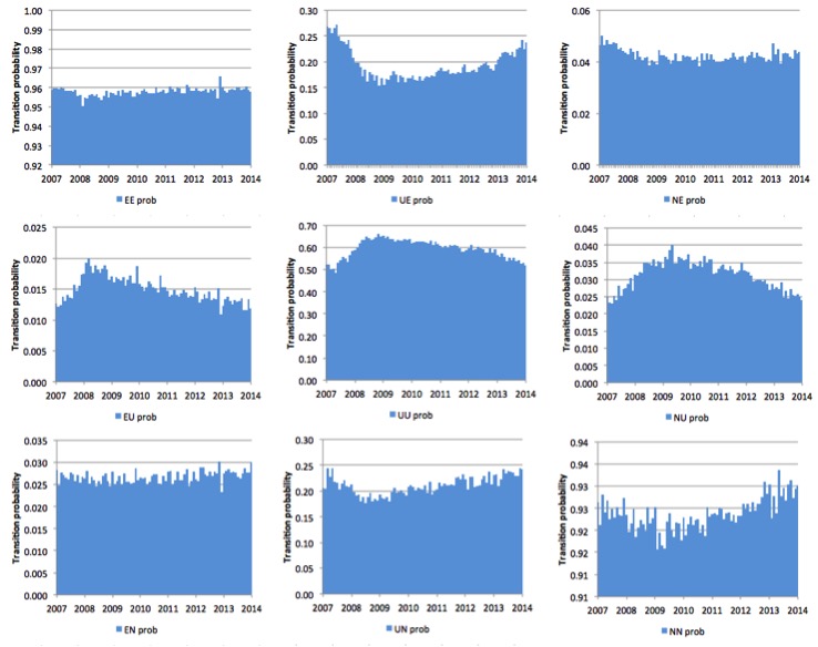
The next graph (or 9 separate graphs) shows the the US transition probabilities from December 2007 (the low-point unemployment rate month of the last cycle) to December 2014 for the 9 transitions (EE, EU, EN, UE, UU, UN, EN, UN, and NN). Note the vertical scales are different (they are optimised for the particular range of probabilities in each.
Several points by way of interpretation can be made (noting that care should be taken to recognise the vertical scales are quite different).
First, the data shows that the EE probability is now stable – that is, the likelihood an employment person will remain employed in the next month (not necessarily with the same employer though) – is about what is was at the start of the crisis. That is a good sign.
Second, the EU probability (employment to unemployment) has fallen since the early days of the crisis but is now hovering around 12-13 per cent and converging on the pre-crisis value of 13 per cent.
Further, the EN probability has risen marginally indicating that employed workers are now increasingly likely to flow out of the labour force once they lose their jobs – that is, they become hidden unemployed or retire (in some form or another). This is a sign that the labour market is still not very strong.
Third, the likelihood of a new entrant getting a job (NE prob) is fairly flat after some initial improvement in 2010. But it still remains that new entrants are more likely to become employed (NE prob) than enter the labour force unemployed (NU).
Fourth, the probability of an unemployed worker remaining unemployed (UU prob) continues to improve albeit slowly. It remains the case that the likelihood that such a worker will leave the labour force (UN prob) is higher than the likelihood of them getting a job (UE prob) although the difference is narrowing.
The former probability has risen over the last 2 years, which is not a good sign (and is consistent with the continued deterioration in the participation rate).
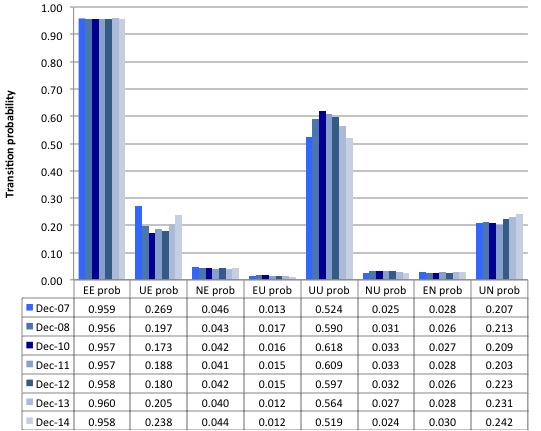
The second graph compares the US transition probabilities for various months during the crisis up until December 2014 (see the accompanying Table for values). I have also jigged the vertical and horizontal scales to allow the changes in the columns to be seen more clearly. That is one of the reasons I also provided the raw data.
December 2007 was the peak of the last cycle and things deteriorated after that. The graph and table give you a year by year summary of how things have changed in the 7 years of recession and recovery.
Overall, the Gross Flows data suggests that the US labour market improved during 2014 although the continuing weakness in the participation rate is certainly a militating factor.
Conclusion
The labour force data as at December 2014 continues to signal that things are improving in the US labour market, in sharp contradistinction with what is going on in Europe.
It is lucky the US politicians were unable able to actually implement their desires for fiscal austerity. Their incompetence gave the US economy some breathing space and growth has been the result.
That is enough for today!
(c) Copyright 2015 Bill Mitchell. All Rights Reserved.


I doubt if the US employment situation will improve given that the plutocracy with the tool and feckless fool Obummer as their mouthpiece and their bought and paid for economists running the show.
It seems to me, from the antipodean perspective, that two factors have crueled employment in the USA.
(1) The fascination with globalisation and the consequent off shoring of jobs.
(2) An insane immigration policy,particularly from Mexico and places South.
All the better for cheap labour to boost the incomes of the rentier class.
Does anyone,except economists of course, see the parallels with Australia ?
Perhaps this is a redundant question, but where are the error estimates in the inflow-outflow tables? I realize that the government department may not have provided them, nevertheless the numbers they provide can’t be exact. Similar data from the thirties are accompanied by their error estimates. Why has this statistical practice seemingly been dropped by economists?
Already happens: Capitalism destroys human labor force and goes to the next phase