I grew up in a society where collective will was at the forefront and it…
Cutting US unemployment benefits is cruel and stupid – Part 2
As a follow up to Monday’s blog on the US labour market – Cutting US unemployment benefits is cruel and stupid – this short blog considers the latest flows in the US to provide a fuller understanding of why it is madness to even contemplate undermining aggregate demand overall (by cutting unemployment benefits). The flows data shows that the labour market is still in recovery, albeit a very tepid recovery, and the chance of a reversal in fortunes is very high, should aggregate demand falter. The US labour market is a long way from full employment (as I demonstrated on Monday) and the underlying dynamics of the labour market which this blog is about show that it is also not very vital at present. Taken together only a stupid person would think it was sensible to deny benefits to the long-term unemployed. Their stupidity is only topped by the intensity of their socio-pathic tendencies.
To fully understand the way gross flows are assembled and the transition probabilities calculated you might like to read these blogs – What can the gross flows tell us? and More calls for job creation – but then. For earlier US analysis see this blog – Jobs are needed in the US but that would require leadership
The data is available from the – Data Retrieval App – from the BLS. I have noted before I hate this App. It replaced the raw text file dump that allowed programmers (like me) to parse and arrange the vast data at the stroke of a run command. Now one has to spend considerable time just getting the data into a format that allows for analysis. It is clear that the BLS didn’t have the researcher in mind when they went into this direction.
Gross flows analysis allows us to trace flows of workers between different labour market states (employment; unemployment; and non-participation) between months. So we can see the size of the flows in and out of the labour force more easily and into the respective labour force states (employment and unemployment).
Each period there are a large number of workers that flow between the labour market states – employment (E), unemployment (U) and not in the labour force (N). The stock measure of each state indicates the level at some point in time, while the flows measure the transitions between the states over two periods (for example, between two months).
National statisticians measure these flows in their monthly labour force surveys. The various stocks and flows are denoted as follows (single letters denote stocks, dual letters are flows between the stocks):
- E = employment, with subscript t = now, t+1 the next period
- U = unemployment
- N = not in the labour force
- EE = flow from employment to employment (that is, the number of people who were employed last period who remain employment this period)
- UU = flow of unemployment to unemployment (that is, the number of people who were unemployed last period who remain unemployed this period)
- NN = flow of those not in the labour force last period who remain in that state this period
- EU = flow from employment to unemployment
- EN = flow from employment to not in the labour force
- UE = flow from unemployment to employment
- UN = flow from unemployment to not in the labour force
- NE = flow from not in the labour force to employment
- NU = flow from not in the labour force to unemployment
The following Matrix Table provides a schematic description of the flows that can occur between the three labour force framework states.
More detailed breakdowns into full-time, part-time, gender etc are available depending on the complexity of the published data. For example, gross flows data from the Australian Bureau of Statistics allows for more detailed breakdowns than the US data we are dealing with in this blog.
The latest US gross flows data is for transitions between October and November 2013.
To give you some idea of the magnitude of these flows between any given months, the next table summarises the flows for the US labour market for the period between October and November 2013.
By way of example, you read the Table in the following way. 2,111 thousand unemployed workers in October 2013 entered employment in November 2013 (the UE flow) while 1,567 employed workers in October 2013 became unemployed in November 2013 (the EU flow).
The EE, UU, and NN (main diagonal elements) flows just tell us that, for example, 138,595 thousand workers who were employed in October 2013 remained employed in November 2013 (EE flow). The other main diagonal elements (UU, NN) are 6,722 thousand and 85,119 thousand, respectively. These are the unchanged state flows.
It doesn’t mean though that a worker who was employed in October 2013 and remained that way in November 2013, didn’t change jobs. Those flows are not captured in this data and can be substantial.
The data also allows us to understand the total change in each state. For example, why did unemployment fall in the US between October and November 2013? Or where did the change in employment come from between these months?
This involves a calculation of the total inflows and outflows from the three labour force states between any two periods of interest.
The following Table shows the concepts total inflows and outflows and total change in state between periods.
The total inflow into employment is measured by the sum, UE + NE and for the period show equalled 5,597 thousand whereas the total outflow from employment, measured by the sum, EU + EN was 4,949 thousand. The net flow was thus positive (that is, employment rose) and equal to 788 thousand workers.
The total inflow into unemployment is measured by the sum, EU + NU and for the period show equalled 4,178 thousand whereas the total outflow from unemployment, measured by the sum, UE + UN was 4,548 thousand. The net flow was thus negative (meaning unemployment fell over the period) and equal to -370 thousand workers.
Finally, the total exits from the labour force is measured by the sum, EN + UN and for the period show equalled 5,813 thousand whereas the total new entrants into the labour force, measured by the sum, NE + NU was 6,231 thousand. The net flow was thus negative and equal to -418 thousand workers.
You can see from the final column that between October and November 2013, employment rose by 788 thousand and that was because 370 thousand workers who were unemployed in October entered employment in November (in net terms) and 418 thousand new entrants (from Not in the Labour Force in October) gained jobs.
This pattern is typical of a recovery period where the long-term unemployed are overlooked for jobs as new entrants from the schooling system or more experienced workers who had given up looking get the new jobs being created.
To put the flows for October and November 2013 into context, here is what the data looked like at the height of the recession when employment was collapsing – October and November 2008.
You can see that the total change in employment was -802 thousand in the month and 355 thousand of those who lost jobs entered unemployment but 447 thousand left the labour force – early (forced) retirement or discouraged workers.
If the labour force had not contracted then the US unemployment rate would have been much higher than it was (and is). The cyclical shifts in participation mean that the full extent of the labour force underutlisation is disguised and some of it manifests outside of the labour force.
And that doesn’t even consider that of the 5,597 thousand that remained in employment between October and November 2008, many would have been reduced to part-time hours because of lack of sales. That is, this data doesn’t tell us about shifts in underemployment.
We can thus understand the stock measures of the labour market states in each period by considering the net flows between two periods.
To learn more about this please read my blog – Labour market measurement – Part 2.
Transition Probabilities
The various inflows and outflows between the labour force categories are expressed in terms of numbers of persons which can then be converted into so-called transition probabilities – the probabilities that transitions (changes of state) occur.
We can then answer questions like: What is the probability that a person who is unemployed now will enter employment next period?
So if a transition probability for the shift between employment to unemployment is 0.05, we say that a worker who is currently employed has a 5 per cent chance of becoming unemployed in the next month. If this probability fell to 0.01 then we would say that the labour market is improving (only a 1 per cent chance of making this transition).
The following table shows the schematic way in which gross flows data is arranged each month – sometimes called a Gross Flows Matrix. For example, the element EE tells you how many people who were in employment in the previous month remain in employment in the current month. Similarly the element EU tells you how many people who were in employment in the previous month are now unemployed in the current month. And so on. This allows you to trace all inflows and outflows from a given state during the month in question.
The transition probabilities are computed by dividing the flow element in the matrix by the initial state. For example, if you want the probability of a worker remaining unemployed between the two months you would divide the flow (U to U) by the initial stock of unemployment. If you wanted to compute the probability that a worker would make the transition from employment to unemployment you would divide the flow (EU) by the initial stock of employment. And so on.
So the 3 Labour Force states in the Matrix Table above allow us to compute 9 transition probabilities reflecting the inflows and outflows from each of the combinations.
Analysing movements in these probabilities over time provides a different insight into how the labour market is performing by way of flows of workers.
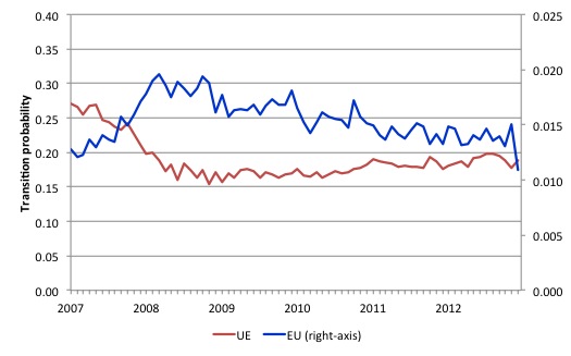
The next graph shows the transitions for EU and UE from December 2007 (when the crisis hit the US labour market) up to November 2013.
The probability of an American (in general) losing their job if employed (blue line) rose throughout 2008 (peaking at 2 per cent in February 2009), slowly evened out and is now slowly falling (1.1 per cent in November 2013). Make that very slowly falling.
In December 2007, the chance of an unemployed American worker gaining employment was 27 per cent. This probability fell to a low of 15.4 per cent in October 2009, and scudded along at around 17 per cent through much of 2010-2011. It peaked again in September 2012 at 19.2 per cent, but as the impacts of the fiscal retreat started to impact, it fell to 17.6 per cent.
It has risen again in recent months and is now around 18.8 per cent (November 2013).
This is not a rapid recovery and there is no definite pattern of growth visible as yet. The US labour market appears to be stuck in a vicious cycle of flat private spending and confidence and an unwillingness of the US government to stimulate sufficiently to fill the gap and create work.
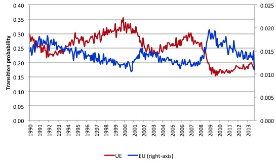
The following graph compares the UE and EU transition probabilities since 1990 to put the recent period into some historical context.
The sharp rises in EU and sharp fall in UE in 2007-08 are notable and and EU is now moving back towards its historical level.
What is also evident is that the employment is becoming more secure (EU falling steadily) but the overall real GDP growth rate is not sufficient to
clear out the unemployment pool given the new entrants to the labour force. The result is that the UE likelihood is improving only slowly and remains well below its recent historical levels.
You can see that in previous periods when the UE probability has dropped the resulting improvement has quickly taken it above the EU probability. But in the tepid recovery that the US is undergoing it still remains that a worker has more chance of losing their job and entering unemployment (EU) than an unemployed person has of getting a job.
In that environment, there is no justification for cutting unemployment benefits.
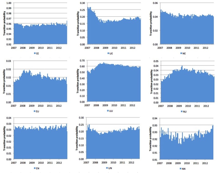
The next graph (or 9 separate graphs) shows the the US transition probabilities from December 2007 (the low-point unemployment rate month of the last cycle) to November 2013 for the 9 transitions (EE, EU, EN, UE, UU, UN, EN, UN, and NN). Note the vertical scales are different (they are optimised for the particular range of probabilities in each.
Several points by way of interpretation can be made.
First, the data shows that the EE probability is now stable – that is, the likelihood an employment person will remain employed in the next month (not necessarily with the same employer though) – is about what is was at the start of the crisis. That is a good sign.
Second, the EU probability (employment to unemployment) has fallen since the early days of the crisis but is now hovering around 14-15 per cent and still well above the pre-crisis value of 13 per cent.
Further, the EN probability has risen marginally indicating that employed workers are now increasingly likely to flow out of the labour force once they lose their jobs – that is, they become hidden unemployed. This is a sign that the labour market is still not very strong.
Third, the likelihood of a new entrant getting a job (NE) is fairly flat after some initial improvement in 2010. But it still remains that new entrants are more likely to become employment (NE) than enter the labour force unemployed (NU).
Fourth, the probability of an unemployed worker remaining unemployed (UU) continues to improve albeit slowly. It remains the case that the likelihood that such a worker will leave the labour force (UN) is higher than the likelihood of them getting a job (UE) and the former probability has risen over the last 2 years, which is not a good sign (and is consistent with the continued deterioration in the participation rate).
Overall, the Gross Flows data suggests the slight improvement in the US labour market during 2012 is now tapering. There is a lot of statis in the data, which can be interpreted as the economy is approaching a switch point.
Growth is not strong enough to budge the inertia and there are signals that it is slowing and a reversal of the gains made to date might be coming.
Conclusion
As millions of long-term unemployed Americans wonder that they are going to do without income now that the US government is cutting their federal benefits there is no credible explanation from the conservatives (and the Democrats including the President who went along with this) as to how the economy will:
1. Cope with the lost spending (albeit modest, given the pittance the unemployed receive for being forced by economic policy choices to give up their income earning opportunities.
2. Cope with the fact that spending is already too weak to drive any major favourable shift in the labour market dynamics. What exactly will increase the UE probability rather than the UN probability and reduce the EU and EN probabilities? No answer.
All we get is wishy-washy stuff about incentives and laziness. We know from past experience what reduces unemployment (with increasing hidden unemployment). It is now mystery – it is called spending which $-for-$ produces income and output. That basic macroeconomic rule is inviolable.
The conservative ideologues continually try to deny it. But that is like deny gravity.
The labour force data as at November 2013 and the on-going disaster over on the other side of the Atlantic should be sending a strong signal to all US politicians that fiscal austerity is the last thing the economy needs at present.
That is enough for today!
(c) Copyright 2013 Bill Mitchell. All Rights Reserved.


Dear Bill,
I don’t quite understand the calculation in the third matrix. Because in my opinion, the amount of the flows should be different according to the second matrix. For example, the EU is 2117 and the total inflow into employment is 4949. Then the results in the third and forth matrix would be totally reversed.
Thank you.
Yours sincerely,
Chaoying
“In December 2009, the chance of an unemployed American worker gaining employment was 27 per cent. ”
I think this is a typo that should be Dec. 2007.
Best Regards for the New Year.
Will Kanaley
Bill, the labels of the bottom graphs have been cut off in your final graphic.
Dear Bill,
On the first matrix, I think “October 2013” and “November 2013” have been reversed (ie October 2013 is denoting the current period when the current period is November 2013).
Kind regards,
Anthony Krensel
Dear Will Kanaley (at 2014/01/03 at 0:02)
Your observations were correct and appreciated. I have fixed both errors now.
I was rushing yesterday. Sorry for the confusion.
best wishes for 2014
bill
Dear Chaoying Qi (2014/01/02 at 10:04)
Your observations were correct and appreciated. I have fixed the errors now. The errors were in the flows matrix not the outflow/inflow tables.
I was rushing yesterday. Sorry for the confusion.
best wishes for 2014
bill
Dear Anthony Krensel (at 2014/01/03 at 7:00)
Your observations were correct and appreciated. I have fixed the first gross flows matrix – the Oct to Nov 2013 flows are now correct.
I was rushing yesterday. Sorry for the confusion.
best wishes for 2014
bill