The Australian Bureau of Statistics (ABS) released the latest labour force data today (APRIL 16,…
What can the gross flows tell us?
Last Thursday I briefly analysed the gross flows data that is published as part of the monthly Labour Force data. In this blog, I am extending this analysis to provide more detailed graphs which help us better understand the way the labour market is adjusting at present and how it adjusts over the course of a business cycle. This is the first part of a few blogs which aim to present a fairly complete summary of this data and what it tells us.
The current labour market data is providing a continued source of debate among us so-called experts. Is the current downturn weaker than 1991? Will the unemployment rate reach 8.5 per cent by next year or something lower? Are firms hoarding labour in part-time capacities rather than shedding labour? Is participation behaviour changing because of the impacts on wealth of the GFC? And many more questions such as these are being asked as researchers come to grips with what is going on.
Most of the analysis to date has focused on the net changes (growth or absolute) and the levels of the labour market aggregates published by the ABS each month in its Labour Force Survey data. This data is useful to a degree but cannot really inform you of how dynamic the labour market is – whether the dynamics are changing etc.
In this regard, gross flows analysis provides a useful alternative way to interpret what is going on. It allows us to trace flows of workers between different labour market states (full-time employment; part-time employment; unemployment; and non-participation) between months. So we can see the size of the flows in and out of the labour force more easily and into the respective labour force states (employment and unemployment).
We can see the inflows and outflows between employment categories and unemployment which are occurring. We are also able to use this data in a Markovian sense, which while placing some restrictions on how we think of the data evolution conceptually does provide a basis for computing the so-called transition probabilities. In this context, transitions are changes of state (for example, a shift from unemployment to full-time employment) and the probabilities which are computed for each of the these changes are called transition probabilities.
So if a transition probability for the shift between full-time employment to unemployment is 0.05, we say that a worker who is currently employed full-time has a 5 per cent chance of becoming unemployed in the next month. If this probability fell to 0.01 then we would say that the labour market is improving (only a 1 per cent chance of making this transition).
If you are interested in this sort of data I suggest you re-read the blog because it has links to ABS references which explain the nature of the data. There are well-known issues with respect to using gross flows data to represent underlying labour market conditions. The major problems are: (a) sample bias present in any survey data; (b) misclassification errors (likely to be small in ABS labour force data); and (c) rotation group bias (significant issue in ABS labour force data). You can also read the Abowd, J.M. and Zellner, A. (1985) ‘Estimating Gross Labor-Force Flows’, Journal of Business and Economic Statistics, 3 (3), 254-283 – for further details of these issues.
By the far the most significant issue is the matched sample techniques that the ABS uses to present the gross flows data in the context of their sample rotation. Again read the references I provided in the previous blog. The upshot is that the sum of the flows in any one row (refer to the following table) will not add up to the actual stocks published in the labour force survey each month.
The following table shows the schematic way in which gross flows data is arranged each month – sometimes called a Gross Flows Matrix. Here FT refers to full-time employment, PT to part-time employment, U to unemployment and N to not-in-the-labour force. The subscripts t and t-1 refer to the current month and the previous month, respectively.
The Gross Flows matrix can be interpreted straightforwardly. As an aside, some students look at you blankly when you say matrix but as soon as you say spreadsheet they light up which is symptomatic of the way learning is conditioned by the tools available. Anyway, each element in the matrix (cell in the spreadsheet) tells you the volume (in 000s for Australian labour force data) of the flows between the different labour force states.
So the element FT to FT tells you how many people who were in full-time employment in the previous month (t-1) are in full-time employment in the current month (t). Similarly the element FT to U tells you how many people who were in full-time employment in the previous month (t-1) are now unemployed in the current month (t). And so on. This allows you to trace all inflows and outflows from a given state during the month in question.
The transition probabilities are then computed by dividing the flow element in the matrix by the initial state. For example, if you want the probability of a worker remaining unemployed between the two months you would divide the flow (U to U) by the initial stock of unemployment, Ut-1. If you wanted to compute the probability that a worker would make the transition from full-time employment to unemployment you would divide the flow (FT to U) by the initial stock of full-time employment, FTt-1. And so on. So for the 4 states we can compute 16 transition probabilities reflecting the inflows and outflows from each of the combinations.
These flow probabilities are called ‘transition’ rates and they determine the relative number of persons in each labour market state. Given that the unemployment rate is the number of unemployed workers expressed as a fraction of the labour force, flow probabilities also determine the unemployment rate.
In trying to compute these transition probabilities over time, you quickly find out that the ABS gross flows data is rather disjointed with several notable breaks in the series. The Australian Bureau of Statistics (ABS) has published estimates of labour force status and gross changes (flows) derived from matched records on a monthly basis since February 1980. The latest coherent dataset from the ABS begins at October 1997. There are various earlier periods when the matched sample was very low as a new sample was being rotated (October 1982, September-December 1987, September-December 1992 and September-October 1997). Also there are issues when telephone interviewing was being phased-in (August 1997 to October 1997).
But skill and determination (read: making assumptions and continuing on regardless) can produce a time series for each of the flows from August 1980. In this regard, the October 1982 quarter was computed as the average over two months (September and November). For the other gaps, linear interpolation was used to fill in the missing observations. Rough but probably not consequential in the final analysis given the purpose of the exercise.
The monthly data was seasonally adjusted (using X12) and then I computed Hodrick-Prescott trends to simplify the interpretation. Even the seasonally-adjusted monthly data is highly variable and messy to graph. While I am critical of the use of HP filters to model potential capacity and steady-state unemployment rates, they are good for depicting linear trends in rather messy high-frequency data. It is questionable whether monthly data is high frequency but it is high enough to be a nuisance when one is trying to extract broader movements.
The resulting dataset then allowed me to compute time series for the 16 transition probabilities for the 4 states. The data is too detailed to deal with in one blog so choices have to be made (I will return to other aspects of the data in other blogs). So in this blog I will only deal with transitions into and out of unemployment.
Transitions in and out of unemployment
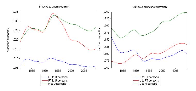
The following graph shows the inflows and outflows for persons over the whole sample (August 1980-June 2009). The left-hand panel shows the inflows probabilities into unemployment over time while the right-hand panel depicts the outflow probabilities from unemployment. You readily appreciate the cyclical nature of the respective flow probabilities. Take the outflow transition probabilities (right panel) – the impact of the 1991 recession is very noticeable with the transition probability of moving from unemployment to full-time employment plunging dramatically as job opportunities dried up. This impact is less severe from the move from unemployment to part-time employment. The probability that an unemployed worker would exit the labour force (U to N) also rose substantially during the 1991 recession.
As the economy resumed growth after 1991, you can see that the transition probabilities from U to PT rose more quickly than the probabilities of moving from U to FT indicating the trend to underemployment that we have observed. Moreover, it became increasingly likely that an unemployed worker would give up looking for work over this period and exit the labour force. It is clear that for the long-term unemployed this option was continually being exercised given the fact that the labour market was held in a demand-deficient state by economic policy settings over this time.
You can also see the impact of the current recession (which I will deal with in more detail later). The probability of getting making the transition from U to either FT or PT has fallen sharply (more so for the unemployment to full-time employment flow). Further, the transition probability from U to N (non-participation) is steady at present indicating that the added worker effect (to compensate for lost family income) is probably outweighing the discouraged worker effect. We are seeing some evidence of this in the participation data (see my blog The labour market is getting sicker on this).
In terms of inflows into unemployment (left panel) it is interesting that since the 1991 recession when the probability of a full-time worker becoming unemployed rose, the trend in this probability has been falling – and has started to rise again in the last several months (modestly) since the labour market hit the downturn.
You can also see that during the 1991 recession, new entrants had much higher chances of flowing into unemployment than during the growth periods. Further the probability of part-time workers becoming unemployed rose much more significantly than the probability of a full-time worker becoming unemployed. All as expected.
As the current downturn hits, you can also see that new entrants are now more likely to enter the labour market via unemployment than during the growth period. Similarly, the transition probabilities from part-time and full-time work into unemployment are rising again. Clearly, these two transition probabilities are still relatively low when compared to the 1991 downturn.
What about gender differences?
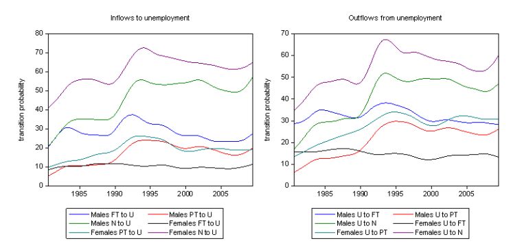
The following graph shows the inflows and outflows for males and females over the whole sample (August 1980-June 2009). The left-hand panel shows the inflows probabilities into unemployment over time while the right-hand panel depicts the outflow probabilities from unemployment. The first obvious point is that the female transition probabilities into and out of the labour force (N to U and U to N) are much higher than males. This reflects the more instrumental nature of the labour market attachment that females have compared to males although that is changing over time.
It is interesting the the inflow and outflow probabilities for females from full-time employment and unemployment are relatively insensitive to the cycle by comparison to those for the males which are very cyclical. This is a key research question at present.
Further, in the current downturn the chances of a full-time male worker becoming unemployed is rising more quickly than for a female in the same situation although the unemployment to full-time probabilities are much higher for males than females. It is also more likely now that a male will exit part-time work into unemployment than a female worker will. This probability has changed over the growth period. Previously, female part-time workers had a higher transition probability of becoming unemployed than males but that situation is reversing as the downturn worsens.
Unemployed males are more nearly as likely get a part-time job as a full-time job whereas previously the gap between these transition probabilities was much larger (in favour of full-time entry from unemployment). For females, the gap between these two entries (U to PT and U to FT) has widened over time.
Further, unemployed females are more likely to gain part-time work than unemployed males. At present, this is the highest probable transition out of the unemployment pool – females taking part-time work. It has been that way since 2003. Males are losing their relative position in the labour market.
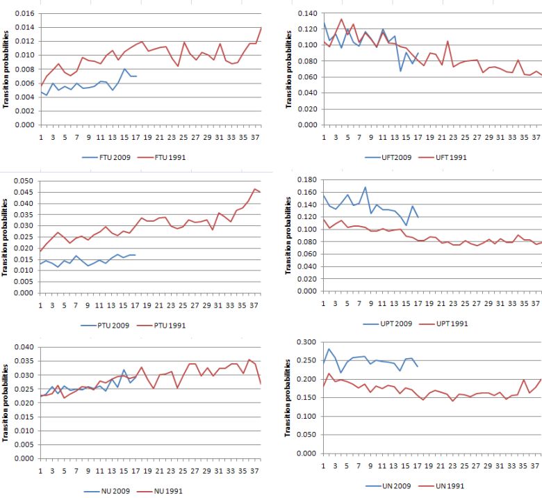
What about a comparison between the 1991 and 2009 recessions? I traced the flow probabilities in and out of unemployment from November 1989 (the low-point unemployment rate for that cycle) and February 2008 (the recent low-point unemployment rate). The 1991 recession saw the unemployment rate peak in December 1992 whereas the current downturn is not yet exhausted. The horizontal axis is the months since the low-point unemployment rate.
The following graph shows the 6 transitions in and out for persons over the two downturns which gives us a good comparison of how things are panning out at present relative to 1991. The inflows into unemployment are down the left-hand panel (full-time employment, part-time employment and non-participation in order) and the outflows from unemployment are down the right hand panel (again FT, PT and N). So to interpret the graph, FTU 1991 (top left hand panel) is the transition probability from full-time employment to unemployment during the 1991 downturn (from low-point unemployment rate to peak).
So the probabilities for FT to U are lower at present than in 1991 (reflecting the length of the most recent growth phase). However, the rate of deterioration is not dissimilar at the same stage of the downturn. 1991 was worse in that respect though.
In terms of the second-top left-hand chart, which shows PT to U, that probability rose more quickly in 1991 than at present although it shows that part-time workers are facing a higher likelihood of becoming unemployed as the months pass.
There is no appreciable difference in the transition probabilities from N to U, that is, non-participation to unemployment. The chances of a person entering the labour market via unemployment is rising at present rather sharply (don’t be fooled by the vertical scale differences between the various charts – note the actual numbers on each to get a feel for the relevant scale in each case).
In terms of outflow from unemployment (right-hand panel), the top right graph shows that the deterioration in prospects for the unemployed gaining full-time work is similar in both recessions. There has been a sharp reduction in the probability of unemployed workers getting full-time employment in this downturn which was a similar happening in 1991.
The patterns for the U to N flows are similar in both downturns although the probability is higher now than in 1991.
Conclusion
In later blogs I will cover the other transitions between part-time and full-time employment and from employment to non-participation which will round out the picture. But the graphs shown here show that the labour market is deteriorating (duh!) but not as significantly as in 1991. The major difference is in the behaviour of part-time employment flows. The full-time to unemployment and vice versa are not significantly different between the recessions.
The transition probability from U to PT is falling at present but still above the 1991 probability. Alternatively, the transition from PT to U is lower at present but rising. So the rising underemployment is the main adjustment at present.
Total digression: drummers get sick of drummer jokes, band together!
This is my story of the day – a million or so drummers running wild! Better they are kept in one place though!


This Post Has 0 Comments