The recent extreme weather in the northern hemisphere, the twin monster tropical storms in Japan,…
Australian labour market – labour wastage rate rises above 15 per cent!
The economic news leading into today’s ABS labour force release was poor. Last week, the national accounts for the June-quarter was released and showed a marked slowing in the Australian economy during that quarter. Many commentators claimed the data wasn’t accurate and would be revised upwards. I don’t think that is the case. Yesterday, there was terrible data released relating to the drop in consumer confidence. And today’s release of the – Labour Force data – for November 2014 by the Australian Bureau of Statistics is consistent with that news. The labour market is weak and getting weaker. Employment is stumbling along and dominated by part-time employment growth. Unemployment continues to rise. Underemployment has rocketed up as working hours have fallen over the last month. The broad ABS labour underutilisation rate – the sum of unemployment and underemployment – is now at 15 per cent. That is a crisis. But the government still claims it needs to cut net public spending. For what purpose? To reduce the fiscal deficit even though this will cause a massive loss of national income and a further rise in unemployment and underemployment. And … as the current evidence suggests, the fall in activity will kill tax revenue and the fiscal deficit will rise anyway. It would be better if the government accepted its responsibility as the currency issuer and stimulated the economy with a job creation plan.
The summary ABS Labour Force (seasonally adjusted) estimates for November 2014 are:
- Employment increased 42,700 (0.36 per cent) with full-time employment increasing by just 1,800 and part-time employment rising by 40,800.
- Unemployment increased 4,700 to 777,700.
- The official unemployment rate increased by 0.1 points at 6.5 per cent.
- The participation rate increased by 0.1 percentage points to 64.7 per cent. It is still well below its November 2010 peak (recent) of 65.9 per cent.
- Aggregate monthly hours worked decreased by 1.8 million hours (0.3 per cent).
- The quarterly ABS broad labour underutilisation estimates (the sum of unemployment and underemployment) were updated this month. Underemployment rose by 0.3 percentage points to 8.6 per cent and total labour underutilisation rate rose sharply to 15 per cent from 14.4 per cent in the August quarter. There are now 1,070.7 thousand persons underemployed. Overall, there are 1.848.1 million workers either unemployed or underemployed.
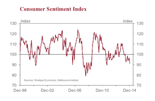
The latest – Consumer Sentiment Index – published on December 10, 2014 shows that the levels are now down to those reached during the GFC and the decline has been more than 12 months in the making.
Here is a graph taken from the published bulletin from the Bank index of the Consumer Sentiment Index from December 1998 to December 2014.
Consumer confidence has fallen by 13.3 points in the last year and 5.7 points in the last month. In December 2012, the index stood at 100, rising to 105 in December 2013 and is now at 91.1 index points. The forward-looking components, such as Economic Conditions in the next 12 months have plunged by 15.2 points.
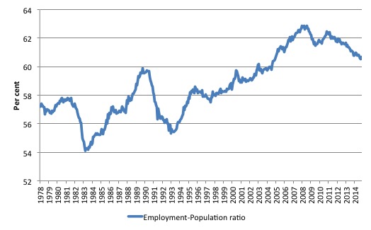
In that context, here is the labour market problem in a nutshell. The following graph shows the Employment-Population ratio (that is, total employment to the population over 15 years of age) from February 1978 to November 2014. The ratio is now at levels las seen in 2004.
It is now much worse than during the downturn associated with the GFC. The decline began with withdrawal of the fiscal stimulus and the obsessive pursuit of fiscal surpluses (a failed pursuit need I add).
The Australian economy is being stifled by fiscal austerity and cannot create enough jobs to even match the population growth. That tells me one thing – the current fiscal policy settings are wrong and the government must increase the deficit, preferably with a large-scale job creation program.
Employment growth positive but mostly part-time
In the last month, total employment 42,700 (0.36 per cent) with full-time employment increasing by just 1,800 and part-time employment rising by 40,800. Over the last 12 months employment has grown by only 1.2 per cent well below the population growth rate.
Over the last 24 months or so we have seen the labour market data switching back and forth regularly between negative employment growth and positive growth spikes. The revised figures are consistent with that history.
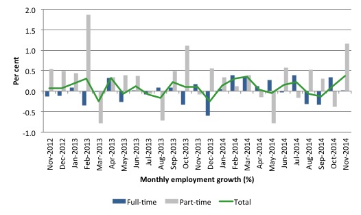
The following graph shows the month by month growth in full-time (blue columns), part-time (grey columns) and total employment (green line) for the 24 months to November 2014 using seasonally adjusted data. It gives you a good impression of just how flat employment growth has been notwithstanding the huge spike in part-time employment in the August survey, which the revised data shows was substantially offset by the fall in full-time employment.
While full-time and part-time employment growth are fluctuating around the zero line, total employment growth is still well below the growth that was boosted by the fiscal-stimulus in the middle of 2010.
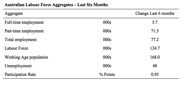
The following table provides an accounting summary of the labour market performance over the last six months. The monthly data is highly variable so this Table provides a longer view which allows for a better assessment of the trends. WAP is working age population (above 15 year olds).
The conclusion – overall there have been only 77.2 thousand jobs (net) added in Australia over the last six months. Full-time employment has risen by just 5.7 thousand jobs (net) while part-time work has risen by 71.5 thousand jobs.
The Working Age Population has risen by 168 thousand in the same period while the labour force has risen by 124.7 thousand. The participation rate has edged up by 0.93 percentage points over the last six months.
Employment growth has not been able to keep pace with the underlying population growth and unemployment has risen by 48 thousand as a result.
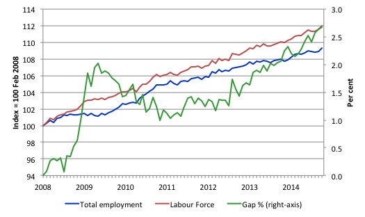
To put the recent data in perspective, the following graph shows the movement in the labour force and total employment since the low-point unemployment rate month in the last cycle (February 2008) to November 2014. The two series are indexed to 100 at that month. The green line (right-axis) is the gap (plotted against the right-axis) between the two aggregates and measures the change in the unemployment rate since the low-point of the last cycle (when it stood at 4 per cent).
You can see that the labour force index has largely levelled off yet the divergence between it and employment growth has risen sharply (in spurts) over the last several months.
The Gap series gives you a good impression of the asymmetry in unemployment rate responses even when the economy experiences a mild downturn (such as the case in Australia). The unemployment rate jumps quickly but declines slowly.
It also highlights the fact that the recovery has not strong enough to bring the unemployment rate back down to its pre-crisis low. You can see clearly that the unemployment rate fell in late 2009 and then has hovered at the same level for some months before rising again over the last several months.
Since the current government was elected in September 2013, the situation has deteriorated significantly.
The Gap shows that the labour market is now in worse shape than it was at the peak of the financial crisis in 2009. After the government prematurely terminated the fiscal stimulus the situation has progressively deteriorated.
In November 2014, the Gap of 2.7 percentage points and remains well above the levels that appeared in May and June 2009 when the Australian economy was enduring the impact of the crisis. All the gains made since then have thus largely disappeared due to poorly crafted fiscal policy not responding appropriately to non-government spending changes.
Today’s results continue to reflect an upward trend in the unemployment rate.
Full-time and Part-time employment in recovery
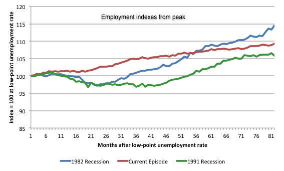
The following graph shows employment indexes for the last 3 recessions and allows us to see how the trajectory of total employment after each peak prior to the three major recessions in recent history: 1982, 1991 and 2009 (the latter to capture the current episode).
The peak is defined as the month of the low-point unemployment rate in the relevant cycle and total employment was indexed at 100 in each case and then indexed to that base for each of the months as the recession unfolded.
I have plotted the 3 episodes for 81 months after the low-point unemployment rate was reached in each cycle – the length of the current episode.
The initial employment decline was similar for the 1982 and 1991 recessions but the 1991 recovery was delayed by many month and the return to growth much slower than the 1982 recession.
The current episode is distinguished by the lack of a major slump in total employment, which reflects the success of the large fiscal stimulus in 2008 and 2009.
However, the recovery spawned by the stimulus clearly dissipated once the fiscal position was reversed and the economy is now producing very subdued employment outcomes.
Moreover, the current episode is also different to the last two major recessions in the sense that the recovery is over and the economy is deteriorating again.
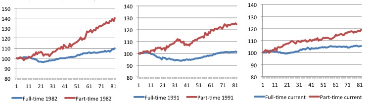
The next 3-panel graph decomposes the previous graph into full-time and part-time employment. The vertical scales are common to allow a comparison between the three episodes.
First, after the peak is reached, part-time employment continues to increase as firms convert full-time jobs into fractional jobs.
Second, recoveries are dominated by growth in part-time employment as firms are reluctant to commit to more permanent arrangements with workers while there is uncertainty of the future course in aggregate demand.
Third, the current recovery is clearly mediocre by comparison, with both very subdued growth in full-time and part-time work.
Teenage labour market – remains weak
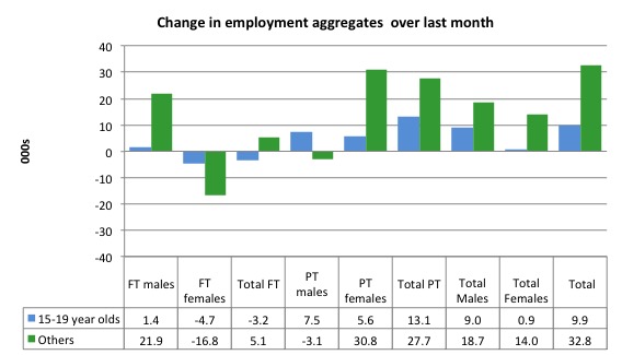
Teenagers gained 9.9 thousand jobs overall (net) in November – losing 3.2 thousand full-time jobs and gaining 13.1 thousand part-time jobs net.
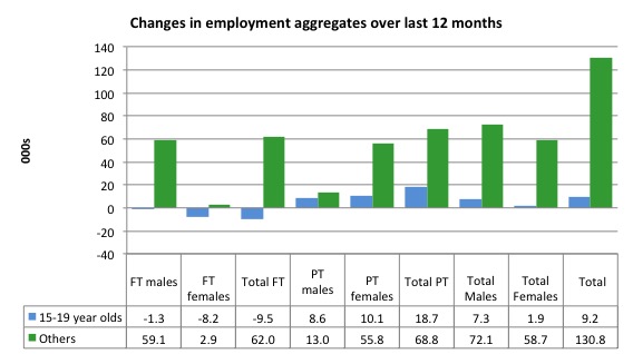
The following graph shows the distribution of net employment creation in the last month by full-time/part-time status and age/gender category (15-19 year olds and the rest)
If you take a longer view you see how poor the situation remains.
Over the last 12 months, teenagers have gained only 9.2 thousand jobs while the rest of the labour force have gained 130.8 thousand net jobs. Remember that the overall result represents a fairly poor annual growth in employment.
The teenage segment of the labour market is being particularly dragged down by the sluggish employment growth, which is hardly surprising given that the least experienced and/or most disadvantaged (those with disabilities etc) are rationed to the back of the queue by the employers.
The following graph shows the change in aggregates over the last 12 months.
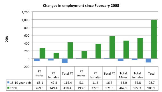
To further emphasise the plight of our teenagers, I compiled the following graph that extends the time period from the February 2008, which was the month when the unemployment rate was at its low point in the last cycle, to the present month (November 2014). So it includes the period of downturn and then the so-called “recovery” period. Note the change in vertical scale compared to the previous two graphs.
Since February 2008, there have been only 989.9 thousand (net) jobs added to the Australian economy but teenagers have lost a staggering 98.7 thousand over the same period. It is even more stark when you consider that 115.4 thousand full-time teenager jobs have been lost in net terms.
Even in the traditionally, concentrated teenage segment – part-time employment, teenagers have only been able to gain a miserable 16.7 thousand jobs (net) even though 571.5 thousand part-time jobs have been added overall.
Overall, the total employment increase is modest. Further, around 58 per cent of the total (net) jobs added since February 2008 have been part-time, which raises questions about the quality of work that is being generated overall.
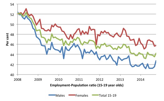
To put the teenage employment situation in a scale context the following graph shows the Employment-Population ratios for males, females and total 15-19 year olds since February 2008 (the month which coincided with the low-point unemployment rate of the last cycle).
You can interpret this graph as depicting the loss of employment relative to the underlying population of each cohort. We would expect (at least) that this ratio should be constant if not rising somewhat (depending on school participation rates).
The facts are that the absolute loss of jobs reported above is depicting a disastrous situation for our teenagers. Males, in particular, have lost out severely as a result of the economy being deliberately stifled by austerity policy positions.
The male ratio has fallen by 9.7 percentage points since February 2008, the female by 6.3 percentage points and the overall teenage employment-population ratio has fallen by 8 percentage points.
Overall, the performance of the teenage labour market continues to be deeply disturbing. It doesn’t rate much priority in the policy debate, which is surprising given that this is our future workforce in an ageing population. Future productivity growth will determine whether the ageing population enjoys a higher standard of living than now or goes backwards.
The best the Government appears to be capable of is to dream up plans which deny income support to this group and impose impossible activity tests on them.
The longer-run consequences of this teenage “lock out” will be very damaging.
I continue to recommend that the Australian government immediately announce a major public sector job creation program aimed at employing all the unemployed 15-19 year olds, who are not in full-time education or a credible apprenticeship program.
The Government should abandon their ideological obsession with supply-side punishment regimes and realise that the unemployed cannot search for jobs that are not there.
It is clear that the Australian labour market continues to fail our 15-19 year olds. At a time when we keep emphasising the future challenges facing the nation in terms of an ageing population and rising dependency ratios the economy still fails to provide enough work (and on-the-job experience) for our teenagers who are our future workforce.
Unemployment – rises by 4,700
The unemployment rate rose by 0.1 points to 6.3 per cent in November 2014. Official unemployment rose by 4,700 to 777,700.. The rise was compounded by the rise in the participation rate.
Overall, the labour market still has significant excess capacity available in most areas and what growth there is is not making any major inroads into the idle pools of labour.
The following graph updates my 3-recessions graph which depicts how quickly the unemployment rose in Australia during each of the three major recessions in recent history: 1982, 1991 and 2009 (the latter to capture the 2008-2010 episode). The unemployment rate was indexed at 100 at its lowest rate before the recession in each case (January 1981; January 1989; May 2008, respectively) and then indexed to that base for each of the months as the recession unfolded.
I have plotted the 3 episodes for 85 months after the low-point unemployment rate was reached in each cycle. The current episode is now in its 82th month (0 being February 2008). For 1991, the peak unemployment which was achieved some 38 months after the downturn began and the resulting recovery was painfully slow. While the 1982 recession was severe the economy and the labour market was recovering by the 26th month. The pace of recovery for the 1982 once it began was faster than the recovery in the current period.
It is significant that the current situation while significantly less severe than the previous recessions is dragging on which is a reflection of the lack of private spending growth and declining public spending growth.
Moreover, the current episode is also different to the last two major recessions in the sense that the recovery is over and the economy is deteriorating again.
In relative terms, the current episode is now worse than the other two recessions (in terms of deviation from low-point unemployment rate).
The graph provides a graphical depiction of the speed at which the recession unfolded (which tells you something about each episode) and the length of time that the labour market deteriorated (expressed in terms of the unemployment rate).
From the start of the downturn to the 82-month point (to November 2014), the official unemployment rate has risen from a base index value of 100 to a value 157.6. After falling steadily as the fiscal stimulus pushed growth along (it reached 122.5 after 35 months – in January 2010), it has been slowly trending up for some months now. Unlike the other episodes, the current trend, at this stage of the cycle, is upwards and accelerating.
It is now above the peak that was reached just before the introduction of the fiscal stimulus. In other words, the gains that emerged in the recovery as a result of the fiscal stimulus in 2009-10 have now been lost.
At 82 months, 1982 index stood at 140.3 while the 1991 index was at 147. It is clear that at an equivalent point in the “recovery cycle” the current period is more sluggish than our recent two major downturns and trending upwards while the trend in the earlier episodes was moderately downwards.
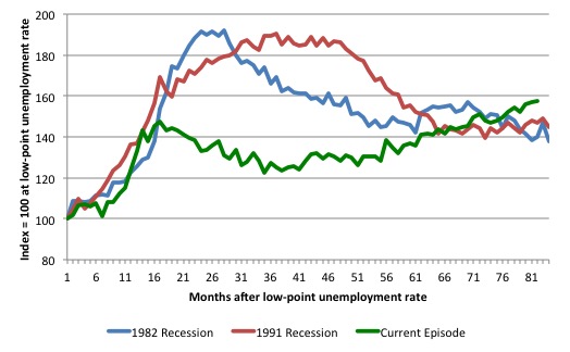
Note that these are index numbers and only tell us about the speed of decay rather than levels of unemployment. Clearly the 6.2 per cent at this stage of the downturn is lower that the unemployment rate was in the previous recessions at a comparable point in the cycle although we have to consider the broader measures of labour underutilisation (which include underemployment) before we draw any clear conclusions.
The notable aspect of the current situation is that the recovery is very slow.
Broad labour underutilisation – rises sharply
The ABS published its quarterly broad labour underutilisation measures for the November quarter in this months’ data release. The extraordinary rise in part-time employment was accompanied by a sharp rise in underemployment. So the small rise in unemployment has to be seen in that light.
In the November-quarter, total underemployment rose from 7.6 per cent in August to 8.6 per cent and the ABS broad labour underutilisation rate (the sum of unemployment and underemployment) rose to 14.4 per cent to 15.0 per cent.
| There are now 1,070.7 thousand persons underemployed. Overall, there are 1.848.1 million workers either unemployed or underemployed. |
The following graph plots the history of underemployment in Australia since February 1978.
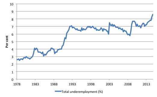
If hidden unemployment is added to the broad ABS figure the best-case (conservative) scenario would see a underutilisation rate well above 17.5 per cent at present. Please read my blog – Australian labour underutilisation rate is at least 13.4 per cent – for more discussion on this point.
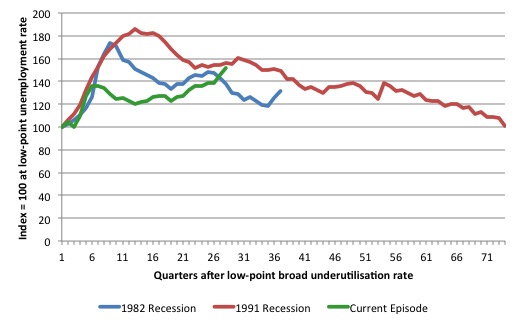
The following graph shows the same type of indexes as the previous graph except it uses the ABS broad labour underutilisation rate (unemployment plus underemployment). It also is in terms of quarters rather than months.
We also show the full evolution of the the 1982 and 1991 episodes from the low-point (= 100) through the peak and back to the next low-point. In the case of the 1982 recession the index had risen to a peak of 172.8 in May 1983 (a broad underutilisation rate of 14.4 per cent) and then fell back to 9.8 per cent by November 1989 (index value 117.4).
At that point, the cycle turned down again signalling the beginning of the 1991 recession. That cycle reached a peak of 185 (or 18.1 per cent in November 1992) and it took until February 2008 for it to reach the low-point of 9.9 percent (an index value of 100.9). That point marked the beginning of the next cycle.
That should tell you how severe the 1991 recession was and how asymmetric the labour market response is on either side of the cycle. From its start in November 1989 it took 74 quarters (18.5 years) to return to more or less that level.
In terms of the three recession comparison, at the same period in the ‘recovery’ (using quarterly data), the broad labour underutilisation rate (unemployment plus underemployment) had an index value of 137.3 in the 1982 recession (absolute value of 11.4 per cent); an index value of 156.1 in the 1991 recession (absolute value of 15.3 per cent); and an index value of 151.5 in the current period (absolute value of 5.0 per cent).
So while the level of unemployment is much lower now than in the 1982 recession (at a comparable stage), underemployment is now much higher and so the total labour underutilisation rates is higher. Further, the 1982 recovery in broad underutilisation terms was more robust than the current stagnating situation.
Commentators who think of the 1982 recession as severe, rarely see it in these terms. Joblessness is probably worse than underemployment but both mean that labour is wasted and income earning opportunities are being foregone. For a worker with extensive nominal commitments, the loss of income when hours are rationed may be no less severe than the loss of hours involved in unemployment, if the threshold of solvency is breached.
The next update will be in the February 2015 Labour Force data release published in early March 2015.
Aggregate participation rate – rose by 0.1 points
The November 2014 participation rate rose by 0.1 points to 64.7 per cent. It remains substantially down on the most recent peak in November 2010 of 65.9 per cent when the labour market was still recovering courtesy of the fiscal stimulus.
What would the unemployment rate be if the participation rate was at that recent November 2010 peak level (65.9 per cent)?
The following graph tells us what would have happened if the participation rate had been constant over the period November 2010 to November 2014. The blue line is the official unemployment since its most recent low-point of 4 per cent in March 2008.
The red line starts at November 2010 (the peak participation month). It is computed by adding the workers that left the labour force as employment growth faltered (and the participation rate fell) back into the labour force and assuming they would have been unemployed. At present, this cohort is likely to comprise a component of the hidden unemployed (or discouraged workers).
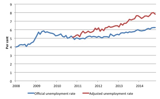
Total official unemployment in November 2014 was estimated to be 777.87 thousand. However, if participation had not have fallen since November 2010, there would be 985.9 thousand workers unemployed given growth in population and employment since November 2010.
| The unemployment rate would now be 7.8 per cent if the participation had not fallen below its November 2010 peak of 65.9 per cent. |
The difference between the two numbers mostly reflects the change in hidden unemployment (discouraged workers) since November 2010. These workers would take a job immediately if offered one but have given up looking because there are not enough jobs and as a consequence the ABS classifies them as being Not in the Labour Force.
Note, the gap between the blue and red lines doesn’t sum to total hidden unemployment unless November 2010 was a full employment peak, which it clearly was not. The interpretation of the gap is that it shows the extra hidden unemployed since that time.
Hours worked – fell in November 2014
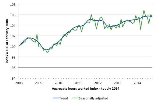
Aggregate monthly hours worked decreased by 4.4 million hours (0.3 per cent) in November 2014 in seasonally adjusted terms as underemployment rose on the back of the dominant part-time employment impact.
The following graph shows the trend and seasonally adjusted aggregate hours worked indexed to 100 at the peak in February 2008 (which was the low-point unemployment rate in the previous cycle).
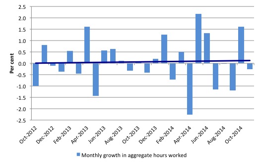
The next graph shows the monthly growth (in per cent) over the last 24 months. The dark linear line is a simple regression trend of the monthly change – which depicts as close to a zero trend as you will get. You can see the pattern of the change in working hours is also portrayed in the employment graph – zig-zagging across the zero growth line.
Conclusion
In general, we always have to be careful interpreting month to month movements given the way the Labour Force Survey is constructed and implemented.
The data now ssems to have settled down again after the ABS introduced their revised methodology in relation to seasonal adjustment last month.
Today’s data shows that the labour market is in a poor state and the bias is towards rising unemployment and stagnant employment growth.
The data tells us that the slowdown reported in last week’s National Accounts estimates for the June-quarter was probably an accurate indication of where the economy was 3 months ago. It is now worse.
The only job opportunities are part-time and underemployment is rocketing upwards.
The sum of official unemployment and underemployment – the broad labour underutilisation rate – is now 15 per cent. That is a massive wastage rate and defies those who claim the economy is close to full employment.
The teenage labour market remains in a parlous state. This is an emergency which is being ignored by the Federal Government.
The neglect of our teenagers will have a very long memory indeed and the negative consequences will be stronger given the ageing population.
The data continues to tell us that the policy settings are all wrong. A fiscal stimulus is needed.
That is enough for today!
(c) Copyright 2014 William Mitchell. All Rights Reserved.
Prepare for the media attacks on the poor and the unemployed, and their role in pushing Australia towards recession.
The youth unemployment figures are alarming.. especially in view of the long term trend.Considering the “free market” is not able to provide full employment (nor will do so in the near future) a job creation program
would appear to be a good idea. But is the public prepared for a larger deficit? What about a levy like a http://en.wikipedia.org/wiki/Bank_transaction_tax to pay for it?
We need the pitchfork approach – pitchforks have 3 prongs.
Prong 1 – Forget the free trade mantra. Introduce tariffs on a selective basis to protect our industry.
Prong 2 – Our population increase is almost entirely due to immigration. An indefinite moratorium on immigration will fix this.
Prong 3 – A job guarantee aimed at our youth in particular.
What are the chances that any of this will happen? – about zero.
This is where the pitchfork comes in again – and its not for pitching hay.
I guess Irish and other euro roboten migration is a big factor.
Sorry to say the generation born post 1990 is useless for anything like real work and is almost unemployable unless for sales stuff and other women’s work.
Good look attempting to absorb them , I am sure the euro banks will be eternally greatfull for your generosity.
I noticed in the ABC TV news tonight an interview with Liberal senate leader Eric Abetz, in which he continued to insist on the necessity for this government to achieve and sustain a budget surplus. I am now beginning to think that he and most of his colleagues really do not know what they are doing, i.e. they are economic illiterates. Previously I went along with the proposition that they well know precisely what they are doing and are simply play-acting according to a preprepared script, as part of their commitment to implementing the neoliberal agenda. Now I am not so sure. Either way, the electoral repercussions – as unemployment and underemployment continue to increase – will ensure that this group of wreckers are swept from office in 2016.
Sorry to say the generation born post 1990 is useless for anything like real work
Of course our parent’s generation said the same thing about us. Our hair was too long. We wore jeans. Listened to strange music etc etc. It was nonsense then and it’s nonsense now.
PS Bill. Do we have to put up with these tiresome posts from T.D.O.C. ?
@The Dork of Cork
What a shame you never take a walk for your names sake into UCC, Cork School Of Music or CIT and talk to the young people there. Instead you waste your time angry at everyone trying to make a difference. Or talk to a young spanish person: all these young people with degrees, training and work experience but no jobs at the end of it.
You’ve disgraced yourself with that comment.
It will read like this to the Liberals: Australians not working hard enough. (the media will of course be happy to sell the story of the dole bludger all over again).
Come next budget when their expected tax revenue is lower because of their NAIRU based metric which underestimates the effect of the automatic stabiliser and welfare spending. That will be the start of work choices mark 2. (not that this isnt already happening anyway).
Bill’s blog post should be hitting the emails of as many labor party politicians as possible as they will be the ones elected to clean up the mess. Whom are all to happy to get votes from people whom think this stuff was (at one time or another) the labor ‘brand’.
Dear Duke of Cork (at 2014/12/11 at 22:41)
You have ventured out of your depth. Most of the Irish immigrants to Australia in recent years have been skilled tradespersons. I suggest you stop raving and stick to evidence. I would normally delete the comment because it was sexist and demeaning of people. But I have left it because it reveals your ignorance.
best wishes
bill
I have found many of the previous postings of TDOC to be erratic and bizarre. This posting is consistent with all the rest in that respect.
Sadly, there will be no appropriate fiscal adjustment while the most senior Banker in the country says we have to fix the budget to retain our AAA rating.
http://www.smh.com.au/business/the-economy/rba-governor-glenn-stevens-says-australian-dollar-better-at-us75-20141212-125g73.html#ixzz3LdMKlqGZ
Bill thank you for the material. On a side note, although Crude Oil continues to decline I note that the Natural Gas prices are still relatively high in $Aus terms. Will this further deteriorate the GNP through greater impost on business cost of capital? Or will we start to see some improvement in the terms of trade to replace declines in other commodities?
Het Bill,
I would be interested in your response to
What about a levy like a http://en.wikipedia.org/wiki/Bank_transaction_tax to pay for it?
@ Chris
Another interesting comment from that article ……………reflects that none of our senior people see youth unemployment as a problem
Mr Stevens pushed back against calls for near-term cuts, saying the economy, jobs and inflation were roughly where the central bank expected them to be.
Read more: http://www.smh.com.au/business/the-economy/rba-governor-glenn-stevens-says-australian-dollar-better-at-us75-20141212-125g73.html#ixzz3LjatVTgg
Dear Danny Turner (at 2014/12/13 at 10:43)
I wrote about the Robin Hood Tax in 2010 – https://billmitchell.org/blog/?p=9006 – my position is unchanged.
best wishes
bill
If somebody were to calculate price sticker for this economic waste, it would be a colossal number. I think it would make good selling point for the Job Guarantee.
People say JG costs money, but that is just illusion. On the contrary, putting people to work would generate much more production.
Another illusion is government debt. People say government owes money, that is just a stock of financial assets government has issued.
Addressing this illusion may be the best way to get people to understand macroeconomics.
We have a government that is capable of spending by issuing financial assets. It is called deficit spending. We can never run out.
The market does not care how much government debt there is, it knows government is always able to pay its bills. It cares about where the central bank sets interest rates.