Today (June 3, 2026), the Australian Bureau of Statistics (ABS) released the latest - Australian…
Australia National Accounts – growth moderates but wage share falls below 50 per cent
The Australian Bureau of Statistics released the latest – Australian National Accounts: National Income, Expenditure and Product, March 2022 – today (June 1, 2022), which shows that the Australian economy grew by 0.8 per cent in the March-quarter 2022 and by 3.3 per cent over the 12 months to the end of March 2022 – a decline in the growth rate. Nominal GDP grew by 10.2 per cent over the year and the change in the GDP price index (a measure of inflation) was 8.2 per cent. The data tells us that after the initial rebound from the lockdowns, growth moderated in the March-quarter and was driven by domestic demand – household consumption, government spending and inventory accumulation. The external sector undermined growth even though the terms of trade boomed. Productivity growth was strong but note working hours fell. The productivity growth provided scope for non-inflationary real wage rises. The problem is that business are pocketing these productivity gains as profits. That needs to stop and the government should do something about it. The wage share fell below 50 per cent which is a shocking testimony of the way the wages system is penalising workers.
The main features of the National Accounts release for the December_quarter 2021 were (seasonally adjusted):
- Real GDP increased by 0.8 per cent for the quarter. The annual growth rate was 3.3 per cent
- Australia’s Terms of Trade (seasonally adjusted) grew by 5.9 per cent in the quarter (a significant risep on previous quarters) and by 8.3 per cent over the 12 month period. The rise in commodity export prices outweighed the rising import prices.
- Real net national disposable income, which is a broader measure of change in national economic well-being rose by 1.4 per cent for the quarter and 2.4 per cent over the 12 months, which means that Australians are better off (on average) than they were at that point 12 months ago.
- The Household saving ratio (from disposable income) fell to 11.4 per cent (from 13.4 per cent).
Overall growth picture – growth continues at slower rate
The ABS – Media Release – said that:
The economy grew for a second consecutive quarter following a contraction in the September quarter 2021, when economic activity was affected by the Delta outbreak …
Household and government spending drove growth this quarter with total final consumption contributing 1.4 percentage points to GDP …
Imports of goods and services rose 8.1 per cent and detracted 1.5 percentage points from GDP. This was the largest rise since December 2009, driven by imports of consumption and intermediate goods …
The household saving to income ratio fell from 13.4 per cent to 11.4 per cent as the increase in household spending outpaced growth in household income.
The first graph shows the quarterly growth over the last five years.

To put this into historical context, the next graph shows the decade average annual real GDP growth rate since the 1960s (the horizontal red line is the average for the entire period (3.3 per cent) from the March-quarter 1960 to the March-quarter 2022).
The 2020-to-now average has been dominated by the pandemic.
But, it is also obvious how far below historical trends the growth performance of the last 2 decades have been as the fiscal surplus obsession has intensified on both sides of politics.
Even with a massive household credit binge and a once-in-a-hundred-years mining boom that was pushed by stratospheric movements in our terms of trade, our real GDP growth has declined substantially below the long-term performance.
The 1960s was the last decade where were pursued and maintained true full employment.

Analysis of Expenditure Components – Domestic demand dominates
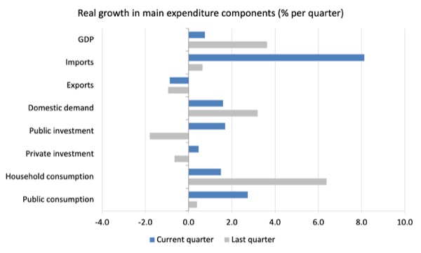
The following graph shows the quarterly percentage growth for the major expenditure components in real terms for the December-quarter 2021 (grey bars) and the March-quarter 2022 (blue bars).
Points to note:
1. Household Consumption expenditure rose by 1.5 per cent in the March-quarter. It exceeded the pre-pandemic level for the first time in the December-quarter 2021.
2. General government consumption expenditure grew by 2.7 per cent in the March-quarter and by 8.3 per cent over the 12 months.
3. Private investment expenditure growth grew by 0.46 per cent for the quarter and by 2.7 per cent over the year.
4. Public investment grew by 1.69 per cent for the quarter and was up 5.3 per cent for the year, as a result of some very large state-level infrastructure projects.
5. Export expenditure fell by 0.87 per cent for the quarter and 4.2 per cent over the 12 months. Imports boomed in the March-quarter = growing 8.1 per cent and by 7.6 per cent for the year.
Contributions to growth
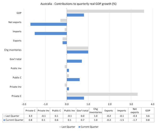
What components of expenditure added to and subtracted from the 0.8 per cent rise in real GDP growth in the March-quarter 2022?
The following bar graph shows the contributions to real GDP growth (in percentage points) for the main expenditure categories. It compares the March-quarter 2022 contributions (blue bars) with the December-quarter 2021 (gray bars).
In no order:
1. Household consumption expenditure added 0.8 points to the overall growth rate of 0.8 per cent.
2. Public Investment added 0.1 points.
3. Growth in inventories contributed 1.0 point to growth as firms built up previously depleted stock levels.
4. Private investment expenditure added 0.1 points.
5. Public consumption added 0.1 points. Overall, the government sector added 0.7 points.
5. Net exports reduced growth by 1.7 points with both a decline in exports (-0.2 points drag) and a rise in imports (1.5 points) at work (remember imports are a drain on expenditure).
Material living standards rose in March-quarter
The ABS tell us that:
A broader measure of change in national economic well-being is Real net national disposable income. This measure adjusts the volume measure of GDP for the Terms of trade effect, Real net incomes from overseas and Consumption of fixed capital.
While real GDP growth (that is, total output produced in volume terms) rose by 0.8 per cent in the March-quarter, real net national disposable income growth rose by 1.4 per cent.
How do we explain that?
Mostly because while GDP growth was positive and the terms of trade rose strongly.
The following graph shows the evolution of the quarterly growth rates for the two series since the March-quarter 2006.

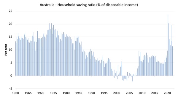
Household saving ratio fell by 2 points to 11.4 per cent
The ABS noted that:
Household saving fell as the rise in household spending outpaced growth in gross disposable income. Household gross disposable income rose 0.6% with growth in labour (COE) and non-labour income partly offset by an increase in income payable.
Non-labour income was driven by non-life insurance claims (+18.6%). Households received $2.8 billion in non-life insurance claims related to floods, adding 0.8 percentage points to the saving-to-income ratio. This was partly offset by a decline in support payments from government as restrictions eased.
The following graph shows the household saving ratio (% of disposable income) from the March-quarter 2000 to the current period. It shows the period leading up to the GFC, where the credit binge was in full swing and the saving ratio was negative to the rise during the GFC and then the most recent rise.

While the saving ratio might appear to be still very high, if we take a longer term view of it, the behaviour is less ‘historic’ than we might think.
The next graph shows the household saving ratio (% of disposable income) from the March-quarter 1960 to the current period.
Back in the full employment days, when governments supported the economy and jobs with continuous fiscal deficits (mostly), households saved significant proportions of their income.
In the neoliberal period, as credit has been rammed down their throats, the saving rate dropped (to negative levels in the lead-up to the GFC).
Hopefully, households are paying off the record levels of debt they are now carrying and improving their financial viability.
The following table shows the impact of the neoliberal era on household saving. These patterns are replicated around the world and expose our economies to the threat of financial crises much more than in pre-neoliberal decades.
The result for the current decade (2020-) is the average from March 2020.
| Decade | Average Household Saving Ratio (% of disposable income) |
| 1960s | 14.4 |
| 1970s | 16.2 |
| 1980s | 12.0 |
| 1990s | 5.1 |
| 2000s | 1.4 |
| 2010s | 6.4 |
| 2020- | 15.3 |
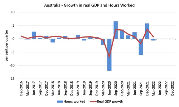
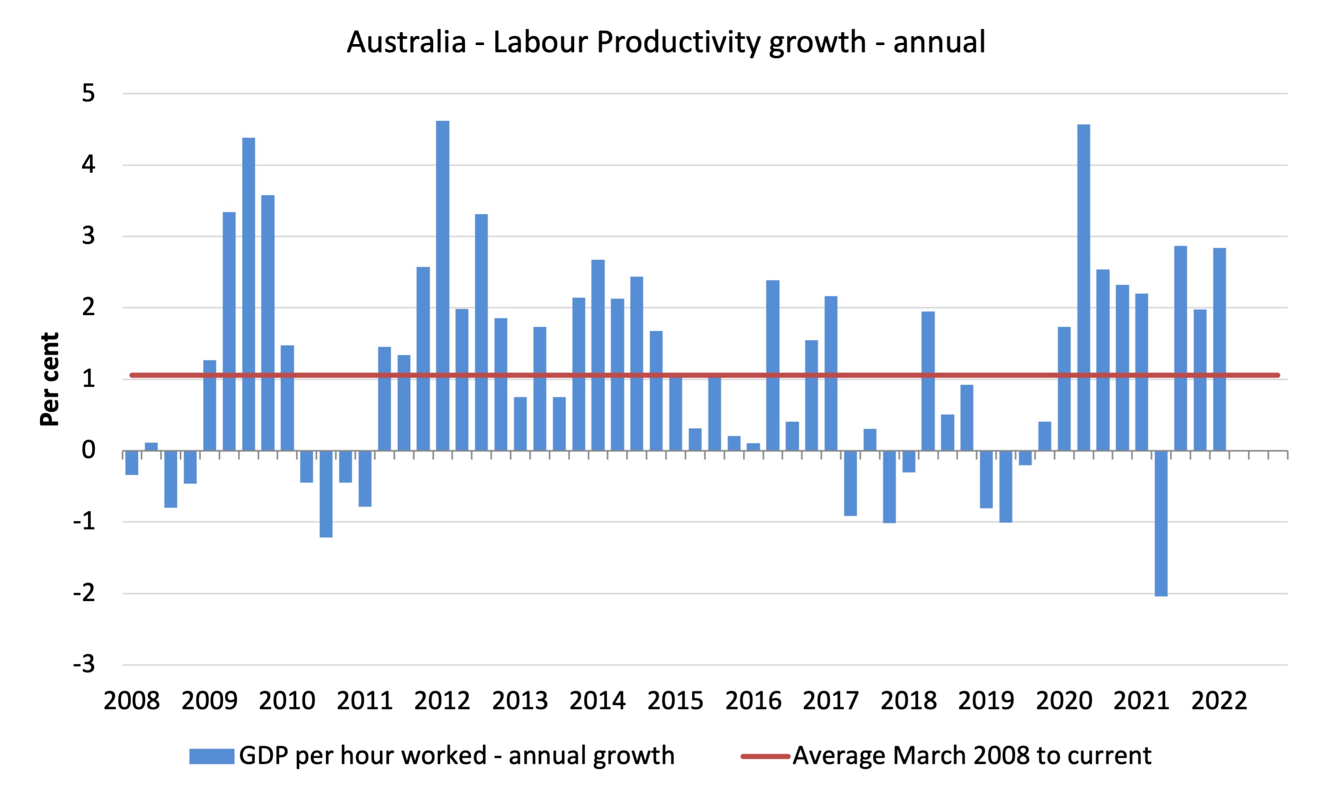
Real GDP growth with falling working hours equals stronger labour productivity growth
The following graph presents quarterly growth rates in real GDP and hours worked using the National Accounts data for the last five years to the March-quarter 2021.
The data shows that both output and hours worked fell during the March-quarter.
To see the above graph from a different perspective, the next graph shows the annual growth in GDP per hour worked (labour productivity) from the March-quarter 2008 quarter to the March-quarter 2022. The horizontal red line is the average annual growth since March-quarter 2008 (1.1 per cent), which itself is an understated measure of the long-term trend growth of around 1.5 per cent per annum.
The relatively strong growth in labour productivity in 2012 and the mostly above average growth in 2013 and 2014 helps explain why employment growth was lagging given the real GDP growth. Growth in labour productivity means that for each output level less labour is required.
As a result of output rising faster than hours worked (which fell in the March-quarter), overall productivity rose. The productivity growth provides the ‘room’ for real wages to grow without putting upward pressure on the inflation rate.
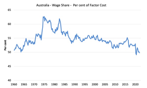
The distribution of national income – with real wage cuts and productivity rising – the wage share plummets
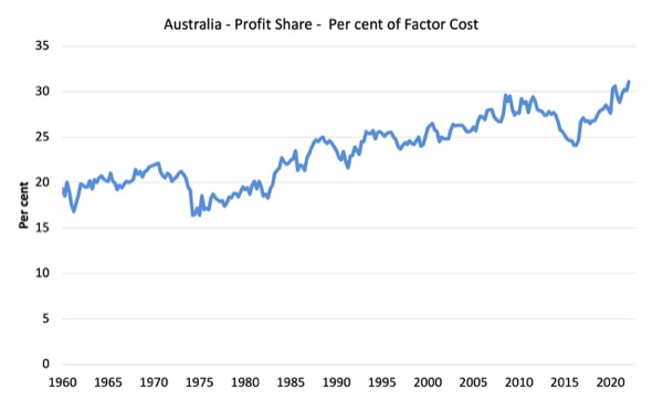
The wage share in national income fell by 0.4 points to 49.8 per cent while the profit share rose by 1 points. The terms of trade rise has boosted profits without being passed on into higher wages growth.
This is one of the major problems facing the new government.
For those who claim wage rises will exacerbate the current inflation situation – they should realise that with productivity growth, there is scope for non-inflationary real wage rises.
The problem is that business are pocketing the productivity gains as profits. That needs to stop and the government should do something about it.
The first graph shows the wage share in national income while the second shows the profit share.
The declining share of wages historically is a product of neoliberalism and will ultimately have to be reversed if Australia is to enjoy sustainable rises in standards of living without record levels of household debt being relied on for consumption growth.
Conclusion
Remember that the National Accounts data is three months old – a rear-vision view – of what has passed and to use it to predict future trends is not straightforward.
The data tells us that after the initial rebound from the lockdowns, growth moderated in the March-quarter and was driven by domestic demand – household consumption, government spending and inventory accumulation.
The external sector undermined growth even though the terms of trade boomed.
Productivity growth was strong but note working hours fell.
The wage share fell below 50 per cent which is a shocking testimony of the way the wages system is penalising workers.
That is enough for today!
(c) Copyright 2022 William Mitchell. All Rights Reserved.
“The wage share fell below 50 per cent which is a shocking testimony of the way the wages system is penalising workers.”
It would be fair to argue that the inverse of the wage share chart could be used as social misery index.
Just about every economic and social ill evident in the West can be sheeted home to this one factor.
@Henry Rech “It would be fair to argue that the inverse of the wage share chart could be used as social misery index.”
I disagree with that blanket statement, particularly if the national pie is growing. The wage earner is better off overall, but relatively less so than profit-earners and the “other” remaining component. But overall, purchasing power to retain a certain standard of living and distributional aspects are vitally important in society and ought to be further examined by policymakers. Cheers.
@ Esp
I don’t personally know any workers who have found themselves better off overall.
It would seem difficult to have workers better off overall with not only the wage share falling below 50% but also inflation in non-discretionary goods and services simultaneously eroding the real value of wages.
As far as I can see, the data just tells us that Australians overall ended up with more – does it tell is which Australians that is? Not too many workers I assume.
How a growing pie is distributed is of crucial importance.
So in addition to all the other data strongly at odds with the RBA’s stated reasoning for raising the cash rate in May, the National Accounts tell us that over the same period of time where the RBA were increasingly fretting about wages building up a head of steam……the wage share in fact fell and plumbed lows mostly not seen over the past 60 years.
Some very serious questions need to be asked about the RBA’s methodology – perhaps they should just defer to the ABS before making monetary policy decisions.
Esp,
I would say that things like household indebtedness, homelessness, increasing difficulty in achieving home ownership, domestic violence, drug abuse etc. are related and are inevitably related to income, actually, the lack of it.
I’m not trying to pick a fight and we are in fierce agreement re distributional aspects. Note, total COE was up 5.5% through the year. I know wage earners doing really well and others struggling (some are a genuine “working poor”). I suppose I’m suggesting the statement that was made could use some nuance.
As for the RBA, it has become a laughing stock. Reputation worse than ever. The market will test it again later this year…and the Board will buckle at the coal face. I would not have it as an ‘independent’ entity, though most economist seem to disagree. I’ve met about half a dozen of the young economists working there over the past five or so years…ain’t nothing gonna change.
Esp,
Sorry, not given to nuance.
Nuance leads to confusion.
@Henry Rech, blinkered views of reality typically detract from what are substantive issues. Apology accepted.
Esp,
Show me a “view of reality” that is not blinkered.
@Esp
Perhaps neoliberal core beliefs are effectively “in the DNA” of economists and board members working for the RBA?
Over the past few years, I was pleased to see the governor appear to start expressing an understanding that, while still a long way short of what I would like, was at least significantly more accepting of the realities pointed out by MMT economists like Bill.
Last month with little advance warning, they dramatically backflipped and re-embraced their old way of thinking, catching myself and others by surprise. It transpired to be an appalling balls-up on their part.
The question is – will they now accept the facts that even in a low unemployment environment, wage rises for a majority of workers are constrained by the loss of unions and collective bargaining from the economic landscape and that wage-price spirals are unlikely to occur………or will they keep their ideological bulldozer on course?
Regardless of their so-called “independence”, as a public institution, the bank and it’s governor must answer to the elected Australian government of the day. If ideology and/or faulty information incentivises them to start on an economic and social demolition binge, I would hope they are hauled up.
RBA is likely to keep failing.
The question in my mind is – at what point are they likely to be held to account for doggedly insisting on continuing to fail (assuming that happens) when failure on their part is the equivalent of economic napalm?
Perhaps there will be an orchestrated media campaign to convince Australians that the RBA has no choice and “needs” to save us from inflation by burning the economy down.
An outstanding oration on the necessity for a JG from a recent ‘student’ of Bill’s – Noel Pearson.
“12th Renate Kamener Oration with Noel Pearson”.
https://www.youtube.com/watch?v=jlAe7eSuhC0
Let’s hope he can get the message through to the new government.