In the 1990s, a new industry was created in Australia. It produced nothing. But it…
US labour market weaker in March 2018
On April 6, 2018, the US Bureau of Labor Statistics (BLS) released their latest labour market data – Employment Situation Summary – March 2018 – which showed that total non-farm employment from the payroll survey rose by just 103,000 in March – or “edged up” to use the BLS words. The Labour Force Survey data, however, showed that employment fell (37 thousand) in March 2018 but was accompanied by an even larger fall in the labour force (158 thousand) which meant that total unemployment fell by 121 thousand. The weaker labour market means that underutilisation outside of the official labour force will have risen (‘hidden unemployment’). There is still a large jobs deficit remaining and the bias towards low paid work intensified in the first three months of 2018. Finally, there is no evidence of a wages breakout going on. Taken together, the US labour market is showing no definite trend up or down at present and it is still some distance from being at full employment.
Overview – Total employment fell by 37 thousand in March 2018
For those who are confused about the difference between the payroll (establishment) data and the household survey data you should read this blog – US labour market is in a deplorable state – where I explain the differences in detail.
See also the – Employment Situation FAQ – provided by the BLS, itself.
The BLS say that:
The establishment survey employment series has a smaller margin of error on the measurement of month-to-month change than the household survey because of its much larger sample size. … However, the household survey has a more expansive scope than the establishment survey because it includes self-employed workers whose businesses are unincorporated, unpaid family workers, agricultural workers, and private household workers …
Focusing on the Household Labour Force Survey data, the seasonally adjusted labour force fell by 158 thousand in March 2018 with the participation rate falling 0.1 points to 62.9 per cent.
Total employment fell by a 37 thousand in net terms, which means that official unemployment fell by 121 thousand.
The official unemployment rate was unchanged at 4.1 per cent.
However, in assessing the overall state of the labour market, we have to bear in mind that the March 2018 participation rate of 62.9 per cent is still far below the peak in December 2006 (66.4 per cent).
Adjusting for the ageing effect (see below), the rise in those who have given up looking for work for one reason or another since December 2006 is around 3.9 million workers.
If we added them back into the labour force and considered them to be unemployed (which is not an unreasonable assumption given that the difference between being classified as officially unemployed against not in the labour force is solely due to whether the person had actively searched for work in the previous month) – we would find that the current US unemployment rate would be around 6.09 per cent rather than the official estimate of 4.07 per cent.
That provides a quite different perspective in the way we assess the US recovery. It challenges the view that the US economy is close to full employment.
Sure enough the unemployment is back down to pre-crisis levels but there are around 3.9 million workers missing from the labour force and their absence is not due to ageing effects (demographic changes).
Conclusion: on that basis, the US labour market is still a long way from where it was at the end of 2007, even though the U-6 Broad indicator has now returned to its pre-GFC level (see below).
But as we see later, wages growth for the vast majority of workers is also flat, which provides further evidence of on-going slack.
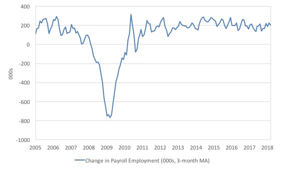
Payroll employment trends
The first graph shows the monthly change in payroll employment (in thousands, expressed as a 3-month moving average to take out the monthly noise).
The monthly changes were stronger in 2014 and 2015, and then dipped in the first-half of 2016. By the end of 2016, job creation was stronger but then it tailed off again, somewhat.
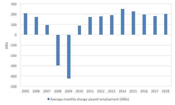
The next graph shows the same data in a different way – in this case the graph shows the average net monthly change in payroll employment (actual) for the calendar years from 2005 to 2017.
The slowdown that began in 2015 is continuing (although the February 2018 outlier has pushed the current average for 2018 up above the 2017 average).
The average change in 2017 was 171 thousand, which is down from the 187 thousand average throughout 2016.
The average net change in 2014 was 250 thousand, in 2015 it was 226 thousand.
The 2018 average is obviously just for the first three months (202 thousand) – but so far 2018 looks stronger than 2017.
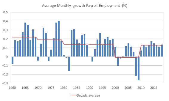
To put the current recovery into historical perspective the following graph shows the average annual growth in payroll employment since 1960 (blue columns) with the decade averages shown by the red line.
It reinforces the view that while payroll employment growth has been steady since the crisis ended, it is still well down on previous decades of growth.
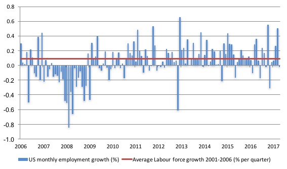
Labour Force Survey – employment growth negative this month
In March 2018, employment as measured by the household survey fell by 0.02 per cent (37 thousand) while the labour force fell by 0.10 per cent (158 thousand) and the participation rate fell 0.1 points to 62.9 per cent.
As a result, total unemployment fell by 121 thousand.
But taken together this is a weaker labour market – but, given that the monthly data has fluctuated considerably lately so it is hard to be definitive.
The next graph shows the monthly employment growth since the low-point unemployment rate month (December 2006). The red line is the average labour force growth over the period December 2001 to December 2006 (0.09 per cent per month).
What is apparent is that there is still no coherent positive and reinforcing trend in employment growth in the US labour market since the recovery began back in 2009. There are still many months where employment growth, while positive, remains relatively weak when compared to the average labour force growth prior to the crisis or is negative.
The sharp positive spike in September 2017 is clearly an outlier as is (to a certain extent) the negative spike in October 2017.
But when we consider the weaker payroll data and the poor labour force survey result, the general conclusion is that things are slightly weaker.
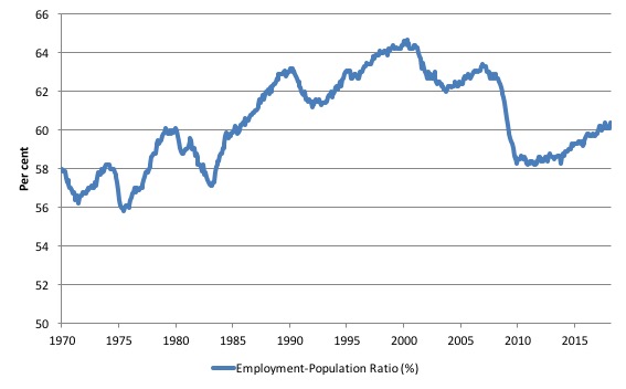
A good measure of the strength of the labour market is the Employment-Population ratio given that the movements are relatively unambiguous because the denominator population is not particularly sensitive to the cycle (unlike the labour force).
The following graph shows the US Employment-Population from January 1970 to March 2018. While the ratio fluctuates a little, the March 2018 outcome was steady 60.4 per cent.
Over the longer period though, we see that the ratio remains well down on pre-GFC levels (peak 63.4 per cent in December 2006), which is a further indication of how weak the recovery has been so far and the distance that the US labour market is from being at full capacity (assuming that the December 2006 level was closer to that state).
There is no wages breakout for workers
The latest data continues to support my assessment that despite the commentariat claiming a wages breakout is nigh, the evidence for that claim is non-existent.
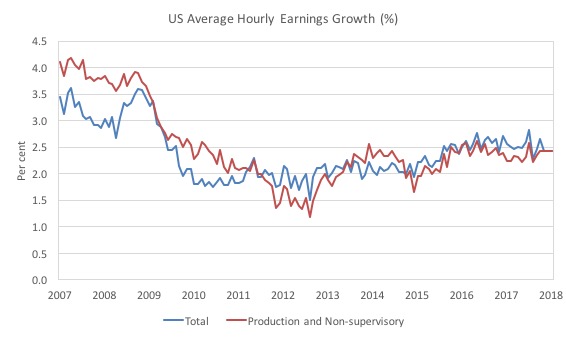
Production and Non-supervisory workers have barely seen movement in their hourly wage outcomes over the last several years (note the BLS revised the January growth figure down in the latest release).
The first graph shows the annual movement in average hourly earnings in total and for Production and Non-supervisory workers. The BLS time series for the latter category began in March 2006.
Total nominal average hourly earnings rose by 2.5 per cent in the 12 months to November 2017, then 2.7 per cent in December 2017.
Since January 2017, the growth has been steady at 2.4 per cent per annum.
Production and nonsupervisory employees were 82.4 per cent of private US non-farm employment. The growth in average hourly earnings for this dominant cohort has been stable (2.4 per cent per annum) since December 2017.
The graph shows that for these workers – the predominant majority in the US labour market – wages growth has been largely flat since 2013 with a dip in 2015.
The annual rate of growth has been sitting on around 2.3 to 2.4 per cent since 2009 (with monthly fluctuations around that attractor).
The conclusion is that for the vast majority of workers there is no acceleration in wages in the US.
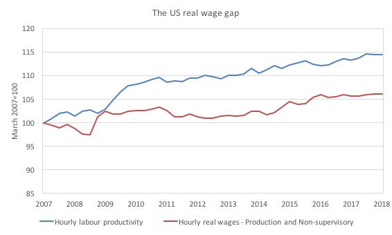
The next graph shows the movements in hourly labour productivity for Production and nonsupervisory employees and their real wages – indexed to 100 in the March-quarter 2007.
As I have explained before, if productivity outstrips real wages growth, then these workers are losing wage share and shifting the difference to profits (or other workers – the top-end of the distribution)
The US real wage gap (labour productivity growth minus real wages growth) is pronounced. Labour productivity (output per hour) has grown by 14.4 per cent since the March-quarter 2007, whereas real hourly wages have only grown by 6 per cent over the same time period.
In the last few years, real hourly wages growth has been virtually non-existent (as the graph shows).
And, of course, these indexes understate the redistribution. If I had have started the base year in the 1990s, for example, the gap now would be much wider.
Unemployment trends
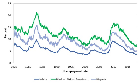
The trends in unemployment by ethnicity are interesting in the US.
Two questions arise:
1. Is the Black and African American unemployment rate higher than it was before the GFC, given that the White unemployment rate is now around its lower levels?
2. Has the relationship between the Black and African American unemployment rate and the White unemployment rate deteriorated since the GFC?
The answer to both questions is No!.
The first graph shows the history of BLS unemployment rates for Black and African Americans, Hispanics and Whites.
You can see that they all cycle together as economic activity cycles. You can also see that the Black and African American unemployment rate is currently at 6.9 per cent, which is well below the pre-GFC minimum achieved of 7.6 per cent (August 2007).
Note: this data moves around a lot on a monthly basis.
The rate rose from 6.8 per cent in December 2017 to 7.7 in January 2018 only to drop back to 6.9 per cent in March 2018.
The White unemployment rate fell in March 2018 from 3.7 to 3.6 per cent.
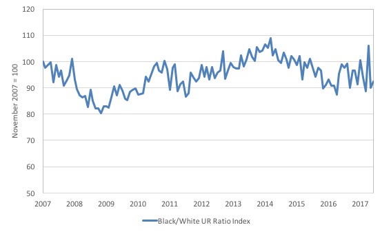
The second graph shows the Black and African American unemployment rate to White unemployment rate (ratio) from November 2007 (index = 100), when the White unemployment rate was at its previous lowest level.
This graph allows us to see whether the relative position of the two cohorts has changed since the crisis.
The data shows that, in fact, Black and African Americans are slightly worse off in relative terms now (March 2018) than they were a decade ago.
The ratio index stands at 92.5 points, meaning that that the Black and African American to White unemployment rate ratio has fallen by 7.5 percentage points since November 2007.
That means that the labour force growth is including the more disadvantaged workers.
The US jobs deficit
As noted in the Overview, the current participation rate of 62.9 per cent is a long way below the most recent peak in December 2006 of 66.4 per cent.
When times are bad, many workers opt to stop searching for work while there are not enough jobs to go around. As a result, national statistics offices classify these workers as not being in the labour force (they fail the activity test), which has the effect of attenuating the rise in official estimates of unemployment and unemployment rates.
These discouraged workers are considered to be in hidden unemployment and like the officially unemployed workers are available to work immediately and would take a job if one was offered.
In most advanced nations, the population is shifting towards older workers who have lower participation rates – so the US is not special in this regard.
Thus some of the decline in the total participation rate could simply being an averaging issue – more workers who have a lower participation rate as a proportion of the total workforce.
In this recent blog post (November 7, 2017) – Updating the impact of ageing labour force on US participation rates – I estimated that about 61 per cent of the decline in the participation rate since January 2008 has been due to non-cyclical shifts in the demographic weights (shifting age composition).
That still leaves a significant cyclical response.
Adjusting for the demographic effect would give an estimate of the participation rate in March 2018 of 64.3 per cent if there had been no cyclical effects (1.4 percentage points up from the current 62.9 per cent).
To compute these job gaps we have to set a ‘full employment’ benchmark. In the past, I have set it at 4.1 per cent, which is where the US labour market is currently sitting and as I explain in this blog post – US labour market – strengthened in February but still not at full employment (March 13, 2018) – is the best case scenario given that I actually think the cyclical losses are much worse than I provide here.
Using the estimated potential labour force (controlling for declining participation), we can compute a ‘necessary’ employment series which is defined as the level of employment that would ensure on 4.1 per cent of the simulated labour force remained unemployed.
This time series tells us by how much employment has to grow each month (in thousands) to match the underlying growth in the working age population with participation rates constant at their January 2007 peak – that is, to maintain the 4.1 per cent unemployment rate benchmark.
In the blog post cited above (US labour market – strengthened in February but still not at full employment), I provide more information and analysis on the method.
There are two separate effects:
- The actual loss of jobs between the employment peak in November 2007 and the trough (January 2010) was 8,582 thousand jobs. However, total employment is now above the January 2008 peak by 8,583 thousand jobs.
- The shortfall of jobs (the overall jobs gap) is the actual employment relative to the jobs that would have been generated had the demand-side of the labour market kept pace with the underlying population growth – that is, with the participation rate at its January 2008 value and the unemployment rate was constant at 4.1 per cent. This shortfall loss amounts to 4,885 thousand jobs.
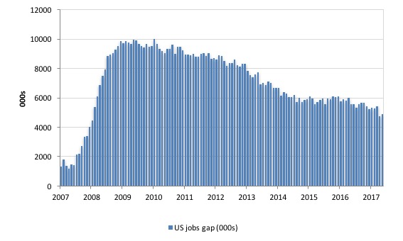
The following graph shows the US Jobs Gap, which is the departure of current employment from the level of employment that would have generated a 4.1 per cent unemployment rate, given current population trends.
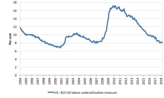
To put that into further perspective, the following graph shows the BLS measure U6, which is defined as:
Total unemployed, plus all marginally attached workers plus total employed part time for economic reasons, as a percent of all civilian labor force plus all marginally attached workers.
It is thus the broadest measure of labour underutilisation that the BLS publish.
In December 2006, before the affects of the slowdown started to impact upon the labour market, the measure was estimated to be 7.9 per cent.
It is now at 8 per cent and has shown modest falls in the early part of 2018..
The U-6 measure remains above the trough of the early 2000s, and remains marginally above its pre-GFC level.
The low-wage bias continues
My feature on the US labour market this month focuses on tracking what I have called in previous blogs the low-wage employment bias in the US labour market.
To see the full methodology I employed in making these calculations please read the blogs – US jobs recovery biased towards low-pay jobs and Bias toward low-wage job creation in the US continues.
The question: Is there a bias towards low-pays jobs in the recovery in the US?
Answer: bias continues and has intensified since late 2017.
Effectively, since the recovery began in January 2010, there have been 18,605 thousand net jobs added to the US labour market (in the non-farm sector).
Of those net employment additions, 26.3 per cent have been what might be considered low-pay, where that is defined as less than 75 per cent of average weekly earnings.
Previously, I have calculated what happened in the downturn with respect to the jobs lost in net terms and their pay characteristics (at a sectoral level).
Please read my blog – US labour market – improves in August but still no growth trend is apparent – for more discussion on this point.
The main conclusions were:
1. Peak US non-farm employment occurred in January 2008 (138,430 thousand) and the trough occurred in December 2009 (129,778 thousand).
2. The job losses for the top-level North American Industry Classification System (2012 NAICS) were calculated from peak (January 2008) to the trough (December 2009).
3. Overall 8.7 million jobs were lost – with 8.8 million lost in the private sector and they were only partially offset by the 94,000 net jobs added in the government sector.
4. In the downturn, 21.1 per cent of the jobs lost (net) were in sectors that paid on average below 75 per cent of the overall private sector average pay (that is, low-pay jobs).
5. 86.1 per cent of the total jobs lost in the downturn were in sectors were paying above average pay.
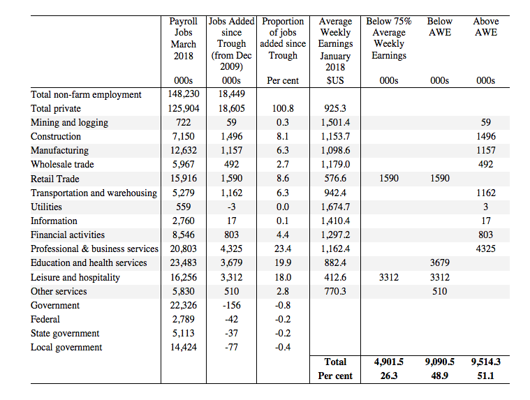
The following table summarises what happened in the period from the trough to the most recent monthly data observation (March 2018).
The second column shows the latest BLS payroll employment data as at March 2018. The next column shows the number of net jobs (in thousands) that have been added by each sector since the trough in December 2009.
The next column shows the percentage of those total jobs added by sector. You can see that with the Government sector in contraction the total jobs added in the Private sector are 100.8 per cent of the total net jobs added.
The fourth column shows the Average Weekly Earnings for each sector as at March 2018.
The final three columns split these job additions into their pay characteristics using the sectoral average weekly earnings and the same criteria as in the previous example.
The summary statistics for each ‘pay category’ (75% of Average Pay, Below Average Pay, Above Average Pay) are at the bottom of each column.
We find that:
1. Government employment has contracted in the expansion by 156 thousand. This has been particularly evident at all levels of government in the US.
2. 26.3 per cent of the total private jobs added could be considered low-pay, that is, in sectors that pay on average weekly wage 75 per cent below the total private sector average weekly earnings.
3. 48.9 per cent of the private jobs created (net) since the recovery began pay below average weekly earnings. That proportion was 50.4 per cent in May 2016.
4. The data shows that the low-paid private jobs that were lost in the downturn (1,843.8 thousand) have been more than added back (in net terms) in the upturn so far (4,901.5 thousand).
5. The above average pay private jobs that were lost in the downturn (7,528.8 thousand) have now been more than added back in net terms (9,514.3 thousand).
6. The bias in the recovery towards low-paid private jobs in the US has increased slightly since the GFC began. In January 2008, low-pay jobs constituted 25.1 per cent of total private jobs and this proportion has risen to 25.6 per cent by March 2018.
7. A similar increase in the proportion of below-average jobs since January 2008 is observed, from 46.2 per cent of the total to 48.8 per cent in March 2018.
Clearly, this analysis is at the aggregated NAICS level and a richer story could be told if we used the two-digit and three-digit typed drill downs into the industry classification.
Conclusion
The March BLS labour market data release for the US revealed a weakening labour market with significant slack still remaining.
Caution should always be exercised given the volatility of the monthly data.
The broader measure of labour underutilisation (U-6) was steady as was the unemployment rate. The weaker employment growth was accompanied by an even larger decline in the labour force, which meant that unemployment fell – but that is a sign of weakness not strength.
The unemployment has no doubt just become ‘hidden’ outside the official labour force.
I still do not think the US labour market is near to full employment. This assessment is reinforced by the fact that the participation rate is still well below where it was even after we adjust for the ageing effects (retirements), a bias towards low wage jobs continues, and the JOLTS dynamics suggest some slack.
Finally, despite the recent claims in the media that wages for US workers are in the process of ‘breaking out’, a closer look at the data shows that for 84 per cent of the private workforce (production and nonsupervisory) wages growth is steady and real wages growth close to zero if not negative.
That is enough for today!
(c) Copyright 2018 William Mitchell. All Rights Reserved.
BLS employment data may be distorted significantly by the growing gig economy (people working multiple jobs). Most reported employment growth has been on the services side – but that’s where multiple jobs are most common (eg, a restaurant worker working for one establishment at lunchtime and a different one in the evening). It appears BLS counts that as two jobs. Per BLS Handbook, “Employment data refer to persons on establishment payrolls who received pay for any part of the pay period that includes the 12th day of the month”. I see nothing in BLS methodology that attempts to eliminate these duplicates.