In the 1990s, a new industry was created in Australia. It produced nothing. But it…
No wages breakout in sight in US labour market
The latest news from the US, other than the regular counts of the number of times the President has lied on any particular day, is that there is a wages breakout looming. Yes, you read that correctly. The CNN report (February 2, 2018) – America gets a raise: Wage growth fastest since 2009 – was representative of the media responses to the latest data from the US Bureau of Labor Statistics on the same day. We read that “Economists say its time to take note of how strong , or ‘tight’ the U.S. job market is”. One bank economist quoted claimed that “It’s too early to call this a trend but the breakout [in wage growth] is very welcome news”. Is that fake news? I am an economists and I don’t see any wages breakout or anything remotely like it. On February 2, 2018, the US Bureau of Labor Statistics (BLS) released their latest labour market data – Employment Situation Summary – January 2018 – which showed that total non-farm employment from the payroll survey rose by 200,000 in January. The Labour Force Survey data also showed a relatively strong net employment gain (409 thousand (net) jobs were created) in January 2018. The labour force was estimated to have risen by 518 thousand with participation constant. The BLS thus estimated that unemployment rose by 108 thousand and the official unemployment rate rose slightly from 4.09 to 4.15 per cent. There is still a large jobs deficit remaining and other indicators suggest the labour market is still below where it was prior to the crisis. But as I show below there is no wages breakout going on despite claims to the contrary.
Overview – Total employment rose by 409 thousand in January 2018
For those who are confused about the difference between the payroll (establishment) data and the household survey data you should read this blog – US labour market is in a deplorable state – where I explain the differences in detail.
See also the – Employment Situation FAQ – provided by the BLS, itself.
The BLS say that:
The establishment survey employment series has a smaller margin of error on the measurement of month-to-month change than the household survey because of its much larger sample size. … However, the household survey has a more expansive scope than the establishment survey because it includes self-employed workers whose businesses are unincorporated, unpaid family workers, agricultural workers, and private household workers …
Focusing on the Household Labour Force Survey data, the seasonally adjusted labour force rise by 518 thousand in January 2018 with the participation rate steady at 62.7 per cent.
Participation has been steady since October 2017, which may signal the cycle has peaked – all the adjustments are exhausted.
Total employment rose by a 409 thousand in net terms, which means that official unemployment rose by 108 thousand.
The official unemployment rate rose marginally to 4.15 per cent (from 4.09 per cent).
However, in assessing the overall state of the labour market, we have to bear in mind that the January 2018 participation rate of 62.7 per cent is still far below the peak in December 2006 (66.4 per cent).
Adjusting for the ageing effect (see below), the rise in those who have given up looking for work for one reason or another since December 2006 is around 3.7 million workers.
If we added them back into the labour force and considered them to be unemployed (which is not an unreasonable assumption given that the difference between being classified as officially unemployed against not in the labour force is solely due to whether the person had actively searched for work in the previous month) – we would find that the current US unemployment rate would be around 6.23 per cent rather than the official estimate of 4.15 per cent.
That provides a quite different perspective in the way we assess the US recovery. It challenges the view that the US economy is close to full employment.
Sure enough the unemployment is back down to pre-crisis levels but there are nearly 4 million workers missing from the labour force and their absence is not due to ageing effects (demographic changes).
Conclusion: on that basis, the US labour market is still a long way from where it was at the end of 2007, even though the U-6 Broad indicator has now returned to its pre-GFC level (see below).
But as we see next, wages growth for the vast majority of workers is also flat, which provides further evidence of on-going slack.
There is no wages breakout for workers
Before I analyse the usual trends in employment and unemployment, I thought I would dig into the data to see whether there is any evidence of a wages breakout.
In short: there isn’t.
If wages are rising more quickly overall it is before wages at the top-end of the wage distribution are rising. Production and Non-supervisory workers have barely seen movement in their hourly wage outcomes over the last several years.
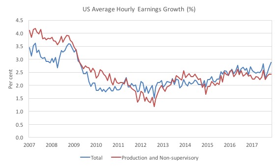
The first graph shows the annual movement in average hourly earnings in total and for Production and Non-supervisory workers. The BLS time series for the latter category began in March 2006.
Total nominal average hourly earnings rose by 2.5 per cent in the 12 months to November 2017, then 2.7 per cent, then 2.9 per cent in the 12 months to January 2018.
It is this acceleration that has lead to the commentators seizing on the ‘wages breakout’ thesis. The problem is that they have examined the data carefully enough.
Production and nonsupervisory employees accounted for 103,403 thousand workers in January 2018 in the non-farm sector. Total private non-farm employment in January 2018 was 125,482 thousand.
In other words, 82.4 per cent of private US non-farm employment are accounted for by Production and nonsupervisory employees
The graph shows that for these workers – the predominant majority in the US labour market – wages growth has been largely flat since 2013 with a dip in 2015.
The annual rate of growth has been sitting on around 2.3 to 2.4 per cent since 2009 (with monthly fluctuations around that attractor).
The conclusion is that for the vast majority of workers there is no acceleration in wages in the US.
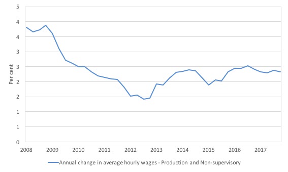
To provide a closer-up image, the following graph shows the annual growth in average hourly earnings for production and nonsupervisory workers from the March-quarter 2008 to the December-quarter 2018.
No acceleration going on there.
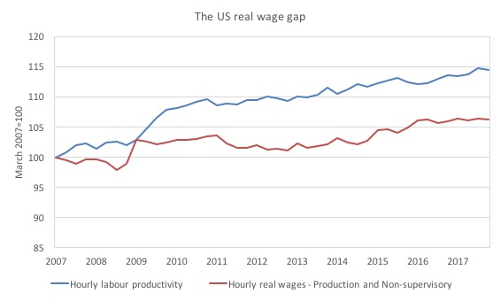
The next graph shows the movements in hourly labour productivity for Production and nonsupervisory employees and their real wages – indexed to 100 in the March-quarter 2007.
As I have explained before, if productivity outstrips real wages growth, then these workers are losing wage share and shifting the difference to profits (or other workers – the top-end of the distribution)
The US real wage gap (labour productivity growth minus real wages growth) is pronounced. Labour productivity (output per hour) has grown by 14.4 per cent since the March-quarter 2007, whereas real hourly wages have only grown by 6.3 per cent over the same time period.
In the last few years, real hourly wages growth has been virtually non-existent (as the graph shows).
And, of course, these indexes understate the redistribution. If I had have started the base year in the 1990s, for example, the gap now would be much wider.
Payroll employment trends
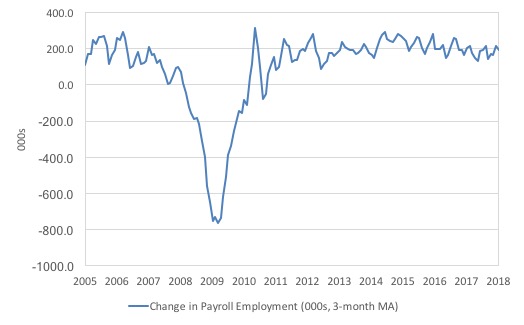
The first graph shows the monthly change in payroll employment (in thousands, expressed as a 3-month moving average to take out the monthly noise).
The monthly changes were stronger in 2014 and 2015, and then dipped in the first-half of 2016. By the end of 2016, job creation was stronger but then it tailed off again, somewhat.
Payroll employment change has steadily fallen per month (with fluctuations) since around 2015.
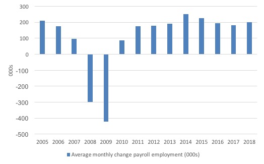
The next graph shows the same data in a different way – in this case the graph shows the average net monthly change in payroll employment (actual) for the calendar years from 2005 to 2017.
The slowdown that began in 2015 is continuing.
The average change in 2017 was 171 thousand, which is down from the 187 thousand average throughout 2016.
The average net change in 2014 was 250 thousand, in 2015 it was 226 thousand.
The 2018 average is obviously just for January.
Labour Force Survey – employment growth positive this month
In January 2018, employment as measured by the household survey rose by 0.27 per cent (409 thousand) while the labour force grew by 0.32 per cent (518 thousand) and the participation rate was steady.
As a result, total unemployment rose by 108 thousand.
The monthly data has fluctuated considerably lately so it is a little hard to be definitive.
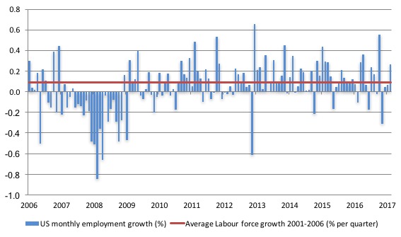
The next graph shows the monthly employment growth since the low-point unemployment rate month (December 2006). The red line is the average labour force growth over the period December 2001 to December 2006 (0.09 per cent per month).
The growth in January 2018 was above the pre-crisis average labour force growth and the average pre-crisis monthly employment growth of 0.11 per cent, which is a good sign.
What is apparent is that there is still no coherent positive and reinforcing trend in employment growth in the US labour market since the recovery began back in 2009. There are still many months where employment growth, while positive, remains relatively weak when compared to the average labour force growth prior to the crisis or is negative.
The sharp positive spike in September 2017 is clearly an outlier as is (to a certain extent) the negative spike in October 2017.
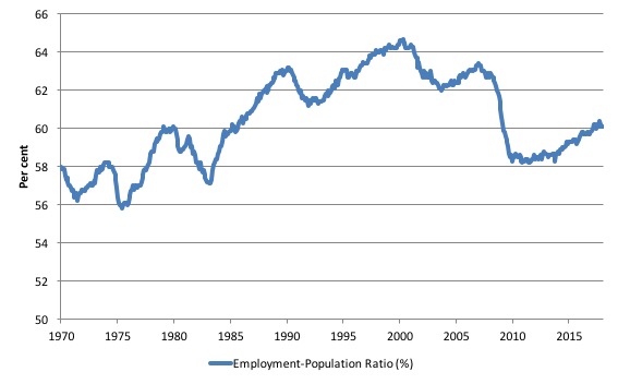
A good measure of the strength of the labour market is the Employment-Population ratio given that the movements are relatively unambiguous because the denominator population is not particularly sensitive to the cycle (unlike the labour force).
The following graph shows the US Employment-Population from January 1970 to January 2018. While the ratio fluctuates a little, the January 2018 outcome was stable at 60.1 per cent.
Over the longer period though, we see that the ratio remains well down on pre-GFC levels (peak 63.4 per cent in December 2006), which is a further indication of how weak the recovery has been so far and the distance that the US labour market is from being at full capacity (assuming that the December 2006 level was closer to that state).
Unemployment trends
The trends in unemployment by ethnicity are interesting in the US.
Two questions arise:
1. Is the Black and African American unemployment rate higher than it was before the GFC, given that the White unemployment rate is now around its lower levels?
2. Has the relationship between the Black and African American unemployment rate and the White unemployment rate deteriorated since the GFC?
The answer to both questions is Possibly, given that the Black and African American unemployment rate rose sharply in January 2018.
The first graph shows the history of BLS unemployment rates for Black and African Americans, Hispanics and Whites.
You can see that they all cycle together as economic activity cycles. You can also see that the Black and African American unemployment rate is currently at 7.7 per cent, which is slightly above the pre-GFC minimum achieved of 7.6 per cent (August 2007).
The rate rose from 6.8 per cent in December 2017 to 7.7 in January 2018. It is too early to say whether that marks a new phase of rising rates for this cohort.
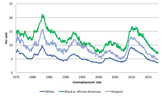
Meanwhile, the White unemployment rate fell in January from 3.7 to 3.5 per cent.
The second graph shows the Black and African American unemployment rate to White unemployment rate (ratio) from November 2007 (index = 100), when the White unemployment rate was at its previous lowest level.
This graph allows us to see whether the relative position of the two cohorts has changed since the crisis.
The data shows that, in fact, Black and African Americans are slightly worse off in relative terms now (January 2018) than they were a decade ago.
The ratio index stands at 106.1, meaning that that the Black and African American to White unemployment rate ratio has risen by 6 percentage points.
However, the ratio jumped from 88.6 to 106.1 points in January alone as a result of the divergent movements in the two unemployment rates making up the ratio.
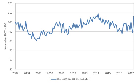
The deterioration in the Black and African American unemployment situation in January provides further evidence that the US economy is not moving closer to full employment.
The US jobs deficit
As noted in the Overview, the current participation rate of 62.7 per cent is a long way below the most recent peak in December 2006 of 66.4 per cent.
When times are bad, many workers opt to stop searching for work while there are not enough jobs to go around. As a result, national statistics offices classify these workers as not being in the labour force (they fail the activity test), which has the effect of attenuating the rise in official estimates of unemployment and unemployment rates.
These discouraged workers are considered to be in hidden unemployment and like the officially unemployed workers are available to work immediately and would take a job if one was offered.
In most advanced nations, the population is shifting towards older workers who have lower participation rates – so the US is not special in this regard.
Thus some of the decline in the total participation rate could simply being an averaging issue – more workers who have a lower participation rate as a proportion of the total workforce.
In this recent blog post (November 7, 2017) – Updating the impact of ageing labour force on US participation rates – I estimated that about 61 per cent of the decline in the participation rate since January 2008 has been due to non-cyclical shifts in the demographic weights.
That is, the shift in the age composition of the working age population towards older workers with lower participation rates accounted for about 61 per cent of the actual decline since January 2008.
So, even if we take out the estimated demographic effect (the trend), we are still left with a significant cyclical response.
What does that mean for the underlying unemployment?
The labour force changes as the underlying working age population grows and with changes in the participation rate.
If we adjust for the ageing component of the declining participation rate and calculate what the labour force would have been given the underlying growth in the working age population if participation rates had not declined since January 2008 then we can estimate the change in hidden unemployment since that time due to the sluggish state of the US labour market.
Adjusting for the demographic effect would give an estimate of the participation rate in January 2018 of 64.1 if there had been no cyclical effects (1.4 percentage points up from the current 62.7 per cent).
It is hard to claim that these withdrawals reflect structural changes (for example, a change in preference with respect to retirement age, a sudden increase in the desire to engage in full-time education).
To compute these job gaps we have to set a ‘full employment’ benchmark. In the past, I have set it at 4.1 per cent, which is where the US labour market is currently sitting.
I doubted that 4.1 per cent was the true irreducible minimum unemployment rate that could be sustained in the US. For example, if the government offered an unconditional Job Guarantee at an acceptable minimum wage there would be a sudden reduction in the national unemployment rate which would take it to well below 4.1 per cent without any significant inflationary impacts (via aggregate demand effects).
In that sense, my estimates should be considered the best-case scenario given that I actually think the cyclical losses are much worse than I provide here.
Using the estimated potential labour force (controlling for declining participation), we can compute a ‘necessary’ employment series which is defined as the level of employment that would ensure on 4.1 per cent of the simulated labour force remained unemployed.
This time series tells us by how much employment has to grow each month (in thousands) to match the underlying growth in the working age population with participation rates constant at their January 2007 peak – that is, to maintain the 4.1 per cent unemployment rate benchmark.
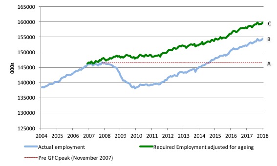
I computed the ‘necessary’ employment series based on the age-adjusted potential labour force (dark green line in the following graph).
The light blue line is the actual employment as measured by the BLS and the dotted red line is the level of employment that prevailed in November 2007 (the peak before the crisis).
This allows us to calculate how far below the age-adjusted 4.1 per cent unemployment rate (constant participation rate) the US employment level currently is.
There are two effects:
- The actual loss of jobs between the employment peak in November 2007 and the trough (January 2010) was 8,582 thousand jobs. However, total employment is now above the January 2008 peak by 7,835 thousand jobs. This gain in jobs is measured by the AB gap in the graph which shows the gap in employment relative to the November 2007 peak (the dotted red line is an extrapolation of the peak employment level). You can see that it wasn’t until August 2014 that the US labour market reached the November 2007 peak employment level again.
- The shortfall of jobs (the overall jobs gap) is the actual employment relative to the jobs that would have been generated had the demand-side of the labour market kept pace with the underlying population growth (Required Employment Adjusted for Ageing) – that is, with the participation rate at its January 2008 value and the unemployment rate was constant at 4.1 per cent. This shortfall loss amounts to 5,407 thousand jobs. This is the segment BC measured as at January 2018.
The US Jobs Gap is thus the departure of current employment from the level of employment that would have generated a 4.1 per cent unemployment rate, given current population trends.
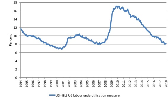
To put that into further perspective, the following graph shows the BLS measure U6, which is defined as:
Total unemployed, plus all marginally attached workers plus total employed part time for economic reasons, as a percent of all civilian labor force plus all marginally attached workers.
It is thus the broadest measure of labour underutilisation that the BLS publish.
In December 2006, before the affects of the slowdown started to impact upon the labour market, the measure was estimated to be 7.9 per cent.
It is now at 8.2 per cent (having risen from 8 per cent in November 2017).
The U-6 measure remains above the trough of the early 2000s, and remains marginally above its pre-GFC level.
The low-wage bias continues
This month I have updated the analysis on what I have been calling the low-wage employment bias in the US labour market recovery.
To see the full methodology I employed in making these calculations please read the blogs – US jobs recovery biased towards low-pay jobs and Bias toward low-wage job creation in the US continues.
The question: Is there a bias towards low-pays jobs in the recovery in the US?
Answer: bias continues.
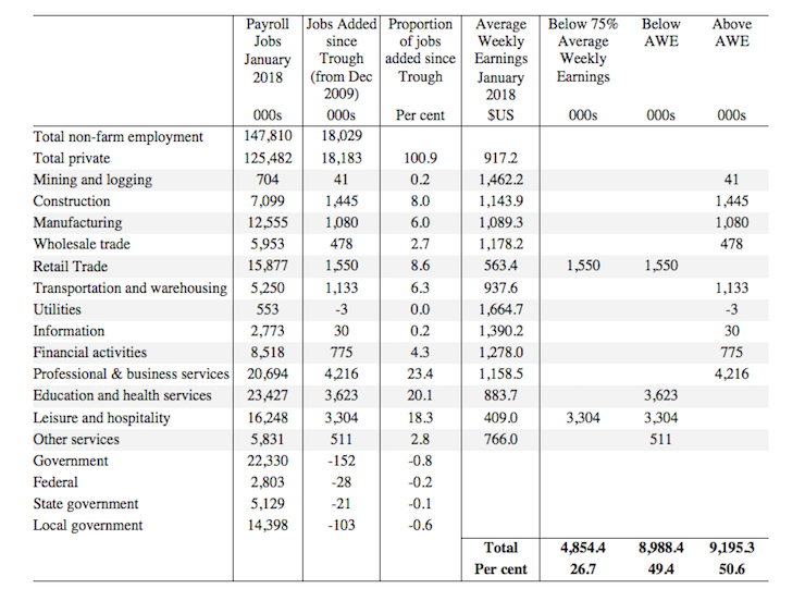
Effectively, since the recovery began in January 2010, there have been 18,184 thousand net jobs added to the US labour market (in the non-farm sector).
Of those net employment additions, 26.7 per cent have been what might be considered low-pay, where that is defined as less than 75 per cent of average weekly earnings.
And 49.4 per cent have been in below-average paying jobs.
Previously, I have calculated what happened in the downturn with respect to the jobs lost in net terms and their pay characteristics (at a sectoral level).
Please read my blog – US labour market – improves in August but still no growth trend is apparent – for more discussion on this point.
The main conclusions were:
1. Peak US non-farm employment occurred in January 2008 (138,430 thousand) and the trough occurred in December 2009 (129,778 thousand).
2. The job losses for the top-level North American Industry Classification System (2012 NAICS) were calculated from peak (January 2008) to the trough (December 2009).
3. Overall 8.7 million jobs were lost – with 8.8 million lost in the private sector and they were only partially offset by the 94,000 net jobs added in the government sector.
4. In the downturn, 21.1 per cent of the jobs lost (net) were in sectors that paid on average below 75 per cent of the overall private sector average pay (that is, low-pay jobs).
5. 86.1 per cent of the total jobs lost in the downturn were in sectors were paying above average pay.
The following table summarises what happened in the period from the trough to the most recent monthly data observation (January 2018).
The second column shows the latest BLS payroll employment data as at January 2018. The next column shows the number of net jobs (in thousands) that have been added by each sector since the trough in December 2009.
The next column shows the percentage of those total jobs added by sector. You can see that with the Government sector in contraction the total jobs added in the Private sector are 100.9 per cent of the total net jobs added.
The fourth column shows the Average Weekly Earnings for each sector as at November 2017.
The final three columns split these job additions into their pay characteristics using the sectoral average weekly earnings and the same criteria as in the previous example.
The summary statistics for each ‘pay category’ (75% of Average Pay, Below Average Pay, Above Average Pay) are at the bottom of each column.
We find that:
1. Government employment has contracted in the expansion by 152 thousand. This has been particularly evident at the State and Local Government level as fiscal austerity has been imposed.
2. 26.7 per cent of the total private jobs added could be considered low-pay, that is, in sectors that pay on average weekly wage 75 per cent below the total private sector average weekly earnings.
3. 49.4 per cent of the private jobs created (net) since the recovery began pay below average weekly earnings. That proportion was 48.6 per cent in November 2017. So despite the claims about wages pressures, a higher proportion of the jobs created in the last two months have been in below-average pay jobs.
4. The data shows that the low-paid private jobs that were lost in the downturn (1,843.8 thousand) have been more than added back (in net terms) in the upturn so far.
5. The above average pay private jobs that were lost in the downturn (7,528.8 thousand) have now been more than added back in net terms (9,044.9 thousand).
6. The bias in the recovery towards low-paid private jobs in the US has increased slightly since the GFC began. In January 2008, low-pay jobs constituted 25.1 per cent of total private jobs and this proportion has risen to 25.6 per cent by January 2018.
7. A similar increase in the proportion of below-average jobs since January 2008 is observed, from 46.2 per cent of the total to 48.9 per cent in January 2018.
Clearly, this analysis is at the aggregated NAICS level and a richer story could be told if we used the two-digit and three-digit typed drill downs into the industry classification.
Conclusion
The January labour market data release for the US show a labour market that is delivering steady outcomes from month to month but significant slack still remains.
Caution should always be exercised given the volatility of the monthly data.
The broader measure of labour underutilisation (U-6) rose slightly while the unemployment rate also edged up marginally as employment growth was outstripped by labour force growth.
I still do not think the US labour market is near to full employment. This assessment is reinforced by the fact that the participation rate is still well below where it was even after we adjust for the ageing effects (retirements), are bias towards low wage jobs continues, and the JOLTS dynamics suggest some slack.
Finally, despite the claims in the media that wages for US workers are in the process of ‘breaking out’, a closer look at the data shows that for 84 per cent of the private workforce (production and nonsupervisory) wages growth is steady and real wages growth close to zero.
That is enough for today!
(c) Copyright 2018 William Mitchell. All Rights Reserved.
Bill,
It has been suggested that the wage uplift was based on less hours worked by supervisors for the same pay rather than a wage increase ie bad weather or federal shutdown meant less hours worked?
Regards
Bill, you have set the US full unemployment benchmark rate at 4.1%. As you know, the unemployment rate in 1944, according to the BLS, was 1.2%, the lowest it has ever been in contemporary times. While 1944 was the penultimate year of the war, with the figure probably being the consequence of unusual conditions prevailing at the time, isn’t 4.1 still a tad too high? What would be wrong with 3.6% or 2.8%, say? I would have thought that 1.2% is the lowest one could go and, thus, a possibly ridiculous benchmark, so I can see why you aren’t going there.
Larry,
I don’t think Bill would disagree with you. In fact he said as much in the post. The way I read it is he maintained the 4.1% to illustrate the amount of slack in the labour market. He goes on to say this results in a conservative estimate.
We will never know the level of full employment until a proper job guarantee paying a decent wage is put in place.
You wrote a blog like this when Drumpf was elected.
Media was saying jobs jobs jobs.
Turned out labor force growth out-stripped job growth so unemployment actually went up!
=(
Thanks, Chris. I was thinking it might be nice to attach a figure to a lower bound however loose it might be.
But something spooked the global capital market this week!
I assumed it was the prospect that labour’s share of the income distribution was finally on the rise and share prices fell to accommodate a decline on the return to invested capital.
If it wasn’t a much needed rebalancing of the income distribution, what was it?