The recent extreme weather in the northern hemisphere, the twin monster tropical storms in Japan,…
US labour market steady but low wage bias continues
On December 8, 2017, the US Bureau of Labor Statistics (BLS) released their latest labour market data – Employment Situation Summary – November 2017 – which showed that total non-farm employment from the payroll survey rose by 228,000 in November, slightly less than the October net increase. While the payroll data showed a fairly strong employment outcome, the Labour Force Survey data estimated a weaker rise in employment (57 thousand) in November. The labour force was estimated to have risen by 148 thousand after October’s results showing a sharp contraction. The BLS thus estimated that unemployment rose by 90 thousand and the official unemployment rate rose slightly from 4.07 to 4.12 per cent. There is still a large jobs deficit remaining and other indicators suggest the labour market is still below where it was prior to the crisis. I also update my ‘low-wage jobs bias’ to November 2017 and conclude that in the recovery, there has been a bias towards low wage and below-average wage job creation.
Overview – Total employment rose by 57 thousand in November 2017
For those who are confused about the difference between the payroll (establishment) data and the household survey data you should read this blog – US labour market is in a deplorable state – where I explain the differences in detail.
See also the – Employment Situation FAQ – provided by the BLS, itself.
The BLS say that:
The establishment survey employment series has a smaller margin of error on the measurement of month-to-month change than the household survey because of its much larger sample size. … However, the household survey has a more expansive scope than the establishment survey because it includes self-employed workers whose businesses are unincorporated, unpaid family workers, agricultural workers, and private household workers …
Focusing on the Household Labour Force Survey data, the seasonally adjusted labour force rise by 148 thousand in November 2017 with the participation rate steady at 62.7 per cent.
Total employment rose by a 57 thousand in net terms, which means that official unemployment rose by 90 thousand.
The official unemployment rate rose marginally to 4.12 per cent (from 4.07 per cent).
The November 2017 participation rate of 62.7 per cent is still far below the peak in December 2006 (66.4 per cent).
Adjusting for the ageing effect (see below), the rise in those who have given up looking for work for one reason or another since December 2006 is around 3.9 million workers.
If we added them back into the labour force and considered them to be unemployed (which is not an unreasonable assumption given that the difference between being classified as officially unemployed against not in the labour force is solely due to whether the person had actively searched for work in the previous month) – we would find that the current US unemployment rate would be around 6.3 per cent rather than the official estimate of 4.1 per cent.
That provides a quite different perspective in the way we assess the US recovery.
Conclusion: on that basis, the US labour market is still a long way from where it was at the end of 2007, even though the U-6 Broad indicator has now returned to its pre-GFC level (see below).
Payroll employment trends
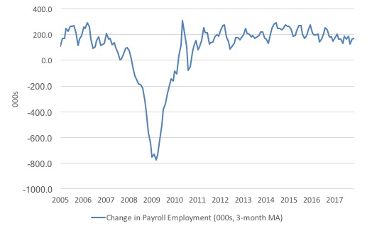
The first graph shows the monthly change in payroll employment (in thousands, expressed as a 3-month moving average to take out the monthly noise).
The monthly changes were stronger in 2014 and 2015, and then dipped in the first-half of 2016. By the end of 2016, job creation was stronger but then it tailed off again, somewhat.
It has been fairly steady if not slightly subdued throughout 2017 apart from the Hurricane-affected September result.
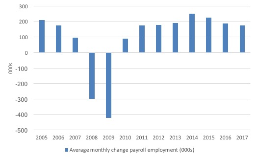
The next graph shows the same data in a different way – in this case the graph shows the average net monthly change in payroll employment (actual) for the calendar years from 2005 to 2017. Clearly, the average for 2017 is for January to November only.
The slowdown that began in 2015 is continuing.
The average change so far in 2017 to November is 174 thousand, which is down from the 187 thousand average throughout 2016.
The average net change in 2014 was 250 thousand, in 2015 it was 226 thousand.
Labour Force Survey – employment growth positive this month
In November 2017, employment as measured by the household survey fell by 0.04 per cent (57 thousand) while the labour force grew by 0.09 per cent (148 thousand) and the participation rate was steady.
We should note that the monthly data has been all over the place lately so it is a little hard to be definitive.
I expect there to be further revisions in the employment outcome when the data comes out next month. Please read – Employment Situation Technical Note – for more on why the data accuracy may vary from month to month.
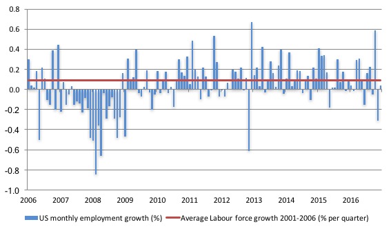
The next graph shows the monthly employment growth since the low-point unemployment rate month (December 2006). The red line is the average labour force growth over the period December 2001 to December 2006 (0.09 per cent per month).
What is apparent is that no coherent positive and reinforcing trend in employment growth has been established in the US labour market since the recovery began back in 2009. There are still many months where employment growth, while positive, remains relatively weak when compared to the average labour force growth prior to the crisis or is negative.
The sharp positive spike in September is clearly an outlier as is (to a certain extent) the negative spike in October.
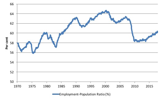
A good measure of the strength of the labour market is the Employment-Population ratio given that the movements are relatively unambiguous because the denominator population is not particularly sensitive to the cycle (unlike the labour force).
The following graph shows the US Employment-Population from January 1970 to November 2017. While the ratio fluctuates a little, the November 2017 outcome (60.1 per cent) was 0.1 points down from the previous month.
Over the longer period though, we see that the ratio remains well down on pre-GFC levels (peak 63.4 per cent in December 2006), which is a further indication of how weak the recovery has been so far.
Unemployment trends
I noted the UK Guardian commentary (December 8, 2017) – Five reasons the US job market is not as rosy as it looks – made a point of the different unemployment rates for blacks versus whites in the US as a reason for concluding that the US labour market is underperforming.
The journalist wrote:
Unemployment rates still vary widely by race and age. White unemployment is just 3.6%, the rate for African Americans is more than twice that at 7.3%. Teens are unemployed at a rate of 15.9%.
The data, however, does not necessarily support the conclusion drawn, given that Black or African American unemployment rates are a always higher than White American unemployment rates.
Two questions arise to help us assess the Guardian’s claim:
1. Is the Black and African American unemployment rate higher than it was before the GFC, given that the White unemployment rate is now around its lower levels?
2. Has the relationship between the Black and African American unemployment rate and the White unemployment rate deteriorated since the GFC?
The answer to both questions (in order) is No and No.
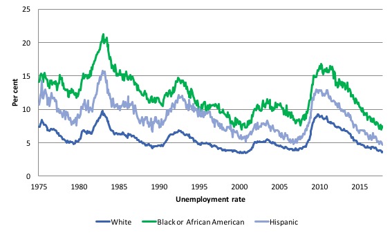
The first graph shows the history of BLS unemployment rates for Black and African Americans, Hispanics and Whites.
You can see that they all cycle together as economic activity cycles. You can also see that the Black and African American unemployment rate is currently at 7.3 per cent, which the Guardian article notes, but when the official total unemployment rate was at its previous lowest level (May 2007) of 4.4 per cent (that is, before the GFC cycle began), the Black and African American unemployment rate was 8.3 per cent.
So the current Black and African American unemployment rate is better than it was leading into the GFC. It is still way to high but just because it is higher than the White rate, one cannot draw the conclusions that the Guardian article does.
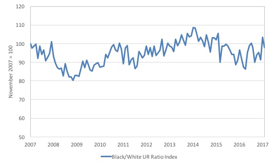
The second graph shows the Black and African American unemployment rate to White unemployment rate (ratio), indexed to 100 at November 2007, when the White rate was at its previous lowest level.
This graph allows us to see whether the relative position of the two cohorts has changed since the crisis.
The data shows that, in fact, Black and African Americans are slightly better off in relative terms now (November 2017) than they were a decade ago.
The ratio index stands at 97.8, meaning that that the Black and African American to White unemployment rate ratio has fallen.
Again, this negates the conclusion drawn by the UK Guardian.
Which is not to say their overall conclusion that the US labour market is “not as rosy at it looks”. That conclusion is supported by other data, which I discuss below.
The US jobs deficit
As noted in the Overview, the current participation rate of 62.7 per cent is a long way below the most recent peak in December 2006 of 66.4 per cent.
When times are bad, many workers opt to stop searching for work while there are not enough jobs to go around. As a result, national statistics offices classify these workers as not being in the labour force (they fail the activity test), which has the effect of attenuating the rise in official estimates of unemployment and unemployment rates.
These discouraged workers are considered to be in hidden unemployment and like the officially unemployed workers are available to work immediately and would take a job if one was offered.
In most advanced nations, the population is shifting towards older workers who have lower participation rates – so the US is not special in this regard.
Thus some of the decline in the total participation rate could simply being an averaging issue – more workers who have a lower participation rate as a proportion of the total workforce.
In this recent blog (November 7, 2017) – Updating the impact of ageing labour force on US participation rates – I estimated that about 61 per cent of the decline in the participation rate since January 2008 has been due to non-cyclical shifts in the demographic weights.
That is, the shift in the age composition of the working age population towards older workers with lower participation rates accounted for about 61 per cent of the actual decline since January 2008.
But, even if we take out the estimated demographic effect (the trend), we are still left with a significant cyclical response.
What does that mean for the underlying unemployment?
The labour force changes as the underlying working age population grows and with changes in the participation rate.
If we adjust for the ageing component of the declining participation rate and calculate what the labour force would have been given the underlying growth in the working age population if participation rates had not declined since January 2008 then we can estimate the change in hidden unemployment since that time due to the sluggish state of the US labour market.
Adjusting for the demographic effect would give an estimate of the participation rate in November 2017 of 64.9 if there had been no cyclical effects (2.2 percentage points up from the current 62.7 per cent).
It is hard to claim that these withdrawals reflect structural changes (for example, a change in preference with respect to retirement age, a sudden increase in the desire to engage in full-time education).
To compute these job gaps we have to set a ‘full employment’ benchmark. In the past, I have set it at 4.1 per cent, which is where the US labour market is currently sitting.
I doubted that 4.1 per cent was the true irreducible minimum unemployment rate that could be sustained in the US. For example, if the government offered an unconditional Job Guarantee at an acceptable minimum wage there would be a sudden reduction in the national unemployment rate which would take it to well below 4.1 per cent without any significant inflationary impacts (via aggregate demand effects).
In that sense, my estimates should be considered the best-case scenario given that I actually think the cyclical losses are much worse than I provide here.
Using the estimated potential labour force (controlling for declining participation), we can compute a ‘necessary’ employment series which is defined as the level of employment that would ensure on 4.1 per cent of the simulated labour force remained unemployed.
This time series tells us by how much employment has to grow each month (in thousands) to match the underlying growth in the working age population with participation rates constant at their January 2007 peak – that is, to maintain the 4.1 per cent unemployment rate benchmark.
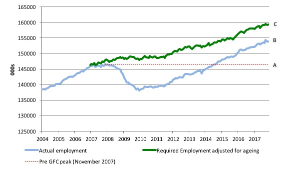
I computed the ‘necessary’ employment series based on the age-adjusted potential labour force (dark green line in the following graph).
The light blue line is the actual employment as measured by the BLS and the dotted red line is the level of employment that prevailed in November 2007 (the peak before the crisis).
This allows us to calculate how far below the age-adjusted 4.1 per cent unemployment rate (constant participation rate) the US employment level currently is.
There are two effects:
- The actual loss of jobs between the employment peak in November 2007 and the trough (January 2010) was 8,582 thousand jobs. However, total employment is now above the January 2008 peak by 7,323 thousand jobs. This gain in jobs is measured by the AB gap in the graph which shows the gap in employment relative to the November 2007 peak (the dotted red line is an extrapolation of the peak employment level). You can see that it wasn’t until August 2014 that the US labour market reached the November 2007 peak employment level again.
- The shortfall of jobs (the overall jobs gap) is the actual employment relative to the jobs that would have been generated had the demand-side of the labour market kept pace with the underlying population growth (Required Employment Adjusted for Ageing) – that is, with the participation rate at its January 2008 value and the unemployment rate was constant at 4.1 per cent. This shortfall loss amounts to 5,337 thousand jobs. This is the segment BC measured as at November 2017.
The US Jobs Gap is thus the departure of current employment from the level of employment that would have generated a 4.1 per cent unemployment rate, given current population trends.
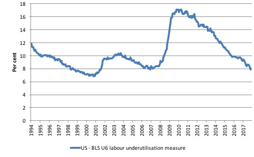
To put that into further perspective, the following graph shows the BLS measure U6, which is defined as:
Total unemployed, plus all marginally attached workers plus total employed part time for economic reasons, as a percent of all civilian labor force plus all marginally attached workers.
It is thus the broadest measure of labour underutilisation that the BLS publish.
In December 2006, before the affects of the slowdown started to impact upon the labour market, the measure was estimated to be 7.9 per cent.
It is now at 8 per cent (having risen from 7.9 per cent in October).
The U-6 measure remains above the trough of the early 2000s, but has now largely returned to its pre-GFC level.
The low-wage bias continues
My feature on the US labour market this month focuses on the quality of employment being created in the US – or what I have called in previous blogs the low-wage employment bias.
To see the full methodology I employed in making these calculations please read the blogs – US jobs recovery biased towards low-pay jobs and Bias toward low-wage job creation in the US continues.
The question: Is there a bias towards low-pays jobs in the recovery in the US?
Answer: bias continues.
Effectively, since the recovery began in January 2010, there have been 17,463 thousand net jobs added to the US labour market (in the non-farm sector).
Of those net employment additions, 26.1 per cent have been what might be considered low-pay, where that is defined as less than 75 per cent of average weekly earnings.
Previously, I have calculated what happened in the downturn with respect to the jobs lost in net terms and their pay characteristics (at a sectoral level).
Please read my blog – US labour market – improves in August but still no growth trend is apparent – for more discussion on this point.
The main conclusions were:
1. Peak US non-farm employment occurred in January 2008 (138,430 thousand) and the trough occurred in December 2009 (129,778 thousand).
2. The job losses for the top-level North American Industry Classification System (2012 NAICS) were calculated from peak (January 2008) to the trough (December 2009).
3. Overall 8.7 million jobs were lost – with 8.8 million lost in the private sector and they were only partially offset by the 94,000 net jobs added in the government sector.
4. In the downturn, 21.1 per cent of the jobs lost (net) were in sectors that paid on average below 75 per cent of the overall private sector average pay (that is, low-pay jobs).
5. 86.1 per cent of the total jobs lost in the downturn were in sectors were paying above average pay.
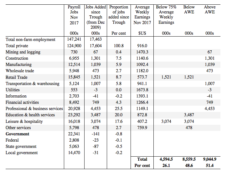
The following table summarises what happened in the period from the trough to the most recent monthly data observation (November 2017).
The second column shows the latest BLS payroll employment data as at November 2017. The next column shows the number of net jobs (in thousands) that have been added by each sector since the trough in December 2009.
The next column shows the percentage of those total jobs added by sector. You can see that with the Government sector in contraction the total jobs added in the Private sector are 100.8 per cent of the total net jobs added.
The fourth column shows the Average Weekly Earnings for each sector as at November 2017.
The final three columns split these job additions into their pay characteristics using the sectoral average weekly earnings and the same criteria as in the previous example.
The summary statistics for each ‘pay category’ (75% of Average Pay, Below Average Pay, Above Average Pay) are at the bottom of each column.
We find that:
1. Government employment has contracted in the expansion by 141 thousand. This has been particularly evident at the State and Local Government level as fiscal austerity has been imposed.
2. 26.1 per cent of the total private jobs added could be considered low-pay, that is, in sectors that pay on average weekly wage 75 per cent below the total private sector average weekly earnings.
3. 48.6 per cent of the private jobs created (net) since the recovery began pay below average weekly earnings. That proportion was 50.4 per cent in May 2016.
4. The data shows that the low-paid private jobs that were lost in the downturn (1,843.8 thousand) have been more than added back (in net terms) in the upturn so far.
5. The above average pay private jobs that were lost in the downturn (7,528.8 thousand) have now been more than added back in net terms (9,044.2 thousand).
6. The bias in the recovery towards low-paid private jobs in the US has increased slightly since the GFC began. In January 2008, low-pay jobs constituted 25.1 per cent of total private jobs and this proportion has risen to 25.5 per cent by November 2017.
7. A similar increase in the proportion of below-average jobs since January 2008 is observed, from 46.2 per cent of the total to 48.8
per cent in November 2017.
Clearly, this analysis is at the aggregated NAICS level and a richer story could be told if we used the two-digit and three-digit typed drill downs into the industry classification.
Conclusion
The November labour market data release for the US show a labour market that is delivering steady outcomes from month to month but significant slack still remains.
Caution should always be exercised given the volatility of the monthly data.
The broader measure of labour underutilisation (U-6) has now largely returned to its pre-GFC level and unemployment rate remains at low levels (although it could go lower with the introduction of a Job Guarantee).
I still do not think the US labour market is near to full employment. This assessment is reinforced by the fact that the participation rate is still well below where it was even after we adjust for the ageing effects (retirements) and the bias towards low wage jobs continues.
That is enough for today!
(c) Copyright 2017 William Mitchell. All Rights Reserved.
I take it that the 100.8% is a rounding error, possibly generated by Excel? I realize that percentages are used that go above 100, but not usually in technical contexts.
It would be nice to have a summary like this of the UK employment situation, after the execrable Budget which was supposed to fix what was to be fixed. That it didn’t is not a surprise.
Thanks for the analysis.
I thought government was getting bigger but no 141 thousand jobs lost.
Soldiers are hired by government no? so here they fall within the federal government slot then?
I just checked online and US military personals have steadily dropped in number.
Maybe thats why I saw an ad on youtube for 40,000 USD bonus for signing up with military.
Regarding the situation of older workers, things are not very good for the older unemployed and I wonder what impact this has on participation rates.
“A stunning 33% of job seekers ages 55 and older are long-term unemployed, according to the AARP Public Policy Institute. The average length of unemployment for the roughly 1.2 million people 55+ who are out of work: seven to nine months. ”
[Bill edited out unnecessary link]