The income and wealth inequality that continues to grow in most advanced nations has led…
US labour market deteriorating – the losses from GFC will be long-lived
In September 2016, I assessed that – The US labour market is nowhere near full employment. This was in the context of an increasing number of commentators claiming that the US economy had already returned to full employment. The IMF World Economic Outlook is also estimating that the output gap in the US (actual relative to potential) has turned positive (meaning the US is beyond full employment). By way of contrast, the Congressional Budget Office considers the US had an output gap of around 0.9 per cent (actual below potential) in the December-quarter 2016. The facts point to even higher output gaps. The current BLS data release – Employment Situation Summary – January 2017 – has not altered my view. It showed that total non-farm employment from the payroll survey rose by 227,000 and the unemployment rate remained “little changed” at 4.8 per cent. But from the perspective of the labour force survey (Current Population Survey), total employment fell by 30 thousand. See below for an explanation of that paradox. The point is that employment still remains well below the pre-GFC peak and the jobs that have been created in the recovery are biased towards low pay. Additional research reveals that the losses from this sluggish economic performance will be long-lived and undermine the prospects of future generations. Fiscal austerity is bad for our grandchildren! In general, the problem is less job creation as quality of the work being created and the capacity of US workers to enjoy wage increases.
Overview
For those who are confused about the difference between the payroll (establishment) data and the household survey data you should read this blog – US labour market is in a deplorable state – where I explain the differences in detail.
See also the – Employment Situation FAQ – provided by the BLS, itself.
The BLS say that:
The establishment survey employment series has a smaller margin of error on the measurement of month-to-month change than the household survey because of its much larger sample size. … However, the household survey has a more expansive scope than the establishment survey because it includes self-employed workers whose businesses are unincorporated, unpaid family workers, agricultural workers, and private household workers …
Focusing on the Household Labour Force Survey data, the seasonally adjusted labour force rose by by 76 thousand in January 2017 and the participation rate rose by 0.2 points.
Total employment fell by 30 thousand in net terms, and as a consequence, official unemployment rose by 106 thousand.
The unemployment rate eased from 4.72 per cent to 4.78 per cent.
In the 2015 calendar year, total employment rose by 2,509 thousand (or 209 thousand average per month). In the 2016, employment only rose by an average of 172 thousand each month or 2,081 thousand for the year.
The growth in the US labour market has thus slowed considerably.
The US economy has been undermining standard wage employment since 2005 (see – All net jobs in US since 2005 have been non-standard) and has demonstrated a bias towards low-wage job creation (see Bias toward low-wage job creation in the US continues).
Further, the January participation rate, which up on December, was still only 62.9 per cent and still far below the peak in December 2006 (66.4).
Adjusting for the ageing effect (see US labour market – some improvement but still soft for an explanation of this effect), the rise in those who have given up looking for work (discouraged) since December 2006 is around 295 thousand workers.
If we added them back into the labour force and considered them to be unemployed (which is not an unreasonable assumption given that the difference between being classified as officially unemployed against not in the labour force is solely due to whether the person had actively searched for work in the previous month) – we would find that around 3,698 thousand workers have exited the labour force due to lack of employment opportunities, which would make the current US unemployment rate around 6.8 per cent rather than the official estimate of 4.8 per cent.
That provides a quite different perspective in the way we assess the US recovery.
The US labour market is still a long way from where it was at the end of 2007.
Employment growth faltering
In January 2016, employment fell by 0.02 per cent, while the labour force rose by 0.05 per cent.
It seems that 2017 is continuing the deterioration that emerged in 2016.
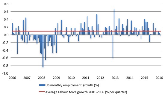
The following graph shows the monthly employment growth since the low-point unemployment rate month (December 2006). The red line is the average labour force growth over the period December 2001 to December 2006 (0.0910 per cent per month).
What is apparent is that a strong positive and reinforcing trend in employment growth has not yet been established in the US labour market since the recovery began back in 2009. There are still many months where employment growth, while positive, remains relatively weak when compared to the average labour force growth prior to the crisis.
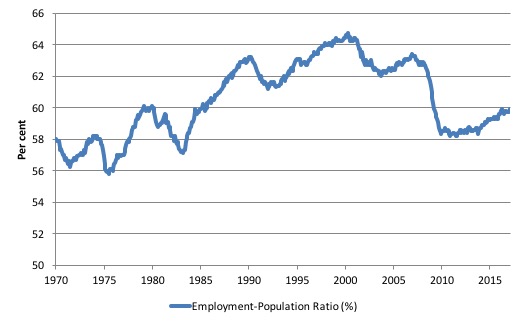
A good measure of the strength of the labour market is the Employment-Population ratio given that the movements are relatively unambiguous because the denominator population is not particularly sensitive to the cycle (unlike the labour force).
The following graph shows the US Employment-Population from January 1970 to January 2017. While the ratio fluctuates a little, the January outcome (59.9 per cent) was up by 0.2 points on December.
But it remains well down on pre-GFC levels (peak 63.4 per cent in December 2006), which is a further indication of how weak the recovery has been so far.
This result also shows why we have to be careful in dealing with monthly survey data, when the underlying populations are not collected on a monthly basis.
The BLS data is telling us that employment fell by 30 thousand in January 2017 (net). So how can the employment-population ratio rise? The answer is their population benchmark for January suggests that the Working Age population fell by 516 thousand.
Even Donald Trump hasn’t had that effect!
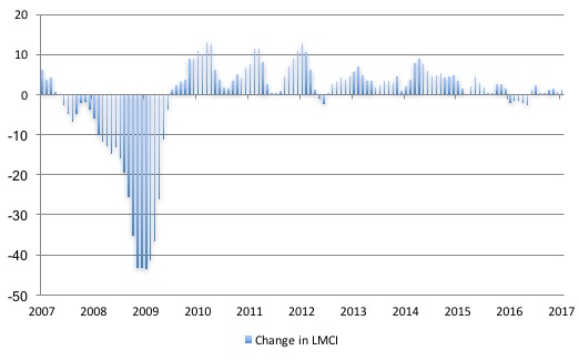
Federal Reserve Bank Labor Market Conditions Index (LMCI)
The Federal Reserve Bank of America has been publishing a new indicator – Labor Market Conditions Index (LMCI) – which is derived from a statistical analysis of 19 individual labour market measures since October 2014.
It is now being watched by those who want to be the first to predict a rise in US official interest rates. Suffice to say that the short-run (monthly) changes in the LMCI are “assumed to summarize overall labor market conditions”.
A rising value (positive change) is a sign of an improving labour market, whereas a declining value (negative change) indicates the opposite.
You can get the full dataset HERE.
I discussed the derivation and interpretation of the LMCI in this blog – US labour market weakening.
In January 2017, the LMCI rose by 1.3 index points, and continues the relative weak trend downwards since 2015.
The following graph shows the FRB LMCI for the period January 2007 to January 2017.
We note that while unemployment is now lower than last year and the rate of hiring has stabilised after declining earlier in the year. The way these factors combine in the index leads to an overall assessment that the labour market has been in decline.
The fall away over the last nine months has been quite significant notwithstanding the July 2016 upturn.
The US jobs deficit
As noted in the Overview, the current participation rate (62.9 per cent) is a long way below the most recent peak in December 2006 of 66.4 per cent.
When times are bad, many workers opt to stop searching for work while there are not enough jobs to go around. As a result, national statistics offices classify these workers as not being in the labour force (they fail the activity test), which has the effect of attenuating the rise in official estimates of unemployment and unemployment rates.
These discouraged workers are considered to be in hidden unemployment and like the officially unemployed workers are available to work immediately and would take a job if one was offered.
But the participation rates are also influenced by compositional shifts (changing shares) of the different demographic age groups in the working age population. In most nations, the population is shifting towards older workers who have lower participation rates.
Thus some of the decline in the total participation rate could simply being an averaging issue – more workers are the average who have a lower participation rate.
I analysed this declining trend in this blog – Decomposing the decline in the US participation rate for ageing.
I updated that analysis to December 2015 and computed that the decline in the participation rate due to the shift in the age composition of the working age population towards older workers with lower participation rates accounted for about 58 per cent of the actual decline.
Thus, even if we take out the estimated demographic effect (the trend), we are still left with a massive cyclical response.
What does that mean for the underlying unemployment?
The labour force changes as the underlying working age population grows and with changes in the participation rate.
If we adjust for the ageing component of the declining participation rate and calculate what the labour force would have been given the underlying growth in the working age population if participation rates had not declined since December 2006 then we can estimate the change in hidden unemployment since that time due to the sluggish state of the US labour market.
Adjusting for the demographic effect would give an estimate of the participation rate in January 2017 of 64.5 if there had been no cyclical effects (1.6 percentage points up from the current 62.9 per cent).
So the 1.6 percentage point decline in the participation rate due to the downturn (net of ageing effect) amounts to 3,698 thousand workers who have left the labour force as a result of the cyclical sensitivity of the labour force.
It is hard to claim that these withdrawals reflect structural changes (for example, a change in preference with respect to retirement age, a sudden increase in the desire to engage in full-time education).
In January 2007 (at the peak participation rate which had carried over from December 2006), the US unemployment rate was 4.6 per cent (which was slightly higher than the 4.4 per cent low point recorded a month earlier in December 2006. It didn’t start to increase quickly until early 2008 and then the jump was sudden.
We can have a separate debate about whether 4.4 per cent constitutes full employment in the US. My bet is that if the government offered an unconditional Job Guarantee at an acceptable minimum wage there would be a sudden reduction in the national unemployment rate which would take it to well below 4.4 per cent without any significant inflationary impacts (via aggregate demand effects).
So I doubt 4.4 per cent is the true irreducible minimum unemployment rate that can be sustained in the US.
But we will use it as a benchmark so as not to get sidetracked into definitions of full employment. In that sense, my estimates should be considered the best-case scenario given that I actually think the cyclical losses are much worse than I provide here.
For those mystified by this statement – it just means that I think the economy was not at full employment in December 2006 and thus was already enduring some cyclical unemployment at that time.
Using the estimated potential labour force (controlling for declining participation), we can compute a ‘necessary’ employment series which is defined as the level of employment that would ensure on 4.4 per cent of the simulated labour force remained unemployed.
This time series tells us by how much employment has to grow each month (in thousands) to match the underlying growth in the working age population with participation rates constant at their January 2007 peak – that is, to maintain the 4.4 per cent unemployment rate benchmark.
I computed the ‘necessary’ employment series based on the age-adjusted potential labour force (dark green line in the following graph).
The light blue line is the actual employment as measured by the BLS and the dotted red line is the level of employment that prevailed in November 2007 (the peak before the crisis).
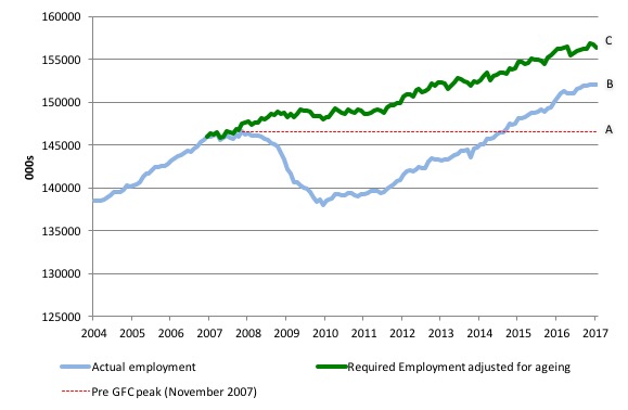
This allows us to calculate how far below the 4.4 per cent unemployment rate (constant participation rate) the US employment level currently is.
There are two effects:
- The actual loss of jobs between the employment peak in November 2007 and the trough (January 2010) was 8,582 thousand jobs. However, total employment is now above the January 2008 peak by 5,486 thousand jobs. This gain in jobs is measured by the AB gap in the graph which shows the gap in employment relative to the November 2007 peak (the dotted red line is an extrapolation of the peak employment level). You can see that it wasn’t until July 2014 that the US labour market reached the November 2007 peak employment level again.
- The shortfall of jobs (the overall jobs gap) is the actual employment relative to the jobs that would have been generated had the demand-side of the labour market kept pace with the underlying population growth (Required Employment Adjusted for Ageing) – that is, with the participation rate at its December 2006 peak and the unemployment rate constant at 4.4 per cent. This shortfall (BC) loss amounts to 4,249 thousand jobs. This is the segment BC measured as at January 2017.
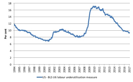
To put that into further perspective, the following graph shows the BLS measure U6, which is defined as:
Total unemployed, plus all marginally attached workers plus total employed part time for economic reasons, as a percent of all civilian labor force plus all marginally attached workers.
It is thus the broadest measure of labour underutilisation that the BLS publish.
In December 2006, before the affects of the slowdown started to impact upon the labour market, the measure was estimated to be 7.9 per cent. It now stands at 9.4 per cent (January 2017) up from 9.2 per cent in December.
It remains well above previous troughs, which suggests (along with the other signals presented above) that the labour market is still a long way from being considered ‘recovered’.
It means that while unemployment has declined modestly over the last year, underemployment and hidden unemployment have risen.
Estimating the losses from the GFC for the US
Which brings me to an interesting research paper I read last week – Can We Estimate the Cost of a Recession? – from some economists at the Wells Fargo organisation in the US.
Essentially, they take estimates of US potential output provided by the CBO in 2007 (so as to be untainted by what was to follow) and compare them to more recent CBO estimates of potential output and the actual evolution of real GDP, to come up with two insights:
1. The current output gap (using the more recent potential estimates as the benchmark; and
2. How far potential output has fallen as a result of the damage to private capital formation caused by the Great Recession – that is, lost investment.
The following graph is the reproduced Figure 1 from their paper and shows the three lines noted above (real GDP, the CBO potential estimate as at 2007 and the CBO potential estimate as at 2016.
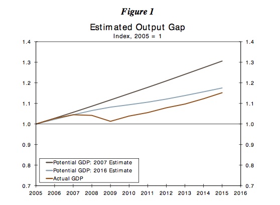
The authors note:
1. “the actual GDP series is below the vintage 2016 and significantly lower than the vintage 2007. This indicates that the U.S. economy has been unable to recover to its potential level.”
2. “the vintage 2016 is well below the vintage 2007 (potential GDP estimated published in 2007) and that implies the Great Recession has shifted the potential level of GDP downward.”
As I have noted many times, the costs of recession are both immediate and long-term. The immediate impacts are the lost incomes from rising unemployment as output gaps widen.
Also, working hours usually decline, participation rates fall and productivity slumps.
The longer term costs are then realised as the growth path flattens out due to the interruption to capacity building as investment stalls and the skill atrophies in the labour force.
Imposing fiscal austerity during a downturn magnifies these short- and long-run costs.
Which is why it is lunacy to invoke discretionary fiscal deficit cuts in the name of some misguided notion of intergenerational fairness (reducing debt burden for children type misguided notions).
The fiscal austerity ensures that the grandchildren suffer diminished prospects relative to what might have been.
My early work in the mid-1980s, which was a critique of the neo-liberal mainstream arguments about ‘natural rates of unemployment’ was focused on developing the concept of hysteresis.
This is the idea that where you is a product of where you have been.
It is an important concept in economics because it undermines the mainstream notion that the long-run is independent of the short-run.
For the layperson, this might be represented by the claim that pursuing some low inflation target no matter how much unemployment is created is not a problem because in the ‘long-run’ the unemployment will be at the ‘natural rate’ anyway. Of-course the notion is nonsense.
The long-run is thus never independent of the state of aggregate demand in the short-run. There is no invariant long-run state that is purely supply determined. History is a series of interlinked (co-dependent) short-runs.
By stimulating output growth now, governments also help relieve longer-term constraints on growth – investment is encouraged and workers become more mobile.
The problem compounds though, because the supply-side of the economy (potential) is influenced by the demand path taken and the longer is a recession (that is, the output gap), the broader the negative hysteretic forces become.
At some point, the productive capacity of the economy starts to fall towards the sluggish demand-side of the economy and the output gap closes at much lower levels of economic activity.
The following diagram is a stylised representation of how the demand-side and supply-sides interact following a recession to which helps us understand the long-run losses that arise if recessions are not prevented.
Unlike the mainstream macroeconomics approach, which assumes that the ‘long-run’ is supply-determined (by technology and population growth) and invariant to the demand conditions in the economy at any point in time, the diagram shows that the supply-side of the economy responds to particular demand conditions.
In terms of the following diagram, the potential output path is denoted by the green solid line noting the dotted green segment is tantamount to our red line in the above graph.
The potential output is the level of real output it would be forthcoming if all the available collective capacity (including Labour and equipment) was being fully utilised.
The diagram assumes, for simplicity, that potential real GDP assumes some constant growth in productive capacity driven by a smooth investment trajectory up until the point where it starts to flatten out.
If we assume that at the peak the economy was working at full capacity – that is, there was no output gap – then we can tell a story of what happens following an aggregate demand failure. The solid blue line is the actual path of real GDP.
You can see that the output gap opens up quickly as real GDP departs from the potential real GDP line. The area A measures the real output gap for the first x-quarters following the Trough.
As the economy starts growing again as aggregate demand starts to recover (perhaps on the back of a fiscal stimulus, perhaps as consumption or net exports improve) after the Trough, the real output gap start to close.
However, the persistence of the output gap over this period starts to undermine investment plans as firms become pessimistic about the future state of aggregate demand.
At some point, investment starts to decline and two things are observed: (a) the recovery in real output does not accelerate due to the constrained private demand; and (b) the supply-side of the economy (potential) starts to respond (that is, is influenced) by the path of aggregate demand takes over time.
Remember investment has dual characteristics. It adds to demand (spending) in the current period but adds to productive capacity in the future periods. It thus influences aggregate demand (now) and aggregate supply (later) – and that interdependency is crucial for understanding hysteresis.
As the recession endures, the capital stock of a nation either remains static or in extreme cases (such as in Greece) it will contract.
The pessimism by firms begins to reduce the potential real output of the economy (denoted by the divergence between the solid green line and the dotted green line).
The area B denotes a declining output gap arising from both these demand-side and supply-side effects. At some point, actual real output reaches potential real output – meaning the output gap is closed – but the overall growth rate is much lower than would have been the case if the economy has continued on its previous real output potential trajectory.
The entrenched recession is thus not only caused major national income losses while the output gap was open but is also made that the growth in national income possible in this economy is much lower and the nation, in material terms, is poorer as a consequence.
Moreover, the inflation barrier (that is, the point at which nominal aggregate demand is greater than the real capacity of the economy to absorb it) occurs at lower actual real output levels.
The estimated costs of the recession and fiscal austerity are much larger than the mainstream will ever admit
The point of the diagram is thus that the supply-side of the economy (potential) is influenced by the demand path taken.
Those who advocate austerity and the massive short-term costs that accompany it fail to acknowledge these inter-temporal costs.

The research paper I cited above provides actual estimates of these impacts.
They also study participation losses (noted in my commentary above), the decline in personal consumption, the loss of productivity and the investment gap.
Taking all these losses together, they find that:
1. “the estimated average annual loss in terms of GDP compared to vintage 2007 is 9.9 percent” – so compared to what the CBO thought potential GDP would be in 2007 before the induced losses of potential GDP occurred as a result of the GFC.
2. So the GFC, “on average, reduced the level of GDP by 9.9 per cent each year during the 2008-2015 period”.
3. When comparing the actual growth path to the revised (2016 CBO potential series), they found the “average annual GDP loss … is 3.8 per cent”.
4. “During the same time period, the average annual loss in employment is 7.8 percent”.
5. The “damages from the Great Recession are long lasting as the level (trend) of potential series (for all variables) has shifted downward. These results are consistent with the overall economic environment since the Great Recession. That is, a painfully slow recovery in the overall economy (GDP), along with slower growth in the personal income, employment, wages and business fixed investment is observed. In addition, monetary policy is still struggling to get back to ‘normal'”.
If I was to estimate output losses based on adjusted productivity growth and my jobs deficit analysis above, I would record slightly higher losses because the CBO potential GDP measures understate potential output (due to their use of the NAIRU).
But they would be in the ballpark – massive.
Conclusion
The evidence is fairly consistent across a range of measures – the mass unemployment in the US was the result of a systemic failure in that economy to produce enough jobs, which emerged as aggregate spending collapsed in early 2008.
Since then, as the economy has slowly starting growing again, the demand-side of the labour market has improved steadily and the unemployment rate has fallen.
The pace of improvement appears to be slowing and this month’s household data shows that total employment actually contracted.
The labour market has considerable slack as indicated by the broader BLS measures of labour underutilisation and the jobs gap and the jobs that are being created are biased towards low pay.
Related analysis shows that the impacts of the Great Recession will be long-lasting.
And cutting into the fiscal deficit to improve things for the future generations is, in fact, achieving exactly the opposite – undermining their futures.
It is not a great outlook.
That is enough for today!
(c) Copyright 2016 William Mitchell. All Rights Reserved.
https://www.bloomberg.com/politics/articles/2016-12-09/cohn-in-his-own-words-views-of-top-trump-pick-for-economic-post Evidently Trump’s economic adviser agrees about the participation rate. Read the article instead of watching the video.
“This is the idea that where you [are now] is a product of where you have been.” And “History is a series of interlinked (co-dependent) short- runs.”
I think those are two very important statements. I just don’t know why they are not obvious to economists. I mean there are very few that don’t recognize that in some ways- I remember my first college econ professor explaining why he would never buy a lottery ticket in our very first class that year, and he certainly would not have approved of basing an economy on lotteries or similar things like gold prospecting. Because it is similar to believe that in the long run the economy will be at full employment regardless of the short run situations as believing that in the long run you will hit your lotto number and therefore become wealthy regardless of your prior day’s status. Sure it might be possible very rarely but how can you base theory on it?
“The financial crisis of the past three years has, on any measure, been extremely costly. . . . And measures of foregone output, now and in the future, put the net present value cost of the crisis at anywhere between one and five times annual world GDP (Haldane (2010)). Either way, the scars from the current crisis seem
likely to be felt for a generation.”
Bill,
From the last diagram it would appear that another future recession would cause the process to repeat with further hysteresis effects and downward movement of employment, investment & GDP?
Maybe I’m just being lazy, but why should the inflation rate go up? Surely it is a percentage value and should thus remain stable whatever the state of the economy. (I am aware that it is a humanly prescribed value). Ignore this if it doesn’t justify an answer!
David,
Inflation can be understood in terms of the economy’s “demand floor” and its “production ceiling”. If the floor tries to push up through the ceiling, then we get inflation. A recession is characterized by a collapse on the demand side, but over time the potential output ceiling begins to lower as well, or at least fails to rise as it would in the course of normal investment activity. Thus, the post-recession economy has a productivity ceiling that is permanently lower than the trend-line that would have been maintained had the recession been stopped.
This doesn’t mean there “will” be higher inflation – just that the point at which inflation would manifest is now lower than it would have been otherwise.
Dear Chrislongs (at 2017/02/14 at 9:09 pm)
It all depends on how long the recession lasts. If it is a short-sharp V-shape then usually productive capacity is not impaired in the longer run. But the longer the recession lasts and the more drawn out the recovery, the more investment is damaged and the growth of productive capacity stalls – then you get that ratcheting down effect.
best wishes
bill
@DavidSwan, thank you- that was a very helpful illustration!