The recent extreme weather in the northern hemisphere, the twin monster tropical storms in Japan,…
US labour market – some improvement but still soft
Last week (June 8, 2016), the US Bureau of Labor Statistics published the latest – Employment Situation – June 2016 – and the data shows that “Total nonfarm payroll employment increased by 287,000 in June, and the unemployment rate rose to 4.9 percent” on the back of rising labour force participation. The Household Survey measure showed that employment grew in net terms by 67 thousand (0.04 per cent), which presents a more modest picture than the media reports, that focus on the payroll data, are portraying. Clearly, the 287,000 net jobs added according to the payroll data is a lot better than the 11,000 added according to the same measure in May 2016 (which was revised downwards from 38,000). Further, hours and earnings data suggests a fairly moderate labour market outlook rather than any boom conditions. Broad measures of labour underutilisation also indicate a worsening situation. Underemployment (persons employed part time for economic reasons), which had risen sharply in May (by 468,000) fell by 587 thousand in June, which along with the rising participation rate (a fall in the discouraged workers by 36 thousand), suggests a better state of affairs that was anticipated in May. It remains to be seen whether this renewed jobs growth reduces the bias towards low-pay jobs – which I most recently examined in this blog US jobs recovery biased towards low-pay jobs continues.
Overview
For those who are confused about the difference between the payroll (establishment) data and the household survey data you should read this blog – US labour market is in a deplorable state – where I explain the differences in detail.
See also the – Employment Situation FAQ – provided by the BLS, itself.
The BLS say that:
The establishment survey employment series has a smaller margin of error on the measurement of month-to-month change than the household survey because of its much larger sample size. … However, the household survey has a more expansive scope than the establishment survey because it includes self-employed workers whose businesses are unincorporated, unpaid family workers, agricultural workers, and private household workers …
Focusing on the Household Labour Force Survey data, the seasonally adjusted labour force rose by 414 thousand (nearly revering the slump in May) as the participation rate rose by 0.1 percentage points.
Total employment rose by only 67 thousand in net terms, and as a consequence of the stronger labour force growth, there was a rise in unemployment of 347 thousand.
The unemployment rate rose from 4.69 per cent to 4.9 per cent, largely due to the rebound in the participation rate.
Some simple calculations allow us to assess the impact of the participation rate increase.
You can compute how much lower the unemployment rate would be if the participation rate had not risen on its May 2016 value.
The difference between the actual labour force now and what it would have been had not the participation risen represents the number of workers that have re-entered the labour force as a result of increased job opportunities available.
There is also a trend ageing effect involved in the long-term decline in the participation rate. I provide some estimates of the decomposition of the participation rate in the US in this blog – Decomposing the decline in the US participation rate for ageing.
Essentially, around 58 per cent of the sectoral decline in the US participation is an artifact of the changing age composition of the labour force (getting older). The rest of the decline is cyclical due to inadequate employment growth relative to the desired supply of hours by workers.
Adjusting for the ageing effect, the monthly shift in participation from 62.6 per cent to 62.7 per cent, added some 280 thousand workers to the labour force.
If the participation rate had not changed then the unemployment rate would be around 4.5 per cent rather than the June 2016 value of 4.7 per cent.
However, the June participation rate is still 0.3 points below the most recent peak of 63 per cent in March 2016. Adjusting for the ageing effect, the rise in those who have given up looking for work (discouraged) in the last three months is around 145 thousand workers.
If we added them back into the labour force and considered them to be unemployed (which is not an unreasonable assumption given that the difference between being classified as officially unemployed against not in the labour force is solely due to whether the person had actively searched for work in the previous month) – then the unemployment rate would rise to 5 per cent rather than the current official unemployment rate of 4.9 per cent.
However, if we assessed the impact of the loss of participation since the peak (December 2006 – 66.4 per cent) and adjusted for the ageing effect on participation, we would find that 3,753 thousand workers had exited due to lack of employment opportunities, which would make the current US unemployment rate would be 8.3 per cent if they were added back in to the jobless.
That provides a quite different perspective in the way we assess the US recovery.
Employment growth faltering
In January 2016, employment rose by 0.41 per cent, while the labour force rose by 0.32 per cent. Since then, employment growth has been declining (even negative in April) and the participation rate has fallen back (despite the rise in June).
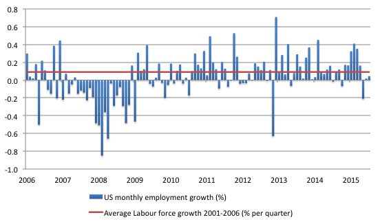
The following graph shows the monthly employment growth since the low-point unemployment rate month (December 2006). The red line is the average labour force growth over the period December 2001 to December 2006 (0.0910 per cent per month). The unemployment rate rises if the employment growth is below the labour force growth rate.
What is apparent is that a strong positive and reinforcing trend in employment growth has not yet been established in the US labour market since the recovery began back in 2009. There are still many months where employment growth, while positive, remains relatively weak when compared to the average labour force growth prior to the crisis.
The first last three months have seen relatively weak employment growth – although it is still too early to establish whether that is a new trend or the vagaries of monthly employment data.
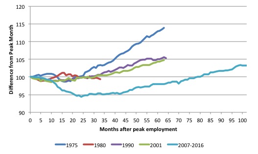
As a matter of history, the following graph shows employment indexes for the US (from US Bureau of Labor Statistics data) for the five NBER recessions since the mid-1970s.
They are indexed at the NBER peak (which doesn’t have to coincide with the employment peak). We trace them out to 64 months or so, except for the first-part of the 1980 downturn which lasted a short period.
It was followed by a second major downturn 12 months later in July 1982 which then endured. In the current period, employment only returned to an index value of 100 in June 2014 (after 78 months). The previous peak was last achieved in December 2007.
The previous recessions have returned to the 100 index value after around 30 to 34 months.
After 102 months, total employment in the US has still only risen by 3.3 per cent (since December 2007), which is a very moderate growth path as is shown in the graph.
Federal Reserve Bank Labor Market Conditions Index (LMCI)
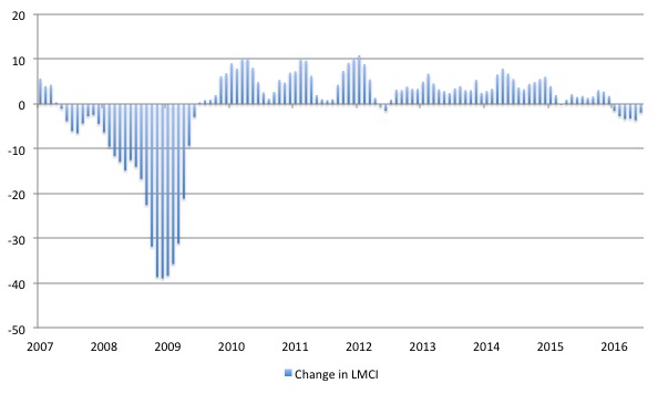
The Federal Reserve Bank of America has been publishing a new indicator – Labor Market Conditions Index (LMCI) – which is derived from a statistical analysis of 19 individual labour market measures since October 2014.
It is now being watched by those who want to be the first to predict a rise in US official interest rates. Suffice to say that the short-run (monthly) changes in the LMCI are “assumed to summarize overall labor market conditions”.
A rising value (positive change) is a sign of an improving labour market, whereas a declining value (negative change) indicates the opposite.
You can get the full dataset HERE.
I discussed the derivation and interpretation of the LMCI in this blog – US labour market weakening.
The LMCI dropped by 1.9 index points in June 2016, the sixth consecutive negative value – declining since December 2015 which signals a weakening situation.
The decline for June was less than the 3.6 point loss in May 2016.
The following graph shows the FRB LMCI for the period January 2007 to June 2016.
We note that while unemployment is now lower than last year but the rate of hiring has declined and the way these factors combine in the index leads to an overall assessment that the labour market is in decline.
The fall away over the last six months has been quite significant.
Payroll data on Hours worked and real earnings
The BLS report that “the average workweek for all employees on private nonfarm payrolls was 34.4 hours for the fifth consecutive month.”
Total aggregate hours worked, which is an indicator of the intensity of the employment growth, rose by a modest 0.19 percentage points between May and June 2016.
In terms of pay, the BLS say that “Over the year, average hourly earnings have risen by 2.6 percent.” While real average hourly earnings were unchanged in May (the latest data available), they rose by 1.4 per cent over the 12 months to May 2016.
The US jobs deficit
As noted in the Overview, the current participation rate (62.7 per cent) is a long way below the most recent peak in December 2006 of 66.4 per cent.
When times are bad, many workers opt to stop searching for work while there are not enough jobs to go around. As a result, national statistics offices classify these workers as not being in the labour force (they fail the activity test), which has the effect of attenuating the rise in official estimates of unemployment and unemployment rates.
These discouraged workers are considered to be in hidden unemployment and like the officially unemployed workers are available to work immediately and would take a job if one was offered.
But the participation rates are also influenced by compositional shifts (changing shares) of the different demographic age groups in the working age population. In most nations, the population is shifting towards older workers who have lower participation rates.
Thus some of the decline in the total participation rate could simply being an averaging issue – more workers are the average who have a lower participation rate.
I analysed this declining trend in this blog – Decomposing the decline in the US participation rate for ageing.
I updated that analysis to December 2015 and computed that the decline in the participation rate due to the shift in the age composition of the working age population towards older workers with lower participation rates accounted for about 58 per cent of the actual decline.
Thus, even if we take out the estimated demographic effect (the trend), we are still left with a massive cyclical response.
What does that mean for the underlying unemployment?
The labour force changes as the underlying working age population grows and with changes in the participation rate.
If we adjust for the ageing component of the declining participation rate and calculate what the labour force would have been given the underlying growth in the working age population if participation rates had not declined since December 2006 then we can estimate the change in hidden unemployment since that time due to the sluggish state of the US labour market.
Adjusting for the demographic effect would give an estimate of the participation rate in June 2016 of 64.3 if there had been no cyclical effects (up from the current 62.7 per cent).
So the 1.6 percentage point decline in the participation rate due to the downturn (net of ageing effect) amounts to 3,927.5 thousand workers who have left the labour force as a result of the cyclical sensitivity of the labour force.
It is hard to claim that these withdrawals reflect structural changes (for example, a change in preference with respect to retirement age, a sudden increase in the desire to engage in full-time education).
In January 2007 (at the peak participation rate which had carried over from December 2006), the US unemployment rate was 4.6 per cent (which was slightly higher than the 4.4 per cent low point recorded a month earlier in December 2006. It didn’t start to increase quickly until early 2008 and then the jump was sudden.
We can have a separate debate about whether 4.4 per cent constitutes full employment in the US. My bet is that if the government offered an unconditional Job Guarantee at an acceptable minimum wage there would be a sudden reduction in the national unemployment rate which would take it to well below 4.4 per cent without any significant inflationary impacts (via aggregate demand effects).
So I doubt 4.4 per cent is the true irreducible minimum unemployment rate that can be sustained in the US.
But we will use it as a benchmark so as not to get sidetracked into definitions of full employment. In that sense, my estimates should be considered the best-case scenario given that I actually think the cyclical losses are much worse than I provide here.
For those mystified by this statement – it just means that I think the economy was not at full employment in December 2006 and thus was already enduring some cyclical unemployment at that time.
Using the estimated potential labour force (controlling for declining participation), we can compute a ‘necessary’ employment series which is defined as the level of employment that would ensure on 4.4 per cent of the simulated labour force remained unemployed.
This time series tells us by how much employment has to grow each month (in thousands) to match the underlying growth in the working age population with participation rates constant at their January 2007 peak.
I computed the ‘necessary’ employment series based on the age-adjusted potential labour force (dark green line in the following graph).
The light blue line is the actual employment as measured by the BLS and the dotted red line is the level of employment that prevailed in November 2007 (the peak before the crisis).
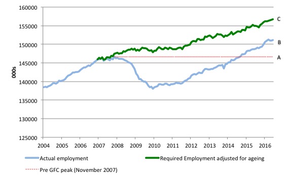
This allows us to calculate how far below the 4.4 per cent unemployment rate (constant participation rate) the US employment level currently is.
There are two effects:
- AB gap – The actual loss of jobs between the employment peak in November 2007 and the trough was in December 2009 was 8,582 thousand jobs. The AB gap in the graph shows the gap in employment relative to the November 2007 peak (the dotted red line is an extrapolation of the peak employment level). You can see that it wasn’t until September 2014 that the US labour market closed that gap. By June 2016, the AB gap is estimated to be minus 4,502 thousand jobs.
- BC gap – The loss of the jobs that would have been generated had the demand-side of the labour market kept pace with the underlying population growth – that is, with the participation rate at its peak and the unemployment rate constant at 4.4 per cent. That loss amounts to 9,170 thousand jobs. This is the segment BC measured as at June 2016
The total jobs that would need to be created to unwind the cyclical damage caused by the crisis is thus 5,637 thousand, which is slightly higher than it was in May 2016 – further evidence that the labour market is not in a robust state. This is the sum of the segments AB + BC or simply segment AC.
Gross Flows and Transition Probabilities
Instead of just looking at the raw employment and unemployment data, I find that I get a lot more intelligence of the dynamics of the labour market by examining the gross flows data.
I updated that dataset for the US today (which takes us to May 2016) and computed updated Transition Probabilities, which are derived from the Gross Flows labour market data.
To fully understand the way gross flows are assembled and the transition probabilities calculated you might like to read these blogs – What can the gross flows tell us? and More calls for job creation – but then. For earlier US analysis see this blog – Jobs are needed in the US but that would require leadership
The data is available from the – US Bureau of Labor Statistics.
Gross flows analysis allows us to trace flows of workers between different labour market states (employment; unemployment; and non-participation) between months. So we can see the size of the flows in and out of the labour force more easily and into the respective labour force states (employment and unemployment).
Each period there are a large number of workers that flow between the labour market states – employment (E), unemployment (U) and not in the labour force (N). The stock measure of each state indicates the level at some point in time, while the flows measure the transitions between the states over two periods (for example, between two months).
The net changes each month – between the stock measures – are small relative to the absolute flows into and out of the labour market states.
National statisticians measure these flows in their monthly labour force surveys. The various stocks and flows are denoted as follows (single letters denote stocks, dual letters are flows between the stocks):
- E = employment stock, with subscript t = now, t+1 the next period.
- U = unemployment stock.
- N = not in the labour force stock.
- EE = flow from employment to employment (that is, the number of people who were employed last period who remain employment this period)
- UU = flow of unemployment to unemployment (that is, the number of people who were unemployed last period who remain unemployed this period)
- NN = flow of those not in the labour force last period who remain in that state this period
- EU = flow from employment to unemployment
- EN = flow from employment to not in the labour force
- UE = flow from unemployment to employment
- UN = flow from unemployment to not in the labour force
- NE = flow from not in the labour force to employment
- NU = flow from not in the labour force to unemployment
The following Matrix Table provides a schematic description of the flows that can occur between the three labour force framework states.
Labour Market Flows Matrix

The various inflows and outflows between the labour force categories are expressed in terms of numbers of persons which can then be converted into so-called transition probabilities – the probabilities that transitions (changes of state) occur.
We can then answer questions like: What is the probability that a person who is unemployed now will enter employment next period?
So if a transition probability for the shift between employment to unemployment is 0.05, we say that a worker who is currently employed has a 5 per cent chance of becoming unemployed in the next month. If this probability fell to 0.01 then we would say that the labour market is improving (only a 1 per cent chance of making this transition).
From the table above – sometimes called a Gross Flows Matrix – the element EE tells you how many people who were in employment in the previous month remain in employment in the current month.
Similarly the element EU tells you how many people who were in employment in the previous month are now unemployed in the current month. And so on. This allows you to trace all inflows and outflows from a given state during the month in question.
The transition probabilities are computed by dividing the flow element in the matrix by the initial state. For example, if you want the probability of a worker remaining unemployed between the two months you would divide the flow (UU) by the initial stock of unemployment. If you wanted to compute the probability that a worker would make the transition from employment to unemployment you would divide the flow (EU) by the initial stock of employment. And so on.
So the 3 Labour Force states in the Matrix Table above allow us to compute 9 transition probabilities reflecting the inflows and outflows from each of the combinations.
Analysing movements in these probabilities over time provides a different insight into how the labour market is performing by way of flows of workers.
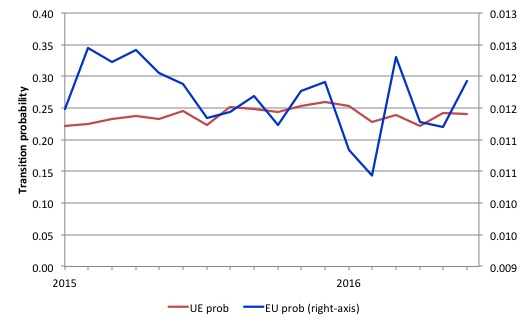
The first graph shows the transition probabilities between employment and unemployment since the beginning of 2015.
In June 2016, it was more likely that an employed worker would enter unemployment than in May 2016. And the probability of an unemployed worker gaining a job fell slightly.
That is further evidence that the US labour market is soft.
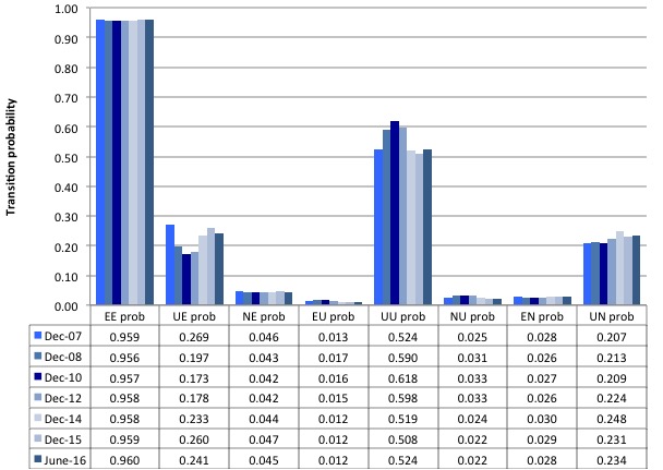
The next graph compares the US transition probabilities for selected months during the crisis up until June 2016 (see the accompanying Table for values). I have also jigged the vertical and horizontal scales to allow the changes in the columns to be seen more clearly. That is one of the reasons I also provided the raw data.
December 2007 was the peak of the last cycle and things deteriorated after that. The graph and table give you a sort of ‘year by year’ summary of how things have changed in the 8.5 years of recession and recovery.
What appears to be the case as at June 2016 compared to the end of last year, is that an unemployed person is now less likely to get a job relative (EU) – 24.1 per cent chance rather than 26 per cent chance.
Further an unemployed worker is more likely to drop out of the labour force (UN) than were at the end of last year.
The chances of a new entrant gaining a job (NE) have also dropped in the first half of 2016.
The overall impression is that those in employment are becoming more slightly secure (static EU probability and rising EE probability) but that the flows between the states are becoming less dynamic.
To provide a time series view of the crisis and its aftermath, the next graph (or 6 separate graphs) shows the the US transition probabilities from December 2007 (the low-point unemployment rate month of the last cycle) to June 2016 for the 6 transitions (EU, UE, EN, NE, NU, and UN). We exclude the same state probabilities (EE, UU, and NN). Note the vertical scales are different (they are optimised for the particular range of probabilities in each.
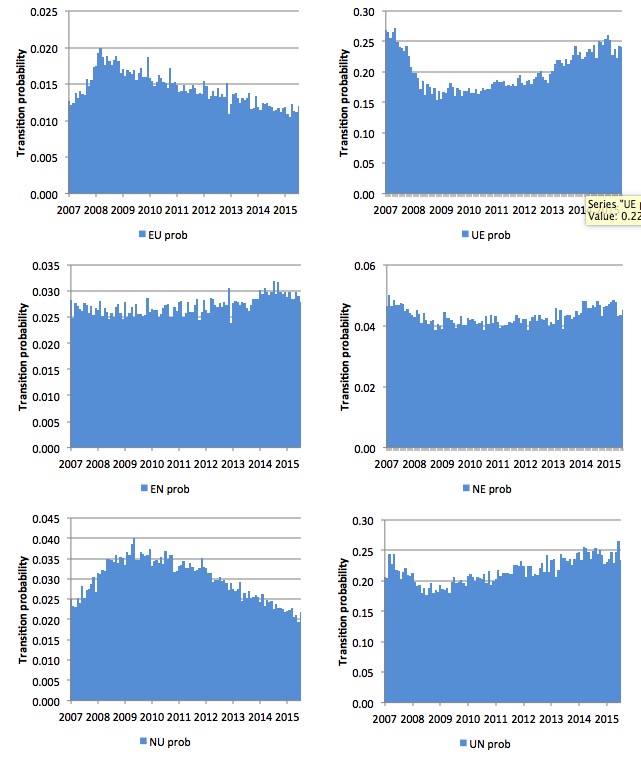
Several points by way of interpretation can be made (noting that care should be taken to recognise the vertical scales are quite different).
First, the EU probability (employment to unemployment) has fallen since the early days of the crisis but is now hovering around 12 per cent – that should be compared to the pre-crisis value of 13 per cent.
Second, the EN probability rose during the crisis and again during the recovery, the latter shift, indicating that employed workers were increasingly likely to flow out of the labour force once they lose their jobs – that is, they become hidden unemployed or retire (in some form or another). That was a sign that the labour market is still not very strong. The effect appeared to be moderating in towards the end of last year, but with the participation rate now declining again, the the probability has been rising this year.
Third, the likelihood of a new entrant getting a job (NE prob) has fallen in recent months after being flat for some months but rose again in June 2016. However, it remains that new entrants are much more likely to become employed (NE prob) than to enter the labour force as unemployed (NU).
Fourth, the probability of an unemployed worker leaving the labour force (UN prob) fell in June 2016 and is now lower than the likelihood of them getting a job (UE prob) although the difference is narrowing.
The former probability had risen over the last 2 years, which was not a good sign but is consistent with the weak participation rate.
Conclusion
While the US fiscal deficit has remained large enough to support some growth and allow some confidence to be regained in the private sector the signs are that the private sector recovery has slowed somewhat in the first half of 2016.
That moderating trend was established throughout 2015.
This slowing is on the back of a deteriorating international situation, which has led global forecasts of World growth to be downgraded in recent months.
Paperback version of my Eurozone book now available
My current book – Eurozone Dystopia: Groupthink and Denial on a Grand Scale (published May 2015) – carries an on-line price of £99.00.
It is now available in much cheaper paperback form for £32.00.
Also the eBook is available 36.27 US dollars from Google Play or 61.45 Australian dollars from eBooks.com.
That is enough for today!
(c) Copyright 2016 Bill Mitchell. All Rights Reserved.
If the fiscal deficit is high but most of the money is going to the financial sector instead of the real economy, then how would that help in job creation?
if its going to financial sector (QE) and its staying there its not helping at all to be honest