The recent extreme weather in the northern hemisphere, the twin monster tropical storms in Japan,…
The US labour market is nowhere near full employment
The president of the Federal Reserve Bank of San Francisco, John C. Williams pronounced in a recent speech (September 6, 2016) – Whither Inflation Targeting? – that “We’re at full employment”, meaning US economy that is. He must have access to different data than the US Bureau of Labor Statistics (BLS) publishes, because the official data tells a very different story once you understand what it is you have to look for in the statistics presented. Last week, the US Bureau of Labor Statistics released the September 2016 – Employment Situation – which showed that total non-farm employment rose by only 156,000 and the unemployment rate remained “little changed” at 5 per cent. The Federal Reserve President’s surmise raises the question as to whether the US has returned to where it was before the GFC. Despite his optimism, the evidence refutes the claim that the US is near full employment. It also suggests that the situation is more likely to worsen than to improve.
Overview
For those who are confused about the difference between the payroll (establishment) data and the household survey data you should read this blog – US labour market is in a deplorable state – where I explain the differences in detail.
See also the – Employment Situation FAQ – provided by the BLS, itself.
The BLS say that:
The establishment survey employment series has a smaller margin of error on the measurement of month-to-month change than the household survey because of its much larger sample size. … However, the household survey has a more expansive scope than the establishment survey because it includes self-employed workers whose businesses are unincorporated, unpaid family workers, agricultural workers, and private household workers …
Focusing on the Household Labour Force Survey data, the seasonally adjusted labour force rose by 176 thousand in September 2016 and the participation rate was stable.
Total employment rose by 354 thousand in net terms, and as a consequence of the stronger labour force growth (444 thousand), there was a rise in unemployment of 90 thousand.
The unemployment rate rose from 4.92 per cent to 4.96 per cent.
The September participation rate of 62.9 per cent was 0.1 points up on the August figure but still 0.1 points below the most recent peak of 63 per cent in March 2016.
Adjusting for the ageing effect (see US labour market – some improvement but still soft for an explanation of this effect), the rise in those who have given up looking for work (discouraged) in the last six months is around 107 thousand workers.
If we added them back into the labour force and considered them to be unemployed (which is not an unreasonable assumption given that the difference between being classified as officially unemployed against not in the labour force is solely due to whether the person had actively searched for work in the previous month) – then the unemployment rate would be marginally higher than it is official recorded, given the participation rate is only 0.1 points below the earlier peak.
However, if we assessed the impact of the loss of participation since the peak (December 2006 – 66.4 per cent) and adjusted for the ageing effect on participation, we would find that 3,737 thousand workers had exited due to lack of employment opportunities, which would make the current US unemployment rate would be 8.2 per cent if they were added back in to the jobless.
That provides a quite different perspective in the way we assess the US recovery.
Employment growth faltering
In January 2016, employment rose by 0.41 per cent, while the labour force rose by 0.32 per cent. Since then, employment growth has faltered – with negative growth in April and two positive spikes in July and September.
Further, the participation rate has been relatively stable and remains at its February 2016 level.
Employment growth in September was 0.23 per cent (hardly setting the world on fire) but improved on the very poor 0.06 per cent in August 2016.
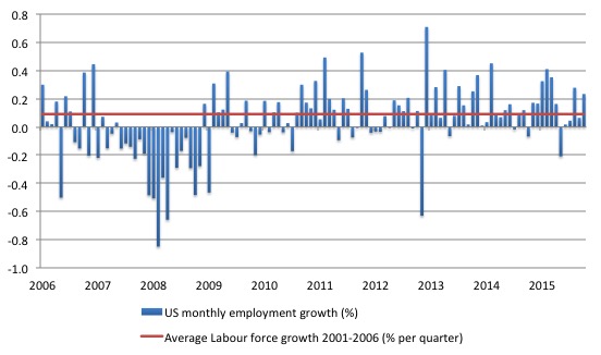
The following graph shows the monthly employment growth since the low-point unemployment rate month (December 2006). The red line is the average labour force growth over the period December 2001 to December 2006 (0.0910 per cent per month).
What is apparent is that a strong positive and reinforcing trend in employment growth has not yet been established in the US labour market since the recovery began back in 2009. There are still many months where employment growth, while positive, remains relatively weak when compared to the average labour force growth prior to the crisis.
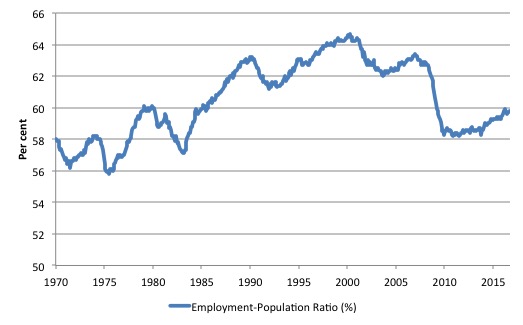
A good measure of the strength of the labour market is the Employment-Population ratio given that the movements are relatively unambiguous because the denominator population is not particularly sensitive to the cycle (unlike the labour force).
The following graph shows the US Employment-Population from January 1970 to September 2016. While the ratio fluctuates a little, the September outcome (59.8 per cent) is at the February 2016 level but well down on pre-GFC levels (peak 63.4 per cent in December 2006).
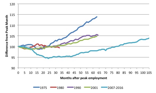
As a matter of history, the following graph shows employment indexes for the US (from US Bureau of Labor Statistics data) for the five NBER recessions since the mid-1970s.
They are indexed at the NBER peak (which doesn’t have to coincide with the employment peak). We trace them out to 64 months or so, except for the first-part of the 1980 downturn which lasted a short period.
It was followed by a second major downturn 12 months later in July 1982 which then endured. In the current period, employment only returned to an index value of 100 in June 2014 (after 78 months). The previous peak was last achieved in December 2007.
The previous recessions have returned to the 100 index value after around 30 to 34 months.
After 105 months, total employment in the US has still only risen by 3.9 per cent (since December 2007), which is a very moderate growth path as is shown in the graph.
Federal Reserve Bank Labor Market Conditions Index (LMCI)
The Federal Reserve Bank of America has been publishing a new indicator – Labor Market Conditions Index (LMCI) – which is derived from a statistical analysis of 19 individual labour market measures since October 2014.
It is now being watched by those who want to be the first to predict a rise in US official interest rates. Suffice to say that the short-run (monthly) changes in the LMCI are “assumed to summarize overall labor market conditions”.
A rising value (positive change) is a sign of an improving labour market, whereas a declining value (negative change) indicates the opposite.
You can get the full dataset HERE.
I discussed the derivation and interpretation of the LMCI in this blog – US labour market weakening.
The LMCI dropped by 2.2 index points in September 2016, the second consecutive negative decline (-1.3 points in August). While the index recorded a positive increase in July, it had fallen for six consecutive months prior to that.
Overall, the trend is definitely down and signals a weakening situation.
The following graph shows the FRB LMCI for the period January 2007 to September 2016.
We note that while unemployment is now lower than last year and the rate of hiring has stabilised after declining earlier in the year. The way these factors combine in the index leads to an overall assessment that the labour market has been in decline.
The fall away over the last nine months has been quite significant notwithstanding the July 2016 upturn.

Why the unemployment rate is a misleading indicator
The Federal Reserve Bank of San Francisco President noted that the unemployment rate was at 4.96 per cent which is about the pre-GFC levels. The conclusion then follows that the US economy has more or less recovered.
He said:
Our goal is not to have an unemployment rate of zero. Instead, it’s to be near the “natural rate” of unemployment: That’s the rate we can expect in a healthy economy. It’s impossible to know exactly what that number is, but economists generally put it between 4¾ and 5 percent today.1 With the unemployment rate at 4.9 percent, we’re right on target.
He did qualify that statement by saying that “the unemployment rate isn’t the only measure of labor market health, and it’s reassuring that a range of indicators have been improving and are sending similar signals” but still concluded that the US was back to full employment.
Well is it?
The International Labour Organization (ILO) outlined the policy objective of full employment in their Employment Policy Convention (ILO No. 122), which was adopted by signatory nations in 1964.
The ILO say (Source) that:
According to this Convention, full employment ensures that (i) there is work for all persons who are willing to work and look for work; (ii) that such work is as productive as possible; and (iii) that they have the freedom to choose the employment and that each workers has all the possibilities to acquire the necessary skills to get the employment that most suits them and to use in this employment such skills and other qualifications that they possess. The situations which do not fulfil objective (i) refer to unemployment, and those that do not satisfy objectives (ii) or (iii) refer mainly to underemployment.
The ILO clearly considers that full employment should require zero underemployment. It would also require that workers have no incentive to give up active search for work if they desire to work.
The concept of activity becomes crucial in understanding why the Federal Reserve Bank of San Francisco President’s assessment is awry.
The follow graphic summarises the Labour Force Framework as applied in Australia, which is made operational through the International Labour Organization (ILO) and its International Conference of Labour Statisticians (ICLS). Thus all national statistical agencies have broadly similiar structures for collecting data about the labour market.
The Labour Force Framework

The public focuses on the unemployment as an indicator of labour market performance because it signifies a waste of productive resources, quite apart from the individual and social costs that accompany it. However, unemployment is a narrow measure of labour underutilisation.
Labour underutilisation arises from a number of different reasons that can be subdivided into two broad functional categories:
- A category involving unemployment or its near equivalent – In this group, we include the official unemployed under ILO criteria and those classified as being not in the labour force on search criteria (discouraged workers), availability criteria (other marginal workers), and more broad still, those who take disability and other pensions as an alternative to unemployment (forced pension recipients). These workers share the characteristic that they are jobless and desire work if there were available vacancies. They are however separated by the statistician on other grounds; and
- A category that involves sub-optimal employment relations – Workers in this category satisfy the ILO criteria for being classified as employed but suffer time-related underemployment or inadequate employment situations.
Since January 1994, the BLS has been publishing their U-1 to U-6 Alternative measures of labor underutilization to provide further insights that are not provided by just focusing on the official unemployment rate (which is defined by the BLS as its U-3 indicator).
The movement from U-1 to U-6 signifies a broadening of the category of labour underutilisation. So U-6 is the most comprehensive.
The BLS produce this Matrix Table to help us understand the broadening of the U-1 to U-6 measures.
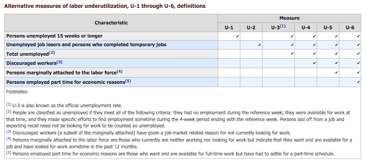
The BLS define them in this way:
- U-1 – Percent Of Civilian Labor Force Unemployed 15 Weeks & over.
- U-2 – Unemployment Rate – Job Losers.
- U-3 – Unemployment Rate.
- U-4 – Total unemployed plus discouraged workers, as a percent of the civilian labor force plus discouraged workers.
- U-5 – Total unemployed, plus discouraged workers, plus all other marginally attached workers, as a percent of the civilian labor force plus all marginally attached workers.
- U-6 – Total unemployed, plus all marginally attached workers plus total employed part time for economic reasons, as a percent of all civilian labor force plus all marginally attached workers.
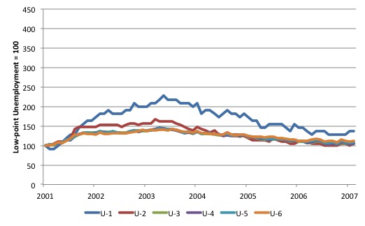
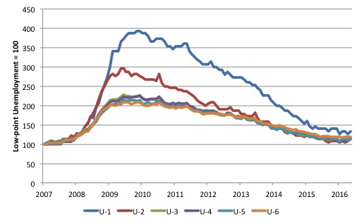
The following two graphs show the movement in each of these time series over the last two US economic cycles. The first cycle ran from March 2001 to May 2007 with the high-point unemployment rate occurring at June 2003. This doesn’t exactly coincide with the NBER GDP cycles. The official unemployment rate reached its low point in May 2007, whereas the GDP cycle ended in December 2007.
The second cycle ran from May 2007, with the high-point unemployment rate occurring at October 2009. The second graph continues to September 2016.
I have made the vertical scales equivalent to allow you to see the differences between the two episodes.
The behaviour of the series in the two cycles is somewhat different in terms of amplitude and persistence:
1. The maximum unemployment rate in the first cycle was 6.3 per cent in June 2003, whereas it reached 10 per cent in October 2009.
2. U-6 (the broadest measure) reached a peak of 10.4 per cent in September 2003 (three months after the U-3 peak), whereas, in the latest cycle, U-6 peaked 17.1 per cent (October 2009) and persisted at that level for several months.
3. After 74 months in the first cycle, the unemployment rate had more or less returned to its previous low-point. However, after 113 months, the U-3 indicator is still 13.6 per cent above the previous low-point (0.6 percentage points).
4. After 74 months in the first cycle, U-6 was still 12.3 per cent above its previous low (0.9 percentage points), whereas in the current cycle, U-6 remains some 18.3 per cent above the previous low (1.5 percentage points) after 113 months. After 74 months, U-6 was 73.2 per cent higher than its previous low.
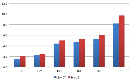
The next graph shows the comparison of the U-1 to U-6 measures at the start of the current cycle (low-point unemployment rate in May 2007) and September 2016.
The broader measures suggest there is still some way to go before the US labour market gets back to where it was in labour underutilisation terms.
The data shows that underemployment (part-time workers who desire to work more hours) has risen somewhat since May 2007 and hidden unemployment has risen (that is, workers classified as not being in the labour force but who would take a job immediately if offered one).
The BLS tell us that:
1. In May 2006, there were 4,111 thousand workers who were being forced to work part-time for ‘economic reasons’. This is the US measure of underemployment. In September 2016 there were 5,894 thousand workers in that state.
2. In May 2006, there were 1,388 thousand workers who were classified as Not in the Labour Force and Marginally Attached to Labor Force. In September 2016 there were 51,844 thousand workers in that state.
3. 2. In May 2006, there were 323 thousand workers who were classified as Discourage workers (hidden unemployed. In September 2016 there were 553 thousand workers in that state.
So in each of these categories, the discrepancy on the pre-GFC levels remains substantial even if the unemployment rate has fallen back under 5 per cent.
Hours and People in Employment
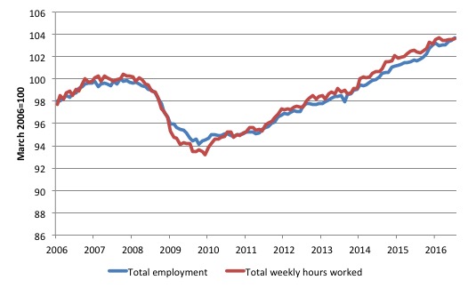
The next graph shows the index of aggregate weekly hours worked by all employees from March 2006 to September 2016 (red line) and total civilian employment (blue line). The data is from the BLS. Both series are indexed to 100 at December 2007 – the peak employment month before the GFC.
Prior to the crisis, the two series moved more in line with each other as average weekly working hours remained fairly steady.
When the GFC hit, firms adjusted by sacking workers but also reducing hours available, the latter effect being greater because firms hoard skilled labour given the hiring and firing costs are high. The last thing a firm wants to get is a reputation for being capricious when it comes to expensive labour. Such a firm will find it hard attracting skilled labour in the upturn.
As the recovery ensued, both employment in persons and total weekly hours worked rose, the latter more quickly as the hoarded labour was put back onto longer time.
That process does not seem to have fully exhausted itself yet and, in part, explains the relatively slow employment growth rate when measured in persons rather than hours.
The US jobs deficit
As noted in the Overview, the current participation rate (62.9 per cent) is a long way below the most recent peak in December 2006 of 66.4 per cent.
When times are bad, many workers opt to stop searching for work while there are not enough jobs to go around. As a result, national statistics offices classify these workers as not being in the labour force (they fail the activity test), which has the effect of attenuating the rise in official estimates of unemployment and unemployment rates.
These discouraged workers are considered to be in hidden unemployment and like the officially unemployed workers are available to work immediately and would take a job if one was offered.
But the participation rates are also influenced by compositional shifts (changing shares) of the different demographic age groups in the working age population. In most nations, the population is shifting towards older workers who have lower participation rates.
Thus some of the decline in the total participation rate could simply being an averaging issue – more workers are the average who have a lower participation rate.
I analysed this declining trend in this blog – Decomposing the decline in the US participation rate for ageing.
I updated that analysis to December 2015 and computed that the decline in the participation rate due to the shift in the age composition of the working age population towards older workers with lower participation rates accounted for about 58 per cent of the actual decline.
Thus, even if we take out the estimated demographic effect (the trend), we are still left with a massive cyclical response.
What does that mean for the underlying unemployment?
The labour force changes as the underlying working age population grows and with changes in the participation rate.
If we adjust for the ageing component of the declining participation rate and calculate what the labour force would have been given the underlying growth in the working age population if participation rates had not declined since December 2006 then we can estimate the change in hidden unemployment since that time due to the sluggish state of the US labour market.
Adjusting for the demographic effect would give an estimate of the participation rate in September 2016 of 64.4 if there had been no cyclical effects (up from the current 62.9 per cent).
So the 1.5 percentage point decline in the participation rate due to the downturn (net of ageing effect) amounts to 3,737 thousand workers who have left the labour force as a result of the cyclical sensitivity of the labour force.
It is hard to claim that these withdrawals reflect structural changes (for example, a change in preference with respect to retirement age, a sudden increase in the desire to engage in full-time education).
In January 2007 (at the peak participation rate which had carried over from December 2006), the US unemployment rate was 4.6 per cent (which was slightly higher than the 4.4 per cent low point recorded a month earlier in December 2006. It didn’t start to increase quickly until early 2008 and then the jump was sudden.
We can have a separate debate about whether 4.4 per cent constitutes full employment in the US. My bet is that if the government offered an unconditional Job Guarantee at an acceptable minimum wage there would be a sudden reduction in the national unemployment rate which would take it to well below 4.4 per cent without any significant inflationary impacts (via aggregate demand effects).
So I doubt 4.4 per cent is the true irreducible minimum unemployment rate that can be sustained in the US.
But we will use it as a benchmark so as not to get sidetracked into definitions of full employment. In that sense, my estimates should be considered the best-case scenario given that I actually think the cyclical losses are much worse than I provide here.
For those mystified by this statement – it just means that I think the economy was not at full employment in December 2006 and thus was already enduring some cyclical unemployment at that time.
Using the estimated potential labour force (controlling for declining participation), we can compute a ‘necessary’ employment series which is defined as the level of employment that would ensure on 4.4 per cent of the simulated labour force remained unemployed.
This time series tells us by how much employment has to grow each month (in thousands) to match the underlying growth in the working age population with participation rates constant at their January 2007 peak.
I computed the ‘necessary’ employment series based on the age-adjusted potential labour force (dark green line in the following graph).
The light blue line is the actual employment as measured by the BLS and the dotted red line is the level of employment that prevailed in November 2007 (the peak before the crisis).
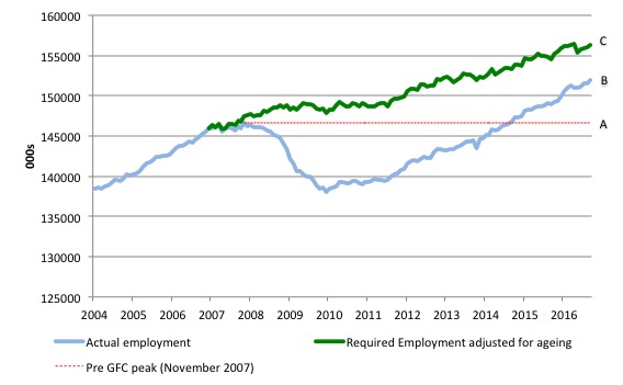
This allows us to calculate how far below the 4.4 per cent unemployment rate (constant participation rate) the US employment level currently is.
There are two effects:
- AB gap – The actual loss of jobs between the employment peak in November 2007 and the trough was in December 2009 was 8,582 thousand jobs. The AB gap in the graph shows the gap in employment relative to the November 2007 peak (the dotted red line is an extrapolation of the peak employment level). You can see that it wasn’t until September 2014 that the US labour market closed that gap. By September 2016, the AB gap is estimated to be minus 5,373 thousand jobs.
- BC gap – The loss of the jobs that would have been generated had the demand-side of the labour market kept pace with the underlying population growth – that is, with the participation rate at its peak and the unemployment rate constant at 4.4 per cent. That loss amounts to 9,921 thousand jobs. This is the segment BC measured as at June 2016
The total jobs that would need to be created to unwind the cyclical damage caused by the crisis is thus 4,549 thousand, which is slightly higher than it was in July and August 2016 – further evidence that the labour market is not in a robust state. This is the sum of the segments AB + BC or simply segment AC.
Conclusion
The evidence is fairly consistent across a range of measures – the mass unemployment in the US was the result of a systemic failure in that economy to produce enough jobs, which emerged as aggregate spending collapsed in early 2008.
Since then, as the economy has slowly starting growing again, the demand-side of the labour market has improved steadily and the unemployment rate has fallen.
The pace of improvement appears to be slowing.
But the extended recovery has still left the labour market with considerable slack as indicated by the broader BLS measures of labour underutilisation and the jobs gap.
Anyone who claims the US is close to full employment is not telling it straight.
That is enough for today!
(c) Copyright 2016 William Mitchell. All Rights Reserved.
Perhaps I am mistaken, but as a teen (in the 1960s) I recall the US unemployment rate generally running around 2%, and that it was considered scandalous when once it hit 4%. Now we consider 5% to be full employment?
Is there some sort of idiot test that these economists who supposedly believe this must pass (other than their PhD) before being accepted as one of the economics commentariat?
I’m in the UK not the US, but one difference I think from, say, the 1950s and the 1960s on the one hand, and say the 1970s onwards on the other, was that in the the former case, people tended to be thinking mostly in terms of male unemployment or employment.
.
It was still socially acceptable, and financially viable (at least in many cases) for a married woman to remain a “housewife”, at least while the children were young.
.
That changed later on, partly because women increasingly wanted to have a career on their own terms (although even nowadays they arguably don’t get an even break in many spheres). The other big change is that because (mostly) of the burden of increased housing costs, it’s increasingly financially impossible for a married couple to survive without both of them working.
.
I’m really just saying that we have to be careful in comparing employment figures between very different decades and historical periods. “Full employment” numbers in the 1960s may well have masked a lot of unemployment or underemployment in reality. Which is not to say that the current employment/unemployment situation is healthy – it clearly isn’t.
“Why the unemployment rate is a misleading indicator”
You may not have seen this?
“Why hasn’t it worked? Because real growth today is constrained by real resource shortages, while in the 1930s traditional Keynesianism’s assumption of unemployed resources was reasonable. There is still unemployed labor to be sure, but not unemployed natural resources, which have become the limiting factor in today’s full world.”
Herman Daly
Mike Ellwood,
You say it was “financially viable (at least in many cases) for a married woman to remain a “housewife”, at least while the children were young”.
This is true. I remember the 1960s. I was a schoolkid then in Brisbane, Australia. Your sentence well describes my family at that time. In the 1960s unemployment was about 2% (frictional unemployment). The legislated basic wage essentially guaranteed that one wage was enough to keep a family of four and buy a house. Our family back then was five. Houses were basic but cheap in the decades after WW2. Returned servicemen, like my father, got cheap housing loans and were able to buy good, basic houses from the Queensland Housing Commission. The house I grew up in was a weatherboard house made of all Australian hardwoods and it stands solid and serviceable to this day and would be about 65 years old. It was sold several years ago as my parents have “shuffled off this mortal coil”. I mention things like the basic wage, the Housing Commission and cheap state-mediated home loans as these were essentially socialistic elements in our economy back then. Which is why the economy worked so well for workers. That and the fact we had not so closely approached the limits to growth as we have now.
Women in those days were required to give up jobs when they married, at least if they had government jobs. Clearly, by today’s standards this was wrong and women’s liberation was much required. However, essentially what happened was that capitalism subverted the liberation of women just as it subverts all social and technological advances to its own ends. The liberation of women and their freedom to enter paid work (they had already been doing an enormous amount of unpaid work) was subverted by using the new found extra income of the family (the woman’s income) as the pretext and enabler for inflating house prices. Families with two workers were, within one generation, pushed back into the position that the total income of the family was just enough to keep about a family of four. High mortgages for price-inflated houses were eating up the extra income of the family.
This intensification of capitalism under neoliberalism was to have been expected if one had read and absorbed Marx’s work properly. I had read Marx’s works by my early twenties but not absorbed them properly. Only after seeing the progress of neoliberalism, taking us now into advanced, late-stage capitalism, have I realised how accurate Marx’s analysis was of capitalism’s movements (it’s “laws of motion” as he termed them).
Today, Thomas Piketty disavows any inspiration from Marx. We may take Piketty at his word as he very clearly works from the historical, empirical data of earnings from capital and wages. He has charted the movement of returns on capital, the movements of distribution of income and wealth by percentile and the movements of return on capital compared to the movements of the rate of growth of the economy.
From this, Piketty has derived his now justly famous (in economic circles at least) conditional equation:
If r GT g then inequality increases.
This means:- If the return on capital is greater than the growth rate then inequality increases. Wealth begins to be concentrated in the top percentile (the richest 1%). Nay, indeed it begins to be concentrated in the top 0.1% and even in the top 0.01%.
Piketty had an extra 150 years of data and modern data handling computers to work with compared to Marx but he still deserves kudos for the tremendous work he has done for his book “Capital in the 21st Century”. This law (r GT g) is the elegant law that Marx did not explicitly find in such neat mathematical and conditional logic terms. Yet, essentially, all of Marx’s work tends to that same finding. Marx also did find the factors which would prevent an r GT g situation from going on indefinitely for such a situation is not sustainable long term. These factors are, in a nutshell;
(a) the reproductive cost of labour (resulting in the tendency of the oppressed and starving to revolt);
(b) the “metabolic rift” (Marx’s term for exceeding the limits of nature and exhausting natural resources); and
(c) the over-accumulation crisis of capital.
Notes:
Reproductive cost of labour: The wages a worker needs to keep him or herself and the family including purchase of food, shelter and care and education of the children to “reproduce” them as workers in their turn.
Metabolic Rift – “Metabolic rift is Karl Marx’s notion of the “irreparable rift in the interdependent process of social metabolism,” – Marx’s key conception of ecological crisis tendencies under capitalism. Marx theorized a rupture in the metabolic interaction between humanity and the rest of nature emanating from capitalist production and the growing division between town and country. This concept has been widely used in recent years in various environmental discussions, particularly on the left.” – Wikipedia.
Over-accumulation of Capital: “Accumulation can reach a point where the reinvestment of capital no longer produces returns. When a market becomes flooded with capital, a massive devaluation occurs. This over-accumulation is a condition that occurs when surpluses of devalued capital and labor exist side by side with seemingly no way to bring them together. The inability to procure adequate value stems from a lack of demand.” – Wikipedia