The Australian Bureau of Statistics (ABS) released the latest labour force data today (APRIL 16,…
The labour market is turning … down!
The monthly wait for the Labour Force data is over and we now know that how all the confusing messages coming from various indicators in the last few weeks are playing out in the labour market. Today’s data suggests that the labour market is starting to now turn for the worse. While today’s 5.8 per cent headline unemployment rate was less than the prediction by most economists (5.9 per cent), employment growth has fallen 3 out of the last 4 months and the in last month this descent quickened. The broader rate of labour underutilisation (sum of unemployment plus underemployment) is now worse at a comparable point in the cycle than it was in 1991 or 1982. That is a sign that things are sick and the employment growth slowdown is a sign that the situation will become sicker.
Economists like me use a rule of thumb to overcome the infrequent publication of underemployment data – its crude but more or less accurate – just double the official unemployment rate to get the broader estimate of labour underutilisation. At present this rule of thumb is probably too conservative given that in May underemployment was 7.7 per cent. At present, the broader rate of labour underutilisation indicated by the sum of unemployment plus underemployment is somewhere between 12 and 14 per cent depending on how you measure it. Add in the hidden unemployment as the participation rate starts to fall and the number will be above 16 per cent. That is a seriously recessed economy despite the plasma TVs still going out the door (don’t get the idea that my constant disparaging references to plasma TVs means anything!).
I notice that most commentators are praising the Government for helping Australia weather the storm better than other countries but the fact that labour underutilisation is rising is a policy failure. I say failure because they have the fiscal capacity to ensure that there is a job for everyone yet they sit by as the labour market spirals downwards seemingly content to make us feel warm by telling us they are standing shoulder to shoulder with the unemployed.
The basic facts in the June LFS data, that describe our Government’s policy failure, are:
- Employment decreased by 21,400 to 10,762,500 with full-time employment continuing its race to the bottom falling by 21,900 only to be partially offset by the rise in part-time employment of 400 (measly) jobs.
- Unemployment rose by 7,400 to 662,900 with more people looking for full-time work (up by 13,000 to 500,900) and less people looking for part-time work (down 5,600 to 162,100).
- The unemployment rate – a narrow measure of overal labour underutilisation – rose from 5.7 to 5.8 per cent. 6.1 per cent of males were unemployed and 5.4 per cent of females.
- The participation rate has started to decline – down 0.2 percentage points to 65.3 per cent.
How are we travelling in relation to 1991 and 1982? There is also a lot of talk around that is claiming that this recession will not be as severe in labour market terms as the past two recessions. I am currently in two minds about that claim – there are conflicting signals at present. But in terms of total labour underutilisation (now around 14 per cent) this current episode is not trivial by any means.
Regular readers will know that I chart the progress of the unemployment against the previous two recessions (1991 and 1982) to detect similarities and differences. This helps us guage the likely direction of the labour market and also assess the impact of the two fiscal stimulus packages.
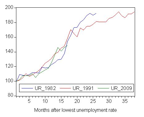
The following graph updates my 3-recessions graph. It depicts how quickly the unemployment rose in Australia during each of the three major recessions in recent history: 1982, 1991 and now 2009. The unemployment rate was indexed at 100 at its lowest rate before the recession in each case (June 1981; November 1989; February 2008, respectively) and then indexed to that base for each of the months until it peaked. It provides a graphical depiction of the speed at which the recession unfolded (which tells you something about each episode) and the length of time that the labour market deteriorated (expressed in terms of the unemployment rate).
From the graph you can also see that the percentage point change in the official unemployment rate is tracking the deteriorations that occurred in the last two recessions. The 2009 evolution has now caught up with the rate of decline in 1991 and tracking it closely. So on this measure, there is no room for complacency. Note that these are index numbers and only tell us about the speed of decay rather than levels of unemployment. Clearly the 5.8 per cent at this stage of the downturn is lower that the unemployment rate was in the previous recessions at a comparable point in the cycle.
Comparison of unemployment rate dynamics – 1982, 1991 and 2009, Index numbers

With that in mind it is useful to think about the deterioration in the levels of broader measures of labour utilisation because at the end of the 2008 boom (February) underemployment was greater than unemployment. This is in contrast to the previous end-boom periods where official unemployment was far more significant relative to the almost non-existence underemployment.
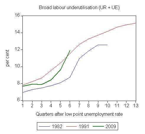
The following graph charts the evolution of the sum of unemployment and underemployment (in per cent) with the latter measure coming from the CofFEE Labour Market Indicators. The data for the 2nd quarter 2009 will be be published on Monday. The charts exclude hidden unemployment which rises in proportion with official unemployment. Note also that we use a different estimation technique to the ABS (we compute an hours-based measure). Our estimates of underemployment are now more conservative than those provided by the ABS. Neither is correct being estimates only but both are likely to be in close proximity to the truth.
This graph provides a reality check I think. The green line is the evolution since February quarter 2008 and the red line is the 1991 recession, where underemployment really first entered the scene.
You can see clearly that while the early stages of this downturn (in 2008) were relatively benign, the acceleration in underutilisation in the current year has been very sharp and the level of labour underutilisation is now higher than it was at the comparable stage in the 1991 and 1982 downturns.
It is true that this is more heavily weighted by underemployment now – but an hour of work lost generates the same output and income loss.
Comparison of broad labour underutilisation dynamics – 1982, 1991 and 2009, per cent

Gender – males are losing out
Males are also losing in this recession as they do in all recessions. This is linked to how the business cycle impacts unevenly across the industry composition. I have examined this in a recent blog – The labour market is getting sicker. It seems that the stimulus package is helping the service sector more than other sectors (which makes sense – retail sales etc) and females are particularly advantaged by this.
While you have to get your ruler out to compare across the three recessions, the data shows that at a comparable point in the cycle, males are now worse off than they were in 1982 but still better placed than in 1991 whereas females are better off overall. This is largely to do with the fact that employment has not plunged yet although it is heading downwards.
Comparison of gender unemployment rate dynamics – 1982, 1991 and 2009, Index numbers

Is it getting harder to get a job?
One way of viewing the labour market is in terms of the gross flows that occur each month between the different labour market states. Just focusing on net results such as how much employment changed by obscures the fact that there is continuous flow going on with workers moving between full-time and part-time jobs, unemplyoment and not in the labour force (that is, non-participation). These strength of these flows and their direction vary over the business cycle.
There is a lot of detailed knowledge you need to have to get into the business of analysing this type of data. If you are interested in reading more go to the ABS resource page as a starting point. There are a lot of traps involved. Note these are particular samples drawn out of the labour force survey sample (matched pairs).
The ABS offer the following tips:
In the Labour Force Survey, one-eighth of the dwellings sampled in the previous month are replaced, in the current month, by a new set of dwellings from the same geographic area. The seven-eighth overlap between the dwellings selected in consecutive months maintains continuity within the population survey sample and enables more reliable measurement of change in the labour force characteristics of the population than would be possible if a new sample was introduced each month.
The matching of respondents who report in consecutive months enables analysis of the transition of individuals between the different labour force status classifications, referred to as the matched sample. The transition counts between the different labour force status classifications from one point in time to the next are commonly referred to as gross flows.
And then they offer this warning which tells you that one cannot reconcile the levels that are provided in the LFS data (employment etc) with the totals that appear in the gross flows matrix:
The figures presented in gross flows are presented in original terms only and do not align with published labour force estimates. The gross flows figures are derived from the matched sample between consecutive months, which after taking account of the sample rotation and varying non-response in each month is approximately 80 per cent of the sample.
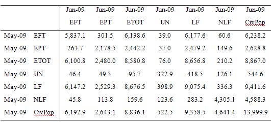
This is what the latest May-June 2009 gross flows matrix looks like. To understand the elements in the “matrix” note the previous month (May 2009) is on the vertical axis (rows) and the columns are the current month (June 2009). EFT = full-time employment; EPT = part-time employment; ETOT = total employment; UN = unemployment; LF = labour force; NLF = not in the labour force; CivPop = the civilian population 15 and over. The data is in thousands.
So 46.4 thousand unemployment persons in May 2009 found full-time employment in June 2009. 126.1 thousand unemployed persons droppped out of the labour force in the last month.
301.5 thousand full-time workers transitted into part-time employment over the month whereas 263.7 part-time workers were able to secure full-time work. 210.2 thousand people who were employed in May 2009 exited into non-participation by June 2009.
You can conduct your own analyse as you see fit but the overall impression is clear – the flows between states are substantial even though there is clear “state dependence” (which means that flows within same states are the largest.
Gross flows matrix, May to June 2009 (matched sample)

Labour economists also think of these flows in Markovian terms which means that we consider they tell us information about the probability of moving between states. These so-called “transition probabilities” are computed from the gross flows data available from the ABS (note you need special freeware to deal with these data supercubes). The Table above is drawn from that data.
So these transition or flow probabilities tells us the relative number of persons in each labour market state.
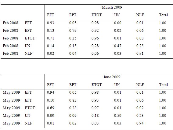
I computed these transitions for two pairs of months: February to March 2008 (which corresponded to the low-point unemployment rate in the last cycle) and May to June 2009. The following Table shows the transition probabilities for each state for those two transitions.
Of interest is that the probability of losing one’s job and getting another once you are unemployed.
The data suggests that if you the probability of becoming unemployed has not risen sharply yet (the numbers at three decimal places are 0.008 and 0.009, respectively). So a slight rise in the chance of transitting from employment to unemployment.
The chance of exiting full-time employment into unemployment has risen (0.00 to 0.01) but the chance of exiting part-time employment into unemployment has fallen (0.02 to 0.01) – a percentage point drop.
Of those who were unemployed in the respective starting months, it is clear that in February 2008, at the top of the boom, you had a 28 per cent chance of exiting unemployment into employment (more or less equally divided between full-time and part-time work).
By May 2009, if you were unemployed then you had a 18 per cent chance of getting a job in June 2009 (again equally divided between full-time and part-time).
The probability of entering the labour force (from NLF) into employment fell in the recent month compared to February to March 2008.
All this is consistent with the fact that the labour market is starting to turn but has not yet plunged. Vacancies are clearly drying up and the slowdown in employment growth is causing lower chances of entering employment from outside of that state.
But at present the major job shedding has not come yet – although the labour market appears to be on the cusp of that situation emerging.
Gross flows matrix, February-March 2008 and May to June 2009 (matched samples)

Conclusion
I could go on about other aspects of the data but a blog is a blog after all. The message I take from the data, bearing in mind that monthly shifts are an unreliable basis to draw solid conclusions, is that the trends are heading down.
Broader labour underutilisation is spiralling up now and the legacy of increasing underemployment over the course of the upswing is now going to come back and bite us badly. We will come out of this recession eventually with a huge pool of long-term unemployed and a increasingly fractured employment space (lots of full-time jobs gone and many workers forced into part-time employment to eke out a living.
This legacy will be the direct result of years of policy neglect – not pursuing full employment. However, it will also reflect deliberate policy design – the industrial relations changes that were designed to undermine the working conditions of persons and bias the economy towards the creation of precarious, casualised employment. The previous government (and its Labor predecessor) set the nation on a race to the bottom – a path characterised by low wages and low productivity growth and increasingly harrowing working experiences.
At present I don’t detect things are likely to change all that much. Failed leadership should be punished very severely.
This Post Has 0 Comments