The income and wealth inequality that continues to grow in most advanced nations has led…
US labour market appears to be marking time
Last week (December 8, 2015), the US Bureau of Labor Statistics published the latest – Employment Situation – December 2015 – and the data shows that “Total nonfarm payroll employment rose by 292,000 in December, and the unemployment rate was unchanged at 5.0 percent”. The BLS noted that they had revised their estimates of the change in total non-farm payroll employment for October up by 9000, and the estimates for the change in November up 41,000. In other words, “employment gains in October and November combined worth 50,000 higher than previously reported”. The BLS also note that “over the past 3 months, job gains of averaged 284,000 per month.” This information was widely interpreted as a strong result with the employment growth spread across several industries and services. Construction employment was also strong for the third consecutive month. However, other indicators suggest a more static picture. Broad measures of labour underutilisation indicate no significant improvement in the latter part of 2015 in the US labour market. Further average hourly earnings were static and of not risen as strongly as in previous recoveries. The participation rate was unchanged at 62.4 per cent and remains well below previous peaks. As I have shown before, despite the robust employment growth, there is a bias towards jobs at the lower end of the pay distribution (see blog – US jobs recovery biased towards low-pay jobs.
For those who are confused about the difference between the payroll (establishment) data and the household survey data you should read this blog – US labour market is in a deplorable state – where I explain the differences in detail.
Focusing on the Household Labour Force Survey data, the seasonally adjusted labour force rose by by 466 thousand in December 2015, while employment rose by 485 thousand, resulting in a decline in unemployment of 20 thousand.
The unemployment rate was stable at 5 per cent (at 1 decimal places) and would have fallen a little had the participation rate not increased by 0.1 percentage points.
The labour market for teenagers softened and their unemployment rate rose sharply from 15.6 per cent to 16.1 per cent.
The fact that the employment growth is only just eating into the unemployment pool means that the proportion of unemployed workers who are considered to be long-term unemployed (in the US this is defined as spells greater than 27 weeks) has risen to 26.4 per cent (up from 25.9 per cent in November).
There was no growth in average hourly earnings which means that the low inflation environment will continue and the US Federal Reserve should be questioning its decision to begin pushing up interest rates.
The participation rate of 62.6 remains at levels not seen since September 1977, although the slump then was mostly cyclical, whereas the declining participation rate over the last decade has also including ‘averaging’ effects of the ageing population (see below).
In 2014, total employment grew by 2,755 thousand (net) jobs, whereas, in 2015 it grew by 2,490 thousand. This is the first year since the recovery from the GFC began that total employment change has declined.
Underemployment remained at elevated levels (around 6 million) but has fallen by 764,000 in the last year – which means that the broader measures of labour underutilisation have eased somewhat.
However, while the underemployment level fell, it remains the case that there are historically large numbers of people who cannot get enough hours of work.
Employment growth improving
In December 2015, employment rose by 0.32 per cent, while the labour force rose by 0.30 per cent. The increase in the labour force was the result of the rise in the underlying working age population (0.01 per cent) and the 0.1 percentage point rise in the participation rate.
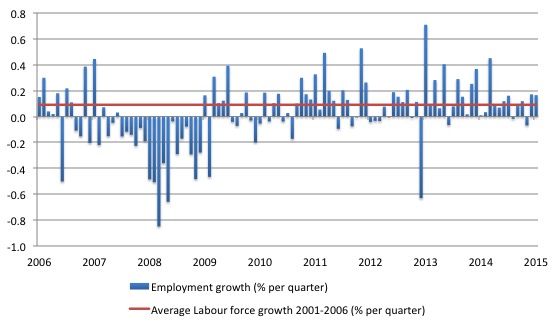
The following graph shows the monthly employment growth since the low-point unemployment rate month (December 2006). The red line is the average labour force growth over the period December 2001 to December 2006 (0.094 per cent per month). The unemployment rate rises if the employment growth is below the labour force growth rate.
What is apparent is that a strong positive and reinforcing trend in employment growth has not yet been established in the US labour market since the recovery began back in 2009. There are still many months where employment growth, while positive, remains relatively weak when compared to the average labour force growth prior to the crisis.
The situation will look decidedly weaker when (and if) the labour force participation rate reverts back to its past behaviour.
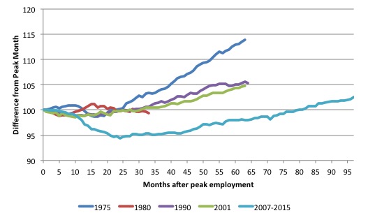
As a matter of history, the following graph shows employment indexes for the US (from US Bureau of Labor Statistics data) for the five NBER recessions since the mid-1970s.
They are indexed at the NBER peak (which doesn’t have to coincide with the employment peak). We trace them out to 64 months or so, except for the first-part of the 1980 downturn which lasted a short period.
It was followed by a second major downturn 12 months later in July 1982 which then endured. In the current period, employment only returned to an index value of 100 in June 2014 (after 77 months). The previous peak was last achieved in December 2007.
The previous recessions have returned to the 100 index value after around 30 to 34 months.
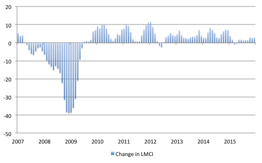
Federal Reserve Bank – Labour Market Conditions Index (LMCI)
The Federal Reserve Bank of America has been publishing a new indicator – Labor Market Conditions Index (LMCI) – which is derived from a statistical analysis of 19 individual labour market measures since October 2014.
It is now being watched by those who want to be the first to predict a rise in US official interest rates. If the latest data from the LMCI is a guide to potential interest rate movements then they won’t be rising any time soon.
You can get the full dataset HERE.
I discussed the derivation and interpretation of the LMCI in this blog – US labour market weakening.
A rising value (positive change) is a sign of an improving labour market, whereas a declining value (negative change) indicates the opposite.
The next graph shows the monthly changes in the LCMI from January 2007 to December 2015.
The conclusion is that the labour market conditions in 2014 were relatively weaker than in 2014. To understand that we note that while unemployment is now lower than last year, the rate of hiring is also slower and the way these factors combine in the index leads to an overall assessment that the labour market is weaker than in 2014 and currently treading water.
Further, over the last few months, the LMCI has been static, which suggests that the rate of improvement in the labour market has stalled.
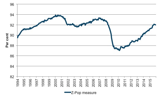
Federal Reserve Atlanta’s ZPOP ratio
Another broad indicator produced by the Federal Reserve Bank of Atlanta is their – ZPOP ratio – which attempts to overcome the limitations of relying on narrow indicators such as the official unemployment rate as a gauge of the state of the labour market.
Many observers use the Employment-Population ratio to purge the cyclical influence on the labour force estimates (via participation rate fluctuations), which make the interpretation of changes in the unemployment rate more complex than they seem.
In other words, the unemployment rate can rise even though unemployment is falling because the labour force is shrinking faster than the unemployment pool because of declines in participation. While a declining unemployment rate might usually be taken as a good sign, in the example given, the interpretation would be clearly of an opposite nature.
The Atlanta Federal Reserve Bank’s solution is to:
… propose an alternative approach that uses a broader definition of utilization that makes it less affected by labor supply trends.
They construct a measure that they consider estimates the proportion of the population that is “fully utilized”, by which they mean:
1. Everyone working full-time.
2. Everyone working part-time for a noneconomic reasons (that is, are not time-based underemployed).
3. Those that say they don’t want a job are considered fully utilized, which includes those with household responsibilities, the retired, those in school, and the disabled who are unable to work.
In other words, they consider a person to be underutilised if they are unemployed, not in the labour force but wanting a job, or employed part-time but wants to work full-time.
Clearly there are some difficulties with this classification scheme. For example a person could be active at school but preferring to be in work. School enrolments in the latter teenage years tend to rise when there is recession because there are a lack of employment opportunities.
Further, the recognition that underemployment matters is important, but their measure only considers time-based underemployment. Many people are in the skills-based underemployed category during a recession because they are forced to take jobs that are below their skill levels. In turn, the less skilled workers are ‘bumped down’ into unemployment.
But the measure is interesting and the following graph shows the evolution of their Z-pop series, which shows the share of the population that is fully utilised since January 1994 (to December 2015).
The Last official version was updated to the September 2015. I quickly calculated the ratio for December 2015 and extrapolated the intervening months (I will do a proper update when I get time). The measure is currently at around 92 per cent and has been static for the last several months.
The US jobs deficit
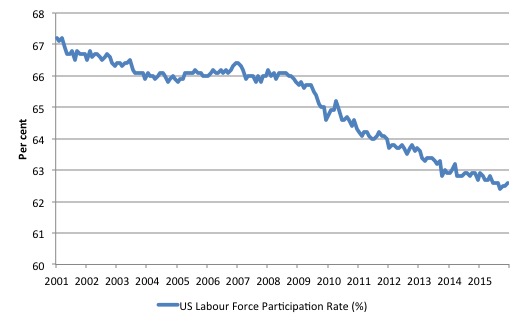
What really is striking about the last few years in the US is the falling participation rate. In December 2015, the participation rate rose by 0.1 percentage points but is still well below previous peaks.
The following graph shows the decline in labour force participation since January 2001 in the US.
The labour force participation rate is the proportion of the working age population that is either employed or unemployed.
The fall in participation since December 2006 has been stark – from 66.4 per cent to 62.6 per cent in December 2015, a decline of 3.8 percentage points.
In terms of the current working age population that amounts to some 9.5 million workers who have exited the labour force since December 2006. Remember that the official unemployment is only 7.9 million workers.
When times are bad, many workers opt to stop searching for work while there are not enough jobs to go around. As a result, national statistics offices classify these workers as not being in the labour force (they fail the activity test), which has the effect of attenuating the rise in official estimates of unemployment and unemployment rates.
These discouraged workers are considered to be in hidden unemployment and like the officially unemployed workers are available to work immediately and would take a job if one was offered.
But the participation rates are also influenced by compositional shifts (changing shares) of the different demographic age groups in the working age population. In most nations, the population is shifting towards older workers who have lower participation rates.
Thus some of the decline in the total participation rate could simply being an averaging issue – more workers are the average who have a lower participation rate.
I analysed this declining trend in this blog – Decomposing the decline in the US participation rate for ageing.
I updated that analysis to December 2015 and computed that the decline in the participation rate due to the shift in the age composition of the working age population towards older workers with lower participation rates accounted for about 58 per cent of the actual decline.
So if there had been no ageing effect the current participation rate would be 64.7 per cent rather than the actual rate in December 2015 of 62.6 per cent.
Thus, even if we take out the estimated demographic effect (the trend), we are still left with a massive cyclical response.
What does that mean for the underlying unemployment?
The labour force changes as the underlying working age population grows and with changes in the participation rate.
If we adjust for the ageing component of the declining participation rate and calculate what the labour force would have been given the underlying growth in the working age population if participation rates had not declined since December 2006 then we can estimate the change in hidden unemployment since that time due to the sluggish state of the US labour market.
The current unemployment rate is 5 per cent. Taking out the demographic effect of the falling participation rate, gives an adjusted unemployment rate of 8.1 per cent (if the participation rate had not declined due to cyclical factors since December 2006).
That puts an entirely different spin on the recovery to date.
To hold the unemployment rate constant with the participation rate at its peak, employment has to expand at a rate equal to the net new entrants into the labour force.
That is, has to keep pace with the underlying growth in the working age population adjusted for participation rate changes.
The following graph shows the actual labour force since January 2007 (green line), which reflects the declining labour force participation rate and contrasts it with what the labour force would have been if the participation rate had have remained at its January 2007 peak of 66.4 per cent (blue line).
The blue line is thus driven by the underlying changes in the working age population.
However, as discussed above, demographic changes have been a driving force in the declining participation rate. I modelled those changes using fixed-weight analysis and adjusted the potential labour force accordingly.
The red line shows what the labour force would have been if the participation rate had not been negatively affected by the cyclical downturn. So it nets out the ageing effect of the declining participation rate.
The difference between the green (actual) and red (potential net of ageing) lines gives an idea of the cyclical damage that has occurred on the labour supply side of the US labour market.
The gap between the lines is an estimate of the additional hidden unemployment that has occurred.
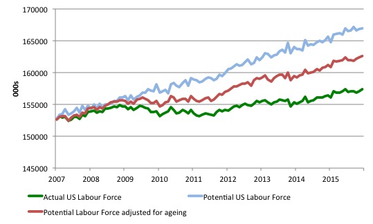
The most recent peak participation rate occurred in January 2007 (66.4 per cent). It has steadily fallen since then and in December 2015 it was 62.6 per cent. Adjusting for the demographic effect would give an estimate of the participation rate in December 2015 of 64.7 if there had been no cyclical effects.
So the 2.1 percentage point decline in the participation rate (net of ageing effect) amounts to 5,279 thousand workers who have left the labour force as a result of the cyclical sensitivity of the labour force.
It is hard to claim that these withdrawals reflect structural changes (for example, a change in preference with respect to retirement age, a sudden increase in the desire to engage in full-time education).
In January 2007 (at the peak participation rate which had carried over from December 2006), the US unemployment rate was 4.6 per cent (which was slightly higher than the 4.4 per cent low point recorded a month earlier in December 2006. It didn’t start to increase quickly until early 2008 and then the jump was sudden.
We can have a separate debate about whether 4.4 per cent constitutes full employment in the US. My bet is that if the government offered an unconditional Job Guarantee at an acceptable minimum wage there would be a sudden reduction in the national unemployment rate which would take it to well below 4.4 per cent without any significant inflationary impacts (via aggregate demand effects).
So I doubt 4.4 per cent is the true irreducible minimum unemployment rate that can be sustained in the US.
But we will use it as a benchmark so as not to get sidetracked into definitions of full employment. In that sense, my estimates should be considered the best-case scenario given that I actually think the cyclical losses are much worse than I provide here.
For those mystified by this statement – it just means that I think the economy was not at full employment in December 2006 and thus was already enduring some cyclical unemployment at that time.
Using the estimated potential labour force (controlling for declining participation), we can compute a ‘necessary’ employment series which is defined as the level of employment that would ensure on 4.4 per cent of the simulated labour force remained unemployed.
This time series tells us by how much employment has to grow each month (in thousands) to match the underlying growth in the working age population with participation rates constant at their January 2007 peak.
I computed the ‘necessary’ employment series for the unadjusted potential labour force and the age-adjusted potential labour force, corresponding to the blue and red lines in the previous graph, respectively.
The following graph compares the two ‘necessary’ employment series with the actual US employment. The former series starts at January 2007. The actual employment data is graphed from January 2003 to show perspective.
The dark green uses the unadjusted potential labour force and the light green uses the age-adjusted potential labour force series.
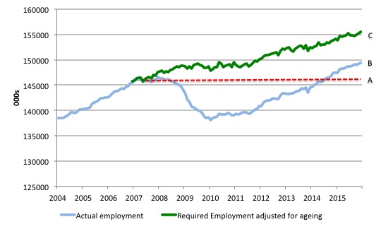
This allows us to calculate how far below the 4.4 per cent unemployment rate (constant participation rate) the US employment level is.
There are two effects:
- The actual loss of jobs since the employment peaked in January 2008 and the trough was in October 2009 – a fall of 8,365 thousand jobs. The AB gap in the graph shows the gap in employment relative to the January 2008 peak (the dotted red line is an extrapolation of the peak employment level). You can see that it wasn’t until July 2014 that the US labour market closed that gap. By December 2015, the AB gap is estimated to be minus 3.171 thousand jobs.
- The loss of the jobs that would have been generated had the demand-side of the labour market kept pace with the underlying population growth – that is, with the participation rate at its peak and the unemployment rate constant at 4.4 per cent. That loss amounts to 9,216 thousand jobs. This is the segment BC measured as at December 2015.
The total jobs that would need to be created to unwind the cyclical damage caused by the crisis is thus 6,046 thousand. which is slightly higher than it was in September 2015. This is the sum of the segments AB + BC or simply segment AC.
Conclusion
The message is less than clear.
While the US fiscal deficit has remained large enough to support some growth and allow some confidence to be regained in the private sector the signs are that the private sector recovery has slowed somewhat over the course of 2015, despite relatively strong growth in employment in December.
This slowing is on the back of a deteriorating international situation, which has led global forecasts of World growth to be downgraded in recent months.
I will examine the behaviour of wages in a separate blog.
That is enough for today!
(c) Copyright 2016 Bill Mitchell. All Rights Reserved.
“deteriorating international situation”. So what is so special about the the current state of affairs? Seems like the usual clusterfuck to me.
“which has led global forecasts of World growth to be downgraded”. Could it be that the infamous Growth At Any Cost paradigm might be running into that dreadful downer,reality. No doubt the usual culprits will deny any such thing. When I read their prognostications I always think of mindless dogs barking at nothing and anything in the wee small hours.
What’s interesting about that US participation rate at around 62/63% is that it is now exactly the same as the UK one. And the UK rate has been static around that value for years and years.
A co-incidence or an indication that the US has moved into post-world-leader status?
Participation rate among prime age workforce has dropped about 3% since recession began. If you add that 3% to the official unemployment rate of 5% you get intolerably high 8%. Doesn’t that just prove that current unemployment statistics are garbage?
Adding to the conclusions: most jobs created are of REALLY inferior quality than those created pre-2008.
So not only the real employment gap between potential and actual hasn’t been reduced much, but it has been reduced at a huge cost in the quality of the jobs being created.
Looks like the population has been scammed with this ‘recovery’.
It has been reported by US economist and former US Assistant Treasury Secretary Paul Craig Roberts and others, that there are confounding factors affecting the BLS jobs data reported. For example the US BLS uses a birth-death model which can” add up to three quarters of a million jobs that don’t exist” to the reported value for the annual payroll jobs increase.
It has also been suggested that the ” seasonal adjustments can have the same effect”. While the need to apply seasonal adjustments is well recognized and accepted, it should set off alarms when those seasonal “adjustments” could be accounting for something on the order of 96% of the reported new job gains.
The message is definitely not clear without confirmation of the ongoing validity of these models which are used to adjust the data reported.
Ignacio, add to this that many formerly full time jobs have been broken up into 2 or even 3 part time jobs and the picture gets worse yet.
Should the incarcerated people be count in?
Borders coming back.
http://www.thesundaytimes.co.uk/sto/news/uk_news/article1654850.ece
The primary purpose of production is consumption, not employment. Employment of course is a perfectly good purpose, and governments need to spend more on infrastructure etc., but if you integrated both infrastructure spending and direct monetary gifting to the individual there would be even more employment than there would be with infrastructure spending alone. And if you also had a policy of discounting retail prices with a government monetary authority rebating all of those discounts back to participating merchants along with both government infrastructure spending and a direct monetary supplement to the individual how roaringly strong, non-inflationary and stable could the economy be?