Go back to the headlines in 2010 - – “Countries with debt over 90 percent…
US labour market improving slowly – Eurozone falls further behind
Last week (February 6, 2015), the US Bureau of Labor Statistics (BLS) released its latest – Employment Situation Summary – which suggested that “Total nonfarm payroll employment rose by 257,000 in January, and the unemployment rate was little changed at 5.7 percent”. That is a relatively strong result and job gains were reported across all the major private sectors. Public employment continued to fall. The data has already been analysed to death within the media so I wanted to concentrate on some comparisons with other nations, which are quite interesting. Further, the BLS released the related – Job Openings and Labor Turnover – dataset yesterday (February 10, 2015), which allows us to dig deeper into the raw aggregate numbers to make better assessments of what is going on.
First, lets consider some aspects of the JOLTS data release.
The JOLTS data allows us to assess the viability of different theoretical views of the labour market. For example, it is often claimed by mainstream eocnomists (and it is in their textbooks) that rises in unemployment are the result of workers quitting their jobs to enjoy leisure.
A related textbook allegation is that the decision to quit is distorted by the provision of unemployment benefits which act as a subsidy to unemployment.
The mainstream textbook models which underpin the claims that unemployment benefit provisions undermines search behaviour is based on the claim that federal income support for the unemployed destroys the, already weak, initiatives of the recipients and should be cut (or abandoned altogether).
The narrative promotes socio-pathological policies, which undermine the viability of the unemployed to live even the most modest material life, and dress these indecencies up as strategies to incentivise the jobless to do more to look for work.
The supply-side story starts with the textbook model of the labour market which claims that employment and the real wage are determined in the labour market at the intersection of the labour demand and the labour supply functions.
The equilibrium employment level is constructed as full employment because it suggests that every firm who wants to employ at that real wage can find workers who are willing to work and every worker who is willing to work at that real wage can find an employer willing to employ them.
Holding technology constant, all changes in employment (and hence unemployment) are driven by labour supply shifts. There have been many articles written by key mainstream economists (such as Milton Friedman) that argue that business cycles are driven by labour supply shifts.
The essence of all these supply shift stories is that quits are constructed as being countercyclical – that is, rise when the economy is in decline and vice-versa – despite all evidence to the contrary.
They have to argue this because the shifts in employment have to come from the supply-side.
One such story that is still told is that the business cycle swings are characterised by swings in voluntary unemployment.
So a downturn in employment (and a rise in unemployment) arises – allegedly – because workers develop a renewed preference for more leisure and less work and the supply of labour at each real wage level thus moves inwards (that is, workers are now less willing to supply the same hours of labour as before at the going real wage).
So they quit their jobs and head to the beach and relax.
The provision of unemployment benefits – so the story goes – increases the attractiveness of leisure.
The evidence is that most nearly everybody do not consider the unemployment benefits to be a superior option to workign and earning an income.
Even the sociology of all this is wrong – given the evidence from countless studies that tell us how the unemployed have to endure alienation, shrinking social networks and a collapse in self-esteem.
The upturn in economic activity – so the mainstream story goes – is characterised by workers developing a new thirst for work and so the supply curve shifts out again – that is, they are willing to supply more hours of work than before at the same real wage levels. Apparently, they get sick of leisure and gain a new appetite for material goods and services.
And at the empirical level this theory predicts that quits will fall as employment falls.
The simplest fact then, which would give support to this notion of supply-side shifts, is whether the quit rate is, indeed, counter-cyclical – as the theory predicts. That is, does the quit rate rise when the unemployment rate rises or not. Simple enough.
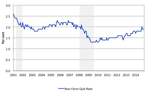
The US Bureau of Labour Market JOLTS database includes estimates of the quit rate. The following graph (for the period January 2001 to December 2014) shows in a compelling way that the quit rate (non-farm quits as a percent of total non-farm employment) behaves in a cyclical fashion as we would expect – that is, it rises when times are good and falls when times are bad.
The grey bars are the NBER recession (peak-to-trough) periods in this sample.
It is clear that when the unemployment rate rises, the quit rate falls. Exactly the opposite to that predicted by the supply-side story which means that their claim that causality runs from unemployment benefits to higher quits to higher unemployment is pure and unadulterated nonsense.
Many studies have demonstrated the phenomenon depicted in the graph.
Workers become very cautious when unemployment starts to rise and postpone any desired or planned job changes and opt for the security of their present job.
When there are more jobs being created and the hiring rate rises, workers then take more risks and the quit rate tends to rise.
The quit rate is now at 1.9 per cent (December 2014) but has not yet reached the levels found before the crisis.
The JOLTS data also allows us to see the number of people who want to work in relation to job openings. We can conclude that there are still nearly 1.8 unemployed workers wanting work per new job opening.
The following graph shows the total number of unemployed per job opening (non-farm and seasonally adjusted) and thus gives a measure of how strong the demand-side of the labour market (job openings) is relative to the number of people seeking work (the unemployed). It is an alternative way of presenting the relationships between unemployment and vacancies.
The shaded-areas denote the NBER recession dates (peak to trough).
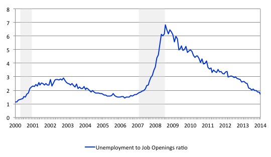
In July 2010, the US Bureau of Labor Statistics described the data at that point in this way:
When the recession began in December 2007, there were 1.8 unemployed persons per job opening. The ratio rose to a high of 6.2 unemployed persons per open job, more than twice the highest ratio seen since the JOLTS series began … From the high of 6.2 unemployed persons per job opening in November 2009, the ratio fell to 5.0 in June 2010.
Since 2010, the ratio has been improving steadily as employment growth continues but it still has a long way to go before it reaches the pre-crisis levels where, at its lowest point (March 2007) there were 1.4 unemployed person per job opening.
Labour markets typically behave over the business cycle in an asymmetric manner as can be seen from the graph. The deterioration was sharp and rapid. The recovery is much slower and is all the more slow as the employment growth not only has to absorb new labour force entrants (arising from population growth) but also has to face the huge pool of unemployed that is caused by the recession.
One of the facts I repeat often is that the unemployed cannot search for jobs that are not there! This is exactly what happens when aggregate demand falls and job openings dry up.
Another way of seeing how the job flows tell us about the direction of change is to compare layoffs with quits. The following graph shows the movements in hires and separations for the US economy as published by the BLS for the period from December 2000 to October 2013.
While labour markets are clearly dynamic in the sense that even in a downturn new jobs are being continually created and destroyed the rates of each dynamic change in a cyclical way. So while there were new jobs being created at the height of the downturn there was a severe shortfall of new jobs emerging as is shown in the graph.
Separations also fall for reasons noted above.
When the labour market is highly constrained by deficient aggregate demand the unemployment queue expands and the ordering of different demographic cohorts within the queue becomes significant. The workers who are more advantaged are able to transit in and out of jobs during a recession more easily than a low-skilled worker who may face prejudice and discrimination from employers.
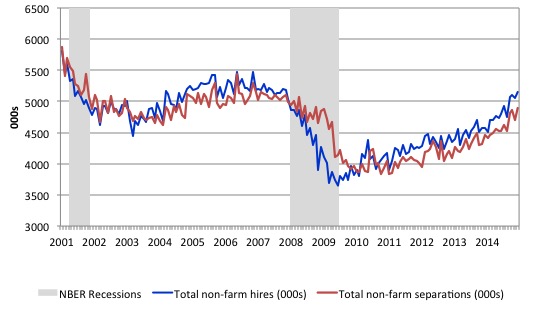
The most recent data shows that while hiring and separations are showing that the recovery continues the improvement is modest. The hires rate is now growing faster than the separations rate but not by much.
But The US labour market now locked into a situation where the tepid employment growth barely absorbs new entrants and the most disadvantaged workers are being trapped in long-term unemployment.
Accordingly, when there is an overall shortage of jobs, higher-skilled (more educated) workers tend to take jobs that were previously occupied by lower skilled workers. The low-skilled are then forced out into the unemployment queue. So there are two inefficiencies: (a) the skills-based underemployment; and (b) the unemployment.
Bumping down is one of the costs (inefficiencies) of recession.
Some labour force comparisons
How is the US faring relative to other economies? In this section, I compare the evolution of the broad labour market aggregates in the US with the movements in Australia, the UK, and the Eurozone. The conclusion is that the austerity-obsessed Eurozone has been left behind by the rest of the world and needs to change policy direction dramatically such are the losses they are racking up.
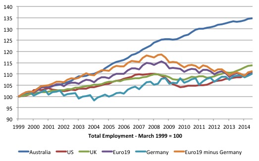
The first graph shows total employment in Australia, the US, the UK, the Eurozone (19 nations), Germany, and the Eurozone 19 net of Germany from the March 1999 quarter (where the series are indexed to 100).
Clearly, Australia is the standout performer with 34.7 per cent growth over that period. In order of overall growth of the remainder, the UK experienced 13.9 per cent growth only, the Euro 19 net of Germany 11.2 per cent, the US 10.2 per cent, the Eurozone 19 10.9 per cent, and bringing up the rear was Germany 10.1 per cent.
So the claims that Germany is the miracle Eurozone economy are not to be made (if at all) in terms of its ability to generate jobs.
Further, as we have discussed before, a significant number of the new net jobs growth in Germany have been the so-called Mini-jobs, which one could suggest are not really jobs at all.
Please read my blog – No fundamental shift of policy at the Bundesbank – for more discussion on this point.
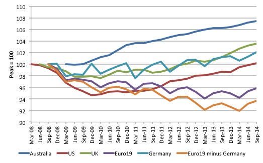
The next graph shows what happened since the peak employment quarter, leading into the GFC until the fourth-quarter 2014. The peak occurred at different quarters in different nations – March-quarter 2008 the US, June-quarter 2008 the UK, September-quarter 2008 Europe, and the March-quarter 2009 Australia.
Each nation’s employment index is set at 100 at the corresponding quarter.
The graph is depicted in actual time with the graphs staggered to start at the actual peak for each nation. So the US led the crisis, which then infected the UK, then Europe and Australia finally started to feel its effects a bit later.
The results are very stark. Australia clearly fared better in the downturn after the government introduced a major stimulus in 2008, which effectively meant only one quarter of negative real GDP growth.
The UK and Germany have had similar scale downturns and modest growth since the trough. It appears that employment in the UK over 2014 started to outstrip the very moderate growth in Germany. Since the end of 2011, employment has grown by 4.9 per cent while German employment has grown by 1.6 per cent.
Germany is not a star performer here having only generated 2 per cent employment growth in 5.5 years despite the more re. It just looks better than its European neighbours.
The US clearly had the worst initial downturn but since the end of 2011 employment has grown by 4.1 per cent. Australia’s employment growth since the last-quarter 2011 has been 3 per cent (very modest).
The clear distinction is shown between those nations and the Eurozone with the Eurozone net of Germany performing disastrously.
Over the entire period employment is still 4.1 per cent below it previous peak (September-quarter 2008) and once we take Germany out of the picture employment is 6.3 per cent below the peak in September 2008. In the six years from peak to September-quarter 2014 (shown in the graph), the Eurozone has been shedding jobs overall.
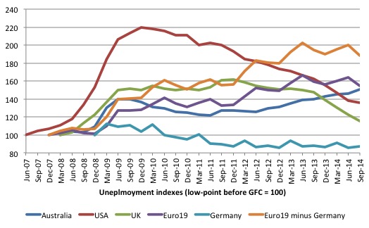
The next graph shows the evolution of the respective unemployment rates from June-quarter 2007 (the low-point for the US in the last cycle). The respective low-points for the other nations are Australia and the UK March-quarter 2008, Europe September-quarter 2007, and Germany December-quarter 2008.
The indexes are set at 100 at those respective dates.
Clearly, the analog of the major decline in employment in the US was the huge increase in its unemployment rate (it rose by 120 per cent between the June-quarter 2007 and the December-quarter 2009) before its steady decline.
Australia’s unemployment history since the crisis is interesting. It rose sharply initially, then fell as the fiscal stimulus started to take effect.
But as a result of the obsession with achieving fiscal surpluses by the previous Labor government and the current Conservative government, the unemployment rate once again has risen again and is still rising. In the September-quarter, it was 50.5 per cent higher than at the onset of the GFC which was not much better than the Eurozone 19 nations (including Germany) which was 54.7 per cent higher.
The unemployment rate in the Euro 19 nations minus Germany, was 88.5 per cent higher in the September-quarter 2014 relative to its level at the onset of the GFC. In some individual Eurozone nations, this figure was obviously much higher than that such has been the scale of the austerity disaster.
The question you might ask is why is Australia’s unemployment rate performance worse thean the US and the UK given Australia’s superior employment growth?
The answer lies in an understanding of the labour force relationships.
The working age population is decomposed by the national statistician into three components:
1. Employment (more than 1 hour of paid work per period).
2. Unemployment (less than 1 hour of paid work but available and looking for work).
3. Not in the labour force (so not working and not available and/or not looking for work).
The labour force is the sum of Employment and Unemployment. The labour force participation rate is the percentage of people in the working age population who are in the labour force.
The unemployment rate is the proportion of people in the labour force who are unemployed. So it can increase if unemployment rises faster than the labour force.
If the participation rate falls, then the labour force declines. Even if the total level of unemployment was unaltered, the unemployment rate would fall in these circumstances because the denominator in the ratio (the labour force) was declining.
The opposite is the case if the participation rate rises and total unemployment remains unchanged – then the unemployment rate rises.
Clearly, if the labour force is unchanged and employment rises, then both the level and rate of unemployment falls.
So to understand movements in the unemployment rate, we have to be cogniscant of the shifts in employment, the underlying population growth rate, and shifts in the participation rate (which translate that population growth into labour force growth).
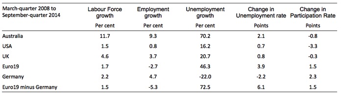
The following Table shows you a more complete story. It shows the changes in the main labour force aggregates from the March-quarter 2008 to September-quarter 2014 (in percent for the Labour Force, Employment and Unemployment, and percentage points for the Unemployment Rate and the Participation Rate).
Despite the falling participation rate, which has taken pressure of the unemployment rate in Australia, its relatively strong labour force growth has overwhelmed the moderate employment growth, which explains why the unemployment rate is 2.1 percentage points higher than it was at the onset of the GFC.
In the case of the US, the participation rate has falling dramatically since the March-quarter 2008, which has taken the pressure off the labour force growth rate and allowed bigger losses in unemployment for a given percentage employment growth rate.
The employment performance of the US economy has been quite poor over the period March-quarter 2008 to September-quarter 2014. They are benefiting from the sluggish labour force growth rate. There is a lot of hidden unemployment in the US economy.
That explains why the unemployment rate in the September-quarter 2014 was only 0.7 points above the pre-crisis low-point. It would have been much higher than that had not the participation rate fallen.
The UK unemployment rate also benefited from a declining participation rate although this effect is less pronounced relative to the same phenomenon in Australia and the US.
Note, none of this discussion considers hours of work, quality of work etc. Unemployment is a narrow indicator of labour underutilisation. Broader forms include underemployment (part-time workers who want to work more hours but cannot find the work) and hidden unemployment (unemployed workers who want to work but have given up looking for lack of opportunity and are thus classified as being inactive or not in the labour force).
To give you an idea of how the dramatic drop in the US participation rate has changed the perception of what is happening in that economy, a simple calculation allows us to answer the question:
What would the unemployment rate be if the participation rate remained at its peak of 66.3 per cent (March 2007)?
The answer is that the given the working age population, the labour force would have 8.7 million extra workers participating and if we considered all of those extra workers had dropped out because of a lack of work available, then the adjusted unemployment rate would be around 10.6 per cent.
That is quite a different picture.
Of course, it is likely that there are additional factors – beyond lack of available work – which help to explain the declining participation rate. For example, the ageing workforce means that more people are now moving into retirement age.
I considered that issue in relation to the US economy in this blog – Decomposing the decline in the US participation rate for ageing
I concluded that the shift in the age composition of the working age population in the US accounted for about 60.1 per cent of the actual decline in the participation rate.
The remainder is most likely the result of cyclical effects or 4.3 million workers who could reasonably be considered to be extra hidden unemployed.
Under those assumptions, the adjusted ‘unemployment rate’ would be 7.8 per cent in December 2014. It is clear that the unemployment rate was much higher than the 5.7 per cent in the December-quarter 2014.
Conclusion
The JOLTS data shows that the US labour market continues to improve but at a relatively modest rate.
The comparative data shows that the austerity-obsessed Eurozone has been left behind by the rest of the world and needs to change policy direction dramatically such are the losses they are racking up.
I read overnight that Greece is near to winning a compromise. It looks like a cave-in to me. I would hardly call it a win. More on that when we know more.
That is enough for today!
(c) Copyright 2015 William Mitchell. All Rights Reserved.
“why is Australia’s unemployment rate performance worse than” etc ?
I’m sure that the ABS has figures re jobs growth versus the immigration rate. I can tell you that they are way out of whack. But of course that way of looking at the problem is well and truly in the blind spot of growth entranced economists.
More in keeping with the ideology (and easier) to obfuscate the issue with all sorts of technical jargon.
with the government sector deficit decreasing in the US
fiscal drag seems inevitable
your American namesake likes to print a graph of falling US
deficits as a recession clock and it seems like the alarm
is about to go off.
“The comparative data shows that the austerity-obsessed Eurozone has been left behind by the rest of the world and needs to change policy direction dramatically such are the losses they are racking up.”
According to S.S.
” And we had something like a controlled experiment, since the US and the Eurozone did roughly the same amount of austerity. (By some measures the US did a bit more.)
The big difference between the two areas was monetary policy. The US did some monetary stimulus through QE and forward guidance, while the ECB did nothing.
Now the unemployment rate in the Eurozone has gone up from 9% to 11.6%, while it’s gone down in the US to 6.3%. This huge divergence in employment outcomes over the last 3 years with monetary policy being the difference, not fiscal policy, seems very striking. But yet again very respected Keynesians say it’s that it’s obvious that fiscal policy explains what went wrong.”
And
“But market monetarists argued that even at the zero lower bound, there’s a lot a central bank can do and to some extent has been doing, like quantitative easing.
And since we’ve talked about monetary policy offsetting fiscal policy, in early 2013 Paul Krugman said that there was a perfect test of Market Monetarism taking place that year, because the US did a lot of austerity. It raised income tax rates at the beginning of the year, raised payroll taxes, and cut government spending quite a lot.
According to the Keynesian model that Krugman subscribes to, all that fiscal austerity should mean that growth would slow down quite a lot.
This was the test: if growth slowed, Krugman would be right. If it didn’t, because the central bank was offsetting it by easing monetary policy, the Market Monetarists would be. I think we passed the test with flying colours: GDP growth actually accelerated in 2013 in the US. At the end of the year Krugman was asked about this and he denied ever setting a test, because all sorts of things change in an economy so no individual factor could be pointed to. A pity.”
http://www.adamsmith.org/wp-content/uploads/2015/02/therealproblemwasnominal2.pdf
I for one do not consider Anglo countries model pupils.
The last time I checked these jurisdictions are sociological disasters.
There would be no unemployment problem in Europe if women returned to pre 1960s household practices.
However there is not enough local purchasing power for this as a result of wastefull conduit industrial practices.
But what if the people of Europe have been damaged by growth and want to be left behind.
These jurisdictions are owned by banks so…..if loses are racking up then it’s the banks losses.
Again I hold radically different social credit views employment within a industrial ecosystem.
We can see how absurd full employment policies are when looking at the most extreme example – the UK.
Huge amounts of diesel is burned each day as people seek purchasing power with minimum production involved.
It truly is a reggae perrin like world of pointless activity.
Bill’s data from the U.S. Bureau of Labor Statistics is straight-up correct, however, an underground joke in the U.S. is that the DOL “cooks the books”, which isn’t far from the truth [see below]-but in any event, my two-cents worth….
Posted on: The Aspen Idea Blog
Walter Isaacson/Aspen Institute, BOOK TV 2/7/15:
Our model for job creation in America is based on the premise that “the market can provide anybody wanting a job, with a job”-problem is, it is anachronistic–unworkable in our 21st Century economy….
And evident by the data, alone-with this as our sole model for job creation, only once since WW II has this resulted in an unemployment rate below 3%–in 1953-leaving millions jobless in its wake–and given “automation”, alone, the market will create fewer and fewer jobs-the further we advance into the 21st Century.
Unemployment is a “No One Wins”…..the jobless lose, civility loses, and the market loses, to wit:
THE LAW OF DIMINISHED INCOME TO THE MARKET FROM UNEMPLOYMENT [hereafter the D/UE LAW]
Short Definition:
3% is the zero-sum threshold above which unemployment starts substantially undermining the Market–and the loss in income to the Market is compounded exponentially with each percentage point of increase in unemployment, above 3%.
In short, our current model for job creation is a dinosaur…unworkable in a modern market economy-and the irony is that the genius of Humphrey-Hawkins [hereafter HH], which became law in 1978 [15 USC § 3101]-a law ahead of its time–is spot on correct as a workable model in our 21st Century economy-
Given the vitriolic climate in Washington, it is little wonder Democrats celebrate, as they rightfully should, our rise from the ashes since 2008–But the inertia of our neo-liberal/Republican-driven current job creation model keeps us trapped with one foot on the plantation-to the detriment of everyone–[our true UE rate is 11.2%–i.e., The DOL does not count persons who have “given up” and on 2-8-15, Gallup CEO Jim Clifton opined “as many as 30 million Americans are either out of work or severely underemployed.”]–as our job creation inches downward at a snail’s pace….
WHICH is inexplicable given that we have the “legal authorization” on the books, via HH, to limit our UE to “3%”, tomorrow–i.e. at no time should our UE rate in America exceed 3%! And, save for a lone Congressman, Conyers [HR 870, HR 1000], this vital solution would be relegated to obscurity-and I am writing to urge your support for this solution.
Ref: FULL EMPLOYMENT IS A PRO-MARKET CONCEPT and THE NEIGHBOR-TO-NEIGHBOR JOB CREATION ACT, Amazon/Kindle
Jim Green, Democrat opponent to Lamar Smith, Congress, 2000
Apologies if a bit off topic but an article by Ross Guest is Professor of Economics and National Senior Teaching Fellow at Griffith University really makes you wonder about the state of the discipline of Economics.
” Government liabilities have risen 11% (of GDP) in Australia over the past two decades and 30% across the OECD, which eventually implies either higher taxes or lower spending.
Some say this isn’t true – that governments are not like households that eventually have to repay their debts because governments can simply print money to repay their debts. This is a dangerously naive view for an economy like Australia that borrows heavily from the rest of the world, and it has been debunked in detail elsewhere. Suffice to say that Queensland lost its AAA credit rating several years ago because of its rising debt, which has cost the taxpayer dearly through rising interest payments. ”
You would think that a Professor of Economics, in offering a critique, would at least need to avoid setting up straw men( “simply print money”).
http://www.psnews.com.au/aps/TalkingPointpsn4421.html
Dear Robert Hart (at 2015/02/12 at 7:05)
The statements by Ross Guest are a disgrace.
best wishes
bill
Taken from a social credit blog.
Sunday, 18 January 2015
Erroneous Economic Assumptions
The following is a list of what I believe are erroneous economic assumptions. While the list is not meant to be exhaustive, these assumptions lead to erroneous conclusions.
1) The labour theory of value
2) The quantity theory of money
3) Say’s law
4) Neutrality of money
5) Factors of production are only land, labour and capital
6) Man’s needs and wants are insatiable
7) There’s no such thing as a free lunch
8) Money is a commodity that acts as a medium of exchange ( dork -however this those not apply to medieval trade fair like dynamics)
9) Real costs are opportunity costs
What I find interesting is Bill’s comments on the first two graphs, where he goes out of his way to tell us how poorly Germany is really doing, while on the third graph, and especially on the final table which (according to Bill) paints the more complete story, there are no similar comments on how good the German numbers actually look.