The Australian Bureau of Statistics (ABS) released the latest labour force data today (March 19,…
Australian labour market data – urgent need for fiscal stimulus
Since the last Labour Force data release (August), Australia has elected a new federal government. Today’s release of the – Labour Force data – for September 2013 by the Australian Bureau of Statistics confirms that the new government needs to substantially alter the macroeconomic policy settings in favour of stimulus to address the virtually zero employment growth and the upward trend in labour underutilisation. We learned today that employment growth remains around zero and, while unemployment fell, that result was all due to the decline in the participation rate (third consecutive month). Working hours also fell, which means that underemployment has risen. This data signals an urgent need for fiscal stimulus to reverse the negative trend. Unfortunately, with both sides of politics are locked into an austerity mindset the situation is likely to deteriorate further.
The summary ABS Labour Force (seasonally adjusted) estimates for September 2013 are:
- Employment increased 9,100 (0.1 per cent) with full-time employment rising by 5,000 and part-time employment rising by 4,100.
- Unemployment decreased by 14,700 (2.1 per cent) to 697,100 but that was due to a continuing decline in the participation rate (third consecutive month).
- The official unemployment rate is at 5.6 per cent (down from 5.7 per cent).
- The participation rate fell by 0.1 points to 64.9 per cent still well below its November 2010 peak (recent) of 65.9 per cent.
- Aggregate monthly hours worked decreased by 6.4 million hours (0.4 per cent).
- The quarterly ABS broad labour underutilisation estimate (the sum of unemployment and underemployment) are published on a quarterly basis, the last release being for the August-quarter where there was a sharp rise from 12.9 per cent (May quarter) to 13.7 per cent. Underemployment was estimated to be 7.9 per cent or 964.3 thousand persons. This will have risen somewhat in the current month given the decline in working hours.
Employment growth – continues to be fluctuate around zero
The September 2013 data shows that employment increased 9,100 (0.1 per cent) with full-time employment rising by 5,000 and part-time employment rising by 4,100.
Over the last 18 months or so we have seen the labour market data switching back and forth regularly between negative employment growth and positive growth spikes.
This pattern has consolidated and indicates the current policy settings are wrong and a stimulus is required.
There have been considerable fluctuations in the full-time/part-time growth over the last year with regular crossings of the zero growth line.
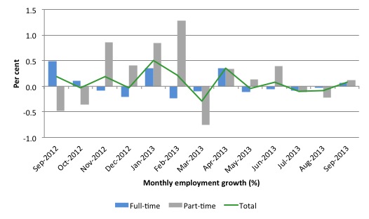
The following graph shows the month by month growth in full-time (blue columns), part-time (grey columns) and total employment (green line) for the 12 months to September 2013 using seasonally adjusted data.
Today’s results just repeat the topsy-turvy nature of the data over the period shown.
While full-time and part-time employment growth are fluctuating around the zero line, total employment growth is still well below the growth that was boosted by the fiscal-stimulus in the middle of 2010.
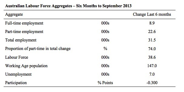
The following table provides an accounting summary of the labour market performance over the last six months. The monthly data is highly variable so this Table provides a longer view which allows for a better assessment of the trends. WAP is working age population (above 15 year olds).
The conclusion – overall there have been 31.5 thousand jobs (net) lost in Australia over the last six month, which is appalling given the positive spikes in April 2013.
Over the last six months, full-time employment has risen by 8.9 thousand jobs (net) while part-time work has risen by 22.6 thousand jobs.
The Working Age Population has risen by 147 thousand in the same period while the labour force has risen by just 38.6 thousand. The labour force growth is tepid (relative to the growth in the WAP) because participation has fallen substantially.
The weak employment growth has thus not been able to keep pace with the underlying population growth and unemployment has risen as a result (by 7 thousand).
The rise in unemployment would have been much worse had the participation rate not dropped by -0.3 points (see below for accounting of that impact).
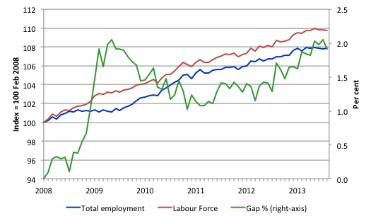
To put the recent data in perspective, the following graph shows the movement in the labour force and total employment since the low-point unemployment rate month in the last cycle (February 2008) to September 2013. The two series are indexed to 100 at that month. The green line (right-axis) is the gap (plotted against the right-axis) between the two aggregates and measures the change in the unemployment rate since the low-point of the last cycle (when it stood at 4 per cent).
You can see that the labour force index has largely levelled off and now falling and the divergence between it and employment growth has been relatively steady over the last several months with this month showing some improvement.
The Gap series gives you a good impression of the asymmetry in unemployment rate responses even when the economy experiences a mild downturn (such as the case in Australia). The unemployment rate jumps quickly but declines slowly.
It also highlights the fact that the recovery is still not strong enough to bring the unemployment rate back down to its pre-crisis low. You can see clearly that the unemployment rate fell in late 2009 and then has hovered at the same level for some months before rising again over the last several months.
The Gap shows that the labour market is still a long way from recovering from the financial crisis that hit in early 2008. There hasn’t been much progress since January 2010, when the fiscal stimulus started to run out.
In fact, in September 2013, the Gap reached the levels that appeared in May and June 2009 when the Australian economy was enduring the impact of the crisis. All the gains made since then have gone.
Full-time and Part-time employment in recovery
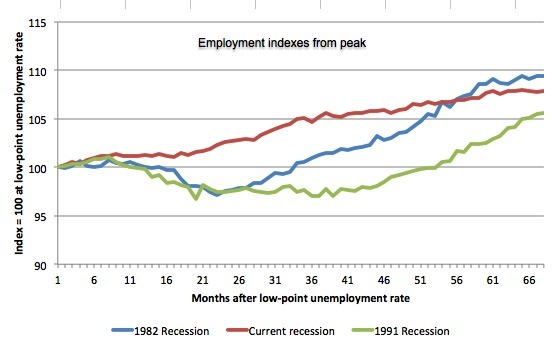
The following graph shows employment indexes for the last 3 recessions and allows us to see how the trajectory of total employment after each peak prior to the three major recessions in recent history: 1982, 1991 and 2009 (the latter to capture the current episode). The peak is defined as the month of the low-point unemployment rate in the relevant cycle and total employment was indexed at 100 in each case and then indexed to that base for each of the months as the recession unfolded.
I have plotted the 3 episodes for 68 months after the low-point unemployment rate was reached in each cycle. The current episode is now in its 68th month.
The initial employment decline was similar for the 1982 and 1991 recessions but the 1991 recovery was delayed by many month and the return to growth much slower than the 1982 recession.
The current episode is distinguished by the lack of a major slump in total employment, which reflects the success of the large fiscal stimulus in 2008 and 2009.
However, the recovery spawned by the stimulus clearly dissipated once the fiscal position was reversed and the economy is now producing very subdued employment outcomes.
Moreover, the current episode is also different to the last two major recessions in the sense that the recovery is over and the economy is deteriorating again.
The next 3-panel graph decomposes the previous graph into full-time and part-time employment. The vertical scales are common to allow a comparison between the three episodes.
First, after the peak is reached, part-time employment continues to increase as firms convert full-time jobs into fractional jobs.
Second, recoveries are dominated by growth in part-time employment as firms are reluctant to commit to more permanent arrangements with workers while there is uncertainty of the future course in aggregate demand.
Third, the current recovery is clearly mediocre by comparison, with both subdued growth in full-time and part-time work.
Teenage labour market – now so bad that policy should change today
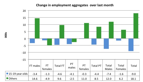
Full-time employment for teenagers fell by 4.6 thousand in September 2013 while part-time employment fell by 4.4 thousand. Overall, teenage employment fell by 9 thousand (net) jobs.
The following graph shows the distribution of net employment creation in the last month by full-time/part-time status and age/gender category (15-19 year olds and the rest)
If you take a longer view you see how poor the situation is.
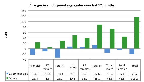
Over the last 12 months, teenagers have lost 20.7 thousand jobs while the rest of the labour force have gained 116.2 thousand net jobs. Remember that the overall result represents a very poor annual growth in employment.
Even more disturbing is the attrition of full-time jobs among teenagers – losing 33.3 thousand over the last year.
The teenage segment of the labour market is being particularly dragged down by the sluggish employment growth, which is hardly surprising given that the least experienced and/or most disadvantaged (those with disabilities etc) are rationed to the back of the queue by the employers.
The following graph shows the change in aggregates over the last 12 months.
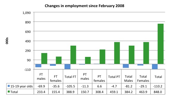
To further emphasise the plight of our teenagers I compiled the following graph that extends the time period from the February 2008, which was the month when the unemployment rate was at its low point in the last cycle, to the present month (September 2013). So it includes the period of downturn and then the so-called “recovery” period. Note the change in vertical scale compared to the previous two graphs.
Since February 2008, there have been only 848 thousand (net) jobs added to the Australian economy but teenagers have lost a staggering 110.2 thousand over the same period. It is even more stark when you consider that 105.5 thousand full-time teenager jobs have been lost in net terms.
Even in the traditionally, concentrated teenage segment – part-time employment – there have been 4.7 thousand jobs (net) lost even though overall some 459.1 thousand part-time jobs have been added.
Overall, the total employment increase is modest. Further, around 54 per cent of the total (net) jobs added since February 2008 have been part-time, which raises questions about the quality of work that is being generated overall.
Overall, the performance of the teenage labour market is close to disastrous. It doesn’t rate much priority in the policy debate, which is surprising given that this is our future workforce in an ageing population. Future productivity growth will determine whether the ageing population enjoys a higher standard of living than now or goes backwards.
The longer-run consequences of this teenage “lock out” will be very damaging.
The problem is that in the modest growth period that the Australian labour market enjoyed as a result of the fiscal stimulus and mining investment, teenagers failed to participate in the gains – they went backwards.
Now, with the economy entering a new period of slowdown, these losses will be added too given that teenagers are among the first in line to be shown the door by employers seeking to reduce staff levels in the face of declining aggregate sales.
The previous Government’s response was to push this cohort into endless training initiatives (supply-side approach) without significant benefits. The research shows overwhelmingly that job-specific skills development should be done within a paid-work environment.
I would recommend that the new Australian government immediately announce a major public sector job creation program aimed at employing all the unemployed 15-19 year olds, who are not in full-time education or a credible apprenticeship program.
It is clear that the Australian labour market continues to fail our 15-19 year olds. At a time when we keep emphasising the future challenges facing the nation in terms of an ageing population and rising dependency ratios the economy still fails to provide enough work (and on-the-job experience) for our teenagers who are our future workforce.
Unemployment
The unemployment rate fell to 5.65 per cent in September 2013, down from 5.77 per cent in August. Official unemployment fell by 14,700 (2.1 per cent) to 697,100 but the decline was all due to the continued fall in the participation rate (third consecutive month).
Overall, the labour market still has significant excess capacity available in most areas and what growth there is is not making any major inroads into the idle pools of labour.
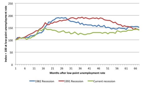
The following graph updates my 3-recessions graph which depicts how quickly the unemployment rose in Australia during each of the three major recessions in recent history: 1982, 1991 and 2009 (the latter to capture the 2008-2010 episode). The unemployment rate was indexed at 100 at its lowest rate before the recession in each case (January 1981; January 1989; April 2008, respectively) and then indexed to that base for each of the months as the recession unfolded.
I have plotted the 3 episodes for 68 months after the low-point unemployment rate was reached in each cycle. The current episode is now in its 68th month. For 1991, the peak unemployment which was achieved some 38 months after the downturn began and the resulting recovery was painfully slow. While the 1982 recession was severe the economy and the labour market was recovering by the 26th month. The pace of recovery for the 1982 once it began was faster than the recovery in the current period.
It is significant that the current situation while significantly less severe than the previous recessions is dragging on which is a reflection of the lack of private spending growth and declining public spending growth.
Moreover, the current episode is also different to the last two major recessions in the sense that the recovery is over and the economy is deteriorating again.
The graph provides a graphical depiction of the speed at which the recession unfolded (which tells you something about each episode) and the length of time that the labour market deteriorated (expressed in terms of the unemployment rate).
From the start of the downturn to the 68-month point (to September 2013), the official unemployment rate has risen from a base index value of 100 to a value 145.7 – peaking at 148 after 17 months. After falling steadily as the fiscal stimulus pushed growth along (it reached 122.8 after 35 months – in January 2010), it has been slowly trending up for some months now. Unlike the other episodes, the current trend, at this stage of the cycle, is upwards.
It will soon be above the peak that was reached just before the introduction of the fiscal stimulus. In other words, the gains that emerged in the recovery as a result of the fiscal stimulus in 2009-10 have now been lost.
At 68 months, 1982 index stood at 151.9 and was falling while the 1991 index was at 143.1 and was also falling. It is clear that at an equivalent point in the “recovery cycle” the current period is more sluggish than our recent two major downturns.
It now appears that the recoveries are converging, which tells us that the current policy has failed to take advantage of the fact that the latest economic downturn was much more mild than the previous recessions. In other words, the policy failure is locking the economy into a higher unemployment rate than is desirable and otherwise attainable.
Note that these are index numbers and only tell us about the speed of decay rather than levels of unemployment. Clearly the 5.7 per cent at this stage of the downturn is lower that the unemployment rate was in the previous recessions at a comparable point in the cycle although we have to consider the broader measures of labour underutilisation (which include underemployment) before we draw any clear conclusions.
The notable aspect of the current situation is that the recovery is very slow.
Broader labour underutilisation
The ABS published its quarterly broad labour underutilisation measures in the August data release. The next update will be in the November release.
In the August release, total underemployment rose to 7.3 per cent (from 7.1 per cent) in the May-quarter and the ABS broad labour underutilisation rate rose sharply by 0.3 points to 12.9 per cent (the sum of unemployment and underemployment).
| There were 964.3 thousand workers underemployed in Australia in August 2013. That number will be higher in September 2013 |
There will likely be a million underemployed workers before the end of the year.
If hidden unemployment is added to the broad ABS figure the best-case (conservative) scenario would see a 15.5 per cent underutilisation rate. Please read my blog – Australian labour underutilisation rate is at least 13.4 per cent – for more discussion on this point.
We will update this analysis in the November Labour Force data release.
Aggregate participation rate fell by 0.1 points – third consecutive month
The participation rate fell by 0.1 percentage points in September 2013 after falling by 0.2 points in July and -0.1 points in August. This continues the downward trend we have seen over the last six months (see Table above).
It is now at 64.9 per cent. The falling participation led to the decline in unemployment. Had the participation rate not fallen, unemployment would have risen.
Unemployment would have been 19 thousand persons higher than the official level had the labour participation rate remained static and given the actual employment growth.
We can assume that hidden unemployment has risen by something close to 19 thousand persons in September 2013 as the employment prospects for workers continue to diminish. The participation rate is also still substantially down on the most recent peak in November 2010 of 65.9 per cent when the labour market was still recovering courtesy of the fiscal stimulus.
The labour force is a subset of the working-age population (those above 15 years old). The proportion of the working-age population that constitutes the labour force is called the labour force participation rate. Thus changes in the labour force can impact on the official unemployment rate, and, as a result, movements in the latter need to be interpreted carefully. A rising unemployment rate may not indicate a recessing economy.
The labour force can expand as a result of general population growth and/or increases in the labour force participation rates.
In the current month, the unemployment rate fell to 5.65 per cent from 5.77 per cent.
What would have the unemployment rate been had the participation rate not fallen by 0.1 points.
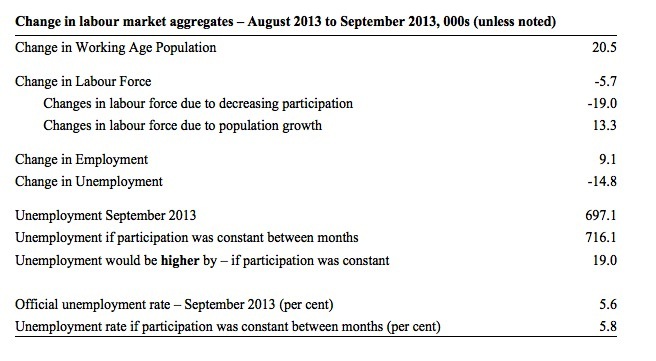
The following Table shows the breakdown in the changes to the main aggregates (Labour Force, Employment and Unemployment) and the impact of the rise in the participation rate.
In September 2013, employment rose by 9.1 thousand while the labour force contracted by 5.7 thousand persons. As a result, unemployment fell by 14.8 thousand.
The labour force fall in September was the outcome of two separate factors:
- The underlying population growth added 13.3 thousand persons to the labour force. The population growth impact on the labour force aggregate is relatively steady from month to month; and
- The fall in the participation rate meant that 19 thousand workers left the labour force (relative to what would have occurred had the participation rate remained unchanged).
So while employment growth failed to keep pace with the underlying population growth, the falling participation took the pressure off somewhat as workers exited the labour force (19 thousand) and were taken out of the official unemployment count.
If the participation rate had not have fallen, total unemployment, at the current employment level, would have been 716.1 thousand rather than the official count of 697.1 thousand as recorded by the ABS – a difference of 19 thousand workers.
Thus, without the fall in the participation rate, the unemployment rate would have actually risen to 5.8 per cent rather than its current value of 5.65 per cent.
The conclusion is that hidden unemployment rose and this attenuated the rise in the official unemployment rise. In functional terms this signals a much worse deterioration in the conditions than signalled by the current official unemployment rate.
There is considerable monthly fluctuation in the participation rate but the current rate of 64.9 per cent is a long way below its most recent peak in November 2010 of 65.9 per cent.
What would the unemployment rate be if the participation rate was at that recent peak level (65.9 per cent)?
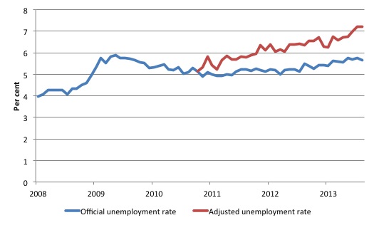
The following graph tells us what would have happened if the participation rate had been constant over the period November 2010 to September 2013. The blue line is the official unemployment since its most recent low-point of 4 per cent in February 2008.
The red line starts at November 2010 (the peak participation month). It is computed by adding the workers that left the labour force as employment growth faltered (and the participation rate fell) back into the labour force and assuming they would have been unemployed. At present, this cohort is likely to comprise a component of the hidden unemployed (or discouraged workers).
Total unemployment in September 2013 was estimated to be 697.1 thousand. However, if participation had not have fallen there would be 906.3 thousand workers unemployed given growth in population and employment since November 2010.
| The unemployment rate would now be 7.2 per cent if the participation had not fallen below its November 2010 peak of 65.9 per cent. |
The difference between the two numbers reflects the change in hidden unemployment since November 2010. These workers would take a job immediately if offered one but have given up looking because there are not enough jobs and as a consequence the ABS classifies them as being Not in the Labour Force.
Note, the gap between the blue and red lines doesn’t sum to total hidden unemployment unless November 2010 was a full employment peak, which it clearly was not. The interpretation of the gap is that it shows the extra hidden unemployed since that time.
As the participation rate dropped over the period, the gap rose.
This is quite a different picture to that portrayed by the official summary statistics.
|
Taken into account the drop in participation since November 2010, the sum of the unemployment and underemployment would generate a broad labour underutilisation rate of 15 per cent in September 2013.
That is 1.85 million workers are either not working or not working enough hours. |
Hours worked – fall in September 2013
Aggregate monthly hours worked decreased by 6.4 million hours (0.39 per cent) in seasonally adjusted terms. The fall in hours worked this month continues the trends over several months of growth being interspersed with contraction with the trend switching back and forth between positive and negative.
The small swings up and down in monthly hours worked each month since the beginning of 2011 is being largely driven by similar fluctuations in full-time employment.
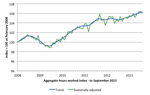
The following graph shows the trend and seasonally adjusted aggregate hours worked indexed to 100 at the peak in February 2008 (which was the low-point unemployment rate in the previous cycle). The rising trend which marked the early recovery courtesy of the fiscal stimulus is now clearly gone.
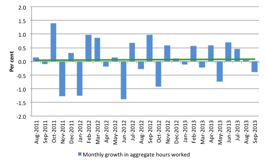
The next graph shows the monthly growth (in per cent) over the last 24 months. The green linear line is a simple regression trend – which depicts a flat trend, which is at least better than a negative trend. You can see the pattern in working hours that is also portrayed in the employment graph – zig-zagging across the zero growth line.
The data supports the conclusion that the Australian labour market is performing badly and the current policy setting are not supporting growth. There needs to be a change in policy towards stimulus. Two years with no discernible upward trend is evidence of policy failure.
Conclusion
Overall, today’s data shows that the Australian labour market continues to weaken.
In general, we always have to be careful interpreting month to month movements given the way the Labour Force Survey is constructed and implemented.
But we have now had two years of weak-to-zero employment growth and deteriorating participation. It is clear that the consistently weak employment growth relative to the underlying population growth is slowly but surely pushing the unemployment rate is trending upwards.
The lack of job opportunities is leading workers to give up looking for jobs (that are not there) and the shrinking labour force is keeping the rise in unemployment down. But the unemployment rate is flattering given the accompanying rise in underemployment and hidden unemployment.
The broad rate of labour wastage is now at least 13.7 per cent. Add to this the impacts of the falling participation rate and the figure is well above 15 per cent.
The most striking aspect of a sad picture remains the appalling performance of the teenage labour market. Employment has collapsed for that cohort since 2008. I consider it a matter of policy urgency for the Government to introduce an employment guarantee to ensure we do not continue undermining our potential workforce.
The data certainly shows the recently defeated Federal Government’s macroeconomic strategy was a failure. The incoming government has to reverse the contractionary bias and that means only one thing – more fiscal stimulus is definitely needed.
It is time for the conservatives to abandon their free market/anti-government biases and do some public sector job creation, which will arrest the current decline and stimulate private sector activity and employment!
That is enough for today!
(c) Copyright 2013 Bill Mitchell. All Rights Reserved.

Hi Bill
Thank you for this blog site.
I am not an economist or even uni educated but what I do know is that with the major parties and the minor parties thinking a deficit is a mortal sin and not even giving a seconds thought to youth unemployement then we are or should I correctly say they are putting at risk an entire generation. My concern is that I cannot see any hope that in the short or even the long term that this situtation will change.
Thank you for this and all your other blogs, I do not pretend to understand some of your reasoning and graphs however I do understand and agree with your point of view and and hope that one day the people that are in charge and therefore can make changes start to listen to people like you.
Phillip
Bill,
it appears to be becoming more broadly accepted among the econo-blogosphere that the fall in the participation rate is mostly the result of retiring baby boomers.
Dear Lefty (at 2013/10/13 at 14:42)
You noted:
And this would be the “econ-blogosphere” that doesn’t know what it is talking about and obviously doesn’t bother to read the data or if it does is incapable of understanding it.
You can get detailed labour force data by age from Table 01. Labour force status by Social marital status, Age and Sex – http://www.ausstats.abs.gov.au/ausstats/ABS@Archive.nsf/0/12EB327C35538C91CA257BEA001164A5/$File/6291001.xls
To save you and the other readers the time, I created this Table. February 2008 was the low-point unemployment of the last economic cycle and February 2011 (using original data) was the last participation rate peak.
To be a baby boomer you have to be at least 51 years old but to retire on superannuation you have to be at least 55 – so I would ignore the 45-54 year old group (which is not driving the collapse in participation anyway).
The conclusion is obvious and it is what I was saying all last week in various radio interviews. Zero or close to employment growth leads to a rise in the discouraged worker effect. From as long as we have known about these things.
I would not read the “broadly accepted econo-blogosphere” – it is clearly incapable of accurate commentary.
best wishes
bill
Thanks Bill.
I agree with your conclusions, I was merely noting that the main comeback to the argument about discouraged workers was that retirees have been driving the fall. Even a casual glance at the ongoing poor state of job vacancies would suggest plenty of discouraged workers, more and more accruing as time rolls on and policy makers fail to rectify the situation.
Cheers
Hate to be the dissenter Bill but I think the “broadly accepted econo-blogosphere” needs to be engaged so they may shift paradigm. Even if it is just to Richard Koo’s view – its a big step in the correct direction (even though not correct), really only another one to take after that.
Hi Bill,
As a (relatively) recent graduate in finance & economics, with a brother who only just graduated from an engineering degree, I can readily attest to the difference between youth and adult employment conditions (or more specifically, experienced vs not).
When I first graduated (with honors BTW), the only job I could get was an entry level admin job for a brokerage. I’ve basically developed my own role in the company I work for but the point remains that my skills are the same, I was just totally unable to get meaningful work as a graduate. My situation has improved purely by virtue of doing meaningless work for longer – which is intuitively stupid, answering phones for a year does not make me better at finance. However, my 2 years of meaningless work is finally bearing fruit, and now I’m lucky enough to be able to push through into more meaningful roles. But the fact remains that I essentially stole a low skilled job from a number of junior applicants, in a career path that I had no interest in proceeding in.
Now my Brother in a similar (potentially worse) situation, working a 38 hour casual contract with no holidays, sick days or penalty rates (including for working public holidays) where he is expected to do senior work on junior pay and is constantly reminded by his employer that his job is in jeopardy.
The harsh reality for youth is that there are no jobs. Graduates are competing with everyone else for low-skilled jobs and the result is the combination of increased under-utilisation, increased underemployment and increased exploitation of an already vulnerable sector of the labour market.
Firstly, job guarantee – oh I wish. There are also a lot of older workers that have given up looking for work due to age discrimination (they are a significant statistic), sadly many of them have good qualifications. A stimulus as you say Bill is well and truly required. An investment by the government in more public service jobs would also be of benefit to the community – even if they are all APS1.