The Australian Bureau of Statistics (ABS) released the latest labour force data today (March 19,…
Australian Labour Force – bad and getting worse
Today’s release of the – Labour Force data – for August 2013 by the Australian Bureau of Statistics tells me two things. First, it presents the case for why we had to change our federal government last weekend. The Labor Party had abandoned their responsibility for keeping unemployment low. Their obsession with achieving a budget surplus (they failed) deliberately undermined employment growth and has led to tens of thousands of Australians losing their jobs. Second, the new conservative government is going to have to shed its own ideological obsession with cutting deficits if it is to create an environment of robust employment growth and reduce unemployment. Its deregulation mantras will just make matters worse. I am not confident. We had the three evils in August – contracting employment, rising unemployment and a contracting labour force (via a further fall in the participation rate). Employment growth has negative now been negative for the last three months (a recession!) and in August both full-time employment and part-time employment contracting. Total employment is now lower than it was 6 months ago. Unemployment is rising towards 6 per cent as the weak employment growth fails to keep pace with the underlying population growth. Hidden unemployment also rose as more people gave up looking for work in an environment where job opportunities are shrinking rapidly. The broad labour underutilisation data from the ABS for the August quarter (released today) show sharp rises in both unemployment and underemployment. The broad rate of labour wastage is now 13.7 per cent. Add to this the impacts of the falling participation rate and the figure would be above 15 per cent. This data signals an urgent need for fiscal stimulus to reverse the negative trend. Unfortunately, with both sides of politics are locked into an austerity mindset the situation is likely to deteriorate further.
The summary ABS Labour Force (seasonally adjusted) estimates for August 2013 are:
- Employment decreased 10,800 (0.1 per cent) with full-time employment falling by 2,600 and part-time employment falling by 8,200.
- Unemployment increased by 9,400 (1.3 per cent) to 714,100 but that rise would have been worse had the participation rate not fallen for the second consecutive month.
- The official unemployment rate rose from 5.7 to 5.8 per cent.
- The participation rate fell by 0.1 points to 65 per cent still well below its November 2010 peak (recent) of 65.9 per cent.
- Aggregate monthly hours worked increased by 1.1 million hours (0.7 per cent).
- The quarterly ABS broad labour underutilisation estimate (the sum of unemployment and underemployment) for the August-quarter has risen sharply from 12.9 per cent (May quarter) to 13.7 per cent. Underemployment is estimated to be 7.9 per cent or 964.3 thousand persons.
Employment growth – continues to be negative
The August 2013 data shows that employment decreased 10,200 (0.1 per cent) with full-time employment falling by 6,700 and part-time employment falling by 3,500.
Today’s data shows that the labour market is now giving way to the weak state of aggregate demand. Over the last 18 months or so we have seen the labour market data switching back and forth regularly between negative employment growth and positive growth spikes.
This pattern is now consolidating into a negative trend.
There have been considerable fluctuations in the full-time/part-time growth over the last year with regular crossings of the zero growth line.
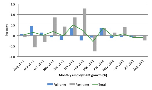
The following graph shows the month by month growth in full-time (blue columns), part-time (grey columns) and total employment (green line) for the 12 months to August 2013 using seasonally adjusted data.
Today’s results just repeat the topsy-turvy nature of the data over the period shown.
While full-time and part-time employment growth are fluctuating around the zero line, total employment growth is still well below the growth that was boosted by the fiscal-stimulus in the middle of 2010.
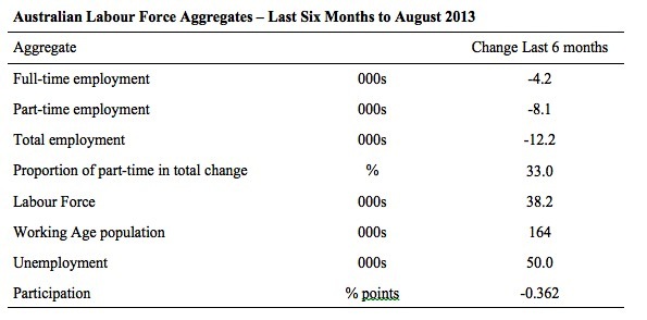
The following table provides an accounting summary of the labour market performance over the last six months. The monthly data is highly variable so this Table provides a longer view which allows for a better assessment of the trends. WAP is working age population (above 15 year olds).
The conclusion – overall there have been 12.2 thousand jobs (net) lost in Australia over the last six month, which is appalling given the positive spikes in April 2013. Employment growth has been negative for the last three months and 5 of the last 6 months
Over the last six months, full-time employment has fallen by 4.2 thousand jobs (net) while part-time work has fallen by 8.1 thousand jobs.
The Working Age Population has risen by 164 thousand in the same period while the labour force has risen by just 38.2 thousand. The labour force growth is tepid (relative to the growth in the WAP) because participation has fallen substantially.
The weak employment growth has thus not been able to keep pace with the underlying population growth and unemployment has risen as a result (by 50 thousand).
The rise in unemployment would have been much worse had the participation rate not dropped by -0.362 points (see below for accounting of that impact).
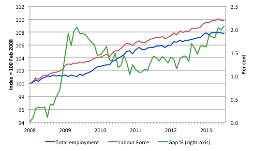
To put the recent data in perspective, the following graph shows the movement in the labour force and total employment since the low-point unemployment rate month in the last cycle (February 2008) to August 2013. The two series are indexed to 100 at that month. The green line (right-axis) is the gap (plotted against the right-axis) between the two aggregates and measures the change in the unemployment rate since the low-point of the last cycle (when it stood at 4 per cent).
You can see that the labour force index has largely levelled off and now falling and the divergence between it and employment growth has been relatively steady over the last several months with this month showing some improvement.
The Gap series gives you a good impression of the asymmetry in unemployment rate responses even when the economy experiences a mild downturn (such as the case in Australia). The unemployment rate jumps quickly but declines slowly.
It also highlights the fact that the recovery is still not strong enough to bring the unemployment rate back down to its pre-crisis low. You can see clearly that the unemployment rate fell in late 2009 and then has hovered at the same level for some months before rising again over the last several months.
The Gap shows that the labour market is still a long way from recovering from the financial crisis that hit in early 2008. There hasn’t been much progress since January 2010, when the fiscal stimulus started to run out.
In fact, in August 2013, the Gap reached the levels that appeared in May and June 2009 when the Australian economy was enduring the impact of the crisis. All the gains made since then have gone.
Full-time and Part-time employment in recovery
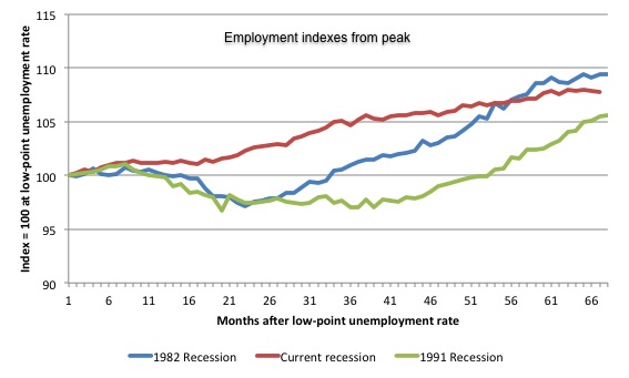
The following graph shows employment indexes for the last 3 recessions and allows us to see how the trajectory of total employment after each peak prior to the three major recessions in recent history: 1982, 1991 and 2009 (the latter to capture the current episode). The peak is defined as the month of the low-point unemployment rate in the relevant cycle and total employment was indexed at 100 in each case and then indexed to that base for each of the months as the recession unfolded.
I have plotted the 3 episodes for 68 months after the low-point unemployment rate was reached in each cycle. The current episode is now in its 67th month.
The initial employment decline was similar for the 1982 and 1991 recessions but the 1991 recovery was delayed by many month and the return to growth much slower than the 1982 recession.
The current episode is distinguished by the lack of a major slump in total employment, which reflects the success of the large fiscal stimulus in 2008 and 2009.
However, the recovery spawned by the stimulus clearly dissipated once the fiscal position was reversed and the economy is now producing very subdued employment outcomes.
Moreover, the current episode is also different to the last two major recessions in the sense that the recovery is over and the economy is deteriorating again.
The next 3-panel graph decomposes the previous graph into full-time and part-time employment. The vertical scales are common to allow a comparison between the three episodes.
First, after the peak is reached, part-time employment continues to increase as firms convert full-time jobs into fractional jobs.
Second, recoveries are dominated by growth in part-time employment as firms are reluctant to commit to more permanent arrangements with workers while there is uncertainty of the future course in aggregate demand.
Third, the current recovery is clearly medicocre by comparison, with both subdued growth in full-time and part-time work.
Teenage labour market – deteriorating from a parlous state
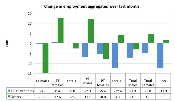
Full-time employment for teenagers was unchanged in August 2013 while part-time employment fell by 12.4 thousand. Overall, teenage employment fell by 12.3 thousand (net) jobs.
The following graph shows the distribution of net employment creation in the last month by full-time/part-time status and age/gender category (15-19 year olds and the rest)
If you take a longer view you see how poor the situation is.
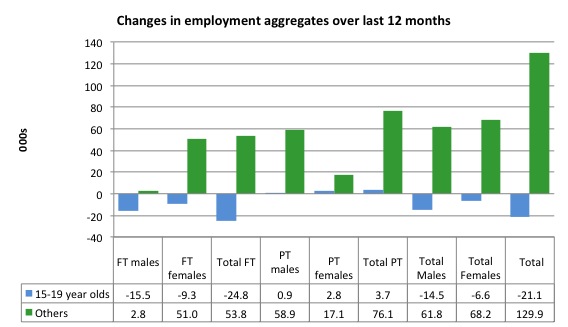
Over the last 12 months, teenagers have lost 21.1 thousand jobs while the rest of the labour force have gained 129.9 thousand net jobs. Remember that the overall result represents a very poor annual growth in employment.
Even more disturbing is the attrition of full-time jobs among teenagers – losing 24.8 thousand over the last year.
The teenage segment of the labour market is being particularly dragged down by the sluggish employment growth, which is hardly surprising given that the least experienced and/or most disadvantaged (those with disabilities etc) are rationed to the back of the queue by the employers.
The following graph shows the change in aggregates over the last 12 months.
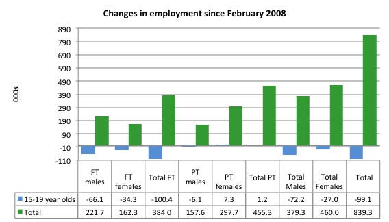
To further emphasise the plight of our teenagers I compiled the following graph that extends the time period from the February 2008, which was the month when the unemployment rate was at its low point in the last cycle, to the present month (August 2013). So it includes the period of downturn and then the “recovery” period. Note the change in vertical scale compared to the previous two graphs.
Since February 2008, there have been 839.3 thousand (net) jobs added to the Australian economy but teenagers have lost a staggering 99.1 thousand over the same period. It is even more stark when you consider that 100.4 thousand full-time teenager jobs have been lost in net terms.
Even in the traditionally, concentrated teenage segment – part-time employment – there have been 1.2 thousand jobs (net) lost even though overall some 455.3 thousand part-time jobs have been added.
Overall, the total employment increase is modest. Further, around 54 per cent of the total (net) jobs added since February 2008 have been part-time, which raises questions about the quality of work that is being generated overall.
Overall, the performance of the teenage labour market is close to disastrous. It doesn’t rate much priority in the policy debate, which is surprising given that this is our future workforce in an ageing population. Future productivity growth will determine whether the ageing population enjoys a higher standard of living than now or goes backwards.
The longer-run consequences of this teenage “lock out” will be very damaging.
The problem is that in the modest growth period that the Australian labour market enjoyed as a result of the fiscal stimulus and mining investment, teenagers failed to participate in the gains – they went backwards.
Now, with the economy entering a new period of slowdown, these losses will be added too given that teenagers are among the first in line to be shown the door by employers seeking to reduce staff levels in the face of declining aggregate sales.
The Government’s response is to push this cohort into endless training initiatives (supply-side approach) without significant benefits. The research shows overwhelmingly that job-specific skills development should be done within a paid-work environment.
I would recommend that the Australian government announce a major public sector job creation program aimed at employing, in the first instance, all the unemployed 15-19 year olds.
It is clear that the Australian labour market continues to fail our 15-19 year olds. At a time when we keep emphasising the future challenges facing the nation in terms of an ageing population and rising dependency ratios the economy still fails to provide enough work (and on-the-job experience) for our teenagers who are our future workforce.
Unemployment
The unemployment rate rose to 5.8 per cent in August 2013, up from 5.7 per cent in July. Official unemployment by 9,400 (1.3 per cent) to 714,100 but that rise would have been worse had the participation rate not fallen for the second consecutive month.
Unemployment is now heading to 6 per cent (my forecast for the end of 2013) and will continue to rise unless there is a dramatic reversal in employment growth.
Overall, the labour market still has significant excess capacity available in most areas and what growth there is is not making any major inroads into the idle pools of labour.
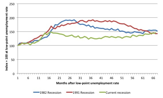
The following graph updates my 3-recessions graph which depicts how quickly the unemployment rose in Australia during each of the three major recessions in recent history: 1982, 1991 and 2009 (the latter to capture the 2008-2010 episode). The unemployment rate was indexed at 100 at its lowest rate before the recession in each case (January 1981; January 1989; April 2008, respectively) and then indexed to that base for each of the months as the recession unfolded.
I have plotted the 3 episodes for 68 months after the low-point unemployment rate was reached in each cycle. The current episode is now in its 67th month. For 1991, the peak unemployment which was achieved some 38 months after the downturn began and the resulting recovery was painfully slow. While the 1982 recession was severe the economy and the labour market was recovering by the 26th month. The pace of recovery for the 1982 once it began was faster than the recovery in the current period.
It is significant that the current situation while significantly less severe than the previous recessions is dragging on which is a reflection of the lack of private spending growth and declining public spending growth.
Moreover, the current episode is also different to the last two major recessions in the sense that the recovery is over and the economy is deteriorating again.
The graph provides a graphical depiction of the speed at which the recession unfolded (which tells you something about each episode) and the length of time that the labour market deteriorated (expressed in terms of the unemployment rate).
From the start of the downturn to the 67-month point (to August 2013), the official unemployment rate has risen from a base index value of 100 to a value 145.7 – peaking at 148 after 17 months. After falling steadily as the fiscal stimulus pushed growth along (it reached 122.8 after 35 months – in January 2010), it has been slowly trending up for some months now. Unlike the other episodes, the current trend, at this stage of the cycle, is upwards.
It will soon be above the peak that was reached just before the introduction of the fiscal stimulus. In other words, the gains that emerged in the recovery as a result of the fiscal stimulus in 2009-10 have now been lost.
At 67 months, 1982 index stood at 155.3 and was falling while the 1991 index was at 142.9 and was also falling. It is clear that at an equivalent point in the “recovery cycle” the current period is more sluggish than our recent two major downturns.
It now appears that the recoveries are converging, which tells us that the current policy has failed to take advantage of the fact that the latest economic downturn was much more mild than the previous recessions. In other words, the policy failure is locking the economy into a higher unemployment rate than is desirable and otherwise attainable.
Note that these are index numbers and only tell us about the speed of decay rather than levels of unemployment. Clearly the 5.7 per cent at this stage of the downturn is lower that the unemployment rate was in the previous recessions at a comparable point in the cycle although we have to consider the broader measures of labour underutilisation (which include underemployment) before we draw any clear conclusions.
The notable aspect of the current situation is that the recovery is very slow.
Broader labour underutilisation
The ABS published its quarterly broad labour underutilisation measures in the May data release. The next update will be in the August release.
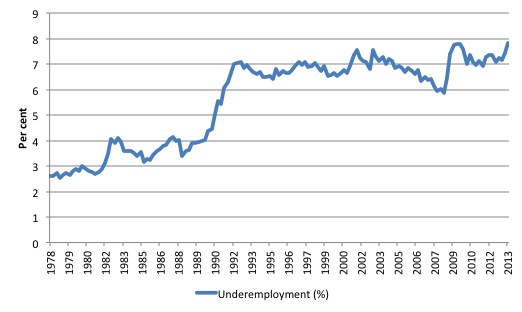
In the May release, total underemployment rose to 7.3 per cent (from 7.1 per cent) in the May-quarter and the ABS broad labour underutilisation rate rose sharply by 0.3 points to 12.9 per cent (the sum of unemployment and underemployment).
| There are now 964.3 thousand workers underemployed in Australia. |
There will likely be a million underemployed workers before the end of the year.
The following graph plots the history of underemployment in Australia since February 1978.
If hidden unemployment is added to the broad ABS figure the best-case (conservative) scenario would see a 15.5 per cent underutilisation rate. Please read my blog – Australian labour underutilisation rate is at least 13.4 per cent – for more discussion on this point.<
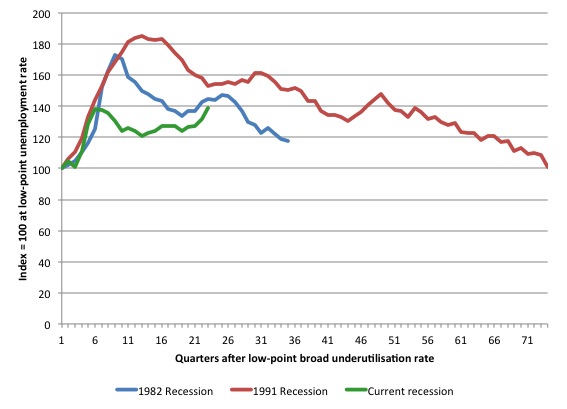
The following graph shows the same type of indexes as the previous graph except it uses the ABS broad labour underutilisation rate (unemployment plus underemployment). It also is in terms of quarters rather than months.
We also show the full evolution of the the 1982 and 1991 episodes from the low-point (= 100) through the peak and back to the next low-point. In the case of the 1982 recession the index had risen to a peak of 172.8 in May 1983 (a broad underutilisation rate of 14.4 per cent) and then fell back to 9.8 per cent by November 1989 (index value 117.4).
At that point, the cycle turned down again signalling the beginning of the 1991 recession. That cycle reached a peak of 185 (or 18.1 per cent in November 1992) and it took until February 2008 for it to reach the low-point of 9.9 percent (an index value of 100.9). That point marked the beginning of the next cycle.
That should tell you how severe the 1991 recession was and how asymmetric the labour market response is on either side of the cycle. From its start in November 1989 it took 74 quarters (18.5 years) to return to more or less that level.
In terms of the three recession comparison, at the same period in the recovery (using quarterly data), the broad labour underutilisation rate (unemployment plus underemployment) had an index value of 145 in the 1982 recession (absolute value of 12.1 per cent); an index value of 152.7 in the 1991 recession (absolute value of 14.9 per cent); and an index value of 138.6 in the current period (absolute value of 13.7 per cent).
So while the level of unemployment is much lower now than in the 1982 recession (at a comparable stage), underemployment is now much higher and so the total labour underutilisation rates is higher. Further, the 1982 recovery in broad underutilisation terms was more robust than the current stagnating situation.
Commentators who think of the 1982 recession as severe, rarely see it in these terms. Joblessness is probably worse than underemployment but both mean that labour is wasted and income earning opportunities are being foregone. For a worker with extensive nominal commitments, the loss of income when hours are rationed may be no less severe than the loss of hours involved in unemployment, if the threshold of solvency is breached.
Aggregate participation rate fell by 0.1 points
The participation rate fell by 0.1 percentage points in August 2013 after falling by 0.2 points in July. This continues the downward trend we have seen over the last six months (see Table above).
It is now at 65.0 per cent. The falling participation meant that the rise in unemployment was lower than otherwise given the contraction in employment.
The fall in participation meant that unemployment would have been 18 thousand persons higher than the official level had the labour participation rate remained static and given the actual employment growth.
We can assume that hidden unemployment has risen by something close to 18 thousand persons in August 2013 as the employment prospects for workers continue to diminish. The participation rate is also still substantially down on the most recent peak in November 2010 of 65.9 per cent when the labour market was still recovering courtesy of the fiscal stimulus.
The labour force is a subset of the working-age population (those above 15 years old). The proportion of the working-age population that constitutes the labour force is called the labour force participation rate. Thus changes in the labour force can impact on the official unemployment rate, and, as a result, movements in the latter need to be interpreted carefully. A rising unemployment rate may not indicate a recessing economy.
The labour force can expand as a result of general population growth and/or increases in the labour force participation rates.
In the current month, the unemployment rate rose to 5.8 per cent. What would have the unemployment rate been had the participation rate not fallen by 0.1 points.
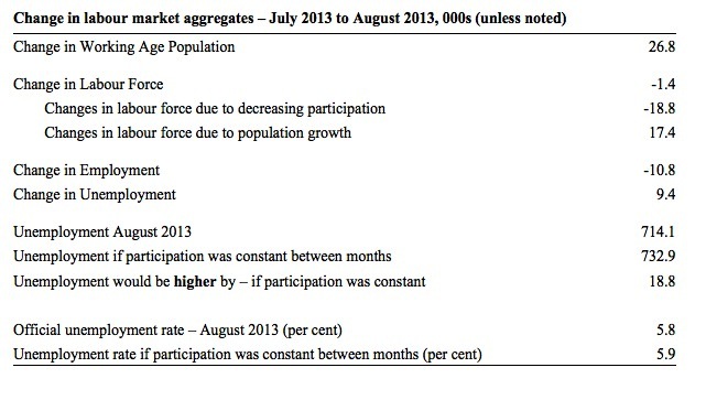
The following Table shows the breakdown in the changes to the main aggregates (Labour Force, Employment and Unemployment) and the impact of the rise in the participation rate.
In August 2013, employment fell by 10.8 thousand while the labour force contracted by 1.4 thousand persons. As a result, unemployment rose by 9.4 thousand.
The labour force fall in August was the outcome of two separate factors:
- The underlying population growth added 17.4 thousand persons to the labour force. The population growth impact on the labour force aggregate is relatively steady from month to month; and
- The fall in the participation rate meant that 18.8 thousand workers left the labour force (relative to what would have occurred had the participation rate remained unchanged).
So while employment growth failed to keep pace with the underlying population growth, the falling participation took the pressure off somewhat as workers exited the labour force (18.8 thousand) and were taken out of the official unemployment count.
If the participation rate had not have fallen, total unemployment, at the current employment level, would have been 732.9 thousand rather than the official count of 714.1 thousand as recorded by the ABS – a difference of 18.8 thousand workers.
Thus, without the fall in the participation rate, the unemployment rate would have actually risen to 5.9 per cent rather than its current value of 5.8 per cent.
The conclusion is that hidden unemployment rose and this attenuated the rise in the official unemployment rise. In functional terms this signals a much worse deterioration in the conditions than signalled by the current official unemployment rate.
There is considerable monthly fluctuation in the participation rate but the current rate of 65.0 per cent is a long way below its most recent peak in November 2010 of 65.9 per cent.
What would the unemployment rate be if the participation rate was at that recent peak level (65.9 per cent)?
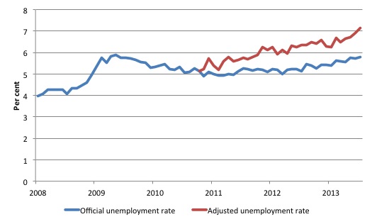
The following graph tells us what would have happened if the participation rate had been constant over the period November 2010 to August 2013. The blue line is the official unemployment since its most recent low-point of 4 per cent in February 2008. It is currently at 5.8 per cent.
The red line starts at November 2010 (the peak participation month). It is computed by adding the workers that left the labour force as employment growth faltered (and the participation rate fell) back into the labour force and assuming they would have been unemployed. At present, this cohort is likely to comprise a component of the hidden unemployed (or discouraged workers).
Total unemployment in August 2013 was estimated to be 714.1 thousand. However, if participation had not have fallen there would be 895.1 thousand workers unemployed given growth in population and employment since November 2010.
| The unemployment rate would now be 7.1 per cent if the participation had not fallen below its November 2010 peak of 65.9 per cent. |
The difference between the two numbers reflects the change in hidden unemployment since November 2010. These workers would take a job immediately if offered one but have given up looking because there are not enough jobs and as a consequence the ABS classifies them as being Not in the Labour Force.
Note, the gap between the blue and red lines doesn’t sum to total hidden unemployment unless November 2010 was a full employment peak, which it clearly was not. The interpretation of the gap is that it shows the extra hidden unemployed since that time.
As the participation rate dropped over the period, the gap rose.
This is quite a different picture to that portrayed by the official summary statistics.
|
Taken into account the drop in participation since November 2010, the sum of the unemployment and underemployment would generate a broad labour underutilisation rate of 15 per cent in August 2013.
That is 1.85 million workers are either not working or not working enough hours. |
Hours worked – barely rise in August 2013
Aggregate monthly hours worked increased by 1.1 million hours (0.407 per cent) in seasonally adjusted terms. The rise in hours worked this month continues the trends over several months of growth being interspersed with contraction with the trend switching back and forth between positive and negative.
With full-time employment contracting for the last four months, and part-time contracting the last two months, the rise in working hours overall is the result of compositional shifts in working hours among the employed.
The small swings up and down in monthly hours worked each month since the beginning of 2011 is being largely driven by similar fluctuations in full-time employment.
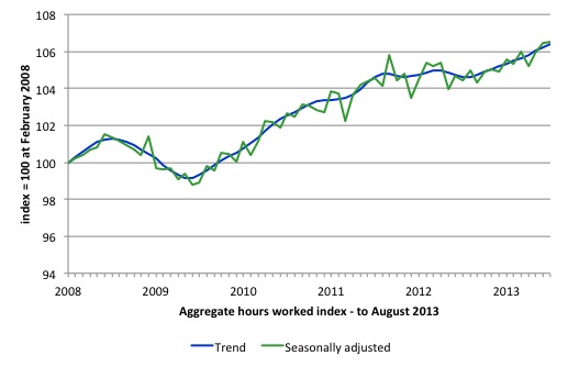
The following graph shows the trend and seasonally adjusted aggregate hours worked indexed to 100 at the peak in February 2008 (which was the low-point unemployment rate in the previous cycle). The rising trend which marked the early recovery courtesy of the fiscal stimulus is now clearly gone.
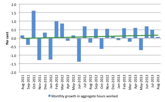
The next graph shows the monthly growth (in per cent) over the last 24 months. The green linear line is a simple regression trend – which depicts a slightly upward trend. You can see the pattern in working hours that is also portrayed in the employment graph – zig-zagging across the zero growth line.
The data supports the conclusion that the Australian labour market is performing badly and slow deteriorating.
strong>Conclusion
Overall, today’s data shows that the Australian labour market is weakening fast total employment contracting for the third consecutive month.
In general, we always have to be careful interpreting month to month movements given the way the Labour Force Survey is constructed and implemented.
But the negative trend is now becoming entrenched enough to support the view that the labour market is very weak and employment growth is consistently so low relative to population growth that the unemployment rate is trending upwards – now more quickly than earlier in the year.
The lack of job opportunities is leading workers to give up looking for jobs (that are not there) and the shrinking labour force is keeping the rise in unemployment down. But the unemployment rate is flattering given the accompanying rise in underemployment and hidden unemployment.
The official unemployment rate is trending upwards and it will eke its way up towards 6 per cent over the next 3 months.
The broad rate of labour wastage is now 13.7 per cent. Add to this the impacts of the falling participation rate and the figure would be above 15 per cent.
The most striking aspect of a sad picture remains the appalling performance of the teenage labour market. Employment has collapsed for that cohort since 2008. I consider it a matter of policy urgency for the Government to introduce an employment guarantee to ensure we do not continue undermining our potential workforce.
The data certainly shows the recently defeated Federal Government’s macroeconomic strategy was a failure. The incoming government has to reverse the contractionary bias and that means only one thing – more fiscal stimulus is definitely needed.
It is time for the conservatives to abandon their free market/anti-government biases and do some public sector job creation, which will arrest the current decline and stimulate private sector activity and employment!
That is enough for today!
(c) Copyright 2013 Bill Mitchell. All Rights Reserved.

I am not sure that the election of the even more neo-liberal Abbott front bench was warranted. Abbott and Hockey set out to wedge Gillard and Swan on the budget deficit.
I prefer a comment that you made on an earlier occasion. The 2007 incoming Labor Government should have set out to educate the Australian public about the proper priorities of a money issuing government. They would have had opposition form the far right but that opposition would have been blunted by the Lehman Bros collapse and the essential rescue of the big four banks.
The Australian economy, like the world economy, will NEVER recover from this point. It will simply get worse and worse.
1. Neoliberalism (late stage capitalism) will remain dominant until climate and resource collapse.
2. From that point no economy can generate a recovery or even remain a cohesive system.
Kenya listened to the IMF / World Bank for 4 decades with devastating results. In Jan 2003, our new president decided to ignore them with spectacular results. Please see the charts below for current account deficits and GDP per capita since 1980.
http://screencast.com/t/1oI8Zsuzk
http://screencast.com/t/pPKTE1oo
@Ikonoclast: “The Australian economy, like the world economy, will NEVER recover from this point.”
Not intending to flame you, but that reads like an extreme if not ridiculous comment; unless your base case is for a permanently destructive nuclear war. I agree that demand stimulation (fiscal, in particular) is required in developed western economies. I think even the conservative parties will eventually get the message. In the US, the sequester clearly hurt growth – but the economy there appears to have improved, albeit by less than it would otherwise have.
It’s a lot harder than you might think to kill an economy. It requires wholesale reductions in capacity (such as happened in Zimbabwe), which is hard to bring about. The stupid austerity measures in Europe have annihilated demand (and can be quickly fixed by big increase in G) rather than impose genuine supply constraints (harder to repair and is currently the key issue in emerging economies).
Cheers!
If a physician assesses a patient and diagnoses an advanced terminal condition is it an extreme and ridiculous statement to say the patient will never recover? No. It is an objectively accurate statement.
The same applies to a world economy which has overshot the sustainable limits to growth. Recession and collapse are as objectively predictable as the collapse of population in the fruit-flies-in-a-bottle experiment.
Not only have we overshot the sustainable limits to growth we have emitted enough CO2 to lock in 4 to 6 degress C of global warming or more. Most climate scientists agree that even 4 degrees C of global warming implies almost certain extinction of homo sapiens.
The global economy might scrape along sideways for a while longer (5 years?) but protracted decline in the medium to long term is now the only possibility.
\”If a physician assesses a patient and diagnoses an advanced terminal condition is it an extreme and ridiculous statement to say the patient will never recover? No. It is an objectively accurate statement.\”
Unless of course the physician is old-fashioned, badly trained, and/or has delusions about their own superiority.
In other words if the physician is simply wrong.
There was a time when HIV was a terminal condition and patients never recovered. Then we decided to stop that happening and have done. HIV is now a chronic condition that can be managed.
No win TINA situations are a myth to try and control people’s minds.
There is always another way.
If we lose one truck driver job in mining we need at least two full jobs created in other industries just to keep even with the mining truck drivers salary. In tourism it would be three jobs as the pay is low.
So the so called rebalance is a dream fantasy for policy wonks and a nightmare for any unlucky Australian who loses a job. Or I don’t understand how it’s done.(the rebalance)
Anyone know?
Cheers Punchy
I have some sympathy for Ikonoclast’s gloomy predictions… “some sympathy”, otherwise I don’t suppose I’d be able to engage with economics.
I’m old enough to have (selfishly) thought I’d be “out of here” before it all started to unravel, but lately I’m not so sure.
To pursue the medical analogy, I think the tumor has quietly metastasised and it won’t regress on a diet of “business as usual”.
Answer for Neil Wilson. Clearly, any model used to predict the future implies a probability judgement. This applies to my physician analogy. I was not implying he had perfect knowledge, rather that he was making a high probability call in a very clear situation.
Look, I can understand impatience, anger and rejection at my gloomy predictions. Gloomy predictions might be accurate (sometimes) but it is hard to see how they are ever useful. I understand that. Gloomy predictions appear defeatist and can operate to be self-fulfilling. If we give up then we surely do fail.
I have used gloomy predictions in the past in an effort to shock people and make them consider and support drastic action. Perhaps it is the wrong approach. However, continuing with a Pollyana BAU approach is assuredly not the way to go. That WILL assure disaster. My personal belief now is that we are beyond the point of safe return. Shocking people into action (if it works but it appears not) would now achieve not a saving of global civilization in its entirety but maybe a salvaging of some parts.
However, I am getting very frustrated with the fact that NOTHING substantial is being done about these huge imminent problems.
@Ikonoclast – “The global economy might scrape along sideways for a while longer (5 years?) but protracted decline in the medium to long term is now the only possibility.”
I don’t think your analogy about the doctor and patient is on the mark. I think global growth can take many directions from here. Indeed, many on this forum would agree that there is massive economic slack – demand deficiency, in particular – that has persisted since the onset of the GFC. A big boost to govt spending would fill the breach and continue to do so for as as is required.
Your comments imply that there is nothing government can do because we have already “overshot the sustainable limits to growth”. I think Neil Wilson’s comments are right on the ball. In economic terms, remember the Club of Rome? They were way off the mark (did they know about FRACing back then?) Look at Saudi Arabia’s claimed oil reserves – virtually unchanged since 1987. With new and ever-improving technology, man will find a way to protect the environment and drag those less fortunate out of poverty.
Cheers!
EG,
I listened to a podcast lecture on sustainable development by Professor Jeffrey Sachs at the LSE a while back.
He mentioned how his economics Professor (at Harvard back in the 70’s) had given the class “The Limits to Growth” to study, with the object of setting the book up for ridicule.
Sachs however says LTG got it pretty much right.
Sachs is an economist but could’ve been channeling David Suzuki.
If you think fracking is some kind of solution read this:
http://www.theguardian.com/environment/2013/aug/11/texas-tragedy-ample-oil-no-water
I wish I could share your belief that man will find a way to protect the environment. So far he hasn’t shown much interest and time’s running out.
I can understand Ikonoclast’s frustration.
Here’s a link for that LSE lecture:
http://www.lse.ac.uk/newsAndMedia/videoAndAudio/channels/publicLecturesAndEvents/player.aspx?id=1823
“Perhaps it is the wrong approach.”
It is. You can’t motivate people with pain. You have to offer them salvation in a clear alternative vision of a better future.
The fact that people switch off unless the panacea of a “better future” is offered – otherwise known as the “obligatory message of hope” that forms the end of every popular environmental book – points to the true nature of the problem we face. It is a problem of human nature – we are, it seems, constitutionally incapable of acting in the long term interests of humanity. Just look at what is happening right now – the Arctic is very close to being ice-free in summer, and the response is simply to exploit more of the fossil fuel resources uncovered by the ice loss, thus accelerating the changes further. Fracking for shale oil and gas is simply a desperate attempt to search behind the cushions for the loose change of burnable fuel on which our industrial civilisation depends. Despite the awareness that 2 degree C temperature rise is already essentially locked in, and truly massive reductions in hydrocarbon burning are required in order for even higher levels of warming to be avoided, very little is being done to change course – the inertia of industrial civilisation, coupled with sclerotic elites and an increasingly economically threatened populace, is just too great. The seemingly inevitable end result of this is likely to be an ad hoc geoengineering technofix that conforms to our hubristic notion that nature is ours to be subdued, rather than respected.
There is a solution of sorts to the world’s environmental problems – it involves restrictions on reproduction, vastly reduced consumption by those of us who are fortunate enough to enjoy the energy-profligate western lifestyle, and generally making do with a lot less in a material sense. But this solution won’t fly with the general public – how many people do you know who have stopped flying and eating meat, given up use of their car, switched occupations from those that support or encourage mass consumption to those with a lower footprint, etc.? Not many, I suspect. All proposed “solutions” to climate change and environmental problems in general are those that do not require any significant alteration to our current way of life, when it is precisely that way of life that is the problem. The spirit of self sacrifice that was seen during WW2 when an external enemy was involved is nowhere to be seen now that the enemy, should it be so acknowledged, is us.
Couldn’t have said it better myself, ParadigmShift. Look, I think MMT has a lot going for it. In theory I would be in favour of all Bill’s prescriptions for getting the economy going again if real resource limits were not a problem. The fact that real resource limits are now a problem is a game changer. MMT still has a lot to offer but it has to grapple in detail with the notion of boosting demand via mass renewables projects and mass social projects (the latter can improve quality of life without high energy and materials use).
I have brought up all this before and probably irritated Bill with my undue vehemence. To his credit he replied with forebearance but also with a specific point of view. He indicated in a mostly general way that MMT can and does support sustainability goals. I don’t doubt this. However, he also maintained a point of view that I felt was a little too hermetically sealed in his own discipline. Again, Bill had very reasonable rationales for this. Economics, specifically MMT, is where his expertise is.
I tend to think now that any solutions to our dilemma are only going to found in an inter-disciplinary study of our problems.* For example, MMT and Biophysical Economics would need to be forged into one new discipline and that entire body of newly connected theory and knowledge be used to chart a sustainable and equitable course for our political economy, so far as that is still possible.
* Note: Our problems are now all interconnected. We have a global economic system (which is a physical system at base) which is interacting strongly with the rest of the biosphere, having a profound effect on it and causing a great number and variety of complexly interconnected problems.
It’s about jobs. I don’t see why anyone would be impressed with all this wordy Bull Dust.
Anyone unemployed should be the priority for us all.
No end of models and theory’s ever employed anyone.
Australia is in deep trouble. Small business (our biggest employer)
is not hiring enough good people. I am very worried for a anyone
looking for work in Australia.