The Australian Bureau of Statistics (ABS) released the latest labour force data today (March 19,…
Australian labour market – good signs but wait for the reversal
Today’s release by the Australian Bureau of Statistics (ABS) of the Labour Force data for May 2012 reveals a stronger labour market than last month with full-time employment growth evident and participation rising. The oddity of the results are that monthly hours worked declined indicating weakness. While the unemployment rate rose to 5.1 per cent (and is still way too high), the reason for the rise in unemployment is that employment growth was outstripped by labour force growth which is a sign of a strengthening labour market. Of-course, the data is highly variable between months and the trend remains weak. Certainly this data is not consistent with the outstanding real GDP growth figures revealed in yesterday’s National Accounts. The most disturbing aspect of the labour market data remains the appalling state of the youth labour market. My assessment of today’s results – good signs but I will wait for the reversal next month.
The summary ABS Labour Force (seasonally adjusted) estimates for May 2012 are:
- Employment increased by 38,900 (0.3 per cent) with full-time employment rising by 46,100 (0.6 per cent) and part-time employment falling by 7,200 (0.2 per cent).
- Unemployment rose by 22,400 (3.7 per cent) to 622,800. The rise in unemployment is largely due to the rising participation rate.
- The official unemployment rate rose to 5.1 per cent.
- The participation rate rose by 0.2 pts to 65.5 per cent.
- Aggregate monthly hours worked decreased by 4.7 million hours (0.3 per cent).
- The ABS broad labour underutilisation estimates (the sum of unemployment and underemployment) were published this quarter and the broad measure increased by 0.1 per cent to 12.6 per cent.
Employment growth – positive but trend remains weak
The May data shows that employment increased by 38,900 (net) (0.3 per cent) with full-time employment rising sharply by 46,100 (0.6 per cent) and part-time employment falling by 7,200 (0.2 per cent).
In the following section I trace the spatial distribution of the employment gains.
However, notwithstanding the strength of the welcome full-time employment outcome, today’s data reasserts the message that the labour market data is switching back and forth each month with an sluggish underlying trend being fairly stable for some months now.
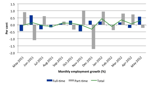
There have been considerable fluctuations in the full-time/part-time growth over the last year with regular crossings of the zero growth line.
Over the last 12 months, full-time employment has risen by just 1 per cent (90.8 thousand full-time jobs, 20.7 thousand part-time jobs and 111.52 thousand jobs overall).
Over the last 12 months, the labour force has grown marginally stronger than employment, which means that unemployment has risen (by 26.8 thousand) over the same period.
Labour force growth is also subdued by the state of the economy (with participation rates still well down on previous peaks and flat over the last 12 months), which means that the sluggish supply growth is keeping unemployment much lower than it otherwise would be given how poor the employment growth has been.
The following graph shows the month by month growth in full-time (blue columns), part-time (grey columns) and total employment (green line) for the 12 months to May 2012 using seasonally adjusted data.
Today’s results just repeat the topsy-turvy nature of the data over the period shown. The Australian labour market is struggling with the low GDP growth creating a near jobless growth environment.
While full-time and part-time employment growth are fluctuating around the zero line, total employment growth is still well below the growth that was boosted by the fiscal-stimulus in the middle of 2010.
The following table provides an accounting summary of the labour market performance over the last six months. The monthly data is highly variable so this Table provides a longer view (over the last 6 months) which allows for a better assessment of the trends. WAP is working age population (above 15 year olds). The first three columns show the number of jobs gained or lost (net) in the last six months.
The conclusion – overall only 87.5 thousand jobs (net) have been created in Australia over the last six months and almost all of them have been full-time employment (82.6 thousand). The WAP has risen by 116 thousand in the same period while the labour force has risen by 76.9 thousand.
The upshot is that relatively weak employment growth has still allowed the unemployment to fall (by 11 thousand) given that the participation rate has been essentially flat over the same period.
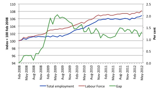
To put the recent data in perspective, the following graph shows the movement in the labour force and total employment since the low-point unemployment rate month in the last cycle (February 2008) to May 2012. The two series are indexed to 100 at that month. The green line (right-axis) is the gap (plotted against the right-axis) between the two aggregates and measures the change in the unemployment rate since the low-point of the last cycle (when it stood at 4 per cent).
You can see that the labour force index has largely levelled off and now falling and the divergence between it and employment growth has been relatively steady over the last several months with this month showing some improvement.
The Gap series gives you a good impression of the asymmetry in unemployment rate responses even when the economy experiences a mild downturn (such as the case in Australia). The unemployment rate jumps quickly but declines slowly.
It also highlights the fact that the recovery is still not strong enough to bring the unemployment rate back down to its pre-crisis low. You can see clearly that the unemployment rate fell in late 2009 and then has hovered at the same level for some months before rising again over the last two months.
The gap shows that the labour market is still a long way from recovering from the financial crisis that hit in early 2008. There hasn’t been much progress since November 2010, when the fiscal stimulus started to run out.
Labour Force data analysis by State/Territory
To get to the bottom of the seemingly odd results (booming real GDP growth and modest employment growth) I dug a little deeper and examined the variations at the State/Territory level over the last month and for this year (from December 2011 to May 2012).
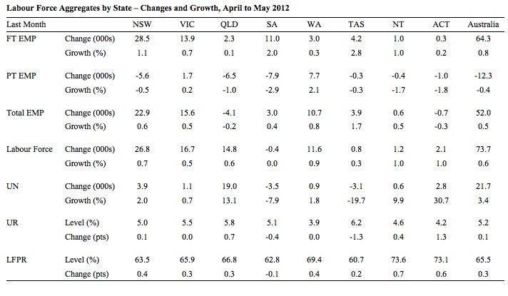
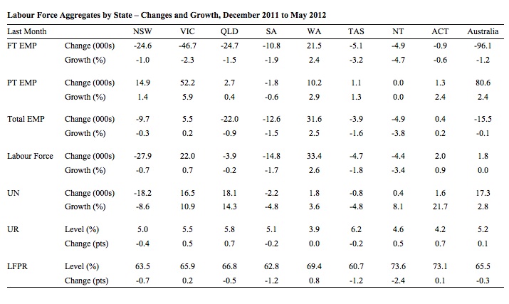
The following two Tables present the summary data – EMP is employment, UN is unemployment, UR is the unemployment rate and LFPR is the labour force participation rate. FT and PT are full-time and part-time, respectively.
The Tables allow us to see where the jobs are being created and lost (in net terms) and where the participation jump has occurred both in the last month and over the year-to-date. The data at the State/Territory level is original (not seasonally adjusted).
In the last month, the surge in full-time jobs growth has been strongest in NSW, South Australia, Tasmania and the Northern Territory. Western Australia and Queensland, both mining states have not generated much full-time employment growth.
We will have to wait until next Thursday when the detailed industry employment data comes out to see In which sectors the growth has been.
In terms of the participation rate gains, they have been uniformly spread except for South Australia.
If the labour force rises more than employment, then unemployment increases. We can see that condition held in all states except Tasmania and South Australia.
The situation is somewhat different when we see what has been happening since December 2011. Recall that yesterday’s National Accounts data has revealed Australia boomed in the first quarter, a result that many economists (including yours truly) have expressed doubt about in the last 24 hours.
Over the last 5 months, full-time employment has fallen sharply (1.2 per cent) overall and only Western Australia defied that outcome. Part-time employment growth has not been sufficient to offset the loss in full-time employment and as a result total employment is now lower (by 15.5 thousand) than it was in December 2011.
That is not consistent with a booming economy unless labour productivity has been sky-rocketing to unbelievable heights.
The most populated states (NSW, VIC, and QLD) engaged in a huge shedding of full-time jobs.
Overall, participation is down over the same period (by 0.3 points). Western Australia, the mining powerhouse, stands out in this regard because it not only defied the decline in participation but experienced a 0.8 points rise.
Northern Territory is interesting. It is another mining strong region but saw total employment decline over the year-to-date and participation fall.
The results are hard to square with the booming economy story that was presented to us yesterday in the National Accounts release.
Teenage labour market – remains in a parlous state
Regular readers will know that I regularly highlight the plight of our teenagers in the labour market.
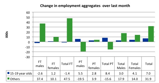
The teenage labour market showed some improvement this month with 7 thousand jobs overall being created (net) although the teenage workers did not share in the full-time employment growth that the rest of the workforce enjoyed. They lost 1400 full-time jobs overall
The following graph shows the distribution of net employment creation in the last month by full-time/part-time status and age/gender category (15-19 year olds and the rest)
If you take a longer view you see how poor the situation is.
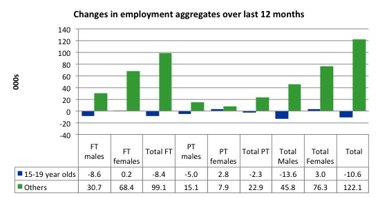
Over the last twelve months teenagers have lost 10.6 thousand (net) jobs while the rest of the labour force has gained 122.1 thousand jobs (net).The decline in full-time teenage employment is particularly evident and problematic.
So it is the teenage segment of the labour market that is being dragged down by the sluggish employment growth, which is hardly surprising given that the least experienced and/or most disadvantaged (those with disabilities etc) are rationed to the back of the queue by the employers.
The following graph shows the change in aggregates over the last 12 months. Australian teenagers are going backwards which is a trend common around the world at present.
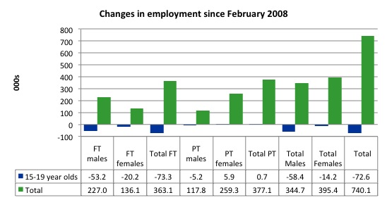
To further emphasise the plight of our teenagers I compiled the following graph that extends the time period from the February 2008, which was the month when the unemployment rate was at its low point in the last cycle, to the present month (May 2012). So it includes the period of downturn and then the “recovery” period. Note the change in vertical scale compared to the previous two graphs. That tells you something!
The results are stunning and represent a major policy failure.
Since February 2008, there have been 740.1 thousand (net) jobs added to the Australian economy but teenagers have lost 72.6 thousand over the same period. It is even more stark when you consider that 73.3 thousand full-time teenager jobs have been lost in net terms. Even in the traditionally, concentrated teenage segment – part-time employment – there has been virtually no new opportunities generated.
Overall, the performance over the last 12 months is poor and should receive a much higher priority in the policy debate than it does.
The longer-run consequences of this teenage “lock out” will be very damaging.
The Australian government has no coherent strategy to resolve this appalling state. Ensuring teenagers are included in paid work, if they do not desire to remain in school, should be number one policy priority.
The Government’s response is to push this cohort into endless training initiatives (supply-side approach) without significant benefits. The research shows overwhelmingly that job-specific skills development should be done within a paid-work environment.
I would recommend that the Australian government announce a major public sector job creation program aimed at employing, in the first instance, all the unemployed 15-19 year olds.
It is clear that the Australian labour market continues to fail our 15-19 year olds. At a time when we keep emphasising the future challenges facing the nation in terms of an ageing population and rising dependency ratios the economy still fails to provide enough work (and on-the-job experience) for our teenagers who are our future workforce.
Unemployment
The unemployment rate rose by 0.2 percentage points in May 2012 to 5.1 per cent as the labour force contracted. This was due to the fact that labour force growth outstripped employment growth (via the participation rate increase). So one might think of it as a virtuous rise in unemployment which will be short-lived if employment continues to grow at this pace.
Eventually, growth exhausts the pool of discouraged workers outside of the labour force and the participation rate stabilises and if employment continues to grow at that point, unemployment starts to vaporise.
But, overall, the labour market still has significant excess capacity available in most areas and what growth there is is not making any major inroads into the idle pools of labour.
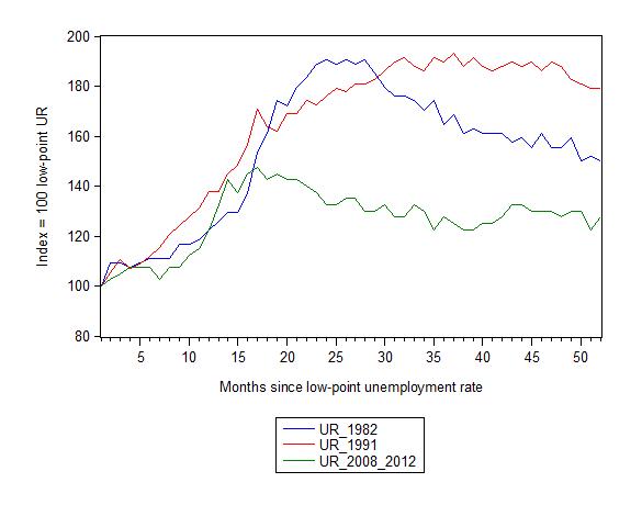
The following graph updates my 3-recessions graph which depicts how quickly the unemployment rose in Australia during each of the three major recessions in recent history: 1982, 1991 and 2009 (the latter to capture the 2008-2010 episode). The unemployment rate was indexed at 100 at its lowest rate before the recession in each case (August 1981; December 1989; April 2008, respectively) and then indexed to that base for each of the months as the recession unfolded.
I have plotted the 3 episodes for 52 months after the low-point unemployment rate was reached. For 1991, the end-point shown is the peak unemployment which was achieved some 38 months after the downturn began although the recovery was painfully slow. While the 1982 recession was severe the economy and the labour market was recovering by the 26th month. The pace of recovery for the 1982 once it began was faster than the recovery in the current period.
It is significant that the current situation while significantly less severe than the previous recessions is dragging on which is a reflection of the lack of private spending growth and declining public spending growth.
The graph provides a graphical depiction of the speed at which the recession unfolded (which tells you something about each episode) and the length of time that the labour market deteriorated (expressed in terms of the unemployment rate).
From the start of the downturn to the 52-month point (to May 2012), the official unemployment rate has risen from a base index value of 100 to a value 127.5 – peaking at 145 after 21 months. It reached this local low point 8 months ago (122.5) and has been hovering at the higher level since then. Unlike the other episode, the current trend, at this stage of the cycle, is unclear.
At 52 months, 1982 index stood at 150 and falling slowly, while the 1991 index was around 179, also falling slowly.
It is clear that at an equivalent point in the “recovery cycle” the current period is more sluggish than our recent two major downturns.
Note that these are index numbers and only tell us about the speed of decay rather than levels of unemployment. Clearly the 5.1 per cent at this stage of the downturn is lower that the unemployment rate was in the previous recessions at a comparable point in the cycle although we have to consider the broader measures of labour underutilisation (which include underemployment) before we draw any clear conclusions.
The notable aspect of the current situation is that the recovery is very slow.
Each quarter the ABS publish their broader measures of labour underutilisation. Today, we received the data for the May 2012 quarter.
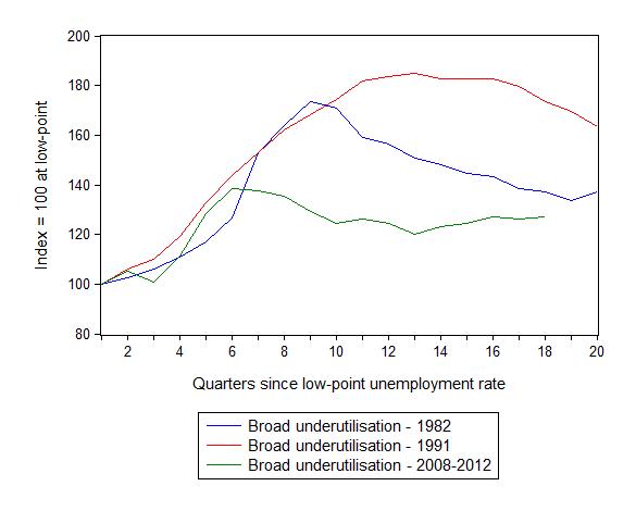
The following graph replicates the previous graph except it uses the ABS broad labour underutilisation rate (unemployment plus underemployment) as a better means of comparing the three recessions.
At the same period in the recovery (using quarterly data), the broad labour underutilisation rate (unemployment plus underemployment) had an index value of 137 in the 1982 recession; an index value of 173 in the 1991 recession (absolute value of 17.6 per cent and falling); and an index value of 126.3 in the current period (absolute value of 12.6 per cent and steady to rising).
So while the level of unemployment is much lower now than in the 1982 recession (at a comparable stage), underemployment is now much higher and so the total labour underutilisation rates are similar.
Commentators who think of the 1982 recession as severe, rarely see it in these terms. Joblessness is probably worse than underemployment but both mean that labour is wasted and income earning opportunities are being foregone. For a worker with extensive nominal commitments, the loss of income when hours are rationed may be no less severe than the loss of hours involved in unemployment, if the threshold of solvency is breached.
Aggregate participation rate rises sharply in May
The participation rate rose by 0.3 percentage points in May 2012 and has been stable over the last 12 months – at 65.5 per cent.
It is still substantially down on the most recent peak of 66 per cent (November 2010) when the labour market was gathering pace courtesy of the fiscal stimulus.
This drop in participation in the last year or more has meant the labour force growth has been relatively subdued with the additional result being that the unemployment rate is considerably lower than would otherwise been the case.
What would have the unemployment rate been if the participation rate was constant (that is, had have remained at its previous month’s level)?
The labour force is a subset of the working-age population (those above 15 years old). The proportion of the working-age population that constitutes the labour force is called the labour force participation rate. So changes in the labour force can impact on the official unemployment rate and so movements in the latter need to be interpreted carefully. A rising unemployment rate may not indicate a recessing economy.
The labour force can expand as a result of general population growth and/or increases in the labour force participation rates.
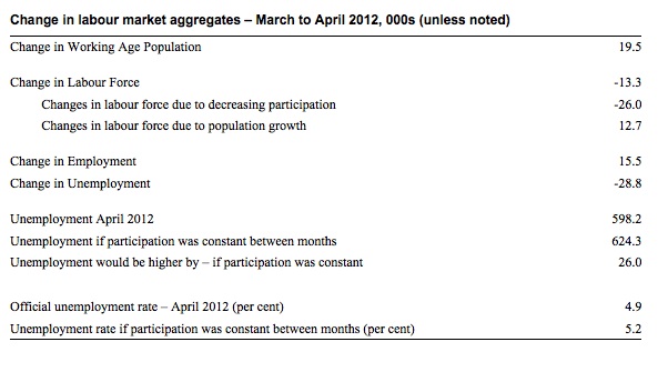
The following Table shows the breakdown in the changes to the main aggregates (Labour Force, Employment and Unemployment) and the impact of the fall in the participation rate.
In May 2012, employment rose by 38,900 while the labour force rose (as a consequence of the rising participation rate) by 61,300 which meant that unemployment rose by 22,400.
The labour force grew in May for two reasons: (a) The underlying population growth added 12.9 thousand to the labour force. The population growth impact on the labour force aggregate is steady from month to month; and (b) the participation rate increase led to a rise in the labour force of 48.4 thousand (relative to what would have occurred had the participation rate remained unchanged.
Given the current employment level, unemployment would have been 574.4 thousand instead of 622.8 thousand as recorded by the ABS.
So if the participation rate had have remained unchanged, the unemployment rate would have fallen to 4.7 per cent rather than 5.1 per cent as officially published. The difference, of-course, is the that the “hidden unemployment rate” fell.
The conclusion is that the rise in unemployment of 22,400 was exclusively due to the rise in labour force participation (equivalent to 48.4 thousand persons) which pushed the labour force up faster than the employment growth could absorb the new entrants.
Economists are less concerned about rises in unemployment when participation increases are driving it. As the business cycle turns and growth quickens this always happens. I am unclear that we are at that point yet given the way in which participation and employment has been moving around over the last 6 months. So we will have to see if the participation rate continues to rise back to peak and then stabilises and employment growth breaks its recent behaviour and records consistent positive outcomes.
Hours worked fell in May 2012
Aggregate monthly hours worked decreased by 4.7 million hours (0.3 per cent) in seasonally adjusted terms although they were mostly flat in trend terms.
A decline in total hours worked is also hard to reconcile with the dominant full-time outcome in May 2012. There must be some complex movements going on within the hours distribution to get full-time employment growing strongly (and recovering from a negative last month outcome) but total hours worked falling.
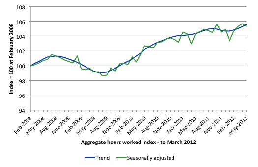
The following graph shows the trend and seasonally adjusted aggregate hours worked indexed to 100 at the peak in February 2008 (which was the low-point unemployment rate in the previous cycle). The rising trend which marked the early recovery courtesy of the fiscal stimulus is now clearly flat.
This should also moderate the views of those that think today’s data shows “strength”. It doesn’t do anything other than show that the situation is not deteriorating from a very subdued current state..
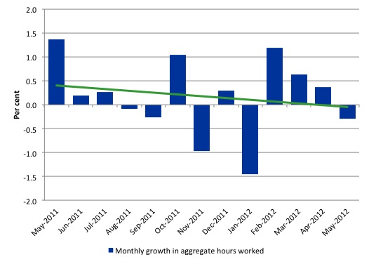
The next graph shows the monthly growth (in per cent) over the last 12 months. The green linear line is a simple regression trend and it is suggesting monthly growth rates are trending down – which is certainly the result depicted for the last four months.
Once again the data doesn’t support the notion of a fully employed labour market that is bursting against the inflation barrier.
The trend in hours growth is now virtually flat with several large losses over the last 6 months.
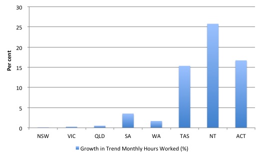
To dig a bit deeper I examined the hours distribution by State/Territory.
Note that it is trend monthly hours shown in the graph. In the three largest states (NSW, Victoria and Queensland) there was no appreciable growth in trend hours worked.
Conclusion
Yesterday’s National Accounts data suggested Australia is booming beyond the expectations of everyone who follows these things closely. As I noted yesterday – Australian national accounts – strong growth creates a puzzle – the results hardly matched the labour market data for the first-quarter 2012.
Today’s labour force data for May 2012 doesn’t alter my view of that. The trend is weak despite the welcome rise in full-time employment this month.
The rising unemployment is being driven by rising participation which means the labour market is translating the hidden unemployed back into officially-recorded unemployed as employment growth improves.
But that improvement is from a very poor base. 2011 was a year of jobless growth in net terms. Over the last 6 months of 2011 employment growth contracted sharply. The national economy clearly failed in 2011 to grow at a rate sufficient to absorb the underlying population growth and unemployment rose.
In the first months of this year, the situation remains uncertain with positive and negative swings in employment growth already evident and repeating the behaviour over the last 18 or so months.
The best assessment is that the labour market is weak – especially when you consider that full-time employment has fallen over the last six months.
We always have to be careful interpreting month to month movements given the way the Labour Force Survey is constructed and implemented. But the underlying trend is weak as a result of the withdrawal of the fiscal stimulus undermining employment growth.
The most striking aspect of a sad picture remains the appalling performance of the teenage labour market. Employment has collapsed for that cohort and I consider it a matter of policy urgency for the Government to introduce an employment guarantee to ensure we do not continue undermining our potential workforce.
Overall, good signs but wait for the reversal.
That is enough for today!

Goldman’s is also perplexed but thinks the pick up in employment (which is not in WA where the engineering construction but in NSW) has to do with a catch-up effect after an unusually wet period (ie, flodds, etc).
Any comments?
please comment on the figures produced by the ROY MORGAN poll on unemployment.
Dear tom (at 2012/06/08 at 6:59)
Please see this blog – Employment fell in December, no it didn’t employment rose – and other apparent inconsistencies – https://billmitchell.org/blog/?p=17871
best wishes
bill
jul-2013 – I work in the mining sector which is the countries leading sector, however most mining companies are now making major cuts in expenses…..large amounts of staff and contractors are going to looose there jobs soon, any supporting businesses to mining are either going to be screwed over or close down.
So what happens when the government gets greedy, centrelink here we come!