I finally arrived back home late last night, so I am catching up today. Part…
Australian national accounts – strong growth creates a puzzle
The ABS released the – Australian National Accounts – today for the March 2012 quarter and the results have stunned all commentators including yours truly. Last quarter, the real GDP growth rate had slumped to 0.6 per cent (this was revised upwards from 0.4 per cent). But in the March 2012 quarter the Australian economy grew by a staggering (fast) 1.3 per cent – driven by both private consumption and private investment are driving growth. For the year, the Australian economy grew by 4.3 per cent which when compared to trend (around 3.25 per cent) suggests a boom. But over the same quarter, employment growth fell by 0.7 per cent and full-time employment fell by 0.2 per cent. That dislocation is very puzzling. There appears to be a divergence occurring between our real output performance and our labour market performance. More analysis is required to fully understand that divergence. Clearly, the data is also indicating that growth can be unbalanced (concentrated in space and particular sectors) which poses policy challenges. For now though, the real GDP growth estimates are good. It is likely we have seen the peak of the investment cycle though (as China slows) and that will have implications for income growth, and, hence, household consumption growth.
The main features of today’s National Accounts release for the March 2012 quarter were (seasonally adjusted):
- Real GDP increased by 1.3 per cent and the December 2011 quarter growth estimate was revised upwards from 0.4 to 0.6 per cent.
- The main positive contributors to expenditure on GDP were Household final consumption expenditure (0.9 percentage points) and Private gross fixed capital formation (0.8 percentage points).
- The main negative factor was Net Exports (detracting 0.5 percentage points).
- Real gross domestic income, which adjusts real GDP for Terms of Trade effects, fell by 0.2 per cent (in trend terms) because the Terms of Trade (seasonally adjusted) fell by 4.3 per cent. It looks like the commodity price cycle has peaked and over the last 6 months our Terms of Trade have been in decline.
- Real net national income, which is a broader measure of change in national economic well-being was flat (because of the declining terms of trade).
The Sydney Morning Herald article – Growth accelerates, easing need for more rate cuts – said:
The economy rose 1.3 per cent in the March quarter, more than double the pace expected by economists …
I have to admit that while I usually ridicule the bank economists for being off the mark so often, I am joining them today – I was wrong as well.
As one of the major bank economists said:
I’m picking my jaw off the table … It certainly shows the economy had a decent amount of momentum in the run-up to the latest round of European woes and that’s a handy position to be in.
Yesterday, the RBA lowered interest rates because it expressed concern over our “modest growth rate”. Today’s results are anything but modest growth.
We all knew that investment is strong at present (contributing 0.8 percentage points to growth in the March 2012 quarter) although expected investment is now lower than previously thought. But today’s data revealed that private consumption is also strong (adding 0.9 percentage points to real GDP growth in the March quarter).
Household consumption grew by 4.2 per cent over the 12 months to the March 2012 quarter – while household maintained a stable saving ratio out of disposable income. How did that happen you may ask? Incomes rose by 2.5 per cent and while company profits are down, there has been strong wages growth on the back of strong productivity growth.
However, caution also needs to be exercised. The investment boom is concentrated on the mining sector which is servicing the growth in China (our largest export market). China is now slowing and we have to remember that the National Accounts data is a rear-view mirror vision of where we have been – not necessarily where we are going.
The other source of caution, following the last point, is that the seasonally adjusted Terms of Trade fell sharply by 4.3 per cent in the March 2012 quarter driven by falling commodity prices.
The ABS say that:
The real purchasing power of income generated by domestic production is affected by changes in import and export prices. Real gross domestic income adjusts the chain volume measure of GDP for the Terms of trade effect … In seasonally adjusted terms, during the March quarter, Real gross domestic income grew 0.2%, while the volume measure of GDP increased by 1.3%, the difference reflecting a decrease of 4.3% in the Terms of trade.
This meant that real net national disposable income – which the ABS describe as a “broader measure of change in national economic well-being” was “flat” (in seasonally adjusted terms) during the March quarter.
So once we factor in the fact that the prices of exports fell relative to the prices we pay for our imports real GDP the spectacular growth figure translates into less spectacular outcomes for real net national disposable income.
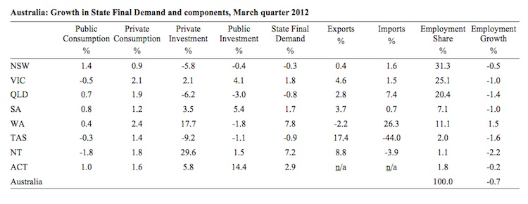
To show you why people are somewhat puzzled consider the following Table, which shows the quarterly growth in State Final Demand and its components for the March 2012 quarter and compares them with the employment share and employment growth over the same period. You will immediately see the quandary that analysts are facing at present.
The Labour Force Survey data is showing employment growth has been declining in all states/territories other than the mining centre of Western Australia, which has 11.1 per cent of total employment. Overall, nation-wide employment fell by 0.7 per cent in the March quarter 2012. In the highly populated states – New South Wales, Victoria, Queensland- which account for 31.3 per cent, 25.1 per cent and 20.4 per cent of total Australian employment, respectively employment fell sharply in the first three months of this year.
Juxtaposing that data with the National Accounts estimates you can see why there is considerable uncertainty among the analysts (including myself).
There is some correspondence between the product market data (National Accounts) and the labour market data in NSW, QLD and Tasmania. State final demand fell in all three states Queensland on the back of sharp retreats in private investment. Private consumption, however, grew strongly in NSW and QLD despite the falling employment. Tasmania behaved more consistently.
But, by way of anomaly, State Final Demand in Victoria grew strongly, again despite the sharp decline in employment, with both private consumption and investment growth exhibiting strong growth.
South Australia is also a puzzle. All the national accounting spending components grew strongly in the first quarter of 2012 but total employment fell sharply by 1 per cent over the same period.
The major mining states of Western Australia and the Northern Territory have had very substantial growth in private investment in the March-quarter 2012 and strong growth in State Final Demand as a consequence. That growth has not been associated with employment growth in the Northern Territory though.
So it is clear that there is very strong private infrastructure development occurring in the more remote (less populated) states/territories of Australia and very (difficult to read) patchy growth elsewhere.
The private investment spending on mining infrastructure will not yield significant employment opportunities once the construction phase is completed. But a substantial proportion of this investment spending must be associated with the large developments (roads, port facilities, rail lines and supporting infrastructure, and other infrastructure) which, presumably.
So the real difficulty in putting all this together is the sharp dislocation between what is happening in the labour market and what today’s National Accounts data is telling us.
We will have to wait to see if there are to be any revisions to the latter.
Some people might suspect the Labour Force data given the controversy in recent months over the methods used by the ABS to estimate their underlying populations between censuses. Please read my blog – Australian labour market – converting unemployment into hidden unemployment – for more discussion on this point (especially in the comments section).
The Labour Force data for May 2012 comes out tomorrow and we will be able to see what has been happening over the last four weeks in the labour market.
But the National Accounts data also (in the words of the ABS) “contains a number of labour market related indicators”, including hours of work. The ABS say of the March quarter 2012 results that:
In the Market sector … Hours worked fell during the quarter (-0.3%) with through the year change at -0.4%.
So that is consistent with the message that the Labour Force Survey data is telling us.
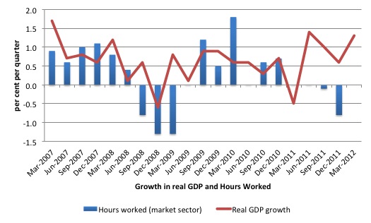
The following graph presents quarterly growth rates in trend GDP and hours worked using the National Accounts data for the last five years to the March quarter 2012.
You can see the major dislocation between the two measures since the middle of last year. So I think the explanation for what is happening is more complex than just accusing the ABS of publishing poor employment data.
What today’s data is reminding us of is that activity has a spatial element. Growth can be strong but significantly unbalanced. That is particularly so in a nation such as Australia where the population is concentrated (very densely) around the Eastern seaboard – particularly in three major (and sprawling) cities (Sydney, Melbourne and Brisbane) yet our major export sector (primary commodities) is located in remote areas with few people and isn’t a major contributor to employment (directly).
It is clear that the investment-driven growth is building a lot of rail lines and the like in the remote areas. But this is not translating in to employment growth in areas where the majority of the population are living and the majority of employment is located in regions where total demand is falling.
But even that conjecture has to be qualified by the strong growth in consumption in most of the states (mining or not).
We just have to wait for more data to really start piecing this puzzle together.
Overall growth picture
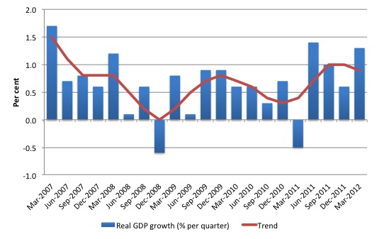
The following graph shows the quarterly percentage growth in real GDP over the last five years to the March-quarter 2012 (blue columns) and the ABS trend series (red line) superimposed. After the decline in trend growth was arrested by the fiscal stimulus in 2008-09 the decline in government support saw the dip in trend growth in 2010. Initially, growth in private investment helped drive the new rise in trend growth and that appears to have continued in the March 2012 quarter.
The average real GDP quarterly growth over the last year is 1.1 per cent (trend 0.9 per cent). Today’s data indicate that over the last year the Australian economy grew by a strong 4.3 per cent although that is somewhat influenced by the strong growth in the June 2011 quarter following the infrastructure funding to repair the damage from the natural disasters in early 2011.
However, if we discount that quarter as an outlier, the Australian economy is has exhibited strong (and surprising) growth.
Contributions to growth
What components of expenditure added to and subtracted from real GDP growth in the March 2012 quarter?
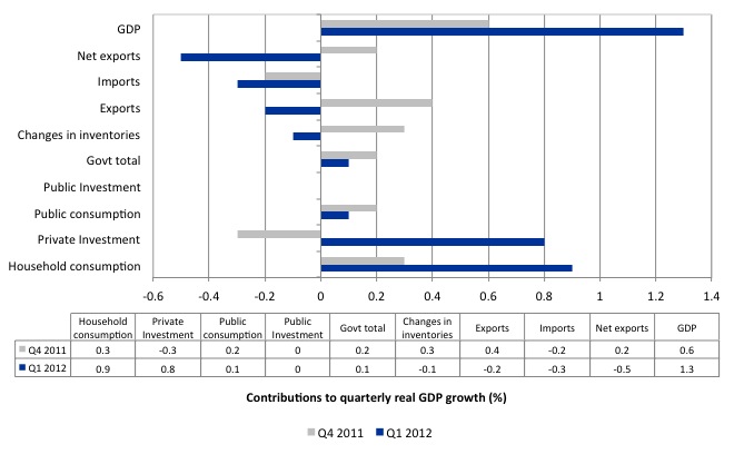
The following bar graph shows the contributions to real GDP growth (in percentage points) for the main expenditure categories. It compares the March 2012 quarter contributions (blue bars) with the December 2011 quarter (gray bars).
The growth components were household consumption was definitely surprising – it contributed 0.9 percentage points to real GDP growth in the March 2012 quarter.
The other major contributor to real GDP growth was private investment which is unsurprising. Last quarter I noted that the sudden weakening in private investment might be a blip and that appears to have been the case.
But as noted above, our major driver of resource investment is the growth in the Chinese economy, which is now in tapering off. So what is going on at present with respect to the match between expected private investment and actual outcomes is anyone’s guess.
Household saving ratio
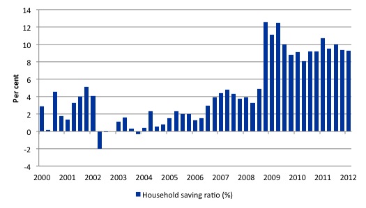
The following graph shows the household saving ratio (% of disposable income) from 2000 to the current period. The household sector is now behaving very differently since the GFC rendered its balance sheet very precarious. Prior to the crisis, households maintained very robust spending (including housing) by accumulating record levels of debt. As the crisis hit, it was only because the central bank reduced interest rates quickly, that there were not mass bankruptcies.
The household saving ratio eased to 9.3 per cent of disposable household income in the March 2012 quarter (down from 9.4 per cent in the September quarter). It has averaged around 10 per cent since the crisis.
For the economy to continue to grow strongly while households are maintaining rising levels of saving (from disposable income), public spending, private investment and/or net exports has to increase.
Clearly the contribution from net exports and public spending has been negative and/or modest in recent quarters and it is private investment spending which is driving income growth that is permitting households to maintain their and deleveraging effort and have relative strong consumption growth.
Given that the household sector is now carrying record levels of debt as a result of the credit binge leading up to the crisis, we are unlikely to see a return to the low saving ratios that were evident in the period 2000 to 2005.
Which means that if private investment growth softens (which it surely will in coming quarters) then households will not be able to have it both ways.
Conclusion
As discussed, the strong growth revealed in today’s National Accounts data creates a puzzle. Employment growth data is telling us that the labour market is weak while the national accounts data is telling us that we are booming (at least three months ago).
Even with the trend being influenced still by the natural disasters earlier in 2011, today’s growth estimates were very solid. Both private consumption and investment are leading the charge (the former responding to income growth driven by the latter).
Some caution is needed when interpreting National Accounts data, given the lag in publication. With China now slowing and the Terms of Trade falling for another quarter, it is likely that the peak in commodity prices has passed and how that impacts on the upcoming investment plans is uncertain.
A fair bet is that intended investment will continue to weaken as the international outlook worsens and so the March quarter 2012 private capital formation performance will be the peak. But for now we should enjoy it.
That is enough for today!
For what it’s worth here’s my two bob’s worth Bill.
I initially thought that the ABS must be needing to check that it’s econometric, number-crunching software was functioning properly. The figures are so far out of whack with other data that I watched coming out of that quarter that I didn’t believe it could be accurate.
March quarter GDP has been most heavily powered by a very strong surge in household consumption. This occurred whilst…
* Retailers continued to report weak trading conditions, except the month of March which was ok.
* Inflation continued falling to almost irrelivent levels, and the annualised figure is now below the RBA target band – when was such a powerful surge in consumer spending accompanied by DISinflation, particularly in the face of a weakening dollar, when so many of our household consumer goods are imported?
* The housing market remained in the doldrums
* Wage and salary growth outside the mining sector (a tiny employer) was not booming
* Credit growth remained wallowing at multi-decade lows and personal credit was actually contracting
In short, there was almost nothing coming out of the March quarter to suggest that such a remarkable surge in household consumption was occurring. Retailers did not report it and nowhere can I see any evidence of a boom in the means to finance such spending.
I feel that at least part of the answer may lie in the opening paragraph of the blog you wrote yesterday..
“I went for a walk at lunchtime through a main shopping area where I am working today. In the past you saw Sale signs twice around twice a year – post Xmas and mid-year. The advertised discounts at this time were modest except for some enticement items that might have been discounted by 30 per cent or so. You rarely saw Closing Down/All Stock must go signs. You rarely saw massive discounts – such as 80 per cent off and the like. Times have changed and there seems to be a permanency to these sales and the discounts are huge. Previously well-to-do shopping strips are now slowly being punctuated with empty shops so the Sale/Closing Down signs are now interspersed with For Lease signs.”
Is it concievable that retailers right around the country are so desperate to move stock in order to stay in business that they are cutting themselves to the bone to offer more or less permanent discounting of very large margins? That they may have succeeded in triggering a large surge in household consumption with their spectacular discounting – but that this will not show up in anything other than the national accounts because more consumption is being procured with less money than before, and with severe discounting needed to move stock, retailers will generally not report good trading conditions (such conditions certainly aren’t good from a retailers point of veiw) .
If such a condition does exist and were to persist, I imagine that the level of retailing in our country – geared towards a high consumer credit growth environment – will start to come under heavy pressure, with increasing numbers of retailers going to the wall and increasing oligopolistic concentration among the bigger players.
I cannot yet think of any other way that household consumption could boom without retailers reporting it, without consumer credit or broader incomes booming, without triggering even the slightest upward CPI movement and with DISinflation occurring instead.
What do you think?
Well strike at least some of that – I see the breakdown shows that household goods and clothing were among the weaker components. No wonder I didn’t hear about retailers jumping for joy by the end of March.
The huge standout was transport services and and Western Australia drove the jump – sounds mining related to me.
Increases still look fairly broad-based though.
An interesting take…..http://www.macrobusiness.com.au/2012/06/the-inflation-trick-on-gdp/
Hi Bill
Hate to be a stickler but your quoting employment level estimate growth which really is confounding employment growth as employment level estimates are highly correlated with population growth. As you probably know the best meaure to use is the employment to population ratio as it removes population growth a a confounding influence. So from what I can tell employment was pretty steady when taking population growth out of the equation.
Also Bill my feeling is that there are alot of people who have forgotten basic stats lessons
http://www.abs.gov.au/ausstats/abs@.nsf/Latestproducts/6202.0Main%20Features10Apr%202012?opendocument&tabname=Summary&prodno=6202.0&issue=Apr%202012&num=&view=
Lot’s of money has been poured into WA and NT. Could some really well paid fly in/ fly outers be spending like they are on a permanent gig? It’s not like the mining companies are going to be building another Mt. Isa after all. Workers building mine, transport or storage will not be wanted when mine is productive so temporarily giving them what seems like an undreamed of fortune for backbreaking work to keep family and mortgage in the city while affording their accommodation, travel and other basic social needs away from home looks like a good deal. I only mention this because this is what my neighbour does. In his nail biting spells between employment he goes to the absolute limit of sanity to spend on home ‘improvements’. Yeah, I know-fallacy of composition ahead. So glad I’m not an economist trying to figure it out.
Dear Andrew (at 2012/06/06 at 19:54)
I don’t really know what you are talking about. I merely quoted quarterly employment growth (no tricks). The debate about the Employment-Population versus Employment Rate is a totally different issue
best wishes
bill
Dear Andrew (at 2012/06/06 at 20:01)
The ABS page you referred us to is not basic stats. Its explains the way in which the ABS corrected for some unpredicted shifts in components of the population. Their explanation has been disputed although I am on the record as saying I thought it was reasonable.
best wishes
bill
Dear Lefty (at 2012/06/06 at 19:44)
That is related to what I was referring in the discussion about Terms of Trade. I will elaborate on that next week.
best wishes
bill
Hi Bill you quoted level estimte growth. I wasn’t suggesting any tricks. Its just employment growth the way you presented it is influenced by population growth. If instead you qoute change in Employment to Population you get a more accurate story.
The second post I was simply referring to Confidence intervals and the seemingly lack of understanding by people who should know better (not you).
What’s going on with that deflator, Bill?
It looks like households are saving the same whilst spending more. This should imply a rise in incomes. If wages are not going up, then maybe they are selling their possessions to pay for essentials while prices are lower.
From what I understand, looking at Australia’s national accounts. Incomes increased in the quarter, but prices didn’t. If Aussie businesses have poor balance sheets then this is probably a blip, else it might provide something positive to offset the government’s austerity package.
My guess is that it is just a blip.
If one removes the mining sector from the calculation, how does the picture change ?
I live in Auckland, but enjoy reading your blog. It would be encouraging for the NZ economy if there was private consumption/investment led growth in Australia.
If it is not a blip, it could be a combination of factors – increased spending by new migrants (UK, NZ, Ireland, SA etc), or increased spending by baby-boomer high income earners who feel that they(and their companies) have survived the crisis and can splash out a bit, after all although times have been tough for lower wage earners, company profits and corporate salaries have been robust in recent years.
Maybe not all households are equal.