The Australian Bureau of Statistics (ABS) released the latest labour force data today (APRIL 16,…
Industry job dynamics in Australia
I have been number crunching today – heavy sort of crunching. One of the on-going discussions in the Australian context is the dual pattern of growth that is being observed here – which has arisen largely because, in essence, we are a primary commodity producer (and exporter) rather than an industrial nation. At present, some sectors (such as manufacturing and tourism) and regions (such as Sydney and Melbourne) are struggling while other sectors (such as mining) and regions (such as Western Australia, Northern Queensland and the Northern Territory) are booming. The East Coast where the majority of Australians live and work is probably close to recession. These trends – popularised by the term ‘two-speed economy’ – whereby serious sectoral and regional imbalances accompany overall economic growth, challenge the fundamental patterns of our economic and social settlements and threaten the financial viability of many Australian households. So I was computing job destruction and job creation rates today as part of an investigation of how the labour market is reacting the dual nature of economic outcomes at present. And then … the ABS published the Retail Sales data for April 2012 today and, as usual, everyone could interpret it in their own way. But it does bear somewhat on how we consider this dual growth pattern.
The ABS published the Retail Sales data for April 2012 today and, as usual, everyone could interpret it in their own way.
The highlights for the Retail Sales data release for April 2012 were as follows (quotes are from the ABS):
- “In current prices, the trend estimate for Australian turnover rose 0.3% in April 2012 following a rise of 0.3% in March 2012 and a rise of 0.3% in February 2012” – so people who want to run an “everything is okay” line will quote this figure.
- “The seasonally adjusted estimate for Australian turnover fell 0.2% in April 2012 following a rise of 1.1% in March 2012 and a rise of 0.2% in February 2012.” – so people who want to run a slowing economy line will quote this figure.
- The “original estimate for Australian turnover fell 4.0% in April 2012. The original estimate for chains and other larger retailers fell 3.4% in April 2012. The original estimate for smaller retailers fell 5.0% in April 2012” – this is what actually happened in April 2012 and is a poor outcome.
One journalist today noted that the Retail roller coaster rocks on, which isn’t too far off the point.
The Sydney Morning Herald report (May 30, 2012) – Retail sales in surprise retreat
– claimed that the fall was unexpected and “disappointing”. It is a common writing ploy by the reporters to suggest that the data release provides a “surprise”.
The SMH article says that:
Australian retail sales registered a disappointing result in April, with total turnover contracting for the first time in 2012. The decline sent the dollar skidding at investors raised their bets of another interest rate cut … The drop in retail spending adds to evidence that the Reserve Bank was slow in cutting interest rates as it weighed up signs of patchy growth and the coming mining investment bulge.
The retail sales data supports most of the current information available. That the Australian economy is in a relatively weak position – with growth well below trend and unemployment rising.
Moreover, it is clear that there is considerable growth in the unpopulated North-West where the mining boom is evolving but that growth is not benefiting the rest of the economy (East Coast) where most of us live and work.
The disappointing result is not only due to the RBA hanging on to an excessively high interest rate for too long – but also because the Federal government is pursuing a rapid fiscal contraction as a result of its obsession with achieving a budget surplus in the coming year – despite the economy slowing.
The bets are all on that alleged “investment bulge” associated with the mining sector. The commentators and officials have been claiming that the bulge was coming two years ago and so far it we have been underwhelmed by the strength of it.
Some new data is coming out tomorrow – Private New Capital Expenditure and Expected Expenditure – for the first-quarter 2012 as a precursor to next week’s national accounts data. That will give us some idea of the current strength of investment spending.
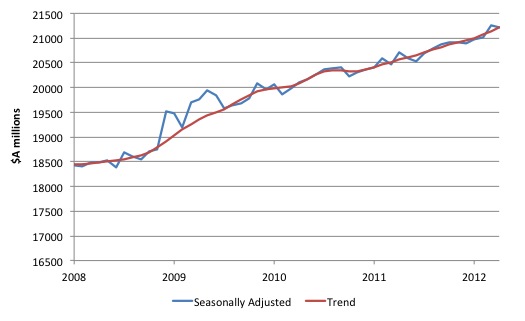
The following graph shows the Retail Sales since January 2008 (in $A millions). The trend is a 6-month moving-average. The first fiscal stimulus payments to consumers was in December 2008 which was followed by the $A42 billion stimulus announcement in February 2008.
If I was looking for a single piece of evidence that the fiscal intervention increased retail sales I couldn’t find a better graph to demonstrate that.
The stimulus clearly boosted spending during the period that it was concentrated as the graph indicates (the significant above-trend retail sales). In doing so, it not only replaced some of the declining private demand but also gave households extra financial capacity to both spend and increase their saving ratio.
At the time, the conservatives claimed that the fiscal stimulus would not be expansionary because the household sector would just save it all. But that seriously misconceived the way spending stimulates income which in turn stimulates saving.
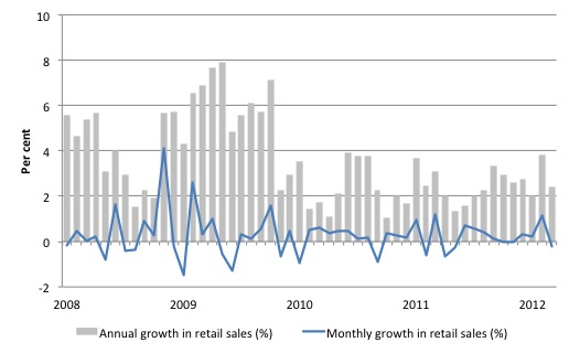
You get another excellent view of the impact of the fiscal intervention from the next graph – note the boost in late 2008 and into 200. Then note the slowdown as the fiscal stimulus was steadily withdrawn. The two large positive spikes (in 2008) for the monthly growth series (blue line) correspond to the impact periods of the fiscal stimulus.
What does this mean for the economy?
That is an interesting question because there is now a view being expressed by the central bank (RBA) and others that there is a structural break in the relationship between retail sales data (which comprises about 30 per cent of total private consumption) and private consumption spending.
The Sydney Morning Herald columnist Michael Pascoe (cited above) noted in today’s column that:
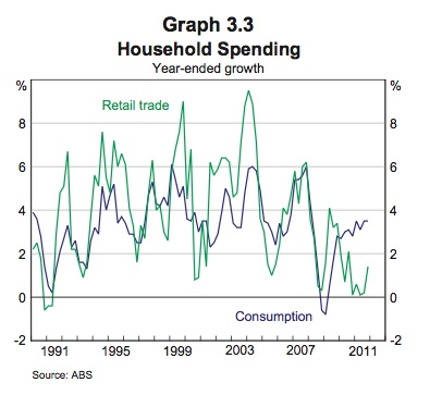
There was a particularly telling graph tucked away in the RBA’s quarterly statement on monetary policy earlier this month, showing that the strict correlation between retail sales and consumption was broken two years ago. Until then, consumption and retail rose and fell in unison, albeit to differing degrees from time to time. In 2010, retail sales growth fell while consumption spending rose and they’re still apart. We’re spending differently. Thus a soft retail sector no longer necessarily means a soft economy. Poor retail performance is a problem for the retail industry, but beyond any direct employment impact, it’s not a broader economic problem.
The graph he was referring to was provided by the RBA in their latest – Statement on Monetary Policy – which was finalised on May 3, 2012. Graph 3.3 Household Spending appears in the Chapter on Domestic Economic Conditions.
The RBA provide the following accompanying text:
Data from the national accounts show that growth in total consumption was considerably stronger than growth in retail trade volumes over 2011, which accounts for around one-third of consumption (Graph 3.3). This reflected stronger growth in spending on household services and spending by Australians overseas.
The argument is that the diverging movements is the result of the growth of on-line purchasing. which supposedly represents a structural shift in our relationship with shops and spending. I don’t use the word “supposedly” to suggest I disagree with the claim that our shopping behaviour is changing. Mine certainly is and I suspect that proposition has validity.
But I think it is still too early to suggest that negative retail sales growth movements do not signal wider negative happenings in the economy.
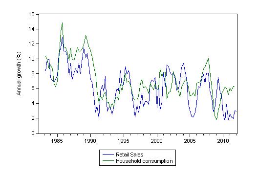
I re-graphed the annual growth in household consumption and retail sales with an extended sample (second-quarter 1982 to the fourth-quarter 2011). Sorry that I swapped the colour of the series but I was rushing.
While the divergence between retail sales and consumption in the last 2 years is clear we should be somewhat circumspect. It has happened before (note: late 1980s and the mid-1990s) when on-line behaviour via the Internet was in its absolute infancy and on-line commerce was just a fancy.
Now, back to the job creation and job destruction computations, which are intensive and involve a fair amount of programming – given the data is at the industry sub-division level and there are 19 top-level (one-digit) industries in the ANZSIC (Australian and New Zealand Standard Industrial Classification).
While the term ‘two-speed economy’ has taken on a number of meanings in different countries the imbalance of most interest here is the precariousness of the East coast economy (particularly, NSW and Victoria) where the majority of Australians live and where most of the employment is generated, relative to the prosperousness of the mining regions of Western Australia, Queensland and the Northern Territory.
Several coincident factors are driving the ‘two-speed’ economy some of which have not received much public attention.
First, our terms of trade for non-rural, particularly base metal commodities are booming but delivering uneven benefits to Australian regions. Further, Australian manufacturing is declining with regionally concentrated costs. Consequently, unemployment is falling in some areas but rising elsewhere.
Second, the major city property booms in the years leading up to the crisis have abated with households left holding record debt levels. In some areas, household finances are now highly vulnerable to minor interest rate variations and increasing unemployment. This is particularly so in Melbourne and Sydney.
Third, the Federal Government is now engaged in its obsessive pursuit of budget surpluses. The resulting squeeze on household disposable income combined with recent increases in interest rates, has elevated the danger that economic slowdown in some areas (like Sydney and Melbourne) will bankrupt many households.
Fourth, a rising terms of trade rise usually promotes exchange rate appreciation. Since March 5, 2010 (to today) the Australian dollar appreciated by 16.5 per cent against the US dollar, 10.6 per cent against the Trade Weighted Index, 20.7 per cent against the YEN, 15.4 per cent against the Euro and 11 per cent against the UK pound.
Since January 4, 2010 (to today), the Australian dollar has appreciated by 9 per cent against the US dollar, 6 per cent against the Trade Weighted Index, 25 per cent against the Euro and 12.5 per cent against the UK pound.
But the real damage to the exposed export sectors which are not enjoying the sort of demand boost that mining is experiencing was done earlier this year.
At the most recent US dollar low-point (February 29, 2012), the Australian dollar appreciation since January 4, 2010 has been 20.5 per cent against the US dollar (13.6 per cent against the TWI, 27 per cent against the Euro and 21 per cent against Sterling). Those sort of changes have undermined the competitiveness of manufacturing and tourism industries to name the most significant.
A further addition to the usual “Dutch Disease” situation where world demand growth in resources places upwards pressure on the currency, disadvantaging export industries which are not enjoying buoyant world prices (such as, manufacturing and tourism) has been retail trade. I will have more to say about whether the Dutch Disease concept adequately describes what is going on at present. I have more research to do before I commit myself publicly on that.
And I haven’t finished all my job creation and job destruction rate calculations yet – but the following will give some idea of what I came up with today as part of a larger project.
The data I was using today was the – ABS Employment by industry subdivision data to compute updated gross flows measures of job creation and job destruction.
As background, I had a large Australian Research Council grant a few years ago to investigate labour market dynamics. Very few people pursue this sort of research yet the results are always very revealing.
Several studies reveal that labour markets in countries like Australia are in a constant state of flux which means that specific jobs are continually created and destroyed as firms expand, adjust to changing labour force characteristics, restructure, contract or close.
This process of job creation and destruction (JC&D) is mirrored by movements of workers between labour force states. When we consider employment dynamics using macroeconomic data we typically focus on measures of net employment changes over time.
For example, say total employment in April is 8000 thousand and in May it is 8020 thousand. Then we would conclude that total employment rose by 20 thousand jobs in the month of May. You will constantly hear commentators saying that 20 thousand jobs were created in May. That is likely to be a false statement because in all likelihood many multiples of that were created at the same time as thousands were also destroyed leaving a net change of 20 thousand.
In other words, a net focus at the aggregate focus prevents an understanding of flows noted above (numbers of jobs created and destroyed and movements of workers across labour force categories).
A net figure showing an increase in employment of 20 thousand can be describe totally different underlying dynamics. For example, imagine that 100 thousand jobs were created and 80 thousand were destroyed in the month – which would suggest a highly fluid labour market. Compare that to just 20 thousand jobs being created and none destroyed – a much less vibrant situation.
Research in this area thus analyses the flows of workers between states usually at a disaggregated industry level to gauge the extent to which the labour market is in flux.
There are several technical issues involved in calculating the job creation and job destruction rates and the derivative time series but I will ignore them here. I have several academic papers out on this topic if anyone is interested in pursuing the matter more formally.
As an example of some freely available work I have done in this area – see the 2005 Working Paper – The dynamics of job creation and destruction in Australia. There are several papers like this in both Working Paper and final published form on various aspects of gross job flows both in Australia and elsewhere.
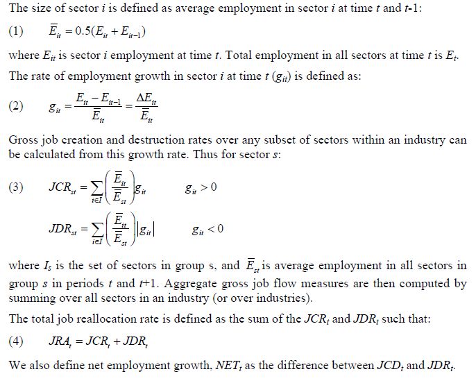
We initially define the rate of employment growth in sector i (that is, a sub-sector of some industry) at some time (t) as the percentage change in employment between two periods in relation to the average size of sector i over the period in question.
We then define the job creation rate for a sector as a sub-sector-weighted average of these growth rates when growth is positive. We also define the job destruction rate as a sub-sector-weighted average of these growth rates (in absolute value) when growth is negative.
Aggregate gross job flow measures are then computed by summing over all sectors in an industry (or over industries).
We also compute the total churn (or job reallocation rate) as the sum of the job creation and job destruction rates. Net employment growth is simply the difference between job creation and job destruction rates.
For the technically-minded the following formulas are used:
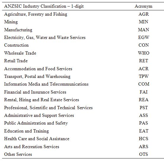
The following Table provides a mapping to the acronyms used in the graphs to allow you to trace what industry is being dealt with in each case.
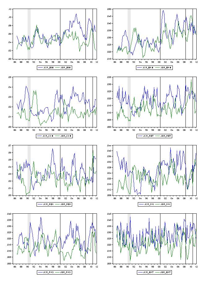
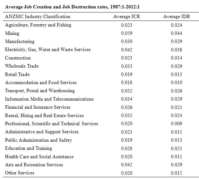
To give you some idea of what the data is saying the following graphs show JCRs and JDRs for some selected sectors in Australia over the period – first-quarter 1987 to the first-quarter 2012. The time series generated are five-quarter moving averages to smooth out some of the volatility in the original data. The vertical axis can be expressed as a percentage. So 0.04 is refers to a job creation or destruction rate of 4 per cent per quarter. I provide a Table below to show the averages over the full-sample for all industries.
The shaded sections (or single observation shaded sections which appear as vertical lines) denote quarters of negative real GDP growth in the sample. The 1991 recession was clearly the last bad downturn the Australian economy experienced.
The following graph shows a selection of eight industries (from left to right, and down) – Mining; Manufacturing; Construction; Retail Trade; Rental, Hiring and Real Estate Services; Financial and Insurance Services; Public Administration and Safety, and Education and Training. The latter two are public sector dominated. The left-hand scales are not common so do not be seduced.
I don’t have time today to really discuss these in detail – that is another blog altogether. But here are some ideas to help with your thinking.
1. Private sector job creation rates and job destruction rates are strongly cyclical – with job creation rates falling quickly as real GDP growth declines and job destruction rates rising quickly. Job creation rates lead the cycle and job destruction lags it and continues to rise after the trough.
2. All flows tend to be higher in the period after the 1990s recession (outside of their cyclical behaviour) which reflects the relative increase in part-time (and casualised) work – there have been a dominance of transitory jobs created in the Australian economy over the last two decades. Service sector flows are more volatile.
3. The pre-crisis mining boom is clearly evident as is the plunge during the recent crisis. There is no truth in the Mining lobby’s claims that it saved the economy from the downturn. The most recent return to growth in the mining sector is clearly signified by rising JCRS and falling JDRs.
4. The JCR in the Manufacturing sector have been in decline (as have the JDRs) in the last few years as the exchange rate has peaked.
5. The real estate and building boom (leading up to the 2008 crisis) is evident in the sharp divergence between JCRs and JDRs in Construction. The other salient point is that construction normally goes backwards sharply during a recession (see relative JCR and JDR impacts in the 1991 recession) but in the most recent downturn that trend was avoided. How? By the massive government fiscal stimulus!
6. The withdrawal of the fiscal stimulus is evident in the bottom two graphs (Public Administration and Safety and Education and Training). JCRs are falling significantly and JDRs in Education are rising.
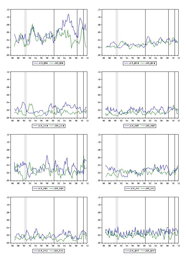
To put the dynamics of the Mining sector into context, the next graph uses a common vertical scale. The Mining sector is much more volatile than the other sectors, which are themselves in a state of considerable flux at any point in time.
The following Table shows the average JCR and JDRs for all sectors since the first-quarter 1987.
Conclusion
Anyway, work in progress. Life as a researcher is always work-in-progress and one has to exist in a continual state of what will be forthcoming tomorrow. Rarely is any questioned answered before some complication or another rises up and the quest for knowledge goes on. So today is very much a Web Log of today’s activities.
But my reading of the data to date is that today’s retail sales result is not a good one for Australia and for certain segments on the industry. But it is true that the data moves around a lot and one can almost read anything into it that one wants.
That is enough for today!
Hi Bill,
The final table is ambiguously labelled, which column is supposed to be JDR?
Dear Andy (at 2012/05/30 at 20:11)
Sorry, I was rushing. The right-hand column is JDR although it says JCR.
best wishes
bill
The Dallas Fed Annual Report of 2003 has a focus on jobs during a transition period. They remained upbeat until….. This history flashback is of particular interest by its omissions during a period of prolonged sector job loss. There was no real place for displaced workers to transition and stay solvent in a society of consumers thinly secured by cashflow and credit. The 2003 tax cuts had no impact on job loss and probably added froth to the housing bubble. Reinventing the workforce is not a simple task.
Australia’s dual fuel economy may require a sector approach.
Just a small technical point: It is not quite clear but it looks as though the average JCR and JDR don’t use the geometric average as they should. The ratios over the twelve year period seem to be high enough for it to make a bit of difference.