The Australian Bureau of Statistics (ABS) released the latest labour force data today (March 19,…
Australian Labour Force data – an unambiguously bad result
Today’s release by the Australian Bureau of Statistics (ABS) of the Labour Force data for February 2012 presents a very poor set of numbers. Yesterday, we learned that the Australian economy had cut its growth rate in half in the December 2011 quarter (compared to September 2011). The labour force data tells us what is happening in the last few weeks and so gives a much more timely assessment of where things are at. The conclusion is that the trend signified by the National Accounts data has accelerated and the economy is shedding jobs, driving workers out of the labour force (participation falling) and unemployment is rising as a result. The Federal government’s reaction to the poor growth figures which are undermining its obsessive pursuit of a budget surplus was that they would have to cut spending even harder. That approach exemplifies irresponsible and failed macroeconomic management. Their policies settings are contributing to the poor labour market data. The most disturbing aspect of the labour market data over the last year or more has been the appalling state of the youth labour market. Teenage females did gain some modest relief this month from the relentless loss of jobs, but teenage males continued to go backwards. This should be a policy priority for the government. But they have gone missing in action – lost in their surplus mania. My assessment of today’s results – the evil troika is evident – falling employment, rising unemployment and falling participation. That is an unambiguously bad result.
I should note that as part of the Australian Bureau of Statistics 50 Years of Labour Statistics they are providing some special, highly-educative information. For example, Understanding Labour Force – is an excellent introduction to the concepts and survey methods.
The summary ABS Labour Force (seasonally adjusted) estimates for February 2011 are:
- Employment decreased by 15.400 (0.1 per cent) with full-time employment unchanged and part-time employment taking the losses.
- Unemployment increased by 16,400 (2.7 per cent) and is now at 632,200.
- The official unemployment rate increased to 5.2 per cent from 5.1 per cent last month.
- The participation rate decreased by 0.1 pts to 65.2.
- Aggregate monthly hours worked increased by 21.6 million hours (1.35 per cent).
- The ABS broad labour underutilisation estimates (the sum of unemployment and underemployment) decreased to 12.5 per cent from 12.6 per cent, which means that underemployment fell marginally (mainly due to the full-time jobs created in January).
For a discussion of the difference between seasonally adjusted data and raw data please read this blog – Employment fell in December, no it didn’t employment rose – and other apparent inconsistencies.
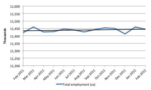
To set the scene straight consider the following graph which shows total employment over the last 12 months (seasonally adjusted) and the linear trend (black line). Melbourne Age economics commentator wrote today that this is “One of the most extraordinary jobs graphs I have ever seen”. Me too Peter! Zero growth – a labour market going no-where.
Later on in the blog I compute the impact of the flat employment growth on participation. The summary result – 142 thousand workers have left the labour force since November 2010 because there has not been enough employment growth. The impact on the unemployment rate – it is more like 6.3 per cent than 5.2 per cent and worse for teenagers.
Anyway, who can put a positive spin on this drawn out period of zero employment growth while our terms of trade are at record levels is lying!
The results thus indicate that last month’s halt in the the deterioration in the labour market of the previous several months was probably a blip and that poor performance is continuing.
But when you get the combination of falling employment, rising unemployment and falling participation you know things are bad.
There was a pre-release ABC News report (March 8, 2012) – Jobless figures tipped to rise – which provided the forecasts of the “bank” economists.
This group predicted that “only 5,000 jobs were created last month, which would be a big fall from the previous month’s total of 46,000” and that the unemployment rate would rise “5.1 per cent in January to 5.2 per cent in February”. So the bank economists were on the right path this time. Typically, they get the sign of the change plus the quantum wrong! But the deteriorating trend is now well established and it is rather foolhardy to hang onto to they myth that the one-in-a-hundred-years mining boom is going to filter down to all of us. A few are getting rich but not many.
But the significant part of the story was the quote from a leading private think tank director who said “there is no need to worry” about the job losses:
There have been a lot of headlines about job losses and there are some important job losses in some big sectors, but Australia’s overall employment growth is only slow, it’s not going backwards … It’s true that mining itself is a pretty small sector, but for example, it’s had a big impact on engineering construction work – the work underway to build not just the mines themselves but the ports, roads, railworks and all that.
Which is a popular view among economists who sit snugly in their offices and houses in Canberra (in that specific case) or elsewhere in capital cities. Well-appointed university and bank offices in downtown Australia gives one a great vantage point to pontificate about why we should not worry about a hollowing out of labour markets where the vast majority of us live.
The fact is that the mining areas are very remote. There is very little infrastructure in these locations – virtually no social and cultural life other than male-dominated camps – and hours of travel are required to get to anywhere remotely like mainstream society.
Economists are quick to talk about letting the market work but people live in social settlements and it is not easy for families to move from the populated East coast with all the normal amenities of social existence to the North-West of Australia where there is mining and nothing much else.
The problem for regional development policy is to ensure that the economic settlement (where the jobs are being created) broadly coincides with the social settlement (where people settle and live). Clearly change is on-going and the balance between the two “settlements” varies over time as some communities become nonviable and others attract new entrants.
But it is not simply possible for all the unemployed to move to the mining regions and be absorbed into that sector.
So we should “worry” about what is happening in the labour market at present as the Australian economy grinds to a near halt and employment growth is about zero.
The ABC News response to the data release – Unemployment rises as job creation stalls – quoted the new Employment and Workplace Relations Minister Bill Shorten as saying that Australia was:
… relatively well-placed. The unemployment number in Australia compares very favourably to those in the industrialised world.
Being hit by 10 tonnes is preferable, I suppose than being hit by 20 tonnes.
The Opposition correctly noted that the Australian government’s spin on the data each month was misleading (“This just shows that you can’t believe what the Government says”) but yesterday were arguing that they would generate larger budget surpluses if they were in office. So it is best to disregard anything that side of politics says on economic matters. They contain zero informational content.
The ABC also quoted a leading bank economist who must have no knowledge of history. He claimed that the unemployment rate of 5.2 per cent was “around its long-term average”.
I suppose it depends on what long-term means. Between September 1959 and March 1975 (data was first reliably published in 1959), the national unemployment rate averaged 2 per cent. Under the neo-liberal era (since governments began to become obsessed with budget surpluses – around mid-1970s) the unemployment rate has average 6.9 per cent.
Employment growth – negative – trend is down
The February data shows that employment decreased by 15,400 (net) (0.1 per cent) after rising by 46,300 last month. While many commentators said that last month’s performance was the signal that the labour market had turned the corner a more circumspect assessment was that it was a blip given that the other indicators were pointing towards a slowing economy.
Today’s data reasserts the poor to deteriorating performance of the labour market that has been evident for some months now.
The best thing one could say about the employment results today is that at least full-time employment held steady with all the losses being in part-time work.
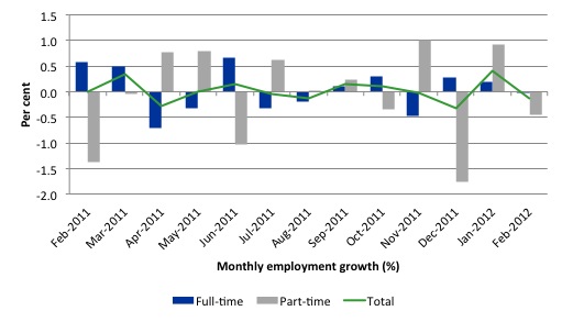
There have been considerable fluctuations in the full-time/part-time growth over the last year with regular crossings of the zero growth line. Over the last 12 months, full-time employment has fallen by 1.7 thousand while part-time employment has risen by 23.9 thousand.
Since February 2011, employment has grown by a miserly 0.2 per cent while the labour force has grown by 0.4 per cent, which means that unemployment has risen (by 29 thousand) over the same period.
Labour force growth is also subdued by the state of the economy (with participation rates down), which means that the sluggish supply growth is keeping unemployment much lower than it otherwise would be given how poor the employment growth has been.
The following graph shows the month by month growth in full-time (blue columns), part-time (grey columns) and total employment (green line) for the 12 months to December 2011 using seasonally adjusted data.
Today’s results just repeat the topsy-turvy nature of the data over the period shown. The Australian labour market is struggling with the low GDP growth creating a jobless growth environment.
While full-time and part-time employment growth are fluctuating around the zero line, total employment growth is still well below the growth that was boosted by the fiscal-stimulus in the middle of 2010.
The following table provides an accounting summary of the labour market performance over the last six months. The monthly data is highly variable so this Table provides a longer view (over the last 6 months) which allows for a better assessment of the trends. WAP is working age population (above 15 year olds). The first three columns show the number of jobs gained or lost (net) in the last six months.
The conclusion – overall only 17.7 thousand jobs (net) have been created in Australia since August 2011. The WAP has risen by 116 thousand in the same period while the labour force has risen by only 10.3 thousand.
The upshot is that weak employment growth has still allowed the unemployment to fall (by 7 thousand) because the sharp decline in the participation rate (0.35 points) has led to a subdued labour force growth rate relative to the underlying population growth.
If participation had not have fallen so sharply (that is, the labour force had have grown more in line with the underlying population growth) there would have been a rise in unemployment. We will analyse that issue presently.
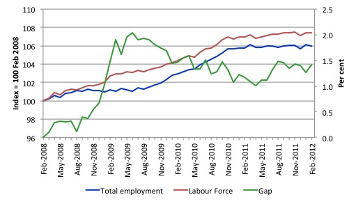
To put the recent data in perspective, the following graph shows the movement in the labour force and total employment since the low-point unemployment rate month in the last cycle (February 2008) to February 2012. The two series are indexed to 100 at that month. The green line (right-axis) is the gap (plotted against the right-axis) between the two aggregates and measures the change in the unemployment rate since the low-point of the last cycle (when it stood at 4 per cent).
You can see that the labour force index has largely levelled off and now falling and the divergence between it and employment growth has been relatively steady over the last several months with this month showing some improvement.
The Gap series gives you a good impression of the asymmetry in unemployment rate responses even when the economy experiences a mild downturn (such as the case in Australia). The unemployment rate jumps quickly but declines slowly.
It also highlights the fact that the recovery is still not strong enough to bring the unemployment rate back down to its pre-crisis low. You can see clearly that the unemployment rate fell in late 2009 and then has hovered at the same level for some months before rising again over the last two months.
The gap shows that the labour market is still a long way from recovering from the financial crisis that hit in early 2008.
Teenage labour market – remains in a parlous state
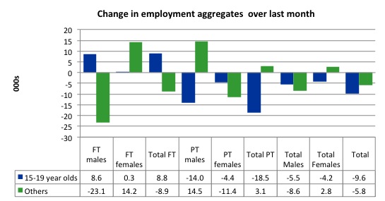
The teenage labour market saw a welcome reprieve in February 2012 from the almost continuous deterioration each month over the last few years (see below).
There was a very modest gain in overall employment but this was dominated by females with teenage males continuing to miss out.
Of the last month, teenagers gained 8.8 full-time jobs (mostly males) but lost 18.5 thousand part-time jobs. So, overall they went backwards again by 9.6 thousand jobs.
The following graph shows the distribution of net employment creation in the last month by full-time/part-time status and age/gender category (15-19 year olds and the rest).
If you take a longer view you see how poor the situation is.
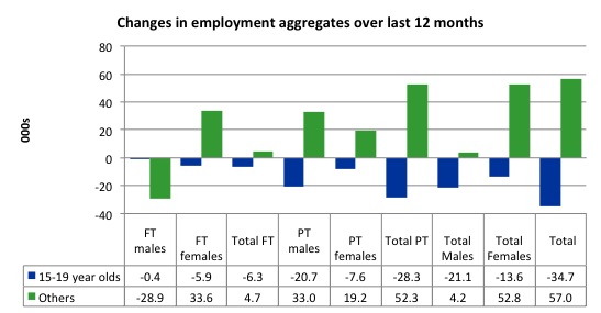
Over the last twelve months teenagers have lost 34.7 thousand (net) jobs while the rest of the labour force has gained 57 thousand jobs (net). So it is the teenage segment of the labour market that is being dragged down by the sluggish growth, which is hardly surprising given that the least experienced and/or most disadvantaged (those with disabilities etc) are rationed to the back of the queue by the employers.
The 15-19 year olds lost 6.3 thousand full time jobs and 23.3 thousand part-time jobs over the last 12 months.
The following graph shows the change in aggregates over the last 12 months. Australian teenagers are going backwards which is a trend common around the world at present.
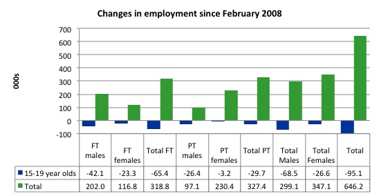
To further emphasise the plight of our teenagers I compiled the following graph that extends the time period from the February 2008, which was the month when the unemployment rate was at its low point in the last cycle, to the present month (February 2012). So it includes the period of downturn and then the “recovery” period. Note the change in vertical scale compared to the previous two graphs. That tells you something!
The results are stunning and represent a major policy failure.
Since 2008, there have been 646 thousand (net) jobs added to the Australian economy but teenagers have lost 95.1 thousand over the same period. It is even more stark when you consider that 65.4 thousand full-time teenager jobs have been lost in net terms. Even in the traditionally, concentrated teenage segment – part-time employment – there have been 29.7 thousand jobs (net) lost.
Further, around 51 per cent of the total (net) jobs added since February 2008 have been part-time.
Overall, the performance over the last 12 months is poor and should receive a much higher priority in the policy debate than it does.
The longer-run consequences of this teenage “lock out” will be very damaging.
In the February 2012 quarter broad labour underutilisation data released today by the ABS, the underemployment rate for 15-24 year olds was 13.6 per cent up from 13.5 per cent in the November 2011 quarter. Total labour underutilisation for 15-24 year olds was 25.3 per cent up from 25 per cent.
As I illustrate in this blog – Age discrimination against our teenagers should end – once you also consider how much the 15-24 participation rate has fallen since the onset of the crisis in February 2008 and thus consider hidden unemployment as well as underemployment plus unemployment then the wastage rate of our youth rises to around 38 per cent.
While the Treasurer is always reminding us how responsible he is being in the pursuit of budget surpluses he fails to mention that this pursuit is one of the reasons that Australian teenagers are being locked out of the labour market.
The Australian government has no coherent strategy to resolve this appalling state. Ensuring teenagers are included in paid work, if they do not desire to remain in school, should be number one policy priority.
I would recommend that the Australian government announce a major public sector job creation program aimed at employing, in the first instance, all the unemployed 15-19 year olds.
It is clear that the Australian labour market continues to fail our 15-19 year olds. At a time when we keep emphasising the future challenges facing the nation in terms of an ageing population and rising dependency ratios the economy still fails to provide enough work (and on-the-job experience) for our teenagers who are our future workforce.
Unemployment
The unemployment rate rise by 0.1 per cent in February to 5.2 per cent with an additional (net) 16,400 entering the unemployment pool.
Overall, the labour market still has significant excess capacity available in most areas and what growth there is is not making any major inroads into the idle pools of labour.
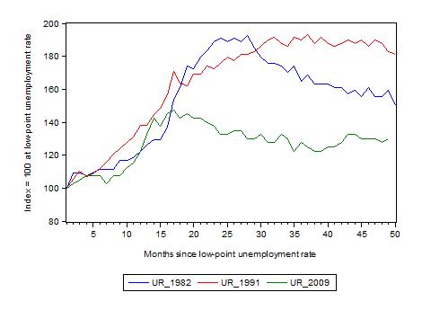
The following graph updates my 3-recessions graph which depicts how quickly the unemployment rose in Australia during each of the three major recessions in recent history: 1982, 1991 and 2009 (the latter to capture the 2008-2010 episode). The unemployment rate was indexed at 100 at its lowest rate before the recession in each case (August 1981; December 1989; February 2008, respectively) and then indexed to that base for each of the months as the recession unfolded.
I have plotted the 3 episodes for 49 months after the low-point unemployment rate was reached. For 1991, the end-point shown is the peak unemployment which was achieved some 38 months after the downturn began although the recovery was painfully slow. While the 1982 recession was severe the economy and the labour market was recovering by the 26th month. The pace of recovery for the 1982 once it began was faster than the recovery in the current period.
It is significant that the current situation while significantly less severe than the previous recessions is dragging on which is a reflection of the lack of private spending growth and declining public spending growth.
The graph provides a graphical depiction of the speed at which the recession unfolded (which tells you something about each episode) and the length of time that the labour market deteriorated (expressed in terms of the unemployment rate).
From the start of the downturn to the 49-month point (to February 2012), the official unemployment rate has risen from a base index value of 100 to a value 130 – peaking at 145 after 21 months. However, it reached a low point 8 months ago (122.5) and has been hovering at the higher level since then. Unlike the other episode, the current trend, at this stage of the cycle, is unclear.
At 48 months, 1982 index stood at 159 and declining in fits, the 1991 index was around 182 and falling slowly
Note that these are index numbers and only tell us about the speed of decay rather than levels of unemployment. Clearly the 5.2 per cent at this stage of the downturn is lower that the unemployment rate was in the previous recessions at a comparable point in the cycle although we have to consider the broader measures of labour underutilisation (which include underemployment) before we draw any clear conclusions.
The notable aspect of the current situation is that the recovery has stalled.
Each quarter the ABS publish their broader measures of labour underutilisation. Today, we received the data for the February 2012 quarter.
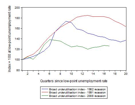
The following graph replicates the previous graph except it uses the ABS broad labour underutilisation rate (unemployment plus underemployment) as a better means of comparing the three recessions.
At the same period in the recovery (using quarterly data), the broad labour underutilisation rate (unemployment plus underemployment) had an index value of 138 in the 1982 recession (absolute value of 11.5 per cent and falling); an index value of 179 in the 1991 recession (absolute value of 17.6 per cent and falling); and an index value of 126.3 in the current period (absolute value of 12.5 per cent and steady to rising).
So while the level of unemployment is much lower now than in the 1982 recession (at a comparable stage), underemployment is now much higher and so the total labour underutilisation rates are similar.
Commentators who think of the 1982 recession as severe, rarely see it in these terms. Joblessness is probably worse than underemployment but both mean that labour is wasted and income earning opportunities are being foregone. For a worker with extensive nominal commitments, the loss of income when hours are rationed may be no less severe than the loss of hours involved in unemployment, if the threshold of solvency is breached.
Aggregate participation rate fell again
The participation rate fell by 0.1 percentage points in February 2012 to 65.2. It had fallen 0.3 percentage points in December 2011 from 65.5 to 65.2 per cent. This sharp drop in the labour force meant that the unemployment rate did not rise in the face of the declining employment growth. In January 2012, there was a favourable movement – up by 0.1 percentage points. But that movement was negated this month.
What would have the unemployment rate been if the participation rate was constant?
The labour force is a subset of the working-age population (those above 15 years old). The proportion of the working-age population that constitutes the labour force is called the labour force participation rate. So changes in the labour force can impact on the official unemployment rate and so movements in the latter need to be interpreted carefully. A rising unemployment rate may not indicate a recessing economy.
The labour force can expand as a result of general population growth and/or increases in the labour force participation rates.
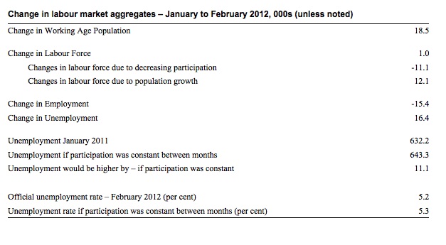
The following Table shows the breakdown in the changes to the main aggregates (Labour Force, Employment and Unemployment) and the impact of the fall in the participation rate.
In February 2012, employment fell by 15.400 while the labour force grew by 1000 which meant that unemployment rose by 16,400.
However, the labour force would have grown by 11.1 thousand more had the participation rate not fallen. The underlying population growth added 12.1 thousand to the labour force. The population growth impact on the labour force aggregate is steady from month to month.
If the participation rate had have been unchanged then the labour force would have been 12,087.3 thousand instead of 12076.2 thousand. Given the current employment level, unemployment would have been 643.3 thousand instead of 632.2 thousand.
So if the participation rate had have remained unchanged, the unemployment rate would have been 5.3 per cent rather than 5.2 per cent as officially published. The difference, of-course, is the that the “hidden unemployment rate” rose.
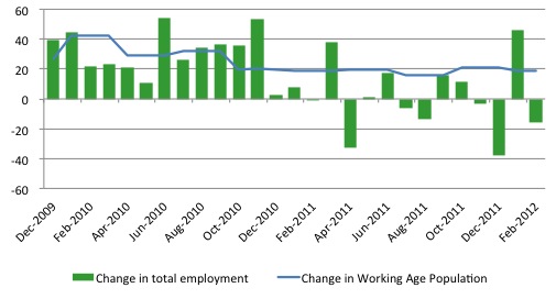
Another way of thinking about the strength of employment growth is to compare the change in employment each month with the change in the working age population (WAP). The change in the WAP is the underlying number of workers that enter the labour force month to month. The labour force fluctuates also due to participation rate changes but they tend to be volatile and cyclical.
So is the Australian economy adding jobs faster than the growth of its population? The answer is no.
The following graph plots the two series over the last two years. Over that period, the WAP has expanded on average by 24 thousand per month while employment has only grown on average by 14 thousand. That is why unemployment has risen. But then further fluctuations in unemployment are driven by the participation rate volatility over this period.
If you consider the last 12 months, it is very clear that employment growth is lagging well behind the growth in the working age population.
To see how participation effects really matter I computed what the impact of the declining participation rate since its last peak (November 2010) has been. Prior to November 2010, employment growth was gathering pace largely because of the positive impacts of the fiscal stimulus packages.
As we saw in the opening graph, there has been zero employment growth since the end of 2010. Since that peak the participation rate has fallen from 66 per cent to 65.2 per cent, a massive reduction.
What does that translate into thousands of workers who are no longer counted in the labour force?
If the participation rate had have remained constant then there would have been an additional 142 thousand workers in the official labour force count and
at present employment growth, unemployment would be at 774 thousand rather than 632 thousand.
The official unemployment rate of 5.2 per cent would have been 6.4 per cent – a considerably weaker picture than that presented in the official data.
The 142 thousand workers who have stopped looking for work are being discouraged (probably) by the flat employment growth.
Hours worked rose slightly in February 2012
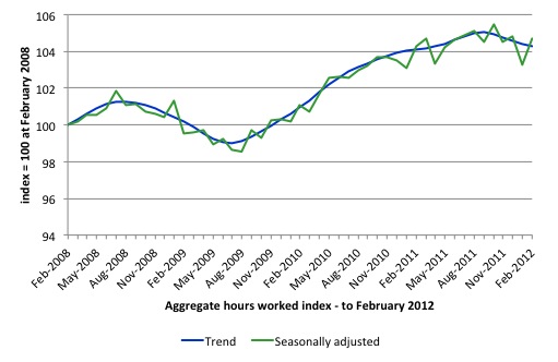
Aggregate hours worked rose by 21.6 million hours (1.35 per cent) in seasonally adjusted terms although they fell in trend terms.
The following graph shows the trend and seasonally adjusted aggregate hours worked indexed to 100 at the peak in February 2008 (which was the low-point unemployment rate in the previous cycle). The rising trend which marked the early recovery courtesy of the fiscal stimulus has now turned negative.
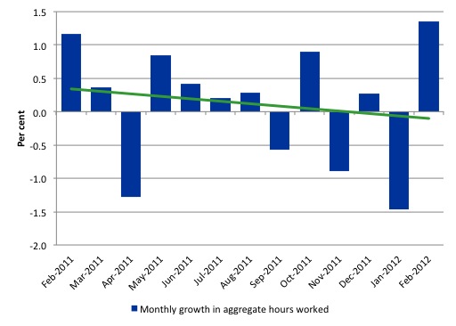
The next graph shows the monthly growth (in per cent) over the last 12 months. The green linear line is a simple regression trend and it is suggesting monthly growth rates is very weak negative trended..
Once again the data doesn’t support the notion of a fully employed labour market that is bursting against the inflation barrier.
The trend in hours growth is now firmly down with several large losses over the last 6 months.
Conclusion
Last year we now know was jobless year and that over the last 6 months of 2011 employment growth contracted sharply. The national economy clearly had failed in 2011 to grow at a rate sufficient to absorb the underlying population growth and unemployment rose.
In the first month of the new year, the data was better and many concluded that the investment associated with the mining boom had allowed the Australian economy to turn the corner and that the labour market would tighten in 2012.
At the time I said that “I wouldn’t get carried away with the results just yet”.
Yesterday’s National Accounts results (where private investment fell sharply) demonstrate why my caution (which ran against the mainstream discussion) was prudent. Today’s labour force data confirms that judgement.
The labour market is stuck and employment growth is around zero and as been for many months.
I still believe that the private sector is deleveraging after a period of unsustainable credit-driven consumption and that mining boom aside, net exports are not strong enough to offset the spending moderation.
In the coming year, the obsessive push towards surplus by the Federal government will also put a significant brake on aggregate spending growth.
We always have to be careful interpreting month to month movements given the way the Labour Force Survey is constructed and implemented but there has now been enough data over the last several months to tell us that my assessment in the previous paragraphs is probably sound.
The withdrawal of the fiscal stimulus is definitely undermining employment growth.
The most striking aspect of a sad picture remains the appalling performance of the teenage labour market. Employment has collapsed for that cohort and I consider it a matter of policy urgency for the Government to introduce an employment guarantee to ensure we do not continue undermining our potential workforce.
That is enough for today!

The Mining sector could have trained huge numbers of kids and set up pathways for them to join the FIFO world. Instead mining lobbies Government to allow the jobs to go to guest workers.
Once the capital expenditure boom in mining is over mines don’t need a huge workforce to keep them going anyway. Driverless trains is just the start of a tech drive to employ even fewer workers.
How many of the newly out of work bankers are going to get jobs in mining. Zero.
By the time the capital expenditure boom in mining ends the hollowing out of services and hospitality will be complete and skills to service the Chinese and Indonesian Tourist boom wont exist so Guest Workers with relevant language skills will be needed to cater for the Asian Tourist boom.
To fix the problem the new mantra is Productivity. Another word for flog the workers to produce more for less and increase profits for shareholders. Bit of a winge eh!
Hope Huey sends you a few waves for your Birthday Bill. Cheers Punch
Another effective way of solving this problem is to cut immigration from its present insane levels.
If population keeps increasing we are just chasing our tail as far as improving infrastructure,quality of life,reducing unemployment and environmental damage.
Of course the Growth At Any Cost Crowd won’t hear of that.They want a large pool of unemployed to keep the proles in line in addition to their other greedy and selfish interests.
Bill,
Looks like Oz is now part of the austerity to growth fiction – perhaps expat Greeks in Sydney can provide some cautionary tales from the old country to head off this madness?
Belated birthday greetings from UK.