The Australian Bureau of Statistics (ABS) released the latest labour force data today (APRIL 16,…
Australian labour force data – tentative improvement
Today’s release by the Australian Bureau of Statistics (ABS) of the Labour Force data for March 2012 provides some positive news for once although as you will read the underlying trend situation remains weak. The labour force data tells us that employment grew, working hours grew, participation rose and unemployment fell, albeit only by a smidgin. Given the monthly variability in the data it is not yet cause for celebration. The pattern of growth/contraction in employment growth has been well documented over the last 18 or so months with nothing much happening in net terms when one takes a longer view (say 6 months or so). The outlook is not very positive either given the Federal government’s obsessive pursuit of a budget surplus which will cut economic growth by some percentage points. The most disturbing aspect of the labour market data remains the appalling state of the youth labour market. This should be a policy priority for the government. But they have gone missing in action – lost in their surplus mania. My assessment of today’s results – positive but cautiously so.
The summary ABS Labour Force (seasonally adjusted) estimates for March 2011 are:
- Employment increased by 44,000 (0.4 per cent) with full-time employment rising by 15,800 (0.2 per cent) and part-time employment rising by 28,200 (0.8 per cent).
- Unemployment decreased by 3,200 (0.5 per cent) and is now at 629,100. So very little shift in the face of the employment growth.
- The official unemployment rate remained steady at 5.2 per cent.
- The participation rate increased by 0.2 pts to 65.4, which is the reason the unemployment level only fell marginally.
- Aggregate monthly hours worked increased by 9.5 million hours (0.6 per cent).
- The ABS broad labour underutilisation estimates (the sum of unemployment and underemployment) is published quarterly (next release in May 2012) and in February was 12.5 per cent. I expect that is now marginally lower given that both full-time employment and working hours increased. But the shift would not be large.
The Sydney Morning Herald story – Economy adds 44,000 jobs – noted that the employment addition was “seven times the number of jobs expected last month” and apparently, reduced “the need for the Reserve Bank to cut interest rates again”.
One bank economist said that “It’s very strong at face value … This makes life very interesting for the RBA because it’s a key measure of how much slack there is in the economy”.
Which is an overstatement. We are now allegedly in the fourth year of the crisis and recovery. In 2011, the Australian economy added zero (about) net jobs. The result so far this year has been slightly better but only slighly. Monthly variations do not signal a strength or weakness as I note below.
Moreover, there is still 12.5 per cent (at least) of willing labour resources either unemployed or underemployed and many more hidden and marginal. There is still a huge amount of slack in the economy.
Other bank economists talked about a “sideways” shift – “Fundamentally it’s a story that says employment is going sideways” – with jobs lost in manufacturing over the last four years being offset by those created in mining.
The ABC News response to the data release – Unemployment rate steadies at 5.2pc – chose to emphasise the fact that unemployment didn’t worsen.
They concluded that the data “was surprisingly strong”. I agree with that assessment although. as noted above, I don’t make conclusions based on monthly variations in labour force data.
What influences my tentatively positive assessment is that all the elements that labour economists look as signals of a positive direction were there – rising employment (although dominated by part-time), rising participation, rising working hours and falling unemployment.
That means that employment growth is stronger the labour force growth – which is what is required to eat into the huge pool of underutilised labour in Australia at present.
However, in saying that, the gap between employment growth and labour force growth was only 3,200 persons – not much at all and certainly not what is required to really reduce the labour wastage quickly. At this rate it will be a long, drawn out process should it continue.
What is also important to point out is that the month to month variations in this sort of data need to be taken into account and it is better to form a view by examining a longer trend – say 6 months. Once we take approach the conclusion remains that the state of the labour market in Australia is very subdued.
The ABC report quoted a bank economist who agreed with this assessment:
A smoothed longer term view confirms the sluggishness in the labour market … “Employment is barely growing, having recorded an anaemic annual growth rate of just 0.3 per cent. What is clear is that the labour market is going sideways. Yes it was encouraging that employment grew in March, but looking forward a sustained pick-up in employment will be needed to justify a turnaround in the fortunes of job seekers.
To see how much variation there is in the monthly data the following Table shows the actual ABS point estimates of the monthly change in the major labour force aggregates alongside their 95 per cent standard errors (upper and lower).
The ABS also publish standard errors which reflect the fact that the estimates are derived from a sample survey. The standard errors provide an indication of the sampling variability involved in trying to draw population estimates from a sample. Statisticians use these standard errors to construct what are called 95% confidence intervals which can be interpreted as showing the range that the true value will lie within 95 times out of a 100. So we can be fairly confident that the true value lies within the 95% confidence interval, which is expressed as an upper and lower value of the survey estimate.
The interpretation is that we could be just as confidence that employment rose by 44,000 in March as we could be that it feel by 10,800 or rose by 98,000. Similarly, we would be equally confident (at the 95 per cent level) that unemployment fell by 3,200, or 37,000 or rose by 30,600.
Please read my blog – A surprise every day … employment rises! – for more discussion on this point.
Employment growth – positive but trend remains weak
The March data shows that employment increased by 44,000 (net) (0.4 per cent) after falling last month.
Today’s data reasserts the message that the labour market data is switching back and forth each month with an sluggish underlying trend being fairly stable for some months now.
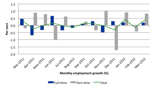
There have been considerable fluctuations in the full-time/part-time growth over the last year with regular crossings of the zero growth line. Over the last 12 months, full-time employment has fallen by 22 thousand while part-time employment has risen by 59.6 thousand reflecting the weak bias in the labour market.
Since March 2011, employment has grown by a miserly 0.05 per cent while the labour force has grown by 0.06 per cent, which means that unemployment has risen (by 33.1 thousand) over the same period.
Labour force growth is also subdued by the state of the economy (with participation rates still well down on previous peaks), which means that the sluggish supply growth is keeping unemployment much lower than it otherwise would be given how poor the employment growth has been.
The following graph shows the month by month growth in full-time (blue columns), part-time (grey columns) and total employment (green line) for the 12 months to December 2011 using seasonally adjusted data.
Today’s results just repeat the topsy-turvy nature of the data over the period shown. The Australian labour market is struggling with the low GDP growth creating a near jobless growth environment.
While full-time and part-time employment growth are fluctuating around the zero line, total employment growth is still well below the growth that was boosted by the fiscal-stimulus in the middle of 2010.
The following table provides an accounting summary of the labour market performance over the last six months. The monthly data is highly variable so this Table provides a longer view (over the last 6 months) which allows for a better assessment of the trends. WAP is working age population (above 15 year olds). The first three columns show the number of jobs gained or lost (net) in the last six months.
The conclusion – overall only 48.6 thousand jobs (net) have been created in Australia since September 2011. The WAP has risen by 119 thousand in the same period while the labour force has risen by only 40.9 thousand.
The upshot is that relatively weak employment growth has still allowed the unemployment to fall (by 8 thousand) because the decline in the participation rate (0.20 points) has led to a subdued labour force growth rate relative to the underlying population growth.
If participation had not have fallen over this period (that is, the labour force had have grown more in line with the underlying population growth) there would have been a rise in unemployment.
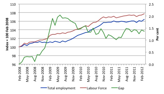
To put the recent data in perspective, the following graph shows the movement in the labour force and total employment since the low-point unemployment rate month in the last cycle (March 2008) to March 2012. The two series are indexed to 100 at that month. The green line (right-axis) is the gap (plotted against the right-axis) between the two aggregates and measures the change in the unemployment rate since the low-point of the last cycle (when it stood at 4 per cent).
You can see that the labour force index has largely levelled off and now falling and the divergence between it and employment growth has been relatively steady over the last several months with this month showing some improvement.
The Gap series gives you a good impression of the asymmetry in unemployment rate responses even when the economy experiences a mild downturn (such as the case in Australia). The unemployment rate jumps quickly but declines slowly.
It also highlights the fact that the recovery is still not strong enough to bring the unemployment rate back down to its pre-crisis low. You can see clearly that the unemployment rate fell in late 2009 and then has hovered at the same level for some months before rising again over the last two months.
The gap shows that the labour market is still a long way from recovering from the financial crisis that hit in early 2008.
Teenage labour market – remains in a parlous state
Regular readers will know that I regularly highlight the plight of our teenagers in the labour market.
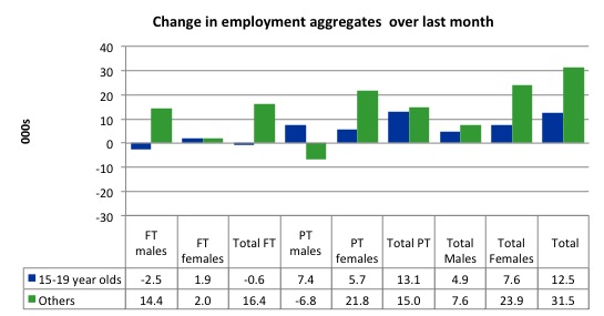
There was some reprieve in March 2012 from the almost continuous deterioration each month over the last few years (see below), although this only manifested in the form of part-time job gains of 13.1 thousand. Teenagers lost 600 (net) full-time jobs in March 2012 all borne by males.
The following graph shows the distribution of net employment creation in the last month by full-time/part-time status and age/gender category (15-19 year olds and the rest)
If you take a longer view you see how poor the situation is.
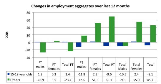
Over the last twelve months teenagers have lost 8.1 thousand (net) jobs while the rest of the labour force has gained 45 thousand jobs (net). So it is the teenage segment of the labour market that is being dragged down by the sluggish growth, which is hardly surprising given that the least experienced and/or most disadvantaged (those with disabilities etc) are rationed to the back of the queue by the employers.
The following graph shows the change in aggregates over the last 12 months. Australian teenagers are going backwards which is a trend common around the world at present.
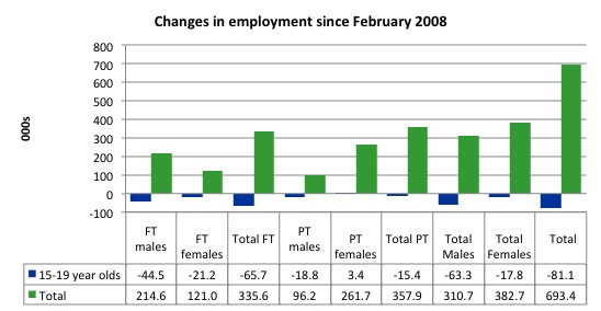
To further emphasise the plight of our teenagers I compiled the following graph that extends the time period from the February 2008, which was the month when the unemployment rate was at its low point in the last cycle, to the present month (March 2012). So it includes the period of downturn and then the “recovery” period. Note the change in vertical scale compared to the previous two graphs. That tells you something!
The results are stunning and represent a major policy failure.
Since 2008, there have been 693.4 thousand (net) jobs added to the Australian economy but teenagers have lost 81.1 thousand over the same period. It is even more stark when you consider that 65.7 thousand full-time teenager jobs have been lost in net terms. Even in the traditionally, concentrated teenage segment – part-time employment – there have been 15.4 thousand jobs (net) lost.
Further, around 51 per cent of the total (net) jobs added since February 2008 have been part-time.
Overall, the performance over the last 12 months is poor and should receive a much higher priority in the policy debate than it does.
The longer-run consequences of this teenage “lock out” will be very damaging.
The Australian government has no coherent strategy to resolve this appalling state. Ensuring teenagers are included in paid work, if they do not desire to remain in school, should be number one policy priority.
The Government’s response is to push this cohort into endless training initiatives (supply-side approach) without significant benefits. The research shows overwhelmingly that job-specific skills development should be done within a paid-work environment.
I would recommend that the Australian government announce a major public sector job creation program aimed at employing, in the first instance, all the unemployed 15-19 year olds.
It is clear that the Australian labour market continues to fail our 15-19 year olds. At a time when we keep emphasising the future challenges facing the nation in terms of an ageing population and rising dependency ratios the economy still fails to provide enough work (and on-the-job experience) for our teenagers who are our future workforce.
Unemployment
The unemployment rate remained steady at 5.2 per cent in March to 5.2 per cent although 3,200 less workers were counted among the jobless by the ABS.
Overall, the labour market still has significant excess capacity available in most areas and what growth there is is not making any major inroads into the idle pools of labour.
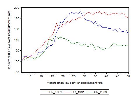
The following graph updates my 3-recessions graph which depicts how quickly the unemployment rose in Australia during each of the three major recessions in recent history: 1982, 1991 and 2009 (the latter to capture the 2008-2010 episode). The unemployment rate was indexed at 100 at its lowest rate before the recession in each case (August 1981; December 1989; March 2008, respectively) and then indexed to that base for each of the months as the recession unfolded.
I have plotted the 3 episodes for 49 months after the low-point unemployment rate was reached. For 1991, the end-point shown is the peak unemployment which was achieved some 38 months after the downturn began although the recovery was painfully slow. While the 1982 recession was severe the economy and the labour market was recovering by the 26th month. The pace of recovery for the 1982 once it began was faster than the recovery in the current period.
It is significant that the current situation while significantly less severe than the previous recessions is dragging on which is a reflection of the lack of private spending growth and declining public spending growth.
The graph provides a graphical depiction of the speed at which the recession unfolded (which tells you something about each episode) and the length of time that the labour market deteriorated (expressed in terms of the unemployment rate).
From the start of the downturn to the 50-month point (to March 2012), the official unemployment rate has risen from a base index value of 100 to a value 130 – peaking at 145 after 21 months. However, it reached a low point 8 months ago (122.5) and has been hovering at the higher level since then. Unlike the other episode, the current trend, at this stage of the cycle, is unclear.
At 50 months, 1982 index stood at 150 and declining quickly, while the 1991 index was around 181 and falling slowly.
It is clear that at an equivalent point in the “recovery cycle” the current period is more sluggish than our recent two major downturns.
Note that these are index numbers and only tell us about the speed of decay rather than levels of unemployment. Clearly the 5.2 per cent at this stage of the downturn is lower that the unemployment rate was in the previous recessions at a comparable point in the cycle although we have to consider the broader measures of labour underutilisation (which include underemployment) before we draw any clear conclusions.
The notable aspect of the current situation is that the recovery has stalled.
Aggregate participation rate fell again
The participation rate rose by 0.2 per cent in March 2012 after falling by 0.1 percentage points in February 2012. It is now at 65.4 per cent which is still substantially down on the most recent peak of 66 per cent (November 2010) when the labour market was gathering pace courtesy of the fiscal stimulus.
This drop in participation in the last year or more has meant the labour force growth has been relatively subdued with the additional result being that the unemployment rate is considerably lower than would otherwise been the case.
Hours worked rose slightly in March 2012
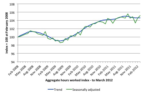
Aggregate monthly hours worked increased by 9.5 million hours (0.6 per cent) in seasonally adjusted terms although they were flat in trend terms.
The following graph shows the trend and seasonally adjusted aggregate hours worked indexed to 100 at the peak in February 2008 (which was the low-point unemployment rate in the previous cycle). The rising trend which marked the early recovery courtesy of the fiscal stimulus is now clearly flat.
This should also moderate the views of those that think today’s data shows “strength”. It doesn’t do anything other than show that the situation is not deteriorating from a very subdued current state..
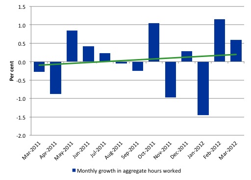
The next graph shows the monthly growth (in per cent) over the last 12 months. The green linear line is a simple regression trend and it is suggesting monthly growth rates is very weak negative trended..
Once again the data doesn’t support the notion of a fully employed labour market that is bursting against the inflation barrier.
The trend in hours growth is now virtually flat with several large losses over the last 6 months.
Conclusion
2011 was a year of jobless growth in net terms. Over the last 6 months of 2011 employment growth contracted sharply. The national economy clearly had failed in 2011 to grow at a rate sufficient to absorb the underlying population growth and unemployment rose.
In the first months of this year, the situation remains uncertain with positive and negative swings in employment growth already evident and repeating the behaviour over the last 18 or so months.
The best assessment is that the labour market is weak – not deteriorating nor becoming stronger.
While many commentators still hang onto the view that the investment associated with the mining boom will eventually push the Australian economy into an inflationary situation with the labour market tightening this year, I beg to differ.
Other data (finance, housing etc) remains weak and the most recent National Accounts (although three months old) shows that private investment fell sharply.
The labour market is stuck and employment growth is barely positive and has been that way for some months.
I still believe that the private sector is deleveraging after a period of unsustainable credit-driven consumption and that mining boom aside, net exports are not strong enough to offset the spending moderation.
In the coming year, the obsessive push towards surplus by the Federal government will also put a significant brake on aggregate spending growth.
We always have to be careful interpreting month to month movements given the way the Labour Force Survey is constructed and implemented. But the underlying trend is weak as a result of the withdrawal of the fiscal stimulus undermining employment growth.
The most striking aspect of a sad picture remains the appalling performance of the teenage labour market. Employment has collapsed for that cohort and I consider it a matter of policy urgency for the Government to introduce an employment guarantee to ensure we do not continue undermining our potential workforce.
That is enough for today!


Hello Billy, I wish to ask you something about this problem. Has Australia to face a problem between distribution and accumulation in relation to a current account constraint?
Another: the mining sector is a capital intensive sector, isn´t? how can it resolve the problem of employment and young unemployment? How can we deal with accumulation by despossession (As D. Harvey says) and the objective of a full employment system? is there any chance within capitalism or we must think in a new factible reality? thanks