The Australian Bureau of Statistics (ABS) released the latest labour force data today (APRIL 16,…
Australian labour market – mixed signals – but subdued overall
Today the Australian Bureau of Statistics (ABS) released the Labour Force data for February 2011 which sends mixed signals. Overall, my interpretation of the data is that the labour market is fairly subdued at present. Today’s data shows that employment growth was negative (but there is probably some flood impact in that figure). Participation fell which took the pressure off unemployment so the unemployment rate was steady. The positive news is that full-time employment growth was stronger and total hours worked rose in February (leading to a modest decline in underemployment). While some of the parrots in the bank economist ranks are already predicting an interest rate rise to combat some “imaginary” inflation threat, today’s data would not support a change in monetary policy in the coming months. The related data (sharp drop in housing finance) reinforces the view that there is no inflation threat building. The data tells me that exactly the opposite is the case. There is still plenty of slack in the Australian labour market and employment growth is doing nothing to mop it up. Its not my opinion – just take a look at the data! The signals are mixed today but you will not see me smiling!
The summary ABS Labour Force (seasonally adjusted) estimates for February 2011 are:
- Employment decreased – 10,100 (-0.1 per cent) with the net gains in full-time employment of 47,600 being more than offset by the losses in part-time employment of 57,700.
- Unemployment decreased 500 to 604,800.
- The official unemployment rate was static at 5.0 per cent.
- The participation rate declined by 0.1 percentage points to 65.7 per cent which indicates that hidden unemployment has risen a little.
- Aggregate monthly hours worked increased 17.9 million hours (1.1 per cent) – due to the substitution of full-time for part-time work.
- The quarterly labour underutilisation estimates for February show that underemployment eased from 7.1 per cent to 6.9 per cent as a result of the growth in full-time employment. Total labour underutilisation (computed by the ABS as the sum of underemployment and unemployment) was estimated to be 11.9 per cent.
So the summary tells us that employment growth was negative but perhaps affected by the severe floods in December and January but full-time employment growth was positive and total hours worked rose. The static unemployment rate was courtesy of a fall in the participation rate attenuating the impact of the decline in employment.
Overall, today’s data release is not good news and tells us that the Australian economy is not growing as strongly as many thought it would.
As many readers will realise Eastern states in Australia are weathering the effects of severe flooding which may have impacted on today’s results. The message from the data is that the impact of the severe floods especially in Queensland (where employment fell by 22 thousand) is blurring what is happening in the economy. The probably trend is for on-going modest recovery.
The labour market is not booming that is clear.
The ABC News report carried the headline – Jobless rate holds steady – which was true but overlooked the fact that underlying dynamic was a rise in the unemployment rate (given the fall in participation.
The Sydney Morning Herald said Jobless rate hovers at 5%.
As usual some of the business economists reported in the press covered themselves in glory as usual (not!). One character from Moody’s was reported as saying the jobless figures point to more interest rate rises to come”:
On the surface this looks like a downbeat report, but delving deeper it shows some positive signs on the strength of the labour market and the economy … Reconstruction efforts and the oncoming mining boom will drive demand for mining, building and construction workers … As a forward-looking central bank, and with the unemployment rate low, policymakers will still have to tighten preemptively to keep inflation in check …
Which makes you wonder what planet this character is on. But I suppose his judgement makes him an ideal employee for Moody’s – they value accurate, insightful people! (-:
The press also reported that a leading measure of consumer inflationary expectations fell substantially in February.
The ABC News quoted a few bank economists one of which provided an interpretation closer to my own view on what the data is telling us:
Revisions mean there hasn’t been any jobs growth since November, and the unemployment rate has only stayed down because the participation rate fell. So, this is not such a good report … While the mining sector might be super strong, retail and others are feeling it tough … The jobs market has been chugging along like a steam engine for so long, but now it seems to have finally slowed down.
Exactly. Please sack that Moody’s worker!
But it remains that some good news came from the data. The growth in full-time work and the fall in underemployment was a positive sign – although full-time and part-time employment seem to be playing tag team lately – switching either side of the zero growth line in sequence.
Despite the claims by some bank economists that the labour market is becoming very tight – in fact, the message is mixed.
The economy and the labour market is not growing strongly enough to drive down unemployment. There was some small decline in underemployment. I do not consider this data release provides any concern for the RBA in terms of signalling an inflationary outburst is imminent.
The related data releases in recent days – a very sharp decline in housing finance (see ABS release) and the softening of consumer inflation expectations (as households continue to save) – support the view that the economy is growing but slowly.
How the future will pan out as the fiscal stimulus disappears and the commodities boom continues is unclear. But to date the net exports sector is still not contributing to growth (see my blog – Australian National Accounts – I wouldn’t say the economy is great). So the withdrawal of the stimulus will probably amount to a net slowing in growth.
The data clearly tells us that the Australian economy is nowhere near full employment nor about to run against the inflation barrier.
Employment growth negative
The February data shows that employment growth was negative (-0.1 per cent) which consolidates three poor months since December 2010. The optimistic outlook from today’s poor figures is that full-time employment grew (0.6 per cent). This was more than offset by the sharp decline in part-time employment (1.7 per cent).
The steady unemployment rate (and falling unemployment) arose because the labour force also shrunk on the back of declining participation. Had the labour force continued to grow then unemployment would have risen.
The rising full-time employment helped explain the slight decrease in underemployment (more later on that).
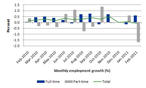
The following graph shows the month by month growth in full-time (blue columns), part-time (grey columns) and total employment (green line) from February 2010 to February 2011 using seasonally adjusted data. The picture has been mixed over the last 12 months with employment growth averaging 0.2 points per month (full-time 0.3 points; part-time 0.0 points).
While full-time and part-time employment growth are fluctuating between around the zero line, there has been a clear drop in total employment growth over the last three months. December saw zero growth, January a very modest 0.1 per cent, and now -0.1 per cent.
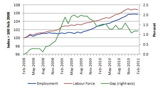
To put the recent data in perspective, the following graph shows the movement in the labour force and total employment since the low-point unemployment rate month in the last cycle (February 2008) to February 2011. The two series are indexed to 100 at that month. The green line (right-axis) is the gap (plotted against the right-axis) between the two aggregates and measures the change in the unemployment rate since the low-point of the last cycle (when it stood at 4 per cent).
The Gap series gives you a good impression of the asymmetry in unemployment rate responses even when the economy experiences a mild downturn (such as the case in Australia). The unemployment rate jumps quickly but declines slowly.
It also highlights the fact that the recovery is still not strong enough to bring the unemployment rate back down to its pre-crisis low. You can see clearly that the unemployment rate fell in late 2009 and very little improvement has been made in the course of this year.
We are now stuck in a period where the recovery has weakened and employment growth is to weak to reduce the pool of unemployed – the gap is now flattening as we limp along.
Negative employment growth for teenagers continues
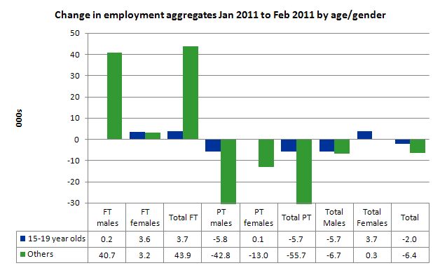
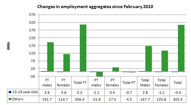
The evidence continues to show that the Australian labour market is excluding teenagers (15-19 year olds) from any employment growth. Teenage employment growth in the last month was negative losing 2,000 jobs (net) and that has been a continuing trend over several months.
Teenagers gained 200 net full-time employment jobs but lost 5.7 thousand part-time jobs (exclusively male). Young males have not fared well in recent months.
At a time when we keep emphasising the future challenges facing the nation in terms of an ageing population and rising dependency ratios the economy still fails to provide enough work (and on-the-job experience) for our teenagers who are our future workforce.
The following graph shows the distribution of net employment creation in the last month by full-time/part-time status and age/gender category (15-19 year olds and the rest).
To put this month’s figures in perspective though, the following graph shows the change in aggregates since February 2010. There you see that in the recovery period of the last 12 months, teenagers have gone backwards – the jobs market has been shrinking for them.
There is nothing good that you can say about that performance. It makes a mockery of those (like the bank economists and our politicians) who claim we are close to full employment. An economy that excludes its active teenagers from any employment growth at all is not one that is using its existing capacity to its potential.
The longer-run consequences of this teenage “lock out” will be very damaging.
I also note that the February broad labour underutilisation data released today by the ABS recorded an underemployment rate for 15-24 year olds of 12.8 per cent (a slight decrease from the November quarter). Total labour underutilisation for 15-24 year olds was 24.6 per cent.
So that should be a headline in the news today and tomorrow – 24.6 per cent of our 15-24 year olds (who are seeking work) but are idle at present (sum of unemployment and underemployment). That is an indictment of government policy and represents a lot of excess capacity that can be tapped via the creation of appropriate job/training slots.
At present, my summary is that the recovery that is occurring in the Australian economy is not providing any significant opportunities for our youngest workers. These workers are our future. We talk of the intergenerational demands on public spending and rising dependency ratios. But then we allow 25 odd percent of our active youth to remain idle and outside the skill development process. This waste ensures our future productivity growth will be lower than it otherwise could be.
How can we be happy about an economy that shuts out our youth from the recovery?
Unemployment
The unemployment rate remained unchanged in February at 5 per cent. This outcome reflects the combination of a fall in employment being matched by the fall in the labour force due to the decline in the participation rate (see later analysis of this). As I show later the underlying dynamic (if the participation rate had not have fallen and taken pressure of the labour market) is for a rising unemployment rate.
Overall, the labour market is still weak with significant excess capacity available in most areas.
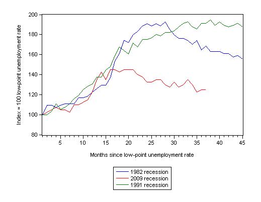
The following graph updates my 3-recessions graph which depicts how quickly the unemployment rose in Australia during each of the three major recessions in recent history: 1982, 1991 and 2009 (the latter to capture the 2008-2010 episode). The unemployment rate was indexed at 100 at its lowest rate before the recession in each case (June 1981; November 1989; February 2008, respectively) and then indexed to that base for each of the months as the recession unfolded.
I have plotted the 3 episodes for 45 months after the low-point unemployment rate was reached. (although the current episode has only endured for 35 months). For 1991, the end-point shown is the peak unemployment which was achieved some 38 months after the downturn began although the recovery was painfully slow. While the 1982 recession was severe the economy and the labour market was recovering by the 26th month. The pace of recovery for the 1982 once it began was faster than the recovery in the current period.
It is significant that the current situation while significantly less severe than the previous recessions is dragging on which is a reflection of the lack of private spending growth and declining public spending growth.
The graph provides a graphical depiction of the speed at which the recession unfolded (which tells you something about each episode) and the length of time that the labour market deteriorated (expressed in terms of the unemployment rate).
From the start of the downturn to the 37-month point (to February 2011), the official unemployment rate has risen from a base index value of 100 to a value 125 – peaking at 145 after 21 months. At the same stage in 1991 the rise was 191 (which was close to its peak) and in 1982 – 168 (and falling in spurts).
So while the current downturn has been a very different type of episode relative to our previous experiences the trend in unemployment is far from being downwards.
Note that these are index numbers and only tell us about the speed of decay rather than levels of unemployment. Clearly the 5.0 per cent at this stage of the downturn is lower that the unemployment rate was in the previous recessions at a comparable point in the cycle although we have to consider the broader measures of labour underutilisation (which include underemployment) before we draw any clear conclusions.
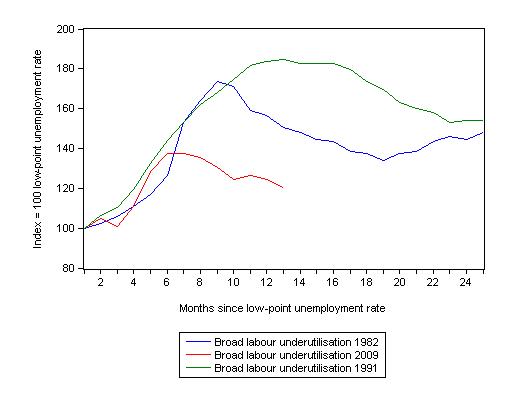
The following graph replicates the previous graph except it uses the ABS broad labour underutilisation rate (unemployment plus underemployment).
At the same period in the recovery (using quarterly data), the broad labour underutilisation rate (unemployment plus underemployment) had an index value of 150 in the 1982 recession (absolute value of 12.3 per cent); an index value of 184 in the 1991 recession (absolute value of 17.9 per cent); and an index value of 120 in the current period (absolute value of 11.9 per cent).
So while the level of unemployment is much lower now than in the 1982 recession (at a comparable stage), underemployment is now much higher and so the total labour underutilisation rates are similar.
Commentators who think of the 1982 recession as severe, rarely see it in these terms. Joblessness is probably worse than underemployment but both mean that labour is wasted and income earning opportunities are being foregone. For a worker with extensive nominal commitments, the loss of income when hours are rationed may be no less severe than the loss of hours involved in unemployment, if the threshold of solvency is breached.
Aggregate participation rate falls
The participation rate fell by 0.2 percentage points in February 2011 which helped to keep the unemployment rate from rising in the face of the negative employment growth. The labour force shrunk at the same rate as employment so unemployment fell by 500.
The labour force is a subset of the working-age population (those above 15 years old). The proportion of the working-age population that constitutes the labour force is called the labour force participation rate. So changes in the labour force can impact on the official unemployment rate and so movements in the latter need to be interpreted carefully. A rising unemployment rate may not indicate a recessing economy.
The labour force can expand as a result of general population growth and/or increases in the labour force participation rates.
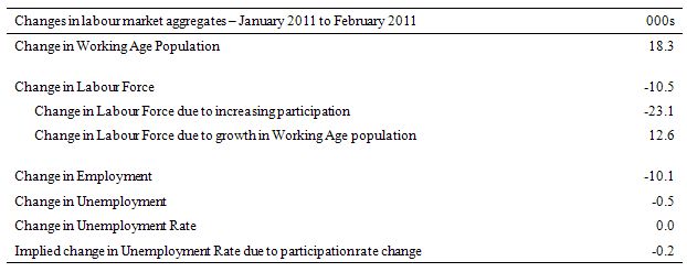
The following Table shows the breakdown in the changes to the main aggregates (Labour Force, Employment and Unemployment) and the impact of the fall in the participation rate.
In February 2011, employment fell by 10.1 thousand and the labour force fell by 10.5 thousand which meant that unemployment fell by 500 (rounded). The impact of the fall in the participation rate was to withdraw 23.1 thousand workers from the labour force. The other impact on the labour force was the extra 12.6 thousand workers looking for work as a result of growth in the working age population which is steady from month to month.
So this month the labour market saw a worsening unemployment situation but this was attenuated by the declining labour force. The population growth component of the growth in the labour force was more than offset by the declining participation rate. The falling unemployment was replaced by a rise in hidden unemployment – which is no real gain.
If the participation rate had have remained at the January 2011 level then the unemployment rate would have been 5.2 per cent – that is a rise of 0.2 points on the January figure. Instead it was static at 5 per cent. That is nothing to celebrate.
Hours worked rise in February – even though employment falls
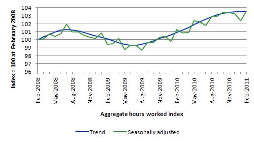
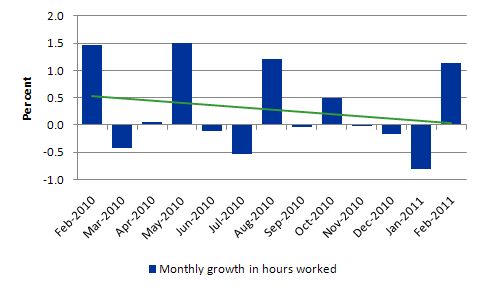
Total monthly hours worked rose in February (17.9 million hours or 1.13 per cent) arresting three months of decline. This was despite total employment shrinking. The reason is simple the growth in full-time employment was sufficient to more than substitute in hours terms the larger decline in part-time work.
The official ABS data suggests the trend has now flattened which is consistent with the very sluggish performance over the last 6 months.
The following graph shows the trend and seasonally adjusted aggregate hours worked indexed to 100 at the peak in February 2008 (which was the low-point unemployment rate in the previous cycle).
The graph shows that the trend growth is all but zero which is very worrying given the substantial underemployment that still exists.
The next graph shows the monthly growth (in per cent) over the last 12 months. The green linear line is a simple regression trend and it is suggesting monthly growth rates have been in decline all year.
Once again the data doesn’t support the notion of a fully employed labour market that is bursting into the inflation barrier.
Conclusion
The last few month’s Labour Force estimates have now consolidated my impression that the labour market is not growing very strongly.
The so-called once-in-a-century mining boom is not driving the labour market as strongly as many bank economists (and other commentators) would have us believe.
But it is true that today’s data is difficult to really interpret given the impact of the natural disasters in the last month (floods, bushfires and cyclones).
Overall, the message was subdued. There is still a lot of slack left to be mopped up and employment growth is clearly not strong enough at present to make any serious dent in the pools of idle labour.
That is enough for today!
unrelated to Professor Mitchell’s blog post, but of interest:
http://news.yahoo.com/s/time/20110310/wl_time/08599205794900
This Times Magazine article is about how some businesses in a small Spanish village have begun accepting pesetas, the Spanish currency before the Euro. Some things that stand out:
(1) ‘In an effort to boost spending during hard times, 61 of Mugardos’ businesses are participating in the campaign. […] “We knew that people were hurting because of the economy,” says Felipe FernÁndez, owner of the Kiosco Loli, which sells magazines, toys, and souvenirs. “We thought this might be a good way to motivate them to spend.”‘
They understand that it is insufficient demand that is hurting their economy, and that demand has to increase to end their recession. These business owners implicitly understand what many economists do not.
(2) Unfortunately, since they do not know MMT, their plan has some problems built into it. The businesses are accepting the peseta, but no where does the article say that the local government is requiring some taxes to be paid with this currency. Also, the peseta is pegged “at the rate of 166.38 to the euro – precisely the exchange on Jan. 1, 2002, the day the latter went into effect”. In other words, the peseta isn’t floating against the euro.
Someone who understands MMT and can speak Spanish or Galician needs to reach out to these people to teach them how to keep their new currency sustainable. Their business owners should be commended for their initiative, but they desperately need to get their local government to support their currency.
It’s inspiring to see that there exist people who desire new currencies who are not gold bugs but intuitively understand that money is made to be spent (and to provide sufficient for full employment and full capacity) and not saved. MMT’ers should assist them when they are being neglected by their democratic national governments practicing austerity.
Its possible the next penny to drop will be the wholesale cancelling or long term delay of many mining related projects. Punchy
Its possible the next penny to drop will be the wholesale cancelling or long term delay of many mining related projects. Punchy
When commodities are expected to appreciate over the long term it makes economic sense to store them in the ground instead of taking short term profits.