The income and wealth inequality that continues to grow in most advanced nations has led…
Australian National Accounts – I wouldn’t say the economy is great
The on-going rhetoric being used to push the federal budget into surplus is that the Australian economy is growing so fast as a result of the mining boom (record commodity prices) that we are in danger of an inflationary break-out. This is at a time when 12.5 per cent of our labour resources are idle (unemployed or underemployed). Today’s Australian Bureau of Statistics release of the National Accounts data for the December quarter shows that the mining sector is making a zero contribution to real GDP growth. Overall, the data shows that the Australian economy grew by 0.7 per cent in the December quarter giving an annual growth of 2.7 per cent. This is not enough to eat into the pool of idle labour given that productivity growth is around 1 per cent per annum and labour force growth is around 1.7 per cent. The zero contribution of private investment is the most disappointing feature of today’s data. But we have to be cautious – this is a rear-view mirror of what the economy was doing 3 months ago. But even so, there is nothing in this data that suggests Australia is facing an inflation problem of too much growth. The growth rate is still not strong enough and with the withdrawal of the fiscal stimulus and China introducing contractionary policies there is still some uncertainty ahead.
The main features of today’s National Accounts release for the December 2010 quarter were (seasonally adjusted):
- Real GDP increased by 0.7 per cent in the December quarter but the September 2010 quarter was revised downwards from 0.2 per cent to 0.1 per cent.
- The main positive contributors to expenditure on GDP were Private gross fixed capital formation on Machinery and equipment (0.3 percentage points) and Inventories (0.8 percentage points). The largest negative contributor was Private gross fixed capital formation on Non-dwelling construction (-0.2 percentage points).
- Net exports made no overall contribution to GDP growth in the December quarter 2010 (Exports and imports increased by 3 per cent). This compares to the negative net exports contribution of -0.5 percentage points in the September quarter 2010.
The press reaction was predictable. The Sydney Morning Herald reported that – GDP growth quickens to 0.7% – and that “Australia’s economic growth accelerated at the end of 2010 as rising commodity prices spurred new investment and improved the country’s trade balance”.
A bevy of bank economists were waxing lyrical today about the results but one of them put the results in a better perspective:
I wouldn’t run away and say the economy is great …
The rise in inventories is a puzzle. Inventory accumulation was the single largest source of growth in the December quarter. Depending on whether the accumulation was planned or not indicates whether the signal is good or bad.
If inventories rose because orders are falling and stock is being held as unplanned investment then that is a bad omen.
However, it might be that firms are expecting strong growth in the coming quarters and so wanted to have plenty of stock available to avoid losing market share. That would be a good sign.
The two uncertainties are: (a) what will the contraction in public demand mean once it starts to bite; and (b) what effect will the floods have. Major productive areas in Australia stalled during December and January as a result of the floods.
We will learn these things when the March quarter results are published in June this year.
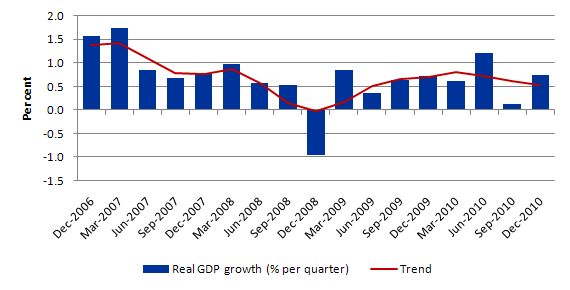
The following graph shows the quarterly percentage growth in real GDP from December 2006 to December 2010 (blue columns) and the ABS trend series (red line) superimposed. While the December quarter figure is an improvement the trend growth rate is now pointing downwards – as it has been since the March 2010 quarter. The average for both trend and actual real GDP growth over the last year is 0.7 per cent. So today’s figures indicate that by the end of last year, the Australian economy was growing at the average rate for 2010 – that is, nothing special given that that average is not enough to sustain strong employment growth.
So what is driving the growth?
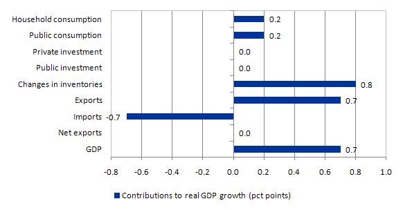
The following graph shows the percentage contributions to real GDP growth in the December 2010 quarter by aggregate spending type. While GDP growth was 0.7 per cent in the December quarter, the strongest contribution came from inventory building (0.8 percentage points). Private consumption added 0.2 percentage points (down from 0.3 percentage points in September quarter). The retail sector overall added nothing to growth in the December quarter.
Private investment contributed zero to growth in the December quarter (down from 0.1 percentage points in September quarter). The contribution of private capital formation has fallen in each of the last three quarters and there is no sense that there is a widespread investment boom about to happen. Private gross fixed capital formation on Machinery and equipment made a positive contribution (0.3 percentage points) but this was offset by declines in other components of private investment. There is very little productive capacity being added to the Australian economy at present.
Public consumption is steady at 0.2 percentage points contribution while public investment made a zero contribution to real GDP growth. Overall, the public contribution is falling as the government unwinds its fiscal stimulus in pursuit of a budget surplus. Fortunately, the deficit is still adding to demand but before long, if the governments maintains its foolish strategy, the economy will be burdened by fiscal drag.
In the September quarter, the external sector was a contractionary force with net exports reducing growth by 0.5 percentage points. In the December quarter, net exports made a zero contribution with exports adding 0.7 percentage points and imports draining growth by the same amount. The strong rebound in import demand (it was negative in the September quarter) is partially due to the appreciating Australian dollar.
Overall, this is still not an economy on the cusp of an inflationary explosion. Rather, the economy is growing under the strain of a negative contribution from private investment and net exports. What happens in China in the coming year or so will determine our fortunes.
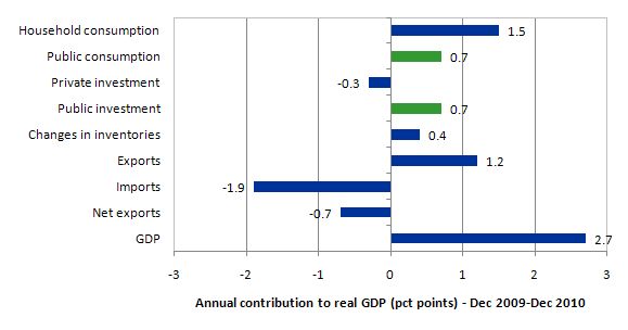
The following graph shows the contribution to real GDP growth over the last year (four-quarters to December 2010) by expenditure components.
The contribution of government consumption and investment (1.4 per cent) is down from the 2 per cent contribution between September 2009 and September 2010 and reflects the withdrawal of the fiscal stimulus. The public contribution, however, also is seen in the private consumption estimates which were helped by direct and multiplied effects arising from the fiscal stimulus.
Private investment subtracted 0.3 percentage points from growth over the same period. The external sector subtracted 0.7 percentage points from the growth.
Australia would have been sliding along the zero growth line (or recessed) over the 12 months to December 2010 without the fiscal stimulus directly adding to demand and indirectly stimulating private consumption spending. There has not been an export-led recovery despite what the commentators would like us to believe.
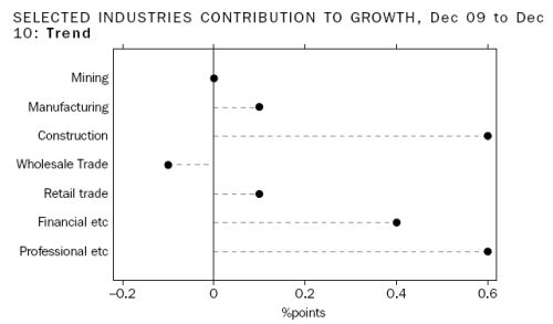
The importance of the public sector contribution is also see when we take a sectoral perspective (rather than an expenditure component view as in the last two graphs).
The following graph is taken from the ABS National Accounts publication for December 2010 (page 8) and shows the sectoral contribution to growth over period from December 2009 to December 2010.
The contribution of the fiscal stimulus is profound (considering the sectors which were impacted by the intervention. For an economy that is supposed to be having a once-in-a-hundred years mining boom the data is telling.
In the December quarter, Mining actually contracted and contributed a negative 0.3 pc points.
Wage share continues to fall
The wage share in factor income is tells us about the direction of real unit labour costs – that is, what each unit of output is costing per real unit of labour input.
The wage share can fall because the real wage is falling as a result of discretionary policies to deregulate the labour market and attack unions. But, equally, it can fall because the economy is booming and productivity growth is strong.
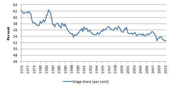
The estimates for the December quarter 2010, show the wage share in seasonally adjusted terms was 52.6 per cent down from 52.7 per cent in September.
In the last year, the wage share has fallen by 0.7 percentage points alone which means that real unit labour costs are falling. Why have commentators been claiming that labour costs overall are rising? The evidence shows that they haven’t been rising for some time.
The following graph shows the evolution of the wage share in national income since March 1976. It shows the continuous redistribution of income from wages to profits which I document as one of the characteristics of the neo-liberal period that led to the current crisis. Please read the blog – The origins of the economic crisis – for more detail on this point.
In historical terms, this redistribution is very large and unprecedented – another atypical behaviour – which the neo-liberals have tried to condition us is just normal. This trend along with the rapid increase in household indebtedness and the obsessive pursuit of budget surpluses are all historically atypical behaviours – which have to be reversed if we are to avoid further crises of the type that has recently crippled the World economy.
So what is this all about?
Analytically, the wage share is expressed as the total wage bill as a percentage of nominal GDP. Economists differentiate between nominal GDP ($GDP), which is total output produced at market prices and real GDP (GDP), which is the actual physical equivalent of the nominal GDP.
To compute the wage share we need to consider total labour costs in production and the flow of production ($GDP) each period.
Employment (L) is a stock and is measured in persons (averaged over some period like a month or a quarter or a year).
The wage bill is a flow and is the product of total employment (L) and the average wage (w) prevailing at any point in time. Stocks (L) become flows if it is multiplied by a flow variable (W). So the wage bill is the total labour costs in production per period.
So the wage bill = W.L
The wage share is just the total labour costs expressed as a proportion of $GDP – (W.L)/$GDP in nominal terms, usually expressed as a percentage. We can actually break this down further.
Labour productivity (LP) is the units of real GDP per person employed per period. Using the symbols already defined this can be written as:
LP = GDP/L
so it tells us what real output (GDP) each labour unit that is added to production produces on average.
We can also define another term that is regularly used in the media – the real wage – which is the purchasing power equivalent on the nominal wage that workers get paid each period. To compute the real wage we need to consider two variables: (a) the nominal wage (W) and the aggregate price level (P).
There is no such thing as a macroeconomic price level so P represents some abstract measure of the general movement in all prices in the economy. Macroeconomics involves using these abstract variables that are never observed – like the price level, like “the interest rate” etc. They are just stylisations of the general tendency of all the different prices and interest rates.
The nominal wage (W) is paid by employers to workers is determined in the labour market – by the contract of employment between the worker and the employer. The price level (P) is determined in the goods market – by the interaction of total supply of output and aggregate demand for that output although there are complex models of firm price setting that use cost-plus mark-up formulas with demand just determining volume sold. We shouldn’t get into those debates here.
The inflation rate is just the continuous growth in the price level (P). A once-off adjustment in the price level is not considered by economists to constitute inflation.
So the real wage (w) tells us what volume of real goods and services the nominal wage (W) will be able to command and is obviously influenced by the level of W and the price level. For a given W, the lower is P the greater the purchasing power of the nominal wage and so the higher is the real wage (w).
We write the real wage (w) as W/P. So if W = 10 and P = 1, then the real wage (w) = 10 meaning that the current wage will buy 10 units of real output. If P rose to 2 then w = 5, meaning the real wage was now cut by one-half.
So the proposition in the question – that nominal wages grow faster than inflation – tells us that the real wage is rising.
Nominal GDP ($GDP) can be written as P.GDP, where the P values the real physical output.
Now if you put of these concepts together you get an interesting framework.
To help you follow the logic here are the terms developed and be careful not to confuse $GDP (nominal) with GDP (real):
- Wage share = (W.L)/$GDP
- Nominal GDP: $GDP = P.GDP
- Labour productivity: LP = GDP/L
- Real wage: w = W/P
By substituting the expression for Nominal GDP into the wage share measure we get:
Wage share = (W.L)/P.GDP
In this area of economics, we often look for alternative way to write this expression – it maintains the equivalence (that is, obeys all the rules of algebra) but presents the expression (in this case the wage share) in a different “view”.
So we can write as an equivalent:
Wage share – (W/P).(L/GDP)
Now if you note that (L/GDP) is the inverse (reciprocal) of the labour productivity term (GDP/L). We can use another rule of algebra (reversing the invert and multiply rule) to rewrite this expression again in a more interpretable fashion.
So an equivalent but more convenient measure of the wage share is:
Wage share = (W/P)/(GDP/L)
That is, the real wage (W/P) divided by labour productivity (GDP/L).
This measure is also referred to as – Real Unit Labour Costs (RULC). You note that unit labour costs are how much it costs in labour terms per unit of output (so ULC = W.L/GDP).
So RULC = (W.L)/P.GDP
In its current National Accounts commentary, the ABS says that:
Unit labour costs (ULC) represent a link between productivity and the cost of labour in producing output. A Nominal ULC measures the average cost of labour per unit of output while a Real ULC adjusts the nominal ULC for general inflation. Positive growth in a real ULC indicates that labour cost pressures exist. In the December quarter 2010, the trend Real ULC decreased 0.6% and the trend Non-farm Real ULC decreased 0.4%. The Non-farm measure is generally preferred as it removes some of the fluctuations associated with Agriculture.
Message: there are no inflationary pressures coming from the Australian labour market at present. Exactly the opposite is the case.
What about the individual components?
The ABS also tell us that “Market sector GDP per hour worked (in trend terms) grew 0.2% in the quarter and 0.9% through the year”. So real wages must have been growing a bit less than that for the wage share to be falling.
We should be a little careful because Market sector GDP per hour worked is not a clean measure of labour productivity (it also captures other contributing factors).
The point is that there is modest growth in labour productivity going on at present (less than 1 per cent per annum).
Household saving ratio
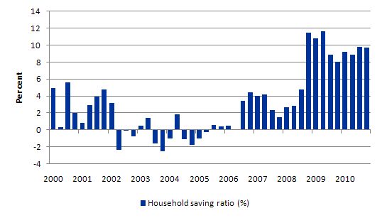
The following graph shows the household saving ratio (% of disposable income) which is holding more or less steady at 9.7 per cent after rising for several quarters. For the economy to continue to grow strongly while households are maintaining rising levels of saving (from disposable income), public spending, private investment and/or net exports has to increase. The problem is that the contribution from net exports and private investment is negative (as explained above). Thus a rise in public net spending is indicated but absent in the Australian context.
A rising budget deficit would provide the nominal aggregate demand growth necessary to “ratify” the household saving intentions and support stronger real growth. The private sector has to reduce the overhang of debt left from the last credit binge. That process has to be supported by a growth in net exports or public spending. Neither expenditure component is helping right now.
With real wages growth continuing to lag behind productivity growth (and the gap is increasing), it is clear that households cannot continue to absorb the real output that is being produced by the economy under these distributional trends without having to continually increase their debt levels.
Real wages growth has to come back into line with productivity growth to ensure sustainable growth is achieved and this means one thing – there has to be a rather significant shift in the wage share upwards.
The reality is that this can only be accomplished if real wages growth is allowed to track labour productivity growth. That will require a paradigm shift away from labour market deregulation, anti-labour legislation and trade union bashing.
Terms of Trade effects
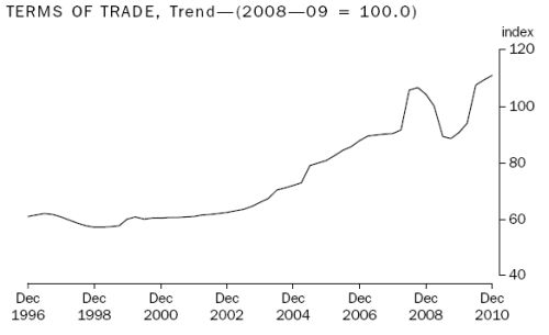
Several readers have asked me to explain the impact of the rising terms of trade which is shown in the following graph (taken from the ABS National Accounts publication for the December quarter 2010). You can always get a detailed explanation from the Australian National Accounts: Concepts, Sources and Methods.
The Terms of Trade is the “relationship between the prices of exports and imports”. So when they are improving (rising) it means that export prices are increasing at “a faster rate than import prices”.
This is often considered to be a measure of a rising standard of living because we can purchase more imports per $ of export sale. Exports are a cost to the nation because they are resources that are foregone. Imports are considered a benefit because they provide goods and services which are typically not produced (in quantity and/or quality) in the domestic economy. So a rising terms of trade is a sign that we are able to get more benefits per unit of foregone cost.
As you can see from the graph the Australian terms of trade continued to rise in the December quarter (1.1 per cent) after a strong 1.7 per cent rise in the September 2010 quarter.
This is being driven by the record primary commodity prices on offer at present – mostly as a result of the rapid expansions in China and India.
What does that mean?
A way of answering that question is to consider another measure available in the National Accounts – Real net national disposable income.
The ABS say that:
This measure adjusts the volume measure of GDP for the Terms of trade effect, Real net incomes from overseas and Consumption of fixed capital …
Real net national disposable income is a broad measure of our material standard of living and should increase when the terms of trade are strong because the latter allows the residents to gain a greater access to goods and services than they are producing (as measured by GDP).
The ABS report that growth in Real net national disposable income “over the past 4 quarters was 8.7% compared with 2.7% for GDP”. Most of that discrepancy is being driven by the terms of trade.
Conclusion
Today’s result is still not signalling an economy that is about to move to full employment very quickly. We have to be careful because it is a rear-vision mirror view of where the economy was 3 months or so ago.
The outlook is certainly a bit brighter than it was 3 months ago when the September quarter National Accounts results were released. But we are still seeing fairly modest private sector spending growth and the export income is being nullified by rising imports.
While our terms of trade are strong this has not translated into an improved or even positive contribution from the external sector (despite imports falling).
With the fiscal stimulus steadily being withdrawn, unless private investment really starts to pick up and add to productive capacity and drive production using existing capacity, real GDP growth will continue to wallow at levels which will not see any material reduction in the idle labour that the economy is carrying.
The household sector is clearly trying to reduce its indebtedness (rising household saving ratio) and that is also deflationary – consumption is steady but overall the retail sector is weak.
It is clear that the fiscal stimulus packages was still driving economic growth in the December 2010 quarter accompanied by a strong showing from inventory building. It is difficult to interpret the inventory building – it can sometimes signal bad news (falling orders) while it can also suggest forward-looking behaviour by firms who expect stronger sales in the coming months.
Overall, growth is not really strong enough to absorb the pools of idle labour that exist at present.
That is enough for today!
I’ll try again.
How do you know your “C + I + G + (X – M)” are in the same time period as your measured Y?
“Overall, growth is not really strong enough to absorb the pools of idle labour that exist at present.”
If there isn’t a shortage of goods/services, then get some more people to retire.
Driving home the other day I switched the radio on and there was some”bank economist” banging on about the threat of inflation due to the Australian economy being at full capacity.
His main fear was that the RBA would move to push up interest rates.
I hope he’s right because the sooner we have the worst depression / recession in history the sooner the Neo-liberals will be recognised as the problem rather than the solution.
So resource plunderers are getting top dollar for their pillage and the economy is barely squeaking along.
Terms of trade are at a record high. I assume this is just a reflection on the high Aussie dollar. Indebted Australians are still able to service their loans at a relatively high rate of interest. Carry trade vampires are still getting a nice feed alongside the Aussie bank leeches.
It’s perfectly poised for calamitous failure if either China reduces demand for ore and coal, or a housing market downturn. What a robust picture of health for the poster boy economy.
I see the liberals in Vic are plotting to dig up the crappiest, dirtiest coal on the planet and flog it to India. What further joys await us?
Hi Bill,
I’m trying to cross-check the figures referenced in this blog post and it seems like there are some miscalculations that could potentially affect your conclusions. This is the first time I ask for comments in your blog, but hope you or someone else will help me to understand the situation described here.
1. Both Fig.2 and Fig.3 don’t add up. If you calculate the sum of individual contributions (like 0.2+0.2+0.8+0.7-0.7 in Fig.2) you don’t get GDP growth (0.7). This is probably due to absence of the factor weights, and introduction of those might change picture dramatically. For example, let’s assume GDP was $100 and rose 8% to $108, inventories were $20 and rose 10% adding $2 to GDP, exports were $40 and rose 5% producing $2 of GDP growth. Despite the fact inventories rose 10% and exports only 5%, they both added $2 or 25% to GDP growth. I couldn’t find absolute value of inventories in Australia, but think it’s quite marginal compared to total GDP, so 0.8% rise of this parameter can’t lead to any big conclusions.
2. If both imports and exports rise by some percent, then net exports rise by the same percent. If X2=1.007*X1 and M2=1.007*M1, then NX2=1.007*(X1-M1)=1.007*NX1. So I believe it’s unfair to say that ‘Net exports made no overall contribution to GDP growth in the December quarter 2010’ given what we see in Fig.2.
3. I tried to reconstruct everything from the raw data provided here http://www.abs.gov.au/AUSSTATS/abs@.nsf/DetailsPage/5206.0Dec%202010?OpenDocument (‘Table 3. Expenditure on Gross Domestic Product (GDP), Current prices’). I don’t understand how you derive 0.7% for exports and -0.7% for imports in Fig. 2. Actually, exports have fallen 1% Sep to Dec in current prices (see column DU), so I don’t understand how could this factor positively contribute to GDP growth in this period.
Thank you in advance for any guidelines to resolve this.
Best regards,
Victor Ichalov.
@Ichalov
I think I can answer most of your questions after a quick look at the original ABS document that Bill cites.
1. Figures 2 and 3 never claim to be an exhaustive list of all contributions to GDP growth, so there is no reason for them to ‘add up’. They simply list some of the more important and/or interesting contributions (or lack thereof), along with the overall figure, and I can see no reason to think that ‘weighting’ plays any part. For example, this quote is obviously the source of some of the numbers in figure 2 – I imagine Bill has done a more thorough reading than me to find the rest.
“On the expenditure side, the growth this quarter (in seasonally adjusted volume terms) was driven by the Change in inventories (adding 0.8 percentage points, Household final consumption expenditure (adding 0.2 percentage points), Government final consumption expenditure (adding 0.2 percentage points). Partially offsetting the growth was Private gross fixed capital formation (detracting 0.1 percentage points).”
As you can see, the effect of ‘Change In Inventories’ is explicitly given as 0.8% contribution to growth (whatever actual change in inventory that involves), which I think answers your second point.
2. I can see your point that, assuming imports and exports aren’t equal, an equal percentage change in each might well make a difference in growth. However, the ABS states quite clearly that net exports have had no effect on gdp growth
‘In seasonally adjusted terms growth in Exports increased 3.0% and growth in Imports increased 3.0% for the December quarter 2010. This means Net exports had no overall contribution to GDP growth in the December quarter ‘
So I can only imagine that what they mean by ‘growth in exports increased by 3.0%’ has a more subtle meaning than that exports actually *grew* by 3%. Certainly all Bill has done is repeat what they said, probably with better understanding than either of us.
3. There is a big difference between the export number (in current prices) in the data document you mention and a ‘0.7% contribution to gdp growth’. Seasonal adjustments and trend calculations would be the two main ones.
not to mention that with more and more growth potential in 0 marginal cost infinite leverage category- down loanding software and songs ‘counts’ for gdp- there is no limit, and there is no amount of demand that can drive up costs for these things.
so any notion of ‘potential growth’ that doesn’t recognize this is grossly understating our prospects and entirely missing the point.