The Australian Bureau of Statistics (ABS) released the latest labour force data today (March 19,…
Australian labour market – some alignment in the stars
The national ABC news carried the headline – Jobs surge smashes expectations after the ABS released the Labour Force data for September 2010. Which expectations are we talking about? Answer: the estimates of the bank economists. So that fact they were wrong – as usual – doesn’t give us very much information at all. After the data release that lot quickly resumed their inflation-obsessive mantra claiming that the RBA would now have to hike rates in November. They had said that the RBA would have to hike this week and were wrong. I often wonder if their employers (the banks) actually ever take their advice seriously. Perhaps the fact the banks keep making huge (unseemly) profits suggests they don’t. Anyway, the labour market showed signs of improvement this month (full-time employment up) although unemployment rose. But I would hardly call this jobs boom. It is true that participation rose by 0.2 percentage points which is usually a good sign when employment growth is positive because it means the labour force is expanding and more people are confident of finding work (reducing hidden unemployment). But employment growth is still not strong enough to reduce unemployment and total hours of work fell slightly. Does this data signal an inflation threat as per the ranting of the bank economists? Answer: no! The signs of improvement are suggesting just some better alignment of the stars. There is still plenty of slack to be absorbed yet (total labour underutilisation remains around 12.5 per cent).
The summary ABS Labour Force (seasonally adjusted) estimates for September 2010 are:
- Employment increased 49,500 (+0.4 per cent) with full-time employment increasing by 55,800 and part-time employment decreasing by 6,300. This continues the trend from last month where net employment growth is biased to full-time employment which reverses the earlier reliance on part-time employment growth as the recovery ensued.
- Unemployment increased 2,400 to 611,000 because employment growth was outstripped by the labour force growth.
- The official unemployment rate remained steady at 5.1 per cent.
- The participation rate rose by 0.2 percentage points to 65.6 per cent and demonstrated that the labour market is getting stronger and absorbing workers from outside the labour force.
- Aggregate monthly hours worked decreased 1 million hours (0.1 per cent) which means that there has been s a strange result giv.
- The quarterly underemployment estimates will not be released until November. The last data release for August, showed that underemployment was estimated to be 7.4 per cent and total labour underutilisation (computed by the ABS as the sum of underemployment and unemployment) was estimated to be 12.5 per cent. It is unclear from today’s data whether underemployment is rising or falling given the contradictory signals (more full-time work but less overall hours worked).
As usual, the financial media rang up the bank economists when the data came up this morning. I guess it is better that the economists spend there time on the phone like this rather than actually doing anything that might be important. I guess the banks realise they can get free publicity – the economists are always parked in front of a huge corporate logo when they give TV interviews – and perhaps that is why they employ them. No-one really cares what they say and most people forget that they are rarely correct in their forecasts.
The ABC news reported several reactions from bank economists summarised here:
We are already looking at skills shortages, particularly in the mining sector …
While the economy is patchy and there are doubts on the global economy, it [RBA] may not be able to take chances on inflation remaining low with the job market tightening
If we want to keep down both wage pressures and interest rates, then labour supply needs to increase and that means more migrants
Over the past year migrant numbers have fallen at the fastest rate on record – that is certainly not a desirable outcome, with fewer young Australians to fill positions.
Last month’s labour force data release brought his headline – Jobs surge rings rates alarm – from the he Sydney Morning Herald. The RBA did not increase interest rates on Tuesday.
But when the record is stuck the record is stuck! Today’s Sydney Morning Herald headline to accompany the September labour force data was – Jobs surge stokes rate rise fears.
Someone said to me once that if you are a forecaster just keep saying the same thing over and over and eventually you will be correct.
Anyway, the Sydney Morning Herald carried these sorts of remarks from bank economists:
Jobs creation is far stronger than expected … The RBA is definitely wary of labour shortages developing in the economy.
The result is quite amazing to be frank. The strength of the September data will surely worry the RBA with the decision to keep rates on hold in October now questionable given the boost to incomes and confidence that such strong data will bring.
The real risk is a skills shortage.
After rates were held in October, booming jobs growth intensifies inflation pressures and is likely to prompt an interest rate increase from the central bank very soon
So the themes that obsess these commentators are clear. Skill shortages! Where is the evidence? Vacancies rising? Wages growth gathering pace? Employment growth starting to eat quickly into the pool of unemployed? Or are the bank economists claiming that the 12.5 per cent (at least) underutilised workers have no skills that would be in demand?
Clearly the character who was advocating more migrants thinks that is the case. The implication that the youth labour market is exhausted is also interesting. As you will see below, nothing could be further from the truth with unemployment rates for 15-19 year olds still at 16.8 per cent and total labour underutilisation rates for this cohort around 15 per cent (unemployment plus underemployment). Does this bank economist live on a different planet to the rest of us?
The constant “inflation is about to break out” mantra which comes out whenever there is signs of growth does wear thin though. Last Tuesday, the RBA clearly thought the economy was not in fit shape to accept another rate rise – and that is according to their own inflation-biased logic.
The fact is that today’s data shows that employment growth is still not strong enough to outstrip the growth in the supply of labour. That means excess supply overall is rising not falling. Yes there could be bottlenecks but we will see that that is not even particularly likely. Further total hours worked fell this month and the trend is not very robust (see below).
Yes, the data is showing the economy is growing and more people are now willing to participate in the labour force as their employment prospects rise. But growth doesn’t cause inflation as a inevitable consequence. Unmanaged growth which depletes available resources causes in inflation and we are some way from that yet. The rising exchange rate is also attenuating any “imported” inflation pressures not that the rest of the world is looking remotely like inflating. Exactly the opposite is the case.
All the recent data shows real unit labour costs falling and the inflation rate docile if not moderating. Please read my blog – RBA confounds the market economists – but that’s easy – for more discussion on this point..
The bank economists always have one message whenever there is any growth in anything – the central bank will push up interest rates. This is the moronic mantra that has fallen on us courtesy of the neo-liberal era. There is a risk of inflation at present – there always is – but it is very low. There is still substantial real capacity in the economy available to expand output in response to further expansion of nominal aggregate demand.
The bank economists are claiming that we are close to the mythical NAIRU. They always say that. I will report soon on work I am doing in Maastricht at present which demonstrates that there is still a lot of excess supply in the labour market and the rise in underemployment is now an independent discipline on inflation (in addition to unemployment).
Rising underemployment keeps inflation in check just as much as rising unemployment. The bank economists never consider this source of labour slack. But if the bank economists think a total labour underutilisation rate of 12.5 per cent is near the inflation threshold then they have lost all perspective about the way the economy functions and should resile from making any further public commentary.
Inflation pressures?
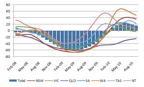
With 12.5 per cent total labour underutilisation overall it is hard to make the case that the labour market is anywhere near full employment. However, there still could be skill bottlenecks in certain occupational areas that might be putting upward pressure on unit labour costs across the board. There is clearly no shortage of low-skill workers given the persistently high underutilisation. So the bottlenecks would have to be occurring in the skilled labour market.
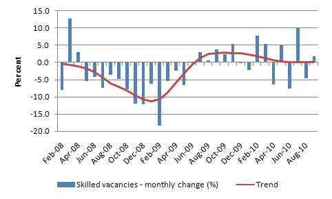
The Federal Department of Education, Employment and Workplace Relations (DEEWR) publishes its Skilled vacancies data each month which provides us with some information about the movement in demand for skilled labour.
The following graph is taking from the DEEWR data. It shows the seasonally adjusted monthly growth in skilled vacancies in Australia (blue bars) and the underlying trend (red line) since the start of the downturn in February 2008. My assessment of the movement in this series is that there is not yet any sign of bottlenecks in the labour market that would lead to an inflation outbreak. This data does not support a case that a large skills gap has developed in aggregate terms in the last several years as the boom peaked. There has not been a sharp rise in the demand for skills in the last several years.
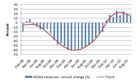
In case you think it is better to use annual growth rates to pick up broader trends and to eliminate the month-to-month volatility then the following graph will satisfy your curiosity. It shows the period February 2008 to September 2010 (as in the previous graph). It is clear to me that while the recovery in skilled vacancies was robust in the early stages of the growth that strength is now dissipating and the trend is towards moderation.
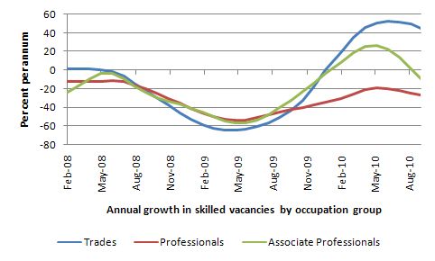
The next graph shows the annual growth in skilled vacancies (February 2008 to September 2010) for the broad occupational groups – Professions, Trades and Associate Professions. In the early stages of the recovery there was strong growth in vacancies for the trades – courtesy of the major fiscal stimulus boost to the construction industry. More modest growth during the early stages of the recovery is evident for associate professionals. Both occupational groups are now experiencing a moderation in the growth of vacancies. For professionals, the recovery has not yet delivered positive growth and the recent trend suggest a further deterioration.
It it is hard to find evidence of a significant pent up demand for skills from this data. I wonder whether the bank economists have even looked at it. I guess they are too busy watching replays of themselves on TV news segments telling the world – again – that inflation is about to break out and the RBA has to hike rates! Comedy central comes to mind except real comics are funny.
 Employment growth improves but still not strong enough to eat into the unemployment pool
The title of the blog is that there was “some alignment in the stars” in this month’s data. This is in reference to the growth in employment (biased towards full-time jobs) and the simultaneous rise in participation. When you see those two things growing together the signs are good. But it still remains the case that employment growth was not strong enough to reduce the unemployment pool and total hours worked fell in September 2010. So some alignment but still not a A-report card.
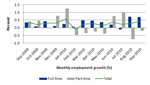
The following graph shows the month by month growth in full-time (blue columns), part-time (grey columns) and total employment (green line) over the last 12 months to September 2010 using seasonally adjusted data. The overall picture is positive with the growth in full-time employment now hopefully consolidating.
The results for September 2010 if maintained are good but they only demonstrate that employment growth overall is stable around 0.3 to 0.4 per cent per month. But much more growth is needed if the unemployment is to fall significantly.
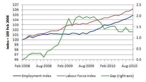
The following graph shows the movement in the labour force and total employment since the low-point unemployment rate month in the last cycle (February 2008) to September 2010. The two series are indexed to 100 at that month. The green line (right-axis) is the gap (plotted against the right-axis) between the two aggregates and measures the change in the unemployment rate since the low-point of the last cycle (when it stood at 4 per cent).
The Gap series gives you a good impression of the asymmetry in unemployment rate responses even when the economy experiences a mild downturn (such as the case in Australia). The unemployment rate jumps quickly but declines slowly.
At present, employment growth is not strong enough to reduce the unemployment pool (which actually rose a little in September 2010). In September 2010, employment growth was 0.4 per cent whereas the labour force grew a little faster and so the unemployment rate was constant when rounded off.
So while the data is telling us that there is some labour market recovery under way we should be mindful of the fact that the fiscal stimulus is waning and private demand may not be strong enough to fill the gap.
Employment growth for teenagers
The teenage labour market improved in September but is still worrying.
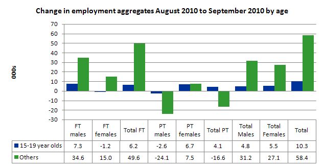
The following graph shows the distribution of net employment creation in the last month by full-time/part-time status and age category (15-19 year olds and the rest).
Teenage employment showed some improvement in September and the significant sign was that teenagers started to experience full-time employment gains which is a change from the trend established since the beginning of this year.
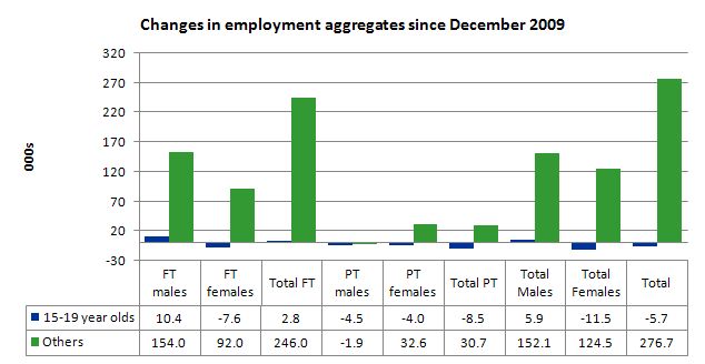
To put this month’s figures in perspective though, the following graph shows the change in aggregates since December 2009. There you see that despite overall employment growth since the beginning of this year, teenagers overall have experienced declining employment as the jobs market has shrunk for them.
Teenage unemployment rates are still at 16.7 per cent (down from 17.71 per cent) with participation also rising slightly. While these trends are excellent it still remains that the labour market is not providing enough hours of work for this crucial cohort.
If we consider their exposure to underemployment and the fact that total labour underutilisation rates are around 26 per cent for our teenagers (sum of unemployment and underemployment) then you realise there is still a lot of excess capacity that can be tapped via the creation of appropriate job/training slots.
At present, my summary is that the recovery that is occurring in the Australian economy is not providing enough opportunities for our youngest workers. These workers are our future. We talk of the intergenerational demands on public spending and rising dependency ratios. But then we allow 26 odd percent of our future workers to remain idle and outside the skill development process. This waste ensures our future productivity growth will be lower than it otherwise could be.
Unemployment
The unemployment rate remained steady at 5.1 per cent in September 2010 indicating that employment growth was not strong enough to outstrip the growth in the labour force participation rate.
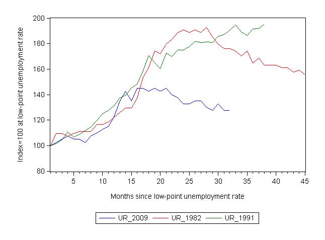
The following graph updates my 3-recessions graph which depicts how quickly the unemployment rose in Australia during each of the three major recessions in recent history: 1982, 1991 and now 2009 (the latter to capture the 2008-2010 episode). The unemployment rate was indexed at 100 at its lowest rate before the recession in each case (June 1981; November 1989; February 2008, respectively) and then indexed to that base for each of the months as the recession unfolded.
For 1991, the end-point shown is the peak unemployment which was achieved some 38 months after the downturn began.
For the other series, I have just charted the evolution for the 30-months in the current cycle (to July 2010 – the length of the current deterioration since February 2008). So it gives us a view of the way the 1982 recovery began too. While the 1982 recession was severe the economy and the labour market was recovering by the 26th month.
It is significant that the current situation while significantly less severe than the previous recessions is dragging on given the lack of private spending growth.
The graph provides a graphical depiction of the speed at which the recession unfolded (which tells you something about each episode) and the length of time that the labour market deteriorated (expressed in terms of the unemployment rate).
From the start of the downturn to the 31-month point (to August 2010 – the length of the current downturn since February 2008), the official unemployment rate has risen from a base index value of 100 to a value 127.5 – peaking at 145 after 21 months. At the same stage in 1991 the rise was 187.1 per cent (and increasing) and in 1982 175.6. The 1982 recession which was fairly severe ended at the 26-month point and the economy began a painful recovery after that month.
So the current downturn has been a very different type of episode relative to our previous experiences.
Note that these are index numbers and only tell us about the speed of decay rather than levels of unemployment. Clearly the 5.1 per cent at this stage of the downturn is lower that the unemployment rate was in the previous recessions at a comparable point in the cycle although we have to consider the broader measures of labour underutilisation (which include underemployment) before we draw any clear conclusions.
The underemployment data comes out quarterly and so the August quarter is the most up to date observation we have of the more general trends in the labour market. The next release for the broad indicators is November 2010.
What about the participation rate effects?
The participation rate rose by 0.2 percentage points in September 2010 and unemployment rose marginally (2,400).
The labour force is a subset of the working-age population (those above 15 years old). The proportion of the working-age population that constitutes the labour force is called the labour force participation rate. So changes in the labour
force can impact on the official unemployment rate and so movements in the latter need to be intepreted carefully. A rising unemployment rate may not indicate a recessing economy.
The labour force can expand as a result of general population growth and/or increases in the labour force participation rates.
The following Table shows the breakdown in the changes to the main aggregates (Labour Force, Employment and Unemployment) and the impact of the rise in the participation rate.
In September 2010, employment rose by 49.5 thousand while the labour force rose by 51.9 thousand which meant that unemployment rose by 2.4 thousand. The impact of the rise in the participation rate on the rising labour force was equivalent to 31.1 thousand while the remainder of the labour force expansion (20.7 thousand) was the result of growth in the working age population.
If the participation rate had have remained at the August 2010 value then the unemployment rate would have dropped to 4.8 per cent.
Hours worked declined
The rebound in aggregate monthly hours worked in May gave way to two consecutive months of declines as a result of the dominance of part-time employment growth and the decline in full-time employment growth. In August, this pattern changed and working hours increased by 14.8 million hours (0.9 per cent) reversing the falls recorded in June and July 2010.
However, in September 2010, hours worked have fallen again overall which, given full-time work has risen means that firms are still reducing hours per job.
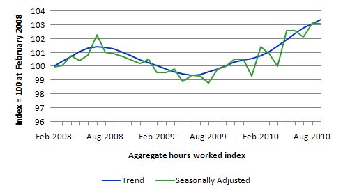
The following graph shows the trend and seasonally adjusted aggregate hours worked indexed to 100 at the peak in February 2008 (which was the low-point unemployment rate in the previous cycle).
You can see a very flat V-shaped recovery with a positive trend.
Conclusion
While the business economists are hyping up the story that the Australian labour market is booming and inflation is about to accelerate, the labour market data continues to tell me that growth is ongoing but there is a lot of slack left to be mopped up. There is recovery but employment growth is still lagging behind labour force growth.
The fact that participation rates rose this month indicates that the hidden unemployed are seeing better chances for work and are coming back into the labour force. That is a good sign.
A rise in full-time employment is nothing to criticise but the fact remains that unemployment rose modestly and underemployment remains high. An economy with 12.5 per cent (at least) of its available labour resources s not one that is reaching capacity constraints and likely to explode into an inflationary spiral any time soon.
The analysis of skilled vacancies also doesn’t suggest any unsustainable shortages of labour at present.
Overall, employment growth is positive but is not strong enough (in persons or hours) to put any serious dent in the labour wastage that the data records.
I see no inflationary pressures at present and I still advocate a further fiscal expansion that should be directly targeted at public sector job creation and the provision of skills development within a paid-work context. That would also be great boost to low inflation growth.
I started work early today because the “ABS data release clock” that seems to be inside my head woke me up to tell me it was 11.30 back home (2.30 am here in Maastricht) and that the ABS was about to release the September Labour Force data. It also helped that the journalists were soon ringing me wanting comment and teeing up radio interviews. Now I am off to my office at the Maastricht University to do another “day’s work”. Today I am investigating inflation dynamics! But first a long bike ride along the canals.
That is enough for today!

Bill,
You missed out the motive for the crime. As Ray pointed out earlier, the Bank chiefs are hoping for a rate rise, to disguise an unjustifiable hike in mortgage rates.
I can’t decide who I dislike the most.
1) The greedy Bank bosses who want to screw struggling mortgagees for a bigger bonus.
2) The economists who sneakily provide false flag events
3) Lazy journalists who ring their economist mate up for an easy story.
Too many good choices.
The employment stats sound neutral to me. It’s the false conclusions that draw my ire.
Bill –
On the ABC’s Lateline, it was explained why the Reserve Bank are so averse to employment growth. Apparently when they were just going by the numbers they didn’t see the 2007 inflation coming.
http://www.abc.net.au/lateline/business/items/201010/s3030419.htm
So if, as you say, falling unemployment is not a good way of forecasting inflation, can you suggest an alternative?
(2) It is the duty of the Reserve Bank Board, within the limits of its powers, to ensure that the monetary and banking policy of the Bank is directed to the greatest advantage of the people of Australia and that the powers of the Bank under this Act and any other Act, other than the Payment Systems (Regulation) Act 1998, the Payment Systems and Netting Act 1998 and Part 7.3 of the Corporations Act 2001, are exercised in such a manner as, in the opinion of the Reserve Bank Board, will best contribute to:
(a) the stability of the currency of Australia;
(b) the maintenance of full employment in Australia; and
(c) the economic prosperity and welfare of the people of Australia.
Bill,
Further to Aidan’s comment above:
I’m looking at the BBC’s Economy Tracker.
I noticed that in the UK recession – in the first quarter of 2008 GDP growth turned negative and CPI/RPI started to rise – yet unemployment started to rise significantly only in the second quarter 2008. My assumtion is that the credit crunch caused problems in supply chains as banks withdrew (or called in) credit throughout Europe. If i’m right, the unemployment rise was a consequence of many businesses that were depending on credit for day-to-day cash flow being forced by these circumstances to lay-off staff or go bust.
Then in 2009, the effect of rising unemployment on demand outweighed the supply side effects on inflation and CPI/RPI fell precipitously.
Therefore high employment did not cause inflation to rise, it was the withdrawal of credit from credit-dependent businesses that caused this rise, so it was a supply side inflation problem. Raising interest rates, I think, would not have changed what happened, as aggregate demand was not the cause of the higher inflation and the time lag would have been too long. Lowering the interest rate would not encourage the banks to lend whilst the banks had become suddenly so risk averse.
Charlie
Off topic….daft article by Alan Greenspan in the Financial Times today. He claims deficits cause households and businesses to invest less.
See: http://www.ft.com/cms/s/0/4524339a-d17a-11df-96d1-00144feabdc0.html
Charlie,
When the GFC hit the headlines, huge corporations with large cash reserves immediately adjusted their outlook. They started reducing inventory and froze hiring to maintain their bottom line. This would have squeezed smaller suppliers and those with poor credit access.
Early in 2009 when the MNC’s felt confident the world was not falling around their ears, they started building back inventory and rehiring selectively. The plan was for 2010 to be a flat recovery year with business back to normal in 2011. Parties were already booked for 2012.
Now most MNC’s are ratcheting their internal 2011 outlook downward. Mainly because of the debt terrorism from the IMF, ECB, Tories and Tea Party.
It’s not all about the banks.
Dear Bill,
Following the July labour force data (release in early August), you said:
“While the bank economists have hailed today’s figures as indicative of “a healthy labour market”, the reality is that the data is consistent with a broad array of statistics showing the Australian economy is slowing as the effects of the fiscal stimulus dissipate and and private spending remains subdued. It is not a healthy labour market at all.”
and:
“Today’s data is consistent with a swathe of other indicators which tell me that the economy is not in good shape and needs further fiscal support. It was obvious that the labour market would continue to slide this month and I wonder how much the banks stake their financial outcomes on the forecasts of their economists. They are typically wrong.”
Since that time we have had the labour force data for August and September, in which employment increased by 30,900 and 49,500 respectively. The unemployment rate has now returned to 5.1%.
So do you still stand by the call you made in August that the labour market is in a fragile state? Or do you believe that the last couple of months indicate that the labour market has improved and in fact things were quite a good deal healthier than you perceived.
If things have improved as the data would seem to suggest, why do you think you were wrong in your call? What did you miss in making you forecast for a deteriorating situation back in August? What unexpected factors do you attribute the strength to?
Cheers.
Dear Gamma (at 2010/10/08 at 0:32)
Thanks for trying to characterise my position although it would have been good if you thought more about what I have written in its entirety about the Australian labour market rather than try to set up a quick point scoring straw person attempt.
1. Employment growth is still not robust enough to outstrip labour supply growth – that is not the sign of a booming labour market.
2. Yes, full-time employment growth has been good in the last two months after several months of declining growth (and one month of negative growth). But total hours of work contracted this month. Again, on any measure, that is not a sign of a booming labour market.
3. I have consistently said that I oppose the view that we are close to full capacity. The evidence is clear – no reduction in total labour utilisation (still at around 12.5 per cent) and an unemployment rate still stuck above 5 per cent. So after almost a year of positive real GDP growth we are not even eating into the unemployment pool yet and, in fact, unemployment rose again this month. Even when compared to the peak of the last growth period we are around 4 per cent short in terms of excess labour supply and employment growth is not making any significant dent in that excess at present.
4. I do not see an inflation threat emerging from the labour market at present. Skilled vacancies growth is now falling (across all broad occupational groupings) after showing signs of recovery. Further, it is clear that this month, the economy was able to “absorb” some rise in the participation rate (which is excellent) and means there are excess supplies of labour outside the recorded labour force. How much? Probably another 1 per cent of the labour force is idle (hidden unemployed). That is a large pool of workers than will still be available for work once employment growth is strong enough. At present, employment growth is showing good signs but it too weak and still dependent on the fiscal stimulus.
5. The growth in the construction industry is slowing as the fiscal stimulus wanes.
6. The impact of the rising dollar on exports is still to play out and will certainly attenuate the strong growth in commodity prices. How much is unknown.
7. I stand by “my call” that the Australian labour market is growing – modestly – but not adding nearly enough jobs to soak up unemployment or enough hours to stop total labour hours from falling again. I have never denied things are improving – check out the title of today’s blog. When total working hours falls (and remains well below trend) and unemployment rises because employment growth is positive but not strong enough, by my reckoning that is a deterioration.
Perhaps you think falling working hours and rising unemployment is a good trend.
best wishes
bill
Dear Bill,
Thanks for your reply. My comments and questions were not an attempt to erect a straw man.
Your views on the level of true unemployment and underemployment in Australia have been well articulated and consistent, I would not dispute that. As are your policy recommendations, some of which I agree with (such as a form of JG).
My comments did not relate to this general idea, they were more specific.
For some time you have been confidently and strongly expressing your opinion that the growth and employment situation in Australia was weak, and likely to deteriorate, if more fiscal support was not supplied.
Recent data seems to be strongly contradicting this account, and you have turned around somewhat and now acknowledged the improvement (even if attributing it to an alignment in the heavens).
Given the apparent strength of your previous convictions, it is reasonable to ask the questions: what sort of degree of improvement has actually occurred (labour force is a notoriously noisy statistic), what caused it, do you see weakness from here, or are you not sure like most of the rest of us? You have responded to a number of these, thanks.
Bill –
4. I do not see an inflation threat emerging from the labour market at present.
Did you in 2007?
And if not, where did it emerge from?
Bill, I can certainly vouch for the fact that traders quite often put on the exact opposite position to the recommendation of the bank’s economists. The role of these economists is first and foremost marketing: the more often they get their faces on TV or their names in the paper alongside the name of the bank, the better job they are considered to be doing. Accuracy in predictions rarely matters too much. Or perhaps I am being cynical.