The Australian Bureau of Statistics (ABS) released the latest labour force data today (APRIL 16,…
Australian labour market – when is a boom a boom?
The national ABC news carried the headline – Unemployment slashed by jobs boom after the ABS released the Labour Force data for August 2010. While the net employment change was more than the market economists predicted (why would that surprise anyone given their tendency to continually get it wrong) I would hardly call the outcome a jobs boom. Further, the broader indicators of labour underutilisation deteriorated in the August quarter of 2010 with underemployment rising by 0.4 percent. There are 12.5 per cent of workers (at least) idle in one way or another (unemployed or underemployed). The fact that our teenagers continue to experience negative employment growth is also telling. While the bank economists have hailed today’s figures as indicative of “very strong across the board” performance and are whipping up the inflation bogey, the reality is different. We continue to waste a huge amount of our potential capacity and there are no inflationary pressures coming from the labour market at present.
The summary ABS Labour Force (seasonally adjusted) estimates for August 2010 are:
- Employment increased 30,900 (+0.3 per cent) with full-time employment increasing by 53,100 and part-time employment decreasing by 22,100. This reverses the trend of falling full-time employment growth in recent months.
- Unemployment decreased 22,500 to 607,700 which still doesn’t wipe out the rises last month.
- The official unemployment rate declined by 0.2 percentage points to 5.1 per cent.
- The participation rate fell by 0.1 percentage points to 65.4 per cent which reversed last month’s rising participation rate and allowed the unemployment rate to fall by 0.2 per cent rather than 0.1 per cent which would have been the case given the employment growth if the participation rate had have remained at its July 2010 level.
- Aggregate monthly hours worked increased 14.8 million hours (0.9 per cent) reversing the falls recorded in June and July 2010.
- The quarterly underemployment estimates were published and show that total labour underutilisation (computed by the ABS as the sum of underemployment and unemployment) rose by 0.2 percentage points to 12.5 per cent. This is no surprise because the quarter has seen rising part-time work and declining full-time growth in the months of June and July which meant that total hours worked also were falling in those months. So underemployment has risen by 0.4 percentage points to 7.4 per cent. I don’t consider the substitution of a small amount of unemployment for a larger amount of underemployment to be the sign of a booming economy.
The ABC news reported several reactions from bank economists summarised here:
The labour market is extraordinarily strong, with the stand-out being the jump in full-time employment … Unemployment dropped back to 5.1 per cent and it can’t go much lower without stirring inflation fears. A jobless rate with a 4 in front is bound to have policy makers on alert.
The labour market is very tight, and the economy is accelerating, and that’s the kind of thing that will make the RBA nervous so they will have to trade that off against the fact that things externally still look a bit soft
We have them [the RBA] on hold for the rest of the year and then hiking in February, but it could be that the risks are to a nearer term move particularly if we get an elevated CPI number in November.
Similarly, the Sydney Morning Herald – under the heading Jobs surge rings rates alarm – carried these sorts of remarks from bank economists:
If we continue to see this kind of job creation over the next six to 12 months then you’d have to agree with RBA deputy governor Ric Battellino that they’ll have to focus on any inflation that’s coming from demand for labour and other resources …
very strong across the board … Growth is clearly at a trend pace and it’s being supported by this big terms-of-trade shock and the income boost that’s occurring at the moment …
The unemployment rate, down at 5.1 per cent, is getting mighty close to that level where the Reserve Bank is going to get much, much more worried about capacity constraints going forward … So I think this tends to firm up a lot expectations that the Reserve Bank will be back to raising rates, probably in November …
… the economy is picking up speed. We are going to hit capacity constraints. We think the RBA will be taking insurance to make sure inflation pressures remain in check.
Yet the recent data shows real unit labour costs falling and the inflation rate docile. The bank economists always have one message whenever there is any growth in anything – the central bank will push up interest rates. This is the moronic mantra that has fallen on us courtesy of the neo-liberal era. There is a risk of inflation at present – there always is – but it is very low. There is still substantial real capacity in the economy available to expand output in response to further expansion of nominal aggregate demand.
The bank economists are claiming that we are close to the mythical NAIRU. They always say that. But the work I have done in the past and my recent work on estimating Phillips curve or wage adjustment functions (next paper due in October on this) shows categorically that underemployment is now an independent discipline on inflation.
Rising underemployment keeps inflation in check just as much as rising unemployment. So when unemployment falls a bit (but still remains above 600 thousand) I don’t get the slightest twitchy about inflation when underemployment is also rising.
If commentators think a total labour underutilisation rate of 12.5 per cent is near the inflation threshold then they have lost all perspective on the way the economy functions and should resile from making any further public commentary.
I don’t see an economy that is increasing underemployment during a supposed boom is hitting any capacity constraint or is “very strong across the board”.
We have also been conditioned that the mining sector is exploding. Yet the labour markets where mining dominates (Western Australia and Queensland) both saw the participation rate falling (a sign that there is not robust growth in vacancies). In Western Australia’s case, even with the participation rate decline, employment growth was not strong enough to stop the unemployment rate rising from 4.4 per cent to 4.5 per cent.
In the non-mining states where manufacturing is more dominant either the unemployment rate fell (New South Wales) or it remained constant with rising participation (Victoria).
Given the strong contribution of household consumption in the June quarter National Accounts (see blog – Australia continues to grow but the signs are not all good) the employment growth in the non-mining more populace states is consistent with a consumption-led boom.
I am not discounting the fact that our terms of trade are strong at present and helping growth but the net contribution coming from the external sector remains negative and consumption and to a lesser extent public investment (the declining fiscal stimulus) is driving employment growth at present.
We will get more detailed data next Thursday from the ABS which will allow us to see the growth at the industry level.
We should also be careful extrapolating anything from the results for one month which stands to be revised anyway. The fact is that full-time growth has been declining over the last several months and was negative last month. The trend is not exciting notwithstanding today’s good full-time result.
Further, while hours worked have increased in August they have not increased in line with the desires of the available labour force (given underemployment has risen by 0.4 percentage points). As I will show later the trends in hours worked is actually interesting and confirms the importance of the public sector.
Employment growth improves but not enough to stop labour underutilisation from rising
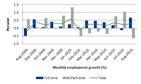
The following graph shows the month by month growth in full-time (blue columns), part-time (grey columns) and total employment (green line) over the last 12 months to August 2010 using seasonally adjusted data. The overall picture is mildly positive. The positive aspect is the apparent return to full-time employment growth after last month’s negative result.
In the more recent period, full-time employment growth has slowed and in July was negative for the first time in 11 months. All net employment creation in July was part-time.
The results for August 2010 if maintained are good but they only demonstrate that employment growth overall is stable around 0.3 percentage points. The important aspect of the August results is the relative strength of full-time employment.
But with the impacts of the fiscal stimulus slowing it is unclear whether private demand is sufficient to keep full-time employment growth moving at the pace demonstrated in August.
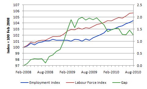
The following graph shows the movement in the labour force and total employment since the low-point unemployment rate month in the last cycle (February 2008). The two series are indexed to 100 at that month. The green line (right-axis) is the gap between the two aggregates and measures the change in the unemployment rate since the low-point of the last cycle (when it stood at 4 per cent).
The Gap series gives you a good impression of the asymmetry in unemployment rate responses even when the economy experiences a mild downturn (such as the case in Australia). The unemployment rate jumps quickly but declines slowly.
At present, employment growth is barely eating into the unemployment pool. In August 2010, employment growth was 0.3 per cent whereas the labour force grew by 0.1 per cent and so the unemployment rate fell by 0.2 percentage points.
So while the data is telling us that there is some labour market recovery underway we should be mindful of the fact that the fiscal stimulus is waning and private demand may not be strong enough to fill the gap.
Employment growth still going backwards for teenagers
While the bank economists are claiming all signs are good and the labour market is very strong across the board they clearly don’t care about the teenage labour market.
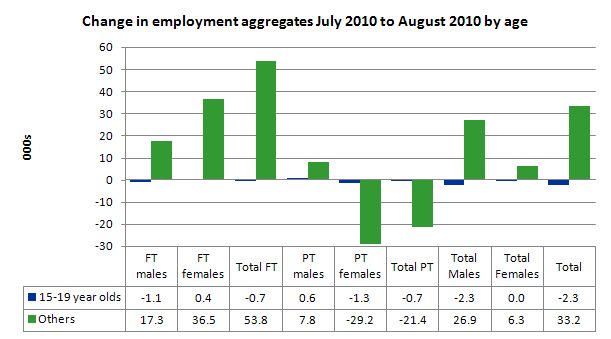
The following graph shows the distribution of net employment creation in the last month by full-time/part-time status and age category (15-19 year olds and the rest).
What you see is that teenage employment continues to decline. Despite the employment growth since the beginning of this year, teenagers overall have experienced declining employment as the jobs market has shrunk for them overall.
It is also notable that teenagers have not only not shared in this month’s full-time employment gains but have also lost part-time jobs.
If we consider their exposure to underemployment and the fact that total labour underutilisation rates are around 26 per cent for our teenagers (sum of unemployment and underemployment) then you wonder how the bank economists can keep saying the Australian economy is close to full employment.
It is clear that the modest recovery that has occurred in the Australian economy has not been beneficial to our youngest workers.
These workers are our future. We talk of the intergenerational demands on public spending and rising dependency ratios. But then we allow 26 odd percent of our future workers to remain idle and outside the skill development process. This waste ensures our future productivity growth will be lower than it otherwise could be.
Unemployment and broader labour underutilisation
The unemployment rate fell to 5.1 per cent in August 2010 (from 5.3 per cent in July). As I show later, half of that fall is attributable to the decline in the participation rate while the other half is due to the on-going employment growth.
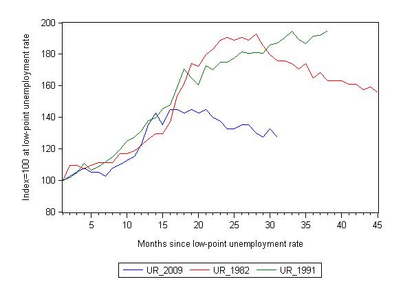
The following graph updates my 3-recessions graph which depicts how quickly the unemployment rose in Australia during each of the three major recessions in recent history: 1982, 1991 and now 2009 (the latter to capture the 2008-2010 episode). The unemployment rate was indexed at 100 at its lowest rate before the recession in each case (June 1981; November 1989; February 2008, respectively) and then indexed to that base for each of the months as the recession unfolded.
For 1991, the end-point shown is the peak unemployment which was achieved some 38 months after the downturn began.
For the other series, I have just charted the evolution for the 30-months in the current cycle (to July 2010 – the length of the current deterioration since February 2008). So it gives us a view of the way the 1982 recovery began too. While the 1982 recession was severe the economy and the labour market was recovering by the 26th month.
It is significant that the current situation while significantly less severe than the previous recessions is dragging on given the lack of private spending growth.
The graph provides a graphical depiction of the speed at which the recession unfolded (which tells you something about each episode) and the length of time that the labour market deteriorated (expressed in terms of the unemployment rate).
From the start of the downturn to the 31-month point (to August 2010 – the length of the current downturn since February 2008), the official unemployment rate has risen from a base index value of 100 to a value 127.5 – peaking at 145 after 21 months. At the same stage in 1991 the rise was 187.1 per cent (and increasing) and in 1982 175.6. The 1982 recession which was fairly severe ended at the 26-month point and the economy began a painful recovery after that month.
So the current downturn has been a very different type of episode relative to our previous experiences.
Note that these are index numbers and only tell us about the speed of decay rather than levels of unemployment. Clearly the 5.1 per cent at this stage of the downturn is lower that the unemployment rate was in the previous recessions at a comparable point in the cycle although we have to consider the broader measures of labour underutilisation (which include underemployment) before we draw any clear conclusions.
The underemployment data comes out quarterly and so the August quarter is the most up to date observation we have of the more general trends in the labour market. The reality is that underemployment is a much more serious issue than it was in the 1991 and 1982 recessions and so the proportional difference between total labour underutilisation now is much less than the proportional difference between the official unemployment rates.
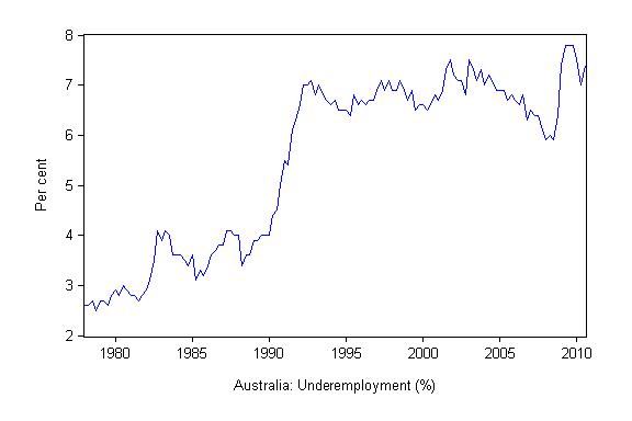
The following graph shows the evolution of underemployment (part-time workers who want more hours but are constrained by labour demand) since February 1978. You can see the jumps in the 1991 and recent downturns. The other notable point is the slow decline after the peaks as growth emerged. The recent jump pushed underemployment well above the peak of 1991 and the trend is for further increases in the coming months.
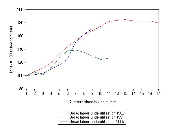
The next graph is the analogue to the 3-recessions unemployment graph above but instead tracks the total labour underutilisation rate (sum of unemployment and underemployment) for the respective downturns. It is self-explanatory.
What about the participation rate effects?
Last month, the participation rate rose by 0.2 percentage points and the unemployment rate rose whereas in August it fell back 0.1 percentage points as the unemployment rate fell.
The labour force is a subset of the working-age population (those above 15 years old). The proportion of the working-age population that constitutes the labour force is called the labour force participation rate. So changes in the labour force can impact on the official unemployment rate and so movements in the latter need to be intepreted carefully. A rising unemployment rate may not indicate a recessing economy.
The labour force can expand as a result of general population growth and/or increases in the labour force participation rates.
In July 2010, the rise in unemployment was essentially the result of an increasing labour force outstripping the very modest employment growth.
What about August 2010?
Employment rose by 30.9 thousand while the labour force rose by 8.4 thousand which allowed unemployment to fall by 22.5 thousand. However, the decline in unemployment due to employment growth was only equal to10 thousand with the other 12.5 thousand being attributable to the declining participation rate. So hidden unemployment went up by about 0.1 per cent.
If the participation rate had have remained at the July vaue (65.5 per cent) the unemployment rate would have been 5.2 per cent rather than 5.1 per cent.
So once again the situation is not “very strong across the board”.
Hours worked – declined for second consecutive month
The rebound in aggregate monthly hours worked in May gave way to two consecutive months of declines as a result of the dominance of part-time employment growth and the decline in full-time employment growth. In August, this pattern changed and working hours increased by 14.8 million hours (0.9 per cent) reversing the falls recorded in June and July 2010.
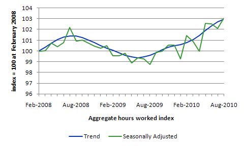
The following graph shows the trend and seasonally adjusted aggregate hours worked indexed to 100 at the peak in February 2008 (which was the low-point unemployment rate in the previous cycle).
You can see a very flat V-shaped recovery with a positive trend.
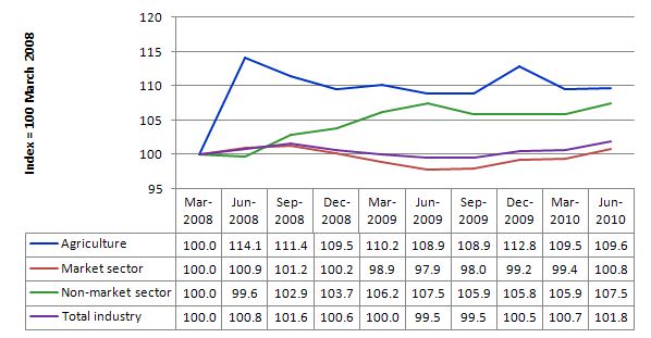
The following graph shows the evolution of hours worked by main industry sectors since the downturn began in the first quarter of 2008. The data shows categorically that the driving force in hours growth has been the non-market sector (dominated by the public sector) and agriculture (a small sector overall). The market sector (including the mining sector) is still not driving much growth at all.
Conclusion
While the business economists are hyping up the story that the Australian labour market is booming and close to full employment the labour market data continues to tell me that there is a lot of slack left to be mopped up. There is recovery but it is far from robust at this stage.
A rise in full-time employment as occurred in August is nothing to criticise but in the current quarter the broader labour underutilisation rate increased to 12.5 per cent with underemployment rising by 0.4 percentage points.
An economy with 12.5 per cent (at least) of its available labour resources and falling participation rates is not one that is reaching capacity constraints and likely to explode into an inflationary spiral any time soon.
Overall, employment growth is stable and positive but is not strong enough (in persons or hours) to put any serious dent in the labour wastage that the data records.
I see no inflationary pressures at presnt and I still advocate a further fiscal expansion that should be directly targeted at public sector job creation and the provision of skills development within a paid-work context. That would also be great boost to low inflation growth.
That is enough for today!
Has anybody from the functional finance/MMT side of the debate come up with an explanation of why the Philips curve failed during the 70s and caused stagflation.
That seems to be the catalyst for the rise of the monetarists and their idealised equations, and it will need to be explained before you can reverse that understanding.
A good place to start would be to augment the wikipedia entry to explain the development of thinking http://en.wikipedia.org/wiki/Phillips_curve
Bill. The other thing about today’s figures was that the number of employed persons in Queensland fell by more than 12,000 and the participation rate also fell sharply in this state. I don’t know if the legal industry is identified separately in the detailed data out next week but over the last couple of months that sector has boomed and now tops the list of job ads in Qld on the main job ads website. This is a very recent phenomenon and I’ve noticed ads for legal jobs are high in other states too. Don’t ask me why. But other than legal, IT, accounting, engineering and health and medical, which are the hot industry sectors for job ads, the rest of the labour market in Qld is very quiet. I was also chatting to a recruitment agency yesterday and they said that employers that used to hire temporary staff to cover leave a couple of years ago were now cross-training their existing staff to cover those absences and not hiring temps any more. I am not surprised that many unemployed Queenslanders would be giving up their jobsearch. Nearly all the employment growth in today’s numbers was in NSW and Victoria. I reckon this must have something to do with property markets down there leading to a feeling of greater prosperity and therefore confidence among people in those states. Either that or Qld and WA had their boom conditions in 2007 and now it is the turn of other states.
Neil: I am pro-MMT, but I don’t think the Phillips Curve “failed”. If PC advocates were saying there is some relationship between inflation and unemployment that is fixed for all time, that was a gross overstatement of their case, because there are clearly a whole string of factors influencing inflation and unemployment that almost cause the PC to get lost in the background noise.
By “factors” I’m referring to things like oil price shocks, and changes in social attitudes to work. For example in the 1950s most people had memories of the 1930s and where thus grateful for work. By the 1970s, living on benefits was almost socially acceptable.
On the other hand if Phillips & Co were simply saying OTHER THINGS BEING EQUAL there is an inverse relationship between inflation and unemployment, then I don’t think the PC has been disproved. In fact, the PC stated in the latter form is a statement of the obvious, seems to me.
David Hume writing 250 years ago noticed this inverse relationship. Search for the phrase “Accordingly we find…” at: http://socserv.mcmaster.ca/~econ/ugcm/3ll3/hume/money.txt
Having worked in this area for a few years, some points about labour market capacity constraints:
Mining per se is not a very large employer, but it is the related engineering/technical/trades occupations where the skill shortage problems arose during the pre-GFC boom. These higher-skill jobs take a long time to train for and cannot easily be filled by the available labour pool, such as youth. The growth in the workforce over the last decade was concentrated in bubble-fuelled construction,
Boom aside, the big and alarming drop in partioipation over the last few years has been in prime-age males (25-44) where there has been an epidemic of workers in physical jobs having to cease that kind of work and finding it difficult to retrain or move into different occupations.
So, on raw number it looks like we have plenty of capacity in labour, but in reality the workers are unable to fulfil a lot of the available jobs.
However I agree with the proposition that in these circumstances creation of public sector jobs is a good remedy. Current projections suggest that the main area of workfiorce growth over the next 10-15 years will be in health, aged, child care and eduction.
Dear Neil,
Neil,
Hyman Minsky in ‘Stabilising an Unstable Economy’ puts forward the following theory: the data Phillips’ used was collected in an institutional context of small government and moderate trade union power. By contrast, the welfare state is inflationary and trade union power somewhat larger (at least back in the 1970s/80s), so when output collapses (unemployment rises), the government’s aggressive fiscal expansion (mostly via transfer payments) creates inflation (i.e. income without any corresponding output). The inflation rate depends on 1) how much debt people have (more debt means income goes to paying down debt, rather than borrowing or consuming); 2) how fast and large the increase in transfer payments are spent; 3) the propensity to consume the payments (1970s mostly eldery and veterans, so high propensity to consume); 4) real resources available (capacity constraints).
The cause of stagflation was this: stag (collapse in the world-wide real estate bubble); flation (automatic stabilisers reasserting themselves to prevent a Depression, particularly via a dramatic rise in transfer payments, particularly in health and education).
There is motivation for the media trumpeting, other than sensationalism of lame news.
CBA is softening the public for an off cycle mortgage rate rise, probably to be followed by other banks. It’s less unpalatable to consumers if they feel the economy is strong. This will drag on consumer spending.
There is a disconnect between Captain Kirk and Scotty in the engine room.
Ralph, Spadj
Thanks for that. What I’m looking for is the counterpunches to the ‘functional finance: we tried that in the 70s and it caused stagflation’ line.
The Wikipedia entry has: “The long-run Phillips Curve was thus vertical, so there was no trade-off between inflation and unemployment. Edmund Phelps won the Nobel Prize in Economics in 2006 for this.” How do you counter that?
The list of economists that have not been awarded the Nobel prize is far more prestigous.
Neil: my answer is as follows. The idea that the Phillips Curve is vertical, i.e. inflation can become infinite is the sort of idea that academic time wasters mess around with in their ivory towers, at the taxpayer’s expense. The idea is irrelevant because governments (with the exception of the very occasional nutter like Mugabwe) become seriously concerned about inflation long before it becomes infinite. In fact they become concerned when it goes much above 3%.
Clearly there is SOME relationship between inflation and unemployment, but whether the Phillips curve or NAIRU or anything else is the right model is, for practical purposes, irrelevant.
Also, I don’t see that “the Phillips Curve is vertical” is a threat to functional finance/MMT as such (if that’s what you are saying). The main element in MMT, as I see it, is simply that governments should create money and spend it (depending on unemployment levels, inflation, etc) as opposed to borrowing money and spending it (a la Keynes). Those are just two alternative ways of regulating aggregate demand (indeed Keynes said as much). So if “Phillips Curve is vertical” is a threat to MMT, then it is also a threat to the basic way that aggregate demand has been regulated in recent decades, i.e. “borrow and spend”.