The Australian Bureau of Statistics (ABS) released the latest labour force data today (APRIL 16,…
Australian labour market slack rises sharply
The Australian Bureau of Statistics (ABS) released the Labour Force data for October 2010. As usual the bank economists got it wrong predicting the unemployment rate would drop to 5 per cent. In fact it rose from 5.1 per cent to 5.4 per cent because employment growth was too weak to match the expansion of the labour force. Further, employment growth fell this month and full-time employment declined. The only reason there was any employment growth was courtesy of the expansion of part-time employment. Finally, some of the bank economists recognised today (in their comments) that business conditions are easing. The previous rhetoric about an economy exploding at the seams now seems very wan indeed. There is no jobs boom going on at present. The mining states are showing deteriorating labour conditions (falling participation and rising unemployment). The data definitely doesn’t support the claims by the Government and the RBA that there is an inflation threat building. There is still plenty of slack in the Australian labour market and last month the degree of slack rose sharply.
The summary ABS Labour Force (seasonally adjusted) estimates for October 2010 are:
- Employment increased 29,700 (+0.3 per cent) with full-time employment falling increasing by 14,100 and part-time employment increasing by 43,800. So the reliance on part-time employment growth is not a sign that the minerals sector is causing a major tightening of the labour market.
- Unemployment increased 32,400 to 646,500 because employment growth failed to even match the labour force growth.
- The official unemployment rate rose sharply by 0.3 points to 5.4 per cent.
- The participation rate rose by 0.3 percentage points to 65.9 per cent and demonstrated that workers who had previously given up looking for work are now coming back into the labour force.
- Aggregate monthly hours worked increased 7.9 million hours (0.5 per cent).
- The quarterly underemployment estimates will not be released until November. The last data release for August, showed that underemployment was estimated to be 7.4 per cent and total labour underutilisation (computed by the ABS as the sum of underemployment and unemployment) was estimated to be 12.5 per cent. It is hard to draw any conclusion from today’s data about the direction of underemployment given the dominance of part-time employment growth but the rise in overall hours worked. It is safe to conclude that there will not have been any significant decline in underemployment.
ABC News Report carried the headlines – Jobless rate rises despite employment boost – which fails to mention how weak the employment boost was. The story reported several reactions from bank economists summarised here:
Employment growth is still very strong at around 3 per cent and it has held above that level for a number of months now … That’s pointing to a pretty tight labour market, even though we did have that big rise in the unemployment rate last month …
The RBA would look and say, ‘well that’s pretty good’. There’s no need to rush another rate hike through for example in December …
Business conditions have eased, probably reflecting slower consumer spending and the high exchange rate …
The breakdown was a little disappointing to the market given the fall in full-time jobs, but when it to comes to the big picture for Australia this data is great news … We’ve got historic highs for the participation rate which means employment can be stronger without leading to inflation.
So great news is now rising unemployment and falling employment growth!
The big picture is fine if you have both according to these characters.
But you also detect that the previous gung-ho the Australian labour market is bursting at the seams rhetoric is tapering (“business conditions have eased”; “breakdown was a little disappointing” etc).
The reality is that net employment growth was only possible this month because part-time employment increased (as full-time employment fell). The strained choruses that are repeatedly telling us that the mining boom is absorbing all available labour is not supported by this data.
First, mining does not offer much part-time work so if there was an out-of-control boom going on full-time employment growth would not be negative.
Second, if you breakdown the states you will see that the participation rate actually fell (from 69.1 to 68.1 percent) in the mining state of Western Australia while the unemployment rate rose by 0.1 points. So employment growth is not even keeping pace with underlying population growth in that state.
Similarly, for Queensland, another mining state, the participation rate actually fell (from 68.0 to 67.9 percent) while the unemployment rate rose by 0.2 points. Again, not a sign that the mining boom is over-heating the labour market.
So where does that story come from?
As usual, the bank economists predicted wrongly. They thought the unemployment rate would fall to 5 per cent (some said lower). But they are inflation-obsessed and do not understand that when there is some sign of growth the supply-side always bounces back.
The other word of caution before we jump to too many conclusions is that the ABS has changed “one of the assumptions used to create the population benchmarks underpinning the Labour Force Survey (LFS) estimates”. You can read up on the changes HERE. I am examining this issue further.
Employment growth falls and not strong enough to absorb the labour force growth
We have been hearing constantly about this once-in-a-hundred years mining boom that is meant to be depleting the labour market of its supply. The data release today does not support that view.
Normally if you see employment growth and labour force participation rate increases things are not bad. It means that people are coming into the labour market to take advantage of the improved job prospects. However, when the employment growth is totally driven by part-time work and unemployment rises sharply then the message is less salutary.
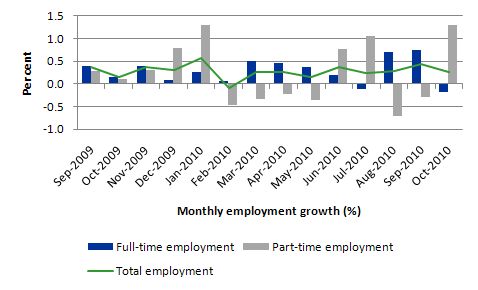
The following graph shows the month by month growth in full-time (blue columns), part-time (grey columns) and total employment (green line) from September 2009 to October 2010 using seasonally adjusted data. Total employment growth fell this month and remains fairly weak overall. The disturbing aspect is the negative growth in full-time employment.
So our “booming” economy is producing declining net employment growth and only adding jobs that are likely to be precarious and at the lower end of the hours-distribution.
The data shows also that employment growth has averaged around 0.3 per cent per month over the last 7 months. So there is no trend increase in employment growth which also signals that the recovery is not as strong as is being claimed.
Much more growth is needed if unemployment and underemployment are to fall significantly. At present, employment growth cannot even keep unemployment from rising.
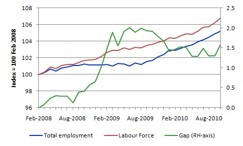
The following graph shows the movement in the labour force and total employment since the low-point unemployment rate month in the last cycle (February 2008) to October 2010. The two series are indexed to 100 at that month. The green line (right-axis) is the gap (plotted against the right-axis) between the two aggregates and measures the change in the unemployment rate since the low-point of the last cycle (when it stood at 4 per cent).
The Gap series gives you a good impression of the asymmetry in unemployment rate responses even when the economy experiences a mild downturn (such as the case in Australia). The unemployment rate jumps quickly but declines slowly.
It also highlights the fact that the recovery is now stalling as the fiscal stimulus wanes. The growth in exports (via the mining sector) is not strong enough to replace the fiscal effect.
At present, employment growth is not strong enough to reduce the unemployment pool (which has now risen for the second consecutive month). In October 2010, employment growth was 0.3 per cent whereas the labour force grew by 0.5 per cent and so the unemployment rate rose by 0.3 per cent when rounded off.
So while the data is telling us that there are jobs being created in net terms we should be mindful of the fact that the fiscal stimulus is waning and private demand may not be strong enough to fill the gap. That conclusion is clearly supported by today’s data release.
Employment growth for teenagersWe keep talking about the future challenges facing the nation in terms of an ageing population yet we systematically trash the potential of our teenagers who are our future workforce.
The teenage labour market continued to deteriorate in September with that cohort not even able to capture their share of part-time employment growth.
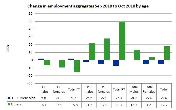
The following graph shows the distribution of net employment creation in the last month by full-time/part-time status and age category (15-19 year olds and the rest).
Teenage employment fell sharply in October with the notable result being that while part-time employment grew overall by 49.4 thousand, teenage part-time employment fell by 7.3 thousand. This area of employment growth is traditionally dominated by this age group (along with women).
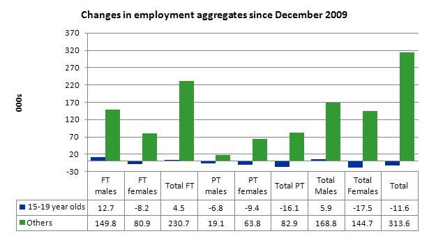
To put this month’s figures in perspective though, the following graph shows the change in aggregates since December 2009. There you see that in the recovery period of the last 11 months, teenagers have experienced declining employment as the jobs market has shrunk for them.
Teenage unemployment rates rose from 16.7 per cent in September 2010 to 17.6 per cent with participation also rising slightly.
If we consider their exposure to underemployment and the fact that total labour underutilisation rates are around 26 per cent for our teenagers (sum of unemployment and underemployment) then you realise there is still a lot of excess capacity that can be tapped via the creation of appropriate job/training slots.
At present, my summary is that the recovery that is occurring in the Australian economy is not providing enough opportunities for our youngest workers. These workers are our future. We talk of the intergenerational demands on public spending and rising dependency ratios. But then we allow 26 odd percent of our future workers to remain idle and outside the skill development process. This waste ensures our future productivity growth will be lower than it otherwise could be.
Unemployment
The unemployment rate rose sharply from 5.1 per cent to 5.4 per cent in October 2010 indicating that employment growth was not strong enough to outstrip the growth in the labour force participation rate.
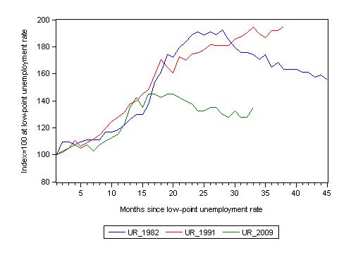
The following graph updates my 3-recessions graph which depicts how quickly the unemployment rose in Australia during each of the three major recessions in recent history: 1982, 1991 and 2009 (the latter to capture the 2008-2010 episode). The unemployment rate was indexed at 100 at its lowest rate before the recession in each case (June 1981; November 1989; February 2008, respectively) and then indexed to that base for each of the months as the recession unfolded.
For 1991, the end-point shown is the peak unemployment which was achieved some 38 months after the downturn began.
For the other series, I have just charted the evolution for the 33-months in the current cycle (to October 2010 – the length of the current deterioration since February 2008). So it gives us a view of the way the 1982 recovery began too. While the 1982 recession was severe the economy and the labour market was recovering by the 26th month.
It is significant that the current situation while significantly less severe than the previous recessions is dragging on given the lack of private spending growth.
The graph provides a graphical depiction of the speed at which the recession unfolded (which tells you something about each episode) and the length of time that the labour market deteriorated (expressed in terms of the unemployment rate).
From the start of the downturn to the 33-month point (to October 2010), the official unemployment rate has risen from a base index value of 100 to a value 135 – peaking at 145 after 21 months. At the same stage in 1991 the rise was 194.6 per cent (and increasing) and in 1982 174 (and falling). The 1982 recession which was fairly severe ended at the 26-month point and the economy began a painful recovery after that month.
So while the current downturn has been a very different type of episode relative to our previous experiences the trend in unemployment is far from being downwards.
Note that these are index numbers and only tell us about the speed of decay rather than levels of unemployment. Clearly the 5.4 per cent at this stage of the downturn is lower that the unemployment rate was in the previous recessions at a comparable point in the cycle although we have to consider the broader measures of labour underutilisation (which include underemployment) before we draw any clear conclusions.
The underemployment data comes out quarterly and so the August quarter is the most up to date observation we have of the more general trends in the labour market. The next release for the broad indicators is November 2010.
What about the participation rate effects?
The participation rate rose by 0.3 percentage points in October 2010 and unemployment rose significantly (32,100).
The labour force is a subset of the working-age population (those above 15 years old). The proportion of the working-age population that constitutes the labour force is called the labour force participation rate. So changes in the labour force can impact on the official unemployment rate and so movements in the latter need to be interpreted carefully. A rising unemployment rate may not indicate a recessing economy.
The labour force can expand as a result of general population growth and/or increases in the labour force participation rates.
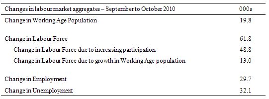
The following Table shows the breakdown in the changes to the main aggregates (Labour Force, Employment and Unemployment) and the impact of the rise in the participation rate.
In October 2010, employment rose by 29.7 thousand while the labour force rose by 61.8 thousand which meant that unemployment rose by 32.1 thousand. The impact of the rise in the participation rate on the rising labour force was equivalent to 48.8 thousand while the remainder of the labour force expansion (13 thousand) was the result of growth in the working age population.
So while employment growth was able to provide enough jobs to absorb the population growth component of the growth in the labour force, the participation rate component swamped the net jobs growth. The economy thus converted some hidden unemployment into actual unemployment.
If the participation rate had have remained at the September 2010 value then the unemployment rate would have dropped to 4.9 per cent.
Hours worked rose in October 2010
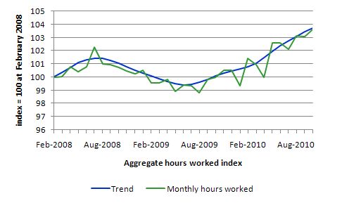
In October 2010, hours worked has risen by 0.5 points which is the bright sign emerging from today’s data release..
The following graph shows the trend and seasonally adjusted aggregate hours worked indexed to 100 at the peak in February 2008 (which was the low-point unemployment rate in the previous cycle).
You can see a very flat V-shaped recovery with a positive trend. But the labour market is hardly boiling.
Inflation pressures?
I dealt with arguments about rising inflation in yesterday’s blog – When does no evidence mean no evidence?. In Australia, with 12.5 per cent total labour underutilisation overall and employment growth failing to even match the growth of the labour force it is hard to make the case that the labour market is anywhere near full employment.
Despite this, all the bank economists and policy makers are warning that inflation is the big problem “as a mining boom spurs the economy and the labour market tightens” So I am constantly looking for the evidence of that.
More information came out today about inflationary pressures in Australia. New data came out today showing that inflationary expectations in Australia have experienced “a substantial fall” in the last month (median expectation from 3.8 per cent to 3.1 per cent).
An economy that cannot even produce employment growth to match the pace of the labour force growth, and the employment growth is dominated by part-time employment biased to the lower hours bands (away from full-time hours) is hardly tightening.
And such an economy is not one that produces rampant wage inflation. When will this inflation obsession which is cruelling a sensible policy approach to joblessness and underemployment going to end? What will end it? The Germans have been poisoned by it for 85 years! Mass psychotherapy is needed.
Conclusion
While the business economists have been hyping up the economy for months now claiming that the Australian labour market is close to full capacity and inflation is about to accelerate, the labour market data continues to tell me that growth is currently insufficient to cope with the supply-side growth as working age population continues to rise and the hidden unemployment come back into the labour force.
There is a lot of slack left to be mopped up and this month the slack increased (as it did last month). It is clear that private spending growth is not strong enough to support wider economic growth to ensure that employment growth at least keeps pace with labour force growth.
The fact that participation rates rose this month indicates that the hidden unemployed are seeing better chances for work and are coming back into the labour force.
That is a good sign.
What it also means is that the NAIRU-depiction of the labour market is flawed because new workers are coming back into the labour force from a previous state of inactivity.
The other worrying sign is the decline in full-time employment and a slowing overall employment growth rate. With unemployment rising again and underemployment remaining high (total of the two being 12.8 per cent or so) the data tells me that we are not reaching capacity constraints and likely to explode into an inflationary spiral any time soon.
Digression: our milk-maid Prime Minister
I recall listening to ABC Radio National a few years ago and they were interviewing some US academic who was about to come to Australia for a lecture tour on his special area (which was in the human sciences). The month was May and it was mid-May to be more precise (for reasons to follow). At some point towards the end of the interview when the they were rapping it up with pleasantries, the US academic asked: “By the way, what month is it down there?” It was hysterical.
It matched my then-best US isolation story which went back to the mid-1990s. I was living in California at the time (working at a University there for some months) and it was at the time that the Srebrenica massacre was unfolding. The story captured headlines and major press attention all around the world except for the US. A small reference to it appeared on about page 5 of the San Francisco newspaper (I think it was the Examiner but it could have been the Chronicle) and the front page carried a headline story which had a headline like “Policeman rescues cat from tree in Oakland” (I cannot remember exactly what the local story was). That was hysterical for someone who lives in a small nation located a long way from anywhere else but which is totally plugged into the developments around the World.
But not only citizens in the US seem to struggle with being part of the world! The Koreans perhaps have become confused by George Bush releasing his book. Recall that at the APEC meeting in 2007, the former US President thanked our former Prime Minister for supplying the “visiting Austrian troops to Iraq”. Bush also said to Howard at a pre-APEC function in Sydney:
Mr Prime Minister, thank you for your introduction. Thank you for being such a fine host for the OPEC summit.
Australia is not a member of OPEC and was hosting the APEC summit and has never supplied Austrian troops.
So the latest laugh comes from the G-20 Summit in Seoul where the organisers have constructed our Prime Minister as an Austrian milkmaid.
The organisers of the G-20 world summit represented all the participating leaders as decorations on a “wedding cake structure” – replete with national flag and national dress. We woke to our PM dressed in a dirndl costume looking like an “Austrian milkmaid”
The news story said the depiction was:
… part Thunderbirds and part Team America – the movie hit written by the South Park creators that featured a marionette of North Korean despot Kim Jong-il throwing former UN weapons inspector Hans Blix into a tank of sharks.
Here is a photo of our glorious “Austrian” Prime Minister:
And another photo of the whole cake!
So all US and Korean readers – please go to Google Maps and locate Newcastle, Australia which is a good place to start learning about the place. Then work out that when it is November here is it November there (apart from nuances around the end of each month and the date line) and finally realise we are not responsible for what the Austrian army does!
That is enough for today!

Aha. Major confusion everywhere. When I was living in the States and answered the question where are you from with Austria I normally ended up with remarks about the excessive proliferation of kangaroos in Austria. Why anybody would refer to the Austrian army is beyond me. It’s practically non-existent given that Austria has only 8 million residents. Some poor guys watching the border to the East so that the government can brag about being tough on immigration to comfort the xenophobe part of the citizenry.
Me thinks Julia Gillard looks pretty hot in a Dirndl. She should wear it more often! And you are lucky. Imagine Tony Abbott in a Lederhosn on a cake. That would be a real embarrassment.
You guys should be greeting Korean visitors in your best lederhosen. Don’t want to confuse them.
Fearless Glen is driving the (Austrian) economy, peering through the rear view mirror as he approaches a right hand bend. His steering equipment is 2 pieces of thick rubber band tied to the wheels. His economic co-drivers have just announced a sharp left hander ahead. It’s not going to be a pleasant result.
Although they have not said it, they seem hell bent on turning the housing market with higher interest rates. The banks were too eager to remove exit fees and put up rates. Are they hinting they are happy to offload stressed mortgage customers onto other banks.
Let me interupt this blog cast with the most stunning news item we have heard so far in the 21st century.
http://www.guardian.co.uk/film/2010/nov/11/dick-van-dyke-porpoises-rescue
I am still dizzy.
Hi Bill,
Most of your economic analysis concerns USA or UK.
I would be glad if you could shed some light on the economy’s of our neighbour Indonesia and our major trading partner China.
Given that US and EU are going to go downhill with respect to Asia in the coming years (decades) I would be interested in your commentry on the Asian economy.
Cheers,
Sriram
Sriram “would be glad if you could shed some light on the economy’s of our neighbour Indonesia”-
-I was thinking when I read “a small nation located a long way from anywhere else” that Australia wasn’t all that far from the 4th largest nation or whatever Indonesia is.
There’s a lot of obfuscation with un/der/employment/participation stats.
Surely it’s better to give a block graph as % of the whole population with minors and retired at bottom and top, employed, on ‘job seeker’ benefits and non labour market participants as a whole in terms of Fullly Employed Equivalents?