Today (June 3, 2026), the Australian Bureau of Statistics (ABS) released the latest - Australian…
Australian National Accounts – growth rate picks up on back of government spending support
Today (December 4, 2024), the Australian Bureau of Statistics released the latest – Australian National Accounts: National Income, Expenditure and Product, December 2024 – which shows that the Australian economy grew by just 0.6 per cent in the December-quarter 2024 and by just 1.3 per cent over the 12 months (up from 0.6 per cent). GDP per capita also reversed its sequence of negative results as output growth outpaced the underlying population growth. The only source of expenditure keeping GDP growth positive is coming from government – both recurrent and investment. The largest component of national expenditure – household consumption spending – returned to a positive contribution as did business investment and net exports. But the fact remains that non-government spending is still relatively weak and it is public spending that is keeping the economy from near recession growth rates.
The main features of the National Accounts release for the December-quarter 2024 were (seasonally adjusted):
- Real GDP increased by 0.6 per cent for the quarter (0.3 per cent last quarter). The annual growth rate was 1.3 per cent (0.6 last quarter).
- GDP per capita rose by 0.1 per cent for the quarter, end 7 consecutive quarters of contraction. Over the year, the measure was down 0.7 per cent – signalling declining average income.
- Australia’s Terms of Trade rose 1.7 per cent for the quarter but were down by 4.8 per cent over the 12 month period.
- Real net national disposable income, which is a broader measure of change in national economic well-being, rose by 0.7 per cent for the quarter and was flat over the 12 months.
- The Household saving ratio (from disposable income) rose to 3.8 per cent (from 3.6).
Overall growth picture – growth continues at much slower rate
The ABS – Media Release – said that:
Australian gross domestic product (GDP) rose 0.6 per cent in the December quarter 2024 and 1.3 per cent through the year …
Modest growth was seen broadly across the economy this quarter. Both public and private spending contributed to the growth, supported by a rise in exports of goods and services …
GDP per capita grew 0.1 per cent this quarter following seven consecutive quarters of falls …
Household spending was up 0.4 per cent in the December quarter after a flat result in the September quarter …
Growth in government spending moderated to 0.7 per cent in the December quarter following larger rises in previous quarters …
Private investment rose 0.3 per cent in the December quarter …
Public investment rose 1.8 per cent …
Trade in services contributed to GDP growth, driven by the rise in exports of services …
The household savings ratio rose modestly to 3.8 per cent in the December quarter, up from 3.6 per cent in the September quarter.
The short story:
1. The weakness in private domestic demand continued although household consumption expenditure and business investment returned modest positive contributions to growth in this quarter.
2. Net exports returned an increasing positive contribution.
3. The ABS said that “Government spending continues to support demand” with state and local levels “hiring across the Health, Education, Policing, and Environment agencies.” Public spending continued to grow (+1.8 per cent) with state and local levels spending on “major transport, water and renewable projects”.
4. The long sequence of negative growth in GDP per capita ended signifying the overall growth was more rapid than the underlying population growth, the latter has been running at record levels.
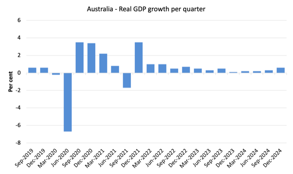
The first graph shows the quarterly growth over the last five years.
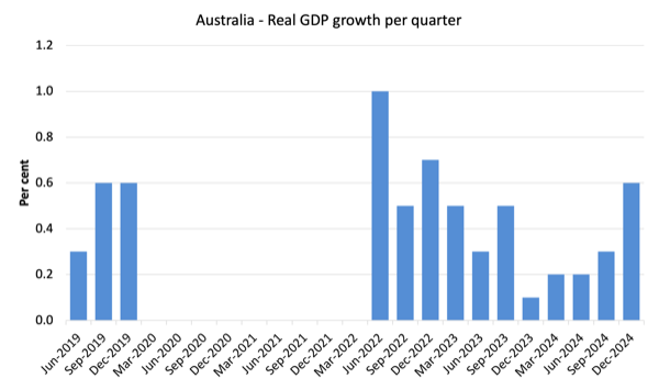
Here is the same graph with the extreme observations during the worst part of the COVID restrictions and government income support taken out.
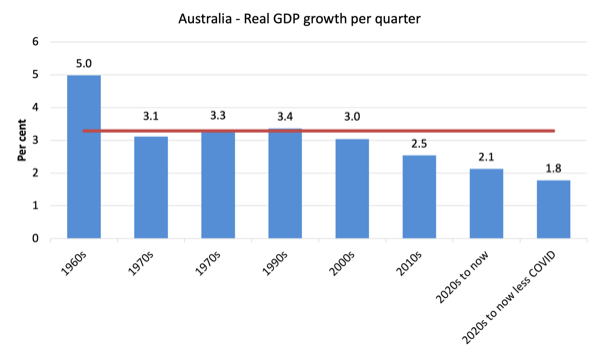
To put this into historical context, the next graph shows the decade average annual real GDP growth rate since the 1960s (the horizontal red line is the average for the entire period (3.29 per cent) from the March-quarter 1960 to the December-quarter 2024).
The 2020-to-now average has been dominated by the pandemic.
But as the previous graph shows, the period after the major health restrictions were lifted generated lower growth compared to the period when the restrictions were in place.
If we take the observations between the December-quarter 2020 and the December-quarter 2022 out, then the average since 2020 has been 1.8 per cent per annum.
It is also obvious how far below historical trends the growth performance of the last 2 decades have been as the fiscal surplus obsession has intensified on both sides of politics.
Even with a massive household credit binge and a once-in-a-hundred-years mining boom that was pushed by stratospheric movements in our terms of trade, our real GDP growth has declined substantially below the long-term performance.
The 1960s was the last decade where government maintained true full employment.
A GDP per capita recession – perhaps over
Up until the December-quarter 2024, GDP per capita had fallen for the 7th consecutive quarters, which means that total output averaged out over the entire population was in contraction.
The meaning of the average is questionable, given the highly skewed income distribution towards the top end.
Given that, if the average is declining, then those at the bottom are doing it very tough indeed.
In the December-quarter 2024, the sequence of contraction was arrested and GDP per capita rose by 0.10 per cent.
The following graph of real GDP per capita (which omits the pandemic restriction quarters between December-quarter 2020 and December-quarter 2021) tells the story.

Analysis of Expenditure Components
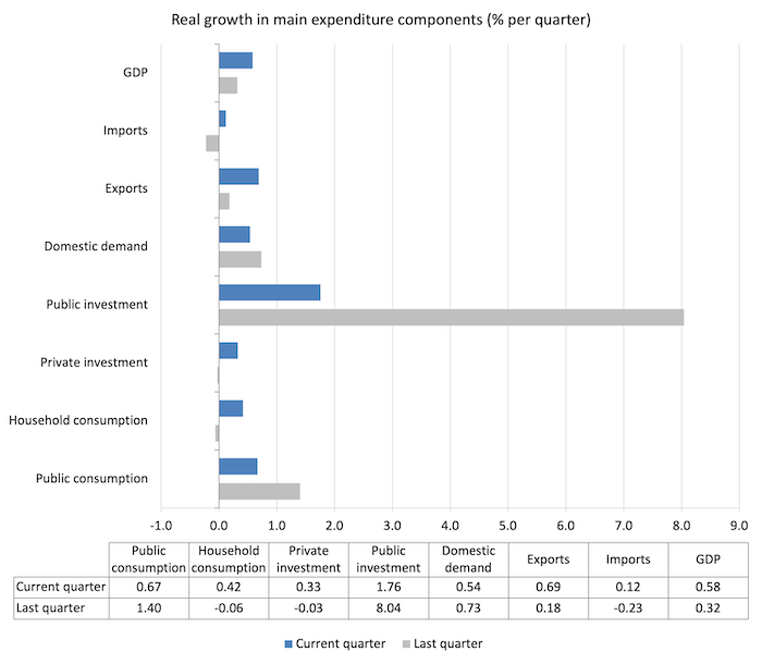
The following graph shows the quarterly percentage growth for the major expenditure components in real terms for the September-quarter 2024 (grey bars) and the December-quarter 2024 (blue bars).
While public expenditure still is robust and private spending weak, the latter did show some signs of recovery with household consumption expenditure growing by 0.4 per cent and private capital formation growing by 0.33 per cent.
Modest but perhaps a sign of improvements into 2025.
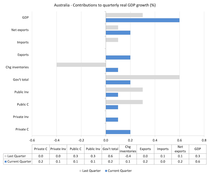
Contributions to growth
What components of expenditure added to and subtracted from the change in real GDP growth in the December-quarter 2024?
The following bar graph shows the contributions to real GDP growth (in percentage points) for the main expenditure categories. It compares the December-quarter 2024 contributions (blue bars) with the previous quarter (gray bars).
1. Net exports added 0.2 points to growth up from 0.1 points.
2. Household consumption (0.2 points) and private investment (0.1 point) returned positive contributions after recording zero contributions in the last quarter.
3. While the government contribution declined it still represented a third of the overall growth rate.
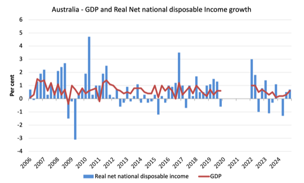
Material living standards rose in December-quarter but was flat for the year overall
The ABS tell us that:
A broader measure of change in national economic well-being is Real net national disposable income. This measure adjusts the volume measure of GDP for the Terms of trade effect, Real net incomes from overseas and Consumption of fixed capital.
While real GDP growth (that is, total output produced in volume terms) rose by 0.6 per cent in the December-quarter, real net national disposable income growth rose by 0.7 per cent.
How do we explain that?
Answer: The terms of trade improved in the December-quarter and compensation of employees (COE) increased per cent.
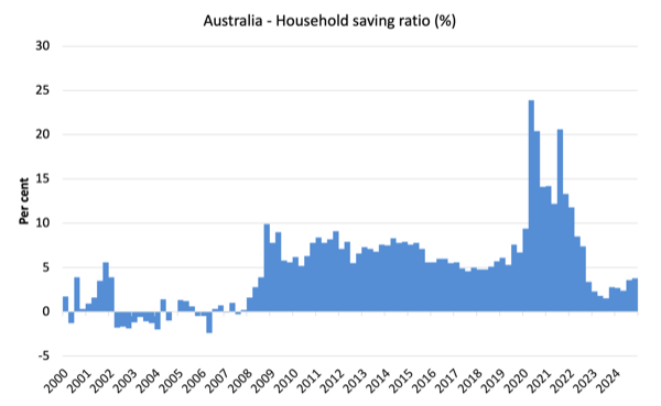
Household saving ratio rose 0.2 points to 3.8 per cent
The RBA has been trying to wipe out the household saving buffers as it hiked interest rates hoping that this would reduce the likelihood of recession.
Of course, that process has attacked the lower-end of the wealth and income distribution, given the rising interest rates have poured millions into those with interest-rate sensitive financial assets.
The following graph shows the household saving ratio (% of disposable income) from the December-quarter 2000 to the current period.
It shows the period leading up to the GFC, where the credit binge was in full swing and the saving ratio was negative to the rise during the GFC and then the most recent rise.
An increasing saving ratio provides the household sector overall with an increased capacity to risk manage in the face of uncertainty.
The next graph shows the saving ratio since 1960, which illustrates the way in which the neoliberal period has squeezed household saving.
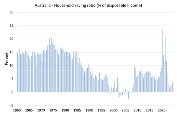
Going back to the pre-GFC period, the household saving ratio was negative and consumption growth was maintained by increasing debt – which is an unsustainable strategy given that household debt is so high.
Even though the ratio has been rising slightly in recent quarters, it is still well below past levels.
The following table shows the impact of the neoliberal era on household saving. These patterns are replicated around the world and expose our economies to the threat of financial crises much more than in pre-neoliberal decades.
The result for the current decade (2020-) is the average from June 2020.
| Decade | Average Household Saving Ratio (% of disposable income) |
| 1960s | 14.4 |
| 1970s | 16.2 |
| 1980s | 11.9 |
| 1990s | 5.0 |
| 2000s | 1.4 |
| 2010s | 6.6 |
| 2020s on | 9.6 |
| Since RBA hikes | 3.2 |
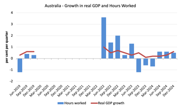
Real GDP growth rose but hours worked rose more and productivity growth declined
Real GDP rose 0.6 points in the quarter, while working hours rose by 0.5 per cent.
Which means that GDP per hour should have risen.
However, the data shows that GDP per hour worked fell by 0.1 point for the quarter – that is, a decrease in labour productivity.
I expect some revision in that data in the next release.
Over the last 12 months, productivity growth averaged -1.2 per cent on the back of weaker output growth and stronger hours growth.
The following graph presents quarterly growth rates in real GDP and hours worked using the National Accounts data for the last five years to the December-quarter 2024.
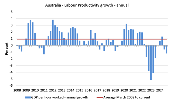
To see the above graph from a different perspective, the next graph shows the annual growth in GDP per hour worked (labour productivity) from the December-quarter 2008 quarter to the December-quarter 2024.
The horizontal red line is the average annual growth since the March-quarter 2008 (0.84 per cent), which itself is an understated measure of the long-term trend growth of around 1.5 per cent per annum.
The relatively strong growth in labour productivity in 2012 and the mostly above average growth in 2013 and 2014 helps explain why employment growth was lagging given the real GDP growth. Growth in labour productivity means that for each output level less labour is required.
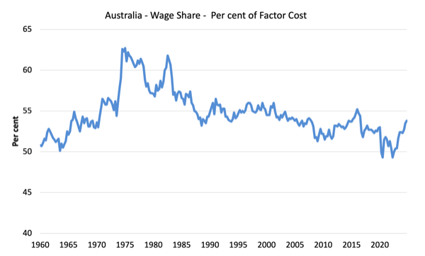
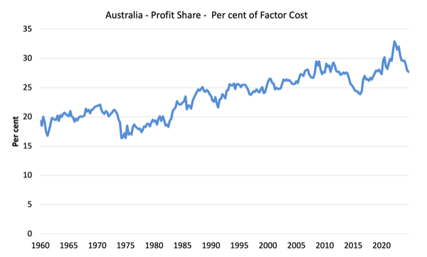
The distribution of national income – wage share slight rise
The wage share in national income rose to 53.8 per cent (up 0.3 points) while the profit share fell to 27.7 per cent (down 0.2 points).
The difference is the shift in the government share.
The first graph shows the wage share in national income while the second shows the profit share.
The declining share of wages historically is a product of neoliberalism and will ultimately have to be reversed if Australia is to enjoy sustainable rises in standards of living without record levels of household debt being relied on for consumption growth.
Conclusion
Remember that the National Accounts data is three months old – a rear-vision view – of what has passed and to use it to predict future trends is not straightforward.
So in the December-quarter, the growth in the Australian economy picked up – 0.6 per cent compared to 0.3 per cent last quarter.
GDP per capita also reversed its sequence of negative results as output growth outpaced the underlying population growth.
The only source of expenditure keeping GDP growth positive is coming from government – both recurrent and investment.
The largest component of national expenditure – household consumption spending – returned to a positive contribution as did business investment and net exports.
But the fact remains that non-government spending is still relatively weak and it is public spending that is keeping the economy from near recession growth rates.
Clarification on terminology
I advocated a degrowth strategy for the global economy overall given that our footprint is 1.7 times the capacity of the biosphere to regenerate.
To achieve that strategy, given that many poorer nations must continue to grow, will require rather substantial cut backs in spending and consumption in the richer nations.
When I analyse the National Accounts data or any expenditure/output data, I write as if growth is ‘good’.
But that terminology is used in the context that without economic growth and without any substantial shifts in income distribution and government transition policies, trying to pursue a recessionary strategy would damage the weakest members of our society disproportionately.
In some respects, I am abstracting from the damaging reality of our ecological footprint.
That is enough for today!
(c) Copyright 2025 William Mitchell. All Rights Reserved.
Surely I’m not alone in sensing that MMT is losing the battle of ideas. Everyone who is not a teacher or student of it seems to have bought the propaganda, the concocted counter-narrative, that MMT means simply the printing and spending of money so promiscuously that roaring inflation results. Even fiat money itself is now under widespread attack and is also being blamed for inherently causing inflation. The popular take, all over the internet, can be summarized in the formula that “fiat money plus MMT equals economic collapse.” Do MMT economists grasp how precarious their discipline, despite all its hard-earned wisdom, has become, how close it is to being consigned to the dustbin of history? Are they coming together and rallying their beleaguered troops to come off the ropes punching and make the strongest possible comeback, or are they merely fiddling around with this or that academic paper on this or that abstruse topic as MMT crashes and burns? These remarks are not addressed to Bill, of course, who, brilliant as he is, doesn’t know the meaning of the word “quit.”
Why do politicians, economists and commentators lie and mislead, Newton? Probably b/c they don’t want the public to know how the financial CICG system actually works. Personally I think MMT – modern monetary theory as a term is obsolete. It’s been around for what? Three decades?
That isn’t ‘modern’ it’s ancient history and it’s been traduced and misrepresented ever since it emerged. Magic Money Tree is something that most people understand now. And in a way, that’s exactly what currency issuing governments have exploited ever since Bretton.
What is lacking and represents our greatest failure is to have the sagacious imagination to use the digital currencies for the good of mankind – rather than rewarding a corrupt, criminal exercise and a very elite top table. MMT’s failure was not taking its discovery and creating a vision of universal collaboration, trust and equality in a new economic paradigm. To challenge the orthodox you must first create its nemesis.