In the 1990s, a new industry was created in Australia. It produced nothing. But it…
Latest US quits behaviour signals possible shift in power to workers
The US Bureau of Labor Statistics published the latest JOLTs data last week (October 12, 2021) – Job Openings and Labor Turnover Summary – August 2021 – which has raised a possible shift in bargaining power in the US labour market towards workers. The most obvious sign of that is the rising quit rates, which are most prevalent in the low-wage sectors. While there is still some slack in the US labour market, the evidence suggests that workers are taking advantage of the improved job opportunities to pursue better wages and conditions. We will have to wait and see whether there are any significant wage outcomes arising from this behaviour or whether workers are just jumping from very bad to bad jobs. Time will tell.
JOLTS data summary for August 2021
The BLS reported that:
The number of job openings declined to 10.4 million on the last business day of August following a series high in July, the U.S …
Hires decreased to 6.3 million while total separations were little changed at 6.0 million …
Within separations, the quits rate increased to a series high of 2.9 percent while the layoffs and discharges rate was little changed at 0.9 percent.
So job openings (effectively unfilled vacancies) fell from a peak in July, hiring decreased but the quit rate rose to record levels.
Quit rates are strongly pro-cyclical, which means they rise when times are good and fall at other times when jobs are hard to find and the fear of unemployment is rising.
Why are workers quitting at record rates, while job openings and hires are decreasing?
The quit rate is booming – what does it tell us?
The quit rate was at the highest level since the BLS started publishing the JOLTS data in January 2000.
The August 2021 result marks six consecutive months of substantial growth in quits.
The BLS note that:
Quits are generally voluntary separations initiated by the employee. Therefore, the quits rate can serve as a measure of workers’ willingness or ability to leave jobs.
And as we saw, the job openings rate has risen sharply without much impact on the official unemployment rate.
Why are the unemployed not taking up the job offers, while those in employment are quitting at record rates?
There is a sense that the pandemic has shaken things up.
All the uncertainty of 2020 combined with years of suppressed wages growth may be giving way to a new sense of boldness among workers who are now demanding better deals from the employers.
For years, the employers were able to dominate bargaining because of elevated levels of labour underutilisation but the situation is probably changing now.
That employer dominance has been reinforced by the prevalence of low-wage employment which have narrow vertical job clusters (no career prospects), which reduce the sense attachment that employers have with their employers and alter the economic consequences of turnover.
Workers in deep job clusters, with strong internal labour market advancement prospects, have economic incentives to remain with their employers even in good times to ensure they enjoy the promotions over time.
There is also evidence that the US child care system is in crisis due to a lack of funding which makes marginal work less attractive for female workers and makes it harder for centres to attract early childhood staff who are qualified. This is one of the casualties of the austerity mindset that has dominated governments over the last few decades (notwithstanding the surge in funding during the GFC and the pandemic).
For more information on this issue, see Columbia University article (July 14, 2021) – The Childcare Crisis Is a Threat to Our Nation .
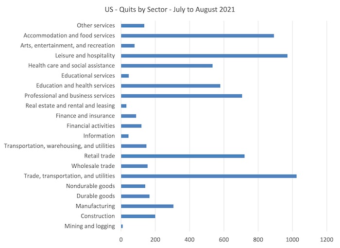
Where are the quits coming from?
The following graph shows the quits in August 2021 by industrial sector.
The low-wage sectors dominate – Accommodation and food services; Trade, transportation and utilities, and Leisure and Hospitality. Health care and social assistance – at the forefront of the stress created by the pandemic – also saw high quits.
The behaviour of the quit rate typically allows us to judge whether the decline in the unemployment rate is being mostly driven by demand-side or supply-side forces.
Mainstream textbooks claim that the dynamics of unemployment are dominated by supply-side movements as workers exert their free choices between labour and leisure.
I discuss the mainstream framework in this regard in detail in this blog post – US labour market in peril as a result of political choices made by the US government (May 18, 2020).
Essentially, the quit rate is constructed as being countercyclical – that is, rise when the economy is in decline and vice-versa – despite all evidence to the contrary.
One such text book story is that the economic cycle swings are characterised by swings in voluntary unemployment. So a downturn in employment (and a rise in unemployment) arises – allegedly – because workers develop a renewed preference for more leisure and less work and the supply of labour at each real wage level thus moves inwards (that is, workers are now less willing to supply the same hours of labour as before at the going real wage).
So the quits rise as unemployment rises.
The simplest fact then, which would give support to this notion of supply-side shifts, is whether the quit rate is, indeed, counter-cyclical – as the theory predicts. That is, does the quit rate rise when the unemployment rate rises or not. Simple enough.
The problem is that this attempt to explain our reality bears no relation to reality.
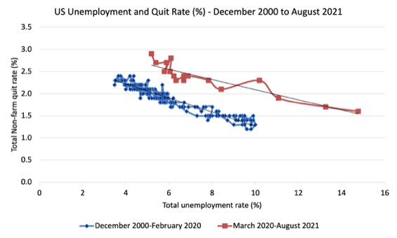
The following graph shows in a compelling way that the quit rate (non-farm quits as a percent of total non-farm employment) behaves in a cyclical fashion as we would expect – that is, it rises when times are good and falls when times are bad.
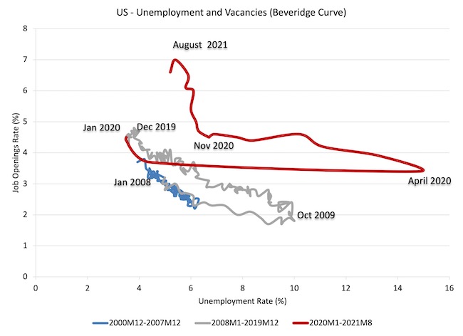
The graph relates the quit rate (vertical axis) to the unemployment rate (horizontal axis). The straight lines are simple linear regression trend drawn through the relevant observations.
I have drawn this graph in two time segments – December 2000 to February 2020 (blue markers) and March 2020 to August 2021 (red markers).
Clearly the pandemic caused the relationship to be displaced and in the recent months that displacement may head vertically rather than horizontally.
But what is evident and beyond dispute is that when the unemployment rate rises, the quit rate falls.
This is exactly the opposite to that predicted by the supply-side story which means that their claim that causality runs from unemployment benefits to higher quits to higher unemployment is unsustainable.
Workers become very cautious when unemployment starts to rise and postpone any desired or planned job changes and opt for the security of their present job.
When there are more jobs being created and the hiring rate rises, workers then take more risks and the quit rate tends to rise.
This also helps us understand why the unemployment-job vacancies graph (above) shifted upwards during the recession and then stabilised as the economy grew again. Remember, that firms were adjusting hours more quickly than persons.
The following graph shows the total number of unemployed per job opening (non-farm and seasonally adjusted) and thus gives a measure of how strong the demand-side of the labour market (job openings) is relative to the number of people seeking work (the unemployed).
It is an alternative way of presenting the relationships between unemployment and vacancies.
The shaded area indicates the NBER recession months.
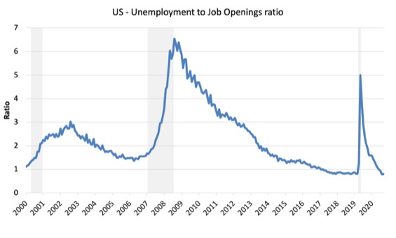
In February 2020, the ratio stood at 0.8 (the lowest in the post-GFC period), while the March 2020 ratio was recorded at 1.2. A very sharp increase.
The ratio in August 2021 was back to 0.8.
The interesting observation is that the pandemic caused a rapid rise in the ratio and an equally rapid decline – which is just a consequence of the recession being driven by the lockdown.
Labour markets typically behave over the economic cycle in an asymmetric manner as can be seen from the graph where a sharp deterioration is followed by a much slower recovery as employment growth not only has to absorb new labour force entrants (arising from population growth) but also has to face the huge pool of unemployed that is caused by the recession.
One of the facts I repeat often is that the unemployed cannot search for jobs that are not there! This is exactly what happens when aggregate demand falls and job openings dry up.
Another way of seeing how the job flows tell us about the direction of change is to compare movements in hires and separations. The following graph shows this relationship for the US economy as published by the BLS for the period from December 2000 to August 2021.
While labour markets are clearly dynamic in the sense that even in a downturn new jobs are being continually created and destroyed the rates of each dynamic change in a cyclical way. So while there were new jobs being created at the height of the downturn there was a severe shortfall of new jobs emerging as is shown in the graph.
Separations also fall for reasons noted above. The difference between hires and separations is the net change in employment in each month. If hires outstrip separations, employment grows and vice versa.
The most recent data shows that while there was massive disruption in the early months of the pandemic, the relationship between the two has reemerged.
Whether the rising separations and the falling hires in August 2021 indicate that this relationship is breaking is not yet known.

And finally, the next graph plots the quit and hire rates for the US. They are going in the same direction, which confounds the mainstream narrative.
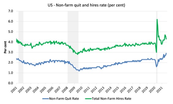
All the evidence supports the conclusion that deficient demand not only increases unemployment in the downturn but also pushes people out of the labour force as they give up actively looking for work that is not there. These hidden unemployed workers re-enter the labour force as the probability of getting a job (in their mind) increases.
The current data also suggests that the previous dominant position held by employers due to elevated levels of labour underutilisation is diminishing and workers are quitting jobs at higher than normal rates presumably to get better pay and conditions.
The fact that the unemployment rate is not rising, participation is fairly stable and the employment-to-population ratio has risen modestly suggests that the quits are not giving up and leaving the labour force.
They are moving from job to job.
U-V curve analysis
How does this fit in with the hiring and firing data available from the – US JOLTS database – supplied by the BLS.
The JOLTS data allows us to distinguish whether ‘supply-side’ movements are driving the shifts in unemployment (that is, actions by workers) or whether ‘demand-side’ factors are more influential.
In general, the JOLTS database usually always shows that it is the number of jobs on offer and the growth of employment that is the dominant force.
To start the discussion, it is useful to look at the US version of the Unemployment to Vacancies curve (where vacancies are the Total Non-Farm Job Openings as a percent of the Labour Force).
The following graph shows three distinct periods:
1. December 2000 to December 2007 (the JOLTS database started in December 2000).
2. January 2008 to December 2019 – so the GFC downturn and drawn out recovery (of sorts).
3. January 2020 to August 2021 – the COVID-19 cycle.
The three periods graphed cover the entire span of the JOLTS data.
Refer to the blog post – Latest Australian vacancy data – its all down to deficient demand (July 2, 2013)- for a conceptual discussion about how to interpret this framework in terms of movements along curves and shifts in relationships.
Summarising, the UV (or Beveridge) curve shows the unemployment-vacancy (UV) relationship, which plots the unemployment rate on the horizontal axis and the vacancy rate on the vertical axis to investigate these sorts of questions.
Mainstream economists interpret movements along the curve as being cyclical events and shifts in the curve as structural events.
So, in that framework, a movement ‘down along the curve’ to the south-east suggests a decline in the number of jobs available due to an aggregate demand failure, while a movement ‘up along the curve’ indicates improved aggregate demand and lower unemployment.
If unemployment rises in an economy where there are movements along the UV curve it is referred to as “Keynesian” or “cyclical” unemployment – that is, arising from a deficiency in aggregate demand.
The mainstream economics literature claims that ‘shifts in the curve’ – (out/in) – indicate non-cyclical (structural) factors (more efficient/less efficient) are causing the rising (falling) unemployment.
Allegedly, the UV curve shifts out because the labour market was becoming less efficient in matching labour supply and labour demand and vice versa for shifts inwards.
The factors that allegedly ’cause’ increasing inefficiency are the usual neo-liberal targets – the provision of income assistance to the unemployed (dole); other welfare payments, trade unions, minimum wages, changing preferences of the workers (poor attitudes to work, laziness, preference for leisure, etc).
Using this logic in the 1970s, when the shifts were first noticed, mainstream economists argued that the Non-Accelerating-Inflation-Rate-of-Unemployment (NAIRU) had risen and that ‘Keynesian’ attempts at reducing unemployment through the use of expansionary fiscal policy would only cause inflation.
They argued that structural policies were needed, which marked the beginning of the neoliberal activation program and the attacks on trade unions etc.
Micro policies like cutting unemployment benefits and/or making it harder to get and remain on benefits became the norm.
The pernicious work test mentality entered the fray.
Industrial relations legislation in many nations made it hard for trade unions to prosecute successful wage claims and minimum wage adjustments stalled or were weak.
The problem was that the evidence used to justify all this was wrongly interpreted.
The shifts in the U-V curve had nothing to do with microeconomic or structural factors.
As is the case in most advanced countries, the shift in the US curve occurred during a major demand-side recession – that is, it has been driven by cyclical downturns (macroeconomic events) rather than any autonomous supply-side shifts.
Once the economy resumed growth the unemployment rate fell more or less in line with the new job openings rate – tracing the grey line up to the north-west of the graph.
We can see that through 2019, as the labour market was tightening and unemployment was reaching levels not seen since the late 1960s, that the UV curve was starting to shift south again.
However, the emergence of the current crisis in March 2020 pushed the curve out – there has never been such a sudden shift in a U-V curve anywhere like this.
And, when things start settling down again, we will see that curve start shifting in again.
All due to cyclical factors that fiscal policy changes can influence.
The striking feature of the current phase in the US U-V curve is the vertical shift since the end of last year compared to the almost horizontal shift during 2020, as the pandemic hit.
The horizontal shift was about the lockdowns – and unemployment rose and fell without very much happening on the demand-side (job openings).
Over the course of this year though, the situation has shifted with strong growth in job openings being associated with very small improvements in the unemployment rate.
Further labour demand and supply analysis
I have previously discussed the drop in labour force participation in the US since 2000.
See the most recent blog post on this topic – Updating the impact of ageing labour force on US participation rates (November 7, 2017).
What that analysis (which is supported by the discussion above) tells me is that there is still some supply-side slack in the US labour market.
I use the term ‘supply-side slack’ to mean that there are plenty of workers who are idle in one way or another and who want to work some or more but cannot find the hours because labour demand is weaker than needed.
However, it seems that the imbalance between labour demand and labour supply is close to the February 2020 level (pre-pandemic).
The BLS U-6 measure adds together total unemployment, all marginally attached workers, all employed part time for economic reasons and expresses this as a percent of all civilian labor force plus all marginally attached workers.
In September 2021, the components are (in thousands):
1. Total unemployment = 7,674 thousand (55 per cent of U6 numerator).
2. Total marginally attached workers = 1,732 thousand (32 per cent of U6 numerator).
3. Total part-time for economic reasons = 4,468 thousand (12 per cent of U6 numerator).
4. Total comprising the U6 numerator (available labour force underutilised) = 13,874 thousand.
5. However, within the Not in the labour force category (total 100,373 thousand as at September 2021), there were 6,984 who want to work and for various reasons fail the activity test (didn’t search within the last 4 weeks).
So it is more realistic to consider these workers as being possible capacity rather than restrict our estimates to the marginally attached workers who are available for work now.
That would give a total number of 1 + 3 + 5 = 21,674 thousand – that’s 20.8 million folks!.
That figure is an aggregate – that is, it doesn’t decompose spatially (where people live relative to jobs) and the sort of ascriptive characteristics the people bring (education, experiences, age, etc).
We also cannot convert that number into a full-time equivalent number because the BLS does not provide detailed hours breakdowns.
The BLS Labour Force survey doesn’t publish the extra hours this cohort would prefer but we do know the proportion that would usually work full-time.
In September 2021, 4,130 thousand workers in the “part-time for economic reasons” category, 1,292 thousand usually work full-time but could not find the work (Table A-25).
That is, 30.5 per cent of those who were forced to work ‘part-time for economic reasons’ usually worked full-time.
As a result of the constraint, they were on average working just 23.9mirage97
hours per week instead of 35 hours.
So that represents a considerable idle capacity.
The JOLTs data set also provides information on labour demand.
In August 2021, there were 10,439 thousand non-farm job openings, slightly down on the July 2021 figure of 11,098 thousand.
To get a feel for the scale of the flows within the US labour market, there were 6,322 thousand non-farm hires in August 2021, and 6,003 thousand separations
A very large percentage of those job openings turnover each month as workers who are laid off (1,343 thousand) or quit (4,270 thousand).
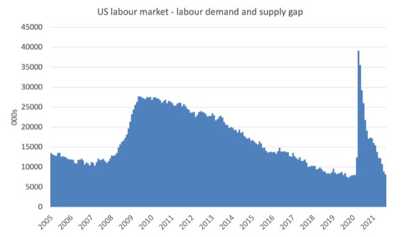
The following graph estimates the gap between labour supply (employment plus unemployment plus part-time for economic reasons plus not in the labour force but want to work) and labour demand (employment plus job openings) from January 2005 to August 2021.
As at August 2021, this measure of slack – the gap – stood at 8,224 thousand or 5.1 per cent of the labour force. In February 2020, this gap stood at 8,076 thousand or 4.9 per cent of the labour force.
So there is still some slack there.
Conclusion
The latest JOLTs data is interesting because it signals are possible shift in bargaining power in the US labour market towards workers.
The most obvious sign of that is the rising quit rates, which are most prevalent in the low-wage sectors.
We will have to wait and see whether there are any significant wage outcomes arising from this behaviour or whether workers are just jumping from very bad to bad jobs.
There is still some slack in the US labour market so the conclusion that workers are now in a better position is a qualified one.
The evidence also continues to confirm that the mainstream claims that unemployment dynamics are driven by the unemployed being lured into leisure by excessive unemployment benefits or some other reason has no veracity.
The evidence is consistent and strong – the mass unemployment in the US is the result of a systemic failure in that economy to produce enough jobs or when governments close down whole sectors.
That is enough for today!
(c) Copyright 2021 William Mitchell. All Rights Reserved.
David Card the joint winner of the Nobel economics prize. His other work has included a study of how a sharp increase in migration from Cuba to Miami affected wages and employment after Fidel Castro’s decision in 1980 to allow people to leave Cuba.
In a four-month period, 125,000 Cubans arrived in Miami, raising the size of the workforce by 7%, but a comparison with four other US cities found no deleterious effects on jobs or wages of low-paid workers.
What effects was David looking at here and how did he compare them ?
His study must have supported the supply side approach to job creation and completely ignored productivity ?
Have you read it Bill and are you going to do an article on it ?
Some of the ‘quits’ are because vaccine mandates are forcing many of the unvaccinated to leave their jobs. As additional income support rolls off, some may rethink about getting the jab.
It’s difficult to see any reason for it, however, yes indeed there is a percentage of workers even within the highly paid healthcare field who decline to be vaccinated, and therefore become at least suspended from their jobs. In the health area, I understand the numbers can be as many as 2%, in our part of the world just across the Ontario- New York State border.
From my understandings people in many sectors found ways to move their jobs home and now want to keep them there. Apparently in places like NYC, this is creating a crisis for commercial landlords as businesses can’t afford the rent without workers to generate income for them.
In our locale an unemployment rate of 7.2% (highly questionable) has been declared “a return to normal”. No worries eh?
If firms attempt to preserve markups and at the same time are forced to pay higher wages to re-hire workers then it will be interesting to see what the Federal Reserve does and what happens to house prices.
Am I crazy or —- ?
It seems to me that if a lot of people quit their jobs last month, that then the total of people with jobs would have gone down a lot.
In fact, the job number IIRC was just 194K more than for the last month. Not the IIRC 700K that MS economists expected.
This was taken in the MS media as proof the economy was hurting and not coming back like it was hoped. I see this spin as just wrong. That people quiting sh!ty jobs as a good thing, not a bad thing. So, take out 80% of those who quit and the number doesn’t seem so bad. Well, except for the owners who now need to hire a replacement, maybe for more money.
I remember a day, long ago, when the employment applications asked, “How much pay do you need?” Do they still? Maybe owners will have to increase the pay because nobody will accept those low paying jobs any more.
It is interesting that the highest quits are in trade, transport and utilities. Enterprises in the UK and USA cannot attract enough transport drivers. Hence the deliveries of fuels and goods are grinding to a halt in both countries. Gas stations are empty, shelves are empty. If conventional economics worked, these enterprises would pay higher wages. They refuse to do so (still) and their countries grind to a halt. Workers have had enough of bad wages and being treated like dirt and they are leaving bad jobs in droves.
This is all highly inefficient. Capitalism is incredibly inefficient. But for the cornucopia granted by science, the cooperation conferred by democracy and the public goods created by government, nothing in capitalism would work. The only thing that keeps capitalism running is the business and corporate welfare ceded to it by social society via the manipulations of the elites.
The most capitalist nations (the most neoliberal nations) are now collapsing. UK, USA and EU are cases in point. The collapse can only be avoided by statist and democratic socialist measures. It’s unlikely such measures will be permitted by the Western elites. So, we face a future of collapse, most likely, unless there is revolutionary change. The chances for revolutionary change still look slim. Looks like things have to get a lot worse first before any fundamental changes occur.
@Ikonoclast, there are certainly supply chain difficulties in the UK, just as there are in other European countries and the US. However deliveries of fuel and goods are not “grinding to a halt”. Petrol stations are operating more or less normally. Food stores remain we’ll stocked. There was temporary disruption of fuel, for a week or so, in some parts of the UK, caused by panic buying and extraordinary factors. But the situation is more or less normal now.
As I understand it at least some of this supply chain difficulty is due to significantly raised demand post pandemic and also because of pandemic disruption.
The MSM in the UK, sometimes mirrored in the US, blame this disruption on Brexit. As yet those who lost the democratic argument (despite their best efforts to subvert the process) have not come to terms with having lost. Of course Brexit does make things worse at the margin. But there are significant HGV driver shortages in Germany, which obviously aren’t caused by Brexit. So the main issues with supply chain difficulties are as outlined above.
I have been waiting for my HGV licence renewal (5-yearly medical when over 45 years old) since I submitted it mid-June. A large part of the HGV driver shortage in the UK Is because the DVLA has all but shut down for the last 18 months.
Please people and/or Bill,
Tell me where I am going wrong above, where I said that if millions quit their jobs in a month, then it is not surprising that 500K of those jobs are still open at the end of the month. This is because this is just about the last 1 week of quits.
And, I said, that more workers quitting is not Pres. Biden fault.
That, in fact, all those quits are a sign of a strong economy, even if they result in a piss poor job growth number for 1 month.
Or, am I right?
Never mind, I see my error.
The correction is very much smaller, because 4M is not the number to start the calculation with.
@GH Yes, DVLA sent me a letter 2 months ago to tell me that my licence had expired in October. Last week I spent many hours on the phone talking to HMRC about the £1,200 penalty they’ve imposed on me for not making a tax return which I was told in 2019 I didn’t have to do. Apparently my letters/case was sent to the wrong department. My older daughter, out of the blue served, served with a direct deduction from earnings notice for its overpayment of tax credits dating back to 2011 – many more hours on the phone. I’ve emailed my MP about all this – one of the majority of tories who just voted against legislation to prevent the dumping of raw sewage into our water courses.
I heard from my niece yesterday, who is a physiotherapist in the NHS, that she’s been offered a better paid job with a start up which will benefit from the government’s decision to transfer all musculoskeletal diagnosis and treatment from GPs to the private sector.
If I hadn’t been able to help my daughter she would soon have been on the streets – literally or figuratively. Others are not so lucky. This is the world’s 6th richest country. It’s a failed state.