The Australian Bureau of Statistics (ABS) released the latest labour force data today (March 19,…
US labour market in peril as a result of political choices made by the US government
I went on a data excursion for part of today to update the flows data from the US Bureau of Labor Statistics. They published the latest JOLTs data last Friday (May 15, 2020) – Job Openings and Labor Turnover Summary – which reveals data up to March 2020. So in a sense it is the calm before the storm. I also reconstructed some of the indicators I compile from that data set which give me a broader impression of what is happening in the US labour market. Clearly, things are going to get worse when the April data is released. We can see that by examining the Department of Labor’s weekly unemployment claimants data, which was updated last Thursday (May 9, 2020). I also updated my state table and map today. Things are looking very bleak. To me, the data tells me that the US is a failed state – incapable of using the capacity the government possesses to advance the well-being, or, in this case, protect the well-being of its people. I am also working on an extended piece on the way the Right and the Left are behaving in this crisis. As usual, the Right are organised and forward-looking putting assets into strategies that will take their agenda to another (pernicious) level. Under the smokescreen of the crisis, they are working to cement changes that will make it even harder for government to advance general prosperity. Meanwhile, the Left appear to be asleep as usual – tweeting their heads off about Biden or Sanders and have taken their eyes off the main game. We have been there before. Even though the US labour market has probably never been here before!
The claimants data horror story continues
Here is the latest update (as for the week ending May 14, 2020) from the US Department of Labor’s weekly data releases for the unemployment insurance claimants.
I first started tracking this data for this downturn in my last commentary on the monthly US labour market data release – Tip of the iceberg – the US labour market catastrophe now playing out (April 6, 2020).
The Department of Labor provides an archive of the weekly unemployment insurance claims data back to July 1, 1967 – HERE.
The weekly data can be found in the – UI Weekly Claims Report.
Bringing together the archived data and the most recent release (May 14, 2020), the following table tells the shocking story.
| Week ending | Initial Claims (SA) | Weekly Change | Cumulative sum since March 7, 2020 |
| March 7, 2020 | 211,000 | -6,000 | n/a |
| March 14, 2020 | 282,000 | +71,000 | 282,000 |
| March 21, 2020 | 3,307,000 | +3,025,000 | 3,589,000 |
| March 28, 2020 | 6,687,700 | +3,560,000 | 10,456,000 |
| April 4, 2020 | 6,615,000 | -252,000 | 17,071,000 |
| April 11, 2020 | 5,237,000 | -1,378,000 | 22,308,00 |
| April 18, 2020 | 4,442,000 | -795,000 | 26,750,000 |
| April 25, 2020 | 3,867,000 | -575,000 | 30,617,000 |
| May 2, 2020 | 3,176,000 | -691,000 | 33,793,000 |
| May 9, 2020 | 2,981,000 | -195,000 | 36,774,000 |
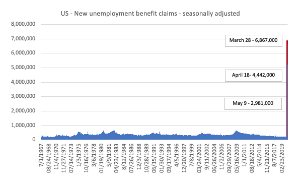
The next graph shows the data from 1967 to May 2, 2020.
The spike at the end of the graph shows how drastic the situation is in the US.
This is a quite extraordinary graph. The small upward lumps along the way are deep recession in the early 1980s, 1990s and the GFC.
The next map shows the cumulative sum of unemployment insurance claimants since the end of February 2020, expressed as a percentage of the Working Age Population in each state. You can compare this with previous maps to see how the situation is changing spatially.
This graphs more starkly demonstrates where the loss of jobs is impacting most significantly. You can compare these maps to see where the virus job losses are having shifting impacts.
Alaska was 16.8 per cent and Hawaii was 20.7 per cent.
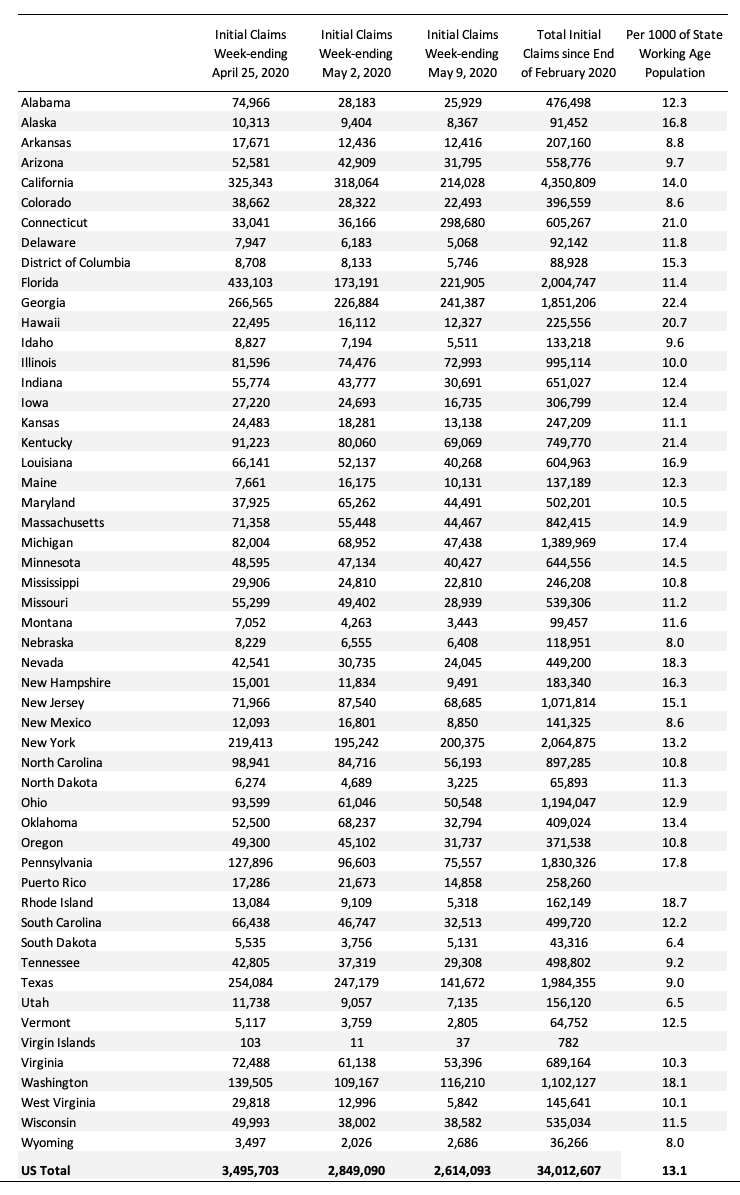
The following Table presents the same data for those who prefer numbers.
Employment and hours
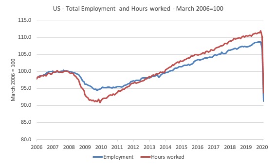
The first graph shows the index of aggregate weekly hours worked by all employees from March 2006 to August 2015 (red line) and total civilian employment (blue line). The data is from the BLS. Both series are indexed to 100 at November 2007 (peak employment before GFC started).
Prior to the GFC, the two series moved more in line with each other as average weekly working hours remained fairly steady.
When the GFC hit, firms first adjusted by adjusting hours downwards, before sacking workers.
This is the typical adjustment that accompanies a downturn in the economic cycle and arises because firms seek to hoard skilled labour given the hiring and firing costs are high.
The last thing a firm wants to get is a reputation for being capricious when it comes to expensive labour. Such a firm will find it hard attracting skilled labour in the upturn.
As the recovery ensued, both employment in persons and total weekly hours worked rose, the latter more quickly as the hoarded labour was put back onto longer time.
The significant aspect of the COVID-19 downturn is that both series have plunged in unison – as a result of the lockout regulations being imposed.
The GFC downturn saw the employment series bottom out at 94.8 index points and the hours series at 91.2 in October 2009.
Already, after one month, the employment series is at 93.8 and the hours series at 93.7 points.
And there will be worse to come in May 2020.
U-V curve analysis
How does this fit in with the hiring and firing data available from the – US JOLTS database – supplied by the BLS.
The BLS published the latest JOLTs data last Friday (May 15, 2020) – Job Openings and Labor Turnover Summary – which reveals data up to March 2020.
So in a sense it is the calm before the storm.
The JOLTS data allows us to distinguish whether ‘supply-side’ movements are driving the shifts in unemployment (that is, actions by workers) or whether ‘demand-side’ factors are more influential.
In general, the JOLTS database usually always shows that it is the number of jobs on offer and the growth of employment that is the dominant force.
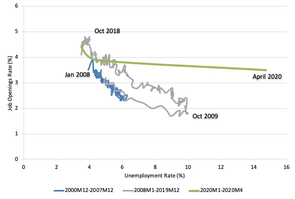
To start the discussion, it is useful to look at the US version of the Unemployment to Vacancies curve (where vacancies are the Total Non-Farm Job Openings as a percent of the Labour Force).
The following graph shows three distinct periods:
1. December 2000 to December 2007 (the JOLTS database started in December 2000).
2. January 2008 to December 2019 – so the GFC downturn and drawn out recovery (of sorts).
3. January 2020 to April 2020 – the COVID-19 downturn. Note I have extrapolated an April value for the JOLTS variable here to accord with the extra observation available from the Labour Force survey published the week before.
The three periods graphed cover the entire span of the JOLTS data.
Refer to the blog – Latest Australian vacancy data – its all down to deficient demand (July 2, 2013)- for a conceptual discussion about how to interpret this framework in terms of movements along curves and shifts in relationships.
Basically, the UV (or Beveridge) curve shows the unemployment-vacancy (UV) relationship, which plots the unemployment rate on the horizontal axis and the vacancy rate on the vertical axis to investigate these sorts of questions.
Mainstream economists interpret movements along the curve as being cyclical events and shifts in the curve as structural events.
So, in that framework, a movement ‘down along the curve’ to the south-east suggests a decline in the number of jobs available due to an aggregate demand failure, while a movement ‘up along the curve’ indicates improved aggregate demand and lower unemployment.
If unemployment rises in an economy where there are movements along the UV curve it is referred to as “Keynesian” or “cyclical” unemployment – that is, arising from a deficiency in aggregate demand.
The mainstream economics literature claims that ‘shifts in the curve’ – (out/in) – indicate non-cyclical (structural) factors (more efficient/less efficient) are causing the rising (falling) unemployment.
Allegedly, the UV curve shifts out because the labour market was becoming less efficient in matching labour supply and labour demand and vice versa for shifts inwards.
The factors that allegedly ’cause’ increasing inefficiency are the usual neo-liberal targets – the provision of income assistance to the unemployed (dole); other welfare payments, trade unions, minimum wages, changing preferences of the workers (poor attitudes to work, laziness, preference for leisure, etc).
The problem is that this view is at odds with the evidence.
As is the case in most advanced countries, the shift in the US curve occurred during a major demand-side recession – that is, it has been driven by cyclical downturns (macroeconomic events) rather than any autonomous supply-side shifts.
Once the economy resumed growth the unemployment rate fell more or less in line with the new job openings rate – tracing the grey line up to the north-west of the graph.
We can see that in through 2019, as the labour market was tightening and unemployment was reaching levels not seen since the late 1960s, that the UV curve was starting to shift south again.
However, the emergence of the current crisis in March and then very much in April 2020 has blown the curve out – there has never been such a sudden shift in a U-V curve anywhere like this.
Words fail!
Further labour demand and supply analysis
I have previously discussed the drop in labour force participation in the US since 2000.
See the most recent blog post on this topic – Updating the impact of ageing labour force on US participation rates (November 7, 2017).
What that analysis (which is supported by the discussion above) tells me is that there is still considerable supply-side slack in the US labour market.
I use the term ‘supply-side slack’ to mean that there are plenty of workers who are idle in one way or another and who want to work some or more but cannot find the hours because labour demand is weaker than needed.
As note above, the BLS U-6 measure adds together total unemployment, all marginally attached workers, all employed part time for economic reasons and expresses this as a percent of all civilian labor force plus all marginally attached workers.
In April 2020 the components are (in thousands):
1. Total unemployment = 23,078 thousand.
2. Total marginally attached workers = 2,825 thousand.
3. Total part-time for economic reasons = 10,887 thousand.
4. Total comprising the U6 numerator (available labour force underutilised) = 36,176 thousand.
5. However, within the Not in the labour force category (total 104,066 thousand as at April 2020), there were 9,761 who want to work and for various reasons fail the activity test (didn’t search within the last 4 weeks).
So it is more realistic to consider these workers as being possible capacity rather than restrict our estimates to the marginally attached workers who are available for work now.
That would give a total number of 1 + 3 + 5 = 43,726 thousand – that’s 43.7 million folks!.
That figure is an aggregate – that is, it doesn’t decompose spatially (where people live relative to jobs) and the sort of ascriptive characteristics the people bring (education, experiences, age, etc).
We also cannot convert that number into a full-time equivalent number because the BLS does not provide detailed hours breakdowns.
The BLS Labour Force survey doesn’t publish the extra hours this cohort would prefer but we do know the proportion that would usually work full-time.
The BLS publication – The Economics Daily (April 8, 2020) – notes that:
Virtually all of the increase in the number of people who were employed part time for economic reasons occurred in the slack work component-that is, among workers who indicated their reason for working part time was slack work or business conditions. There was little change in the number of part-time workers who indicated they could only find part-time work.
For example, in April 2020, 10,648 thousand workers in the “part-time for economic reasons” category, 8,131 thousand usually work full-time but could not find the work (Table A-25).
That is, 76 per cent of those who were forced to work ‘part-time for economic reasons’ usually worked full-time.
As a result of the constraint, they were on average working just 20 hours per week instead of 35 hours.
So that represents a considerable idle capacity.
The JOLTs data set noted above also provides information on labour demand.
In March 2020, there were 6,191 thousand non-farm job openings (down in the month from 7,004 thousand).
To get a feel for the scale of the flows within the US labour market, there were 5,206 thousand non-farm hires in March 2020, and 14,517 thousand separations
A very large percentage of those job openings turnover each month as workers are laid off (11,372 thousand) or quit (2,782 thousand).
There had been continued growth in the job openings over the last few years up until mid-2019 but there was still many more people available for work than there is new jobs opening up.
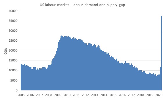
The following graph estimates the gap between labour supply (employment plus unemployment plus part-time for economic reasons plus not in the labour force but want to work) and labour demand (employment plus job openings) from January 2005 to March 2020.
As at April 2020 (extrapolating the April job openings figure from March), this measure of slack – the gap – stood at 37,736 thousand or 24.1 per cent of the labour force. In February 2020, this gap stood at 8,074 thousand.
That is how disastrous this crisis is turning out to be for the US.
Quit and hire rates
We can also look at the behaviour of the quit rate to judge whether the decline in the unemployment rate is being mostly driven by demand-side or supply-side forces.
Remember that the mainstream text book economics view is that the supply-side dominates as workers exert their free choices between labour and leisure.
The supply-side story starts with the textbook model of the labour market which claims that employment and the real wage are determined in the labour market at the intersection of the labour demand and the labour supply functions.
The equilibrium employment level is constructed as full employment because it suggests that every firm who wants to employ at that real wage can find workers who are willing to work and every worker who is willing to work at that real wage can find an employer willing to employ them.
Frictional unemployment is easily derived from this Classical labour market representation, as is voluntary unemployment.
Holding technology constant, all changes in employment (and hence unemployment) are driven by labour supply shifts. There have been many articles written by key mainstream economists (such as Milton Friedman) that argue that economic cycles are driven by labour supply shifts.
The essence of all these supply shift stories is that the quit rate is constructed as being countercyclical – that is, rise when the economy is in decline and vice-versa – despite all evidence to the contrary.
Quits “are voluntary separations, and measure workers’ willingness or ability to leave the job” (Source)
One such text book story is that the economic cycle swings are characterised by swings in voluntary unemployment. So a downturn in employment (and a rise in unemployment) arises – allegedly – because workers develop a renewed preference for more leisure and less work and the supply of labour at each real wage level thus moves inwards (that is, workers are now less willing to supply the same hours of labour as before at the going real wage).
So workers quit their jobs and head to the beach and relax.
The provision of unemployment benefits – so the story goes – increases the attractiveness of leisure. It is seen as a direct subsidy of non-work.
Upturns in economic activity is characterised in this story as workers developing a new thirst for work and so the supply curve shifts out again – that is, they are willing to supply more hours of work than before at the same real wage levels. Apparently, they get sick of leisure and gain a new appetite for income so as to buy goods and services unattainable while they spent their time in non-work.
And at the empirical level this theory predicts that quits will fall as employment falls.
The simplest fact then, which would give support to this notion of supply-side shifts, is whether the quit rate is, indeed, counter-cyclical – as the theory predicts. That is, does the quit rate rise when the unemployment rate rises or not. Simple enough.
Lester Thurow in his 1983 book – Dangerous Currents – challenged the mainstream view by asking:
… why do quits rise in booms and fall in recessions? If recessions are due to informational mistakes, quits should rise in recessions and fall in booms, just the reverse of what happens in the real world.
The reference to “informational mistakes” is another version of the mainstream supply-side story. The narrative goes that the central bank/treasury can temporarily buy a reduction in unemployment (below what the neo-liberals refer to as the natural rate – another myth) – by inflating the economy with spending.
As economic activity picks up both money wages and prices rise (typical story about too much money chasing too few goods). The trick is that they claim that the rate of increase in money wages is less than the rise in prices and so the real wage falls.
Firms react to the declining real wage by offering more employment – because they know that marginal labour productivity is lower (another myth).
But why do workers agree to supply more labour when the real wage is falling? After all the textbook labour market model tells us that the labour supply curve is upward sloping in terms of the real wage because workers will only supply more labour if the relative price of leisure (which is the real wage) rises.
The trick is that the entire supply of labour shifts because workers think that the real wage has risen – they get beguiled by the rise in money wages into forming the view that they are better off per hour than before and so the quit rate falls and employment increases.
Hence, for a time (a short time), the economy can operate at unemployment levels lower than the natural rate.
How long can this go on for? Well, how long does it take for workers to go down to the shops and realise that everything is more expensive now and, in fact, they are worse off than before (because the real wage has fallen)?
Accordingly, as the story goes, once they learn the truth, the labour supply curve shifts back in and workers withdraw their labour en masse (the quit rate rises again) and employment and economic activity falls back to the ‘natural’ level.
The lesson that is hammered home to students that this all demonstrates how futile policy interventions that aim to lower the unemployment rate are. The only way the ‘natural’ rate can be lowered (if at all) is for policies to be designed with reduce structural impediments in the labour market. What are they? For example, cut the subsidy to leisure (the unemployment benefit). etc.
It is an extraordinary story in total denial of the facts – but it survives because of the dominance of Groupthink in the academy.
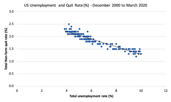
The US Bureau of Labour Market JOLTS database includes estimates of the quit and the hiring rate. The following graph shows in a compelling way that the quit rate (non-farm quits as a percent of total non-farm employment) behaves in a cyclical fashion as we would expect – that is, it rises when times are good and falls when times are bad.
The graph relates the quit rate (vertical axis) to the unemployment rate (horizontal axis). The straight black line is a simple linear regression trend drawn through the graph.
There are no shifts evident in this relationship just movements along a fairly defined inverse relationship.
That is, when the unemployment rate rises, the quit rate falls. Exactly the opposite to that predicted by the supply-side story which means that their claim that causality runs from unemployment benefits to higher quits to higher unemployment is unsustainable.
Many studies, which are not caught up in the orthodox Groupthink, have demonstrated the phenomenon depicted in this graph – for several countries where decent data is available.
Workers become very cautious when unemployment starts to rise and postpone any desired or planned job changes and opt for the security of their present job.
When there are more jobs being created and the hiring rate rises, workers then take more risks and the quit rate tends to rise.
This also helps us understand why the unemployment-job vacancies graph (above) shifted upwards during the recession and then stabilised as the economy grew again. Remember, that firms were adjusting hours more quickly than persons.
The BLS Monthly Labor Review article (June 15, 2015) – Job openings reach a new high, hires and quits also increase – notes that:
Quits are procyclical, rising during an expansion and falling during a contraction … As of 2014, quits had not reached prerecession values in most industries. While some industries recovered fully to surpass 2007 values, overall, the annual quits level was 88 percent of its 2007 level.
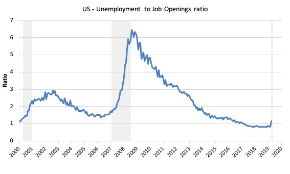
The following graph shows the total number of unemployed per job opening (non-farm and seasonally adjusted) and thus gives a measure of how strong the demand-side of the labour market (job openings) is relative to the number of people seeking work (the unemployed).
It is an alternative way of presenting the relationships between unemployment and vacancies.
The shaded area indicates the NBER recession months.
The US Bureau of Labor Statistics (in the article cited) wrote:
The job openings and unemployment levels generally move in opposite directions. During a robust economy, job openings are high and unemployment is low. During an economic contraction, the dynamics reverse – unemployment rises, while job openings fall. Accordingly, the ratio of the unemployed to job openings provides a metric that helps describe the state of the economy …
In February 2020, the ratio stood at 0.8 (the lowest in the post-GFC period), while the March 2020 ratio was recorded at 1.2. A very sharp increase.
Labour markets typically behave over the business cycle in an asymmetric manner as can be seen from the graph. The deterioration was sharp and rapid. The recovery is much slower and is all the more slow as the employment growth not only has to absorb new labour force entrants (arising from population growth) but also has to face the huge pool of unemployed that is caused by the recession.
One of the facts I repeat often is that the unemployed cannot search for jobs that are not there! This is exactly what happens when aggregate demand falls and job openings dry up.
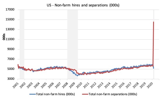
Another way of seeing how the job flows tell us about the direction of change is to compare movements in hires and separations. The following graph shows this relationship for the US economy as published by the BLS for the period from December 2000 to July 2016.
While labour markets are clearly dynamic in the sense that even in a downturn new jobs are being continually created and destroyed the rates of each dynamic change in a cyclical way. So while there were new jobs being created at the height of the downturn there was a severe shortfall of new jobs emerging as is shown in the graph.
Separations also fall for reasons noted above. The difference between hires and separations is the net change in employment in each month. If hires outstrip separations, employment grows and vice versa.
The most recent data shows that hiring and separations have stalled somewhat and even fallen from the levels attained earlier in the year.
The net change in employment per month which began to slowdown in 2015 when compared to 2014 when employment growth was more robust, has continued to stall in 2016.
Whether this is the beginning of a new downturn is unclear at this stage. But it is starting to look like a turning point in the time series.
Further, the layoff and discharges rate also published in the BLS JOLTS database which reflects the demand-side of the labour market is also firmly counter-cyclical as we would expect. Firms layoff workers when there is deficient aggregate demand and hire again when sales pick-up.
Again this is contrary to the mainstream text book logic.
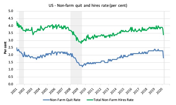
And finally, the next graph plots the quit and hire rates for the US. They are going in the same direction, which confounds the mainstream narrative.
All the evidence supports the conclusion that deficient demand not only increases unemployment in the downturn but also pushes people out of the labour force as they give up actively looking for work that is not there. These hidden unemployed workers re-enter the labour force as the probability of getting a job (in their mind) increases.
Conclusion
Anyway, a bit of a data excursion to complete the day.
The JOLTS data is very useful because it addresses some of the most simple claims made by the mainstream approach to unemployment. And the evidence is clear. There is no validity in the supply-side case that mass unemployment is somehow something to do with the unemployed being lured into leisure by excessive unemployment benefits or some other reason.
The evidence is consistent and strong – the mass unemployment in the US is the result of a systemic failure in that economy to produce enough jobs or when governments close down whole sectors.
The point is that it is always a political choice of government.
The government can always eliminate unemployment if it chooses.
In the current circumstances, while the lockdowns are driving people into joblessness, the alternative would have been for the government to just pay the wages and order people to stay at home.
No unemployment would then occur.
That is enough for today!
(c) Copyright 2020 William Mitchell. All Rights Reserved.

I’m curious professor Mitchell, if you could do a basic analysis of the Canadian governments response during this pandemic. Thank you.
“!n the current circumstances, while the lockdowns are driving people into joblessness, the alternative would have been for the government to just pay the wages and order people to stay at home”.
Which is what a currency-issuing govt can and should do.
But I’m not sure what a eurozone govt can do, absent direct monetary financing by the ECB which the treaties forbid. The only option they have is to sell bonds – assuming there are any buyers.
Of course, the ECB has announced that it will be a buyer to whatever extent (?) may be necessary (in defiance of the Treaties of course but “excused” by the humanitarian nature of the corona crisis).
But to deflect German/Dutch objections the bond-purchases come with a poison pill:- conditionality SGP-style.. So they’re caught by a double-whammy.
Only answer is leave the eurozone and regain currency sovereignty.
I’m not holding my breath.
Intending to comment on it, I highlighted the same excerpt from Bill’s post as robertH did. If the masses understood the axioms of MMT, which they are now being compelled to learn by brute facts, then paying people who had to stay home and keeping businesses afloat that had to close, would be no-brainers–simple, direct expressions of human decency and governmental responsibility. And it is THIS fundamental issue of human decency/governmental responsibility which will soon become the overriding issue that unites the masses against the elites, the intensity of the movement varying in each country according to how decent and responsible that country’s government has been. And once the immediate effects of the covid-crisis have been addressed, whether by voluntary governmental action or forced by public pressure/protest/civil disobedience, the scope of that fundamental issue of decency and responsibility will expand to include all those who have suffered not only from the acute covid-crisis but also from the chronic crisis of neoliberal capitalism–those of our fellow human beings who have long been exploited or marginalized (or worse) by a maniacal, ecocidal economic system. And as that adjective “ecocidal” indicates, along with the human species, this decency and responsibility must expand to include Mother Earth herself, lest everything else we do prove futile. So there will be no return to business as usual or to a new lower level of “normal” after the Covid-crisis, as there was after the much milder GFC. The neoliberal world order, which (like certain sharks) had to keep swimming (producing, consuming, expanding) to breathe, has been fast-frozen in its tracks. We’re in uncharted waters, suddenly faced as a species with an evolutionary/revolutionary choice that is, to use William James’ term, a forced option, a situation that compels either decisive action or death. A prophetic genius named Edward Bellamy saw this forced option coming even during the first Gilded Age, and here’s how he put it. “The great enthusiasm of humanity which overthrew the old order and brought in the fraternal society was not primarily or consciously a godward aspiration at all. It was essentially a humane movement. But ‘if we love one another God dwelleth in us,’ and so men found it. It appears that there came a moment, the most transcendent moment in the history of the race of man, when with the fraternal glow of this world of new-found embracing brothers there seems to have mingled the ineffable thrill of a divine participation, as if the hand of God were clasped over the joined hands of men. And so it has continued to this day and shall for evermore.” Will to believe in the human spirit.
Newton Finn – I feel that so many people think that we’ll come out of this crisis improved. Already I feel despair because although I feel that in the UK we have the worst government ever, everything they are doing is preparing the ground for the dystopia that follows. I used to think the Tories were thick. No longer, they are just so clever at setting up the fall guys. Like the fire fighters got blamed for Grenfell Towers, so it’ll be Doctors, nurses, scientists and just about every front line worker that’ll carry the can for this crisis. They will win. We will lose. I have absolutely no doubt about it.
Sure you do, Rod, on some level, or you wouldn’t be reading this remarkable blog and engaging with other readers. Bill works incessantly to clarify the MMT lens in order that we can use it to “reclaim the state,” something he believes can and must be done despite the odds. Please don’t confuse the long term with the short term, especially in light of our current crop of political “leaders.” This evolution/revolution, this reclaiming by the people of their sovereignty, will take at least a generation, so while it begins right now with us, we must sow without thought of reaping.
Well, we (USA) are not quite yet a ‘failed state’. In fact, our executive office presents one of the most successful sit-coms ever on an almost daily basis. What other country has a president who speculates about injecting disinfectants as a cure to a disease? And we certainly take care of our bankers and military contractors and large corporations even now. Have not failed there yet. Some of the rest of it is pretty depressing though for the ordinary citizen.
On the brighter side- there are still a lot of talented and very good people in the US. The federal government may be hampered by politics, and neoliberals, and just plain idiocy, but there are still a lot of competent people working there. And they are doing some things right, if not the best things. And in government and private sectors in the rest of the country. And we have many, many people working on some ways to end this damn disease. As do countries throughout the world. One thing for sure- if anyone anywhere in the world figures it out, Donald Trump will claim credit for it.
Off topic.
It always amazes me that almost everyone believes the BS that the US debt can be paid-off someday.
I point out that it stands at well over $23 trillion. How can that much be sucked out of the economy and not destroy it?
Their answer is, “I have no idea, but it must somehow be possible.”
I ask, what is the reason or benefit of changing the debt as bonds into $23T in cash in the economy? That I sort of understand the desire back when the world was on the gold standard. But now, why do this?
Their answer is, “Aha…..”
But, they just can’t grok that it is flatly *impossible*.
The Repuds starting with Reagan did this. It’s all their fault. They cut taxes and spent like drunken sailors. Until, Bush II caused the GFC/2008, so that Pres. Obama had to also spend and spend to fix things a little. Not enough really, but necessary.
Now we have the covid-19 crisis and Trump lost control of it. So, again a Repud has to spend like a drunken sailor to patch the economy up. But, we still hear expert economists saying that soon we will have to rise taxes and start paying the debt down. Don’t they know, aren’t they smart enough to know, that paying it off is impossible? So, why try?
Steve, that is not only off topic- it is ridiculous. The US federal debt is in US Dollars. Who makes US Dollars- the US federal government. How many Dollars can the US government make- an unlimited amount. That ‘debt’ can always be paid off if that is what we want to do. And it will be paid off as it comes due. There is no question about it whatsoever.
News in the Financial part of the Guardian today: Merkel and Macron have proposed that the European Commission, in the name of the EU, borrows on the financial markets to disperse some E500bn to European economise hardest hit by the cv. Liabilities for the debt would be added to the EU budget. Clearly it’s those financial markets that have a bottomless pool of money. Remind me, who bailed out who after the GFC?
Rod, I understand your despair and realisation: ‘I used to think the Tories were thick. No longer, ‘
let’s remember the Tories won the election on 88% mis- and disinformation and did it with transparency because they knew that a benumbed and benighted populace (well maybe 30% of voters) would see it as faux-establishment . SO they convinced a lot of people that ‘taking back control’ was happening when , in reality, the bonds and shackles were tightening as plans for US trade deals, privatisations by stealth were planned.
Stockholm syndrome of a sort. Worth noting that while the Tories paraded bogus SSRI inducing trash jingoism and meaningless slogans their policies completely left out anything to do with the fundamental crises of our time: ageing population, social care, housing and pollution/climate.
So the Tory shysterdom was clever to an extent but let’s be clear, the bar wasn’t particularly high.
As far as significant parts of the UK public are concerned , it’s a case of ‘those whom the gods would destroy…..’
P.S The Tories have made clear that the recover will be based around a resurgence in the bubbled to death housing market -absolutely disastrous and rentier economics on steroids. https://www.theguardian.com/commentisfree/2020/may/14/estate-agents-britain-recovery-government-property-market-coronavirus-society
Jerry,
Oops, I left off the “with tax revenues” phrase.
OTOH, I did say that they are calling for raising taxes to pay down the debt.
And, you do know that you can’t pay *off* a debt with borrowed money, right?
PS Adding another thought. All fiat nations need a law that all Gov. bonds that have been held by the Central Bank for 6 months *must be* written off or cancelled (or whatever word that’s better). Do it on or soon after the 1st of each month. It’s just confusing to include such bonds as part of the national debt.
Steve, if you are able to create the money you owe a debt in, then you do not have to ‘borrow’ it to pay off that debt- you could just create it at any time. That applies to the USA and our government debt situation. It is really a very simple idea once you understand it. And really not controversial at all.
You have got to read a few more of the older blog posts from Professor Mitchell.
https://billmitchell.org/blog/?p=332
The Deficit Spending 101 posts are a must read if you want to understand MMT. Believe me- it is worth your time.
Jerry,
“What we have here is a failure to communicate.”
I SAID, to PAY *OFF* THE US NATIONAL DEBT WITH DOLLARS FROM TAX RECEIPTS, is *not* possible.
I *TOTALLY* KNOW THAT THE US CAN EASILY PAY THE DEBT OFF WITH MAGIC MONEY TREE DOLLARS.
However, many economic “experts” are beginning to warn about tax increases *someday* to pay for the covid-19 spending with dollars from tax receipts that follow from the US Gov. running a surplus.
I’m trying to educate the people who hear those “experts” and are afraid because they have been taught that those “experts” are right.
“I SAID, to PAY *OFF* THE US NATIONAL DEBT WITH DOLLARS FROM TAX RECEIPTS, is *not* possible.”
Yeah. The principle is that the government’s liability is the private sector’s asset. (Without getting the external sector involved.) The government’s “debt” is the population’s cash on hand. Seizing one to pay off the other would erase everything.
But if those words don’t click with the “outsiders” you’re talking to, you’re pressed to come up with different words. The mistaken idea that rich people are the true source of money is deeply ingrained.