The Australian Bureau of Statistics (ABS) released the latest labour force data today (March 19,…
Australian labour market – recovery continues but storm clouds on the immediate horizon
The latest data from the Australian Bureau of Statistics – Labour Force, Australia, March 2021 – released today (April 15, 2021), shows that the Australian labour market continues to recover – and while the recovery had stalled a bit over the latter part of 2020, the March result builds on the strong February result. Employment increased by 0.5 per cent (70,700) in the month and unemployment fell by 27,100 to 778,100 persons. As a result the unemployment rate fell by 0.2 points to 5.6 per cent, even though participation rose by 0.2 points. Overall, a good outcome. The main uncertainty now is that the recovery to this point has been dependent on government fiscal support, which ended in March 2021. Given the labour market is still quite a margin from where it was in March 2020, the idea that the government would withdraw its fiscal support is not a compelling option. We will see the first results of the fiscal withdrawal in the next month’s data and I expect things to not look as rosy as they are this month. Further, undertainty has now entered the equation as a result of the vaccination bungling by the federal government. We will see how that plays out in the coming months. Overall, the recovery is still too slow and more government support by way of large-scale job creation is needed.
The summary ABS Labour Force (seasonally adjusted) estimates for March 2021 are:
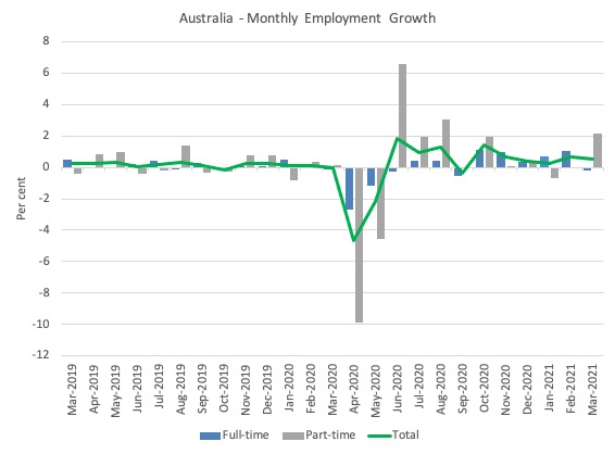
- Employment increased 70,700 (0.5 per cent) – Full-time employment decreased by 20,800 and part-time employment increased by 91,500.
- Unemployment decreased 27,100 to 778,100 persons.
- The official unemployment rate decreased 0.2 points to 5.6 per cent.
- The participation rate increased by 0.2 points to 66.3 per cent.
- Aggregate monthly hours worked increased 1,800 million hours (2.2 per cent).
- Underemployment decreased by 0.6 points to 7.9 per cent (a fall of 84.3 thousand). Overall there are 1,094.4 thousand underemployed workers. The total labour underutilisation rate (unemployment plus underemployment) decreased by 0.8 points to 13.5 per cent. There were a total of 1,872.5 thousand workers either unemployed or underemployed.
Employment continues to rebound in March 2021
1. Employment growth was 0.5 per cent which represents are fairly robust monthly growth rate.
It is now above the February 2020 level by 68.9 thousand (-0.5 per cent).
2. Full-time employment decreased by 10,800 and part-time employment increased by 91,500.
3. So overall Australia is now back to where it was before the pandemic hit, but only in aggregate terms. There are some sectors that are still languishing while others are rebounding strongly.
The following graph shows the month by month growth in full-time (blue columns), part-time (grey columns) and total employment (green line) for the 24 months to March 2021 using seasonally adjusted data.
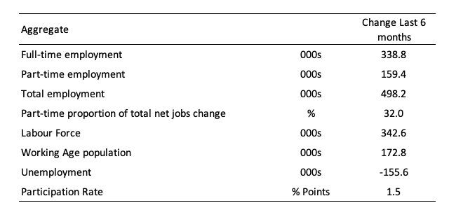
The following table provides an accounting summary of the labour market performance over the last six months to provide a longer perspective that cuts through the monthly variability and provides a better assessment of the trends.
Assessment:
1. Total employment has risen by 498.2 thousand and 32 per cent of that increase has been in part-time work.
2. Full-time employment is still below the March level by 15.3 thousand.
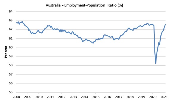
Given the variation in the labour force estimates, it is sometimes useful to examine the Employment-to-Population ratio (%) because the underlying population estimates (denominator) are less cyclical and subject to variation than the labour force estimates. This is an alternative measure of the robustness of activity to the unemployment rate, which is sensitive to those labour force swings.
The following graph shows the Employment-to-Population ratio, since June 2008 (the low-point unemployment rate of the last cycle).
It fell with the onset of the GFC, recovered under the boost provided by the fiscal stimulus packages but then went backwards again as the Federal government imposed fiscal austerity in a hare-brained attempt at achieving a fiscal surplus in 2012.
The ratio rose by 0.3 points in March 2021 to 62.6 per cent on the back of strong employment growth. The ratio is now 0.3 points below pre-GFC peak in April 2008 of 62.9 per cent.
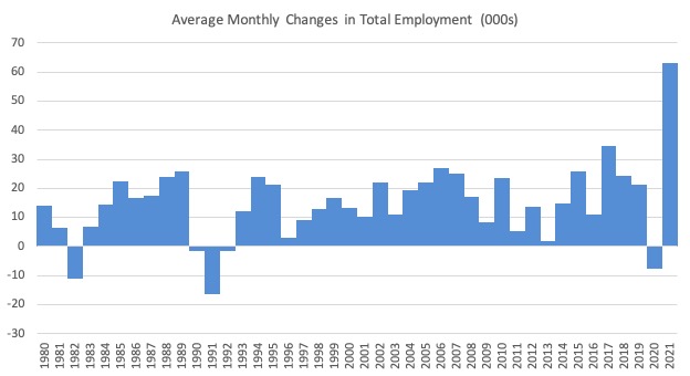
To put the current monthly performance into perspective, the following graph shows the average monthly employment change for the calendar years from 1980 to 2020 (to date).
1. The labour market weakened considerably over 2018 and that situation worsened in 2019.
2. The average employment change over 2020 was -7.5 thousand.
3. So far in 2021, the average monthly change is 62.9 thousand and you can see that from the graph that this is exceptional, although it has only been for three months so far as businesses return to more normal levels of operation.
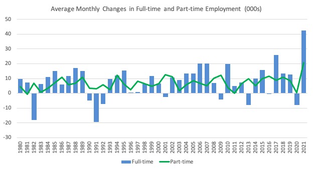
The following graph shows the average monthly changes in Full-time and Part-time employment (lower panel) in thousands since 1980.
The interesting result is that during recessions or slow-downs, it is full-time employment that takes the bulk of the adjustment. Even when full-time employment growth is negative, part-time employment usually continues to grow.
However, this crisis is different because much of the employment losses are the result of lockdown and enforced business closures in sectors where part-time employment dominates.
But the slow recovery of full-time employment signals that the demand-side impacts from the lockdown have had wider effects.
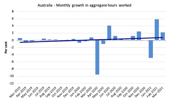
Hours worked increased 1,800 million hours (2.2 per cent) in March 2021
The recovery in hours worked continued as the various state lockdowns eased further this month.
The following graph shows the monthly growth (in per cent) over the last 24 months.
The dark linear line is a simple regression trend of the monthly change – which depicts slightly positive trend.
State by State
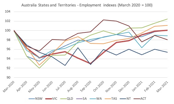
With the State lockdowns now fading and borders mostly open the recovery in the larger states is apparent.
Relative to when the pandemic began in February 2020, NSW, Victoria, Queensland and Western Australia now have regained their employment levels.
The Northern Territory is the worst performing state (index of 97.5 relative to 100 in February 2020).
Victoria which had the 111-day strict lockdown during its damaging second wave is now the second best performing state.
Unemployment decreased 27,100 to 778,100 persons
The official unemployment rate fell 0.2 points to 5.6 per cent as the rise in employment (70.7 thousand) vastly outstripped the rise in the labour force (43.6).
The decline in unemployment would have been greater had not the participation rate risen 0.2 points, as people sensed the increased employment opportunities.
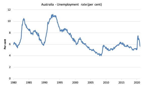
The following graph shows the national unemployment rate from February 1980 to March 2021. The longer time-series helps frame some perspective to what is happening at present.
Assessment:
1. There is still considerable slack in the labour market that could be absorbed with further fiscal stimulus. Unemployment remains 62.1 thousand above the February 2020 level.
Broad labour underutilisation decreased by 0.9 points to 13.5 per cent in March 2021
The results for March 2021 are (seasonally adjusted):
1. Underemployment decreased by 84.3 thousand.
2. The underemployment rate fell by 0.6 points to 7.9 per cent.
2. Overall there are 1,094.4 thousand underemployed workers.
3. The total labour underutilisation rate (unemployment plus underemployment) decreased by 0.9 points to 13.5 per cent all as a result of both the decline in unemployment and underemployment.
4. There were a total of 1,872.5 thousand workers either unemployed or underemployed.
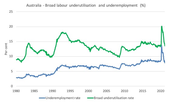
The following graph plots the seasonally-adjusted underemployment rate in Australia from February 1980 to the March 2021 (blue line) and the broad underutilisation rate over the same period (green line).
The difference between the two lines is the unemployment rate.
The three cyclical peaks correspond to the 1982, 1991 recessions and the more recent downturn.
The other difference between now and the two earlier cycles is that the recovery triggered by the fiscal stimulus in 2008-09 did not persist and as soon as the ‘fiscal surplus’ fetish kicked in in 2012, things went backwards very quickly.
The two earlier peaks were sharp but steadily declined. The last peak fell away on the back of the stimulus but turned again when the stimulus was withdrawn.
With the participation rising this month, I expect a slight decline in hidden unemployment. Please read my blog post – Australian labour underutilisation rate is at least 13.4 per cent – for more discussion on this point.
Unemployment and broad labour underutilisation indexes – last four downturns
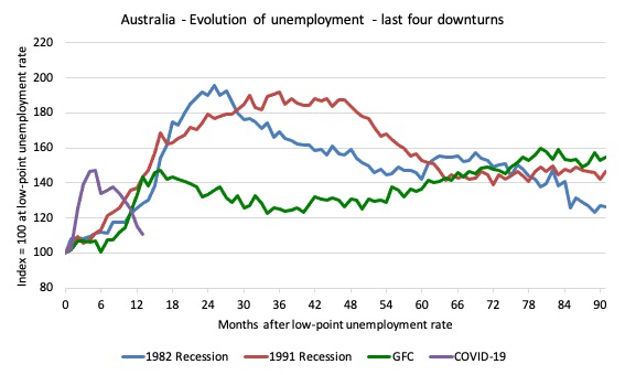
The following graph captures the evolution of the unemployment rates for the 1982, 1991, GFC and COVID-19 downturns.
For each episode, the graph begins at 100 – which is the index value of the unemployment rate at the low-point of each cycle (June 1981; December 1989; February 2008, and February 2020, respectively).
We then plot each episode out for 90 months.
For 1991, the peak unemployment which was achieved some 38 months after the downturn began and the resulting recovery was painfully slow. While the 1982 recession was severe the economy and the labour market was recovering by the 26th month. The pace of recovery for the 1982 once it began was faster than the recovery in the current period.
During the GFC crisis, the unemployment rate peaked after 16 months (thanks to a substantial fiscal stimulus) but then started rising again once the stimulus was prematurely withdrawn and a new peak occurred at the 80th month.
The COVID-19 downturn was obviously worse than any of the previous recessions shown but because of its unique nature – the job losses being largely driven by lockdowns etc.
And the recovery is evident.
The graph provides a graphical depiction of the speed at which each recession unfolded (which tells you something about each episode) and the length of time that the labour market deteriorated (expressed in terms of the unemployment rate).
After 11 months, the unemployment had risen from 100 to:
1. 128.1 index points in 1982 and rising.
2. 143.6 index points in 1991 and rising.
3. 1143.4 index points in the GFC and rising.
4. 110.6 index points currently and falling.
Note that these are index numbers and only tell us about the speed of decay rather than levels of unemployment.
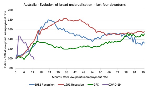
The next graph performs the same operation for the broad labour underutilisation rate (sum of official unemployment and underemployment).
Teenage labour market weaker in March 2021
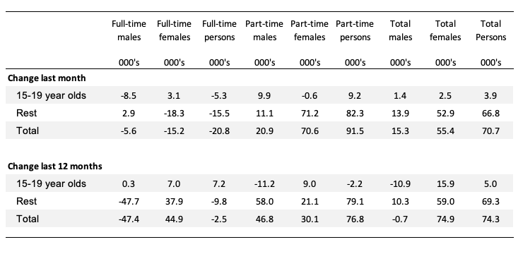
1. Total teenage net employment rose by 3.93 thousand in March 2021 (0.6 per cent) – a slowdown in the pace of recovery.
2. Full-time teenage employment fell by 5.3 thousand (3.3 per cent) and part-time employment rose by 9.2 thousand (1.7 per cent).
3. The teenage unemployment rate fell by 0.8 points to 15.8 per cent and the participation rate fell by 0.4 points.
The following Table shows the distribution of net employment creation in the last month and the last 12 months by full-time/part-time status and age/gender category (15-19 year olds and the rest).
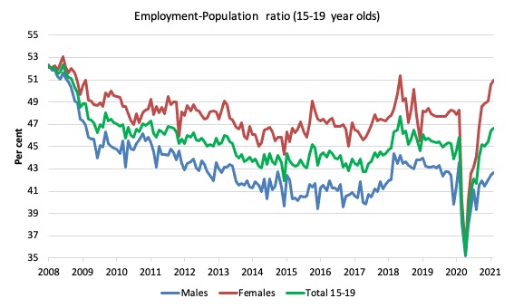
To put the teenage employment situation in a scale context (relative to their size in the population) the following graph shows the Employment-Population ratios for males, females and total 15-19 year olds since June 2008.
You can interpret this graph as depicting the loss of employment relative to the underlying population of each cohort. We would expect (at least) that this ratio should be constant if not rising somewhat (depending on school participation rates).
1. The male ratio has fallen by 9.7 percentage points since February 2008, and 0.9 points since March 2020, but rose 0.18 points over the month.
2. The female ratio has fallen by 1.2 percentage points, but has risen by 2.6 points since March 2020, and 0.33 points over the month.
3. The overall teenage employment-population ratio has fallen by 5.6 percentage points and 0.8 points since March 2020, but rose 0.25 points over the month.
Conclusion
My standard monthly warning: we always have to be careful interpreting month to month movements given the way the Labour Force Survey is constructed and implemented.
The March 2021 data reveals that the Australian labour market continues to recover – and while the recovery had stalled a bit over the latter part of 2020, the March result builds on the strong February result.
My overall assessment is:
1. Total employment is now above where it was in February 2020 but there are major sectoral differences – some sectors are still in deep recession while others are booming.
2. Unemployment fell while participation rose. Taken together with the rise in employment these trends are unambiguously good.
3. The main uncertainty now is that the government employment was withdrawn at the end of last month and we will see the impact of that flowing through in next month’s data. I expect employment to stall as a result.
4. And with the vaccination process now in chaos as a result of Federal government bungling, it is highly unlikely that the border will open and as a aresult tourism and aviation will continue to lag.
That is enough for today!
(c) Copyright 2021 William Mitchell. All Rights Reserved.
“So overall Australia is now back to where it was before the pandemic hit, but only in aggregate terms. There are some sectors that are still languishing while others are rebounding strongly…. With the State lockdowns now fading and borders mostly open the recovery in the larger states is apparent.” While Bill is almost always ahead of the curve, he’s behind IMHO when it comes to fully groking the nature and implications of this pandemic. I’d be foolish to quibble with his data and snapshot assessment in this post, but Australia has largely been spared, SO FAR, the devastation that Covid 19 has brought to American shores and to those of many other countries, much of which devastation Bill has ably documented. No one seems to want to hear this, but I’m going to say it anyway. If you think I’m exaggerating or fear-mongering, please check out the frontline work of Dr. Michael Osterholm, one of the world’s leading epidemiologists and a member of Biden’s initial pandemic advisory team. He’s the head of one of the world’s most respected centers for pandemic research and monitoring (CIDRAP) and has YET TO MAKE A SINGLE MISTAKE in predicting the course of Covid 19 as it works its way through our global civilization. According to Osterholm, we haven’t BEGUN to see the worst of this pandemic, which is already well into another major and more dangerous wave. Variant 117 (the so-called British variant) is currently sweeping across parts of the USA, Canada, Europe, and other areas, threatening new lockdowns which would intensify the massive socioeconomic damage we were hoping to soon put behind us. FAR MORE SINISTER YET are other emerging mutations of the virus, some of which we’ve discovered to be much more virulent, much more dangerous to younger people, and apparently impervious to existing vaccines and treatments. And how many variants have yet to be discovered as they hatch and fester and spread from the healthcare-deprived poorest countries and poorest sections of richer countries into the wider population, inevitably moving, as viruses are wont to do, across thin, artificial political borders? If Osterholm is right about this, and his history of correctly calling the shots indicates he may well be, then we are RIGHT NOW IN WORSE SHAPE, in terms of public health and socioeconomic viability, than we were when Covid 19 first reared its ugly head and knocked us flat on our backsides. Perhaps the most disturbing statement the doctor recently made is that today he knows less about this virus than he did a year ago, because it’s acting in ways no other known and studied virus has acted. Reading Bill’s post this morning reminded me of reading “On the Beach” in my younger days, a novel about Australians who, having avoided the direct impact of a nuclear war, were waiting around for the inevitable fallout to drift down to them. Nothing, of course, would please me more than for Osterholm to be dead wrong for the first time this time around. But then comes an even more sickening thought than the horrible pandemic itself–that a speedy and steady recovery from Covid, at this juncture, would undoubtedly entail a resumption and escalation of utterly ecocidal neoliberalism. In that case, wouldn’t THE WHOLE HUMAN RACE be like those Australians waiting around on the beach?
Michael Osterholm is indeed brilliant.
I came across an interesting comment on Brian Romanchuk’s blog..
The guy is talking about the real value, not the nominal value. He says the real value of government liabilities is the only meaningful way to measure and respond to inflation.
Goes like this…
” My favorite tool for discussing inflation, is talking about the “total valuation” of gov’t currency assets: bonds held by public, reserve at the fed, and cash. Which mostly ends up being the national debt. So the real value of the national debt, is the most indicative number, and much easier to analyze.
Inflation, as a number, can go arbitrarily high. One quintillion. But really your currency is just rapidly approaching a zero value. Furthermore, inflation is a percentage change over some time period. All of these make for a very confusing way to present the numbers.
It is much easier to say “The value of circulating currency and bonds declined by half in one month”, rather than say, we had an annual inflation rate of 4,096% last month. Furthermore, once you label it an “inflation rate”, the expectation is that it will continue, as bill mitchell discusses when he defines inflation as a “continuous rise in the price level”.
The failure to be able to translate between these to frames: the change of one unit over a period, to the aggregate real value, just leads to bad thinking.
Rather than referring to the QTM, MV = PY with Y and V constant, I prefer to refer to the aggregate value of outstanding government issued assets: Total Savings = Aggregate Valuation = Unit Value * Number of units. An austrian could never deny that the aggregate value is just the unit value times the number of units. It fits with their way of thinking, but breaks their analysis. Because then the valuation is meaningful, whereas austrians tend to think everything in the market should be priced the way they feel. No, your feelings don’t really matter here. Unit value = Aggregate value/ Number of units. Ignoring the numerator, or arbitrarily sticking their own fantasy in for the numerator is the austrian’s game.
You see, at the end of the day, someone must be willing to save that valuation– doesn’t matter if it’s equity, debt or currency, issued by public or private parties. The amount of savings in an asset, is tautologically its valuation, which is tautologically its market value. If they aren’t they will exchange it, and not so that it merely circulates, but be willing to mark down the price.
Mosler’s theory of the price level is clear: the price of collateral and prices offered by government when it spends are what matters. Not even the deficit or the debt level really matters, in this formulation, if you have price discipline when spending and lending. I believe this is accurate long term, but sometimes you may need to provision yourself, and accept the market prices.
The standard definition of “real value” is to divide through by the price index. Which means you need a price index to define the real value. You have a price index, but you use that to measure the aggregate value of government liabilities. So you track how much, of the basket of goods(price index), all the government liabilities could buy. The problem comes in only trying to track the unit value. If you don’t look at the aggregate value of government liabilities.
The underlying point of course, is that monetary sovereignty allows your liabilities to function as equity, and go both up in value and down in value in a fluid manner, according to your total real valuation. No regime, which, in the face of inflation, targets their real valuation, is going to have a problem. The unit value of liabilities doesn’t really matter, except that affects the behavior of savers, in a feedback cycle.
Part of the problem with contemporary interest rate policy, is that the bond rate is assumed to be above the rate of inflation. It is easy to stop all inflation, by changing any continuous change in the price level, into an instantaneous one time change in the price level. This would be ideal. So instead of having inflation over several months or years, you instantaneously shrink the real value of outstanding liabilities, by an instantaneous change in the price index/price level. So if you have $10 trillion in nominal and real liabilities(1 to 1) and then you are worried about inflation, you actually want to instantly experience that inflation. So now that $10 trillion, is only worth $5 trillion(even though nominally it is still $10 trillion). By making it instantaneous, you can carry on spending as normal, just whatever percentage of real GDP. But you don’t pay interest.
Now that is ideal, if you want maximum fiscal control. But of course, it’s not really realistic. So you just offer a bond rate below the inflation rate, and wait for markets to correct. Maybe not instantaneous, but still not drawn out forever. So the real value of your outstanding liabilities shrinks.
Obviously, there’s an issue here, of not only monetary sovereignty, but also trade sovereignty. Ie if you are very dependent on imports, that ties your hands a lot. I mean monetary sovereignty lets you always manage domestic resources, but sometimes that’s not the issue.
The most extreme example is to just cancel all the existing liabilities, and start over from scratch. But you can’t really keep getting away with this. The private sector needs something. Sometimes a one time shock, is better than long drawn out uncertainty. So if you just let your price index change by a factor of 10 overnight, and then your outstanding liabilities are 1 tenth of their previous real amount. Then you
I mean, these are all is just extreme examples of applying the two following statements.
1) Interest on bonds is a policy choice.
2) The price level is a function of prices paid by government when it spends.
The problem with mainstream narratives, is that they don’t see how letting bond rates fall below inflation, allows currency and bonds, to function as a kind of pseudo-equity, so currency and bonds are dynamically valued by markets in real time. Sure issuing more shares can dilute valuation, but only depending on how that capital is spent. The same for monetary sovereignty, but it’s a little different because the purpose of government is create positive externalities, and it doesn’t have a profit motive. So really, the capacity to save is a function of the extra wealth the government helps to build for the private sector.
Unlike a private company, the value of a government is not what is on there own balance sheet, but rather the health of private balance sheets, which allows them to save money, and sell goods and services, for the purpose of seeking money. If productive capacity has slack, the desire to save is infinite. ”
I thought it was interesting and could give a metric for purchasing powers for an economy. Which sounds like a step in the right direction ??
But is it really telling us that much ??
Gday Bill, having graduated MMT101 I now feel confident to comment here without looking a complete pillock, so here goes.
I have a suspicion that these employment numbers are hiding a reduction in our productive capacity. My premise is this: in normal or good times, certainly in my industry (design & architecture), there is a constant struggle to find good staff. Under-resourced, we work too hard and get burned out. Yet, whenever there is a downturn many people are let go including some very good people. Every time, some of these people will leave the industry and do something else, or very good experienced people will simply get jack of it and retire early.
Rinse and repeat, I’ve watched it happen too many times already. Companies never just hire back the same good people, new people all need training in company systems, existing people have to adjust to new staff or managers, etc. The point is, this cycle is destructive for productivity and I’m sure this applies to other industries.
So while the headline employment numbers “look good”, surely our productive capacity is not nearly back to where it should be. If we compound this with the deliberate starvation of Australia’s universities during the COVID, does it add up to a reduction in capacity big enough to cause inflation? You can bet your left bum-cheek that neo-liberals will blame the stimulus spending when it happens!
Then the government will cut spending even more and make it worse, maybe even to the point of stagflation.
On the other hand, a big increase in education spending, along with enough other government spending to prevent those cycles of redundancies, might increase future capacity to such an extent that inflation would decrease. It’s counter-intuitive but increasing spending in ways that improve capacity should decrease inflation.
I don’t know if anyone has tried to put numbers on this but the thought experiment works in my head.