The recent extreme weather in the northern hemisphere, the twin monster tropical storms in Japan,…
US labour market goes backwards with mixed signals – but significant slack remains
Last Friday (May 7, 2021), the US Bureau of Labor Statistics (BLS) released their latest labour market data – Employment Situation Summary – April 2021 – which showed that the recovery since the catastrophic labour market collapse in March and April 2020, has substantially slowed after signs in March that the revovery was accelerating. The change in payroll employment fell from 770 thousand in March 2021 to a miserly 266 thousand and unemployment edged up slightly to 6.1 per cent. The broader labour wastage captured by the BLS U6 measure fell by 0.4 points to 10.7 per cent. The US labour market is still 8,215 thousand jobs short from where it was at the end of February 2020 and the unemployment to job openings ratio also suggests significant slack remains.
Overview for April 2021:
- Payroll employment increased by 266,000.
- Total labour force survey employment rose by 328 thousand net (0.22 per cent).
- The seasonally adjusted labour force rose by 430 thousand (0.27 per cent).
- Official unemployment rose by 102 thousand to 9,812 thousand.
- The official unemployment rate rose by 0.1 points to 6.1 per cent.
- The participation rate rose by 0.2 points at 61.7 per cent.
- The broad labour underutilisation measure (U6) fell by 0.3 points to 10.4 per cent.
For those who are confused about the difference between the payroll (establishment) data and the household survey data you should read this blog post – US labour market is in a deplorable state – where I explain the differences in detail.
BLS explanation of COVID effects on data
The BLS say:
As in previous months, some workers affected by the pandemic who should have been classified as unemployed on temporary layoff were instead misclassified as employed but not at work. However, the share of responses that may have been misclassified was highest in the early months of the pandemic and has been considerably lower in recent months. Since March 2020, BLS has published an estimate of what the unemployment rate might have been had misclassified workers been included among the unemployed. Repeating this same approach, the seasonally adjusted unemployment rate in April 2021 would have been 0.3 percentage point higher than reported. However, this represents the upper bound of our estimate of misclassification and probably overstates the size of the misclassification error.
So we are now operating in an environment of minimal uncertainty.
Payroll employment trends
The BLS noted that:
Total nonfarm payroll employment increased by 266,000 in April, following increases of 770,000 in March and 536,000 in February.
In April, nonfarm employment is down by 8.2 million, or 5.4 percent, from its pre-pandemic level in February 2020. In April, notable job gains in leisure and hospitality, other services, and local government education were partially offset by losses in temporary help services and in couriers and messengers …
In April, employment in leisure and hospitality increased by 331,000, as pandemic-related restrictions continued to ease in many parts of the country … Although leisure and hospitality has added 5.4 million jobs over the year, employment in the industry is down by 2.8 million, or 16.8 percent, since February 2020.
In April, employment increased by 44,000 in the other services industry … Employment in other services is 352,000 below its February 2020 level.
Employment in local government education increased by 31,000 in April but is 611,000 lower than in February 2020. Federal government employment increased by 9,000 over the month.
In April, employment in social assistance rose by 23,000 … Employment in social assistance is 286,000 lower than in February 2020.
Employment in financial activities rose by 19,000 over the month … Employment in financial activities is down by 63,000 since February 2020.
Within professional and business services, employment in temporary help services declined by 111,000 in April and is 296,000 lower than in February 2020 …
Manufacturing employment edged down in April (-18,000), following gains in the previous 2 months (+54,000 in March and +35,000 in February) … Employment in manufacturing is 515,000 lower than in February 2020.
Retail trade employment changed little in April (-15,000), following a gain in the prior month (+33,000) … Employment in retail trade overall is 400,000 lower than in February 2020.
Employment in health care changed little in April (-4,000) … Health care employment is down by 542,000 since February 2020.
Employment in construction was unchanged over the month. Employment in the industry is up by 917,000 over the year but is 196,000 below its February 2020 level.
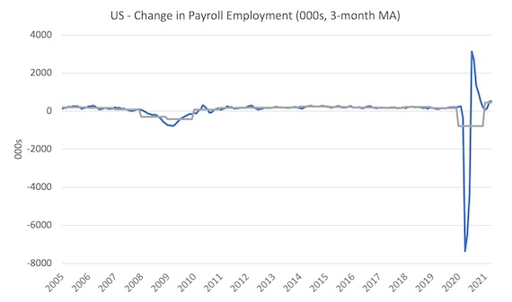
The first graph shows the monthly change in payroll employment (in thousands, expressed as a 3-month moving average to take out the monthly noise). The gray lines are the annual averages.
The data swings are still large and dwarf the past history.
Clearly, the 266,000 jobs gain (net) in March is a substantial reduction in what we saw in March. With States easing restrictions the fall off is surprising.
The US labour market is still 8,215 thousand jobs short from where it was at the end of February 2020.
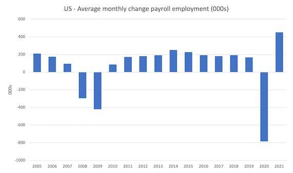
The next graph shows the same data in a different way – in this case the graph shows the average net monthly change in payroll employment (actual) for the calendar years from 2005 to 2020 (the 2020 average is for the months to date).
The final average for 2019 was 168 thousand.
The final average for 2020 was -785 thousand.
The average for 2021 (so far) is 451 thousand.
Labour Force Survey – employment slows below labour force growth
The data for December reveals:
1. Employment as measured by the household survey rose by 328 thousand net (0.22 per cent).
2. The labour force rose by 430 thousand (0.27 per cent).
3. The participation rate rose by 0.2 points to 61.7 per cent.
4. As a result (in accounting terms), total measured unemployment rose by 102 thousand to 9,812 thousand and the unemployment rate rose from 6 per cent to 6.1 per cent.
The BLS note that both unemployment measures:
Both the unemployment rate, at 6.1 percent, and the number of unemployed persons, at 9.8 million, were little changed in April. These measures are down considerably from their recent highs in April 2020 but remain well above their levels prior to the coronavirus (COVID-19) pandemic (3.5 percent and 5.7 million, respectively, in February 2020).
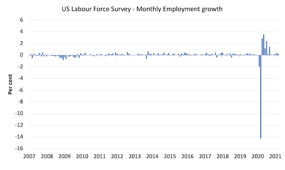
The following graph shows the monthly employment growth since January 2008, which shows the massive disruption this sickness has caused.
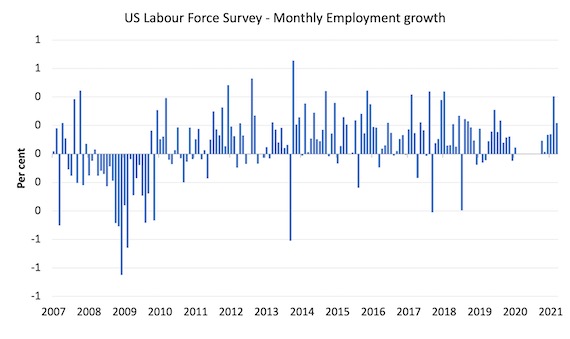
To put the recent period in perspective I took out the extreme observations (outliers) between March 2020 and October 2020 and repeated the graph.
This graph shows the current recovery more realistically.
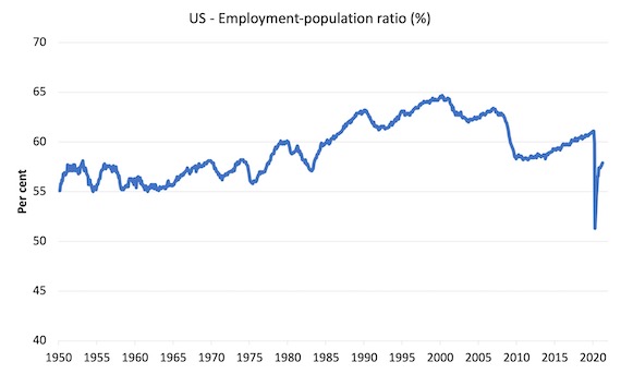
The Employment-Population ratio is a good measure of the strength of the labour market because the movements are relatively unambiguous because the denominator population is not particularly sensitive to the cycle (unlike the labour force).
The following graph shows the US Employment-Population from January 1950 to April 2021.
While the ratio fluctuates a little, the April 2020 ratio fell by 8.6 points to 51.3 per cent, which is the largest monthly fall since the sample began in January 1948.
In April 2021, the ratio rose by 0.1 points to 57.9 per cent.
It is still well down on the level in February 2020 (61.1 per cent).
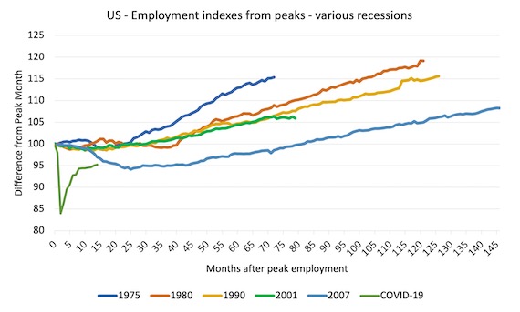
As a matter of history, the following graph shows employment indexes for the US (from US Bureau of Labor Statistics data) for the five NBER recessions since the mid-1970s and the current 2020-COVID crisis.
They are indexed at the employment peak in each case and we trace the data out for each episode until one month before the next peak.
So you get an idea of:
1. The amplitude (depth) of each cycle in employment terms.
2. The length of the cycle in months from peak-trough-peak.
The early 1980s recession was in two parts – a short downturn in 1981, which was followed by a second major downturn 12 months later in July 1982 which then endured.
Other facts:
1. Return to peak for the GFC was after 78 months.
2. The previous recessions have returned to the 100 index value after around 30 to 34 months.
3. Even at the end of the GFC cycle (146 months), total employment in the US had still only risen by 8.3 per cent (since December 2007), which is a very moderate growth path as is shown in the graph.
The current collapse is something else recent gains are evident.
Unemployment and underutilisation trends
The first graph shows the official unemployment rate since January 1994.
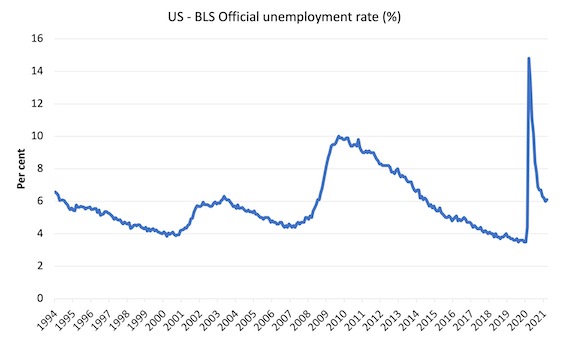
The official unemployment rate is a narrow measure of labour wastage, which means that a strict comparison with the 1960s, for example, in terms of how tight the labour market, has to take into account broader measures of labour underutilisation.
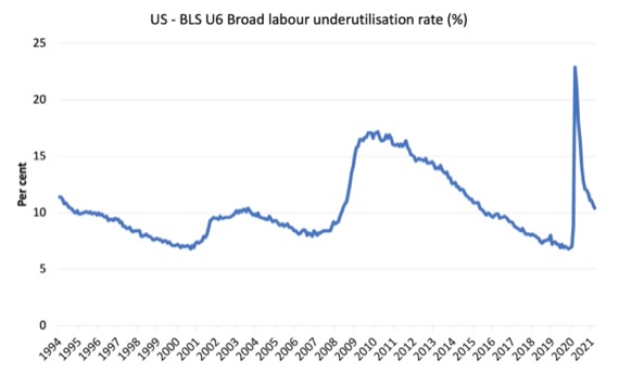
The next graph shows the BLS measure U6, which is defined as:
Total unemployed, plus all marginally attached workers plus total employed part time for economic reasons, as a percent of all civilian labor force plus all marginally attached workers.
It is thus the broadest quantitative measure of labour underutilisation that the BLS publish.
Pre-COVID, U6 was at 6.8 per cent (December 2019).
In April 2021 the U6 measure was 10.4 per cent, a decline of 0.4 points.
The part-time for economic reasons cohort (the US indicator of underemployment) fell by 583 thousand (10 per cent), which explains most of the decline.
The BLS say that:
The number of persons employed part time for economic reasons decreased by 583,000 to 5.2 million in April. This decline reflected a drop in the number of people whose hours were cut due to slack work or business conditions. The number of persons employed part time for economic reasons is 845,000 higher than in February 2020 …
In April, the number of persons not in the labor force who currently want a job was 6.6 million, little changed over the month but up by 1.6 million since February 2020 …
Among those not in the labor force who currently want a job, the number of persons marginally attached to the labor force, at 1.9 million, was essentially unchanged in April but is up by 419,000 since February 2020.
Aggregate participation rate – rose by 0.2 points to 61.7 per cent
What is the impact of that increase for the actual unemployment situation?
We can make two comparisons:
1. Compare the April 2021 with the March 2020 state.
2. Compare the changes in the last month.
The labour force is a subset of the working-age population (those above 15 years old). The proportion of the working-age population that constitutes the labour force is called the labour force participation rate. Thus changes in the labour force can impact on the official unemployment rate, and, as a result, movements in the latter need to be interpreted carefully. A rising unemployment rate may not indicate a recessing economy.
The labour force can expand as a result of general population growth and/or increases in the labour force participation rates.
The following Table decomposes these effects and summarises the relevant aggregates:
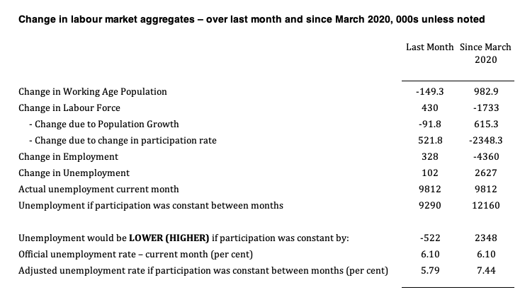
1. The labour force in April 2021 rose by 521.8 thousand as a result of the 0.2 points rise in the labour force participation since March.
3. If those workers had not have come back into the labour force, then the unemployment rate would have been 5.79 per cent rather than the official estimate of 6.1 per cent.
4. Since March 2020, the labour force has contracted by 1,733 thousand as a result of the 0.9 points fall in the labour force participation over that period.
5. If we assume those workers are hidden unemployed – they want to work, are willing to work, but did not actively seek work – and add them back into the official unemployment, the adjusted unemployment rate in April 2021 would be 7.4 per cent rather than the official estimate of 6.1 per cent.
The point is that as the participation rate rises with more employment opportunities becoming available, the unemployment rate will remain somewhat resistant to declines.
It will take a sustained period of employment growth to push the participation rate back to pre-COVID levels and then a more accurate picture of the unemployment situation will be revealed.
How much slack is there in the US labour market?
The question that is being asked is whether the slowdown in payroll employment change is a sign that there is more slack in the labour market remaining than some commentators have been leading their readers to believe.
I use the term ‘supply-side slack’ to mean that there are plenty of workers who are idle in one way or another and who want to work some or more but cannot find the hours because labour demand is weaker than needed.
As note above, the BLS U-6 measure adds together total unemployment, all marginally attached workers, all employed part time for economic reasons and expresses this as a percent of all civilian labor force plus all marginally attached workers.
In April 2021 the components are (in thousands):
1. Total unemployment = 9,821 thousand.
2. Total marginally attached workers = 1,763 thousand.
3. Total part-time for economic reasons = 5,243 thousand.
4. Total comprising the U6 numerator (available labour force underutilised) = 16,818 thousand.
5. However, within the Not in the labour force category (total 100,723 thousand as at April 2021), there were 6,466 who want to work and for various reasons fail the activity test (didn’t search within the last 4 weeks).
So it is more realistic to consider these workers as being possible capacity rather than restrict our estimates to the marginally attached workers who are available for work now.
That would give a total number of 1 + 3 + 5 = 21,521 thousand – that’s 21.5 million folks!.
That figure is an aggregate – that is, it doesn’t decompose spatially (where people live relative to jobs) and the sort of ascriptive characteristics the people bring (education, experiences, age, etc).
We also cannot convert that number into a full-time equivalent number because the BLS does not provide detailed hours breakdowns.
The BLS Labour Force survey doesn’t publish the extra hours this cohort would prefer but we do know the proportion that would usually work full-time.
The BLS publication – The Economics Daily (April 8, 2020) – notes that:
Virtually all of the increase in the number of people who were employed part time for economic reasons occurred in the slack work component-that is, among workers who indicated their reason for working part time was slack work or business conditions. There was little change in the number of part-time workers who indicated they could only find part-time work.
For example, in April 2021, 5,031 thousand workers in the “part-time for economic reasons” category, 1,472 thousand usually work full-time but could not find the work (BLS Table A-25).
That is, 29.3 per cent of those who were forced to work ‘part-time for economic reasons’ usually worked full-time.
As a result of the constraint, they were on average working just 22.6 hours per week instead of 35 hours.
So that represents a considerable idle capacity.
The JOLTs data set noted above also provides information on labour demand.
In February 2021, there were 7,367 thousand non-farm job openings (an increase in the month from 7,099 thousand).
To get a feel for the scale of the flows within the US labour market, there were 5,738 thousand non-farm hires in February 2021, and 5,456 thousand separations
A very large percentage of those job openings turnover each month as workers are laid off (1,775 thousand) or quit (3,357 thousand).
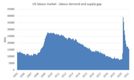
The following graph estimates the gap between labour supply (employment plus unemployment plus part-time for economic reasons plus not in the labour force but want to work) and labour demand (employment plus job openings) from January 2005 to February 2021.
As at February 2021, this measure of slack – the gap – stood at 15,595 thousand or 9.73 per cent of the labour force. In February 2020, this gap stood at 8,076 thousand.
That provides another indicator that there is still considerable slack in the US labour market.
Quit and hire rates
We can also look at the behaviour of the quit rate to judge whether the decline in the unemployment rate is being mostly driven by demand-side or supply-side forces.
The next graph shows the quit and job openings rate for the non-farm sector. The data is only to February 2021 so does not capture the dynamics that the latest payroll data suggests.
In February, the rate of job openings (the number of openings divided by employment plus job openings) had accelerated, reaching 4.9 per cent. This was a higher rate than the US experienced just before the pandemic (4.8 per cent) and was the highest since the data series began in December 2000.
The quit rate has been steady for some months and was 2.3 per cent in February and at the levels experienced before the pandemic.
So workers were demonstrating that they were prepared to move between jobs as job openings rose.
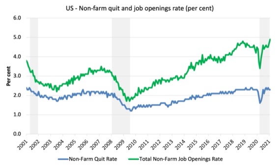
But, it remains that there are still elevated levels of unemployment per job opening.
The following graph shows the total number of unemployed per job opening (non-farm and seasonally adjusted) and thus gives a measure of how strong the demand-side of the labour market (job openings) is relative to the number of people seeking work (the unemployed).
It is an alternative way of presenting the relationships between unemployment and vacancies.
The shaded area indicates the NBER recession months.
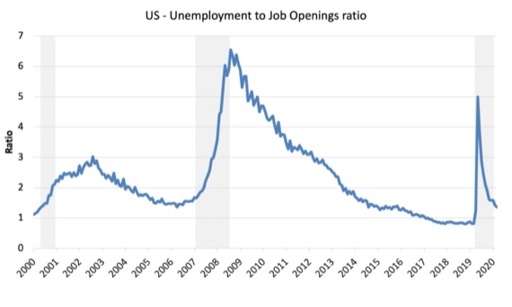
The US Bureau of Labor Statistics article (June 15, 2015) – Job openings reach a new high, hires and quits also increase – notes that:
The job openings and unemployment levels generally move in opposite directions. During a robust economy, job openings are high and unemployment is low. During an economic contraction, the dynamics reverse – unemployment rises, while job openings fall. Accordingly, the ratio of the unemployed to job openings provides a metric that helps describe the state of the economy …
In February 2020, the ratio stood at 0.8 (the lowest in the post-GFC period), while the April 2020 ratio was recorded at 5. A very sharp increase.
Over the remainder of 2020, the ratio steadily fell and by February 2021, the ratio was 1.4, still well above the pre-pandemic level.
If we calculated the ratio using the broader levels of labour underutilisation, then the ratio was 1.5 in February 2020 and was 2.3 in February 2021.
The interpretation is that despite improving dynamics, the data in February was still indicating significant slack in the US labour market.
Ethnicity and Education
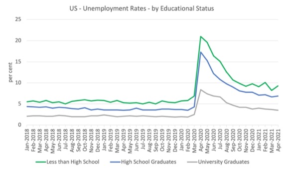
The next graph shows the evolution of unemployment rates for three cohorts based on educational attainment: (a) those with less than high school completion; (b) high school graduates; and (c) university graduates.
As usual, when there is a crisis, the least educated suffer disproportionately.
In the collapse in employment, the unemployment rates rose by:
- 14.1 points for those with less than high-school diploma.
- 13.0 points for high school, no college graduates.
- 5.9 points for those with university degrees.
The period since April 2020 has seen the unemployment rate fall by:
- 11.7 points for those with less than high-school diploma meaning the unemployment rate is now 3.8 points above the March level.
- 10.4 points for high school, no college graduates meaning the unemployment rate is now 4.6 points above the March level.
- 4.9 points for those with university degrees meaning the unemployment rate is now 2.3 points above the March level.
In the last month, the change in the unemployment rate has been:
- rise of 1.1 point for those with less than high-school diploma – so this cohort is bearing the cost of the stalled recovery.
- rise of 0.2 points for high school, no college graduates.
- fall of 0.2 points for those with university degrees.
In the US context, especially in the current time, the trends in trends in unemployment by ethnicity are interesting.
Two questions arise:
1. How have the Black and African American and White unemployment rate fared in the post-GFC period?
2. How has the relationship between the Black and African American unemployment rate and the White unemployment rate changed since the GFC?
Summary:
1. All the series move together as economic activity cycles. The data also moves around a lot on a monthly basis.
2. The Black and African American unemployment rate was 6.8 per cent in March 2020, rose to 16.7 per cent in May and is at 9.7 per cent in April 2021. In the last month, it rose by 0.1 points.
3. The Hispanic or Latino unemployment rate was 6 per cent in March 2020, rose to 18.9 per cent in April and fell to 7.9 per cent in April 2021. In the last month, it was unchanged.
4. The White unemployment rate was 3.9 per cent in March 2020, rose to 14.1 per cent in April and fell to 5.3 per cent in April 2021. In the last month, it fell 0.1 points.
So the rise in unemployment in the last month has been endured by Black and African American workers.
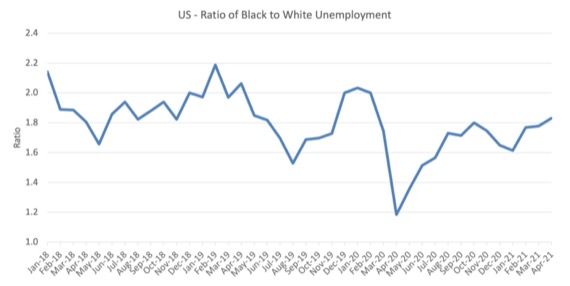
The next graph shows the Black and African American unemployment rate to White unemployment rate (ratio) from January 2018, when the White unemployment rate was at 3.5 per cent and the Black or African American rate was at 7.5 per cent.
This graph allows us to see whether the relative position of the two cohorts has changed since the crisis.
If it is rising, then the unemployment rate of the Black and African American cohort is either rising faster than the white unemployment rate or falling more slowly (or a combination of that relativity).
While there is month-to-month variability, the data shows that, in fact, through to mid-2019, the position of Black and African Americans had improved in relative terms (to Whites), although that just reflected the fact that the White unemployment was so low that employers were forced to take on other ‘less preferred’ workers if they wanted to maintain growth.
In April 2019, the ratio was 2.1 (meaning the Black and African American unemployment rate was more than 2 times the White rate).
By April 2020, the ratio had fallen to its lowest level of 1.2, reflecting the improved relative Black and African American position.
As the pandemic hit, the ratio rose and peaked at 1.8 in October 2020.
In April 2021, the ratio was 1.83 rising from 1.61 in January.
This is the highest ratio level since April 2019.
Conclusion
The April 2021 US BLS labour market data release has sent a mixed signal – the strong March 2021 payroll result has reversed dramatically.
But some of the dynamics that have been building suggest that this reversal might be a temporary state.
What isn’t ambiguous, is that the US labour market is still 8,215 thousand jobs short from where it was at the end of February 2020.
And the unemployment to job openings ratio also suggests significant slack remains.
That is enough for today!
(c) Copyright 2021 William Mitchell. All Rights Reserved.
Has Bill or any other economist done an in-depth analysis of employment from the perspective of what I, as a layman, would call solid or traditional jobs vs. precarious or marginal jobs. When this codger was a young man, having a job usually meant being paid at least a living wage, having some decent benefits, and enjoying some level of job security. I would love to know how many these days are employed in jobs like that, as opposed to gig jobs, temp jobs, on-call jobs, self start-ups, etc. I would find that kind of data far more revealing than raw numbers of employed or unemployed when employment itself has undergone such a drastic devolution in my lifetime.
Analyzing the current unemployment situation in the U.S. demands the addition of the impact of the federal government’s largesse in paying individuals more than they would earn when employed. History doesn’t give us any examples of when a government took such steps to put a safety net under the economy to pay people not to work. Examining the current statistics without taking into account these programs can be fraught with erroneous conclusions.
Tom Nugent, yes it is probably the case that some people are collecting more from the US federal government than they would earn if they were employed part time. The feds are chipping in $300 a week on top of state unemployment compensation at this time. So if you previously had a pretty crummy low paid job AND were eligible for unemployment benefits, you MIGHT be getting more from unemployment compensation than from your previous paycheck.
I think it says more about the quality of those jobs than about paying people not to work. What do you think are some of the erroneous conclusions that people draw from the current situation?
@
Newton E. Finn
Tuesday, May 11, 2021 at 1:53
We are lucky to have the Australian Bureau of Statistics release figures on underemployment as well as normal unemployment, giving an overall underutilisation figure. Underemployment captures a lot of what you talk about.
This of course embarrasses governments and one of our recent Prime Ministers (Abbott) threatened to de-fund the ABS.
The Howard Government in 2005 gave the public free access to ABS data. Prior to that you had to pay for access.
https://www.abs.gov.au/ausstats/abs@.nsf/mediareleasesbyReleaseDate/919E796CD026938FCA25710D00000152?OpenDocument
To Newton E. Finn,
Dr. Mitchell has discussed job quality in some of his posts. Here is a link to one: https://billmitchell.org/blog/?p=41512
Best,
Justin Holt