Today (June 3, 2026), the Australian Bureau of Statistics (ABS) released the latest - Australian…
Australian economy recovers somewhat as the restrictions ease
The Australian economy officially exited recession in the September-quarter 2020, but I wouldn’t tell the labour market that. A technical recession, in case you were not aware, is defined as two, consecutive quarters of negative growth. But, given that employment always lags the start of a recovery, things remain much worse in the labour market than the GDP figures would indicate. Further, we still haven’t a clear idea of what will happen when the wage subsidy and the unemployment supplement schemes are wound back. If things are not well and truly pumping before the Government starts withdrawing the stimulus then bleak(er) times are ahead. The latest data release from the Australian Bureau of Statistics of the – Australian National Accounts: National Income, Expenditure and Product, September 2020 (released December 2, 2020) – shows that the Australian economy grew by 3.3 per cent in the September-quarter after contracting by 7 per cent in the previous quarter as a result of the extensive lockdowns. Household Consumption expenditure rose strongly as opportunities to spend increased and disposable income recovered somewhat. The wage share fell to record levels though (49 per cent) as the real wage growth was outpaced by productivity growth. Overall, I expect the next quarter (December) to be stronger given the recovery that Victoria will bring after opening its economy back up again.
The main features of the National Accounts release for the September-quarter 2020 were (seasonally adjusted):
- Real GDP increased by 3.3 per cent for the quarter. The annual growth rate was minus 3.8 per cent
- The main negative contributor was net exports (minus 1.9 points).
- Australia’s Terms of Trade (seasonally adjusted) rose by 0.7 per cent in the quarter but was down by 1.8 per cent over the 12 month period.
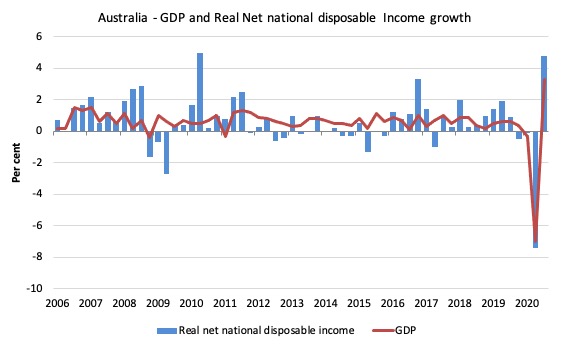
- Real net national disposable income, which is a broader measure of change in national economic well-being rose by 4.8 per cent for the quarter but fell by 3.5 per cent for the 12 months, which means that Australians are worse off (on average) than they were at that point 12 months ago.
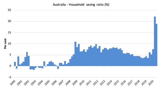
- The Household saving ratio (from disposable income) decreased from 22.1 per cent to 18.9 per cent as the uncertainty over employment and health continued.
Overall growth picture – a slow recovery begins
The ABS – Press Release – said that:
Following the record 7.0 per cent decline in the June quarter, Australia experienced a partial recovery in the September quarter. As a result, economic activity fell 3.8 per cent through the year to September quarter …
Household spending drove the economy, rising 7.9 per cent due to increased spending on both goods and services. Spending on services rose 9.8 per cent, driven by spending on hotels, cafes and restaurants, health and recreation and culture as containment measures were relaxed … Victoria’s household spending fell 1.2 per cent, the only state to record a fall, as tighter restrictions were imposed …
Despite record quarterly growth in household spending, the level in September quarter was 6.8 per cent lower than that recorded in December Quarter 2019 …
Net trade detracted 1.9 percentage points from GDP, the largest detraction since September quarter 1980. Imports of goods and services rose, predominantly reflecting increased demand for consumption goods as restrictions lifted. Exports of goods of services fell, as a result of weaker demand for Australian mining commodities and constraints on travel.
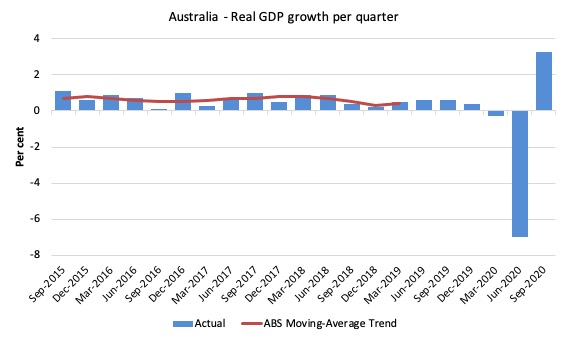
The first graph shows the quarterly growth over the last five years (with the red line being the ABS moving average trend). The ABS has now stopped publishing the trend for the time being given the large swings in performance that will be experienced over the next several quarters.
The massive 2020 outlier renders graphs like this rather binary and suppress the variations in the growth performance in prior quarters.
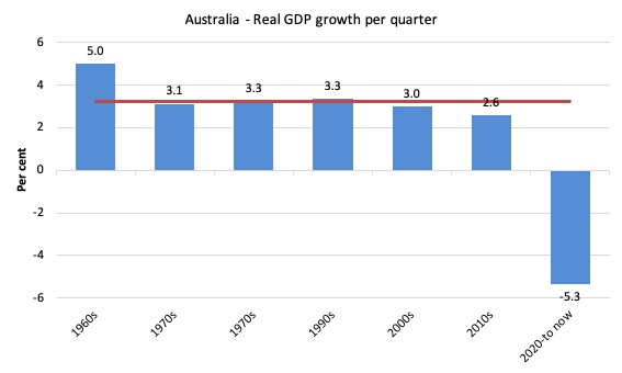
To put this into historical context, the next graph shows the decade average annual real GDP growth rate since the 1960s (the horizontal red line is the average for the entire period (3.2 per cent) from the September-quarter 1960 to the September-quarter 2020).
The 2020-to-now average is obviously just the March- to September-quarter 2020 average.
I put the data labels in the graph because it is harder to differentiate the decades given the flattening effect of the current outlier.
It is obvious then how far below historical trends the growth performance of the last 2 decades have been as the fiscal surplus obsession has intensified on both sides of politics.
Even with a massive household credit binge and a once-in-a-hundred-years mining boom that was pushed by stratospheric movements in our terms of trade, our real GDP growth has declined substantially below the long-term performance.
Analysis of Expenditure Components
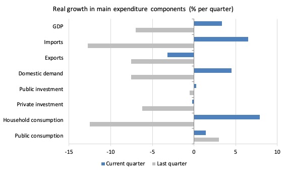
The following graph shows the quarterly percentage growth for the major expenditure components in real terms for the June-quarter 2020 (grey bars) and the September-quarter 2020 (blue bars).
Points to note:
1. The pre-Pandemic growth performance was already weak, a point that the Government should recognise when calibrating the appropriate size of the stimulus to deal with the health crisis.
2. Household Consumption expenditure rose by 7.9 per cent in the September-quarter after declining by 12.5 per cent in the previous quarter. Over the last 12 months, it has fallen by 6.5 per cent.
3. General government consumption expenditure rose by 1.4 per cent in the September-quarter and by 7.8 per cent over the 12 months.
4. Export expenditure fell by 3.2 per cent in the September-quarter and by 14.9 per cent over the 12 months. The difference this quarter is that imports rose by 3.3 per cent, whereas they declined by 7 per cent last quarter to offset the decline in exports. In other words, the trade sector undermined growth this quarter, whereas last quarter it contributed to growth (even though the economy still contracted).
5. Private investment expenditure growth continued to decline and fell by 0.2 per cent this quarter after declining by 6.6 per cent in the previous quarter.
6. Public investment rose by 0.3 per cent for the quarter. Over the 12 months public investment spending has declined, however, as the big state government transport projects start to taper. But with state governments starting to announce large stimulus packages targetted at public infrastructure, that situation will change quickly.
Contributions to growth
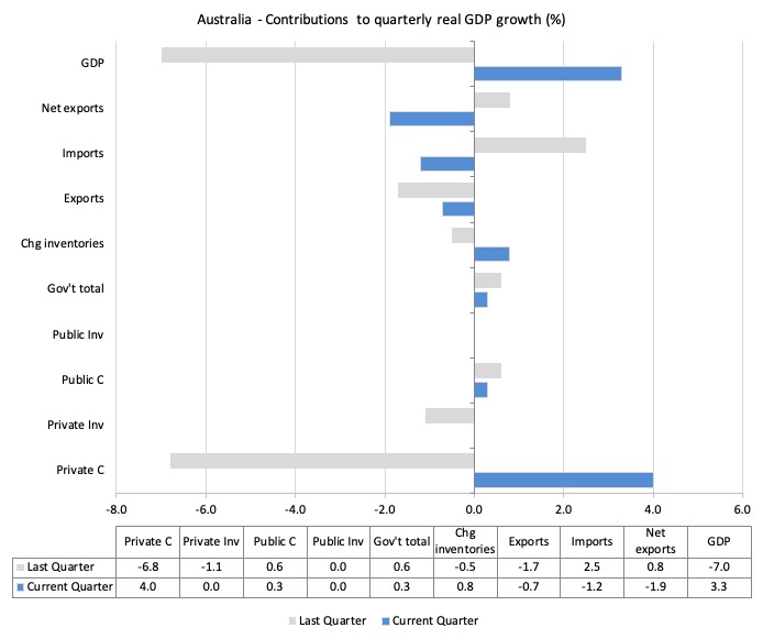
What components of expenditure added to and subtracted from the 7 per cent decline in real GDP growth in the September-quarter 2020?
The following bar graph shows the contributions to real GDP growth (in percentage points) for the main expenditure categories. It compares the September-quarter 2020 contributions (blue bars) with the March-quarter 2020 (gray bars).
In order of contribution:
1. Household consumption expenditure contributed 4 points to the overall growth decline result as households starting spending more.
2. Private investment expenditure undermined growth by 0 points (negative at 2 decimal points).
3. Growth in inventories contributed contributed 0.8 points. This is related to firms replenishing stocks.
4. Public consumption contributed 0.3 points and public investment 0 points. Overall, the government sector contributed 0.3 points.
5. Net exports reduced growth by 1.9 points – because both exports (-0.7 points) and imports (-1.2 points) worked in opposite directions (remember imports are a drain on expenditure).
Material living standards fell significantly in September-quarter 2020
The ABS tell us that:
A broader measure of change in national economic well-being is Real net national disposable income. This measure adjusts the volume measure of GDP for the Terms of trade effect, Real net incomes from overseas and Consumption of fixed capital.
While real GDP growth (that is, total output produced in volume terms) rose by 3.3 per cent in the September-quarter 2020, real net national disposable income growth rose by 4.8 per cent.
How do we explain that?
There was a rise in employee compensation (of 2.3 per cent), which boosted household disposable income.
Further the terms of trade improved.
The following graph shows the evolution of the quarterly growth rates for the two series since the September-quarter 2006.
Household saving ratio falls marginally as household spending returns
The household saving ratio fell from 22.1 per cent to 18.9 per cent in the September-quarter as disposable income rose and more opportunities to spend opened up.
The impacts of the coronavirus (lost income) have exacerbated the tension households have been facing with flat income growth for several years and massive debt levels.
The following graph shows the household saving ratio (% of disposable income) from the September-quarter 2000 to the current period. It shows the period leading up to the GFC, where the credit binge was in full swing and the saving ratio was negative to the rise during the GFC and then the most recent rise.
While the saving ratio might appear to be still very high, if we take a longer term view of it, the behaviour is less ‘historic’ than we might think. Back in the full employment days, when governments supported the economy and jobs with continuous fiscal deficits (mostly), households saved significant proportions of their income.
In the neoliberal period, as credit has been rammed down their throats, the saving rate dropped (to negative levels in the lead-up to the GFC).
Hopefully, households are paying off the record levels of debt they are now carrying and improving their financial viability.
To put the more recent period into an historical context, the next graph shows the household saving ratio (% of disposable income) from the September-quarter 1960 to the current period.
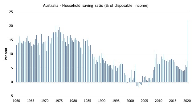
The following table shows the impact of the neoliberal era on household saving. These patterns are replicated around the world and expose our economies to the threat of financial crises much more than in pre-neoliberal decades.
The result for the current decade (2020-) is the average for the March and June observations.
| Decade | Average Household Saving Ratio (% of disposable income) |
| 1960s | 14.3 |
| 1970s | 16.1 |
| 1980s | 12.0 |
| 1990s | 5.4 |
| 2000s | 2.2 |
| 2010s | 6.42 |
| 2020- | 16.2 |
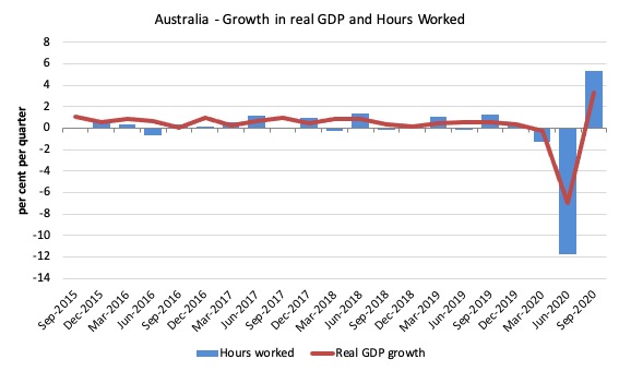
Real GDP growth and hours worked
The following graph presents quarterly growth rates in real GDP and hours worked using the National Accounts data for the last five years to the September-quarter 2020.
The September-quarter data shows the rather dramatic reversal in total hours worked with real GDP following – which means that productivity growth rose quite strongly (3.1 per cent).
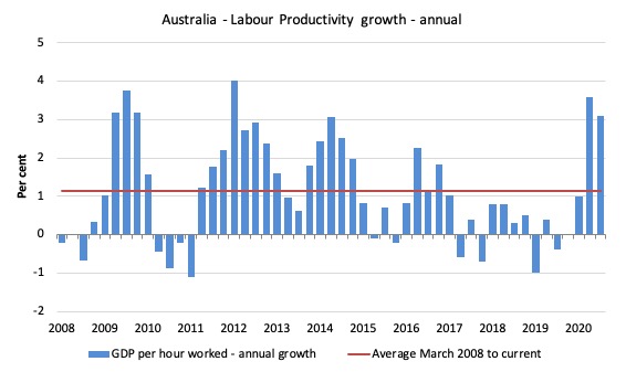
To see the above graph from a different perspective, the next graph shows the annual growth in GDP per hour worked (labour productivity) from the September-quarter 2008 quarter to the September-quarter 2020. The horizontal red line is the average annual growth since September-quarter 2008 (1.1 per cent), which itself is an understated measure of the long-term trend growth of around 1.5 per cent per annum.
The relatively strong growth in labour productivity in 2012 and the mostly above average growth in 2013 and 2014 helps explain why employment growth was lagging given the real GDP growth. Growth in labour productivity means that for each output level less labour is required.
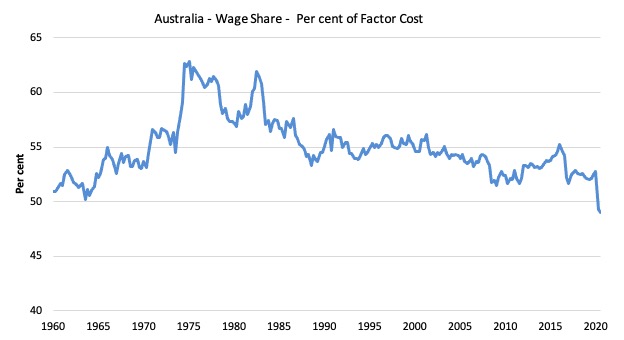
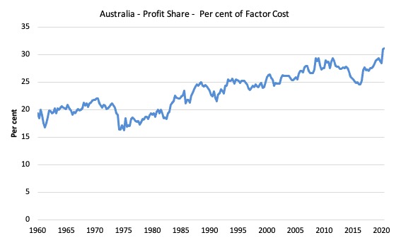
The distribution of national income moves towards profits
This is the real story of the data release.
The stronger productivity growth outstripped any real increase in wages and so the wage share in national income fell by 0.3 points to a record low of 49 per cent while the profit share rose to 31.1 per cent (up 0.1 points).
The first graph shows the wage share in national income while the second shows the profit share.
The declining share of wages historically is a product of neoliberalism and will ultimately have to be reversed if Australia is to enjoy sustainable rises in standards of living without record levels of household debt being relied on for consumption growth.
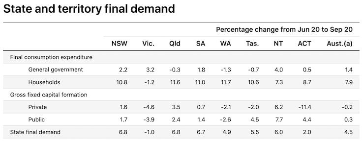
The change in final demand at the State/Territory level
The following graph shows the percentage decline in final demand for the States and Territories for the September-quarter. It is taken from the ABS Table (thanks).
It is clear that the harsh Stage 4 lockdown that has seen Victoria defeat the second wave of the virus (32 days in a row with zero cases), contributed to its over 1 per cent decline in final demand at a time that the other states and territories (which were not in lockdown) were recovering.
The decline is actually modest given the scale of the lockdown in Victoria – I was surprised (pleasantly) in that regard.
If the virus containment (Australia has nearly eliminated it) continues then Victoria will rebound strongly in the December-quarter, particularly given the massive state government stimulus package announced in its recent fiscal statement.
Conclusion
Remember that the National Accounts data is three months old – a rear-vision view – of what has passed and to use it to predict future trends is not straightforward.
The recovery in real GDP growth in the September-quarter is welcome after a massive decline in the June-quarter.
I expect the next quarter (December) to be stronger given the recovery that Victoria will bring after opening its economy back up again.
However, the labour market is still struggling and if the Government withdraws its fiscal support too early things will get ugly quickly
That is enough for today!
(c) Copyright 2020 William Mitchell. All Rights Reserved.
This Post Has 0 Comments