The recent extreme weather in the northern hemisphere, the twin monster tropical storms in Japan,…
Is the $US900 billion stimulus in the US likely to overheat the economy – Part 2?
The answer to the question posed in the title is No! Lawrence Summers’ macroeconomic assessment does not stack up. In – Is the $US900 billion stimulus in the US likely to overheat the economy – Part 1? (December 30, 2020) – I developed the framework for considering whether it was sensible for the US government to provide a $US2,000 once-off, means-tested payment as part of its latest fiscal stimulus. Summers was opposed to it claiming that it would push the economy into an inflationary spiral because it would more than close the current output gap. Today, I do the numbers. The conclusion is that there is more than enough scope for the Government to make the transfers without running out of fiscal space.
Measuring the output gap in the US
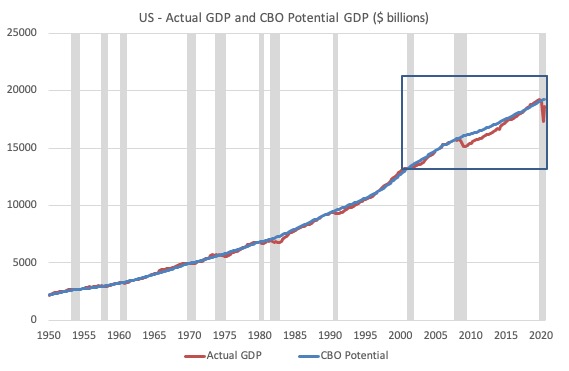
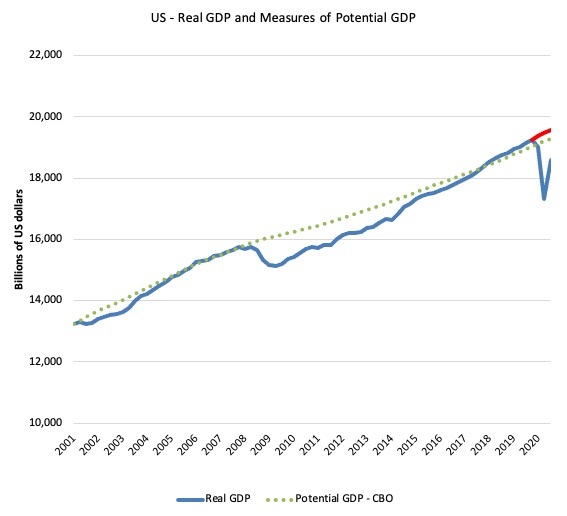
The first graph gives you an idea of the real GDP (output) history and the CBO measure of potential GDP. The grey bars are the NBER recessions (peak to trough).
The boxed area is shown in more detail in a later graph.
The thing that stands out in this graph is that the GFC was a very bad recession relative to the previous downturns, of which some were quite serious – such as the 1981-82 recession.
Not only was the length of downturn of the GFC prolonged but the amplitude of the real GDP contraction stands out.
But the other major issue is that CBO estimated that the potential growth path contracted significantly as a result of the prolonged recession.
One of the reasons, potential GDP declines after a recession is if the investment ratio declines significantly.
Investment spending has two impacts:
(a) It adds to current demand for goods and services (capital equipment, etc).
(b) It adds productive capacity to the economy which increases the potential GDP.
So an enduring decline in investment, which commonly drives recessions, not only opens up the output gap, but also reduces potential output.
The impact on potential GDP depends on how deep and how long the recession is.
The GFC was particularly severe.
The decline in the investment ratio as a result of the crisis was substantial and endured for 2 years. It went from 18.2 per cent in the June-quarter 2006 to a low of 12.3 per cent in the December-quarter 2009.
As a result the potential productive capacity of the US contracted somewhat The question is how much?
There are various estimates available but the overall message is that potential GDP fell considerably as a result of the lack of productive investment in the period following the crisis (see below).
It returned slowly (the cyclical response was asymmetric) to 18 per cent by the June-quarter 2018, fell back somewhat and then peaked at 18.4 per cent in the June-quarter 2019.
The current decline due to the pandemic only accentuates the downturn spiral that began in the September-quarter 2019.
The next graph shows the percentage annual change in business investment in the US since 1950.

Now consider the next graph which zooms in on the rectangular area identified in the earlier graph.
To get some idea of what has happened to potential real GDP growth in the US, the next graph shows the actual real GDP for the US (in $US billions) and two estimates of the potential GDP. There are many ways of estimating potential GDP given it is unobservable.
In this blog post – Common elements linking US and UK economic slowdowns (May 1, 2017) – I discussed estimates of potential GDP in the US and the shortcomings of traditional methods used by institutions such as the Congressional Budget Office.
So if you are interested please go back and review that discussion.
The latest CBO estimates, made available through – St Louis Federal Reserve Bank, show why we should be skeptical.
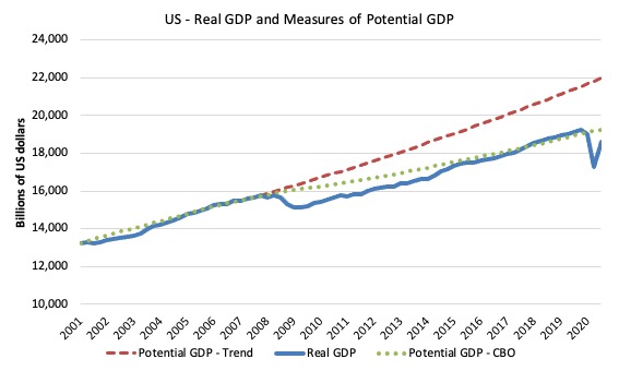
While I could have adopted a much more sophisticated technique to produce the red dotted series (potential GDP) in the graph, I decided to do some simple extrapolation instead to provide one base case.
The question is when to start the projection and at what rate. I chose to extrapolate from the most pre-GFC GDP peak (December-quarter 2007). This is a fairly standard sort of exercise.
The projected rate of growth was the average quarterly growth rate between 2001Q4 and 2007Q4, which was a period (as you can see in the graph) where real GDP grew steadily (at 0.65 per cent per quarter) with no major shocks.
If the global financial crisis had not have occurred it would be reasonable to assume that the economy would have grown along the red dotted line (or thereabouts) for some period.
The gap between actual and potential GDP (red dotted version) in the September-quarter 2020 is around $US3,377.3 billion or around 15.4 per cent.
The green dotted line is the estimate of potential output provided by the US Congressional Budget Office and suggests that the US economy is 3.5 per cent below potential GDP (as calculated by the CBO).
Note that prior to the pandemic, the CBO was estimating that the US economy was operating above its potential limits by 1.2 points (in the December-quarter 2019).
They considered the economy had been operating at over-full capacity since the March-quarter 2018.
It is hard to believe the estimate!
Why?
1. Inflation has shown no signs of accelerating.
2. Inflationary expectations declined over that period.
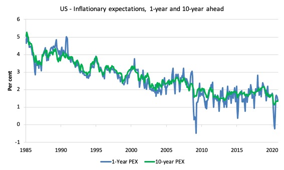
The following graphs are compiled using the Cleveland Federal Reserve Bank’s – Inflation Expectations data.
The first graph shows the expected price inflation for the next 12 months and for the next 10 years from 1985 to November 2020.
The second graph zooms in on the period one-quarter before the CBO estimated the US economy was ‘overheating’ (that is, producing more than its capacity).
Over that period the inflationary expectations have been trending down and well below 2 per cent, which is a benchmark the Federal Reserve uses to define price stability.
In other words, the market participants have no expectation that inflation is going to rise at all over the next year or over the ten-year period ahead.
Inflationary expectations are benign.
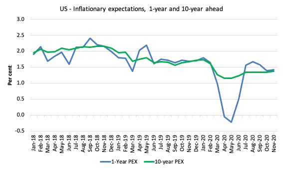
While it might take a few quarters for an over-capacity economy to ‘heat up’, it doesn’t make any sense for the market to systematically believe that inflation will continue to spiral downwards at the same time the economy is operating at more than 1 percentage point above its potential.
3. The US Federal Reserve Open Market Committee (FOMC) probably bought some of the OBS kool-aid and started hiking rates in December 2016. There were 8 subsequent increases before they worked out the economy was not overheating at all and they quickly cut the rate to 0.25 per cent (cutting 2 points).
They had already cut it three times before the pandemic hit.
4. While the unemployment fell to levels not seen since the 1960s, the broader measures of labour underutilisation indicated there was still considerable slack.
Even though the official unemployment rate has been relatively low, the question to ask is this: How much lower would the unemployment rate and the broader underutilisation rate go if the US federal government offered a Job Guarantee on an unconditional basis?
I would bet the answer would be much lower without any inflation acceleration emerging.
The flat wages growth supports that interpretation.
The only group that enjoyed significant wages growth has been at the top-end of the wage distribution (95th percentile and beyond).
The bottom percentiles have barely seen any growth and certainly not sufficient to think of the last few years as being an overheating economy.
Taken together, all the usual indicators suggest that the CBO output gap estimates are inaccurate – probably by several percentage points.
And that inaccuracy is a direct function of the way they define potential GDP and integrate the NAIRU into the estimation process.
We know (and I explain this in more detail in the blog post mentioned above), the CBO base their estimate of Potential GDP on their estimate of the NAIRU – the (unobservable) Non-accelerating Inflation Rate of Unemployment.
This is a conceptual unemployment rate that is consistent with a stable rate of inflation.
The literature demonstrates that the history of NAIRU estimation is far from precise. Studies have provided estimates of this so-called ‘full employment’ unemployment rate as high as 8 per cent or as low as 3 per cent all at the same time, given how imprecise the methodology is.
The former estimate would hardly be considered “high rate of resource use”. Similarly, underemployment is not factored into these estimates.
The continued slack in the labour market (bias towards low-pay and high underemployment) would lead to the conclusion that the output gap is likely to be somewhat closer to the extrapolated estimate (red dotted line) than the CBO estimate.
However, while the red dotted line may have had some validity as a guide to potential output in the early part of the GFC, it is also clear that with the poor investment response during the GFC that the true potential GDP has fallen off that trend and lies somewhere between the CBO estimate and the crude extrapolation (red dotted line).
Think about the period between 2017 and 2018.
GDP growth steadied after its long recovery and a new trend looked like emerging before the pandemic.
If we extrapolate from that point, based on the average growth from the December-quarter 2015 to the December-quarter 2019 (0.57 per cent per quarter growth, which was below the pre-GFC trend of 0.65 per cent) out to the September-quarter 2020, we get a new line denoted by the red line in the next graph.
You can see that it lies above the CBO potential GDP estimates and closer to but well below the red dotted line (which is not shown here).
The estimated output gaps then – as at September-quarter 2020 – are:
1. Red dotted line – 15.4 per cent.
2. Red line – 5.1 per cent.
3. CBO official – 3.5 per cent.
4. Jobs gap method (see below) – 6.6 per cent.
I would suspect that the truth is somewhere between 1 and 2 but much closer to 4.
The US jobs deficit and the output gap
I updated the participation shifts due to ageing this morning to allow us to decompose the shift in participation into cyclical components and ageing population component.
As the population ages, and older workers have lower participation rates, the aggregate participation rate, which is a weighted average of the individual age cohort participation rates, falls – not because the individual age cohort rates change but that there are more workers in the total with lower rates.
That is, some of the drop in US participation rates over the last 2 decades is due to a compositional effect rather than a cyclical effect (the latter captures workers dropping out of the labour force temporarily when they stop searching as a result of the lack of job opportunities).
My detailed analysis which I will write up in another blog post some time later shows that about 66 per cent of the decline in the participation rate since April 2000 is due to these compositional shifts and 33.8 per cent is due to the economic cycle (output below potential).
The current participation rate of 61.5 per cent is a long way below the most recent peak in January 2007 of 66.4 per cent.
Adjusting for the demographic effect would give an estimate of the participation rate in November 2020 of 65.3 per cent if there had been no cyclical effects.
To compute the job gaps, a ‘full employment’ benchmark of 3.5 per cent is used – which was the low-point rate rate achieved in December 2019 before the pandemic.
I explain in this blog post – US labour market – strengthened in February but still not at full employment (April 13, 2018).
Using the estimated potential labour force (controlling for declining participation), we can compute a ‘necessary’ employment series which is defined as the level of employment that would ensure on 3.5 per cent of the simulated labour force remained unemployed.
This time series tells us by how much employment has to increase in each month (in thousands) to match the underlying growth in the working age population to maintain the 3.5 per cent unemployment rate benchmark.
In the blog post cited above (US labour market – strengthened in February but still not at full employment), I provide more information and analysis on the method.
There are two separate effects:
- The actual loss of jobs between the employment peak in December 2019 and November 2020 is 9,071 thousand jobs.
- The shortfall of jobs (the overall jobs gap) is the actual employment relative to the jobs that would have been generated had the demand-side of the labour market kept pace with the underlying population growth and the participation rate adjusted for ageing. This shortfall loss amounts to 5,711 thousand jobs.
- The total jobs gap is thus 14,782 thousand.
This gives another perspective on what the output gap might be.
We can estimate the extra output that would be forthcoming if these workers were engaged as the current potential by multiplying the jobs gap by the average average productivity per person employed.
The aggregate average productivity is likely to overstate the actual productivity gain from the workers who are currently without work given they typically work disproproportionately in the lower paying jobs I adjust the average productivity to be only 70 per cent of the economy-wide average.
Using that benchmark we get an output gap in the September-quarter of 6.6 per cent.
The $US900 billion package
The stimulus package that the President has signed is included in the – Consolidated Appropriations Act 2021 (all 5,600 pages of it).
Distilling the essential features leads to this summary (which may not be perfect):
1. $US286 billion in direct aid comprising $US600 cheques means-tested (those earning below $US75,000 annually) and weekly unemployment assistance of $US300 per week for 11 weeks (to March 14, 2021).
The $US600 cheque outlays are to be capped at a total of $US166 billion.
2. $US325 billion for small business assistance, including $US284 in foregivable loans .
3. $US82 billion for assistance to help schools.
4. $US54 billion for public-health measures associated with contact tracing and vaccination.
5. $US45 billion for transportation – assisting airline payroll support and public transport.
6. $US25 billion in rental assistance.
7. $US13 billion for food-assistance (SNAP).
8. $US10 billion to help pre-school assistance, child-care.
9. $US15 billion to aid the arts sector (theatres, cinemas, music venues, etc).
10. $US10 billion to US Postal service.
11. $US7 billion to expand high-speed internet access to low-income families.
12. $US35 billion for development of wind, solar and other clean energy projects.
So the stimulus package is a mixture of individual transfers, government consumption expenditure, loans to businesses and transfers to state and local governments.
The composition is important because it has implications for the multiplier effects (see below).
With more than a third being in the form of loans to business, which may or may not be re-cycled into the spending stream, the direct injection from the package will be considerably lower than $US900 billion.
Further, as I pointed out in this blog post – Tax cuts are unlikely to work at present and are less effective than government spending increases (October 1, 2020) – the evidence from the cash handouts under the CARES Act (the first stimulus package) indicated that:
1. “Only 15 percent of recipients of this transfer say that they spent (or planned to spend) most of their transfer payment, with the large majority of respondents saying instead that they either mostly saved it (33 percent) or used it to pay down debt (52 percent).”
2. “U.S. households report having spent approximately 40 percent of their checks on average, with about 30 percent of the average check being saved and the remaining 30 percent being used to pay down debt.”
3. “Little of the spending went to hard-hit industries selling large durable goods (cars, appliances, etc.). Instead, most of the spending went to food, beauty, and other non-durable consumer products that had already seen large spikes in spending even before the stimulus package was passed because of hoarding.”
I provided more analysis in the blog post cited.
So it is questionable how much of the direct assistance via individual transfers will actually be spent, given the fact that American households are carrying excessive debt levels.
The fiscal multiplier
The next step is to think about the spending multiplier, which measures the impact on final output and income of a unit change in an injection of spending.
So, if the multiplier is 1.5, then a $1 injected into the spending stream, say, by government fiscal stimulus, will lead to a final increase in GDP of $1.50.
The value depends on the proportion of each extra income received that is spent on consumption, the tax rate structure and the extra dollars that leak out to import spending.
An extra dollar in the hands of a low-income worker is likely to be most spent whereas the same is not true for an extra dollar given to a high-income earner.
Further, during crises, when borrowing capacities fall and assets cannot be easily sold, the proportion increases.
Please read my blog post – Spending multipliers (December 28, 2009) – for more discussion on this point.
This recent ‘FRBSF Economic Letter’ published by the Federal Reserve Bank of San Francisco – The COVID-19 Fiscal Multiplier: Lessons from the Great Recession (May 26, 2020) – provides some interesting discussion of the likely multiplier effects of the COVID stimulus packages.
They note that the composition of the stimulus package influences the value of the multiplier:
1. Individual transfers – trigger high on-spending.
2. Government consumption – “the multiplier may be as high as 1.5 to 2.0”.
3. Transfers to state and local governments – “unlikely that states would use any of their federal transfer funds to finance tax cuts or pay down preexisting debt.”
Overall, they conclude that the multiplier is likely to be “near or above 1” which means that a fiscal stimulus will be expansionary.
They conclude that:
Overall, the evidence suggests that the output boost from the current fiscal response is likely to be large.
So is the $US900 billion too expansionary?
We now have some concept of how far the US economy is from its potential.
I might also project that the output gap will widen in the next quarter or so given the horrific state of the pandemic in the US.
A $US900 billion spending increasing would represent about 1.2 per cent of annual GDP.
There are two other uncertainties:
1. We do not know the time profile of when the spending will enter the spending stream.
2. We do not know how much of the $900 billion will enter the spending stream given the fact that a significant proportion of the CARES stimulus was saved or used to pay down debt and that more than a third of this stimulus package is in the form of loans.
What does an percentage output gap translate into billions?
1. 5.1 per cent is $US3,950 billion over a year.
2. 6.6 per cent is $US5,267 billion over a year.
3. CBO 3.5 per cent is $US2,684 billion over a year.
So even if all the $US900 billion entered the spending stream over 2021 and the CBO’s estimates of the output gap were accurate, there would be no likelihood that the stimulus (multiplied up) would drive the economy into a state of overheating (that is, exhausting its productive potential).
Clearly, given that the full $US900 billion is not going to enter the spending stream over 2021 and the output gap is likely to be closer to 6.6 per cent than the CBO’s estimate, then the fiscal space is clearly able to accommodate the $US600 payment and would also be able to accommodate the revised proposal for $US2,000 per eligible person.
Distributional matters
Which means there would also be scope to address the distributional anomalies that concern progressives within the current fiscal space (see my discussion in Part 1) without any offset fiscal measures to reduce the net spending injection.
That is the topic of another blog post though.
Conclusion
Larry Summers was not correct in his macroeconomic analysis and that is where the attacks should have begun.
I hope I have given a feel for how analysis of this type is an art form rather than an exact science.
There are assumptions, uncertainties, and complete unknowns that enter into the exercise, which ultimately has to be distilled down to a numbers game.
Some heterodox economists argue that because of the endemic uncertainty this sort of analysis is meaningless.
They overlook the fact that governments have to outlay dollars to motivate changes in the aggregates and so it is better to provide some numerical scope for what those outlays will deliver.
A good analysis also has an eye to sensitivity of settings, which I have demonstrated by considering the reasonable range of output gaps, for example.
Then you have to consider the consequences of error.
In this case, the consequences of not providing enough fiscal stimulus are much more significant than providing too much.
In the former case, a shortfall of spending will leave unemployment higher than otherwise necessary and sacrifice billions in foregone income.
The consequences of pushing spending a little more than is necessary is some price pressures, which are less destructive than unemployment and can be easily dealt with.
Happy New Year – as Victoria again closes its border to NSW after the latter has failed to deal with the latest virus numbers and spread the infection to Melbourne from Sydney.
More flights I had planned for tomorrow have just been cancelled.
2021 looking like 2020.
That is enough for today!
(c) Copyright 2020 William Mitchell. All Rights Reserved.
Brilliant analysis.
Happy New Year to you as well.
Can anyone question the rightness of this:- “I hope I have given a feel for how analysis of this type is an art form rather than an exact science”?
And yet, and yet … Some of the comments on Part 1 seem to imply that decisions concerning the adjustment of social-support measures to people’s real needs can – and therefore ought to be – entrusted to “automatic” mechanisms (ie requiring no human intervention in their operation). Surely, there’s a basic contradiction (or a misconception) there somewhere?
How could that ever come to be so, if the exercise of judgment upon which such decisions would necessarily continue to rest relies on art, not on exact science?
Maybe we should just turn the whole thing over to AI devices – to “learning machines”? Then the politicians could be dispensed-with entirely and – might one hope – the economists along with them?
Dr. Mitchell,
Is this a typo:
“1. Red dotted line – 15.4 per cent.”
Should the number 1 read 5.4?
Please excuse my comment if I am in error.
Happy New Year,
Justin Holt
Now if we could only get Biden to sit down and listen. And then he could sit Pelosi down and she would listen. Who knows. Mitchell has a far firmer grip on reality compared to Summers. I link to Mitchell’s posts for my readers benefit. But I’m a ‘bankbencher,’ state rep from New Hampshire. Baby steps.
Happy New Year Bill
and to everybody around the world as your time comes.
“This gives another perspective on what the output gap might be.”
With the US do we have to factor in all those places in the rest of the world that peg themselves to the US dollar? The US gets to use up their capacity as well as that within its own borders.
If that is the case then the US has even more ‘shock buffers’ that could absorb ‘excess spending’ than anywhere else in the world.
Happy New Year Bill and all yall in progressive mentality / long term thinking.
And to all others also
P. S. Mine is in 4 hours (hopefully without anymore tremors in New Year, these last 3 days were a bit.h cause of earthquakes here)
Dear Justin Holt (at 2021/01/01 at 12:18 am)
Thanks for the comment.
The 15.4 per cent relates to the red dotted line, which extrapolates out the growth trend from pre-GFC. That gives an output gap of that magnitude.
So there no typo here.
best wishes
bill
Excellent analysis!
I like it when Bill mentioned that although the derived and used framework for numerical crunching may not be fully scientific, but it is one that is based on a clear understanding of macroeconomics and a real as well as an estimate data sets.
When a thesis is presented succinctly, and more importantly, all parts of it stood the constant public scrutiny over time, it basically means this will be the one to replace our current understanding on this issue, and the one to use going forward, especially when it is published (like on this blog).
Happy New Year to you Bill and everyone who reads this blog!
Dear Professor Mitchell, your analysis is as always excellent and very well documented and substantiated. I’m only curious to learn how Larry has reached his conclusion about overheating the economy but I suspect that he’s employing neoliberal inflation scaremongering to discipline the few progressive politicians like Bernie and AOC, who advocate the necessity of increasing the stimulus to $2000/person.
I’m also puzzled with the following quotation from your post “A $US900 billion spending increasing would represent about 1.2 per cent of annual GDP.” and I wonder how you arrived at this low percentage given that USA GDP is estimated about $21,000 billion as of 3rd quarter of 2020.
Wishing everyone a Happy and Prosperous New Year, pandemic free and peaceful. I also hope that your predictions regarding this new year to be proven, for once, wrong!
I agree with robert H.
Faith in automatic stabilisers seems to be wishful thinking.
The unknowns in this blogs analysis are striking.
There just isn’t any viable economic model to predict inflation accurately.
Science no ,Artful maybe. Politics for sure.
I can agree with the conclusion the prudent thing for the government t do is increase fiscal stimulus.
Macroeconomic analysis at the level of current understanding despite the lack of rigor is still a good starting point. It should be a foundation of all policy decisions. It is unfortunate, of course, that it is more art than science. However, I still maintain, that the real progress can only be made by implementing a political and financial system where fiscal and monetary interventions are frictionless, speedy and flexible, perhaps accompanied by some automatic stabilizers. The tools are not expected to be accurate. In other words, one shouldn’t have to argue over $600 or $2000 checks to population. Just spend, tax or invest as much as is felt necessary at the moment. As long as miscalculations can be quickly corrected it shouldn’t be an issue. This implies ability to measure results and having regulations in place to avoid waste and maintain responsibility for outcomes. At present this is not feasible. This is primarily due to political and ideological environment throughout the world. Also, this would go against the interests of the ruling financial and industrial elites. All modern governments are tightly connected to and most of the time indirectly represent this demographic. As long as this persists one cannot expect much improvement in democratic process.
I also believe that it is futile to treat economic, political and ideological systems as separate and more or less independent. A practical design must span all of these spheres. Macroeconomic arguments drive policy decisions which in turn are made through a political process with a stated goal of improving life of the people as defined by some moral considerations. If the process fails at any of those steps it’s not a useful or workable design regardless how ‘correct’ the other portions are. MMT is a portion of the economic component. It must be accompanied by an equally well described (implementable) political system to complement it. Also, moral foundation of the society must be adjusted to allow the people to see value in and strive for the common good.
Lavrik, you do remember that Neo-liberal economists have proven that the best common good case is the one achieved by letting everyone try to maximize his own selfish interests. This has been proven from 1st principals. It can’t be argued against.
/snarky BS.
I don’t really think all these talk of 2000 overheating economy really applies to me at all.
I try to save money no matter what anyway. If I have any extra, I’d just save it. My parents went bankrupt before. I know society has no obligation for me at all.
2000 USD will go to the parasitic landlords anyway, people are just transitional holders of the stimulus.
Increasingly I find that alot of articles and analyses of the mainstream simply does not apply to poor people like myself. They are for middle class people who have leeway to spend because they are always secure fundamentally.
Even before the pandemic my savings were being run out because my parents couldn’t find work.
The world my professors knew and teach us about does not exist anymore.