The Australian Bureau of Statistics (ABS) released the latest labour force data today (APRIL 16,…
Australian labour force data – underutilisation rate rises to 23.4 per cent
Whatever way you want to interpret it, the Australian labour market fell off a very steep cliff in the four weeks from around March 12 to April 12. The latest data from the Australian Bureau of Statistics – Labour Force, Australia, April 2020 – released today (May 14, 2020) is shocking. Like all the data releases at the moment. All the main aggregates moved in extremely adverse directions. Employment fell by 4.6 per cent (594,300). Unemployment rose by 104,500 thousand. But that is a gross understatement of the problem given that the participation rate fell by 2.4 points, which meant the labour force fell by 489.8 thousand. Without the fall in the participation rate in April 2020, the unemployment rate would have been 9.7 per cent rather than its current value of 6.2 per cent). Monthly hours of work fell by 9.2 per cent. And the broad labour underutilisation rate is now at 19.9 per cent, after underemployment rose by 4.9 points to 13.7 per cent. There are now 2,639.4 thousand workers either unemployed or underemployed. That number swells to 3,142.6 (or 23.4 per cent) if we add the rise in hidden unemployment back into the ‘jobless’. Any government that oversees that sort of disaster has failed in their basic responsibilities to society. Its fiscal stimulus is totally inadequate.
The summary ABS Labour Force (seasonally adjusted) estimates for April 2020 are:
- Employment decreased 594,300 (4.6 per cent) – Full-time employment decreased 220,500 and part-time employment decreased 373,800.
- Unemployment increased 104,500 to 823,300 persons.
- The official unemployment rate increased 1.0 points to 6.2 per cent.
- The participation rate decreased by 2.4 points to 63.5 per cent.
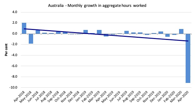
- Aggregate monthly hours worked decreased 163.9 million hours (-9.2 per cent).
- Underemployment rose by 16.5 thousand or 4.9 points to 13.7 per cent. Overall there are 1,816.1thousand underemployed workers. The total labour underutilisation rate (unemployment plus underemployment) increased by 5.9 points to 19.9 per cent. There were a total of 2,639.4 thousand workers either unemployed or underemployed.
Employment decreased 594,300 or 4.6 per cent in April 2020
1. Employment decreased 594,300 (2.5 per cent).
2. Full-time employment decreased 220,500 and part-time employment decreased 373,800.
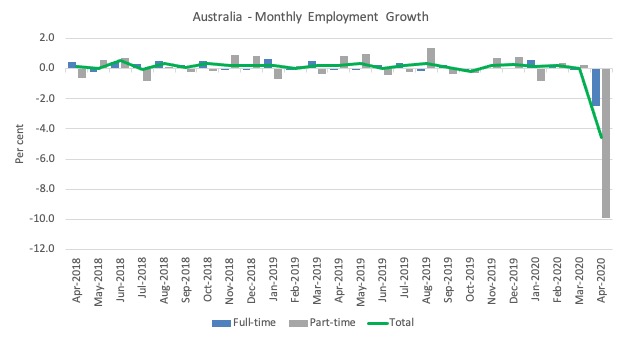
The following graph shows the month by month growth in full-time (blue columns), part-time (grey columns) and total employment (green line) for the 24 months to April 2020 using seasonally adjusted data.
Last month, I wrote that “I expect that next month, the green line will plunge into the negative area”.
Plunge is an understatement.
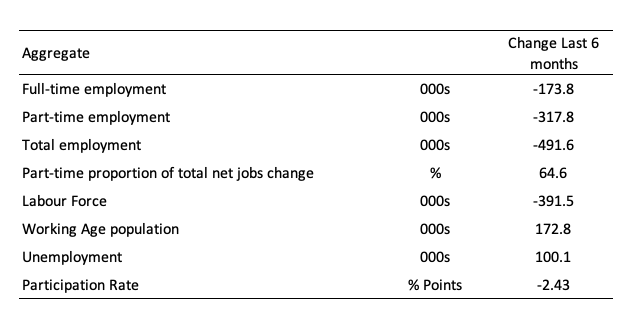
The following table provides an accounting summary of the labour market performance over the last six months.
As the monthly data is highly variable, this Table provides a longer view which allows for a better assessment of the trends.
Assessment:
1. Every bad thing that can happen has happened – employment collapse, participation rate collapse, labour force collapse, which reduces the collapse in official unemployment.
2. As a consequence while unemployment rose 100 thousand, hidden unemployment will have risen substantially as well (see below for quantification).
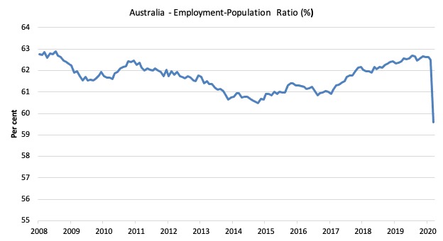
Given the variation in the labour force estimates, it is sometimes useful to examine the Employment-to-Population ratio (%) because the underlying population estimates (denominator) are less cyclical and subject to variation than the labour force estimates. This is an alternative measure of the robustness of activity to the unemployment rate, which is sensitive to those labour force swings.
The following graph shows the Employment-to-Population ratio, since April 2008 (the low-point unemployment rate of the last cycle).
It fell with the onset of the GFC, recovered under the boost provided by the fiscal stimulus packages but then went backwards again as the Federal government imposed fiscal austerity in a hare-brained attempt at achieving a fiscal surplus in 2012.
The ratio fell by 2.9 points in April 2020 at 59.6 per cent. The ratio is now 3.3 points below pre-GFC peak in April 2008 of 62.9 per cent.
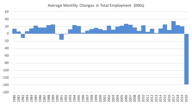
To put the current monthly performance into perspective, the following graph shows the average monthly employment change for the calendar years from 1980 to 2020 (to date).
1. It is clear that after some lean years, 2017 was a much stronger year if total employment is the indicator.
2. It is also clear that the labour market weakened considerably over 2018 and that situation worsened in 2019.
3. 2020 has not started well and the deterioration will get deeper in the months to come.
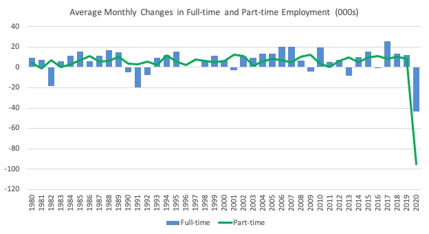
The following graph shows the average monthly changes in Full-time and Part-time employment (lower panel) in thousands since 1980.
The interesting result is that during recessions or slow-downs, it is full-time employment that takes the bulk of the adjustment. Even when full-time employment growth is negative, part-time employment usually continues to grow.
However, this crisis is different because much of the employment losses are the result of lockdowns and enforced business closures in sectors where part-time employment dominates.
Unemployment increased 104,500 to 823,300 or 6.2 per cent
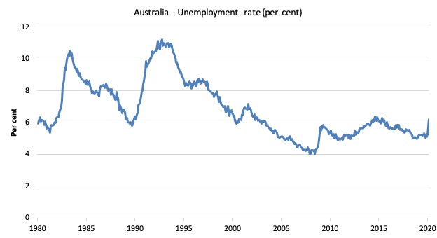
The official unemployment rate increased by 1 point to 6.2 per cent but the actual unemployment arising from the crisis is much higher given the sharp fall in the participation rate.
Most of the fall in the Labour Force (-489.8 thousand) will be hidden unemployed who have not satisfied activity tests in the survey (that is, they probably said they had given up looking).
Further on I will quantify what that means for the underlying unemployment rate.
The following graph shows the national unemployment rate from January 1980 to April 2020. The longer time-series helps frame some perspective to what is happening at present.
Assessment:
1. Any time the unemployment rate rises like this you know one other thing – the extent of fiscal policy support is inadequate.
2. There is clearly still considerable slack in the labour market that could be absorbed with further fiscal stimulus.
3. The government is choosing to allow this rise in joblessness.
Broad labour underutilisation rose by 4.9 points to 19.9 per cent
The results for April 2020 are (seasonally adjusted):
1. Underemployment rose by 603.3 thousand.
2. The underemployment rate rose by 4.9 points to 13.7 per cent.
2. Overall there are 1815.1 thousand underemployed workers.
3. The total labour underutilisation rate (unemployment plus underemployment) increased by 5.9 points to 19.9 per cent.
4. There were a total of 2639.4 thousand workers either unemployed or underemployed.
5. In other words, nearly 20 per cent of the labour force are idle (but see below to appreciate those that have dropped out of the labour force).
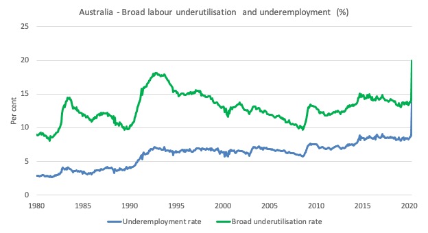
The following graph plots the seasonally-adjusted underemployment rate in Australia from January 1980 to the April 2020 (blue line) and the broad underutilisation rate over the same period (green line).
The difference between the two lines is the unemployment rate.
The three cyclical peaks correspond to the 1982, 1991 recessions and the more recent downturn.
The other difference between now and the two earlier cycles is that the recovery triggered by the fiscal stimulus in 2008-09 did not persist and as soon as the ‘fiscal surplus’ fetish kicked in in 2012, things went backwards very quickly.
The two earlier peaks were sharp but steadily declined. The last peak fell away on the back of the stimulus but turned again when the stimulus was withdrawn.
In the coming months these graphs will turn sharply upwards.
If hidden unemployment (given the depressed participation rate) is added to the broad ABS figure the best-case (conservative) scenario would see a underutilisation rate well above 23 per cent at present. Please read my blog post – Australian labour underutilisation rate is at least 13.4 per cent – for more discussion on this point.
Unemployment and broad labour underutilisation indexes – last four downturns
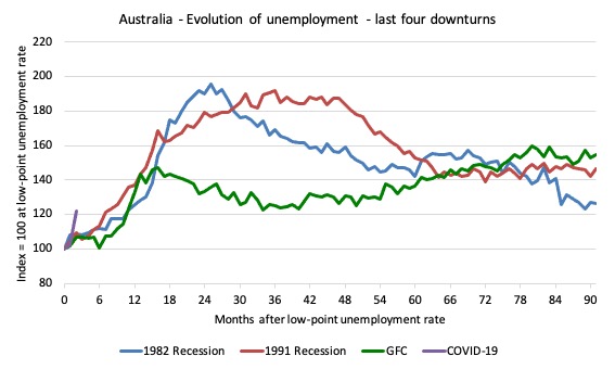
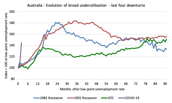
The following graph captures the evolution of the unemployment rates for the 1982, 1991, GFC and COVID-19 downturns.
For each episode, the graph begins at 100 – which is the index value of the unemployment rate at the low-point of each cycle (June 1981; December 1989; February 2008, and January 2020, respectively).
We then plot each episode out for 90 months.
For 1991, the peak unemployment which was achieved some 38 months after the downturn began and the resulting recovery was painfully slow. While the 1982 recession was severe the economy and the labour market was recovering by the 26th month. The pace of recovery for the 1982 once it began was faster than the recovery in the current period.
During the GFC crisis, the unemployment rate peaked after 16 months (thanks to a substantial fiscal stimulus) but then started rising again once the stimulus was prematurely withdrawn and a new peak occurred at the 80th month.
The COVID-19 downturn, while in its early months, is obviously worse than anything of the previous recessions shown.
In relative terms, the current episode is now worse than the other three downturns (in terms of deviation from low-point unemployment rate).
The graph provides a graphical depiction of the speed at which each recession unfolded (which tells you something about each episode) and the length of time that the labour market deteriorated (expressed in terms of the unemployment rate).
After three months, the unemployment had risen from 100 to:
1. 108.8 index points in 1982.
2. 109.2 index points in 1991.
3. 107.1 index points in the GFC.
4. 122.0 index points currently (and note the point below about participation rate declining)
Note that these are index numbers and only tell us about the speed of decay rather than levels of unemployment.
The next graph performs the same operation for the broad labour underutilisation rate (sum of official unemployment and underemployment).
Aggregate participation rate decreased by 2.4 points to 63.5 per cent
The fall in the labour force participation rate meant that the labour force fell by 489.8 thousand.
That number would have been added to official unemployment had the workers (in all probability) not given up looking for work.
In other words, the 1 point rise in the official unemployment rate is a gross underestimate of what is actually goin on with respect to job loss.
By how much would unemployment have risen if the participation rate had not fallen?
The labour force is a subset of the working-age population (those above 15 years old). The proportion of the working-age population that constitutes the labour force is called the labour force participation rate. Thus changes in the labour force can impact on the official unemployment rate, and, as a result, movements in the latter need to be interpreted carefully. A rising unemployment rate may not indicate a recessing economy.
The labour force can expand as a result of general population growth and/or increases in the labour force participation rates.
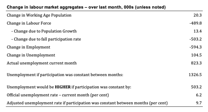
The following Table shows the breakdown in the changes to the main aggregates (Labour Force, Employment and Unemployment) and the impact of the rise in the participation rate.
The change in the labour force in April 2020 was the outcome of two separate factors:
- The underlying population growth added 13.4 thousand persons to the labour force. The population growth impact on the labour force aggregate is relatively steady from month to month but has slowed in recent months; and
- The fall in the participation rate meant that there were 503.2 thousand workers dropping out of the labour force (relative to what would have occurred had the participation rate remained unchanged).
- The net result was that the labour force fell by 489.8 thousand.
Assessment:
1. If the participation rate had not have fallen, total unemployment, at the current employment level, would have been 1,326.5 thousand rather than the official count of 823.3 thousand as recorded by the ABS – a difference of 503.2 thousand workers (the ‘participation effect’).
2. Without the fall in the participation rate in April 2020, the unemployment rate would have been 9.7 per cent (rounded) rather than its current value of 6.2 per cent).
3. Hidden unemployment thus rose by 502.2 thousand.
4. If we add the change in hidden unemployment back into the broad labour underutilisation rate currently estimated to be 19.9 per cent, we would get a total wastage rate of 23.4 per cent. Hideous. Policy. Failure.
Teenage labour market collapses in April 2020
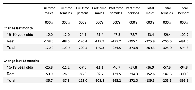
1. Total teenage net employment fell by 102.7 thousand in April 2020 (14.8 per cent) – as a result of the closures in hospitality, recreation and arts etc.
2. Full-time teenage employment fell by 24.1 thousand (16.1 per cent) and part-time employment fell by 78.7 thousand (14.4 per cent).
3. The teenage unemployment rate rose by 1.5 points to 18/1 per cent.
The following Table shows the distribution of net employment creation in the last month and the last 12 months by full-time/part-time status and age/gender category (15-19 year olds and the rest).
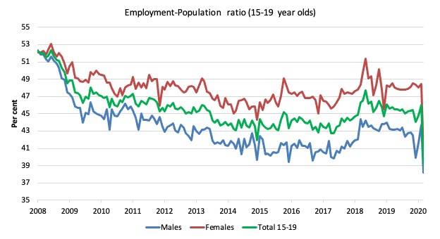
To put the teenage employment situation in a scale context (relative to their size in the population) the following graph shows the Employment-Population ratios for males, females and total 15-19 year olds since April 2008.
You can interpret this graph as depicting the loss of employment relative to the underlying population of each cohort. We would expect (at least) that this ratio should be constant if not rising somewhat (depending on school participation rates).
The absolute loss of jobs reported above has impacted more on males than females.
1. The male ratio has fallen by 14.2 percentage points since February 2008.
2. The female ratio has fallen by 11.7 percentage points.
3. The overall teenage employment-population ratio has fallen by 13 percentage points.
4. In other words, over the entire cycle that has just ended, teenagers went backwards.
The other statistic relating to the teenage labour market that is worth highlighting is the decline in the participation rate since the beginning of 2008 when it peaked in April at 61.4 per cent.
In April 2020, the participation rate was just 48 per cent. This is a very unreliable statistic overall – it fluctuates widely on a monthly basis.
However, the difference between the 2008 level, amounts to an additional 194 thousand teenagers who have dropped out of the labour force as a result of the weak conditions since the crisis.
If we added them back into the labour force the teenage unemployment rate would be 35.4 per cent rather than the official estimate for April 2020 of 18.1 per cent.
Some may have decided to return to full-time education and abandoned their plans to work. But the data suggests the official unemployment rate is significantly understating the actual situation that teenagers face in the Australian labour market.
Overall, the performance of the teenage labour market is disastrous and will undermine future productivity and prosperity as our society ages.
This situation doesn’t rate much priority in the policy debate, which is surprising given that this is our future workforce in an ageing population. Future productivity growth will determine whether the ageing population enjoys a higher standard of living than now or goes backwards.
I continue to recommend that the Australian government immediately announce a major public sector job creation program aimed at employing all the unemployed 15-19 year olds, who are not in full-time education or a credible apprenticeship program.
This is desperately required now.
Hours worked decreased 163.9 million hours (-9.2 per cent) in April 2020
As I indicated last month, I expected both the number of workers and the total working hours to simultaneously collapse this month.
That has certainly happened.
The following graph shows the monthly growth (in per cent) over the last 24 months.
The dark linear line is a simple regression trend of the monthly change – which depicts a sharp decreasing trend. Even before the coronavirus crisis struck, the trend was downwards.
Conclusion
My standard monthly warning: we always have to be careful interpreting month to month movements given the way the Labour Force Survey is constructed and implemented.
Given the survey week for the April data release ended towards the end of the second week in April, I expect the situation to deteriorate even further.
The April 2020 data reveals that the Australian economy is in dire straits now.
All the main aggregates moved in extremely adverse directions.
Employment fell by 4.6 per cent (594,300 thousand).
Unemployment rose by 104,500 thousand.
But that is a gross understatement of the problem given that the participation rate fell by 2.4 points, which meant the labour force fell by 489.8 thousand.
Without the fall in the participation rate in April 2020, the unemployment rate would have been 9.7 per cent rather than its current value of 6.2 per cent).
Monthly hours of work fell by 9.2 per cent.
And the broad labour underutilisation rate is now at 19.9 per cent, after underemployment rose by 4.9 points to 13.7 per cent.
There are now 2,639.4 thousand workers either unemployed or underemployed. That number swells to 3,142.6 (or 23.4 per cent) if we add the rise in hidden unemployment back into the ‘jobless’.
My overall assessment is:
1. The current situation can best as catastrophic.
2. The Australian labour market needs massive fiscal policy intervention targetted at direct job creation.
3. The prior need for a fiscal stimulus of around 2 per cent has changed to a fiscal stimulus requirement of several times that.
4. There is clear room for some serious fiscal policy expansion at present and the Federal government’s attempts to date have been seriously under-whelming.
5. Any government that oversees that sort of disaster has failed in their basic responsibilities to society. Its fiscal stimulus is totally inadequate.
That is enough for today!
(c) Copyright 2020 William Mitchell. All Rights Reserved.
Hi Bill,
Seems like the participation rate is definitely impacted by jobseeker – there are no mutual obligation requirements for receiving this for both April and May. Seems like this is a major driver. Might see a movement back once mutual obligation comes back.
@ vote for pedro,
would they still be classified as “not in the labour force” though?
Leftwinghillbillyprospector
I think so. to be classified as not in labour force while on jobseeker the abs explanatory note says “it depends on their labour market activity”. If they didn’t look for work in the past 4 weeks, then they are not in the labour force. If jobseeker doesn’t require them to look for work, they might not bother.
The government responsibility here falls under three simple words here:
Duty of care
Pedro. “If jobseeker doesn’t require them to look for work, they might not bother.” That buys into the idea that people don’t want to work which is a typical (UK) Tory mantra. I worked for 45 years before retiring at 70 and was never unemployed for more than a couple of weeks. I was made redundant in the late eighties due to having a bad car accident which put me in hospital for 7 weeks, then attended classes as a requirement of claiming jobseekers allowance. Every one of the attendees was desperate to find work. And it’s not just about the money – I showed that I was 50p a week better off working than claiming benefits but I did it for the sense of being of use to society, the personal interaction and the possibility to improve oneself. It worked as I started off as a storeman and ended up as after sales manager, then went on to run my own businesses.
Nigel hargreaves
There is more than one reason someone might not bother to look for work. For example, if you worked in a significantly affected industry – you may just be waiting for restrictions to be lifted to start re-applying for jobs.
Especially if you think it’s a short term event, which many have been predicting. Don’t waste time trying to find a job for 1-2 months in an industry outside your expertise. Be patient and the good job will come back, that sort of thinking. This is normal behaviour – switching industries usually comes once someone realises it’s a long term problem.
That jobseeker is temporarily higher means that more people can “take a breath” between losing their job and trying to find another.
The 80s/90s recessions were bad, but they were also slow compared to this. People are still processing the shock. We don’t know how well things will bounce back this time.
Thanks pedro
The other possible and perhaps very significant reason not mentioned In the article for the drop in the labour force is the hundreds of thousands, even a million or more people- overseas workers, grey nomads and local and overseas students who rely on casual work but can’t get any in traditional low skilled areas because employers are closed. They can’t apply for Jobseeker, and some can’t move to where jobs are for cost and quarantine reasons.
I’m quite sure they’d be in the labour force looking for jobs if they were not struggling to even eat or find and pay for accomodation. They have not CHOSEN not to work or look for work, they have had the rug pulled out from under them and are hibernating and isolating and struggling to exist in our glorious society during the time the statistics are compiled. They are so invisible they are not even a statistic thanks to our Dear Leaders actions.
I posted a link to Thursday’s blog on NAIRU on another discussion site.
It’s amazing the denial I see there.
Bill, what do you think of this argument?
The Phillips Curve theory postulates that as the unemployment rate drops the inflation rate will always rise. And this higher inflation is *caused* by the fall in the unemployment rate.
On the other hand, the NAIRU theory postulate that as comp or industries reduce their workforces, the remaining workers gain bargaining power to drive up wages. Can’t this be restated as this? “The NAIRU theory postulate that as comp or industries reduce their workforces which increases the unemployment rate in that industry, the remaining workers gain bargaining power to drive up wages which will always increase the inflation rate. So, as the unemployment rate increases the inflation rate will always rise.And this higher inflation is *caused* by the increase in the unemployment rate.
. . Isn’t this a clear contradiction? The inflation rate will increase if the unemployment rate either increases or falls.
I bet MS economists say something about ‘time’ to make the 2 cases different, though.
No Steve. Not even NAIRU believers say that. NAIRU says that as the unemployment rate decreases below some completely asinine made up number of an economy’s structural impediments to employment then you will see rising inflation as the result as costs to employ people get bid up. That is opposite of what you have written. The major problem is that some ‘economists’ think they can estimate that asinine made up number and try to slow down economies before they approach anything like full employment out of a dread of potential inflation if unemployment becomes lower than their estimates.
NAIRU is the idea that the is some lower boundary rate of unemployment called the ‘non accelerating inflation rate of unemployment’ and once that lower bound has been passed then an economy will experience accelerating rates of inflation. But Bill has shown many times that estimates of that number are basically made up and are useless.
One of the replies referred to hysteresis, so I googled “hysteresis economics” and got this in Wikipedia.
“Causes —
When some negative shock reduces employment in a company or industry, there are fewer employed workers left. As the employed workers usually have the power to influence or set wages, their reduced number incentivizes them to bargain for even higher wages when the economy again gets better, instead of letting the wage stay at the equilibrium wage level, where the supply and demand of workers would match. This causes hysteresis, i.e., the unemployment becomes permanently higher after negative shocks.[4]
It has also been argued that unemployed people lose their skills during unemployment, which makes them less likely to again get jobs.[5]”
Doesn’t this say that as the unemployment rate rises the workers power to demand a raise rises? And isn’t that what wrote?
Really, I want to know to understand.
Well Steve- I wouldn’t put much stock in that theory and it is definitely not the NAIRU idea in any case.
If all the people who had lost their jobs had died then maybe that idea would make sense to me. Because they would not be available to return to their previous jobs at their old wages being dead so to speak.
Hysteresis is a different idea from NAIRU.
Steve, what can happen is that companies attempt to retain their most skilled and important, hardest to replace employees in a downturn of the economy while letting their less experienced workers go. That can have the effect of raising average wages of the employed, even while total wages are way down. That would need a lot of strange assumptions to mutate into inflationary biases though.
To all who have relied or will reply, THANK YOU.
I hope Bill will reply too.
It sounded like Hysteresis is a part of the NAIRU theory.
Yes my thinking of those dropping out of the labour force are in effect those that do not need to work but want to work to make the extra income, in effect, doing a disservice to the involuntary unemployed.
Perhaps more research is required in this area?
And perhaps all volunteering should be banned, unless/until there is zero involuntary underemployment in a JG system.
“And perhaps all volunteering should be banned, unless/until there is zero involuntary underemployment in a JG system”.
Tongue-in-cheek I daresay, but be careful what you wish for.
The least life-enhancing regimes in history have been authoritarian utopias. The French Revolution, the Bolshevik Revolution, Maoist perpetual revolution, the Khmer Rouge …
A JG funded by the state, without relying on a (involuntary) ‘volunteer’ workforce?
Has got to be better than this (from Bill’s article today):
“the data tells me that the US is a failed state – incapable of using the capacity the government possesses to advance the well-being, or, in this case, protect the well-being of its people. I am also working on an extended piece on the way the Right and the Left are behaving in this crisis. As usual, the Right are organised and forward-looking putting assets into strategies that will take their agenda to another (pernicious) level. Under the smokescreen of the crisis, they are working to cement changes that will make it even harder for government to advance general prosperity. Meanwhile, the Left appear to be asleep as usual – tweeting their heads off about Biden or Sanders and have taken their eyes off the main game. We have been there before. Even though the US labour market has probably never been here before!”
“A JG funded by the state, without relying on a (involuntary) ‘volunteer’ workforce” wasn’t the point at issue. I already bought-into the JG as a concept, as an inherent part of implementing an MMT-aware socio-political agenda.
It was the “ban all volunteering” bit that provoked my comment. As I said, I assumed it was tongue-in-cheek but if you were serious I don’t know what more can usefully be said.