In the 1990s, a new industry was created in Australia. It produced nothing. But it…
US Labour Market – stronger at the start of the year
On February 7, 2020, the US Bureau of Labor Statistics (BLS) released their latest labour market data – Employment Situation Summary – January 2019 – which reveals a labour market was stronger in January by a considerable margin. Employment growth was robust and the participation rate rose by 0.2 points, which meant that the labour force change outstripped the net jobs added and unemployment rose as a consequence. But the employment-population ratio rose by 0.1 points. The Broad labour underutilisation ratio (U-6) remains high, and rose in January by 0.2 points, because there were more underemployed workers. An examination of the transition probabilities show that there is still strong growth into employment from those who were previously outside the labour force (in inactivity). The corresponding entry from outside the labour force into unemployment continues to fall. So the US labour market is absorbing new entrants straight into employment at increasing rates, which is a good sign. Overall, these appears to be excess capacity that can still be tapped if growth is strong enough. And while workers are still being absorbed into paid employment from outside the labour force is a sign of a strengthening labour market, as regular readers will know, I have documented the strong bias in the US to lower paid and precarious work. So getting workers into paid employment is one thing. Paying them decent wages and providing them with secure jobs is another.
Overview for January 2020:
- Payroll employment rose by 225,000 – a step up from the 2019 monthly average.
- There was a substantial recasting of the labour force survey data as a result of updated population benchmarks
- Total labour force survey employment rose (after netting out the impact of the changes) by 418 thousand (net).
- The seasonally adjusted labour force rose by 574 thousand.
- Official unemployment rose by 156 thousand to 5,892 thousand.
- The official unemployment rate rose by 0.1 points to 3.6 per cent.
- The participation rate rose by 0.2 points to 63.4 per cent but remains well below the peak in December 2006 (66.4 per cent). Adjusting for age effects, the rise in those who have given up looking for work for one reason or another since December 2006 is around 3,271 thousand workers. The corresponding unemployment rate would be 4.76 per cent, far higher than the current official rate.
- The broad labour underutilisation measure (U6) rose by 0.2 points to 6.9 per cent largely because of a rise in the number in the part-time for economic reasons cohort (the US indicator of underemployment).
For those who are confused about the difference between the payroll (establishment) data and the household survey data you should read this blog post – US labour market is in a deplorable state – where I explain the differences in detail.
Payroll employment trends
The BLS noted that:
Total nonfarm payroll employment increased by 225,000 in January, compared with an average monthly gain of 175,000 in 2019. Notable job gains occurred in construction in health care, and in transportation and warehousing.
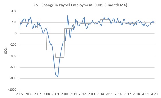
The first graph shows the monthly change in payroll employment (in thousands, expressed as a 3-month moving average to take out the monthly noise). The gray lines are the annual averages.
This month saw the change in payroll employment rise (225) well above the average monthly change for 2019 (175 thousand). Whether this demonstrates a step-up in the trend is to be determined as the months unfold.
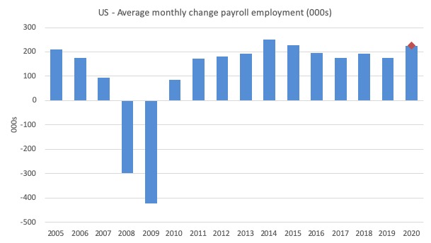
The next graph shows the same data in a different way – in this case the graph shows the average net monthly change in payroll employment (actual) for the calendar years from 2005 to 2020 (the 2020 average obviously is just the January result).
The red diamond is the current month’s increase.
The slowdown that began in 2015 continued through 2017 was reversed last year. The 2018 average was 223 thousand compared to 179 thousand in 2017.
The final average for 2019 was 175 thousand.
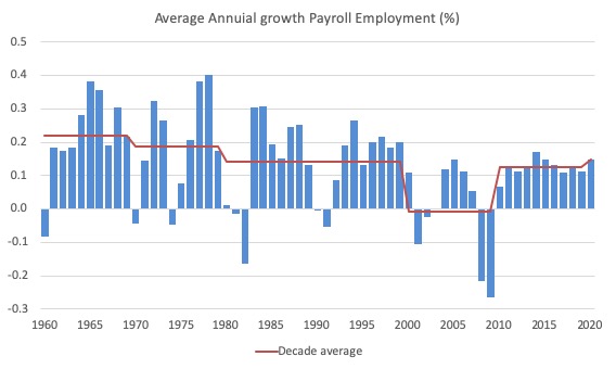
To put the current recovery into historical perspective the following graph shows the average annual growth in payroll employment since 1960 (blue columns) with the decade averages shown by the red line.
It reinforces the view that while payroll employment growth has been steady since the crisis ended, it is still well down on previous decades of growth.
Labour Force Survey – employment growth remains positive
The BLS report that:
Both the unemployment rate, at 3.6 percent, and the number of unemployed persons, at 5.9 million, changed little in January.
The data for January was affected by the updated population benchmarks, which makes comparison over time difficult.
The BLS wrote:
Effective with data for January 2020, updated population estimates were incorporated into the household survey. Population estimates for the household survey are developed by the U.S. Census Bureau. Each year, the Census Bureau updates the estimates to reflect new information and assumptions about the growth of the population since the previous decennial census. The change in population reflected in the new estimates results from adjustments for net international migration, updated vital statistics, and estimation methodology improvements.
In accordance with usual practice, BLS will not revise the official household survey estimates for December 2019 and earlier months.
The impacts on the LFS aggregates are shown in the following Table (from BLS Table C):
So, for example, the changes in the population benchmark controls led to the labour force being reduced by 524 thousand on the December 2019 level but the actual change in the monthly estimate was 50 thousand. So removing the population control impact, gives an overall increase in the December-January labour force of 574 thousand.
| Category | Dec-Jan change as published | 2020 Population update impact | Dec-Jan Change after removing Population update |
| Civilian non-institutional population | -679 | -811 | 132 |
| Civilian labour force | 50 | -524 | 574 |
| Participation rate | 0.2 | 0.0 | 0.2 |
| Employed | -89 | -507 | 418 |
| Employment-population ratio | 0.2 | 0.0 | 0.2 |
| Unemployed | 139 | -17 | 156 |
| Unemployment rate | 0.1 | 0.0 | 0.1 |
| Not in Labour Force | -729 | -2875 | -442 |
Focusing on Column 4 of the Table then, we conclude that employment as measured by the household survey rose by 418 thousand netnet, while the labour force rose by 574 thousand.
As a result (in accounting terms), total unemployment rose by 156 thousand and the unemployment rate rose by 0.1 points to 3.6 per cent.
This sustains the unemployment rates last seen in the late 1960s.
I won’t publish the usual graph shows the monthly employment growth since January 2008 until the population benchmarks have been fully absorbed.
But the summary conclusion:
1. Once the disruption to the time series from the population benchmark changes are taken into account, employment grew by 0.26 per cent in January, which is well above the recent trend growth.
2. Notwithstanding that boost in jobs, there is still no coherent positive and reinforcing trend in employment growth since the recovery began back in 2009. There are still many months where employment growth, while positive, remains relatively weak when compared to the average labour force growth prior to the crisis or is negative.
There are also months where employment growth is negative.
As the previous table shows, the population benchmarking did not impact on the ratios, including the Employment-Population ratio.
This is a Good measure of the strength of the labour market because the movements are relatively unambiguous because the denominator population is not particularly sensitive to the cycle (unlike the labour force).
The following graph shows the US Employment-Population from January 1948 to January 2020. While the ratio fluctuates a little, the January 2020 ratio rose by 0.2 points to 61.2 per cent, the first rise since September 2019 and the highest value since November 2008.
Over the longer period though, we see that the ratio remains well down on pre-GFC levels (peak 63.4 per cent in December 2006), which is a further indication of how weak the recovery has been so far and the distance that the US labour market is from being at full capacity (assuming that the December 2006 level was closer to that state).
It is usually a positive sign though when total employment outstrips or keeps up with the underlying growth in the working age population.

Unemployment and underutilisation trends
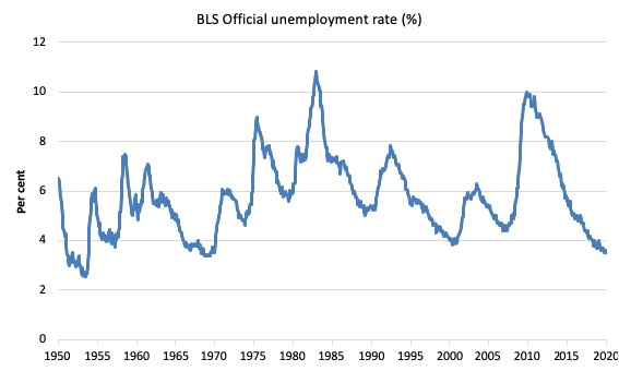
The first graph shows the official unemployment rate since January 1950 which is currently at 3.6 per cent, up 0.1 points on the previous month.
Once the benchmarking impact is removed, it is clear that the change in employment lagged behind the labour force growth, which was stimulated by a 0.2 point increase in the participation rate.
The result is that unemployment rose by 156 thousand, which pushed the rate up slightly.
But it remains that the US labour market is now maintaining unemployment rates not seen since the late 1960s.
With inflation stable, the continued low unemployment rates make a mockery of official NAIRU estimates of full employment coinciding with an unemployment rate of 4.6 per cent.
The official unemployment rate is a narrow measure of labour wastage, which means that a strict comparison with the 1960s, for example, in terms of how tight the labour market, has to take into account broader measures of labour underutilisation.
The next graph shows the BLS measure U6, which is defined as:
Total unemployed, plus all marginally attached workers plus total employed part time for economic reasons, as a percent of all civilian labor force plus all marginally attached workers.
It is thus the broadest quantitative measure of labour underutilisation that the BLS publish.
In December 2006, before the effects of the slowdown started to impact upon the labour market, the measure was estimated to be 7.9 per cent.
In January 2020 the U6 measure increased by 0.2 points to 6.9 per cent. This was driven, in part, by the rise in the category ‘Part-time for economic reasons’ – a measure of underemployment in the US data context) – it rose by 34 thousand or 0.8 per cent.
U-6 was 8.0 per cent at the beginning of 2019.
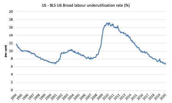
The U-6 measure is now below the pre-GFC level, and, while, signalling improvement, there is still some scope to go before full capacity is reached.
Feature this month: Gross Flows analysis
One way to think about the extent of the supply-side capacity is to examine the flows data from the labour force survey.
I discuss the use of gross flows data in this blog post (among others) – What can the gross flows tell us? (July 14, 2009).
I don’t intend to do a full analysis here of the latest data.
Gross flows analysis allows us to trace flows of workers between different labour market states (employment; unemployment; and non-participation) between months. So we can see the size of the flows in and out of the labour force more easily and into the respective labour force states (employment and unemployment).
Each period there are a large number of workers that flow between the labour market states – employment (E), unemployment (U) and not in the labour force (N). The stock measure of each state indicates the level at some point in time, while the flows measure the transitions between the states over two periods (for example, between two months).
The net changes each month – between the stock measures – are small relative to the absolute flows into and out of the labour market states.
National statisticians measure these flows in their monthly labour force surveys. The various stocks and flows are denoted as follows (single letters denote stocks, dual letters are flows between the stocks):
- E = employment stock, with subscript t = now, t+1 the next period.
- U = unemployment stock.
- N = not in the labour force stock.
- EE = flow from employment to employment (that is, the number of people who were employed last period who remain employment this period)
- UU = flow of unemployment to unemployment (that is, the number of people who were unemployed last period who remain unemployed this period)
- NN = flow of those not in the labour force last period who remain in that state this period
- EU = flow from employment to unemployment
- EN = flow from employment to not in the labour force
- UE = flow from unemployment to employment
- UN = flow from unemployment to not in the labour force
- NE = flow from not in the labour force to employment
- NU = flow from not in the labour force to unemployment
The following Matrix Table provides a schematic description of the flows that can occur between the three labour force framework states.
Labour Market Flows Matrix

The various inflows and outflows between the labour force categories are expressed in terms of numbers of persons which can then be converted into so-called transition probabilities – the probabilities that transitions (changes of state) occur.
We can then answer questions like: What is the probability that a person who is unemployed now will enter employment next period?
So if a transition probability for the shift between employment to unemployment is 0.05, we say that a worker who is currently employed has a 5 per cent chance of becoming unemployed in the next month. If this probability fell to 0.01 then we would say that the labour market is improving (only a 1 per cent chance of making this transition).
From the table above – sometimes called a Gross Flows Matrix – the element EE tells you how many people who were in employment in the previous month remain in employment in the current month.
Similarly the element EU tells you how many people who were in employment in the previous month are now unemployed in the current month. And so on. This allows you to trace all inflows and outflows from a given state during the month in question.
The transition probabilities are computed by dividing the flow element in the matrix by the initial state. For example, if you want the probability of a worker remaining unemployed between the two months you would divide the flow (UU) by the initial stock of unemployment. If you wanted to compute the probability that a worker would make the transition from employment to unemployment you would divide the flow (EU) by the initial stock of employment. And so on.
So the 3 Labour Force states in the Matrix Table above allow us to compute 9 transition probabilities reflecting the inflows and outflows from each of the combinations.
Analysing movements in these probabilities over time provides a different insight into how the labour market is performing by way of flows of workers.
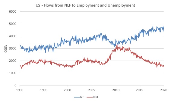
Examining the flows from outside the labour force into employment and unemployment is a useful way of understanding how much spare capacity there might be on the supply-side of the US labour market.
The following graph shows these flows from February 1990 to January 2020 (in thousands).
The data shows that the NE transition (not in labour force to employment) is at record highs (the data was first published in 1990) and the upward trend is not slowing.
Workers are being drawn back into employment from inactivity in record numbers as the expansion continues.
With the participation rate still well down on historic highs (even after adjusting for ageing), one has to conclude that there is still supply-side capacity to be absorbed within the US labour market.
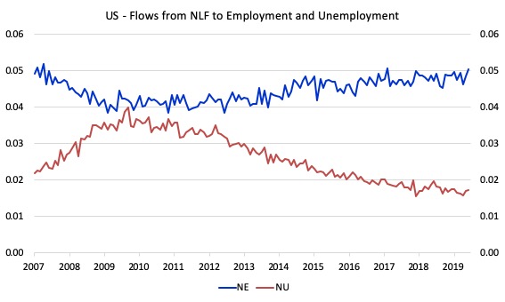
The next graph shows the flows in terms of transition probabilities (the likelihood that the flow will occur) from January 2007 to January 2020.
In January 2020, a worker who is currently outside the labour force has a 5.1 per cent chance of entering the labour force by gaining employment (depicted NE) compared to the 1.7 per cent change of entering the labour force via unemployment (depicted NU).
That is a dramatic shift from the situation that prevailed in April 2010 when the respective probabilities were NE 4.2 per cent, NU 4 per cent.
The final graph shows the transition probabilities for all 9 states (the straight line is the linear trend) from December 2007 to January 2020.
Be careful to note that the vertical scales are quite different for each graph.
![]()
Conclusion
The January 2020 US BLS labour market data release tells me that the US labour market was stronger in January by a considerable margin.
Employment growth was robust and the participation rate rose by 0.2 points, which meant that the labour force change outstripped the net jobs added and unemployment rose as a consequence.
The employment-population ratio rose by 0.1 points, which tells us that employment growth is outstripping the growth in the underlying population.
Taken together these are good signs.
But, the Broad labour underutilisation ratio (U-6) remains high, and rose in January by 0.2 points, because there were more underemployed workers.
An examination of the transition probabilities show that there is still strong growth into employment from those who were previously outside the labour force (in inactivity).
The corresponding entry from outside the labour force into unemployment continues to fall. So the US labour market is absorbing new entrants straight into employment at increasing rates, which is a good sign.
Overall, these appears to be excess capacity that can still be tapped if growth is strong enough.
And while workers are still being absorbed into paid employment from outside the labour force is a sign of a strengthening labour market, as regular readers will know, I have documented the strong bias in the US to lower paid and precarious work.
The worry is that the jobs being added represent a significant hollowing out of jobs in the median wage area (the so-called ‘middle-class’ jobs), which is reinforcing the polarisation in the income distribution and rising inequality.
Taken together, we can conclude that the US labour market is not yet at full employment despite the low unemployment rate.
Getting workers into paid employment is one thing. Paying them decent wages and providing them with secure jobs is another.
That is enough for today!
(c) Copyright 2020 William Mitchell. All Rights Reserved.
Does anyone know or care that it is obviously true that the big business elites in the US can {and have the cash to} just hire people for a while before the election to get Trump reelected and then lay them all of after the election is over?
If you can see this is true then say so here.
Also say if you think this is mostly or partly the reason for the good employment numbers between now and then from now to the election. Say so here.
Hi Steve,
Not sure if I can answer you questions directly, but I would say Bernie just needs to keep hammering his message for “an economy that works for all”; and given the egregious disadvantage in the US which is surely experienced by a majority of the population, he should be able to win.
As Bill says, good employment numbers doesn’t mean good mean wages.
Not sure if Bill objects to this Fox News interview with Sanders.
Remarkable that Fox put it to air, unabridged.
https://twitter.com/i/status/1226536797565374464
Whilst the post clearly addresses the issue of wages and job security, I’m not really gleaning anything as to what this data analysis is supposed to point to apart from the bald statements. Does it tell us Donald Trump’s economic policy is correct? Accidentally correct? Just a reflection of general economic recovery rather than targeted fiscal policy? Even though we know it pursues corporate welfare, corporate tax cuts, the creation of shoddy zero-hours contract jobs, targeted subsidisation of polluting industries for political gain?
I accept this is an economics blog, but by extension also addresses political economy.
“I have documented the strong bias in the US to lower paid and precarious work. So getting workers into paid employment is one thing. Paying them decent wages and providing them with secure jobs is another.” As I move toward enfeeblement, with the rest of my Boomer generation, I worry that once we pass, there will no one around who actually experienced what a better world looked like, felt like–a world where a secure job paid decent wages and provided sufficient benefits so that a working class family could live a modest but rewarding life and anticipate that their children would be even better off than they were. My generation was the first in the U.S., for example, in which working class kids like me were able to attend college and even work their way through graduate or professional school, without being saddled by massive, lifelong debt. It’s one thing to know how screwed up things now are for all but the elite. But it’s another thing–an even sadder, more maddening thing– to have lived in and vividly remember that better, though far from perfect, world that has been lost…or should I say, that has been taken from us.
The tariff “wars” increased uncertainty for business and depressed employment decisions. Now that most of those problems are behind us, businesses are likely to increase employment. The coronavirus will also put a dent in global growth but the 15% decline in oil prices and the collapse in natural gas prices will lower traditional measures of inflation over the next six months as will the fall in interest rates. Once the Boeing situation is resolved the U.S. economy will get a catchup boost. Growing cooperation between the U.S. and China will enhance trade between the two powers. A post-Brexit trade agreement between the U.S. and Great Britain will add to world trade. Consumer sentiment and business sentiment in the U.S. is rising as is the income of the low income earners. And Trump doesn’t care about the U.S. budget deficit. What’s not to like?
I have never ever understood employment/unemployment figures. What do they calculate and more importantly how do they calculate? Are the same measures used throughout the world? And if not why not? If a person is employed for one hour a week are they classified as being employed? Are independent contractors defined as being part of the employed?
Steve the American, I think you have a point. But the wealthy and the powerful are doing it through the federal government. Last I looked GDP was at 4% and the budget deficit was 7%. Massive fiscal stimulus. Monetary stimulus too. The FF stands at 1.5 while PPI is 2.0 and CPI is 2.3. The republicans crank it up for their own. They always have their snouts in the public trough.
Patricia, short answers but not 100% accurate answers because it get complicated- overly complicated.
What do they calculate and more importantly how do they calculate? – They attempt to give a snapshot of the relative employment/unemployment situation in a country at a particular time. The U.S. uses more than one method to try to do that. One method is by polling a percentage of the population, another is by collecting employment statistics from large employers, and then there is also something the US Census Bureau does. Not sure how that works.
Are the same measures used throughout the world? And if not why not?- No and I don’t know why.
If a person is employed for one hour a week are they classified as being employed?- In the US they would be counted as being part of the labor force and as being employed.
Are independent contractors defined as being part of the employed?- Yes. They would be part of the employed unless they had absolutely no work during the previous month even though actively seeking it.
Ferdinand writes:
“Does it tell us Donald Trump’s economic policy is correct? Accidentally correct? Just a reflection of general economic recovery rather than targeted fiscal policy?”
Trump’s economic policy, including ignoring deficits, is based on keeping China at bay.
But as Bill says, MMT is politically neutral, so Trump can ‘spend’ those deficits on endless upgrading of his nuclear arsenal, while cutting Medicare and Medicaid to appease his base who think deficits are bad.
Thomas Nugent writes:
“And Trump doesn’t care about the U.S. budget deficit. What’s not to like?’
See my reply to Ferdinand, above.
@Thomas: “And Trump doesn’t care about the U.S. budget deficit. What’s not to like?”
I’ll tell you what’s not to like. I’m British and last night I watched on the TV for the umpteenth time ‘As Good as it Gets’. Every time it jolts me to see a mother unable to afford the medication for her asthmatic son because her health plan doesn’t provide the necessary medication. Trump is cutting Medicaid.
@Neil, I saw that video yesterday and thought that Bernie is doing the right thing. He has to go along with the myth of balanced budgets to get elected. There’s no time to ‘educate the public’. I doubt whether John McDonnell understood this as he had the wrong advisors but the same applied in our general election last year. I’ve been saying the same about LVT ever since John became Shadow Chancellor. Don’t mention it, just do it. He did mention it both times to no good effect.
If as a result of the coming leadership election we get a Shadow Chancellor who will pick decent advisors, we could have a chance to educate within 5 years. However, my offer of a talk to a local Labour Party was rejected on the basis that we should just organise the members rather than educate them. I am still going to speak to my local party once the leadership election is over.