I started my undergraduate studies in economics in the late 1970s after starting out as…
Tale of two recessions and more
Today among other things I have been examining the hours data more closely to further highlight the difference between the 1991 recession and our current woes. The comparison is interesting and reveals a lot about how labour markets adjust. It also provides some scope to develop further insights into total labour underutilisation. However, while the current labour market state requires an urgent further injection of net public spending the circumstances are different to what we faced in 1991.
As I discussed last week in the blog – The labour market barely hanging on – the ABS is now publishing a total hours worked series (monthly 000s). Given it begins in July 1985, it provides information which permits some comparisons between the 1991 recession and now.
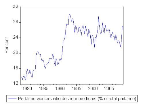
In that previous blog we saw that while the growth boom after 1991 was lauded by the previous government as pushing us close to full employment, the reality is that the workers who were gaining the jobs were having to scramble for a declining overall volume of hours of work on offer. In other words, the economy didn’t provide enough hours of work. This is clear from the fact that the part-time workers are increasingly signalling to the ABS that they want to work longer hours but cannot find them.
We further saw that since February 2008 total employment has grown by 0.6 per cent (all part-time) while total working hours has declined by 1.6 per cent. Since January 2009, total employment has declined by 0.1 per cent while total working hours has declined by 1.3 per cent. So at present the labour market is adjusting mostly in hours worked.
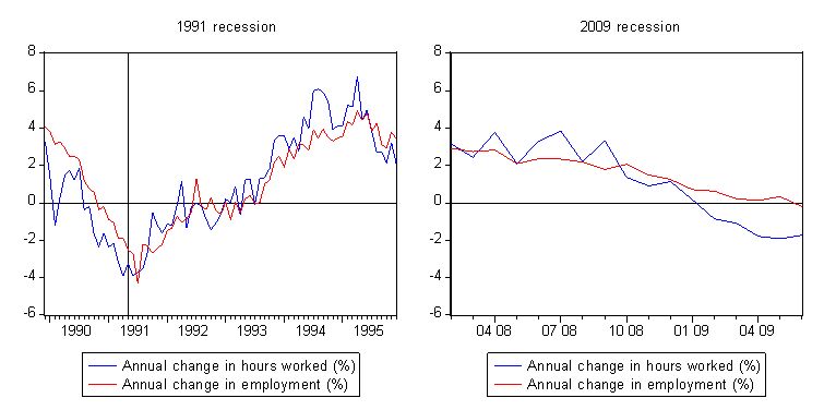
Consider the following graph which shows the annual percentage changes of hours worked and total employment from the low-point unemployment rate month in the 1991 recession (November 1989) out to December 1995 (left-hand panel) and the same data for the current recession with the low-point unemployment rate month being February 2008 (right-hand panel). The vertical line in the left-hand panel is May 1991 – so 18 months into that downturn. The vertical scale (annual percentage changes) are the same in both panels to illustrate relative depth of the downturns.
This graph tells us a great deal. First, in terms of the 1991 recession, you can see that the adjustment in total working hours precedes employment (persons) adjustment. As the aggregate demand fell in late 1989, firms started to adjust working hours more quickly than persons employed. and it was only right at the trough of the downturn (in employment terms) that the rate of layoffs stripped the adjustment in hours. You can also see that as the labour market slowdown started to weaken (that is jobs and hours were still be shed but at a slower rate) the adjustment was again in hours first then persons employed second.
By the time that consistent employment growth had returned in August 1992 the growth in hours had been positive for some months and led the relatively weak recovery into 1995. This is why unemployment kept rising for years and why long-term unemployment became entrenched after that recession.
The principle reason for this parlous state was the failure of the federal government to accommodate the huge loss of demand in the economy. Their fiscal intervention came very late in the downturn and was insipid to say the least.
It is also interesting that the tide started turning in 1991 around December 1991 a full-two years into the downturn.
Second, focusing on our current experience, once again hours are leading the way although that pattern has taken some time to assert itself. It appeared that the decline was relatively coincident up until late 2008 but once the fiscal packages were announced firms have held onto workers (until last month) but have shed hours significantly. Whether the slight upturn in hours growth is signalling a bottoming out is too early to say.
Third, comparing both recessions, while the adjustment of hours before persons similar the amplitude of these adjustments is very dissimilar. By the corresponding time in the 1991 recession (18 months – vertical line), hours and employment growth was -3.25 per cent per annum and -2.51 per cent per annum, respectively. Two months later at the trough for employment growth the economy was losing jobs at a rate of 4.32 per cent per annum.
In the last month, hours worked slumped by 1.73 per cent on an annualised basis while employment contracted by 0.26 per cent on an annualised basis.
So the striking conclusion is that this recession is very different so far. While the neo-liberals are claiming it is to do with deregulation (Work Choices and tougher welfare-to-work measures) the most significant difference between 1991 and now is the timing and magnitude of the fiscal intervention (and the monetary policy easing). In the 1991 recession, interest rates (11 am call rate) came down from 18.18 per cent in November 1989 to 13.05 per cent November 1990 to 8.64 per cent in November 1991. Fiscal policy was expanded late in the recession as noted above.
This time, interest rates (Interbank cash market) are down from 6.96 in February 2008 to 3.00 at present. Inflation was higher in the early 1990s that is true.
But the overwhelming difference is that the federal government has increased its net spending contribution by billions before employment growth was even negative.
Further if deregulation saves an economy from major job loss then the US (highly deregulated) hasn’t proven the point and Japan (highly regulated) is another counter-example.
More on hours worked
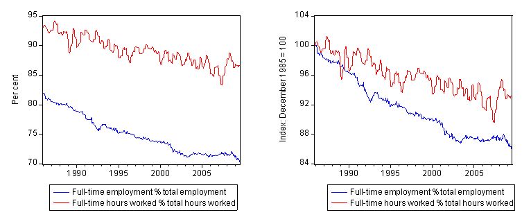
The following graph shows the full-time hours worked as a percentage of total hours (smoothed using a 6-month moving average) and full-time employment as a percentage of total employment both in raw percentages (left-hand panel) and then indexed to 100 at December 1985 (right-hand panel). You clearly see that the part-time persons ratio is rising throughout the period at a much faster rate than the share of total hours being worked by part-time workers. Now combine that with the second graph below which shows the percentage of part-time workers that want more hours and you see can guage the way in which underemployment has evolved.
Labour underutilisation
I have also been looking at ways to use the hours data to further expose the degree of broad labour underutilisation in the Australian. This is an on-going research program of mine but the following brief analysis might be of interest to you.
First, I estimated the current level of hidden unemployment using the approach that I developed some years ago but is explained again in this working paper. The method was fully explained in my 2001 book Unemployment: the tip of the iceberg and other academic journal articles since that time.
Basically you estimate the sensitivity of the labour force participation rate to the business cycle and then compute how much larger the labour force would be if the economy was at full employment. You then can compute the extra employment that would be forthcoming at that level of economic activity. Given I always consider full employment to be 2 per cent unemployment (zero hidden unemployment and zero underemployment) all calculations are based on that benchmark.
So the hidden unemployment is the extra labour that would come into the labour force at 2 per cent unemployment compared to the current labour force.
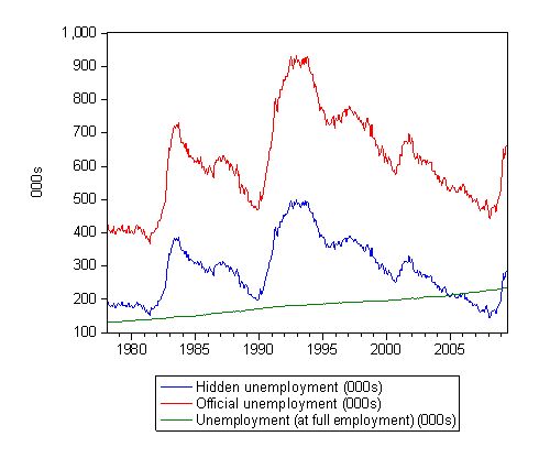
The following graph shows the current estimate of hidden unemployment (blue line) as well as the official unemployment level (red line) and what unemployment would be at full employment – the so-called frictional unemployment (green line).
So the sum of the red and blue lines gives you one broad measure of labour underutilisation – that arising from unemployment and discouraged workers. In February 2008, at the low-point unemployment rate of the previous cycle, official unemployment stood at 440 thousand and estimated hidden unemployment was 142 thousand combining to be 583 thousand.
At July 2009, official unemployment is 664 thousand and hidden unemployment is estimated to be 284 thousand given a total of 949 thousand workers without any work.
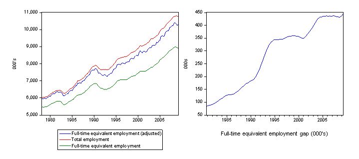
Another dimension of labour underutilisation is underemployment. So the last set of graphs provides some further information about that. I computed the underlying data for these graphs in the following way. The red line is actual total employment from the ABS Labour Force data. You can then convert this into a full-time equivalent measure by the following method: Add the product of full-time employment and average weekly full-time hours to the product of part-time employment by average weekly part-time hours and divide the sum by average weekly full-time hours. This gives you the full time equivalent of the total employment (green line).
However, this overstates the degree of labour underutilisation arising from the decline in full-time work because some part-time workers (the majority in fact) are happy to work part-time. So the adjusted series (the blue line) is computed by the following method: Add the product of full-time employment and average weekly full-time hours to the product of part-time employment of those who desire more work by average weekly part-time hours and divide the sum by average weekly full-time hours. Then add the part-time employment of those who do not desire more work to this sum to get the adjusted series.
The right-hand panel is the gap between actual employment and the adjusted full-time equivalent employment and gives you a measure of underemployment in full-time equivalent units. You can see how quickly it increased in the 1991 recession and is now increasing again. The growth period since 1991 did nothing to reduce this source of labour wastage.
There is more work to be done on all this. But that is enough for today.
Bill,
Will you be doing a similar analysis of the ‘over-worked’ ?
Cheers,
Tim
Dear Tim
I am looking at new data that the ABS has released about longer working hours. Stay tuned. But the FTE analysis does include the long workers implicitly because they help push up the average weekly working hours for full-time workers.
best wishes
bill
I’ve put up some graphs based on ABS labour market flows data that readers might find of interest.
(link)
I conclude that the drop in hours worked is being driven by fewer workers moving from part-time to full-time, rather than by more workers moving from full-time to part-time.