The Australian Bureau of Statistics (ABS) released the latest labour force data today (APRIL 16,…
The labour market barely hanging on
Today’s Australian Bureau of Statistics Labour Force data confirms the trends that have been evident in the broader data series in recent months that the economy has slowed dramatically but hasn’t yet crashed. While unemployment is rising the main worry is the rapidly increasing underemployment. It is also been a common theme in recent months that firms are hoarding labour. While the new data series that the ABS has published today (hours worked) suggests that this is occuring, most of the hours adjustment in the labour market is arising from the loss of full-time employment in manufacturing and elsewhere. In other words, it is a sectoral story rather than a within-firm story. So while the unemployment rate is stable, there is nothing to cheer about in this data.
The main results in seasonally adjusted terms were:
- Employment increased by 32,200 to 10,793,600. Full-time employment decreased by 16,000 to 7,590,400 and part-time employment increased by 48,200 to 3,203,200.
- Unemployment increased by 800 to 664,100.
- The unemployment rate remained steady at 5.8 per cent with the male unemployment rate increasing by 0.1 percentage point to 6.2 per cent and the female unemployment rate decreasing by 0.1 percentage point to 5.3 per cent.
- The participation rate increased 0.1 percentage point to 65.3 per cent.
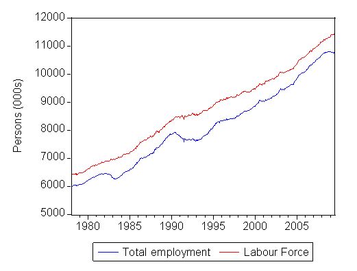
First, consider the following graph which shows the evolution of the Labour Force (available persons) and Total Employment (in thousands) since February 1978 (data is seasonally adjusted). The gap between the two series is official unemployment. You can clearly see the three major recessions over this period – 1982, 1991 and the present episode. seasonally-adjusted employment peaked in October 2008 at 10816.7 thousand persons and has fallen since then (now at 10793.6 thousand persons). So the rate of decline is much slower this time around which is good news.
Total employment gap – February 1978 to July 2009
The following table summarises the employment changes that have occurred since the downturn begun (February 2008 was the low-point unemployment rate in the previous cycle) and over the course of 2009 to date. Like previous downturns, full-time employment is bearing the brunt and this loss has accelerated in 2009 when the stimulus packages were started to impact on aggregate demand. It is clear that part-time work has been the beneficiary of the fiscal intervention given its retail trade orientation. Perhaps the infrastructure spending that is now kicking in (school renovations, insulation etc) will provide some boost to full-time work in the months to come. Overall, employment has fallen this year (by 7.8 thousand persons) reflecting the fact that the deterioration in full-time employment is now outpacing the growth in part-time employment. That is a big worry for the months to come.
The data also tells us that unlike previous downturns, this recession is biased against males. They have borne the brunt of the full-time losses and while not gaining as many of the part-time jobs as females have increased their share of part-time employment marginally. This spells a story that underemployment is becoming a shared phenomenon in the Australian labour market whereas in the past it was almost exclusively concentrated among females.
How are we travelling in relation to 1991 and 1982? Regular readers will know that I chart the progress of the unemployment against the previous two recessions (1991 and 1982) to detect similarities and differences. This helps us guage the likely direction of the labour market and also assess the impact of the two fiscal stimulus packages.
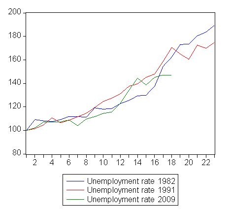
The following graph updates my 3-recessions graph. It depicts how quickly the unemployment rose in Australia during each of the three major recessions in recent history: 1982, 1991 and now 2009. The unemployment rate was indexed at 100 at its lowest rate before the recession in each case (June 1981; November 1989; February 2008, respectively) and then indexed to that base for each of the months until it peaked. It provides a graphical depiction of the speed at which the recession unfolded (which tells you something about each episode) and the length of time that the labour market deteriorated (expressed in terms of the unemployment rate).
While the unemployment rate was tracking the severity of the 1991 recession up until about 4 months ago, it is clear that it is now rising more moderately compared to the rate of decline back then.also see that the percentage point change in the official unemployment rate is tracking the deteriorations that occurred in the last two recessions. Note that these are index numbers and only tell us about the speed of decay rather than levels of unemployment. Clearly the 5.8 per cent at this stage of the downturn is lower that the unemployment rate was in the previous recessions at a comparable point in the cycle.
Comparison of unemployment rate dynamics – 1982, 1991 and 2009, Index numbers
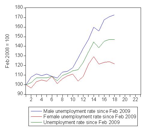
The next graph provides a different view of the gender story. It shows the evolution of the unemployment rate since February 2008 for persons (green), males (blue) and females (red) in index number form. You can clearly see that while the female unemployment rate is now falling slightly the male unemployment rate continues to rise.
Unemployment rate since February 2008 index numbers
New series: Hours worked
As I noted yesterday, the ABS has now (finally) begun to release their hours worked series (monthly 000s) and have made it available from July 1985. So we can compare the 1991 recession with now and also compare persons employed with hours worked to guage the different rates of adjustment in each as an indicator of how firms might be reacting to changing demand conditions.
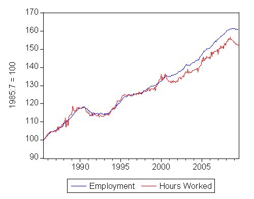
The first graph shows the complete hours worked series indexed to 100 at July 1985 and compares it to total employment also indexed to 100 at July 1985. The growth in the two series is almost coincident until around September 2000 after which the economy increasingly produces jobs but with deficient hours of work. This tells us that the growth boom that was lauded by the previous government created growth in employment but the people who were gaining the jobs were having to scramble for a declining overall volume of hours of work on offer. In other words, the economy didn’t provide enough hours of work. This is clear from the fact that the part-time workers are increasingly signalling to the ABS that they want to work longer hours but cannot find them.
You can also see how significantly, the hours series has fallen in the recent months which signifies that there are both job losses occurring (as shown above) and also that firms may be adjusting part-time hours downwards. I was asked by a News Limited journalist today (yes they still talk to me!) what I thought about these trends – the question being how much of it is sectoral (manufacturing in decline and retail up) and how much of it is full-time jobs being converted into part-time hours and/or part-time jobs being downgraded further.
My response was that it is mostly sectoral (see further analysis of this below) and some part-time adjustment. I doubted that full-time workers were being confronted with the demand from their employers to shift reconstruct their jobs as part-time. I would be interested to hear any stories out there about this.
Anyway, since February 2008 total employment has grown by 0.6 per cent (all part-time) while total working hours has declined by 1.6 per cent. Since January 2009, total employment has declined by 0.1 per cent while total working hours has declined by 1.3 per cent. So at present the labour market is adjusting mostly in hours worked.
The unemployment rate has risen because employment growth is not sufficient to absorb the new entrants that continue to want work. Participation rates have held up to date.
Employment and Hours worked – July 1985 to July 2009, Index numbers
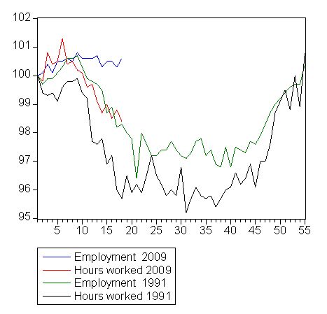
The next graph shows the index numbers (corresponding to the same time frames in the unemployment graphs above) for total employment and hours worked for the 1991 and 2009 recessions. Two things are noticeable. First, the sudden drop in employment in 1991 came some months after the low-point unemployment rate was observed. Once employment started to fall it really fell. We are now past that point in the current cycle with employment still holding up though very weakly. Second, hours worked falls more quickly than total employment as a matter of course – that is, the economy adjusts hours first then persons. But that deterioration was considerably more pronounced in 1991. At the corresponding period (18 months since the low-point unemployment rate the hours worked index had fallen from 100 to 95.7 in 1991 whereas in the current episode it has fallen from 100 to 98.4.
Comparison of Employment and Hours worked dynamics – 1991 and 2009, Index numbers
There is some speculation around about how flexible the labour market is at present relative to the 1991 recession. The following table sheds some light on that issue. I computed the loss of full-time employment from the low-point unemployment rate month (February 2008 and November 1989) and also from January 2009 for the current episode. I converted that into lost hours of work (using a rough 38 hours per week to represent a full-time working week and 20 working days per month) this allows a comparison between the lost working hours overall and that which might be attributable to the full-time employment loss. It is approximate.
For the first 18 months of the downturn in 1991, full-time employment losses accounted for around 90 per cent of the total hours lost over that period. In the current recession, for the first 18 months, full-time employment losses accounted for around 63 per cent of the total hours lost over that period. That means that there is more adjustments going on to part-time working hours despite part-time work growing when measured by persons. So underemployment is rising.
Further, the decline in full-time work really began in the new year (since January 2009) and you can see that 89 per cent of the hours worked that have been lost since that period can be attributable to full-time jobs being scrapped. So for the commentators who are extolling the virtues of our more flexible labour market now they should think again because the bulk of the hours adjustment is now in full-time job losses just as it was in 1991.
Conclusion
A sombre result. Better than we expected a few months ago but employment growth remains very weak, unemployment is rising and underemployment is soaring.


What are the odds that the government will say “People are choosing to work less hours” ?
Dear Alan
High but we know they will be lying!
best wishes
bill