The Australian Bureau of Statistics (ABS) released the latest labour force data today (APRIL 16,…
It is easier to keep a job than to get one
Today I have analysing the ABS Gross Flows data which reveals the underlying dynamics in the labour market that combine to give us the unemployment rate and other labour market aggregates. The current downturn is revealing itself to be quite different (so far) to the 1991 recession. While the chances of an unemployed person finding a job have fallen in a similar way to 1991, the chances of an employed person losing their job has not deteriorated markedly in the current recession, in contradistinction to what happened in 1991. The difference is in the hours data that we analysed yesterday. In 1991, the labour market contracted largely via unemployment whereas this time around it is contracting via underemployment. The flows data also reveals fundamental differences between Australian and the US in the sense that the American labour market is contracting more traditionally at present compared to our “underemployment” recession.
You may want to read an earlier blog – What can the gross flows tell us? – where I explain how the gross flows data works and what it all means. Here is a brief update before looking at some interesting things that the data is telling us about how the labour market is adjusting and what is different this time.
The following table shows the schematic way in which gross flows data is arranged each month – sometimes called a Gross Flows Matrix. Here FT refers to full-time employment, PT to part-time employment, U to unemployment and N to not-in-the-labour force. The subscripts t and t-1 refer to the current month and the previous month, respectively.
The Gross Flows matrix can be interpreted straightforwardly. As an aside, some students look at you blankly when you say matrix but as soon as you say spreadsheet they light up which is symptomatic of the way learning is conditioned by the tools available. Anyway, each element in the matrix (cell in the spreadsheet) tells you the volume (in 000s for Australian labour force data) of the flows between the different labour force states.
So the element FT to FT tells you how many people who were in full-time employment in the previous month (t-1) are in full-time employment in the current month (t). Similarly the element FT to U tells you how many people who were in full-time employment in the previous month (t-1) are now unemployed in the current month (t). And so on. This allows you to trace all inflows and outflows from a given state during the month in question.
The transition probabilities are then computed by dividing the flow element in the matrix by the initial state. For example, if you want the probability of a worker remaining unemployed between the two months you would divide the flow (U to U) by the initial stock of unemployment, Ut-1. If you wanted to compute the probability that a worker would make the transition from full-time employment to unemployment you would divide the flow (FT to U) by the initial stock of full-time employment, FTt-1. And so on. So for the 4 states we can compute 16 transition probabilities reflecting the inflows and outflows from each of the combinations.
These flow probabilities are called ‘transition’ rates and they determine the relative number of persons in each labour market state. Given that the unemployment rate is the number of unemployed workers expressed as a fraction of the labour force, flow probabilities also determine the unemployment rate.
The Australian Bureau of Statistics (ABS) has published estimates of labour force status and gross changes (flows) derived from matched records on a monthly basis since February 1980. Please read the earlier blog – What can the gross flows tell us? to see how difficult this data is – breaks in series etc. The monthly data was seasonally adjusted (using X12) and then I computed Hodrick-Prescott trends to simplify the interpretation.
Flows into and out of employment
The first graph shows the inflows to employment and the outflows from employment for males, females and persons from August 1980 to July 2009. If you compare this recession with the 1991 recession you can see that the probability of getting a job (inflows into employment) have plunged in both episodes. But the big difference is that while in 1991 the probability of losing a job (outflows from employment) rose sharply, in the current episode that probability has not moved much. In other words, the chances of losing a job once you have one is not rising significantly this time. Keep this in mind when you look at the US graphs below. In the US, the likelihood of keeping a job has falling dramatically at the same time as the probability of getting a job has also declined significantly. That is one of the reasons their unemployment rate has risen so much compared to the relatively muted increase in the Australian unemployment rate.
You can also see that the male chances of losing a job a rising slightly now whereas for females the probability continues to decline.
When you piece this information together with the hours analysis I presented yesterday then you can understand better why Australia is increasing underemployment faster than unemployment whereas in the US the conventional pattern of adjusting via job loss seems to be the way.
Flows into and out of unemployment
The second graph shows the inflows to unemployment and the outflows from unemployment for males, females and persons from August 1980 to July 2009. It provides another view of the labour market dynamics that we see above. It is clear that the probability of leaving unemployment has fallen dramatically since the downturn began – similar to the 1991 experience.
But the probability of becoming unemployed has not changed much this time in contradistinction to the 1991 experience. For males the probability has risen a little whereas for females there is no change. So again, once you are unemployed you have a declining chance of leaving that state but at present the recession is not dramatically increasing the chances of the working age population becoming unemployed.
Flows between employment and unemployment
The next graph shows the transition probabilities between the two categories of employment and unemployment – flows each way. The message is clear. The likelihood of an unemployed person leaving that state and finding work has plunged in the current downturn in a similar way to the behaviour of the 1991 recession.
Howevr, while employed males are now experiencing a slightly rising probability of entering unemployment, females are enjoying a declining probability. This is quite different to what happened in 1991 where both males and females endured increased chances of losing their jobs.
The next graph shows the transition probabilities between the two categories of employment (full-time and part-time) and unemployment – flows each way. For unemployed males the probability of getting a full-time job has fallen by more than the decline in the probability of getting a part-time job. This is similar to the 1991 situation for males. In terms of the the chances of becoming unemployed, males in full-time employment have a relatively unchanged probability, whereas those males in part-time employment are seeing a rising probability.
For unemployed females the probability of getting a full-time and part-time job has remained relatively stable this downturn compared to the deterioration evident in the 1991 recession.
For unemployed females the probabilities of getting a full-time and part-time job have both fallen as they did in 1991, but the rate of decline is slower and the probabilities are still higher than they were in 1991. For the employment females, while the probability of losing their jobs rose in 1991, it is relatively stable this downturn.
Flows between employment and not in the labour force
The next graph shows the transition probabilities between the two categories of employment (full-time and part-time) and not in the labour force – flows each way.
First, it shows that for males and females it is increasingly likely that you will enter (or re-enter) the labour force via part-time employment rather than full-time employment. Both entry probabilities have declined somewhat in the current downturn.
Second, the decline in the exit probability from part-time employment to not in the labour force over the period is very noticeable. People in part-time work are not as likely to exit the labour force now and this probability has dropped even faster in the current downturn.
Gross flows in the US labour market
I am doing some work on the US gross flows data as well at the moment and it tells us a very interesting story about the differences between their largely deregulated labour market and our less deregulated labour market. It also indicates how an early and large fiscal stimulus (here) targetting consumption spending is more effective than the fiscal stimulus in the US which has targetted the financial sector largely.
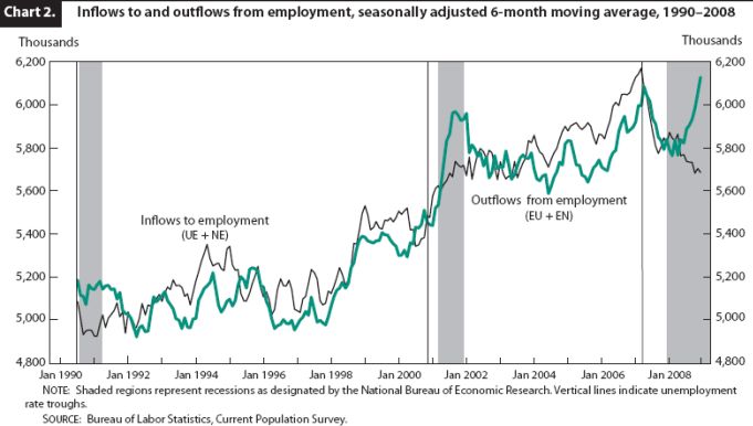
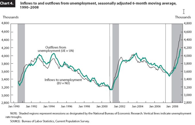
I haven’t time today to prepare all the graphs but I took this from a paper by US Bureau of Labor Statistics researchers Harley J. Frazis and Randy E. Ilg – Trends in labor force flows during recent recessions (published April 2009). You can also find out general information and get all the data from the BLS CPS Flows page. Note their graphs are not transition probabilities but the raw flows (in 000s). But they tell you the same story by way of direction of change.
The first graph is the flows into and out of employment. Whatever else that you can see in the graph, the relevant point for the current recession is that outflows from employment have jumped sharply while inflows into employment have fallen dramatically. This is very different to the current Australian experience where the outflows from employment have not risen significantly yet. So it is just as hard to get a job here as it is in the US but not as easy to lose it once employed.
The second graph shows the flows into and out of unemployment. You can see how different they are.
Conclusion
I could provide a lot more analysis and charts but the message is very clear. The Australian labour market is at a stand-still with the chances of getting a job declining sharply at present. But unlike the 1991 downturn, the chances of an employed person losing their job has not risen significantly in the current downturn.
When we compare our labour market dynamics with the US, that is the fundamental difference. Employed persons there have seen a rapidly rising chance of losing their jobs while at the same time the unemployed have seen their chances of gaining work plummet.


So much for the “superiority” of the heavily de-regulated US labour market.
Dear Lefty
I think there is something in that. I am working out how to examine that question in a formal sense.
best wishes
bill
Just an anecdotal point drawing on my own recent labor market experience in Melbourne.
I was made redundant from my full-time job in the financial sector in May. I more or less straight away picked up a part-time position in retail (the retail stimulus seems to be working you could say). From what my employer told me they were pretty much business as usual. Now two months later I have a full time job at Victorian Treasury.
There aren’t a lot of full-time jobs going in the financial space from what I can gather, so I consider myself lucky more than anything else.
So from full-time to unemployed, unemployed to part-time, and part-time to full-time in three months. I’m sure a lot of people in the financial sector have had this type of experience.