Go back to the headlines in 2010 - – “Countries with debt over 90 percent…
Australian inflation outlook benign – room for fiscal stimulus
Central banks around the world have been demonstrating how weak monetary policy is in trying to stimulate demand. They have been building up their balance sheets (massively) by creating reserves in return for government and corporate paper in an attempt to push their inflation rates up. But the data suggests their efforts are in vain. Which should inform all those who think that if the government stopped issuing debt to match their deficits there would be horrible inflation to think again. Progressives should be calling for their governments to abandon the gold standard practice of issuing debt, which would change the political dialogue considerably. Australia is also struggling to push it inflation rate into the so-called policy range of 2 to 3 per cent. Last week’s Australian Bureau of Statistics inflation data release – Consumer Price Index, Australia – data for the September-quarter 2017 showed that the September-quarter inflation rate was 0.6 per cent with an annual inflation rate of 1.8 per cent (down from 1.9 per cent last quarter). The headline inflation rate has been below the Reserve Bank of Australia’s lower target bound of 2 per cent for nearly two years now. Clearly, within their own logic where an inflation rate within the 2 to 3 per cent band reflects successful monetary policy, the RBA is failing. The RBA’s preferred core inflation measures – the Weighted Median and Trimmed Mean – are also now below the lower target bound and are not showing signs of moving up. The most reliable measure of inflationary expectations has also fallen quite sharply. With the labour market data demonstrating weakness and the economy stuck in this low inflation malaise, it is clearly time for a change in policy direction.
The summary Consumer Price Index results for the September-quarter 2017 are as follows:
- The All Groups CPI rose by 0.6 per cent compared with a rise of 0.2 per cent in the June-quarter 2017.
- The All Groups CPI rose by 1.8 per cent over the 12 months to the September-quarter 2016, compared to the annualised rise of 1.9 per cent over the 12 months to June-quarter 2017.
- The Trimmed mean series rose by 0.4 per cent in the September-quarter 2017 (0.2 per cent in the June-quarter 2017) and by 1.8 per cent over the previous year (1.8 per cent for the 12 months to June-quarter 2017).
- The Weighted median series rose by 0.4 per cent in the September-quarter 2017 (0.1 per cent in the June-quarter 2017) and by 1.9 per cent over the previous year (1.9 per cent for the 12 months to the June-quarter 2017).
- The most significant price rises this quarter are electricity (+8.9 per cent), tobacco (+4.1 per cent), international holiday travel and accommodation (+4.1 per cent) and new dwelling purchase by owner-occupiers (+0.8 per cent).
- The most significant offsetting price falls this quarter are vegetables (-10.9 per cent), automotive fuel (-2.3 per cent) and telecommunication equipment and services (-1.5 per cent)
While the Australian debate has not been centred on any QE myths – that is, the Reserve Bank of Australia (RBA) has not engaged in any widespread asset purchases unlike its counterparts in Europe, the UK, Japan, the US – there is still an obsession that inflation is just about to accelerate and this will force the RBA to increase interest rates.
Even though inflation has been benign now for some quarters, the market economists (banks) still think it is about to accelerate and the RBA will be hiking interest rates.
But the reality is quite the opposite.
If anything, the pressure is now on the RBA to reduce interest rates given that their preferred measures (see below) are now well below their targetting range (2 to 3 per cent) and have been for several quarters.
What is apparent from yesterday’s inflation figures and the most recent labour market data is that there is plenty of room for further fiscal stimulus.
How to align that reality with the political narratives from both sides of politics which is running the exact opposite line is the question.
Trends in inflation
The headline inflation rate increased by 0.6 per cent in the September-quarter 2017 translating into an annualised increase of 1.8 per cent, down from 1.9 per cent in the June-quarter 2017.
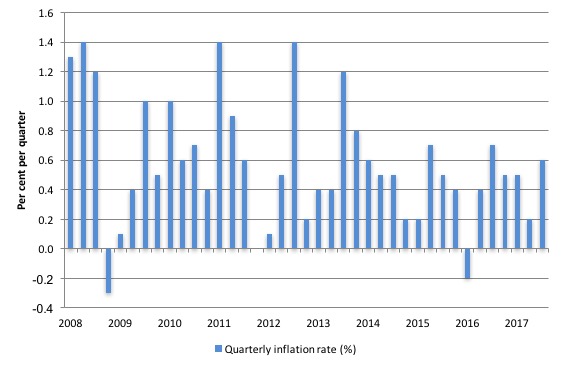
The following graph shows the quarterly inflation rate since the March-quarter 2008. There is clearly no breakout trend emerging.
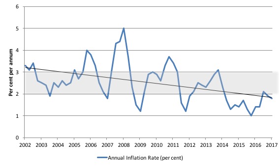
The next graph shows the annual headline inflation rate since the first-quarter 2002. The black line is a simple regression trend line depicting the general tendency. The shaded area is the RBA’s so-called targetting range (but read below for an interpretation).
The trend inflation rate is quite steeply downwards despite the hikes in electricity and gas prices in the September-quarter.
Much has been made of electricity prices in the last 12 months as the folly of the various privatisations over the years are now starting to play out.
We have seen price gouging, our national grid is teetering on the edge of blackouts (and has blacked out an entire state in 2016), and we have seen private energy companies manipulating generating capacity to create price spikes so as to increase profits.
The sooner we take back the essential services into public hands and ban speculative financial transactions on power prices the better.
Please read my blog – Market manipulation and electricity blackouts – for more discussion on this point.
In the September-quarter 2017, the annual inflation rate dropped marginally to 1.8 per cent despite a massive hike in electricity prices (8.9 per cent) at the beginning of the quarter. Gas and other household fuels rose by 5.2 per cent as the major gas companies export to gain profit and sell into the local market gas they have purchased abroad (ridiculous).
These prices are being driven by the wholesale energy market – which demonstrates the failure of energy policy in Australia – it has favoured corporate profits over service delivery.
Further, the ABS has done some analysis of the impact of scrapping the Carbon Tax – which was one of the headline policy initiatives of the newly elected Conservative government in 2013 – claiming it would bring down energy prices.
The ABS produced this graph in their current data release:
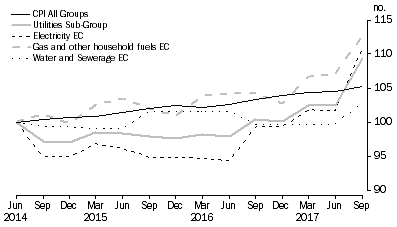
They comment:
The period from June quarter 2014 to September quarter 2017 commences with the removal of carbon pricing. For this period the utilities sub-group rose 9.3%. This was driven by gas and other household fuels (+12.7%), followed by electricity (+10.8%) and water and sewerage (+2.9%).
So much for the claim that scrapping the tax would reduce prices.
What is driving inflation in Australia?
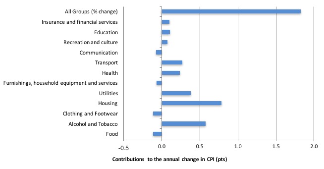
The following bar chart compares the contributions to the quarterly change in the CPI for the September-quarter 2017 (red bars) compared to the June-quarter 2017 (blue bars).
Note that Utilities is a sub-group of Housing – and in the September-quarter 2017 the dominant driver of housing cost rises.
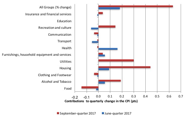
The ABS say that:
- The most significant price rises this quarter are electricity (+8.9%), tobacco (+4.1%), international holiday travel and accommodation (+4.1%) and new dwelling purchase by owner-occupiers (+0.8%).
- The most significant offsetting price falls this quarter are vegetables (-10.9%), automotive fuel (-2.3%) and telecommunication equipment and services (-1.5%).
I have discussed the energy price rises above.
Tobacco prices rose on the back of “the 12.5% federal excise tax increase effective from 1 September 2017” – so a government policy induced rise rather than anything happening in the ‘market’.
Under Recreation and culture, the main driver was “international holiday travel and accommodation … The rise in international holiday travel and accommodation is typical of the summer peak seasons in Europe and America.”
The next bar chart provides shows the contributions in points to the annual inflation rate by the various components.
In the twelve months to the end of September 2017, the major drivers of inflation were Housing (energy prices) and Alcohol and Tobacco Prices. The tobacco and health price rises largely reflect government policy changes.
Inflation and Expected Inflation
I mentioned at the outset, the on-going inflation obsession among market players. If you examine the market trends in speculative trades then it is clear that the traders have been betting on a major shift in the RBA policy upwards because they have been punting on a substantial rise in inflation.
They have been systematically wrong on that front.
The fear of inflation, in part, drives the misplaced faith in monetary policy over fiscal policy.
If we went back to 2009 and examined all of the commentary from the so-called experts we would find an overwhelming emphasis on the so-called inflation risk arising from the fiscal stimulus. The predictions of rising inflation and interest rates dominated the policy discussions.
The fact is that there was no basis for those predictions in 2009 and seven years later inflation is turning into deflation despite the rising estimates of the fiscal deficit.
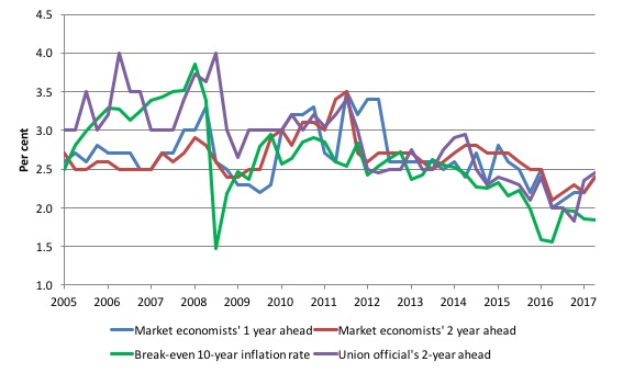
The following graph shows four measures of expected inflation expectations produced by the RBA – Inflation Expectations – G3 – from the June-quarter 2005 to the September-quarter 2017.
The four measures are:
1. Market economists’ inflation expectations – 1-year ahead.
2. Market economists’ inflation expectations – 2-year ahead – so what they think inflation will be in 2 years time.
3. Break-even 10-year inflation rate – The average annual inflation rate implied by the difference between 10-year nominal bond yield and 10-year inflation indexed bond yield. This is a measure of the market sentiment to inflation risk.
4. Union officials’ inflation expectations – 2-year ahead.
Notwithstanding the systematic errors in the forecasts, the price expectations (as measured by these series) are trending down in Australia, which will influence a host of other nominal aggregates such as wage demands and price margins.
The market economists’ one-year and two-year ahead expectations are well above the Break-even 10-year inflation rate. Even Union officials have fallen for the accelerating inflation outlook.
It is well known that the ‘market economists’ systematically get movements in the economy wrong and one wonders if their organisations actually bet money on their analysis!
The most reliable measure – the Break-even 10-year inflation rate – is now at 1.8 per cent, well below the lower bound of the RBA targetting range but spot on where the actual raw inflation rate came in at.
It has falling rapidly towards the actual inflation rate in the last few quarters, reflecting the relatively weak state of the Australian economy.
The other expectations are still lagging behind the actual inflation rate, which means that forecasters progressively catch up to their previous forecast errors rather than instantaneously adjust, a further piece of evidence that refutes the mainstream economics hypothesis that we have ‘rational expectations’ (that is, on average get it right).
Implications for monetary policy
What does this all mean for monetary policy?
Clearly, the market economists have been punting on a rise in the interest rate.
But the inflation trends highlighted in last week’s data release provide no basis for that expectation nor for the RBA hiking interest rates anytime soon.
The Consumer Price Index (CPI) is designed to reflect a broad basket of goods and services (the ‘regimen’) which are representative of the cost of living. You can learn more about the CPI regimen HERE.
Please read my blog – Australian inflation trending down – lower oil prices and subdued economy – for a detailed discussion about the use of the headline rate of inflation and other analytical inflation measures.
The RBA’s formal inflation targeting rule aims to keep annual inflation rate (measured by the consumer price index) between 2 and 3 per cent over the medium term. Their so-called ‘forward-looking’ agenda is not clear – what time period etc – so it is difficult to be precise in relating the ABS data to the RBA thinking.
What we do know is that they do not rely on the ‘headline’ inflation rate. Instead, they use two measures of underlying inflation which attempt to net out the most volatile price movements.
To understand the difference between the headline rate and other non-volatile measures of inflation, you might like to read the March 2010 RBA Bulletin which contains an interesting article – Measures of Underlying Inflation. That article explains the different inflation measures the RBA considers and the logic behind them.
The concept of underlying inflation is an attempt to separate the trend (“the persistent component of inflation) from the short-term fluctuations in prices. The main source of short-term ‘noise’ comes from “fluctuations in commodity markets and agricultural conditions, policy changes, or seasonal or infrequent price resetting”.
The RBA uses several different measures of underlying inflation which are generally categorised as ‘exclusion-based measures’ and ‘trimmed-mean measures’.
So, you can exclude “a particular set of volatile items – namely fruit, vegetables and automotive fuel” to get a better picture of the “persistent inflation pressures in the economy”. The main weaknesses with this method is that there can be “large temporary movements in components of the CPI that are not excluded” and volatile components can still be trending up (as in energy prices) or down.
The alternative trimmed-mean measures are popular among central bankers.
The authors say:
The trimmed-mean rate of inflation is defined as the average rate of inflation after “trimming” away a certain percentage of the distribution of price changes at both ends of that distribution. These measures are calculated by ordering the seasonally adjusted price changes for all CPI components in any period from lowest to highest, trimming away those that lie at the two outer edges of the distribution of price changes for that period, and then calculating an average inflation rate from the remaining set of price changes.
So you get some measure of central tendency not by exclusion but by giving lower weighting to volatile elements. Two trimmed measures are used by the RBA: (a) “the 15 per cent trimmed mean (which trims away the 15 per cent of items with both the smallest and largest price changes)”; and (b) “the weighted median (which is the price change at the 50th percentile by weight of the distribution of price changes)”.
Please read my blog – Australian inflation trending down – lower oil prices and subdued economy – for a more detailed discussion.
So what has been happening with these different measures?
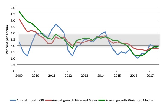
The following graph shows the three main inflation series published by the ABS since the March-quarter 2009 – the annual percentage change in the all items CPI (blue line); the annual changes in the weighted median (green line) and the trimmed mean (red line).
The RBAs inflation targetting band is 2 to 3 per cent (shaded area). The data is seasonally-adjusted.
The three measures are currently very close:
1. CPI measure of inflation – 1.8 per cent and below the RBAs target band for the last two years.
2. The RBAs preferred measures – the Trimmed Mean (1.8 per cent and stable) and the Weighted Median (1.9 per cent and stable) – are also below the lower bound of the RBAs targetting range of 2 to 3 per cent.
How to we assess these results?
First, the ABS will realise that the energy price hikes (up to four times the overall inflation rate) are not a reason to hike interest rates. They do not signify an overheating economy but rather price gouging and a failed energy policy, that will have a negative impact on economic activity.
Second, there is clearly a downward trend in all of the measures. The “core” measures used by the RBA have been benign for many quarters even with a relatively large fiscal deficit and record low interest rates. They are now trending flat.
Second, it is clear that the RBA-preferred measures are well below the lowest inflation-targeting band rate of 2 per cent and have been since the end of 2015.
The RBA will also be mindful that real GDP growth is still below trend and the labour market is still in an uncertain-to-vulnerable state, with broad labour underutilisation still above 14 per cent (or more).
In terms of their legislative obligations to maintain full employment and price stability, one would think the RBA would have to cut interest rates in the coming month given the state of the economy and the benign inflation environment.
Further, as I have noted elsewhere, wages growth is flat and at record lows.
Please read my blog – Australia – real wages growth zero and the rip-off of workers continues – for more discussion on this point.
The inflationary expectations of the union officials (see graph above) are also not signalling any major breakout, which might drive higher wage demands.
My view is that the RBA should cut rates now that all three measures have been consistently below the targetting range. It won’t but it also will not be hiking rates anytime soon. And the market economists will be wrong again.
Shifting relations between labour underutilisation and inflation
With unemployment now falling yet wages growth flat and inflation benign – a global phenomenon – there have been questions raised about our usual understandings of these relationships.
Some years ago (2004) I wrote a paper which explored the notion that a declining unemployment rate no longer provided the same signals for inflation trends as it might have done in the past. Specifically,I hypothesised that with the rise of underemployment accompanying the casualisation of the labour market in the neo-liberal era, “within-firm” measures of labour slack were now likely to be an additional way in which wages growth was suppressed.
In other words, you had to consider the broader measures of labour underutilisation in a study of inflation. These ideas coincided with the development of my broader hours-based measures of labour underutilisation which were published as the CofFEE Labour Market Indicators – I discontinued that work after the ABS took the lead and started publishing underemployment and broader labour underutilisation indicators.
Recall that the Phillips curve links the unemployment rate and inflation based upon the notion that unemployment is an inverse proxy for labour market pressure – so excess labour supply was considered to be a key variable constraining wage and price changes.
However, if the way in which the labour market slack manifests changes – to include slack within the firm (underemployment) as well as slack that is external to the firm (unemployment) – then the earlier approach to studying the Phillips curve will miss out on important factors that may help to explain inflation.
Specifically, a falling unemployment rate may be offset (more or less) by rising underemployment. As a consequence, if the policy makers are attempting to gauge inflation pressure by examining movements in the unemployment rate (that is, the NAIRU type approach) they will overestimate the tightness of the labour market when there is signficiant underemployment.
The point is that over the the last several decades, the relationship between inflation and unemployment has been unstable and during the periods of stability it has been fairly flat – implying disinflation policies are very costly.
Please read my blog – Inflation targeting spells bad fiscal policy – for more discussion of the sacrifice ratios involved in using unemployment to discipline inflation.
In earlier work (2004) I tested several interesting testable hypotheses at that time about how the changing labour market impacted on the inflation generating process.
I have updated that work (which will come out soon in the academic press) and the summary results of one part of the research are presented below.
First, the standard Phillips curve model predicts a significant negative coefficient on the official unemployment rate (a proxy for excess demand). I found that in the sample tested (February 1978 to September 2017), the unemployment rate in a typical Phillips curve model exerted a statistically-significant negative influence on the rate of inflation.
Second, when I added an underemployment variable I found it exerts negative influence on annual inflation with the negative impact of the UR being reduced. The underemployment impact is much stronger than the unemployment impact.
The point is that even though unemployment has fallen in Australia since the worst period of the recent downturn, underemployment has not falling much and rose sharply as the economy slowed.
The inflation discipline coming from the labour market is at present fairly strong and that is why I conclude there is not significant inflation threat coming from that source.
Conclusion
Just before the GFC hit all the macroeconomic policy talk in Australia was about getting deficits down and into surplus to ensure that inflation didn’t accelerate.
It was nonsensical talk even then, when economic growth was stronger and unemployment lower.
The doomsayers were completely wrong when they predicted the fiscal stimulus in 2008-09 would generate dangerous inflation impulses.
The trend has been down for some years now and some nations are fighting deflation rather than inflation.
Australia is now a member of the low-inflation/deflationary brigade as a result of our austerity-obsessed national government.
We are skating along at below-trend growth rates and tolerating elevated levels of labour underutilisation. A sort of slow death.
Something has to give in the policy debate which remains dominated by a supposed need to record fiscal surpluses.
That is enough for today!
(c) Copyright 2017 William Mitchell. All Rights Reserved.
Hello,
One thing that comes out well on a graph is the inverse relationship between interest rates and private debt.
The higher the private debt the lower the interest rate.
Due to monetarist economic policy, the level of private debt peaked in most countries at the boom phase of the GFC and has not fallen very far since. Central banks moved in to shore it up with QE.
Professors Steve Keen and Micheal Hudson have done some great work on private debt and how it erodes aggregate demand and thus causes “debt deflation”.
In Nz today, inflation 1.9%. Still doesn’t stop comments from msm about how massive inflation is about to be unleashed with rate hikes that will accompany some huge stagflationary episode caused by the new government . I fixed the mortgage for another year….but I doubt they will be lifted.
Thanks for the format. Great info
Increasing interest rates causes inflation and weakens a currency.
The FED has had 4 rate hikes
The $ index has fallen from 103 to 91
Gold went from $1,020 to $1,350
All else equal.
They are price adjustments, pure and simple. Higher rates equate to higher prices and higher prices mean higher inflation. Inflation is not good for currency. Higher inflation is good for inflation-sensitive stuff like gold and commodities as well as some stocks.
The data since the FED started hiking proves this. Just pick a graph, any graph. The price increases get passed on right across the economy.
Currencies are a bit like bonds, the only difference being they have zero maturity. Everyone seems to understand that when rates go up bond prices go down. It’s an inverse relationship. The discount to par reflects the implied yield and that discount increases as rates go up.
Same with currencies. The spot price of a currency can be considered par. In a rising-rate environment the forward prices of a currency are lower. The market is literally pricing in a lower exchange rate. The degree of discount to par reflects the implied yield. Buy a forward and hold it over time until it converges to spot and you will earn the implied yield.
Gold and commodities exhibit the opposite behavior. They don’t earn. They cost you to hold. There are interest payments and storage costs so the natural “curve” of gold and commodity markets has a positive slope. (Deferred contracts are priced higher than spot.)
In a rising-rate environment, forward contracts for gold are priced higher. That reflects the “cost” of holding, which equals the interest rate plus storage, etc. Prices rise in a rising-rate environment and they fall in a falling rate environment.
Of course this does not reflect short-term portfolio shifts based on traders’ beliefs. Many believe that lower rates are bullish for gold or bearish for a currency and vice-versa. As a result, they act on those beliefs and buy and sell accordingly. However, that’s not the true fundamental effect. That’s why so many people lost money buying gold when they believed rate cuts would be inflationary. Similarly, they wrongly sold the dollar. These mistakes are being repeated now, only in reverse.
The Fed thinks it is fighting inflation when actually it is feeding it via these rate hikes. Any commodity curve will show this in reaction to a rising-rate environment. The curve will instantly reflect higher future costs.
In addition, their policy and statements seem to reflect a lack of understanding of the government being a net payer of interest. They talk about being on guard against further fiscal stimulus when it is the Fed itself that is doing the stimulating. It is paying. That is income added, not removed. While some may find it harder to borrow because of the higher cost of credit, that is offset by the additional income earned by creditors and savers. There is net income received by the economy and that is by no means a brake on economic activity.
Of course none of this is supposed to happen right !!! Not if you completely ignore the interest income channels it isn’t and you don’t beleive that the FED is the price setter and that price increases gets passed on. You don’t beleive rate hikes increase deposits.
Of course if you cut interest rates the opposite is true. Russia is a great example of what happens if you cut interest rates.
The Ruble was one of the strongest currencies last year and their inflation rate dropped from 6.1% to 3% after cutting interest rates from 11% to just above 8%.
Central banks think if they increase their interest rates it fights inflation. I’d like to see them prove it considering all the data shows the reverse is true.
Just look at this graph from Mike Norman below
Inflation bottomed out Dec 2015 when the FED started hiking that was no coincidence. I’m not talking about hyperinflation here far from it but when you raise interest rates the inflation rate will move upwards..
https://realmoney.thestreet.com/articles/01/18/2017/here-comes-inflation
This brings the year-over-year increase the highest in five years.
Is there no positive side to QE ?
ie Allowing Australian banks to meet their reserve requirements through RBA funding as opposed to global markets ?
Or do banks only borrow for other reasons ? ie foreign currencies
During the time in which the Fed conducted QE. On aggregate personal interest income did not grow. It went from $1.4T annually in 2008 to just under $1.4T in 2015. The Federal debt went from $11T in 2008 to $19T in 2015. So the debt rose by $8T and there was no increase in personal interest income. People were holding $8T more interest bearing securities yet on aggregate they earned not a penny more.
The Fed was stripping it out. The Fed’s earnings on assets went from about $20 billion annually in 2007 to over $100 billion annually by 2015. That’s interest income that would have gone into the economy, but instead it went to the Fed.
Madness when you think about it. I’m not sure but I am starting to believe that after the crash when they knew the automatic stabilisers were going to kick in and pushed the deficit all the way to 10% of GDP.
QE was actually used to help control inflation. Yet, they still to this day call QE a fiscal stimulas.
If the mainstream believe that increasing interest rates fight inflation and make a currency stronger then the Onus is on them to prove it. No matter what data you look at it is not the case.
As for balance sheet reduction they’ll get that wrong as well which is again adding interest income to the economy. Not to mention that Glenn Hadden at the recent MMT conference made a really interesting point about balance sheet reduction. He said,
“What balance sheet reduction if the fiscal side just keep putting them back in”
The Bank Of England are about to raise interest rates tomorrow because they believe it will fight inflation.
Hence, there lies the problem.
Hi Derek,
Interesting comments.
Could we also argue that currency value also affects inflation and rates?
For instance, the RBA has been stating for quite some time now that a higher AUD will dampen inflation, and sure enough after sitting above 78 for a few months we get these most recent poor inflation numbers.
My reasoning suggests, at least from the currency affecting inflation etc angle, that higher AUD means cheaper imports which means less domestic spending.
Hi Dingo,
Not really but maybe on the margins.
Bill has covered this in the past. Pass through inflation because of the exchange rate is not what it used to be.
Is exchange rate depreciation inflationary?
https://billmitchell.org/blog/?p=32922
“While some may find it harder to borrow because of the higher cost of credit, that is offset by the additional income earned by creditors and savers. There is net income received by the economy and that is by no means a brake on economic activity.”
Got to be careful with that simplification. It misses the non-linearity of the feedback loop on the spending flow.
If the government sector is paying higher interest rates you get a net add of interest to the economy, but the increase in the price of money reduces the number of worthy borrowers which reduces the balance sheet expansion of the banks and may reverse it. On top of that is the redistribution from borrowers to savers which tends to be a flow reduction (savers don’t spend as much as borrowers).
Monetary policy changes have extremely uncertain distribution characteristics. There are too many moving parts.
Why should home owners pay more in interest rates because of rising inflation due to rising costs ? Is this not a double whammy ? higher costs + higher costs ?