Go back to the headlines in 2010 - – “Countries with debt over 90 percent…
Common elements linking US and UK economic slowdowns
Last week, the British Office of National Statistics (ONS) released data that revealed that quarterly growth in real GDP dropped to 0.3 per cent in the March-quarter 2017, down from 0.7 per cent in the December-quarter 2016. Household consumption growth fell in an environment of rising household debt and flat real wages. In the same week (April 28, 2017), the US Bureau of Economic Analysis released the latest National Accounts data for the US for the March-quarter 2017 – Gross Domestic Product: First Quarter 2017 (Advance Estimate). It showed that GDP grew on an annualised rate of 0.7 per cent in the first quarter of 2017, down from 2.1 per cent in the December-quarter 2016. The US result was driven, in part, by a dramatic slowdown in personal consumption expenditure and a negative contribution from government. The common elements linking the slowdown on both sides of the Atlantic are clear – growing and massive levels of household debt, flat growth in personal incomes (real wages etc) and inadequate fiscal support for growth. These elements, in part, were key features leading up to the GFC. Governments haven’t learned that relying on personal consumption expenditure for economic growth in an environment of flat wages growth means that household debt will rise quickly and reach unsustainable levels. How harsh the correction is unclear. The faltering the outlook in the US and the UK suggests that their national governments will need to increase their discretionary fiscal deficits to stimulate confidence among business firms and get growth back on track.
US, UK and Eurozone comparison
We do not have the first-quarter 2016 national accounts data in for the Eurozone yet but the December-quarter result was that GDP grew by 0.4 per cent, which was a tad below the US fourth-quarter 2016 result of 0.5 per cent.
Consider the following graph. It shows the evolution of real GDP indexed to 100 at the peak-quarter in the last cycle (December-quarter 2007 for the US; June-quarter 2008 for the UK, and March-quarter 2008 for the Eurozone Member States).
So for the US there are 37 quarters in the current cycle and correspondingly less for the other two time series.
The initial downturn was similar in speed and ferocity for all of the economies shown, with the Eurozone and UK hitting their trough at 1.6 points deeper than the US, although the latter came later in the cycle.
The fiscal stimulus in all three economies (driven by both some discretionary measures and the operation of the automatic stabilisers) saw some positive growth response and for a time (from a lower base), all economies were growing at about the same rate.
But that is where the similarity ends. The election of David Cameron in 2010 saw George Osborne try to implement fiscal austerity and all he managed to do was kill that growth that he had inherited.
The Eurozone growth was also curtailed by nothing other than the bloody-minded incompetence of Brussels as they imposed the Stability and Growth Pact (SGP) rules (more or less) and fiscal austerity was prioritised.
Despite the best efforts of the Republican and Blue Democrats in the US to walk the same austerity plank, the dysfunctional US political system meant that the deficit remained in place at elevated levels which saw the US economy diverge from the those across the Atlantic.
Once George Osborne abandoned his rabid austerity push (or should I say ‘putsch’) in 2012, the British economy diverged from the basket-case Eurozone and chased the US economy upwards.
It took until the December-quarter 2015 (30 quarters) for the 19 Eurozone Member States to finally pass the March 2008 peak and after 35 quarters (March-quarter 2017), the aggregate Eurozone real GDP is still only 1.6 percentage points above that peak.
In the Eurozone, austerity caused the stagnation and the Eurozone remains locked into a struggle with deflation and stagnant economic growth which is not being driven by capital formation, thus underpinning growth in potential GDP as well as supporting current spending.
Overall, the Eurozone bloc endured cumulative real output losses for 7.5 years and now the world is approaching the next cycle.
In contradistinction, is the performance of the US economy, even though by any standards its recovery has been pretty weak. It took 14 quarters to return to an index level of 100 and is now 11.2 per cent larger than it was in the December-quarter 2007. The UK economy took 19 quarters and is now 9.5 per cent larger than it was in the June-quarter 2008.

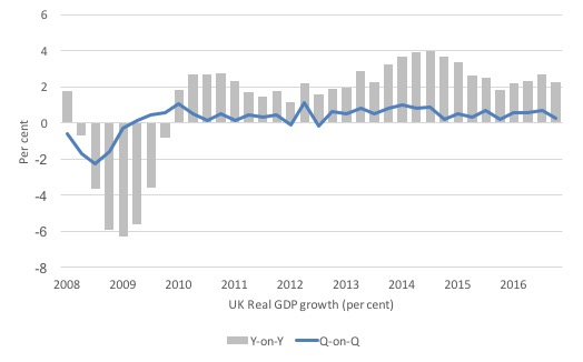
UK economy slows
The latest data from the British Office of National Statistics (ONS) show that quarterly growth in real GDP dropped to 0.3 per cent in the March-quarter 2017, down from 0.7 per cent in the December-quarter 2016.
The preliminary data suggests that household consumption, which has been holding up British growth in recent quarters has now fallen as flat income growth and rising inflation eats into the purchasing power of workers, who are labouring under record levels of household debt.
The ONS located the slowdown in the retail and services sector.
The following graph shows the quarterly and annual growth in British real GDP since the June-quarter 2008 to the March-quarter 2017.
I will analyse that data in more detail when the more detailed expenditure information is available.
But the message is that there is a slowdown going on and it is not a particularly UK or, as we will see, a US phenomenon (so lets keep Brexit out of it!).
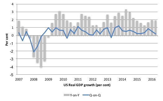
US economy – what is going on?
In their April 28, 2017 data release – Gross Domestic Product: First Quarter 2017 (Advance Estimate), the US Bureau of Economic Analysis said that:
Real gross domestic product (GDP) increased at an annual rate of 0.7 percent in the first quarter of 2017 … In the fourth quarter of 2016, real GDP increased 2.1 percent.
This represents a slowdown. The December-quarter growth was 0.52 per cent (quarterly), 2 per cent (annual) and 2.1 per cent (quarterly annualised – this is the BEA measure).
In the March-quarter 2017, quarterly growth was 0.17 per cent, annual was 1.9 per cent and annualised quarterly was just 0.69 per cent.
This is a significant deterioration.
The peak real GDP growth rate was 3.3 per cent in the March-quarter 2015, and each subsequent quarter up until the September-quarter 2016 experienced a deterioration in the performance of the US economy. The improvement in the latter part of 2016 may now be over.
The following sequence of graphs captures the story.
The first graph shows the annual real GDP growth rate (year-to-year) from the peak of the last cycle (December-quarter 2007) to the March-quarter 2017 (gray bars) and the quarterly growth rate (blue line). The data is available – HERE.
The year-to-year growth calculation smooths out the considerable volatility in the quarterly data to help us see the trend.
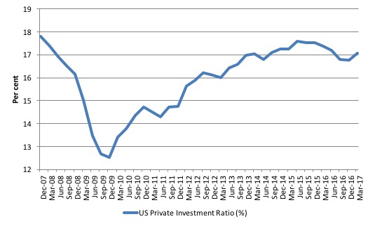
It is too early to predict a US recession is coming but policy has to change given the consistent deterioration in private investment.
The next graph shows the evolution of the Private Investment to GDP ratio from the December-quarter 2007 (real GDP peak prior to GFC downturn) to the March-quarter 2017.
The decline in the investment ratio as a result of the crisis was substantial and endured for 2 years. As a result the potential productive capacity of the US contracted somewhat. There are various estimates available but the overall message is that potential GDP fell considerably as a result of the lack of productive investment in the period following the crisis.
After June-quarter 2015, the Investment ratio has once again been in retreat and dropped from 17.6 per cent to 16.8 per cent of GDP by the end of 2016. In the first three quarters of 2016, private capital formation declined in absolute terms.
The ratio has improved a little in the March-quarter 2017. But if you think about the growth shown in the 2016, investment was not a driving force (see next section).
The decline in capital formation came before the GFC and has still not returned to the peak of the June-quarter 2005 (18.5 per cent).
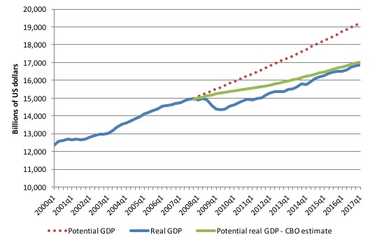
To get some idea of what has happened to potential real GDP growth in the US, the next graph shows the actual real GDP for the US (in $US billions) and two estimates of the potential GDP. There are many ways of estimating potential GDP given it is unobservable.
While I could have adopted a much more sophisticated technique to produce the red dotted series (potential GDP) in the graph, I decided to do some simple extrapolation instead to provide a base case.
The question is when to start the projection and at what rate. I chose to extrapolate from the most recent real GDP peak (December-quarter 2007). This is a fairly standard sort of exercise.
The projected rate of growth was the average quarterly growth rate between 2001Q4 and 2007Q4, which was a period (as you can see in the graph) where real GDP grew steadily (at 0.68 per cent per quarter) with no major shocks.
If the global financial crisis had not have occurred it would be reasonable to assume that the economy would have grown along the red dotted line (or thereabouts) for some period.
The gap between actual and potential GDP in the fourth-quarter 2015 is around $US2,276 billion or around 12.1 per cent. That gap has been rising steadily sine late 2014 after it had stopped rising around 2013 because real GDP was once again growing about as fast at it did, on average in the 6 years before the crisis.
But now growth is slowing and so the gap is rising again.
The green line is the estimate of potential output provided by the US Congressional Budget Office and made available through – St Louis Federal Reserve Bank.
Their output gap estimate (difference between actual and potential) for the March-quarter 2017 is 1.1 per cent, which is clearly less than that derived from a simple extrapolation.
In relation to the CBO estimate, the output gap increased in the March-quarter 2017 as real GDP growth has slowed down appreciably.
How should we assess these two estimates of the output gap?
CBO define Potential GDP as “the level of output that corresponds to a high level of resource-labor and capital-use.”
They explain their estimation methodology in the document – A Summary of Alternative Methods for Estimating Potential GDP.
I discussed the methodology and limitations in these blogs – Structural deficits and automatic stabilisers and US problems are cyclical not structural.
For those who want even more technical detail, please consult my 2008 book with Joan Muysken – Full Employment abandoned – where we provide a mathematical and econometric discussion of the techniques that the CBO uses.
By way of summary, the CBO say that they:
They start with “a Solow growth model, with a neoclassical production function at its core, and estimates trends in the components of GDP using a variant of a tried-and-tested relationship known as Okun’s law. According to that relationship, actual output exceeds its potential level when the rate of unemployment is below the “natural” rate of unemployment) Conversely, when the unemployment rate exceeds its natural rate, output falls short of potential. In models based on Okun’s law, the difference between the natural and actual rates of unemployment is the pivotal indicator of what phase of a business cycle the economy is in.
The resulting estimate of Potential GDP is “an estimate of the level of GDP attainable when the economy is operating at a high rate of resource use” and that if “actual output rises above its potential level, then constraints on capacity begin to bind and inflationary pressures build” (and vice versa).
So despite saying that their estimate of Potential GDP is “the level of output that corresponds to a high level of resource-labor and capital-use” what you really need to understand is that it is the level of GDP where the unemployment rate equals some estimated (unobservable) Non-accelerating Inflation Rate of Unemployment (NAIRU).
Intrinsic to the computation is an estimate of the so-called “natural rate of unemployment” or the NAIRU which is the mainstream version of ‘full employment’ but is, in fact, a conceptual unemployment rate that is consistent with a stable rate of inflation.
The literature demonstrates that the history of NAIRU estimation is far from precise. Studies have provided estimates of this so-called ‘full employment’ unemployment rate as high as 8 per cent or as low as 3 per cent all at the same time, given how imprecise the methodology is.
The former estimate would hardly be considered “high rate of resource use”. Similarly, underemployment is not factored into these estimates.
Also, recall how the European Commission estimated that the Spanish NAIRU jumped from around 12 per cent to around 25 per cent in a short period. Nonsense!
The concept of a potential GDP in the CBO parlance is thus not to be taken as a fully employed economy. Rather they use the devious shift in definition in mainstream economics where the the concept of full employment is not constructed as the number of jobs (and working hours) that which satisfy the preferences of the available labour force but rather in terms of the unobservable NAIRU.
The fact is that these estimates will typically underestimate (by some margin) the true scale of the existing output gaps because the estimated NAIRU is never above the irreducible minimum unemployment rate, the latter reflecting frictions in the labour market as people move between jobs.
You may also like to read this blog – Demand and supply interdependence – stimulus wins, austerity fails – where I discuss the US Federal Reserve Bank’s recent updated estimates of potential GDP.
Both potential GDP estimates in the graph above (the red dotted linear extrapolation and the CBO green estimates) are extremes and the truth is somewhere in between the two.
It is clear that the decline in the Investment ratio will have caused the potential GDP growth to slacken somewhat, which means the red dotted line is an upper limit.
The continued slack in the labour market (bias towards low-pay and high underemployment) would lead to the conclusion that the output gap is likely to be closer to 12.4 per cent(extrapolated estimate) than 1.1 per cent.
The problem then is that the resulting decline in potential real GDP growth reduces the space that the economy can grow within without hitting capacity ceilings. In turn, this locks in higher than necessary labour underutilisation rates.
The other relevant point about the graph is that it defies those who want to characterise the main US problem as being structural (labour market rigidities etc). The US would not have fallen off the cliff as it did in early 2008 if that was the case. Structural deterioration is gradual and cumulative not sudden and sharp.
Contributions to growth
The accompanying BEA Press Release said that:
The increase in real GDP in the first quarter reflected positive contributions from nonresidential fixed investment, exports, residential fixed investment, and personal consumption expenditures (PCE), that were offset by negative contributions from private inventory investment, state and local government spending, and federal government spending. Imports, which are a subtraction in the calculation of GDP, increased …
The deceleration in real GDP in the first quarter reflected a deceleration in PCE and downturns in private inventory investment and in state and local government spending that were partly offset by an upturn in exports and accelerations in both nonresidential and residential fixed investment.
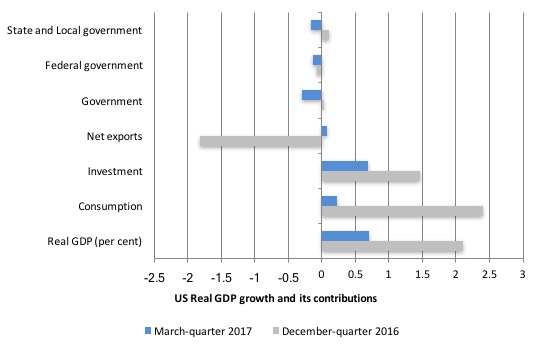
The next graph compares the March-quarter 2017 (blue bars) contributions to real GDP growth at the level of the broad spending aggregates with the December-quarter 2016 (gray bars), where the overall annualised real GDP growth was 2.1 per cent.
The contribution from Private consumption spending has dropped substantially in the March-quarter 2017 – from 2.4 percentage points in the last quarter to 0.2 points this quarter.
American household debt remains high (see below) and real wages growth is flat. Uncertainty is increasing. So how that impacts will remain to be seen.
Similarly, Private investment spending has reduced its contribition from 1.5 percentage points to just 0.7 points in the March-quarter 2017.
The Government sector undermined growth in the March-quarter 2017 by -0.3 points overall after contributing 0.03 points in the December-quarter 2016.
All levels of government undermined growth in the March-quarter 2017.
The other contributor to growth was Net exports (0.07 points).
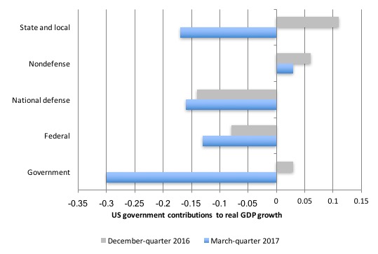
The next graph decomposes the government sector and shows the substantial reversal in growth contribution from the State and Local government sectors.
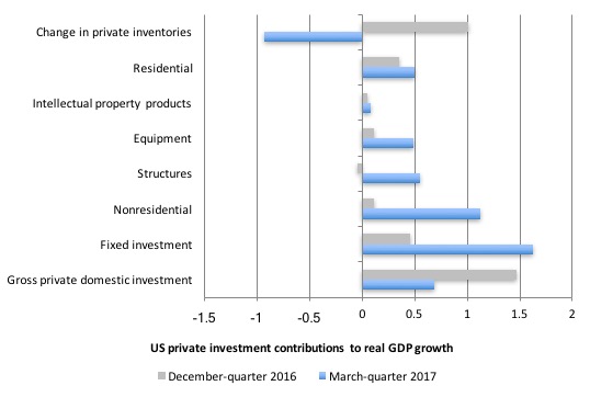
The next graph shows the contributions to real GDP growth of the various components of investment.
The inventory cycle was negative in the March-quarter 2017, which dominated other positive investment contributions
A sustained downturn in the inventory cycle signals on-going weakness in the economy. We will have to see.
The next graph shows the contributions the different expenditure components have made to real GDP growth since the peak in the December-quarter 2007.
The thing to concentrate on is what was going on in 2016 where only household consumption was holding growth up. With incomes flat and prices rising, that growth was being fuelled by increased indebtedness.

The Federal Reserve Bank of New York publication – Household Debt and Credit Report – was last pubilshed in February 2017 (PDF Download)
It shows a marked increase in household debt throughout 2016 of $US0.46 trillion or 3.8 per cent. Total debt which is dominated by housing debt began to diverge significantly from housing debt in 2016.
With the economy now slowing again, the question is will US households be able to withstand the drop in national income and the rise in unemployment, given the buildup in debt, which is now only 0.8 per cent below the September-quarter 2008 peak.
The following graph is taken from the FRBNY publication.

Conclusion
The March-quarter 2017 real GDP growth estimate was a sharp drop on where the US economy was heading at the end of 2016.
On an annualised basis, the quarterly growth rate of 0.17 per cent dropped from 2.1 per cent to 0.69 per cent.
It is starting to look as though the stronger results in the latter part of 2016 (September- and December-quarters) were an aberration after we had observed five successive quarters of deterioration after the the peak real GDP growth rate of 3.3 per cent in the March-quarter 2015.
The growth that was observed in 2016 was clearly driven by personal consumption and coincided with a return to faster growth rates of household indebtedness as real wages growth remained flat. That tendency is unsustainable and household consumption growth declined sharply in the March-quarter 2017.
The March-quarter 2017 slowdown was also driven by the negative contribution from the all levels of government.
A bright spot was the growth in private capital formation over the last three quarters.
In general, I conclude that the federal government’s deficit is now too low to support stronger growth and labour underutilisation rates (U6) remain elevated (and excessive).
UK NHS Campaign
Follow this up if you are keen for the UK to keep its NHS intact (as much as it is after years of whiteanting).
Further information available at: http://bit.ly/999JudicialReview

That is enough for today!
(c) Copyright 2016 William Mitchell. All Rights Reserved.
Nice piece professor! An explanation that is understandable and thorough for readers like myself.
So the Output Gap in your graph looks similar to the estimate by the White House in 2012 of $1.7 -1.8 Trillion?
I would have thought the gap would have widened since then considering the deflated state of the US economy. Unfortunately I don’t remember who was behind the White House figures.
I have been unable to find any political party in the US, UK or Europe whose economic platform does not conflict with the principles of MMT.
Does anyone know of any that do not conflict with the principles of MMT?
Many thanks,
Julian Hare,
Cape Town,
South Africa
The party with the least austerity policies in the UK is The Green Party and it gets slated for it.
Disclosure: I am a party member and candidate for West Bridgford West in the Nottingham County Council elections.