In the 1990s, a new industry was created in Australia. It produced nothing. But it…
Australian labour market – contracts again, policy settings wrong
Today’s release of the – Labour Force data – for April 2015 by the Australian Bureau of Statistics shows that the Australian labour market has contracted again, repeating the pattern over the last 24 months or so where employment growth zig-zags around the zero line and is weak at best. Full-time employment growth was sharply negative this month. Unemployment rose as a result as did the unemployment rate, but the latter would have been higher than 6.2 per cent had not the participation rate fell by 0.1 percentage points. The teenage labour market went backwards again and remains in a parlous state and requires an urgent policy problem that the Federal government refuses to recognise or deal with. In general, there remains a need for more job creation stimulated by an increased federal government deficit. Next week’s fiscal statement, widely tipped to include further cuts in net government spending, will demonstrate how incompetent and out of touch the federal government in Australia is.
The summary ABS Labour Force (seasonally adjusted) estimates for April 2015 are:
- Employment decreased by 2,900 (0.02 per cent) with full-time employment decreasing by 21,900 and part-time employment rising by 19,000.
- Unemployment increased 7,000 to 766,500.
- The official unemployment rate increased by 0.1 pts to 6.2 per cent.
- The participation rate fell by 0.1 points to 64.8 per cent. It is still well below its November 2010 peak (recent) of 65.9 per cent.
- Aggregate monthly hours worked increased by 17.8 million hours (1.1 cent).
- The quarterly ABS broad labour underutilisation estimates (the sum of unemployment and underemployment) were updated last month. In that release, underemployment had remained constant at 8.6 per cent and total labour underutilisation rate was 14.9 per cent (down 0.1 points). There were 1,060.9 thousand persons underemployed and a total of 1.838.2 thousand workers either unemployed or underemployed. The next quarterly release is in the May 2015 publication.
Employment growth negative – again
In the last month, total employment decreased by 2,900 (0.02 per cent) with full-time employment decreasing by 21,900 and part-time employment rising by 19,000.
Over the last 12 months employment has grown by only 1.5 per cent well which is still below the underlying population growth rate. The labour force has grown 1.9 per cent over that period.
Over the last 24 months or so we have seen the labour market data switching back and forth regularly between negative employment growth and positive growth spikes.
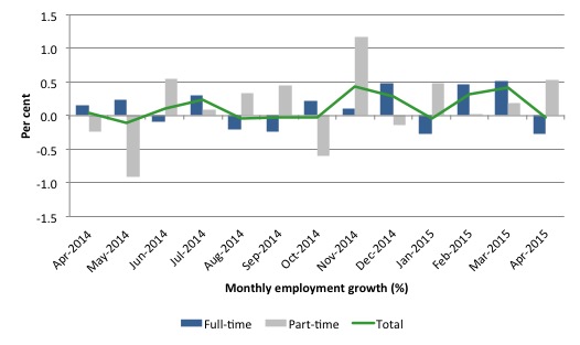
The following graph shows the month by month growth in full-time (blue columns), part-time (grey columns) and total employment (green line) for the 24 months to April 2015 using seasonally adjusted data. It gives you a good impression of just how flat employment growth has been notwithstanding the huge spike in part-time employment in the November 2014 survey.
While full-time and part-time employment growth are fluctuating around the zero line, total employment growth is still well below the growth that was boosted by the fiscal-stimulus in the middle of 2010.
Notwithstanding this, the last two months have been relatively strong in terms of full-time employment growth.
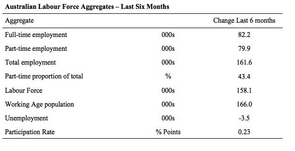
The following table provides an accounting summary of the labour market performance over the last six months. The monthly data is highly variable so this Table provides a longer view which allows for a better assessment of the trends. WAP is working age population (above 15 year olds).
The conclusion – overall there have been only 161.6 thousand jobs (net) added in Australia over the last six months. This is a modest employment growth outcome overall.
Full-time employment has risen by 82.2 thousand jobs (net) while part-time work has risen by 79.9 thousand jobs. Thus, 43.4 per cent of the total employment created (net) over the last 6 months has been part-time.
The Working Age Population has risen by 166 thousand in the same period while the labour force has risen by 158.1 thousand. The participation rate has risen by 0.23 points.
The result is that employment growth has just kept pace with the underlying population growth and unemployment has fallen marginally by 3.5 thousand.
A poor outcome given that unemployment and underemployment remain high.
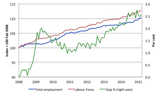
To put the recent data in perspective, the following graph shows the movement in the labour force and total employment since the low-point unemployment rate month in the last cycle (February 2008) to April 2015. The two series are indexed to 100 at that month. The green line (right-axis) is the gap (plotted against the right-axis) between the two aggregates and measures the change in the unemployment rate since the low-point of the last cycle (when it stood at 4 per cent).
You can see that the labour force and employment indexes are following a similar growth path and so the rise in unemployment has levelled off for the time being.
The Gap series gives you a good impression of the asymmetry in unemployment rate responses even when the economy experiences a mild downturn (such as the case in Australia). The unemployment rate jumps quickly but declines slowly.
It also highlights the fact that the recovery has not strong enough to bring the unemployment rate back down to its pre-crisis low. You can see clearly that the unemployment rate fell in late 2009 and then has hovered at the same level for some months before rising again over the last several months.
Since the current government was elected in September 2013, the situation has deteriorated significantly.
The Gap shows that the labour market is now in much worse shape than it was at the peak of the financial crisis in 2009. After the government prematurely terminated the fiscal stimulus the situation has progressively deteriorated.
In April 2015, the Gap of 2.6 percentage points and remains well above the levels that appeared in May and June 2009 when the Australian economy was enduring the impact of the crisis. All the gains made since then have thus disappeared due to poorly crafted fiscal policy not responding appropriately to non-government spending changes.
Full-time and Part-time employment trends
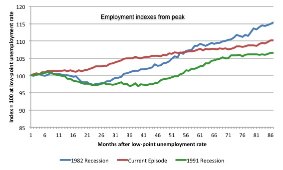
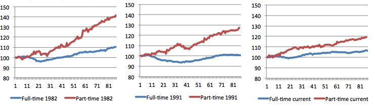
The following graph shows employment indexes for the last 3 recessions and allows us to see how the trajectory of total employment after each peak prior to the three major recessions in recent history: 1982, 1991 and 2009 (the latter to capture the current episode).
The peak is defined as the month of the low-point unemployment rate in the relevant cycle and total employment was indexed at 100 in each case and then indexed to that base for each of the months as the recession unfolded.
I have plotted the 3 episodes for 86 months after the low-point unemployment rate was reached in each cycle – the length of the current episode.
The initial employment decline was similar for the 1982 and 1991 recessions but the 1991 recovery was delayed by many month and the return to growth much slower than the 1982 recession.
The current episode is distinguished by the lack of a major slump in total employment, which reflects the success of the large fiscal stimulus in 2008 and 2009.
However, the recovery spawned by the stimulus clearly dissipated once the fiscal position was reversed and the economy is now producing very subdued employment outcomes.
Moreover, since February 2008, employment has grown by a miserly 10.2 per cent, which is a glacial pace.
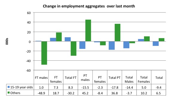
The next 3-panel graph decomposes the previous graph into full-time and part-time employment. The vertical scales are common to allow a comparison between the three episodes.
First, after the peak is reached, part-time employment continues to increase as firms convert full-time jobs into fractional jobs.
Second, recoveries are dominated by growth in part-time employment as firms are reluctant to commit to more permanent arrangements with workers while there is uncertainty of the future course in aggregate demand.
Third, the current recovery is clearly mediocre by comparison, with both very subdued growth in full-time and part-time work.
Teenage labour market – continues to deteriorate
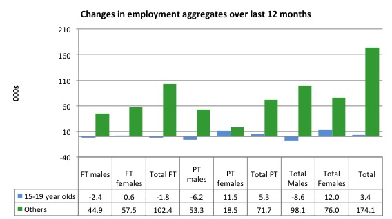
Teenagers lost 9.4 thousand jobs overall (net) in April 2015 – gaining 8.3 thousand full-time jobs but losing 17.8 thousand part-time jobs net.
The increase in full-time jobs is one little bright spot in a dismal outlook.
The following graph shows the distribution of net employment creation in the last month by full-time/part-time status and age/gender category (15-19 year olds and the rest)
If you take a longer view you see how poor the situation remains.
Over the last 12 months, teenagers have gained only 3.4 thousand jobs overall while the rest of the labour force have gained 174.1 thousand net jobs. Remember that the overall result represents a fairly poor annual growth in employment.
The teenage segment of the labour market is being particularly dragged down by the sluggish employment growth, which is hardly surprising given that the least experienced and/or most disadvantaged (those with disabilities etc) are rationed to the back of the queue by the employers.
The following graph shows the change in aggregates over the last 12 months.
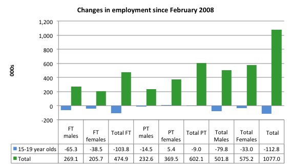
To further emphasise the plight of our teenagers, I compiled the following graph that extends the time period from the February 2008, which was the month when the unemployment rate was at its low point in the last cycle, to the present month (April 2015). So it includes the period of downturn and then the so-called “recovery” period. Note the change in vertical scale compared to the previous two graphs.
Since February 2008, there have been only 1,077 thousand (net) jobs added to the Australian economy but teenagers have lost a staggering 112.8 thousand over the same period. It is even more stark when you consider that 103.8 thousand full-time teenager jobs have been lost in net terms.
Even in the traditionally, concentrated teenage segment – part-time employment, teenagers have lost 9 thousand jobs (net) even though 602.1 thousand part-time jobs have been added overall.
Overall, the total employment increase is modest. Further, around 56 per cent of the total (net) jobs added since February 2008 have been part-time, which raises questions about the quality of work that is being generated overall.
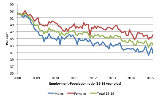
To put the teenage employment situation in a scale context the following graph shows the Employment-Population ratios for males, females and total 15-19 year olds since February 2008 (the month which coincided with the low-point unemployment rate of the last cycle).
You can interpret this graph as depicting the loss of employment relative to the underlying population of each cohort. We would expect (at least) that this ratio should be constant if not rising somewhat (depending on school participation rates).
The facts are that the absolute loss of jobs reported above is depicting a disastrous situation for our teenagers. Males, in particular, have lost out severely as a result of the economy being deliberately stifled by austerity policy positions.
The male ratio has fallen by 10.1 percentage points since February 2008, the female by 6.7 percentage points and the overall teenage employment-population ratio has fallen by 8.5 percentage points. That is a staggering decline in the employment market for Australian teenagers.
Overall, the performance of the teenage labour market continues to be deeply disturbing. It doesn’t rate much priority in the policy debate, which is surprising given that this is our future workforce in an ageing population. Future productivity growth will determine whether the ageing population enjoys a higher standard of living than now or goes backwards.
The best the Government appears to be capable of is to dream up plans which deny income support to this group and impose impossible activity tests on them.
The longer-run consequences of this teenage “lock out” will be very damaging.
I continue to recommend that the Australian government immediately announce a major public sector job creation program aimed at employing all the unemployed 15-19 year olds, who are not in full-time education or a credible apprenticeship program.
The Government should abandon their ideological obsession with supply-side punishment regimes and realise that the unemployed cannot search for jobs that are not there.
It is clear that the Australian labour market continues to fail our 15-19 year olds. At a time when we keep emphasising the future challenges facing the nation in terms of an ageing population and rising dependency ratios the economy still fails to provide enough work (and on-the-job experience) for our teenagers who are our future workforce.
Unemployment – increased 7,000
The unemployment rate increased by 0.1 points to 6.2 per cent in April 2015. It would have been slightly higher given that participation also fell slightly in April.
Overall, the labour market still has significant excess capacity available in most areas and what growth there is is not making any major inroads into the idle pools of labour.
The following graph updates my 3-recessions graph which depicts how quickly the unemployment rose in Australia during each of the three major recessions in recent history: 1982, 1991 and 2009 (the latter to capture the 2008-2010 episode). The unemployment rate was indexed at 100 at its lowest rate before the recession in each case (February 1981; February 1989; May 2008, respectively) and then indexed to that base for each of the months as the recession unfolded.
I have plotted the 3 episodes for 86 months after the low-point unemployment rate was reached in each cycle. The current episode is now in its 85th month (0 being February 2008). For 1991, the peak unemployment which was achieved some 38 months after the downturn began and the resulting recovery was painfully slow. While the 1982 recession was severe the economy and the labour market was recovering by the 26th month. The pace of recovery for the 1982 once it began was faster than the recovery in the current period.
It is significant that the current situation while significantly less severe than the previous recessions is dragging on which is a reflection of the lack of private spending growth and declining public spending growth.
Moreover, the current episode is also different to the last two major recessions in the sense that the recovery is over and the economy is deteriorating again.
In relative terms, the current episode is now worse than the other two recessions (in terms of deviation from low-point unemployment rate).
The graph provides a graphical depiction of the speed at which the recession unfolded (which tells you something about each episode) and the length of time that the labour market deteriorated (expressed in terms of the unemployment rate).
Clearly this type of graph will lose relevance because the 1982 episode will start feeding into the 1992 period. It just goes to show how long these episodes of high unemployment are – in all three cases the unemployment rate was still well above where it started some 7 years earlier.
From the start of the downturn to the 86-month point (to April 2015), the official unemployment rate has risen from a base index value of 100 to a value 154.6.
After falling steadily as the fiscal stimulus pushed growth along (it reached 122.5 after 35 months – in February 2010), it has been slowly trending up for some months now. Unlike the other episodes, the current trend, at this stage of the cycle, is mildly upwards.
It is now above the peak that was reached just before the introduction of the fiscal stimulus. In other words, the gains that emerged in the recovery as a result of the fiscal stimulus in 2009-10 have now been lost.
At 86 months, 1982 index stood at 131.3 (and falling) while the 1991 index was at 148.6 (and steady). It is clear that at an equivalent point in the “recovery cycle” the current period is more sluggish than our recent two major downturns and trending upwards while the trend in the earlier episodes was moderately downwards.
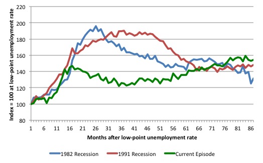
Note that these are index numbers and only tell us about the speed of decay rather than levels of unemployment. Clearly the 6.2 per cent at this stage of the downturn is lower that the unemployment rate was in the previous recessions at a comparable point in the cycle although we have to consider the broader measures of labour underutilisation (which include underemployment) before we draw any clear conclusions.
The notable aspect of the current situation is that the recovery is very slow.
Broad labour underutilisation – 14.9 per cent
The ABS published its quarterly broad labour underutilisation measures for the February quarter in last months’ data release.
In the February-quarter, total underemployment remained at 8.6 per cent in the February-quarter and the ABS broad labour underutilisation rate (the sum of unemployment and underemployment) fell from 15.0 per cent to 14.9 per cent (as a result of the fall in the unemployment rate this month).
| There were 1,060.9 thousand persons underemployed. Overall, there were 1.838.2 thousand workers either unemployed or underemployed. |
The following graph plots the history of underemployment in Australia since February 1978.
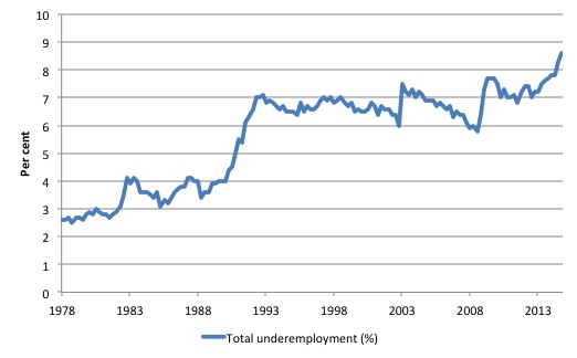
If hidden unemployment is added to the broad ABS figure the best-case (conservative) scenario would see a underutilisation rate above 17 per cent at present. Please read my blog – Australian labour underutilisation rate is at least 13.4 per cent – for more discussion on this point.
The next update will be for the May-quarter 2015 Labour Force data release published in early June 2015.
Hours worked – rose modestly in April 2015
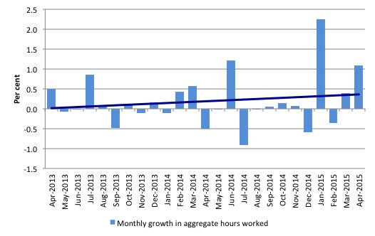
Aggregate monthly hours worked increased by 17.8 million hours (1.1 per cent) in April 2015 in seasonally adjusted terms.
The following graph shows the trend and seasonally adjusted aggregate hours worked indexed to 100 at the peak in February 2008 (which was the low-point unemployment rate in the previous cycle).
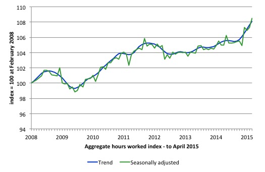
The next graph shows the monthly growth (in per cent) over the last 24 months. The dark linear line is a simple regression trend of the monthly change – which depicts a slight upward trend. You can see the pattern of the change in working hours is also portrayed in the employment graph – zig-zagging across the zero growth line.
The reality is that working hours in the Australian labour market over the last two years have exhibited hardly any net growth and over the last twelve months total working hours are up by just 3.3 per cent.
Conclusion
In general, we always have to be careful interpreting month to month movements given the way the Labour Force Survey is constructed and implemented.
But today’s data shows that the labour market remains weak and any optimism that might have been engendered from last month’s data release should be shelved.
Employment growth contracted again and continues the pattern that is well-defined over the last 24 months or so where employment growth zig-zags around the zero line and is weak at best.
Once again, employment growth failed to keep pace with the growth in the labour force which meant that unemployment rose by 7,000.
The unemployment rate rose to 6.2 per cent, but the latter would have been higher than 6.2 per cent had not the participation rate fell by 0.1 percentage points.
The participation rate remains well below its November 2010 peak. The unemployment rate would now be around 7.9 per cent rather than 6.2 per cent if the participation rate was at that recent peak value. The difference is mostly accounted for by workers giving up looking for work in the weak labour market.
The teenage labour market also remains in a parlous state. This is an emergency which is being ignored by the Federal Government. The Treasurer in recent days denied that there was a crisis in this segment of the labour market.
The neglect of our teenagers will have a very long memory indeed and the negative consequences will be stronger given the ageing population.
The data continues to tell us that the policy settings are all wrong. A fiscal stimulus is needed. Unfortunately, the Federal government is still talking cuts in public spending.
Cutting net public spending when the economy is slowing and incapable of producing enough jobs is the exemplar of fiscal incompetence.
That is enough for today!
May I suggest you read Gail Tverberg’s latest blog?
A seminal read!
http://ourfiniteworld.com/2015/05/06/why-we-have-an-oversupply-of-almost-everything-oil-labor-capital-etc/#comment-57092
Hi Bill,
I am posting an expression of general appreciation rather than a comment on today’s blog. I want to thank you for this informative site. I have been signed up for for only a short time but I have been ploughing through the vast amount of material you have made available and am so pleased to find a coherent theory that points out many of the inconsistencies, inaccuracies and inhumanities of the dominant neoliberal theory. I don’t pretend to understand all you are arguing, but it is coming clearer.
I guess, too, that I want to let you know you are being read, even when your readers might have little to say in response.
Cheers, Jenny
Jenny, here is a good overview:
https://alittleecon.wordpress.com/2014/06/03/the-basics-of-modern-monetary-theory/