The income and wealth inequality that continues to grow in most advanced nations has led…
US labour market – weaker than headline data indicates
The latest US – Employment Situation Summary – for March 2015, was released by the US Bureau of Labor Statistics (BLS) last Friday (April 3, 2015). The growth in employment was disappointing to say the least. The Bloomberg survey of economists came up with an median estimate of 247,000 (net) jobs would be created in March. The data shows only 126,000 would be created. The closest forecast in the Survey was 200,000. The data is consistent with other negative data published in the last week (for example, the ADP National Employment Report. Most of the commentators focused on the fact that the unemployment rate remained unchanged at 5.5 per cent. This was taken as an indicator that the US labour market was still relatively strong. But closer analysis provides quite a different view of the state of the US employment situation.
In its – March 2015 Employment Report – the ADP Research Institute reported last Wednesday (April 1, 2015) that hiring intentions among US businesses were flat as a result of declining total spending.
Their survey showed that Manufacturing employment was declining.
The spokesperson for ADP said that (Source):
Job growth took a step back in March. The fallout from the collapse in oil prices and surge in value of the dollar is hitting the job market. Despite the slowdown, underlying job growth remains strong enough to reduce labor market slack.
I thought that was an interesting comment and demonstrated that the commentators’ version of labor market slack is almost exclusively focused on the unchaged unemployment rate.
But the labour force participation rate (the percentage of the working age population that is either employed or unemployed) is also worthy of focus in the US setting at present given its extraordinary decline since 2008.
In March 2015, the participation rate declined for the second consecutive month (0.1 points in March following the 0.1 points decline in February) and now stands at 62.7 per cent.
This is historically a very low level of participation for the US labour market.
The following graph shows the aggregate participation rate from January 1948 to March 2015. The US aggregate participation rate peaked at 67.3 per cent in April 2000 (seasonally adjusted). Thereafter it has declined on trend with some reversions in between.
While there has been a declining participation rate since April 2000, it is clear that since the GFC hit, the participation rate has fallen significantly.
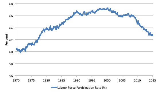
At the peak of the last cycle (December 2006), the participation rate was 66.4 per cent and the declining trend since the turn of the Century had reversed somewhat. The rate of decline since then has been sharp to say the least.
This tells me that something cyclical has been dominating rather than some structural trend (like an ageing population), which is not to say that the latter effect hasn’t been part of the story.
I last considered this question in this blog – Decomposing the decline in the US participation rate for ageing. I found that about 40 per cent of the decline in the labour force participation rate can be accounted for by cyclical factors.
Nearly a year later I decided to check on those calculations, given the participation rate has fallen further as employment growth has started to taper off.
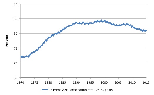
The following graph shows the Prime-age participation rate in the US since 1970. This is the group that you would expect to be insulated from so-called ageing retirement effects. The rise in the 1970s is all due to the increased participation of married women as social changes occurred.
Once that effect was absorbed the rate was fairly steady as you would expect. But the decline since the GFC began is clear and almost all cyclical.
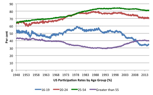
The next graph breaks the aggregate down into age groups. The prime age (25-54) and 20-24 groups have seen a tapering of their participation rates sine the late 1980s.
There have been sharp declines in the participation rates for teenagers (16-19) since the late 1980s and a steady rise in participation rates for the over 55s, although these have tapered off since the onset of the GFC.
The teenage rate, particularly declined at the onset of the GFC. This age group is extremely disadvantaged when there is a shortage of jobs because employers will take more experienced workers in preference and ‘bump’ them down to job levels that would typically be occupied by teenagers.
Such is the desperation that arises during a recession among workers.
There is a strong conservative lobby that seeks to discourage the use of fiscal policy to stimulate the economy who always invoke structural explanations for worrying trends.
Labour force participation rates have been falling around the world since the onset of the GFC. A reasonable first guess is that these declines signal the vanishing employment opportunities in 2008 and 2009 and then the slack employment growth that has accompanied the aftermath of the GFC.
It is clear that many workers are opting to stop searching for work while there are not enough jobs to go around. These discouraged workers are considered to be part of hidden unemployment.
These workers fail the activity test built into the Labour Force Survey (the active search requirement) and the national statisticians (the BLS in this case) exclude these workers from the labour force estimate, which only includes unemployed (who are available for work and actively seeking it).
This has the effect of attenuating the rise in unemployment.
The discouraged workers differ from the officially unemployed only because they have given up active search. The evidence is strongly supportive of the view that they give up looking because there are insufficient jobs to go around and to protect their self-esteem from the multiple rejections they just stop looking and wait for employment growth to improve.
If they were offered a job they would take it and start work immediately. In that sense, they are functionally no different to someone who is unemployed. The discouraged workers are otherwise known as the hidden unemployed for that reason.
But, it is also true, that participation rates are influenced by compositional shifts (changing shares) of the different demographic age groups in the working age population.
This is the basis of the structural hypothesis.
In most nations, the population is shifting towards older workers who have lower participation rates. Thus some of the decline in the total participation rate could simply being an averaging issue – more workers are the average who have a lower participation rate.
The aim of this blog is to update my previous investigation of this issue for the US.
Basic LF arithmetic
The Labour Force Survey typically asks the respondents:
1. Did you work for at least one hour in the past week? Yes: counted as Employed. Then the respondent will be interrogated about whether they have enough hours of work and more.
2. If the answer was No, then the person is asked: (a) Are you willing to work?; and (b) Are you actively seeking work?
If the answers are: Yes, Yes, then the person is counted among the officially Unemployed.
If the answers are: Yes, No, then the person is counted as being Not in the Labour Force (NLF), that is, inactive.
The aggregates are E + U = the Labour Force (LF).
LF + NLF = Working Age Population (WAP).
The Labour Force Participation Rate (LFPR) = LF/WAP
The Unemployment rate (UR) = U/LF.
Decomposing the Trend and Cycle components
The question is: How much of that falling LFPR is due to the cyclical slowdown and how much of it is due to the ageing of the population?
The total participation rate (LFPR) is weighted average of the underlying participation rates of the demographic groups that make up the total Working Age Population (WAP). We will stick to using: three broad groups – young workers 15-24 years old; prime-age workers 25-54 years old; and older workers 55 years and over.
The behaviour of the individual age cohorts within the prime-age category (25-34, 35-44, 45-54) is very similar and researchers often reduce the complexity of the problem by aggregating them together with little loss of information.
For those who like formulas we can write the total participation rate as:
LFPR(t) = (w1524 x LFPR1524) + (w2554 x LFPR2554) + (wGT55 x LFPRGT55)
where LFPR1524 is the participation rate of the 15-24 year olds, and w1524 is the proportion of that age cohort in the total labour force, and so on.
In English this just says that the Total LFPR at time t is equal to the weighted sum of the participation rates of the three demographic groups, where the weights are given by the share of each demographic group in the WAP.
The weights are calculated, for example as: w1524 = Total Population of 15-24 year olds divided by Total WAP. And so on for the other two groups.
The following holds: w1524 + w2554 + wGT55 = 1
The weights proportionately segment the total WAP into the three age groups respective shares.
Like any average, the total is influenced by the LFPR behaviour of the three groups and the weights each group has in the WAP.
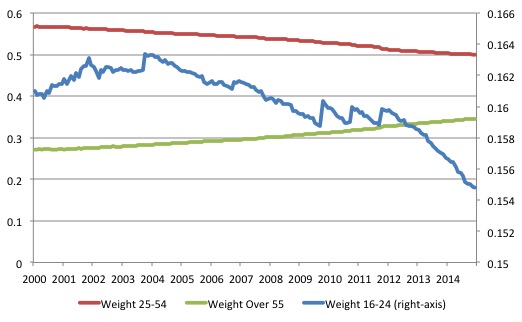
For example, we could encounter a situation where the LFPRs for the three groups are unchanged but the total WAP becomes comprised on more of the GT55 group and less of the 1524 groups and if LFPRGT55 < LFPR1524, then the total LFPR will fall just because there are proportionately more people in the WAP who have lower participation rates. So the LFPR can fall not due to changes in the underlying behaviour or any cyclical influences but because of shifts in the population age composition. The next graph shows the changing weights of the three groups in the total Working Age Population (WAP) for the US from April 2000 (the peak participation rate month) to June 2014. We note that Prime-age demographic (25-54 year olds) steadily declines as a share of the total WAP over the period shown. At that time, the share of older workers (GT55) in the total WAP started to rise steadily as the Prime-age persons moved into that category. The US Youth participation rates (16-24), shown on the right-hand axis has declined over the same period. The absolute decline in weights are:
- 16-24: -0.62 percentage points
- 25-54: -6.78 percentage points
- Over 55: 7.40 percentage points
As an aside, this information allows you to see how scaling on a vertical axis can provide a very misleading impression. The youth decline is very small relative to the changes in the weights of the other two age groups.
The decline in the Prime-age weight has been less than the rise in the Older workers share because the Prime-age category is experiencing flows at both thresholds – the youth flow in and the older Prime-age workers flow out.
Estimating the effect of ageing on the LFPR
The total LFPR peaked in April 2000 at 67.3 per cent. By March 2015 it was estimated to be 62.7 per cent, which suggests a dramatic fall. The difference given the current WAP is some 11.5 million workers who are no longer in the workforce. These workers would have been in the Labour Force if the participation rate had not fallen from its April 2000 peak.
The question is what happened to these workers?
In a recession, older workers typically reduce their participation rates because they are among the first to lose their jobs. They become discouraged workers, some retire prematurely, others take up disability support pensions (doctors take sympathy on them and give then an easy ride through the system), and others, still, start small business with payout cheques.
The current recession and its aftermath has seen something quite different. Older workers have maintained the same participation rates as were in evidence at the outset of the crisis.
There are also more of these workers in the Working Age Population, which will reduce the weighted average total.
We can estimate the impact of the shifting demographic composition of the Working Age Population on the Total LFPR from any point in time quite easily.
If we use April 2000 as the demographic benchmark and ask the question: How much of the decline in the total LFPR is due to the ageing of the Working Age Population, then we can calculate the weighted average in the following way.
Instead of using the current weights as in the previous formula:
LFPR(t) = (w1624 x LFPR1624) + (w2554 x LFPR2554) + (wGT55 x LFPRGT55)
The formula would be (in this case):
LFPR(t)April_2000 = (w1624April_2000 x LFPR1624) + (w2554April_2000 x LFPR2554) + (wGT55April_2000 x LFPRGT55)
where the term (for example) w1624April_2000 is the share of 15-24 years olds in the WAP as at April 2000, and so on.
Then the difference between the two calculations LFPR(t) and LFPR(t)April_2000 tells us the change in the participation rate that is due to changes in the age distribution of the Working Age Population since April 2000.
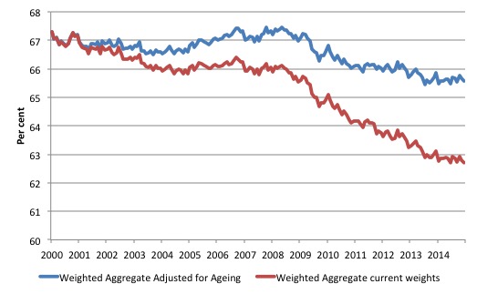
The following graph plots the two times series – the actual LFPR(t) (denoted Weighted Aggregate current weights LFPR) and LFPR(t)April_2000 (denoted Weighted Aggregate Adjusted for Ageing LFPR).
The results suggest if the age composition of the Working Age Population had have remained at its April_2000 shares then the LFPR at March 2015 would be 65.6 per cent rather than the actual reported LFPR of 62.7 per cent. The April_2000 LFPR was 67.3 per cent.
The actual decline in the LFPR since April 2000 has been 4.6 percentage points.
We estimate therefore that the shift in the age composition of the working age population accounted for a fall in the LFPR of 2.9 percentage points, which is about 62 per cent of the actual decline.
The remainder is most likely driven by cyclical effects (more analysis is required), which would suggest that some 4.3 million workers could reasonably be considered to be extra hidden unemployed.
There were 8,575 million workers officially unemployed in the US (5.5 per cent of the labour force) in March 2015.
If we added the extra 4.3 millions workers considered to be hidden unemployed, then the adjusted ‘unemployment rate’ would be 8.1 per cent in March 2015.
Thus even when we adjust for the ageing factor, the situation is still much worse than the headline 5.5 per cent official unemployment in the US would suggest.
So there is not much difference to the analysis I did in June 2014.
Conclusion
There is thus some factual basis for the conclusion that the falling participation rate in US is an artefact of the ageing population.
There are now more older workers in the WAP and although their participation rate has risen somewhat since the onset of the GFC, the volume effect outweighs the rate effect and the impact on the overal weighted average (the total LFPR) is negative.
It still remains that the cyclical factor is huge (4.3 millions workers) and the official unemployment rate is not an accurate indicator of the true poor state of the US labour market.
That is enough for today!
(c) Copyright 2015 Bill Mitchell. All Rights Reserved.
What would be the unemployment rate if further adjusted for part-time workers who wish to work full time but cannot find a full time job?
It appears labor statistics watchers in the US have been finding the official numbers from the BLS suspect for some time now: http://www.paulcraigroberts.org/2015/04/03/march-payroll-jobs-report/
It’s noteworthy that many of the jobs claimed to have been created seem to be lower wage occupations that once were considered “entry level jobs”, and could not provide enough income to live on. Not the sort of work older workers have had years of experience in or would prefer either. Another type of growth industry seems to be “employment services” ie helping other people find jobs (that apparently don’t exist) for a fee.
It’s all very discouraging news for Canada as we are reminded daily by the media commentators of our strong trade ties with the “growing US economy” as the new hope while the realities due to policies placing heavy reliance on Alberta tar sands oil exports begin to percolate through the broader economy following the recent price shock.
Bill,
Your estimate may be low. If you include persons who currently want a job from table A1 from the employment situation the unemployment rate for March would be 9.2%.
Apropos … https://www.stlouisfed.org/on-the-economy/2015/march/how-long-until-slack-is-out-of-the-labor-market?&utm_source=Twitter&utm_medium=SM&utm_campaign=998&utm_term=labor&utm_content=blogResearch