The income and wealth inequality that continues to grow in most advanced nations has led…
US economy slows down sharply, government undermining growth
On Tuesday, the British National Accounts data was published and the preliminary estimates revealed that the British economy was slowing and there would return to recession if the Government was re-elected and put in place its plans for the next three years. Please read my blog – The slowest recovery in modern history just slowed down again. Yesterday, the US Bureau of Economic data release – Gross Domestic Product, 1st quarter 2015 (advance estimate) – showed that the US economy took a turn to the South and “increased at an annual rate of 0.2 percent in the first quarter of 2015” after having increased by 2.2 per cent in the fourth-quarter 2014. It is a preliminary (“advance”) estimate and revisions will be published on May 29, 2015. But don’t expect too much to change. The reason for the slowdown is down to a slowdown in personal consumption, exports and non-residential investment and state and local government spending. Federal government spending helped keep the economy in positive growth. Households have lifted their saving ratio a bit (5.5 per cent of disposable personal income compared to 4.6 per cent last quarter).
The BEA said in the release that:
Real gross domestic product — the value of the production of goods and services in the United States, adjusted for price changes — increased at an annual rate of 0.2 percent in the first quarter of 2015 … In the fourth quarter, real GDP increased 2.2 percent … The increase in real GDP in the first quarter primarily reflected positive contributions from personal consumption expenditures (PCE) and private inventory investment that were partly offset by negative contributions from exports, nonresidential fixed investment, and state and local government spending. Imports, which are a subtraction in the calculation of GDP, increased.
The slump in growth is not as severe as it was in the first-quarter of 2014, when real GDP fell by 2.1 per cent (annualised). Both slumps have been put down to poor weather. I have a lot of weather data for the US and had a look to see if I could see any pattern between real GDP growth and various dimensions of climate (temperature, rainfall and snow depth and coverage). So far, I have found nothing statistically significant but will keep digging and might report in a later blog if I find something.
But at first glance, output in construction is much lower and we know that that sector is highly sensitive to the bad winters.
The reason this weather speculation is important is because it helps us assess whether the decline is a blip or something of a trend that is starting. It is also being used by commentators to assess the next move of the US Federal Reserve Bank in terms of interest rates. I doubt the central bank will be too influenced by this quarter’s data.
In general, if you have been following other data releases (housing, business investment, retail sales) you would have already formed the view that the US economy was slowing down. How much is the question. In the March-quarter, the slowdown was substantial.
The following sequence of graphs captures the story.
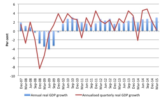
The first graph shows the annual real GDP growth rate (year-to-year) from the peak of the last cycle (December-quarter 2007) to the March-quarter 2014 (blue bars) and the annualised last quarter growth rate (red line). The data is available – HERE.
The year-to-year growth rate (March-quarter 2014 to March-quarter 2015) was 3 per cent, up on 2.4 per cent from last quarter. There is considerable volatility in the data which is smoothed out by the year-to-year growth calculation.
The annualised quarterly growth rate (that is, multiplying the March-quarter 2015 performance by 4) is only 0.25 per cent down from 2.2 per cent in the last quarter.
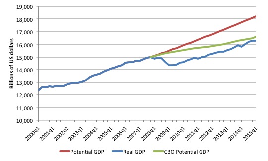
The next graph shows the actual real GDP for the US (in $US billions) and an estimate of the potential GDP. There are many ways of estimating potential (given it is unobservable). There is a whole industry involved in this endeavour and is in the realm of ‘making stuff up’.
While I could have adopted a much more sophisticated technique to produce the red series (potential GDP) in the graph, I decided to do some simple extrapolation instead. Not much is lost I would suggest.
The question is when to start the projection and at what rate. I chose to extrapolate from the most recent real GDP peak (December-quarter 2007). This is a fairly standard sort of exercise.
The projected rate of growth was the average quarterly growth rate between 2001Q4 and 2007Q4, which was a period (as you can see in the graph) where real GDP grew steadily (at 0.62 per cent per quarter) with no major shocks.
If the global financial crisis had not have occurred it would be reasonable to assume that the economy would have grown along the red line (or thereabouts).
The gap between actual and potential GDP in the first-quarter 2015 is around $US1,922 billion or around 10.5 per cent.
The green line is the estimate of potential output provided by the US Congressional Budget Office in their latest – January 2015 Baseline. I distributed their annual estimates across the quarters in a linear fashion.
Their output gap estimate (difference between actual and potential) is around 2 per cent. They use a NAIRU type methodology to make these estimates, which always underestimates the scale of the output gaps.
The truth is that both estimates are extremes and the truth is somewhere in between the two. The qualitative assessment is that unemployment is still elevated and underemployment is high, which means that the output gap is likely to be closer to 10 per cent than 2 per cent.
But it is true that potential output will have fallen of the red linear trend as the investment ratio (total investment as a percent of GDP) slowed in 2009. It went from 18.3 per cent in 2007 to 13 per cent in 2009.
So there has been a slowdown in capacity building which would have reduced the potential growth path somewhat.
It was back to 16.4 per cent in 2014 which is still below the long-term average.
The other relevant point about the graph is that it defies those who want to characterise the main US problem as being structural (labour market rigidities etc). The US would not have fallen off the cliff as it did in early 2008 if that was the case. Structural deterioration is gradual and cumulative not sudden and sharp.
Contributions to growth
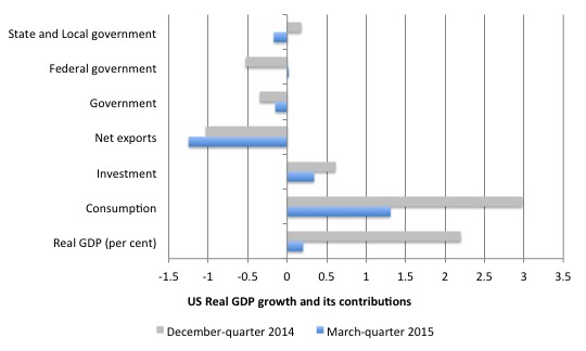
The next graph compares the December-quarter 2014 (gray bars) contributions to real GDP growth at the level of the broad spending aggregates with the March-quarter 2015 (blue bars). The overall real GDP growth was 0.2 per cent.
The main aggregate source of growth came from Private consumption spending (1.31 percentage points). This was weaker than the previous quarter (3 percentage points).
The anticipated rise in consumption from the falling oil prices did not eventuate. But the falling oil prices have probably had a negative impact on investment.
Private investment spending also provided a positive contribution of 0.34 points (down from 0.61).
The contraction of the government sector scythed 0.15 points (down from -0.35 points) of real GDP growth in the March-quarter 2015. Federal spending added 0.02 points but this was more than offset by the contraction in state and local level (-0.17 points).
Net exports drained total spending by 1.25 points (up from 1.03 points in the last quarter). Last quarter, exports added 0.59 points but this quarter they subtracted 0.96 points.
Some commentators believe this is due to the stronger US dollar parity, while others are pointing to supply constraints (port strikes, bad weather). There is nothing in other data releases to suggest that the US trade sector is in major decline, so this quarter’s result does not suggest a trend yet.
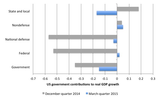
The next graph decomposes the government sector and shows that the positive contribution at the federal sphere was due to non-defense spending more than offsetting a contraction in national defense spending.
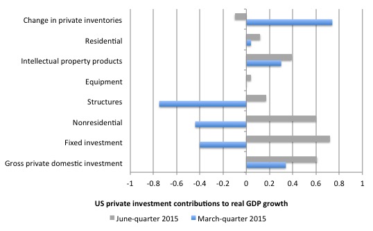
The next graph shows the contributions to real GDP growth of the various components of investment.
There was a big swing in unsold inventories in the March-quarter 2014, which contributed 0.74 points to the real GDP outcome (up from -0.1 points). That is probably a result of the slower rate of growth in private consumption spending and could be a sign that the inventory cycle is turning down.
That is, firms may well cut back production in the second-quarter as a result of poor sales in the March-quarter.
There was a swing in fixed investment, which subtracted 0.4 points from growth in the current quarter (down from 0.72 points).
The data shows that investment in structures fell quite sharply (down by 23.1 per cent over the year) and subtracted 0.75 points from the real GDP outcome.
This includes investments in factory buildings, office buildings, hospitals etc but also would include investments in mining and oil production capacity.
Residential investment was a weaker contributor in the current quarter (0.04 points down from 0.12 points).
Conclusion
Is the real GDP growth rate fast enough in the US? That depends on what the aim is. In relation to the output gap, the answer is no!
In relation to the labour market the answer is no. The current growth rate is below that necessary to reduce unemployment further.
The US government (all levels) is now undermining growth even though the Federal level provided a modicum of support in the March-quarter 2015, reversing its destructive effect in the December-quarter 2014.
But the overall public contribution to growth is negative because the state and local governments have significantly cut back on their spending.
Households are also starting to save more of their disposable income despite falling oil prices and businesses are generally adopting a pessimistic view as evidenced by the contraction in investment support for growth.
Overall, not a rosy picture. But it might have been the weather. We will see when the June-quarter data comes out in July sometime.
That is enough for today!
(c) Copyright 2015 Bill Mitchell. All Rights Reserved.
How much did the west coast dock strike take away from GDP?
Also, in the graph on growth before the GFC, wasn’t a lot of that growth due to overbuilding and so would make the increase too high? My point is that we may have overshot on the blue line until 08 and the blue line after that may be more realistic.
Not that I am endorsing this point of view, but Evans-Pritchard in yesterday’s Telegraph (29 April) has come out saying that the situation in the US does not appear to be that bad. This is how he ends his piece.
“The ratio of job openings to applicants is now higher than it was at the top of the last boom in 2007 by a substantial margin. Hours worked have surged. The labour market is tightening hard. Unless Americans have gone through a Puritan conversion, their swelling disposable income must soon start flowing into the shopping malls.
This is not the picture of a country on the cusp of recession.”
Glh
The question is, was unemployment too low prior to Gfc?
Yes, we built more houses than sub-prime borrowers could afford, but there was enormous amount of 100+ Year-old infrastructure that needed, and still needs, replacement… And which construction workers employed building more homes than then needed were fully qualified to do. I.e. No skills gap.
So interest rates were too low in those years, encouraging those too- many homes, and gov. Spending on infrastructure was far too low.
Krugman/summers are hinting we might need bubbles, what we really need is higher deficits until we return to full employment.
Also, with the private sector middle class too indebted to take on more debt, we need larger deficits than we would have previously to get to full employment… And the high dollar is making this worse, cash flowing overseas to foreign savers drains cash/spending in U.S., which would be ok if it was replaced by U.S. Deficits.
1q numbers are horrific, if avg was 0.2, imagine what March was. Imo that was first recession month.
The bad winter weather in the USA is very arguably due in part to climate change. The intensification of weather extremes is real and measureable. Climate scientists are now finding a proportion of weather extremes are attributable to climate change and not just to normal weather variability.
Climate change (global warming) is intensifying winter extremes over the US and Canada. The north polar vortex is adopting a longer wave pattern. This means colder weather can push further south in (say) eastern USA while warmer weather pushes further north in (say) western USA and Canada. Due the larger wave amplitude this weather pattern progresses (eastwards) more slowly and even gets stuck for periods of time. This has a lot to do with extended blizzards in the east and excess warmth and drought in the west.
Weather patterns are intensifying and changing. This will bring large economic costs and few if any benefits. It’s harder to farm, build and do maintenance when the weather is more unstable. The relatively benign holocene era is over. We have entered the anthropocence when human acticities have a significant influence on ecology and climate. The results are very damaging and will bring (and indeed already are bringing) huge economic costs. Only when these costs become indisputable and the damage palpably obvious to most will politics change. Let’s hope it’s not too late to save the biosphere as a place which can support at least some human civilzation.