The Australian Bureau of Statistics (ABS) released the latest labour force data today (June 25,…
Australia Labour Force – weak and no signs of improvement
Today’s release of the – Labour Force data – for October 2014 by the Australian Bureau of Statistics is the since it made extraordinary admissions about the breakdown of seasonally adjustment methodology, which had made the last three months’ data largely unbelievable. See below for comment on that. Today’s major revision shows that employment growth was modest in October after two consecutive months of negative growth. Unemployment edged up again this month although the unemployment rate remained stable (when rounded to one decimal place – it actually rose a little in unrounded terms). The participation rate edged up a little but remains well below recent peaks. Monthly hours of work rose but that was due to the fact that full-time employment growth dominated the overall tepid employment expansion. The teenage labour market deteriorated further and has been signalling a state of emergency for several years now – a crisis ignored by the policy makers.
The summary ABS Labour Force (seasonally adjusted) estimates for October 2014 are:
- Employment increased 24,100 (0.2 per cent) with full-time employment increasing by 33,400 and part-time employment declining by 9,400.
- Unemployment increased 7,100 to 772,100.
- The official unemployment rate remained at 6.2 per cent.
- The participation rate increased by 0.1 percentage points to 64.6 per cent. It is still well below its November 2010 peak (recent) of 65.9 per cent.
- Aggregate monthly hours worked increased by 24.9 million hours (1.6 per cent).
- The quarterly ABS broad labour underutilisation estimates (the sum of unemployment and underemployment) were published in the August release and revised in the October release. Underemployment rose by 0.9 percentage points to 8.5 per cent and total labour underutilisation rate rose sharply to 14.4 per cent. There are now 1,050.1 thousand persons underemployed. Overall, there are 1.822.2 million workers either unemployed or underemployed (counting August underemployed and October unemployed).
First release under the new seasonal adjustment methodology
Please read my blog from yesterday – ABS revises labour force methodology – things are much worse than we thought – for an explanation of how the ABS has addressed the extreme volatility that entered the labour force data around July.
Employment growth – but weak in October 2014
The revised data in the October release shows that employment growth remains weak after two negative months.
In the last month, total employment increased 24,100 (0.2 per cent) with full-time employment increasing by 33,400 and part-time employment declining by 9,400. Over the last 12 months employment has grown by only 0.1 per cent.
Over the last 24 months or so we have seen the labour market data switching back and forth regularly between negative employment growth and positive growth spikes. The revised figures are consistent with that history.
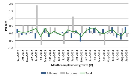
The following graph shows the month by month growth in full-time (blue columns), part-time (grey columns) and total employment (green line) for the 24 months to October 2014 using seasonally adjusted data. It gives you a good impression of just how flat employment growth has been nothwithstanding the huge spike in part-time employment in the August survey, which the revised data shows was substantially offset by the fall in full-time employment.
While full-time and part-time employment growth are fluctuating around the zero line, total employment growth is still well below the growth that was boosted by the fiscal-stimulus in the middle of 2010.
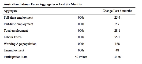
The following table provides an accounting summary of the labour market performance over the last six months. The monthly data is highly variable so this Table provides a longer view which allows for a better assessment of the trends. WAP is working age population (above 15 year olds).
The conclusion – overall there have been a miserable 28.1 thousand jobs (net) added in Australia over the last six months. Full-time employment has risen by 25.4 thousand jobs (net) while part-time work has risen by 2.7 thousand jobs.
The Working Age Population has risen by 168 thousand in the same period while the labour force has risen by 55.5 thousand. The participation rate has fallen by 0.28 percentage points over the last six months.
Employment growth has not been able to keep pace with the underlying population growth and unemployment has risen by 48 thousand as a result.
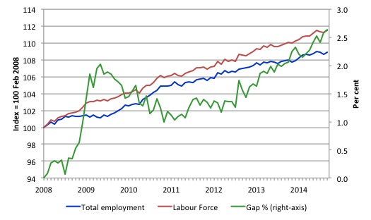
To put the recent data in perspective, the following graph shows the movement in the labour force and total employment since the low-point unemployment rate month in the last cycle (February 2008) to October 2014. The two series are indexed to 100 at that month. The green line (right-axis) is the gap (plotted against the right-axis) between the two aggregates and measures the change in the unemployment rate since the low-point of the last cycle (when it stood at 4 per cent).
You can see that the labour force index has largely levelled off yet the divergence between it and employment growth has risen sharply (in spurts) over the last several months.
The Gap series gives you a good impression of the asymmetry in unemployment rate responses even when the economy experiences a mild downturn (such as the case in Australia). The unemployment rate jumps quickly but declines slowly.
It also highlights the fact that the recovery has not strong enough to bring the unemployment rate back down to its pre-crisis low. You can see clearly that the unemployment rate fell in late 2009 and then has hovered at the same level for some months before rising again over the last several months.
Since the current government was elected in September 2013, the situation has deteriorated significantly.
The Gap shows that the labour market is now in worse shape than it was at the peak of the financial crisis in 2009. After the government prematurely terminated the fiscal stimulus the situation has progressively deteriorated.
In October 2014, the Gap of 2.6 percentage points and remains well above the levels that appeared in May and June 2009 when the Australian economy was enduring the impact of the crisis. All the gains made since then have thus largely disappeared due to poorly crafted fiscal policy not responding appropriately to non-government spending changes.
Today’s results continue to reflect an upward trend in the unemployment rate.
Full-time and Part-time employment in recovery
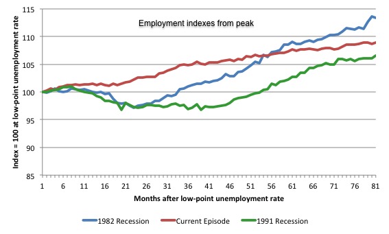
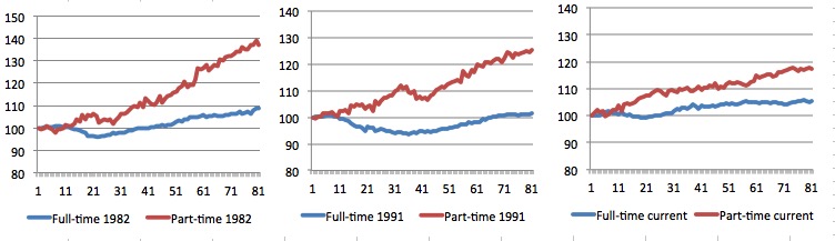
The following graph shows employment indexes for the last 3 recessions and allows us to see how the trajectory of total employment after each peak prior to the three major recessions in recent history: 1982, 1991 and 2009 (the latter to capture the current episode).
The peak is defined as the month of the low-point unemployment rate in the relevant cycle and total employment was indexed at 100 in each case and then indexed to that base for each of the months as the recession unfolded.
I have plotted the 3 episodes for 80 months after the low-point unemployment rate was reached in each cycle – the length of the current episode.
The initial employment decline was similar for the 1982 and 1991 recessions but the 1991 recovery was delayed by many month and the return to growth much slower than the 1982 recession.
The current episode is distinguished by the lack of a major slump in total employment, which reflects the success of the large fiscal stimulus in 2008 and 2009.
However, the recovery spawned by the stimulus clearly dissipated once the fiscal position was reversed and the economy is now producing very subdued employment outcomes.
Moreover, the current episode is also different to the last two major recessions in the sense that the recovery is over and the economy is deteriorating again.
The next 3-panel graph decomposes the previous graph into full-time and part-time employment. The vertical scales are common to allow a comparison between the three episodes.
First, after the peak is reached, part-time employment continues to increase as firms convert full-time jobs into fractional jobs.
Second, recoveries are dominated by growth in part-time employment as firms are reluctant to commit to more permanent arrangements with workers while there is uncertainty of the future course in aggregate demand.
Third, the current recovery is clearly mediocre by comparison, with both very subdued growth in full-time and part-time work.
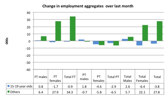
Teenage labour market – continued decline
Teenagers lost 3.8 thousand jobs overall (net) in October – losing 0.9 thousand full-time jobs and 2.9 thousand part-time jobs net.
The following graph shows the distribution of net employment creation in the last month by full-time/part-time status and age/gender category (15-19 year olds and the rest)
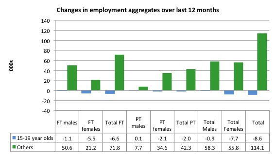
If you take a longer view you see how poor the situation remains.
Over the last 12 months, teenagers have lost 8.6 thousand jobs while the rest of the labour force have gained 114.1 thousand net jobs. Remember that the overall result represents a fairly poor annual growth in employment.
The teenage segment of the labour market is being particularly dragged down by the sluggish employment growth, which is hardly surprising given that the least experienced and/or most disadvantaged (those with disabilities etc) are rationed to the back of the queue by the employers.
The following graph shows the change in aggregates over the last 12 months.
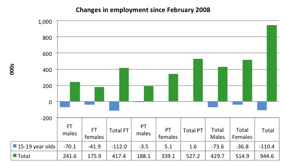
To further emphasise the plight of our teenagers, I compiled the following graph that extends the time period from the February 2008, which was the month when the unemployment rate was at its low point in the last cycle, to the present month (October 2014). So it includes the period of downturn and then the so-called “recovery” period. Note the change in vertical scale compared to the previous two graphs.
Since February 2008, there have been only 944.6 thousand (net) jobs added to the Australian economy but teenagers have lost a staggering 110.4 thousand over the same period. It is even more stark when you consider that 112 thousand full-time teenager jobs have been lost in net terms.
Even in the traditionally, concentrated teenage segment – part-time employment, teenagers have only been able to gain a miserable 1.6 thousand jobs (net) even though 527.2 thousand part-time jobs have been added overall.
Overall, the total employment increase is modest. Further, around 55 per cent of the total (net) jobs added since February 2008 have been part-time, which raises questions about the quality of work that is being generated overall.
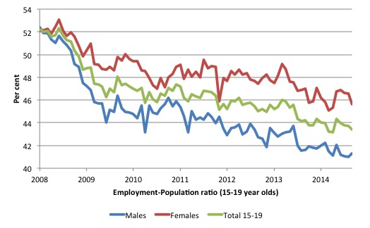
To put the teenage employment situation in a scale context the following graph shows the Employment-Population ratios for males, females and total 15-19 year olds since February 2008 (the month which coincided with the low-point unemployment rate of the last cycle).
You can interpret this graph as depicting the loss of employment relative to the underlying population of each cohort. We would expect (at least) that this ratio should be constant if not rising somewhat (depending on school participation rates).
The facts are that the absolute loss of jobs reported above is depicting a disastrous situation for our teenagers. Males, in particular, have lost out severely as a result of the economy being deliberately stifled by austerity policy positions.
The male ratio has fallen by 11.4 percentage points since February 2008, the female by 6.4 percentage points and the overall teenage employment-population ratio has fallen by 8.8 percentage points.
Overall, the performance of the teenage labour market continues to be deeply disturbing. It doesn’t rate much priority in the policy debate, which is surprising given that this is our future workforce in an ageing population. Future productivity growth will determine whether the ageing population enjoys a higher standard of living than now or goes backwards.
The best the Government appears to be capable of is to dream up plans which deny income support to this group and impose impossible activity tests on them.
The longer-run consequences of this teenage “lock out” will be very damaging.
The problem is that in the modest growth period that the Australian labour market enjoyed as a result of the fiscal stimulus and mining investment, teenagers failed to participate in the gains – they went backwards.
It remains that the teenage cohort is not benefiting from the modest growth at present.
I continue to recommend that the Australian government immediately announce a major public sector job creation program aimed at employing all the unemployed 15-19 year olds, who are not in full-time education or a credible apprenticeship program.
The Government should abandon their ideological obsession with supply-side punishment regimes and realise that the unemployed cannot search for jobs that are not there.
It is clear that the Australian labour market continues to fail our 15-19 year olds. At a time when we keep emphasising the future challenges facing the nation in terms of an ageing population and rising dependency ratios the economy still fails to provide enough work (and on-the-job experience) for our teenagers who are our future workforce.
Unemployment – rises by 7,100
The unemployment rate remained unchanged at 6.2 per cent in October 2014. Official unemployment rose by 7,100 to 772,100. The rise was compounded by the rise in the participation rate.
Overall, the labour market still has significant excess capacity available in most areas and what growth there is is not making any major inroads into the idle pools of labour.
The following graph updates my 3-recessions graph which depicts how quickly the unemployment rose in Australia during each of the three major recessions in recent history: 1982, 1991 and 2009 (the latter to capture the 2008-2010 episode). The unemployment rate was indexed at 100 at its lowest rate before the recession in each case (January 1981; January 1989; May 2008, respectively) and then indexed to that base for each of the months as the recession unfolded.
I have plotted the 3 episodes for 81 months after the low-point unemployment rate was reached in each cycle. The current episode is now in its 81th month (0 being February 2008). For 1991, the peak unemployment which was achieved some 38 months after the downturn began and the resulting recovery was painfully slow. While the 1982 recession was severe the economy and the labour market was recovering by the 26th month. The pace of recovery for the 1982 once it began was faster than the recovery in the current period.
It is significant that the current situation while significantly less severe than the previous recessions is dragging on which is a reflection of the lack of private spending growth and declining public spending growth.
Moreover, the current episode is also different to the last two major recessions in the sense that the recovery is over and the economy is deteriorating again.
In relative terms, the current episode is now worse than the other two recessions (in terms of deviation from low-point unemployment rate).
The graph provides a graphical depiction of the speed at which the recession unfolded (which tells you something about each episode) and the length of time that the labour market deteriorated (expressed in terms of the unemployment rate).
From the start of the downturn to the 81-month point (to October 2014), the official unemployment rate has risen from a base index value of 100 to a value 157.1. After falling steadily as the fiscal stimulus pushed growth along (it reached 122.5 after 35 months – in January 2010), it has been slowly trending up for some months now. Unlike the other episodes, the current trend, at this stage of the cycle, is upwards and accelerating.
It is now above the peak that was reached just before the introduction of the fiscal stimulus. In other words, the gains that emerged in the recovery as a result of the fiscal stimulus in 2009-10 have now been lost.
At 81 months, 1982 index stood at 138.1 (and falling) while the 1991 index was at 147.8. It is clear that at an equivalent point in the “recovery cycle” the current period is more sluggish than our recent two major downturns and trending upwards while the trend in the earlier episodes was moderately downwards.
It now appears that the recoveries have converging, which tells us that the current policy has failed to take advantage of the fact that the latest economic downturn was much more mild than the previous recessions. In other words, the policy failure is locking the economy into a higher unemployment rate than is desirable and otherwise attainable.
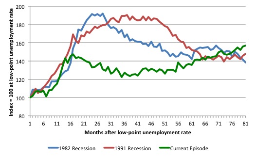
Note that these are index numbers and only tell us about the speed of decay rather than levels of unemployment. Clearly the 6.2 per cent at this stage of the downturn is lower that the unemployment rate was in the previous recessions at a comparable point in the cycle although we have to consider the broader measures of labour underutilisation (which include underemployment) before we draw any clear conclusions.
The notable aspect of the current situation is that the recovery is very slow.
Broad labour underutilisation
The ABS published its quarterly broad labour underutilisation measures in the August data release. In the August-quarter, total underemployment rose from 7.6 per cent to 8.5 per cent and the ABS broad labour underutilisation rate rose to 14.5 per cent (the sum of unemployment and underemployment).
| There are now 1,050.1 thousand persons underemployed. Overall, there are 1.822.2 million workers either unemployed or underemployed. |
The following graph plots the history of underemployment in Australia since February 1978.
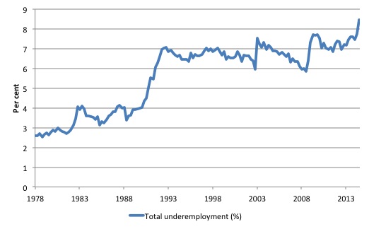
If hidden unemployment is added to the broad ABS figure the best-case (conservative) scenario would see a underutilisation rate well above 17 per cent at present. Please read my blog – Australian labour underutilisation rate is at least 13.4 per cent – for more discussion on this point.
The next update will be in the November Labour Force data release.
Aggregate participation rate – rose by 0.1 points
The October 2014 participation rate rose by 0.1 points to 64.6 per cent. It remains substantially down on the most recent peak in November 2010 of 65.9 per cent when the labour market was still recovering courtesy of the fiscal stimulus.
What would the unemployment rate be if the participation rate was at that recent November 2010 peak level (65.9 per cent)?
The following graph tells us what would have happened if the participation rate had been constant over the period November 2010 to October 2014. The blue line is the official unemployment since its most recent low-point of 4 per cent in March 2008.
The red line starts at November 2010 (the peak participation month). It is computed by adding the workers that left the labour force as employment growth faltered (and the participation rate fell) back into the labour force and assuming they would have been unemployed. At present, this cohort is likely to comprise a component of the hidden unemployed (or discouraged workers).
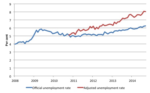
Total official unemployment in October 2014 was estimated to be 772.1 thousand. However, if participation had not have fallen since November 2010, there would be 1011.8 thousand workers unemployed given growth in population and employment since November 2010.
| The unemployment rate would now be 8 per cent if the participation had not fallen below its November 2010 peak of 65.9 per cent. |
The difference between the two numbers mostly reflects the change in hidden unemployment (discouraged workers) since November 2010. These workers would take a job immediately if offered one but have given up looking because there are not enough jobs and as a consequence the ABS classifies them as being Not in the Labour Force.
Note, the gap between the blue and red lines doesn’t sum to total hidden unemployment unless November 2010 was a full employment peak, which it clearly was not. The interpretation of the gap is that it shows the extra hidden unemployed since that time.
Hours worked – rose modestly in October 2014
Aggregate monthly hours worked increased by 24.9 million hours (1.6 per cent) in October 2014 in seasonally adjusted terms.
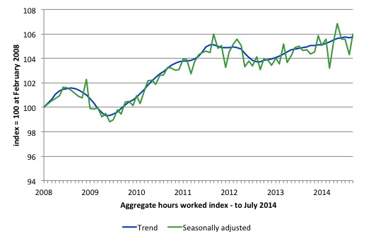
The following graph shows the trend and seasonally adjusted aggregate hours worked indexed to 100 at the peak in February 2008 (which was the low-point unemployment rate in the previous cycle).
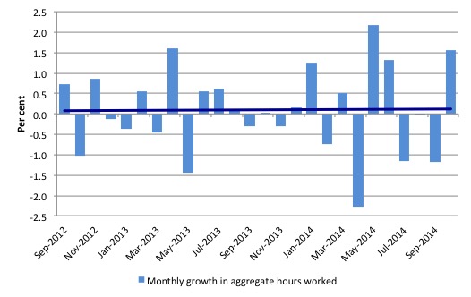
The next graph shows the monthly growth (in per cent) over the last 24 months. The dark linear line is a simple regression trend of the monthly change – which depicts as close to a zero trend as you will get. You can see the pattern of the change in working hours is also portrayed in the employment graph – zig-zagging across the zero growth line.
Conclusion
In general, we always have to be careful interpreting month to month movements given the way the Labour Force Survey is constructed and implemented.
The last several month of data have also shown how sensitive the data estimates are to the way the statistician collects and adjusts the data for seasonality.
The revelation that the seasonal factors previously applied were wrong is fairly disturbing and it is hoped that the revised methodology will provide for more stable estimates. We will see.
Today’s data release seems to have restored sanity in the time series, in that it confirms the patterns that have been apparent for the last two years.
The labour market is in a poor state and the bias is towards rising unemployment and stagnant employment growth.
The teenage labour market, which is in a parlous state, deteriorated further in October 2014. This is an emergency which is being ignored by the Federal Government.
The neglect of our teenagers will have a very long memory indeed and the negative consequences will be stronger given the ageing population.
That is enough for today!
(c) Copyright 2014 William Mitchell. All Rights Reserved.
Just a few thoughts on unemployment data. On the previous thread, I suggested interrogation of government databases would yeild better data than archaic surveys. Please see that post.
Anecdotally, I also wondered why I had never been selected in my entire adult life (over 40 years now) for an ABS Labour survey. Nor has my wife been selected, nor has anyone I know ever mentioned being so selected. Of course, some friends, acqauintances and relatives may have been selected and never mentioned it.
The ABS site mentions that: “This (survey method) is expected to result in about 52,200 persons responding to the survey, covering about 1 in 312 (0.32%) of the civilian population aged 15 years and over.”
I assume this is now monthly, although of course historically it was quarterly. Let us assume an average of 6 surveys per year over my life from 15 to 60. That is 6 x 45 surveys = 270 surveys. In each one, let us assume I have a 1 in 312 chance of being surveyed. This would equate to close to an 85% chance of being surveyed in my lifetime. Of course, probability says its possible I would never be surveyed (15% possibility). My wife I know for sure has never been selected either. Of course, I would have to widen my sample a lot, maybe ask 150 people at random to get an idea.
I wonder how good the ABS sampling method has ever been? I feel rather sceptical about it. This is what we base our unemployment data on? We now have vast government databases (ATO, Centrelink, Child Support, Medicare and DVA) of pretty much the entire population. These databases can be interrogated for the required data (numbers) without extracting a single name (to protect privacy). So basically, our ABS still use 19th century survey methods, albeit the statistical theory side of things might have improved somewhat.
I think it’s time we brought ABS data methods from the 19th C into the 21st C.