I finally arrived back home late last night, so I am catching up today. Part…
Australian National Accounts – gloomy but not yet disastrous
Today’s Australian Bureau of Statistics – Australian National Accounts – for the June-quarter 2013, shows that real GDP growth was 0.6 per cent, up slightly from the revised 0.5 per cent for the March-quarter 2013 (previously published at 0.6 per cent). The annualised growth rate of 2.6 per cent is now well below the trend rate between 2000 and 2008 and there is now a 4.3 per cent gap between actual growth and trend. This will widen in coming quarters and it is the reason the unemployment rate is rising. Overall, the data paints a fairly gloomy overall picture for the Australian economy. Gloomy without being disastrous. However, if the new federal government (after Saturday) start hacking into public spending to flex their conservative muscles then the outlook will shift very quickly from gloomy to disastrous and we will follow Europe down the sink hole.
The main features of today’s National Accounts release for the June-quarter 2013 were (seasonally adjusted):
- Real GDP increased by 0.6 per cent after recording a 0.5 per cent increase in the March-quarter (this was revised downwards from 0.6 per cent).
- The main positive contributors to expenditure on GDP were Final consumption expenditure (0.4 percentage points), Private gross fixed capital formation (1.4 percentage points) and Changes in inventories (0.2 percentage points).
- The main negative factor was the continued decline in Public gross fixed capital formation (-1.4 percentage points).
- Our Terms of Trade (seasonally adjusted) rose by only 0.1 per cent following a 3.1 per cent increase in the March-quarter 2013. Over the year to June-quarter 2013, the Terms of Trade have fallen by 4.9 per cent and that trend is the reason that forward-looking estimates of private investment (mining related) are looking very subdued for the rest of 2013 and into 2014.
- Real net national disposable income, which is a broader measure of change in national economic well-being rose by only 0.4 per cent (after rising by 1.3 per cent in the December-quarter and 1.1 per cent over the year to March-quarter 2013). This is a very modest improvement in real living standards.
Overall growth picture – continuing to trend down
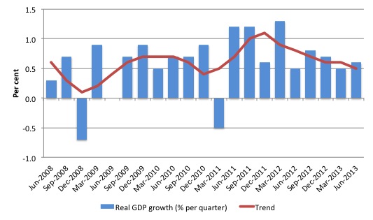
The following graph shows the quarterly percentage growth in real GDP over the last five years to the June-quarter 2013 (blue columns) and the ABS trend series (red line) superimposed. After the decline in trend growth was arrested by the fiscal stimulus in 2008-09 the decline in government support saw the dip in trend growth in 2010.
Initially, the growth in private investment associated with the record terms of trade and the resulting mining boom helped drive the new rise in trend growth and that appears to have ended in the December-quarter 2011.
As private investment boom slows and the impact of fiscal austerity bites, growth has now fallen to around 2.6 per cent per year.
That result is dominated by the September-quarter 2012 (0.8 per cent) following the a surge in private investment spending. Since then growth has moderated although the slowdown in investment spending is steady at present which means that overall growth is not collapsing.
Trend growth has been declining for the last six quarters of published data.
Incremental Output Gap – 4.5 per cent and growing
What are output gaps? The output gap is usually defined as the difference between actual and potential real GDP, expressed as a percentage of potential output.
I provide a detailed discussion of the various ways in which output gaps have been constructed including the ideological nature of such exercises in this blog – Australia output gap – not close to full capacity.
The method used here is much more transparent and generates results that the RBA and Treasury would not disagree with although they wouldn’t dare admit to that.
I use a regression equation to generate an estimate of trend. The method is standard. Real GDP was decomposed into its trend and cyclical components and for the period 2000Q1 to 2008Q1.
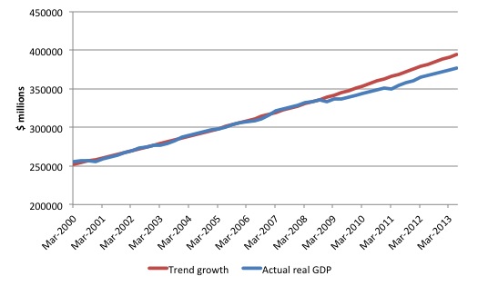
The estimated model was then forecast out-of-sample for the period 2008Q2 to the most recent observation 2013Q1. The forecast trend series can be interpreted as telling us what would have happened to the evolution of real GDP if the GFC had not have occurred and the Government had not pursued its surplus obsession.
The following graph shows real GDP in Australia (Gross domestic product: Chain volume measure) for the period 2000Q1 to 2013Q1 (blue line) and estimated trend based on the log-linear regression (red line).
This model is entirely plausible and fits well with other data indicators that are available.
The gap between real GDP and trend GDP is not strictly an output gap because that would require the additional assumption that trend growth always defines the potential growth of the economy. An economy may be held in a state of austerity for years (as we are seeing in Europe at present) and its trend will be much lower than its potential – given that tens of thousands to millions of people might be persistently unemployed or underemployed.
At the peak of the last cycle (February 2008) there were still 9.9 per cent of willing labour underutilised (4 per cent official unemployed and 5.9 per cent underemployed), which means that we could hardly call that state one of full employment.
It is in that context that I used the term – incremental output gap – to describe the gap between real GDP and trend GDP because it does not presume that the trend output upon which the forecast was based coincided with potential output or full employment.
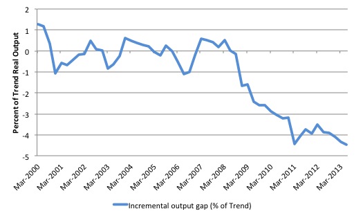
The incremental output gap depicts the increase in whatever gap existed at the time the forecast began (June-quarter 2013). In terms of the previous graph, it is the difference between the red and blue lines.
The following graph shows the incremental output gap (expressed as a percentage of trend real GDP) that is derived from the previous regression and forecasting exercise.
As at June-quarter 2013, the incremental output gap is estimated to be around 4.5 per cent (up from 4.4 per cent in the March-quarter) or around $A70.6 billion (on an annualised basis) in lost annual output and income.
This gap will increase throughout the year unless there is a reversal of the growth slowdown.
Real GDP growth and hours worked
One of the puzzles over the last few years or so has been the sharp dislocation between what is happening in the labour market and what the National Accounts data has been telling us.
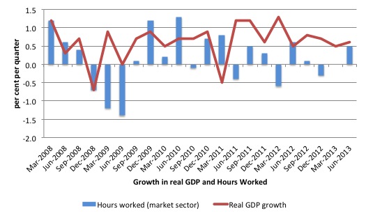
Employment growth and hours worked has been virtually flat over the period while real GDP growth has been around 2.4 to 2.6 per cent per annum. Today’s data suggests dislocation is continuing. Even though growth is slowing, it remains around the 2.4 per cent per annum mark). But there is no employment dividend of any significant amount forthcoming.
The following graph presents quarterly growth rates in trend GDP and hours worked using the National Accounts data for the last five years to the June-quarter 2013.
You can see the major dislocation between the two measures that appeared in the middle of 2011 persisted into the first-quarter 2013. Hours worked increased in the June-quarter 2012 more in line with what we would expect but then collapsed again.
In the June-quarter 2013, the correspondence between hours-worked and real GDP growth is more typical and implies that labour productivity has fallen.
Just in case you think the labour force data is suspect, the hours worked computed from that data is very similar to that computed from the National Accounts.
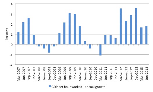
To see the above graph from a different perspective, the next graph shows the annual growth in GDP per hour worked (so a measure of labour productivity) from the March 2007 quarter to the June-quarter 2013. The relatively strong growth in labour productivity in 2012 helps explain why employment growth has been lagging given the real GDP growth. Growth in labour productivity means that for each output level less labour is required.
In the recent two quarters, the growth has slowed which suggests that the cycle associated with the investment boom is over and real GDP growth and employment growth will start to converge back to more typical proportions (at a lower overall real GDP growth rate).
Contributions to growth
What components of expenditure added to and subtracted from real GDP growth in the June-quarter 2013?
The ABS tell us that:
On the expenditure side, the increase this quarter (in seasonally adjusted volume terms) was driven by Private gross fixed capital formation (adding 1.4 percentage points) and Final consumption expenditure (adding 0.4 percentage points). These increases were partially offset by the decrease in Public gross fixed capital formation (detracting -1.4 percentage points)
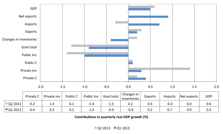
The following bar graph shows the contributions to real GDP growth (in percentage points) for the main expenditure categories. It compares the June-quarter 2013 contributions (grey bars) with the March-quarter 2013 (blue bars).
The overall contribution of investment is zero given that the strong result for private capital formation (1.4 percentage points) was offset by the dramatic drag on growth coming from public investment (-1.4 percentage points).
Note that the strong contribution from net exports in the first-quarter 2013 (0.9 percentage points) has vanished with net exports now a (very close to zero) negative contributor (-0.04 points).
The elevated net exports contribution in the March-quarter was due to a massive drop in imports. In the June-quarter, imports are once again draining quarterly real GDP growth rate and offsetting the slightly increased contribution from export volumes.
Private consumption is weakening (see evidence of a sharp rise in the household saving ratio later in the report).
The fiscal contraction is clearly evident now with substantial and increasing declines in public investment dragging growth down.
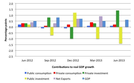
The next graph shows the contributions to real GDP growth of the major expenditure aggregates since June-quarter 2012 (in percentage points). The total real GDP growth (in per cent) is also included as a reference.
The data suggests that household consumption (and public consumption) is weak. The private investment boom associated with the mining sector is also in decline as the record terms of trade moderates but private capital formation is still the major contributor in the June-quarter.
The stand-out result is the continued negative contribution of public capital formation notwithstanding the large positive spike in the December-2012 quarter. This contribution came from the State and Local government public corporations and is a once-off. The Federal government contribution to growth overall is now strongly negative.
Household saving ratio jumps to 10.8 per cent
The following graph shows the household saving ratio (% of disposable income) from 2000 to the current period. The household sector is now behaving very differently since the GFC rendered its balance sheet very precarious. Prior to the crisis, households maintained very robust spending (including housing) by accumulating record levels of debt. As the crisis hit, it was only because the central bank reduced interest rates quickly, that there were not mass bankruptcies.
The household saving ratio was 10.8 per cent of disposable household income in the June-quarter 2013, up from 10.5 per cent in the March-quarter 2013.
For the economy to continue to grow strongly while households are maintaining this higher levels of saving (from disposable income), public spending, private investment and/or net exports has to increase.
Clearly, the contribution from private investment is now fading (and was negative in the December quarter) and the net exports contribution in the current quarter while strong will not endure given the movements in the terms of trade.
Which means that continued growth will require a much stronger contribution from the government sector. The 1.1 per cent contribution from the State and Local government public corporations is an outlier and will not endure.
The problem is that if incomes start to drop and the households continue to pursue this saving proportion aggregate demand will decline even further. What the Government fails to understand is that the household sector is now carrying record levels of debt as a result of the credit binge leading up to the crisis and we are unlikely to see a return to the low saving ratios that were evident in the period 2000 to 2005.
That means that government surpluses which were associated with the credit binge, and only were made possible by the unsustainable credit binge are untenable in this new (old) climate. The Government needs to learn about these macroeconomic connections.
A return to higher saving ratios is surely signalling a need for a return to more or less continuous budget deficits, depending on what happens to the external sector.
That is what the overall real GDP growth slowdown is telling us – very clearly. So clearly that the neo-liberals fail to see it!
Regional growth disparities closing as the investment phase of the mining boom fades
In media interviews over the last 12 months I have been saying the “East Coast” of Australia, where most of the population is concentrated, is either in or close to recession and it is only the mining states of Western Australia and the Northern Territory, which are keeping Australia in the positive real GDP growth range.
The record terms of trade that Australia has enjoyed in recent years (since around 2005) promoted exchange rate appreciation, which is now showing signs of correction as the terms of trade weaken.
Since early 2001, the Australian dollar has fluctuated significantly. In March 2001, the Trade-Weighted Index was 47.4. By June 2008, it had risen to 73.4 (a 55 per cent increase). Then it plunged to 53.2 six months later (a drop of 28 per cent), only to rise again on the rebound in commodity prices to 79.2 (a 49 per cent rise). Similar movements against the major currencies also occurred. After some period above parity, the currency is now falling again.
However, the commodity prices for non-base metals have not enjoyed the same increases as for the mining commodities. This suggests a classic “Dutch Disease” situation. In the Australian context, the concept typically applies to the impact of a resources boom on the Australian dollar.
The appreciating currency: (a) damages the competitiveness of ‘import-competing’ sectors (dominated by manufacturing, service and agricultural firms) because import prices fall relative to local cost levels; and (b) promotes wage pressures which further damage sectors who are not enjoying buoyant demand conditions.
The depreciating currency will reverse some of these negative impacts.
A trend that has been emerging in Australia for several years, whereby some sectors (such as manufacturing) and regions (such as Sydney and Victoria) are struggling while other sectors (such as mining) and regions (such as Western Australia) are booming is consistent with these exchange rate dynamics.
These developments – popularised by the term ‘two-speed economy’ – whereby serious sectoral and regional imbalances accompany overall economic growth, challenge the fundamental patterns of our economic and social settlements and threaten the financial viability of many Australian households.
While the term ‘two-speed economy’ has taken on a number of meanings in different countries the imbalance of most interest here is the precariousness of the NSW (particularly, Sydney) and Victorian (Melbourne) economies relative to the prosperousness of the mining regions of Western Australia, Queensland and the Northern Territory.
Several coincident factors are driving the ‘two-speed’ economy some of which have not received much public attention (for example, the fiscal austerity that the national government imposed before the non-government sector had recovered from the 2008-09 slowdown.
This is a danger for any nation where exports are highly specialised and where the traded-goods sector is comprised of one dominant industry group. It is clear that mining has been growing at the expense of manufacturing and agriculture.
While the Australian Bureau of Statistics produces annual measures of Gross State Product, they also produce quarterly measures of State Final Demand (Australian National Accounts: State Accounts, cat. no. 5220.0). State Final Demand is thus the best estimate of economic activity available at the State/Territory level on an on-going basis (quarterly).
The ABS define State Final Demand as:
a measure of economic demand for products in the economy. It is an aggregate obtained by summing government final consumption expenditure, household final consumption expenditure, private gross fixed capital formation and the gross fixed capital formation of public corporations and general government. It is different from Gross State Product (GSP) as it excludes international and interstate trade as well as change in inventories.
What does the evidence tell us about the existence of a “two-speed” (or multi-speed economy)?
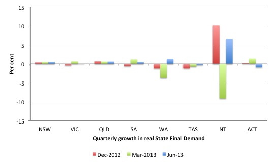
The following graph shows the quarterly growth in real State Final Demand for the last three quarters by State/Territory. It is clear that Tasmania is in recession (at least two consecutive quarters of negative output growth).
Of significance, is the fact that Western Australia, which has been the driving force in the Australian economy in recent years has come out of recession after recording two consecutive quarters of negative output growth in the December- (2012) and March-quarters (2013).
The Northern Territory, another mining state also reversed its poor performance last quarter.
The states with the largest populations – New South Wales and Victoria – both are stuck in low growth situations and while Queensland appears to be growing at the national average (moderately).
Taken together the evidence suggests that the mining states are slowing (relative to 2011 and 2012) but are still contributing to growth while the east coast states are just keeping their head above ground.
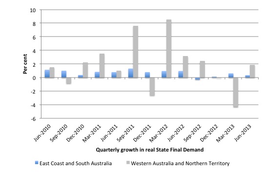
The next graph aggregates the States/Territories into two groups – East Coast plus South Australia and the two mining strongholds of Western Australia and the Northern Territory. I excluded the Australian Capital Territory because of the dominance of the public sector. Most of the Australian population are concentrated around the East Coast. Very few Australians live in Western Australia or the Northern Territory (although Perth, the capital of WA is a large city).
The data shows that the East Coast (Tasmania, Victoria, New South Wales, and Queensland) plus South Australia are performing poorly compared to the mining states (Western Australia and Northern Territory) but still maintaining some growth.
To give you some idea of the disparity in growth across States/Territories since the mining boom began, the following graph indexes real State Final Demand from the March-quarter 2005 (base quarter). This was about the time the first phase of the commodity price boom started.
It is clear that the Western Australian economy has been the stand-out performer given its concentration of mining. The Northern Territory and Queensland (both who enjoy strong mining sectors) have also enjoyed similar prosperity although they both flattened out during the economic crisis.
As the nation’s capital and public service centre, the ACT has also enjoyed relatively strong growth in State Final Demand.
Contrast that to the manufacturing states of NSW, Victoria and South Australia and the smaller state of Tasmania. Their performance over the period has been modest at best and all are in recession or near recession now.
Conclusion
Today’s National Accounts data indicates that the economy has converged for the time being around a below-trend growth path as the investment phase of the mining boom slows. At present, this investment phase has not collapsed altogether and thus moderate growth continues.
Remember that the National Accounts tells us what was happening in 3-6 months ago. The most recent evidence suggests that net exports will not contribute as much in the next 6 months given that the consumption component of imports has not shifted much recently.
But the terms of trade fell by around 4.9 per cent in the last 12 months, although there was some recovery in the June-quarter 2013. The uncertainty is over the export phase of the boom, which will follow from the increased capacity developed by the investment phase, as long as world demand for metal ores and minerals remains strong.
It is clear that private consumption growth is modest and declining. Taken together, the fiscal drag and the modest private spending would indicate that real GDP growth will remain below trend into the future with the majority of the population are living in regions which are close to recession.
I think today’s national accounts data paints a fairly gloomy overall picture for the Australian economy. Gloomy without being disastrous.
However, if the new federal government (after Saturday) start hacking into public spending to flex their conservative muscles then the outlook will shift very quickly from gloomy to disastrous and we will follow Europe down the sink hole.
That is enough for today!
(c) Copyright 2013 Bill Mitchell. All Rights Reserved.


Bill,
private investment appears to have been largely accounted for by the purchase by a consortium of 99 year leases for Port Botany and Port Kembla. I expect the NSW government to be of an austerity mindset and not actually spend the money back into the economy.
“Recorded private aggregate investment rose 5.9%/6.1%, but this was more than accounted for by the national accounts book entry for the purchase by a private sector consortium of the 99-year leases for New South Wales’s Port Botany and Port Kembla in April. Take that out and private business investment declined by 1.2%/-1.3%”
http://www.macrobusiness.com.au/2013/09/nab-australian-gdp-flatters-reality/
I think the economy is already tiptoeing along the edge of recession – Abbot will drive us over.
Bill – great post as always.
The LNP have now delivered their “costings” 2 days before the election. To be honest, it does not look like a LNP Governent will be imposing sever Austerity (at least, nothing like Europe). Do you really think their policies will casue the “outlook will shift very quickly from gloomy to disastrous”?
A seperate post on this issue would be interesting.